
Search results for "Decision" in Home Design Ideas
 Visionary Home Remodeling Inc.
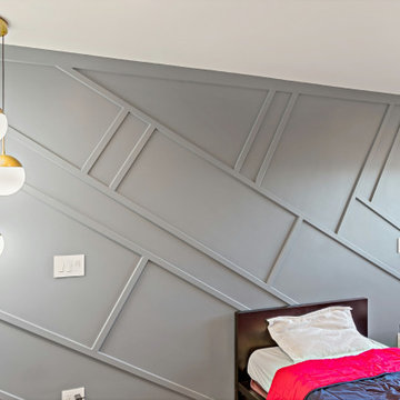
THIS WALL WAS STRATEGIZED BY OUR DESIGN TEAM// WE BELIEVE EVERY HOUSE NEEDS TO HAVE A MONEUMENTAL ACCENT WALL. THIS IS IT! THIS IS IN THE GUEST ROOM AT OUR CLIENTS HOME. THE DECISION TO PUT THE LIGHTING IN A CORNER AND MAKING IT A SYMBOL FOR THE ROOM WAS MADE LAST MINUTE. ENJOY
 Neil Kelly Company
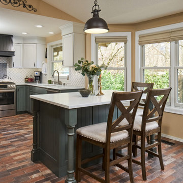
The decision to keep the original cabinet boxes meant simply replacing the cabinet drawers and drawer fronts for a refreshing transformation. The porcelain tile floor has the unmistakable look of brick without the struggle to keep it clean. New appliances, stylish range hood, and a new cabinet box for the refrigerator. A custom island located in the original dining nook satisfies the client's number one request, providing a place to drink wine and make cookies.

 Alice Welborn
Withstand the elements with the versatile Clink Dining Side Chair. Progress decisively forward with a discerning design made of brushed steel. Lightweight and appropriate for both indoor and outdoor use, Clink is a favorite choice for contemporary decks, patios, cafes, restaurants, dining room and kitchen spaces.
Buy Now
OVERALL PRODUCT DIMENSIONS 21.5″L x 16″W x 32.5″H
SEAT DIMENSIONS 14.5″L x 15.5″W x 17.5″H
BACKREST DIMENSIONS 16″W x 15″H
BASE DIMENSIONS 16.5″L x 15.5″W
Find the right local pro for your project
 Greater Dayton Building & Remodeling
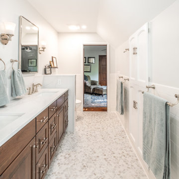
The newly renovated space checks all the boxes without sacrificing too much of the adjacent
Guest Bedroom. From making the shower feel more open to adding room for the double bowl
vanity, this project gave the Clients everything they wanted in their Primary Suite Bathroom.
The functional upgrades of generating more storage and usability are highlighted by the
beautiful tile and quartz work that create a luxurious feel in the space. Every design decision
and material selection was made through the lens of mixing modern and classic which has
helped breathe new life into this Tudor Revival.
 LMOH Home
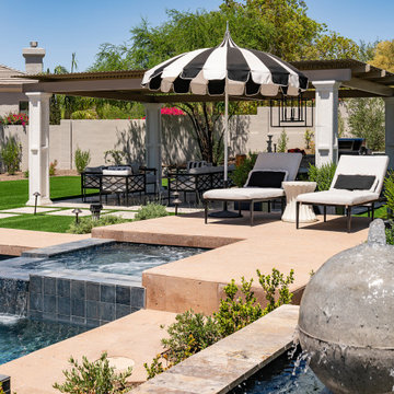
Located in Scottsdale, Arizona, Paradise Drive demonstrates how a series of intentional design decisions can completely transform a home. Rather than undertaking a full renovation, our clients wanted to elevate key spaces with architectural details, statement materials, and custom features that reflected their love of bold, collected design.
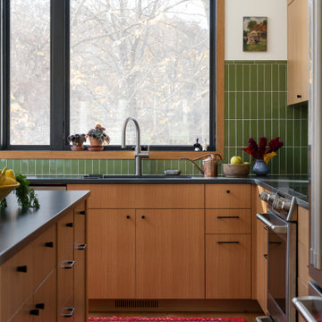
 Susan Yeley Homes
We approached this new build as a seamless, full-service collaboration between architecture and interiors. Every decision—structural, spatial, and aesthetic—was shaped with intention, not to mention collaboration, since our contractor was also our client. Our contractor said, “make the rooflines simple and direct the water away.” His wife said, “I like color.” Check, and check. The bold exterior lines of the home both contrast with and recede into the woods around it, and the interiors are layered with cheerful hues, custom details, and playful patterns. Each room carries its own moment of cheer, while the overall palette ties together into a cohesive, uplifting whole, not unlike its namesake rainbow.
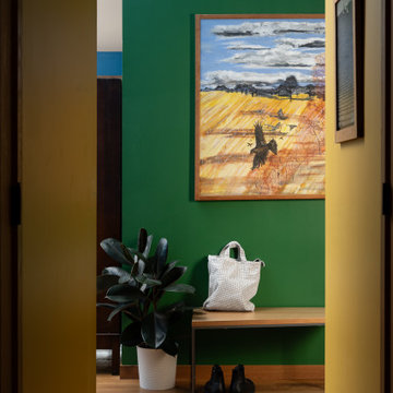 Susan Yeley Homes
We approached this new build as a seamless, full-service collaboration between architecture and interiors. Every decision—structural, spatial, and aesthetic—was shaped with intention, not to mention collaboration, since our contractor was also our client. Our contractor said, “make the rooflines simple and direct the water away.” His wife said, “I like color.” Check, and check. The bold exterior lines of the home both contrast with and recede into the woods around it, and the interiors are layered with cheerful hues, custom details, and playful patterns. Each room carries its own moment of cheer, while the overall palette ties together into a cohesive, uplifting whole, not unlike its namesake rainbow.

 Nilus Designs
An 1878 Victorian with an eclectic history and beautiful bones is transformed into a series of light filled, expansive spaces. Care was taken to retain the traditional Victorian detailing while adding a modern casework and furnishings to update the space.
The house had been through many incarnations – including housing for naval officers, home to a dental school, crash pad for rock stars – all of which left their mark on the architecture. Before any design decisions could be made, the house was stripped to its bones, which revealed capacious and thoughtfully designed spaces. The design intent was to honor the original architecture and traditional detailing – decorative door knobs, intricate moldings – and blend Victorian with modern.


 The Masons Co and Dionysian Artificers Landscape
Guidelines for Choosing an Outdoor Firepit Designs
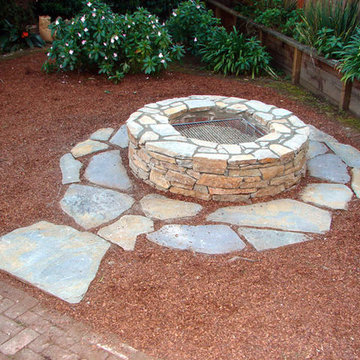
When going over possible Outdoor Firepit Ideas in Kansas City MO, one of the main considerations is the decor and design of your home as it stands now. This is because it is important for the firepit to blend with and complement your home as opposed to standing out and looking out of place. Alternatively, if you are looking to redecorate your home, you can select an outdoor firepit that complements not your current decor, but the target.
Most outdoor design ideas incorporate either metal or copper as the main material. The design itself depends on individual preference. For instance, you may choose an ornate design, in addition to providing you with the option of choosing from different shapes such as a square or a rectangle. A major consideration when selecting a design is the number of people who would potentially be warming themselves around the fire. For an outdoor pit around which many people are likely to gather, an open design is recommended.
The professionals and designers in UMKC Masonry are in the business of enhancing spaces and creating a final product that is both functional and aesthetic. These experts prioritize high quality and first-rate service for every client.
Kansas City Landscape & Design is Kansas city’s only certified Real stone veneer/siding contractor, BRICK PATIO CONTRACTOR..Stone veneer, STONE PATIO, FIRE PIT, KANSAS CITY’S BRICK,STONE WALLS CONTRACTOR,,Stone siding or cladding, is used for homes, offices, hardscapes, landscaping or any other architectural construction project that demands the finest surface covering.

 ZeroEnergy Design
This renovated brick rowhome in Boston’s South End offers a modern aesthetic within a historic structure, creative use of space, exceptional thermal comfort, a reduced carbon footprint, and a passive stream of income.
DESIGN PRIORITIES. The goals for the project were clear - design the primary unit to accommodate the family’s modern lifestyle, rework the layout to create a desirable rental unit, improve thermal comfort and introduce a modern aesthetic. We designed the street-level entry as a shared entrance for both the primary and rental unit. The family uses it as their everyday entrance - we planned for bike storage and an open mudroom with bench and shoe storage to facilitate the change from shoes to slippers or bare feet as they enter their home. On the main level, we expanded the kitchen into the dining room to create an eat-in space with generous counter space and storage, as well as a comfortable connection to the living space. The second floor serves as master suite for the couple - a bedroom with a walk-in-closet and ensuite bathroom, and an adjacent study, with refinished original pumpkin pine floors. The upper floor, aside from a guest bedroom, is the child's domain with interconnected spaces for sleeping, work and play. In the play space, which can be separated from the work space with new translucent sliding doors, we incorporated recreational features inspired by adventurous and competitive television shows, at their son’s request.
MODERN MEETS TRADITIONAL. We left the historic front facade of the building largely unchanged - the security bars were removed from the windows and the single pane windows were replaced with higher performing historic replicas. We designed the interior and rear facade with a vision of warm modernism, weaving in the notable period features. Each element was either restored or reinterpreted to blend with the modern aesthetic. The detailed ceiling in the living space, for example, has a new matte monochromatic finish, and the wood stairs are covered in a dark grey floor paint, whereas the mahogany doors were simply refinished. New wide plank wood flooring with a neutral finish, floor-to-ceiling casework, and bold splashes of color in wall paint and tile, and oversized high-performance windows (on the rear facade) round out the modern aesthetic.
RENTAL INCOME. The existing rowhome was zoned for a 2-family dwelling but included an undesirable, single-floor studio apartment at the garden level with low ceiling heights and questionable emergency egress. In order to increase the quality and quantity of space in the rental unit, we reimagined it as a two-floor, 1 or 2 bedroom, 2 bathroom apartment with a modern aesthetic, increased ceiling height on the lowest level and provided an in-unit washer/dryer. The apartment was listed with Jackie O'Connor Real Estate and rented immediately, providing the owners with a source of passive income.
ENCLOSURE WITH BENEFITS. The homeowners sought a minimal carbon footprint, enabled by their urban location and lifestyle decisions, paired with the benefits of a high-performance home. The extent of the renovation allowed us to implement a deep energy retrofit (DER) to address air tightness, insulation, and high-performance windows. The historic front facade is insulated from the interior, while the rear facade is insulated on the exterior. Together with these building enclosure improvements, we designed an HVAC system comprised of continuous fresh air ventilation, and an efficient, all-electric heating and cooling system to decouple the house from natural gas. This strategy provides optimal thermal comfort and indoor air quality, improved acoustic isolation from street noise and neighbors, as well as a further reduced carbon footprint. We also took measures to prepare the roof for future solar panels, for when the South End neighborhood’s aging electrical infrastructure is upgraded to allow them.
URBAN LIVING. The desirable neighborhood location allows the both the homeowners and tenant to walk, bike, and use public transportation to access the city, while each charging their respective plug-in electric cars behind the building to travel greater distances.
OVERALL. The understated rowhouse is now ready for another century of urban living, offering the owners comfort and convenience as they live life as an expression of their values.
Eric Roth Photo
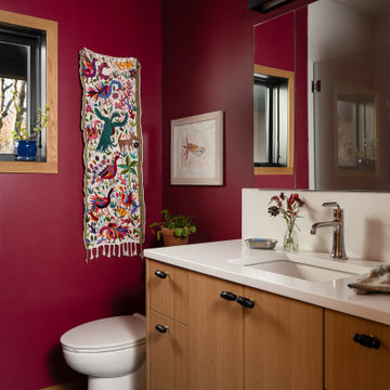 Susan Yeley Homes
We approached this new build as a seamless, full-service collaboration between architecture and interiors. Every decision—structural, spatial, and aesthetic—was shaped with intention, not to mention collaboration, since our contractor was also our client. Our contractor said, “make the rooflines simple and direct the water away.” His wife said, “I like color.” Check, and check. The bold exterior lines of the home both contrast with and recede into the woods around it, and the interiors are layered with cheerful hues, custom details, and playful patterns. Each room carries its own moment of cheer, while the overall palette ties together into a cohesive, uplifting whole, not unlike its namesake rainbow.

 Main Street Custom Homes & Remodeling
In 2010, with the homeowner’s children grown, they were faced with what has become a concern for many families, how to provide for aging parents. They considered many options, and made the decision to move her mother and father, both in their nineties, into their current family home. An addition was built that would best accommodate the parents’ needs, and include all the custom design details and quality construction of the main home.

 DK Homes
Uniquely situated on a double lot high above the river, this home stands proudly amongst the wooded backdrop. The homeowner's decision for the two-toned siding with dark stained cedar beams fits well with the natural setting. Tour this 2,000 sq ft open plan home with unique spaces above the garage and in the daylight basement.

 User
What began as three spaces – a larger-than-needed garage, an oversized laundry and utility room, and a too-small original kitchen – was reconfigured as two spaces. The laundry was relocated to the garage and much of the garage space given to the new spacious kitchen remodel. This required structural modifications and a complete re-design of the flow of the kitchen, with an island in the middle and a new peninsula instead of a solid wall opening to the formal dining area. Both spaces were designed for more natural light, and given all new finishes. The finish choices and design decisions were made by our team working together with the client to achieve just the right look to complement the existing home layout.
Photos courtesy of Willoughby & Alan – Coldwell Banker.

 PPG PROLUXE Wood Finishes
This photo is evidence that modern doesn't have to mean sterile. The clean lines of the deck, stairs, overhang and furniture create a contemporary feel. The abundance of wood and the rich color of PPG ProLuxe Wood Finishes add warmth.

 Heather Garrett Design
How to help a young couple who loved the location and bones of a traditional home, but wanted a decisive shift in its decor and vibe to modern luxe? Begin by pulling down the 2-story walls of oak paneling, heavy fireplace mantle, and scraping out the dimly lit kitchen. Opening the kitchen into the family room and reworking the architecture of the space was the solution to creating the fresh feeling we were after.
Photos by John Bessler

 Larina Kase Interior Design
Our clients moved to Wayne, a town in Philadelphia's Main Line, from the NYC area. They are young and stylish and we wanted to give them a kitchen that is current and on trend but also timeless so they won't have to make any changes down the line. We called their style Vintage Modern and kept that in mind with decisions. One of our favorite parts of the kitchen renovation are the honed quartzite countertops.

 Fusion Architecture
Example of a mid-sized trendy wooden u-shaped open and cable railing staircase design in Seattle
151