
Search results for "Decision" in Home Design Ideas

 Karla Trincanello, CID, Interior Decisions, Inc.
Scalamandre crystal beaded wallcovering makes this a powder room to stun your guests with the charcoal color walls and metallic silver ceiling. The vanity is mirror that reflects the beaded wallcvoering and the circular metal spiked mirror is the a compliment to the linear lines. I love the clien'ts own sconces for adramatic accent that she didn't know where to put them and I love them there!

 Next Stage Design + Build
Designer: Ramona Tan; Allied ASID, CID #6227, CAPS, CKBR
Photographer: Nathan Lewis
Though an addition to the Main House was considered, the decision to add space to the existing detached garage proved to be a better decision for their lifestyle, budget and timeline needs.

 DEANE Inc | Distinctive Design & Cabinetry
Located in the highly sought-after Allwood neighborhood of Darien, this spec house is the fourth collaboration with a client who first began with a renovation of her own home. While architecturally it is a traditional home from the exterior, the interiors are more transitional in style. In order to compete in the speculative market, our client’s directive was clear – ‘differentiation the kitchen design from every other spec house’. So we incorporated painted cabinetry but highlighted with rift-cut white oak base cabinets. This contrast between these finishes influenced our decision to select a subtle white quartzite countertop to deliberately highlight the striking porcelain backsplash.
The steel and glass partition frames the space – drawing the eye to the focal point of the kitchen, the custom stainless steel hood. Gold hardware adds a pop of flair to the space and warms the room. Walnut drawer inserts, stainless steel appliance garage, pull out trash drawers with compost bins and a stylish desk make this the Gold Standard of spec houses.
Find the right local pro for your project
 Karla Trincanello, CID, Interior Decisions, Inc.
One large expansive room in this townhome was separated by tall columns and then elegant French portierre drapery to define two separate areas insteal of one room for both spaces. sheer motorized shades provide just the right touch when the sun glares intot he room. The sectional upholstery may look untouchable but it is extremely confortable and perfect for relaxing and watching the TV while a warm fire is blazing.

 Infinite Home
Custom Home Built for Real Life
Our clients came to us with a clear vision: a home that could adapt to their lifestyle and growing family. They needed a home built with intention, designed with the future in mind, and built around the routines they loved and the people they loved more.
Open-Concept Living With Hosting in Mind
Our clients hosted often and lived actively, so the main level had to be flexible for all of life’s moments. The goal was a space that felt grand without losing its warmth.
Cooking together as a family mattered to our clients – the Wolf range, farmhouse sink, integrated appliances, and large island gave them a kitchen that flowed effortlessly while looking beautiful. This space also served as the bridge between other parts of the main level so that they would stay in view of the next. This created the perfect environment for gathering where everyone had their own spot without ever feeling apart from the whole group.
For the living room, our clients wanted space that felt open without losing its warmth. Soaring ceilings created that sense of scale, while warm tones and materials, like the wood coffered ceiling and fireplace wall, kept it grounded. That same warmth carried outside, where an outdoor lounge with a fireplace and dining area made sure guests felt welcomed the moment they stepped out.
A Backyard Built for Real Rest
Every corner of the backyard was designed with one goal: to be the ultimate outdoor retreat. The elevated, white-brick-framed pool and integrated spa hot tub gave them a place to truly exhale. As the sun set, the fire pit lounge next to the pool became the hangout spot when they hosted their youth groups and family gatherings.
Room to Grow
With kids in the house, “custom” had to also mean flexible. Our clients had 2 young sons and needed their rooms to grow with them through the years. The two bedrooms and a full bath sat beside a loft that served as both their hangout-and-homework spot. The guest suite sat on the same level where a four-poster bed, floor-to-ceiling wood-look tile, and a frameless glass shower welcomed their guests from day one.
A Retreat That’s Actually Theirs
Between hosting and raising kids, this couple needed a suite that felt like a true escape. The wood-planked tray ceiling and French doors grounded the room in warmth the moment you walked in, while the ensuite bathroom carried a spa-like feeling with a freestanding soaking tub, custom double vanity, and a glass-enclosed shower.
This Is What Approachable Luxury Looks Like
The approachable luxury experience meant starting with conversations about how they wanted their space to live with them – how they hosted, how their kids played, how they wanted to feel walking through their own front door, and how we took their goals and experience and used it as the foundation of every decision that was made from start to finish. We wanted our clients to feel taken care of through the process and, most importantly, feel heard.

 Interiors by Natasha
I was hired by the parents of a soon-to-be teenage girl turning 13 years-old. They wanted to remodel her bedroom from a young girls room to a teenage room. This project was a joy and a dream to work on! I got the opportunity to channel my inner child. I wanted to design a space that she would love to sleep in, entertain, hangout, do homework, and lounge in.
The first step was to interview her so that she would feel like she was a part of the process and the decision making. I asked her what was her favorite color, what was her favorite print, her favorite hobbies, if there was anything in her room she wanted to keep, and her style.
The second step was to go shopping with her and once that process started she was thrilled. One of the challenges for me was making sure I was able to give her everything she wanted. The other challenge was incorporating her favorite pattern-- zebra print. I decided to bring it into the room in small accent pieces where it was previously the dominant pattern throughout her room. The color palette went from light pink to her favorite color teal with pops of fuchsia. I wanted to make the ceiling a part of the design so I painted it a deep teal and added a beautiful teal glass and crystal chandelier to highlight it. Her room became a private oasis away from her parents where she could escape to. In the end we gave her everything she wanted.
Photography by Haigwood Studios


 Ashby Collective
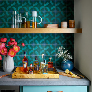
Inspiration for a small modern single-wall dry bar remodel in Austin with floating shelves, blue cabinets, soapstone countertops, blue backsplash, ceramic backsplash and gray countertops

 Wanda Ely Architect Inc.
The kitchen is designed for two serious home chefs who often entertain guests for dinner parties. Merging the kitchen and dining room into a singular space was a strategic design decision to both foster their style of ‘chefs table’ entertaining, and also make the most efficient use of valuable floor space - a common consideration in most Toronto homes. The table becomes an island-like surface for additional prep space, and also as the surface upon which the meal is eventually enjoyed.

 Framestudio
This project began as a design-build proposal to build an addition for an indoor swim spa and exercise room to a ranch style house. The Clients were seeking a functional and inviting space reminiscent of the luxury resorts and space they have visited during their international travels.
One of the biggest challenges was to fit the program within the site and buildable area constraints. In order to maximize floor area, the exterior walls of the addition were located parallel to the property lines along the required setbacks, which resulted in a non-orthagonal geometry in plan. The volume of the addition began to take shape with large floor to ceiling openings strengthening the connection to the outdoors with roof line that rises northward to capture daylight. A series of operable skylights ventilate the room and allow more daylight to penetrate into the adjacent existing den.
Inspired by modern additions made to historic structures in Europe, we made a conscious decision to not try to blend the addition into the language of the existing ranch house, choosing instead to juxtapose a structure that was layered and felt light next to the cement tile roof and framed picture windows. The interior walls were finished with a marine grade plywood to withstand a humid environment, and the exteriors were clad with a cedar rainscreen to give privacy where needed and gradually reduced to allow for more glass and visibility.
The Clients are immersed in the technological environment of Silicon Valley and appreciated the simple geometries and aesthetics of modern design.
david wakely

 Douglas Knight Construction
 and
Springgate Photography
Transitional u-shaped dark wood floor eat-in kitchen photo in Salt Lake City with recessed-panel cabinets, dark wood cabinets, an island, marble countertops, beige backsplash, ceramic backsplash and stainless steel appliances
Transitional u-shaped dark wood floor eat-in kitchen photo in Salt Lake City with recessed-panel cabinets, dark wood cabinets, an island, marble countertops, beige backsplash, ceramic backsplash and stainless steel appliances


 Misiaszek Turpin pllc
Resting upon a 120-acre rural hillside, this 17,500 square-foot residence has unencumbered mountain views to the east, south and west. The exterior design palette for the public side is a more formal Tudor style of architecture, including intricate brick detailing; while the materials for the private side tend toward a more casual mountain-home style of architecture with a natural stone base and hand-cut wood siding.
Primary living spaces and the master bedroom suite, are located on the main level, with guest accommodations on the upper floor of the main house and upper floor of the garage. The interior material palette was carefully chosen to match the stunning collection of antique furniture and artifacts, gathered from around the country. From the elegant kitchen to the cozy screened porch, this residence captures the beauty of the White Mountains and embodies classic New Hampshire living.
Photographer: Joseph St. Pierre

 VanderHorn Architects
Locally sourced Connecticut fieldstone envelops the sprawling first floor.
Huge traditional blue three-story stone house exterior idea with a hip roof and a shingle roof
Huge traditional blue three-story stone house exterior idea with a hip roof and a shingle roof
 Karla Trincanello, CID, Interior Decisions, Inc.
The tile is what makes this master bathroom distinctive against the while marble walls. The pattern was laid in a diagonal direction with a contemporary free standiing bathr tub, The shower is a steam shower outfitted with clean glass.
 Karla Trincanello, CID, Interior Decisions, Inc.
This well used but dreary bathroom was ready for an update but this time, materials were selected that not only looked great but would stand the test of time. The large steam shower (6x6') was like a dark cave with one glass door allowing light. To create a brighter shower space and the feel of an even larger shower, the wall was removed and full glass panels now allowed full sunlight streaming into the shower which avoids the growth of mold and mildew in this newly brighter space which also expands the bathroom by showing all the spaces. Originally the dark shower was permeated with cracks in the marble marble material and bench seat so mold and mildew had a home. The designer specified Porcelain slabs for a carefree un-penetrable material that had fewer grouted seams and added luxury to the new bath. Although Quartz is a hard material and fine to use in a shower, it is not suggested for steam showers because there is some porosity. A free standing bench was fabricated from quartz which works well. A new free
standing, hydrotherapy tub was installed allowing more free space around the tub area and instilling luxury with the use of beautiful marble for the walls and flooring. A lovely crystal chandelier emphasizes the height of the room and the lovely tall window.. Two smaller vanities were replaced by a larger U shaped vanity allotting two corner lazy susan cabinets for storing larger items. The center cabinet was used to store 3 laundry bins that roll out, one for towels and one for his and one for her delicates. Normally this space would be a makeup dressing table but since we were able to design a large one in her closet, she felt laundry bins were more needed in this bathroom. Instead of constructing a closet in the bathroom, the designer suggested an elegant glass front French Armoire to not encumber the space with a wall for the closet.The new bathroom is stunning and stops the heart on entering with all the luxurious amenities.

 User
photo-Caitlin Atkinson
This is one of the new pathways that we were able to create where there had formally been lawn. By mounding the planting areas, we were able to introduce healthy new soil.


 Karla Trincanello, CID, Interior Decisions, Inc.
This was a renovation project that expanded the kitchen by using the space that was an adjacent laundry room. Contemporary kitchen with large 'waterfall island' as the centerpiece to dine, storage beneath and refrigerator/freezer drawers along with microwave drawer. Quartz was used for the island,counter and stove backsplash as a slab.in calacutta pattern, perimeter is also a quartz in a coordinated darker color. stainless steel hood with textured grayish white cabinetry. breakfast area is used mostly as a sitting area to watch TV and be a part of the kitchen but the cocktail table converts to dining height as well as expands for additional dining table space and seating is then becomes a dining banquette.area. Butler pantry is new area added and widened entry to dining room. Design by Karla Trincanello.
photo by Wing Wong Memories LLC

 Jessica Bradley Interiors
Inspiration for a coastal dark wood floor and brown floor open concept kitchen remodel in Atlanta with a farmhouse sink, shaker cabinets, gray cabinets, stainless steel appliances, an island and gray countertops
56