
Search results for "Decor began" in Home Design Ideas
 Just the Thing Decorating, Staging, and Windows
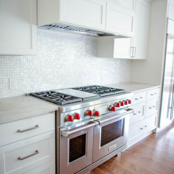
This recent renovation project began with a desire to open up the kitchen to the family room. Today everyone seems to want the big island to live and entertain around, right?
I always recommend taking your time during the planning phase—6 weeks at least! Kitchens and bathrooms are highly functional areas, so you want to give yourself time to think thoughts like, “where am I going to put all my plastic cups?” I ask my clients lots of questions during this phase to help them design a kitchen that truly has a place for everything. Appliances and plumbing are part of this phase as well.
Once the cabinet design was finalized, the demo began! Because that troublesome wall was load bearing, so the GC, Miland Home Construction, had to install a beam to support the second floor. But once that was done, boy we had a lot of space to work with!
Picking your countertops is a little like picking an ice cream flavor: you really want to see all your options! Not only is function important here, but your counter material is really a major element of the kitchen, so pick one you love! This client fell in love with Taj Mahal Quartzite.
The backsplash was the next layer of fun. Now the mood of the kitchen becomes clear. Will it be elegant? Homey? Rustic? Picking the lighting then becomes like the fine tuner on a microscope, adjusting the view to its perfect clarity.
With construction underway, and the mood of the new space established, soft furnishings become the focus. Layering in luxurious, yet durable fabrics are the name of the game for most families. We all want beautiful spaces that can stand up to spouses, kids, and pets! It’s always a lot fun to select a deep and comfy sofa and chairs!
The finishing touches are what really give the project that designer look—so be sure to save room in the budget for art, window treatments, and accessories. In this home I wallpapered the wall behind the tv with a subtle grasscloth, selected a large abstract to center the room, and echoed its colors throughout the accessories. The result is eye-pleasing indeed: soft, textured, interesting and peaceful. This busy family was thrilled with the results.
 ED Enterprises, Inc.
We understood the customer's dream to remove an existing closet and several walls.
We began with the removal of several structural walls and closet. We found that the previous contractor had incorrectly removed structural wood posts. We secured the structural integrity of the building with wood and steel.
We proceeded to expand the opening between
the Kitchen and Butler Pantry, which included relocating waste and water lines from the second floor.
We upgraded the existing electrical and installed a 440-volt electrical system for the entire home.
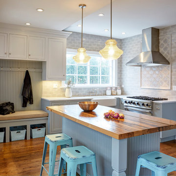
You can enjoy the illumination of the cabinetry and kitchen, by the pendant lights, recessed lights, under cabinet lights, and curio lights in the glass door cabinets,
Note the brick pattern Subway tile from the counter top to the ceiling, in the kitchen and the Butler Pantry. Take special notice of the decorative tile area above the range.
The chimney style hood was vented to the exterior.
The unique sitting area, near the rear entry, was finished with beadboard paneling and wall cabinets up to the ceiling., trimmed with crown molding.
General Contractor / Remodel: E D Enterprises, Inc.
Michael Alan Kaskel Photography
 Advance Design Studio, Ltd.
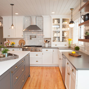
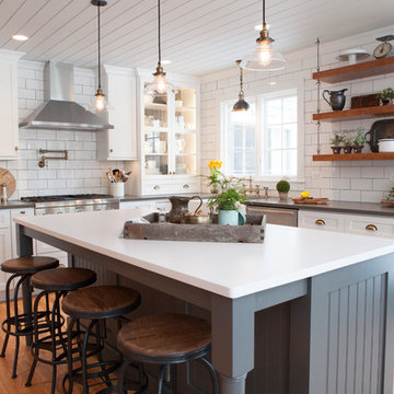
When this suburban family decided to renovate their kitchen, they knew that they wanted a little more space. Advance Design worked together with the homeowner to design a kitchen that would work for a large family who loved to gather regularly and always ended up in the kitchen! So the project began with extending out an exterior wall to accommodate a larger island and more moving-around space between the island and the perimeter cabinetry.
Style was important to the cook, who began collecting accessories and photos of the look she loved for months prior to the project design. She was drawn to the brightness of whites and grays, and the design accentuated this color palette brilliantly with the incorporation of a warm shade of brown woods that originated from a dining room table that was a family favorite. Classic gray and white cabinetry from Dura Supreme hits the mark creating a perfect balance between bright and subdued. Hints of gray appear in the bead board detail peeking just behind glass doors, and in the application of the handsome floating wood shelves between cabinets. White subway tile is made extra interesting with the application of dark gray grout lines causing it to be a subtle but noticeable detail worthy of attention.
Suede quartz Silestone graces the countertops with a soft matte hint of color that contrasts nicely with the presence of white painted cabinetry finished smartly with the brightness of a milky white farm sink. Old melds nicely with new, as antique bronze accents are sprinkled throughout hardware and fixtures, and work together unassumingly with the sleekness of stainless steel appliances.
The grace and timelessness of this sparkling new kitchen maintains the charm and character of a space that has seen generations past. And now this family will enjoy this new space for many more generations to come in the future with the help of the team at Advance Design Studio.
Dura Supreme Cabinetry
Photographer: Joe Nowak
Find the right local pro for your project
 Ariana Hoffman
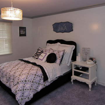
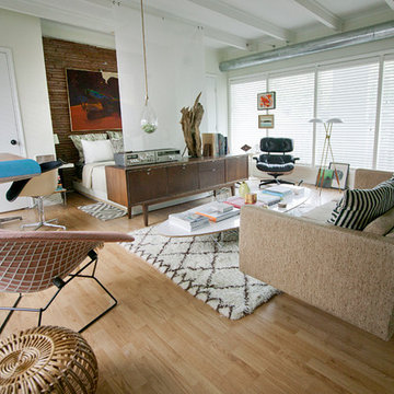
The faux painter's at AH & Co. out of Montclair, NJ. began this tween girl's bedroom makeover starting with the inspiration from the comforter and purple carpeting. From there the client and I created the concept which included faux painting the crown molding with silver metallic paint, the walls were coated in a multi-layer high gloss white paint, the ceiling a coordinating lavender and all of the doors were finally highlighted with a silver detail line in the bevel and bedazzled with large rhinestones.

 LaMantia Design and Remodeling
During a showroom meeting with Lana Galloway, CKBR, UDCP, while preparing selections for their Downers Grove Kitchen remodel, their third project in six years, our clients received a startling phone message; there was water coming out from under the door into the hallway of their 15th floor Sandburg Village apartment. This was to be their refuge while their suburban Kitchen was removed!
The kitchen waste stack, located at the Kitchen sink, had backed up into the unit. The issue had gone unnoticed for several days while the water encompassed a large amount of the unit, causing wood floor, cabinets and drywall damage.
Before
Before
Before
Before
Before
Before
Before
Before
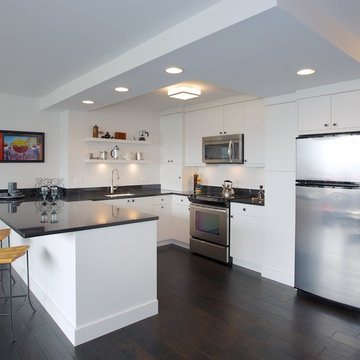
Insurance claims were swiftly filed and soon Galloway began designing a second kitchen remodel. Our clients were so disgruntled, their first thought was to repair only enough to sell, but once the drawings and material selections began, there was a change of heart.
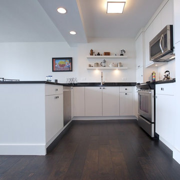
By removing the entry closet/book shelf, Galloway was able to enlarge the existing kitchen footprint. In the new design, the refrigerator was moved to the right of the buildings existing chase, the chase was then disguised with a false pantry door, the Peninsula seated area was repositioned, and the work aisle expanded with the additional cabinetry on the sink wall. The dark stained engineered flooring, installed to the strict codes of the building, creates a sleek back-drop for the contemporary cabinetry.
The beauty inside this unit now matches the glorious views of the city and our clients are now enjoying their two new LaMantia Kitchens.
 Advance Design Studio, Ltd.
When this suburban family decided to renovate their kitchen, they knew that they wanted a little more space. Advance Design worked together with the homeowner to design a kitchen that would work for a large family who loved to gather regularly and always ended up in the kitchen! So the project began with extending out an exterior wall to accommodate a larger island and more moving-around space between the island and the perimeter cabinetry.
Style was important to the cook, who began collecting accessories and photos of the look she loved for months prior to the project design. She was drawn to the brightness of whites and grays, and the design accentuated this color palette brilliantly with the incorporation of a warm shade of brown woods that originated from a dining room table that was a family favorite. Classic gray and white cabinetry from Dura Supreme hits the mark creating a perfect balance between bright and subdued. Hints of gray appear in the bead board detail peeking just behind glass doors, and in the application of the handsome floating wood shelves between cabinets. White subway tile is made extra interesting with the application of dark gray grout lines causing it to be a subtle but noticeable detail worthy of attention.
Suede quartz Silestone graces the countertops with a soft matte hint of color that contrasts nicely with the presence of white painted cabinetry finished smartly with the brightness of a milky white farm sink. Old melds nicely with new, as antique bronze accents are sprinkled throughout hardware and fixtures, and work together unassumingly with the sleekness of stainless steel appliances.
The grace and timelessness of this sparkling new kitchen maintains the charm and character of a space that has seen generations past. And now this family will enjoy this new space for many more generations to come in the future with the help of the team at Advance Design Studio.
Photographer: Joe Nowak
Dura Supreme Cabinetry

 EAG Studio
On a quiet street just steps from San Francisco’s beloved Dolores Park, a formerly modest urban structure has been transformed into a luminous vertical residence that quietly redefines contemporary city living. Through a comprehensive remodel and both vertical and horizontal expansion, the project turns a constrained urban footprint into a sequence of serene, art-forward living spaces that unfold upward toward expansive city views.
The architecture balances restraint and warmth: crisp contemporary geometry softened by natural materials, artful lighting, and carefully curated interiors. The result is a home that feels simultaneously grounded and elevated—deeply connected to its neighborhood yet remarkably private.
Reimagining the Urban Envelope
The original building has been almost entirely reconceived. The facade now reads as a disciplined composition of plaster volumes and precisely detailed window openings framed by subtle projecting bands. The geometry references San Francisco’s classic rhythm of bayed facades while stripping the language down to a refined modern expression.
Behind this quiet exterior lies a dramatically expanded interior volume. The redesign adds both additional floor area and new vertical circulation, transforming what was once a conventional city house into a multi-level architectural sequence organized around light, art, and views.
At the roofline, planted terraces soften the building’s silhouette and create a green crown visible from surrounding hillsides.
Interiors as a Sequence of Galleries
Inside, the home unfolds as a series of spatial moments connected by a sculptural stair and gallery-like corridors.
Wide plank oak floors run throughout, providing continuity and warmth against a palette of plaster walls, dark steel detailing, and natural stone. The hallways function almost as curated galleries, with layered artworks suspended in front of mesh panels that create depth and subtle shadow.
Light filters through carefully placed windows and stair openings, transforming circulation spaces into contemplative transitions rather than mere passageways.
A Living Room Anchored by Stone and Light
The primary living room occupies one of the home’s central floors, where a quiet interplay of texture and geometry defines the space.
A monumental fireplace wrapped in dark stone forms the room’s anchor, its mass contrasting with a recessed ceiling plane that seems to float above the seating area. Integrated perimeter lighting creates a soft architectural glow that washes the ceiling and walls.
Furniture is sculptural yet understated—rounded lounge chairs in warm ochre velvet, tailored sofas, and a striking marble cocktail table whose expressive veining becomes a focal artwork in itself. Deep blue carpeting grounds the seating arrangement and subtly absorbs light, enhancing the calm atmosphere.
Above the fireplace, a delicate projection artwork introduces a moment of visual poetry—an unexpected cinematic gesture that transforms the wall into a quietly animated canvas.
Kitchen as Architectural Furniture
The kitchen expresses a different register: crisp, tactile, and materially rich.
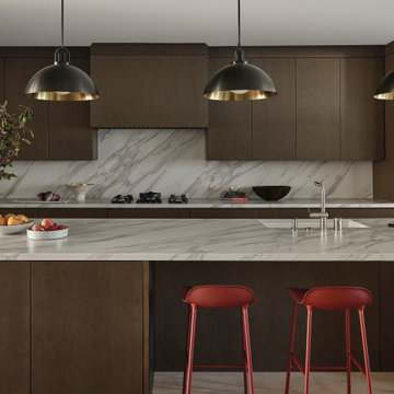
Custom walnut cabinetry spans the wall in a continuous plane, punctuated only by the sculpted hood and integrated appliances. The wood’s depth and warmth are balanced by expanses of pale marble that flow seamlessly from countertop to backsplash.
Three dome pendants hover above the island like industrial sculptures, casting pools of warm light onto the stone surface.
A row of vivid red stools introduces a controlled burst of color, a small but confident departure from the otherwise restrained palette.
Dining With a Living Backdrop
Adjacent to the kitchen, the dining room opens toward a glass wall overlooking a vertical garden of climbing ivy. The greenery becomes a constantly changing backdrop—lush and shadowy during the day, atmospheric and cinematic after sunset.
A dark wood table anchors the room, surrounded by pale oak chairs whose understated forms echo Scandinavian design traditions. The simplicity of the furniture allows the view and natural light to become the dominant experience.
Intimate Spaces and Material Contrast
Throughout the home, smaller rooms offer moments of intimacy and material experimentation.
The powder room pairs textured wall coverings with a dramatic black marble vanity whose bold veining feels almost geological. A suspended mirror and slender pendant create a sculptural composition against the tactile backdrop.
The primary bedroom, by contrast, feels serene and expansive. Floor-to-ceiling glazing frames sweeping views of the city, while soft textiles and warm wood paneling create a cocooning effect. Slender black columns subtly define a sitting area without interrupting the openness of the space.
Bathing Above the City
In the primary bathroom, a sculptural freestanding tub sits beside a panoramic window overlooking San Francisco’s hills and rooftops.
The room’s palette—light oak, grey stone, and matte metals—reinforces the spa-like atmosphere. Floating cabinetry and integrated lighting maintain a sense of visual lightness despite the richness of the materials.
Entertaining Above the Park
Higher in the house, a lounge and bar area becomes the social heart of the home. Here, dark stone slabs with dramatic veining wrap the bar wall like a piece of monumental art.
Open shelving displays glassware and spirits, while integrated wine storage hints at the home’s entertaining ambitions. A soft leather sectional and low glass table create a relaxed setting for conversation, framed by expansive views of the city skyline.
Cinema and Retreat
The lower level introduces yet another atmosphere: a dedicated media room designed for immersive viewing.
Dark walls, plush seating, and soft lighting create a cinematic environment that contrasts intentionally with the airy upper floors. It’s a retreat within the home—intimate, quiet, and removed from the brightness above.
Architecture That Balances Discipline and Warmth
What makes the project particularly compelling is its balance between architectural discipline and lived warmth.
Every element—from the carefully framed views to the restrained material palette—contributes to a cohesive spatial narrative. Yet the home never feels austere. Natural materials, curated art, and layered lighting create a sense of comfort and depth.
The result is a house that feels both architecturally rigorous and deeply human.
A Contemporary Interpretation of San Francisco Living
In a neighborhood defined by historic homes and iconic park views, this transformation offers a contemporary interpretation of San Francisco living.
It respects the city’s urban density while embracing openness, light, and vertical living. The home rises quietly above its surroundings, culminating in panoramic vistas that stretch across rooftops, hills, and sky.
What began as a conventional structure has become something far more nuanced: a modern urban sanctuary—part gallery, part retreat, and wholly connected to the vibrant city just beyond its walls.
 Simply Home Decorating
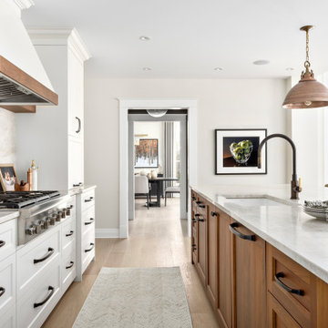
When our clients approached us to renovate their 1950s Newfoundland home, their goal was to modernize while reflecting both their West Coast roots and current East Coast lifestyle. What began as a simple ensuite repair expanded into a full home transformation, completed in two thoughtfully phased renovations. Drawing from our cross-coastal experience—and a personal connection to the home’s past—we blended classic East Coast charm with West Coast simplicity. From reworking the layout and finishes to integrating their art collection and layering in warm, tactile materials, every detail was designed to feel cohesive, inviting, and deeply personal.
 Simply Home Decorating
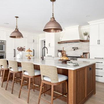
When our clients approached us to renovate their 1950s Newfoundland home, their goal was to modernize while reflecting both their West Coast roots and current East Coast lifestyle. What began as a simple ensuite repair expanded into a full home transformation, completed in two thoughtfully phased renovations. Drawing from our cross-coastal experience—and a personal connection to the home’s past—we blended classic East Coast charm with West Coast simplicity. From reworking the layout and finishes to integrating their art collection and layering in warm, tactile materials, every detail was designed to feel cohesive, inviting, and deeply personal.
 Jenni Leasia Interior Design
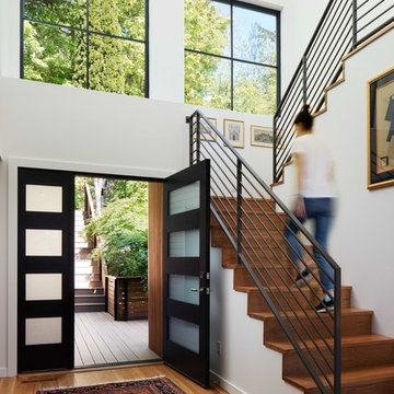
Beautiful pieces from the clients’ international collection of art & decor items complement the sophisticated interiors of this Portland home.
Project by Portland interior design studio Jenni Leasia Interior Design. Also serving Lake Oswego, West Linn, Eastmoreland, Bend, Hood River and the Greater Portland Area.
For more about Jenni Leasia Interior Design, click here: https://www.jennileasiadesign.com/
To learn more about this project, click here:
https://www.jennileasiadesign.com/council-crest-portland-remodel
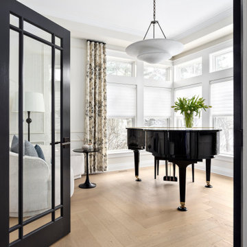 Simply Home Decorating
When our clients approached us to renovate their 1950s Newfoundland home, their goal was to modernize while reflecting both their West Coast roots and current East Coast lifestyle. What began as a simple ensuite repair expanded into a full home transformation, completed in two thoughtfully phased renovations. Drawing from our cross-coastal experience—and a personal connection to the home’s past—we blended classic East Coast charm with West Coast simplicity. From reworking the layout and finishes to integrating their art collection and layering in warm, tactile materials, every detail was designed to feel cohesive, inviting, and deeply personal.
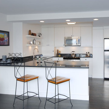 LaMantia Design and Remodeling
During a showroom meeting with Lana Galloway, CKBR, UDCP, while preparing selections for their Downers Grove Kitchen remodel, their third project in six years, our clients received a startling phone message; there was water coming out from under the door into the hallway of their 15th floor Sandburg Village apartment. This was to be their refuge while their suburban Kitchen was removed!
The kitchen waste stack, located at the Kitchen sink, had backed up into the unit. The issue had gone unnoticed for several days while the water encompassed a large amount of the unit, causing wood floor, cabinets and drywall damage.
Before
Before
Before
Before
Before
Before
Before
Before
Insurance claims were swiftly filed and soon Galloway began designing a second kitchen remodel. Our clients were so disgruntled, their first thought was to repair only enough to sell, but once the drawings and material selections began, there was a change of heart.
By removing the entry closet/book shelf, Galloway was able to enlarge the existing kitchen footprint. In the new design, the refrigerator was moved to the right of the buildings existing chase, the chase was then disguised with a false pantry door, the Peninsula seated area was repositioned, and the work aisle expanded with the additional cabinetry on the sink wall. The dark stained engineered flooring, installed to the strict codes of the building, creates a sleek back-drop for the contemporary cabinetry.
The beauty inside this unit now matches the glorious views of the city and our clients are now enjoying their two new LaMantia Kitchens.
Sponsored
Sunbury, OH

J.Holderby - Renovations
Franklin County's Leading General Contractors - 2X Best of Houzz!
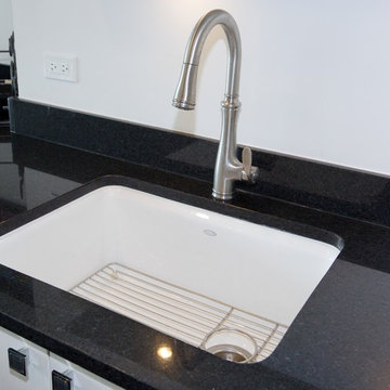 LaMantia Design and Remodeling
During a showroom meeting with Lana Galloway, CKBR, UDCP, while preparing selections for their Downers Grove Kitchen remodel, their third project in six years, our clients received a startling phone message; there was water coming out from under the door into the hallway of their 15th floor Sandburg Village apartment. This was to be their refuge while their suburban Kitchen was removed!
The kitchen waste stack, located at the Kitchen sink, had backed up into the unit. The issue had gone unnoticed for several days while the water encompassed a large amount of the unit, causing wood floor, cabinets and drywall damage.
Before
Before
Before
Before
Before
Before
Before
Before
Insurance claims were swiftly filed and soon Galloway began designing a second kitchen remodel. Our clients were so disgruntled, their first thought was to repair only enough to sell, but once the drawings and material selections began, there was a change of heart.
By removing the entry closet/book shelf, Galloway was able to enlarge the existing kitchen footprint. In the new design, the refrigerator was moved to the right of the buildings existing chase, the chase was then disguised with a false pantry door, the Peninsula seated area was repositioned, and the work aisle expanded with the additional cabinetry on the sink wall. The dark stained engineered flooring, installed to the strict codes of the building, creates a sleek back-drop for the contemporary cabinetry.
The beauty inside this unit now matches the glorious views of the city and our clients are now enjoying their two new LaMantia Kitchens.
 LaMantia Design and Remodeling
During a showroom meeting with Lana Galloway, CKBR, UDCP, while preparing selections for their Downers Grove Kitchen remodel, their third project in six years, our clients received a startling phone message; there was water coming out from under the door into the hallway of their 15th floor Sandburg Village apartment. This was to be their refuge while their suburban Kitchen was removed!
The kitchen waste stack, located at the Kitchen sink, had backed up into the unit. The issue had gone unnoticed for several days while the water encompassed a large amount of the unit, causing wood floor, cabinets and drywall damage.
Before
Before
Before
Before
Before
Before
Before
Before
Insurance claims were swiftly filed and soon Galloway began designing a second kitchen remodel. Our clients were so disgruntled, their first thought was to repair only enough to sell, but once the drawings and material selections began, there was a change of heart.
By removing the entry closet/book shelf, Galloway was able to enlarge the existing kitchen footprint. In the new design, the refrigerator was moved to the right of the buildings existing chase, the chase was then disguised with a false pantry door, the Peninsula seated area was repositioned, and the work aisle expanded with the additional cabinetry on the sink wall. The dark stained engineered flooring, installed to the strict codes of the building, creates a sleek back-drop for the contemporary cabinetry.
The beauty inside this unit now matches the glorious views of the city and our clients are now enjoying their two new LaMantia Kitchens.
 Storie Collective
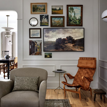
Stripped of its original charm with sagging floors and water leaks, this 1900 row house was prime for a full renovation. While the staircase and marble fireplace are original, everything from the white oak flooring, crown, applied, and base moldings, to the archways and brass door hardware is new; yet they all feel original to the house. Other projects included removing soffits and tucking away randomly placed support beams and posts, relocating and expanding the kitchen, renovating each bathroom – and adding a new one, upgrading all the mechanical, electric and plumbing systems, removing a fireplace, and regrading the back patio for proper drainage and added greenery. The project is a perfect study of juxtaposing new and old, classic and modern.
Photography Stacy Zarin Goldberg
 LMB Interiors
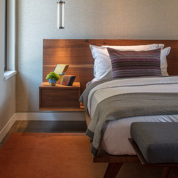
Wallpaper on bed wall: Phillip Jeffries, vinyl, color: Belgian Linen Khaki
Photo by Eric Rorer
While we adore all of our clients and the beautiful structures which we help fill and adorn, like a parent adores all of their children, this recent mid-century modern interior design project was a particular delight.
This client, a smart, energetic, creative, happy person, a man who, in-person, presents as refined and understated — he wanted color. Lots of color. When we introduced some color, he wanted even more color: Bright pops; lively art.
In fact, it started with the art.
This new homeowner was shopping at SLATE ( https://slateart.net) for art one day… many people choose art as the finishing touches to an interior design project, however this man had not yet hired a designer.
He mentioned his predicament to SLATE principal partner (and our dear partner in art sourcing) Danielle Fox, and she promptly referred him to us.
At the time that we began our work, the client and his architect, Jack Backus, had finished up a massive remodel, a thoughtful and thorough update of the elegant, iconic mid-century structure (originally designed by Ratcliff & Ratcliff) for modern 21st-century living.
And when we say, “the client and his architect” — we mean it. In his professional life, our client owns a metal fabrication company; given his skills and knowledge of engineering, build, and production, he elected to act as contractor on the project.
His eye for metal and form made its way into some of our furniture selections, in particular the coffee table in the living room, fabricated and sold locally by Turtle and Hare.
Color for miles: One of our favorite aspects of the project was the long hallway. By choosing to put nothing on the walls, and adorning the length of floor with an amazing, vibrant, patterned rug, we created a perfect venue. The rug stands out, drawing attention to the art on the floor.
In fact, the rugs in each room were as thoughtfully selected for color and design as the art on the walls. In total, on this project, we designed and decorated the living room, family room, master bedroom, and patio.
While my design firm is known for our work with traditional and transitional architecture, and we love those projects, I think it is clear from this project that Modern is also our cup of tea.
If you have a Modern house and are thinking about how to make it more vibrantly YOU, contact us for a consultation.
Sponsored
Columbus, OH

Hope Restoration & General Contracting
Columbus Design-Build, Kitchen & Bath Remodeling, Historic Renovations
 Simply Home Decorating
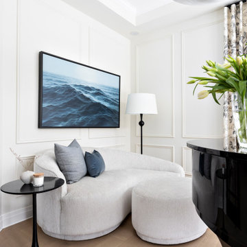
When our clients approached us to renovate their 1950s Newfoundland home, their goal was to modernize while reflecting both their West Coast roots and current East Coast lifestyle. What began as a simple ensuite repair expanded into a full home transformation, completed in two thoughtfully phased renovations. Drawing from our cross-coastal experience—and a personal connection to the home’s past—we blended classic East Coast charm with West Coast simplicity. From reworking the layout and finishes to integrating their art collection and layering in warm, tactile materials, every detail was designed to feel cohesive, inviting, and deeply personal.
 Simply Home Decorating
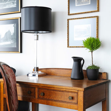
The homeowners of this condo sought our assistance when downsizing from a large family home on Howe Sound to a small urban condo in Lower Lonsdale, North Vancouver. They asked us to incorporate many of their precious antiques and art pieces into the new design. Our challenges here were twofold; first, how to deal with the unconventional curved floor plan with vast South facing windows that provide a 180 degree view of downtown Vancouver, and second, how to successfully merge an eclectic collection of antique pieces into a modern setting. We began by updating most of their artwork with new matting and framing. We created a gallery effect by grouping like artwork together and displaying larger pieces on the sections of wall between the windows, lighting them with black wall sconces for a graphic effect. We re-upholstered their antique seating with more contemporary fabrics choices - a gray flannel on their Victorian fainting couch and a fun orange chenille animal print on their Louis style chairs. We selected black as an accent colour for many of the accessories as well as the dining room wall to give the space a sophisticated modern edge. The new pieces that we added, including the sofa, coffee table and dining light fixture are mid century inspired, bridging the gap between old and new. White walls and understated wallpaper provide the perfect backdrop for the colourful mix of antique pieces. Interior Design by Lori Steeves, Simply Home Decorating. Photos by Tracey Ayton Photography

 Klopf Architecture
From Mid-Century Classic to the Present
An iconic design updated with comfort, function, and flow for today.
A Remodel That Balances Past and Present
What started as a desire to update a classic Eichler soon became an exploration of how Mid-Century Modern design can successfully evolve for today. The client, a tech professional with a passion for scuba diving and underwater photography, wanted a home that would both honor its original character and feel tailored to his daily life. A lifelong technology enthusiast, he still owns the very first Mac desktop he saved up for as a teenager working at Radio Shack, a detail that underscores his appreciation for design that melds function and form.
Honoring Separation While Expanding Possibility
Unlike many contemporary remodels where walls are opened up to create expansive living spaces, this project took a more restrained approach. The client valued the defined rooms of the original plan and wanted to preserve as much wall space as possible for displaying his large-format underwater photography. The emphasis was not on dramatic spatial reinvention, but on thoughtful refinements. Klopf Architecture shaped a gallery-like backdrop while also expanding the primary suite, modernizing materials and fixtures throughout the home, and improving the functionality and layout of the kitchen. The finished home feels at once timeless and renewed, an Eichler that continues to inspire while fully supporting the lifestyle of its present-day owner.
A major turning point came mid-design. The original project brief had not included an addition, but as the reconfiguration of the primary bedroom and bath unfolded, it became clear that an expansion was the best approach to achieve the client’s vision of a more spacious suite. Fortunately, the adjustment came at a stage when revisions were still manageable and was integrated seamlessly, showing how thoughtful course corrections can strengthen a project rather than hinder it.
Navigating Challenges With Precision
The design development included multiple conceptual rounds, balancing preservation with subtle expansion. During construction, an existing post previously thought to be load-bearing turned out not to be. The structural engineer was able to pivot quickly, and both the post and the cross beam that had been intended to replace it could be omitted, allowing the original rhythm of the Eichler beam bays to be preserved.
Sustainability was not just a checklist item, but a way to align the home with the client’s values of simplicity, efficiency, and long-term functionality. R-38 roof insulation reduced energy usage, solar panels with battery storage provided independence and resilience, and passive comfort strategies eliminated the need forenergy-intensive air conditioning. An electric vehicle charger and an on-demand hot water recirculation system (with call buttons as opposed to having constant circulation) add to the home’s long-term efficiency factors. Together, these moves created a home that is quieter, more comfortable, and better equipped for the future, qualities that supported the client’s pragmatic approach to design and living lightly.
Details That Respect the Eichler DNA
The remodel carries forward the Eichler’s original spirit while introducing new layers of modern livability. Originally, the house was approached along a deep, narrow walk, with the garage on one side and the house on the other, leaving the front door tucked far back within this chasm-like space. By pulling the entry forward, the design reshaped the arrival experience, creating a clearer threshold and a natural drop-off zone for bags, shoes, and keys. This shift also made room for a custom bench at the entry that extends seamlessly through the glass sidelight. The bench and drop-off zone now work together as a single, integrated sequence that supports everyday living while offering a tactile reminder of Eichler’s philosophy of connectedness.
At the client’s request, Klopf reintroduced a classic Eichler gesture by extending the exterior siding into the entry and living room. The detail reinforces a sense of indoor/outdoor continuity while providing a subtle architectural surface that allows the client’s photography to take visual precedence.
The signature concrete masonry wall at the front was reconstructed using blocks sourced to match the originals, now strengthened with rebar for seismic resilience while maintaining a private outdoor courtyard, visually extending the kitchen outward. A decorative trellis element, a detail borrowed from a neighboring Eichler, restores a familiar mid-century modern architectural motif. At the courtyard entry door, a custom etched glass sidelight with an ocean-themed design featuring kelp and jellyfish serves as a subtle homage to the client’s passion for deep-sea diving.
Landscaping became an integral part of the overall transformation. The homeowner engaged landscape architect Randi Johnsen of Third Nature Studio to shape a series of calm, inviting outdoor rooms that read as a natural extension of the interiors. While technically outside of the core construction scope, the landscape design proved central to achieving a sense of completeness and connectedness across the property. Such whole-property considerations often emerge as design ideas take shape, underscoring the importance of flexibility in planning and budgeting, as well as close collaboration among the design team starting early in the process.
The Value of Evolving Scope
As with many custom residential projects, the scope evolved during the design process. What began as a targeted remodel grew to include a new/expanded primary suite, a rebuilt CMU patio wall for strength and longevity, and a solar panel array and battery storage for energy resilience and carbon-reduction. Each thoughtful decision represented a conscious investment in the home’s performance and character, rather than a cost overrun.
The result was a project delivered on schedule, tailored precisely to the client’s lifestyle, and positioned to add long-term value both functionally and aesthetically. By embracing scope evolution as an opportunity rather than a challenge, and relying on good design paired with transparent communication, this remodel demonstrates how Eichler homes can be adapted for contemporary living without erasing their DNA.
Klopf Architecture project team: John Klopf, AIA, and Klara Kevane, Elise Webb and Nicholas LaNasa.
Contractor: Golden Cove Construction
Landscape Design: Third Nature Studio
Structural Engineer: Daniel Bastiao Design
Photography: ©2025 Mariko Reed
Year Completed: 2024
Location: Sunnyvale, CA
12