
Search results for "Delicate" in Home Design Ideas

 Jo Rabaut
Chris Little Photography
Living room - traditional living room idea in Atlanta with blue walls and a standard fireplace
Living room - traditional living room idea in Atlanta with blue walls and a standard fireplace


 Earlene Scheid
Josh Beeman Photography
Bright white, airy kitchen
Eat-in kitchen - transitional l-shaped eat-in kitchen idea in Cincinnati with a farmhouse sink, raised-panel cabinets, white cabinets, white backsplash, subway tile backsplash and stainless steel appliances
Eat-in kitchen - transitional l-shaped eat-in kitchen idea in Cincinnati with a farmhouse sink, raised-panel cabinets, white cabinets, white backsplash, subway tile backsplash and stainless steel appliances
Find the right local pro for your project

 Christopher A Young - HouseSmith LLC
Jamie Cook of Cook Editions
Example of a large transitional wooden u-shaped metal railing staircase design in Atlanta with white walls and painted risers
Example of a large transitional wooden u-shaped metal railing staircase design in Atlanta with white walls and painted risers
 Artistic Ornamental Iron, LLC
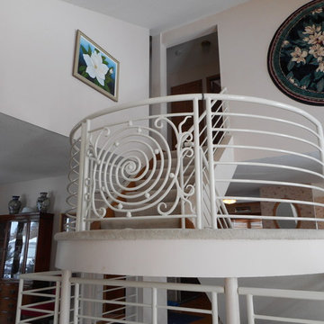
Hand forged scroll railing with horizontal pickets
Inspiration for an industrial staircase remodel in Minneapolis
Inspiration for an industrial staircase remodel in Minneapolis

 RJA Design
This project was purposefully neutralized in ocean grays and blues with accents that mirror a drama filled sunset. This achieves a calming effect as the sun rises in the early morning. At high noon we strived for balance of the senses with rich textures that both soothe and excite. Under foot is a plush midnight ocean blue rug that emulates walking on water. Tactile fabrics and velvet pillows provide interest and comfort. As the sun crescendos, the oranges and deep blues in both art and accents invite you and the night to dance inside your home. Lighting was an intriguing challenge and was solved by creating a delicate balance between natural light and creative interior lighting solutions.

 Thomas Development + Construction
Example of a mid-sized danish l-shaped ceramic tile dedicated laundry room design in Dallas with an undermount sink, flat-panel cabinets, white cabinets, white walls, a stacked washer/dryer and quartz countertops

 Andrew Mann Architecture
Matthew Millman
Example of a classic tile patio design in San Francisco with a pergola
Example of a classic tile patio design in San Francisco with a pergola

 Mad Mod Home
Example of a trendy master light wood floor and beige floor bedroom design in Los Angeles with white walls

 Rove Concepts
Asher's seamless joinery and beautiful walnut or ash veneer are inspired by the design of traditional teak Danish mid-century masterpieces. Carefully crafted and delicately sculpted, the frame is beveled with 45 degree edges that fall towards the center, encapsulating the security of the head. At the base, which sits wide above slim tapered solid wood legs, the complementary edges gently slope outwards, gradually bringing you down into deeper, dramatic slumber. The Asher Bed is available in King or Queen and is part of a five piece set that completes the classic mid-century modern dream.


 THINK Architecture, Inc.
Photo by: Joshua Caldwell
Example of a large classic l-shaped gray floor and concrete floor dedicated laundry room design in Salt Lake City with green cabinets, a drop-in sink, shaker cabinets, quartz countertops, white walls and a side-by-side washer/dryer
Example of a large classic l-shaped gray floor and concrete floor dedicated laundry room design in Salt Lake City with green cabinets, a drop-in sink, shaker cabinets, quartz countertops, white walls and a side-by-side washer/dryer


 Scott Byron & Co., Inc.
Summer annuals display. Photo by Rachel Carlson
This is an example of a traditional partial sun landscaping in Chicago for summer.
This is an example of a traditional partial sun landscaping in Chicago for summer.

 Alexanders Designs & Remodeling LLC
Bedroom - large tropical master bedroom idea in Hawaii with green walls

 User
UserLaurie Perez Photography
Example of a small transitional dark wood floor bar cart design in Houston with furniture-like cabinets
Example of a small transitional dark wood floor bar cart design in Houston with furniture-like cabinets

 Cory Connor Designs
Kazart Photography
Huge transitional master dark wood floor bedroom photo in New York with gray walls
Huge transitional master dark wood floor bedroom photo in New York with gray walls

 Kristy Kay
Kristy Kay
Example of a beach style medium tone wood floor foyer design in Boston with white walls
Example of a beach style medium tone wood floor foyer design in Boston with white walls
 Brenna Bozarth
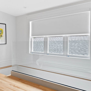
To keep our unique, third floor, principal suite bright, fresh and energizing, we removed the 1970s bookshelf railing and replaced it with a frameless glass option. Removing the old railing actually added almost a foot of depth to the room. Between that, the glass, the lovely white walls and light streaming in from three sides, it's easy to forget you're in a converted attic!
The piece hanging near the window is "Don't Make a Perfect Weapon" by Vivian Liddell.
Photos by Inside Out Media.
8