
Search results for "Depression" in Home Design Ideas
 TVL Creative Ltd.
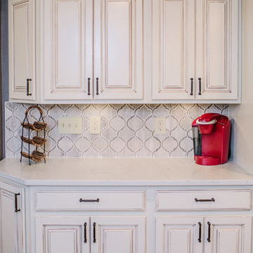
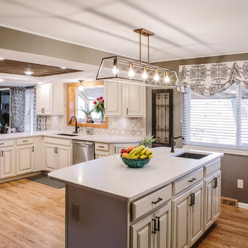
This challenging kitchen came our way at the same time as another similarly located Centennial kitchen. It was apparent that both houses had been built by the same builder: tight space, low ceilings, awkward arrangement, and poor building materials. Our client here is a single mother of three boys with an incredibly demanding work life. Once finally home at the end of a busy day, our client was virtually unable to use her kitchen. Cabinet doors were falling off, limited storage and workspace offered her little opportunity to cook and prep for her children, and the dark and low ceiling created an atmosphere that can only be described as depressing. Our client is also from Louisiana and has always dreamed of a kitchen that reminds her of home warmth and hospitality. Our goal was not only to expand functional storage and workspace, but bring in the southern NOLA appeal that reminds our client so much of home. To do this, we removed the wall between the formal dining room and kitchen to create an extended kitchen that runs the full length of both spaces. The back wall of what used to be the dining room is now the cooking zone for our client: we've relocated her range and microwave, and have created an island full of storage where her children can sit and socialize. We've also lifted up the low ceiling to create a tray ceiling that we have finished with ghostwood. The cabinetry is an off-white color with a hazelnut glaze that offers a more traditional, warm appearance. The island and mini work nook feature dramatic, handmade tin ceiling tiles for a dramatic texture and color. We've finished the space with functional quartz countertops and an arabesque two-toned marble backspalsh. The sinks, faucets and hardware are all in a matte black finish that offer a dramatic pop throughout the space. Little touches of Parisian flair add to this Cajun-French aesthetic and we are so thrilled with the final result!
 Dezinerwallz
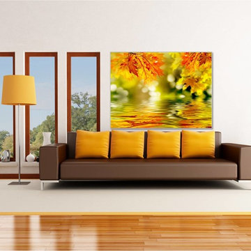
Check out our Healing Art Collection of biophilic wall art available for purchase on Houzz.
Home design - contemporary home design idea in Toronto
Home design - contemporary home design idea in Toronto
 Birch+Oak Construction
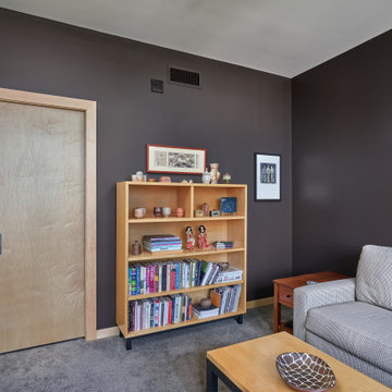
Reprioritizing & reconfiguring spaces to update master bath and create guest accommodations.
Project Details:
These homeowners loved the light, the views, and the compactness of their condo unit. The dining space could accommodate the whole family, they had private areas for quiet reading time, and they loved the location, the building and the community. They definitely did not want to leave.
However, the wasted space in the guest bath, the dark, depressing, heavy-feeling in the master bath and the lack of closet space for guests were all problems for them. They wanted a brighter, more inviting bathroom with more functionality and storage, better accommodations for guests, and the tv room to become a comfortable place to relax and actually enjoy the incredible view they had. The unit was designed specifically for the needs of the previous owner, but they needed their home to fit their own needs and lifestyle.
Our team helped this couple create the bright master bath they wanted, complete with additional functionality and storage options. The guest bath and sitting room were also both reconfigured. The guest bath was reworked to become smaller - but more functional, and the sitting room was expanded to become a fully-functioning guest room.
The reprioritization and reworking of spaces in this unit is a great example of working within an existing framework to create rooms that better fit the needs and wants of a homeowner. The new spaces are a much better fit for the lifestyle and aesthetic of this couple, while mimicking the warmth and welcoming feel of the existing spaces they already enjoyed. They are now able to fully take advantage of the views in all living areas of the unit and can easily accommodate guests in comfort whenever they desire.
Find the right local pro for your project
 TVL Creative Ltd.
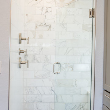
This newly purchased home was the perfect size for our client's growing family. The house, having been expanded on and renovated by the previous owners was the right size but not quite the right style. The house was full of design elements that may have been "cool" in the early 2000s but just didn't feel right for a young family. The master bathroom was in the most serious need of redo with many, many square feet of dingy and somewhat depressing deep red granite tile with diamond accents in black granite. The bathroom felt dark and dingy. Together with our clients, we set out on our mission to efficiently turn this room into an inviting and happy place for our clients. Thankfully the layout of the space was very functional, so we focused on an aesthetic overhall. At the top of the client’s list was to have a beautiful and comfortable freestanding soaker tub. Behind the Kohler tub and throughout the bathroom walls is polished Calacatta Gold marble tile. The new brushed nickel plumbing fixtures are timeless and unfussy, an important thing for busy young parents! The new bathroom is sleek but not stark. A welcoming space for our clients to feel at home.
 TVL Creative Ltd.
This newly purchased home was the perfect size for our client's growing family. The house, having been expanded on and renovated by the previous owners was the right size but not quite the right style. The house was full of design elements that may have been "cool" in the early 2000s but just didn't feel right for a young family. The master bathroom was in the most serious need of redo with many, many square feet of dingy and somewhat depressing deep red granite tile with diamond accents in black granite. The bathroom felt dark and dingy. Together with our clients, we set out on our mission to efficiently turn this room into an inviting and happy place for our clients. Thankfully the layout of the space was very functional, so we focused on an aesthetic overhall. At the top of the client’s list was to have a beautiful and comfortable freestanding soaker tub. Behind the Kohler tub and throughout the bathroom walls is polished Calacatta Gold marble tile. The new brushed nickel plumbing fixtures are timeless and unfussy, an important thing for busy young parents! The new bathroom is sleek but not stark. A welcoming space for our clients to feel at home.
 TVL Creative Ltd.
This challenging kitchen came our way at the same time as another similarly located Centennial kitchen. It was apparent that both houses had been built by the same builder: tight space, low ceilings, awkward arrangement, and poor building materials. Our client here is a single mother of three boys with an incredibly demanding work life. Once finally home at the end of a busy day, our client was virtually unable to use her kitchen. Cabinet doors were falling off, limited storage and workspace offered her little opportunity to cook and prep for her children, and the dark and low ceiling created an atmosphere that can only be described as depressing. Our client is also from Louisiana and has always dreamed of a kitchen that reminds her of home warmth and hospitality. Our goal was not only to expand functional storage and workspace, but bring in the southern NOLA appeal that reminds our client so much of home. To do this, we removed the wall between the formal dining room and kitchen to create an extended kitchen that runs the full length of both spaces. The back wall of what used to be the dining room is now the cooking zone for our client: we've relocated her range and microwave, and have created an island full of storage where her children can sit and socialize. We've also lifted up the low ceiling to create a tray ceiling that we have finished with ghostwood. The cabinetry is an off-white color with a hazelnut glaze that offers a more traditional, warm appearance. The island and mini work nook feature dramatic, handmade tin ceiling tiles for a dramatic texture and color. We've finished the space with functional quartz countertops and an arabesque two-toned marble backspalsh. The sinks, faucets and hardware are all in a matte black finish that offer a dramatic pop throughout the space. Little touches of Parisian flair add to this Cajun-French aesthetic and we are so thrilled with the final result!
 Britto Charette LLC - NYC Interiors
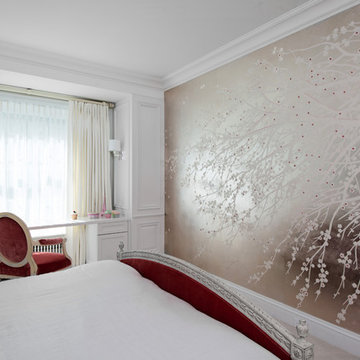
A classic pre-depression residence in the heart of Montreal is updated by removing the servants quarters and a redundant service stair to create a stunning contemporary interior to showcase the clients artwork and focus on family.
David Giral Photography
 TVL Creative Ltd.
This remodel took a dated and cramped bathroom and transformed it into a classy oasis for our Lowry clients. The clients had a limited budget and wanted to leave the space as in-place as possible. However, the large drop in tub ate valuable floor space and a half wall between the shower and tub had become a holding place for random items without a home. The thick frame on the shower glass made the shower feel extremely small, and the dated lighting and fixtures further depressed the space. We proposed a traditional and elegant design that consider the client's budgetary and spatial constraints. We removed the existing drop-in tub and replaced it with a lovely free-standing soaker. The length of this tub is short, but the depth is exaggerated, making it an ideal replacement in this tiny footprint. The shower glass was swapped for framless glass that boldly expands space. We tore out the existing carpet and installed gorgeous wood-look tile that adds depth and warmth to the room. The clients opted to keep their existing vanity to save cost, so a new top was added to bring the aesthetic up to the level of the new additions. The wall paint was taken from a buttery yellow to a soft gray-green, accented by a darker version of this same color on the siding barn door and toilet room door. New vanity lights, faucets, and storage shelves were installed to help our clients organize and keep things off the counter tops. Finally, new custom up-down window shades were curated for the bathroom to add to the final touch. This space is a simple scope with a dramatic transformation that introduces a timeless look for years to come.
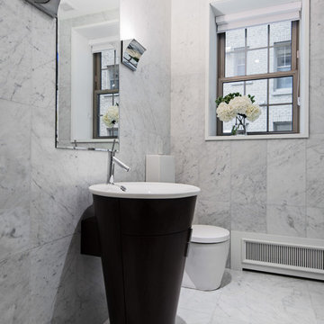 Britto Charette LLC - NYC Interiors
A classic pre-depression residence in the heart of Montreal is updated by removing the servants quarters and a redundant service stair to create a stunning contemporary interior to showcase the clients artwork and focus on family.
David Giral Photography
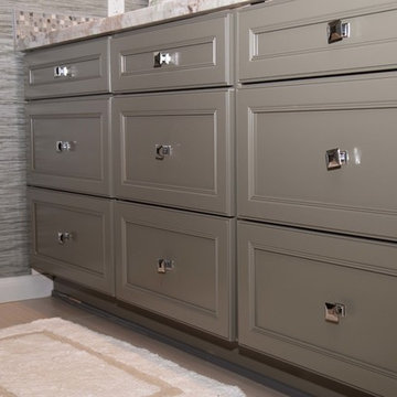
 Division 9 Inc.
The guest bathroom plays an important role on how your guests will perceive the architecture and style of your home. In this house we totally transformed the outdated bathroom. In collaboration with Roberto Lugo a daring designer from New York, the design process was focused on creating a contemporary space that could be elegant and comfortable.
The initial renovation on this project started with the demolition of entire bathroom including doors, vanity, floor, plumbing and light fixture, toilet, tub, tile switches and outlet. An existing wall between toilet/shower room and vanity room was also removed. The existing door frame was expanded to 27" wide (interior) and the existing floor was inspected to determine a depression on the vanity side.
The existing door frame was converted into a pocket door frame (door opens to the right). To accommodate for standard crown molding the ceiling above the shower was dropped 4".
For the vanity, a furniture-like cabinet style with soft close hardware was installed. The grain stain was paired perfectly with a gray marble countertop.
The shower turned out beautifully. A Shower/Bathtub combination with a sliding door was installed. Porcelain tile was installed vertically on the returns walls, glass mosaic for the long walls, glass mosaic was also used along leading edge of tub enclosure. Porcelain tile was used on the floor.
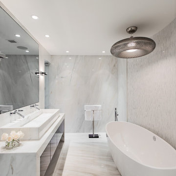 Britto Charette LLC - NYC Interiors
A classic pre-depression residence in the heart of Montreal is updated by removing the servants quarters and a redundant service stair to create a stunning contemporary interior to showcase the clients artwork and focus on family.
David Giral Photography
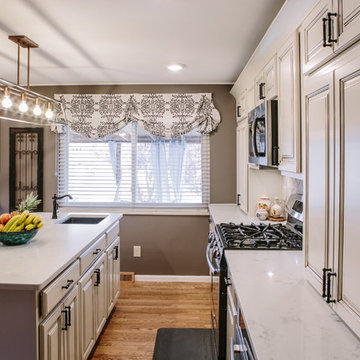 TVL Creative Ltd.
This challenging kitchen came our way at the same time as another similarly located Centennial kitchen. It was apparent that both houses had been built by the same builder: tight space, low ceilings, awkward arrangement, and poor building materials. Our client here is a single mother of three boys with an incredibly demanding work life. Once finally home at the end of a busy day, our client was virtually unable to use her kitchen. Cabinet doors were falling off, limited storage and workspace offered her little opportunity to cook and prep for her children, and the dark and low ceiling created an atmosphere that can only be described as depressing. Our client is also from Louisiana and has always dreamed of a kitchen that reminds her of home warmth and hospitality. Our goal was not only to expand functional storage and workspace, but bring in the southern NOLA appeal that reminds our client so much of home. To do this, we removed the wall between the formal dining room and kitchen to create an extended kitchen that runs the full length of both spaces. The back wall of what used to be the dining room is now the cooking zone for our client: we've relocated her range and microwave, and have created an island full of storage where her children can sit and socialize. We've also lifted up the low ceiling to create a tray ceiling that we have finished with ghostwood. The cabinetry is an off-white color with a hazelnut glaze that offers a more traditional, warm appearance. The island and mini work nook feature dramatic, handmade tin ceiling tiles for a dramatic texture and color. We've finished the space with functional quartz countertops and an arabesque two-toned marble backspalsh. The sinks, faucets and hardware are all in a matte black finish that offer a dramatic pop throughout the space. Little touches of Parisian flair add to this Cajun-French aesthetic and we are so thrilled with the final result!
 Britto Charette LLC - NYC Interiors
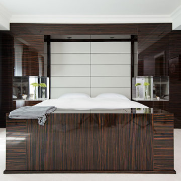
A classic pre-depression residence in the heart of Montreal is updated by removing the servants quarters and a redundant service stair to create a stunning contemporary interior to showcase the clients artwork and focus on family.
David Giral Photography
 DesignAnts LLC
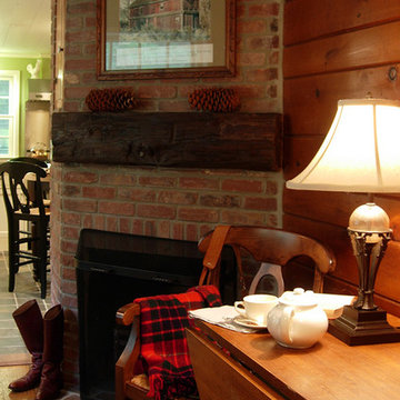
This kitchen has a classic style that blends well with the historic nature of the structure. Enter the kitchen through a small sitting room. Brick wood burning fireplace with an old barn beam for a mantel. Original Pine Floor, Original Pine shiplap walls, Painted white wood ceiling, built-in bookcase helps frame the doorway to the kitchen. Kitchen cabinets are painted white with a lightly brushed glaze, brushed nickel cabinet hardware. Soapstone countertops, paneled appliances to match cabinets, tumbled natural slate flooring, aged brass milk glass pendants, stainless steel stove and hood. Handmade white subway tile backslash, walls painted depression green, decorative cabinet includes brass chicken wire. Custom Designed Painted green wood hutch includes a white painted bead board back and electric for small appliances, a slide out shelf for additional service area, a thin drawer for serving flatware and a butcher block countertop. Custom designed Round Island painted black with a butcher block top, four bar height black painted counter height hand-woven rush seats.
 TVL Creative Ltd.
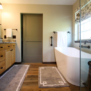
This remodel took a dated and cramped bathroom and transformed it into a classy oasis for our Lowry clients. The clients had a limited budget and wanted to leave the space as in-place as possible. However, the large drop in tub ate valuable floor space and a half wall between the shower and tub had become a holding place for random items without a home. The thick frame on the shower glass made the shower feel extremely small, and the dated lighting and fixtures further depressed the space. We proposed a traditional and elegant design that consider the client's budgetary and spatial constraints. We removed the existing drop-in tub and replaced it with a lovely free-standing soaker. The length of this tub is short, but the depth is exaggerated, making it an ideal replacement in this tiny footprint. The shower glass was swapped for framless glass that boldly expands space. We tore out the existing carpet and installed gorgeous wood-look tile that adds depth and warmth to the room. The clients opted to keep their existing vanity to save cost, so a new top was added to bring the aesthetic up to the level of the new additions. The wall paint was taken from a buttery yellow to a soft gray-green, accented by a darker version of this same color on the siding barn door and toilet room door. New vanity lights, faucets, and storage shelves were installed to help our clients organize and keep things off the counter tops. Finally, new custom up-down window shades were curated for the bathroom to add to the final touch. This space is a simple scope with a dramatic transformation that introduces a timeless look for years to come.
 Premier Service
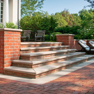
The true artistry and craftsmanship of masonry is evoked in this scene. Here we see the full potential for elongated reclaimed clay roof tiles as a riser element. Corner cuts create a seamless face to the limestone treads while columns aid in transitioning through this depressed hardscape threshold.
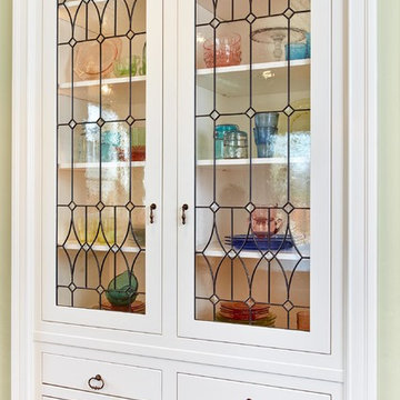
 JOURNEY HOME INTERIORS
Abrams and Paulin
Example of a transitional home design design in San Francisco
Example of a transitional home design design in San Francisco
 TVL Creative Ltd.
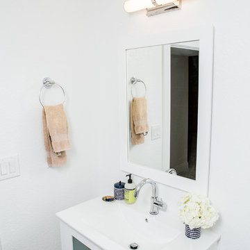
This newly purchased home was the perfect size for our client's growing family. The house, having been expanded on and renovated by the previous owners was the right size but not quite the right style. The house was full of design elements that may have been "cool" in the early 2000s but just didn't feel right for a young family. The master bathroom was in the most serious need of redo with many, many square feet of dingy and somewhat depressing deep red granite tile with diamond accents in black granite. The bathroom felt dark and dingy. Together with our clients, we set out on our mission to efficiently turn this room into an inviting and happy place for our clients. Thankfully the layout of the space was very functional, so we focused on an aesthetic overhall. At the top of the client’s list was to have a beautiful and comfortable freestanding soaker tub. Behind the Kohler tub and throughout the bathroom walls is polished Calacatta Gold marble tile. The new brushed nickel plumbing fixtures are timeless and unfussy, an important thing for busy young parents! The new bathroom is sleek but not stark. A welcoming space for our clients to feel at home.
 TVL Creative Ltd.
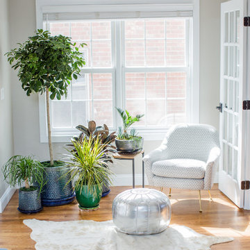
This newly purchased home was the perfect size for our client's growing family. The house, having been expanded on and renovated by the previous owners was the right size but not quite the right style. The house was full of design elements that may have been "cool" in the early 2000s but just didn't feel right for a young family. The master bathroom was in the most serious need of redo with many, many square feet of dingy and somewhat depressing deep red granite tile with diamond accents in black granite. The bathroom felt dark and dingy. Together with our clients, we set out on our mission to efficiently turn this room into an inviting and happy place for our clients. Thankfully the layout of the space was very functional, so we focused on an aesthetic overhall. At the top of the client’s list was to have a beautiful and comfortable freestanding soaker tub. Behind the Kohler tub and throughout the bathroom walls is polished Calacatta Gold marble tile. The new brushed nickel plumbing fixtures are timeless and unfussy, an important thing for busy young parents! The new bathroom is sleek but not stark. A welcoming space for our clients to feel at home.
 Shenton Architects LLP
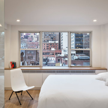
Located in the Midtown East neighborhood of Turtle Bay, this project involved combining two separate units to create a duplex three bedroom apartment.
The upper unit required a gut renovation to provide a new Master Bedroom suite, including the replacement of an existing Kitchen with a Master Bathroom, remodeling a second bathroom, and adding new closets and cabinetry throughout. An opening was made in the steel floor structure between the units to install a new stair. The lower unit had been renovated recently and only needed work in the Living/Dining area to accommodate the new staircase.
Given the long and narrow proportion of the apartment footprint, it was important that the stair be spatially efficient while creating a focal element to unify the apartment. The stair structure takes the concept of a spine beam and splits it into two thin steel plates, which support horizontal plates recessed into the underside of the treads. The wall adjacent to the stair was clad with vertical wood slats to physically connect the two levels and define a double height space.
Whitewashed oak flooring runs through both floors, with solid white oak for the stair treads and window countertops. The blackened steel stair structure contrasts with white satin lacquer finishes to the slat wall and built-in cabinetry. On the upper floor, full height electrolytic glass panels bring natural light into the stair hall from the Master Bedroom, while providing privacy when needed.
archphoto.com
35