
Search results for "Depth background" in Home Design Ideas
 Skill Construction & Design, LLC
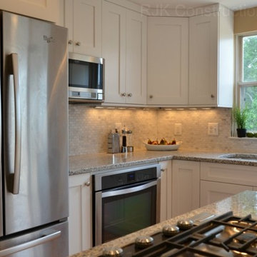
There are so many design elements to this kitchen, I almost don’t know where to start. Bright and airy with crisp clean white cabinets, the kitchen is open and welcoming. Still crisp but gently contrasting, the stainless steel appliance add depth amid the white. To keep this kitchen warm, natural oak covers the floors and a toasted wheat color washes the walls. And then there is the architectural elements. You know. That post and beam in the middle of the room. It’s the center of attention.
When you walk into a room your eyes roam around, establishing the size and shape of the room as your feet take you forward. From the front door of this home straight ahead you encountered this wall. The dining area to the right gives you a glimpse of things to come. Where there is a dining room you will usually find a kitchen.
The architecture of years gone by consistently hides the kitchen, the heart of the home, behind walls. I sympathize with my Mom, and all the other Moms, who have had to spend so much time tucked into a tight kitchen, away from the family. This wall had to go, but it was structural. We needed its support but not its bulk.
So we got rid of the bulk and only the bulk. Instead of a wall we have a post and beam, offering all of the structure we need. We could have installed a huge steel beam and reconfigure the joists to upset the beam, but why? The small beam and post add an incredible architectural element. It’s turning lemons into lemon, we simply made the most of what we had. It may be functional but it’s so fantastic. It looks like we created the effect just for the drama.
The original kitchen may have had a working triangle and some counter space, but it was fairly small, with each area only a step or two away. The dark cabinets made the space feel even smaller and the butcher block patterned laminate counter tops were very dated. The appliances were feeling their age as well, from a coil burner electric stove to a top freezer refrigerator. To keep this kitchen within its space, a half wall separated it from the dining area.
With the wall gone we borrowed some space from the living room and extended what was a U shaped kitchen into an L. At the living room window we start our new kitchen. We kept a small part of the wall to support the other end of our decorative beam. Sandwiched between a large pantry and our new French door refrigerator, the wall disappears. With our new open floor plan a sizable island was in order.
We split our cooking areas and installed a continuous grill gas cooktop into the island. A sleek island hood takes care of exhaust and adds an extra element to our architectural feature. Under the cooktop we added over-sized drawers for pots and pan storage. The frameless cabinets from New River Cabinetry are maple, painted white, with the Herndon door style. With the cooktop safely nestled into our island, we still had to add an oven.
We used the space where the old range sat for a large single oven of stainless steel and glass. If it worked for one, why not two? We created a home for a microwave in the wall cabinets. It’s perfect for heating leftovers so close to the refrigerator.
An important consideration for hot spots in your kitchen is landing zones. Each of our cooking areas have generous landing zones, one on each side of the cooktop and an entire counter area above or below the ovens, depending on which one you’re using.
We wanted to give the sink area more room so the half wall had to come out. We moved the trash and recycle cans into a cabinet, removed the heavy soffits and kept the sink under the window.
With that little bit of extra space we were able to add a larger cabinet above the dishwasher and slide it all down. This used to be where the carpeting met the vinyl floor, but all of it is gone. Long oak planks eliminate that final divide between the kitchen and the dining area, while adding visual length to the area. White wall cabinets on each side of the window reflect the sunlight for a brighter view.
With all of the darker cabinetry the backsplash walls had been painted white. Even still, there was a darkness in the corners and it wasn’t very exciting. We wanted to add visual interest and reflect the new under-cabinet lighting, eliminating the shadows in this corner.
With 1″x 2″ Arabescato Honed marble mosaics and those under-cabinet lights, we achieved the perfect balance. The marble has subtle swirls in gray and beige on a clean white background, but with the honed finish the light is softly reflected instead of glaring. For granite, we chose the soft gray tones of Luna Pearl. The speckles of gray and beige are a gentle contrast to the white cabinets and emulate the color of the stainless steel.
Between the carpet, red half wall, dark railing and dated light fixture, the dining area felt tired. Since the kitchen lacked sufficient storage, a large utility cabinet crowded the table space without adding any decorate elements.
Although it didn’t get any bigger, our dining area feels fresher and more open too. With the oak flooring joining the area to the rest of our space and the toasted wheat on the walls, the white table and chairs compliment the cabinetry while contrasting the warmer colors. We replaced the chandelier with recessed lighting and changed that railing too.
With our new open floor plan, we ended up with a fairly open area in between our foyer closet and the living room window. Not one to miss an opportunity, we filled the space with a multi-functional work space.
With the sunlight streaming in this bright corner works for anything this family needs.
There’s plenty of space for a chair under this large desk drawer. A closed cabinet below, glass doors above and lots of open shelving let you store and or showcase your belongings. We added a lite area at the top to keep away the darker corners.
The transformation is complete. This kitchen and all of its features are truly the center of attention in this home.
http://www.designsbyskill.com/
http://www.rjkconstructioninc.com/
 Skill Construction & Design, LLC
There are so many design elements to this kitchen, I almost don’t know where to start. Bright and airy with crisp clean white cabinets, the kitchen is open and welcoming. Still crisp but gently contrasting, the stainless steel appliance add depth amid the white. To keep this kitchen warm, natural oak covers the floors and a toasted wheat color washes the walls. And then there is the architectural elements. You know. That post and beam in the middle of the room. It’s the center of attention.
When you walk into a room your eyes roam around, establishing the size and shape of the room as your feet take you forward. From the front door of this home straight ahead you encountered this wall. The dining area to the right gives you a glimpse of things to come. Where there is a dining room you will usually find a kitchen.
The architecture of years gone by consistently hides the kitchen, the heart of the home, behind walls. I sympathize with my Mom, and all the other Moms, who have had to spend so much time tucked into a tight kitchen, away from the family. This wall had to go, but it was structural. We needed its support but not its bulk.
So we got rid of the bulk and only the bulk. Instead of a wall we have a post and beam, offering all of the structure we need. We could have installed a huge steel beam and reconfigure the joists to upset the beam, but why? The small beam and post add an incredible architectural element. It’s turning lemons into lemon, we simply made the most of what we had. It may be functional but it’s so fantastic. It looks like we created the effect just for the drama.
The original kitchen may have had a working triangle and some counter space, but it was fairly small, with each area only a step or two away. The dark cabinets made the space feel even smaller and the butcher block patterned laminate counter tops were very dated. The appliances were feeling their age as well, from a coil burner electric stove to a top freezer refrigerator. To keep this kitchen within its space, a half wall separated it from the dining area.
With the wall gone we borrowed some space from the living room and extended what was a U shaped kitchen into an L. At the living room window we start our new kitchen. We kept a small part of the wall to support the other end of our decorative beam. Sandwiched between a large pantry and our new French door refrigerator, the wall disappears. With our new open floor plan a sizable island was in order.
We split our cooking areas and installed a continuous grill gas cooktop into the island. A sleek island hood takes care of exhaust and adds an extra element to our architectural feature. Under the cooktop we added over-sized drawers for pots and pan storage. The frameless cabinets from New River Cabinetry are maple, painted white, with the Herndon door style. With the cooktop safely nestled into our island, we still had to add an oven.
We used the space where the old range sat for a large single oven of stainless steel and glass. If it worked for one, why not two? We created a home for a microwave in the wall cabinets. It’s perfect for heating leftovers so close to the refrigerator.
An important consideration for hot spots in your kitchen is landing zones. Each of our cooking areas have generous landing zones, one on each side of the cooktop and an entire counter area above or below the ovens, depending on which one you’re using.
We wanted to give the sink area more room so the half wall had to come out. We moved the trash and recycle cans into a cabinet, removed the heavy soffits and kept the sink under the window.
With that little bit of extra space we were able to add a larger cabinet above the dishwasher and slide it all down. This used to be where the carpeting met the vinyl floor, but all of it is gone. Long oak planks eliminate that final divide between the kitchen and the dining area, while adding visual length to the area. White wall cabinets on each side of the window reflect the sunlight for a brighter view.
With all of the darker cabinetry the backsplash walls had been painted white. Even still, there was a darkness in the corners and it wasn’t very exciting. We wanted to add visual interest and reflect the new under-cabinet lighting, eliminating the shadows in this corner.
With 1″x 2″ Arabescato Honed marble mosaics and those under-cabinet lights, we achieved the perfect balance. The marble has subtle swirls in gray and beige on a clean white background, but with the honed finish the light is softly reflected instead of glaring. For granite, we chose the soft gray tones of Luna Pearl. The speckles of gray and beige are a gentle contrast to the white cabinets and emulate the color of the stainless steel.
Between the carpet, red half wall, dark railing and dated light fixture, the dining area felt tired. Since the kitchen lacked sufficient storage, a large utility cabinet crowded the table space without adding any decorate elements.
Although it didn’t get any bigger, our dining area feels fresher and more open too. With the oak flooring joining the area to the rest of our space and the toasted wheat on the walls, the white table and chairs compliment the cabinetry while contrasting the warmer colors. We replaced the chandelier with recessed lighting and changed that railing too.
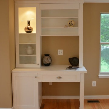
With our new open floor plan, we ended up with a fairly open area in between our foyer closet and the living room window. Not one to miss an opportunity, we filled the space with a multi-functional work space.
With the sunlight streaming in this bright corner works for anything this family needs.
There’s plenty of space for a chair under this large desk drawer. A closed cabinet below, glass doors above and lots of open shelving let you store and or showcase your belongings. We added a lite area at the top to keep away the darker corners.
The transformation is complete. This kitchen and all of its features are truly the center of attention in this home.
http://www.designsbyskill.com/
http://www.rjkconstructioninc.com/
 Grigsby Construction
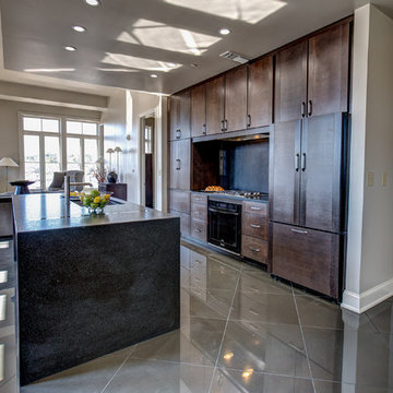
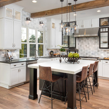
This kitchen is located in the center of a rectangular living space. The old shaker style green cabinets, large stainless steel appliances and a two tier island with pendant lights were the focal point of the condominium.
In keeping with the owner’s desire for the kitchen to “blend into” the contemporary look and feel of the condo, we changed the wood flooring to black porcelain tiles, dark sleek cabinets, a black granite top and backsplash, antiqued waterfall island top and replaced all lighting with small recessed can lighting.
The walls of cabinets are all the same depth with matching black granite backsplash balanced with large cabinets left and paneled refrigerator right. The cooktop area almost appears to be “carved out”. The kitchen now melts into the background of the owners more contemporary look.
Large open windows overlooking a more urban landscape give it a sense of openness. Because this condominium is on the third floor of an old commercial building, we were limited on the size of the granite slab that we could get into the building. To avoid a boring seam . . . we inlaid a piece of wood in between the granite sections adding a trimmed appearance to the granite sections.
The client is very pleased that she has achieved her desired kitchen atmosphere in keeping with the contemporary motif that she has created in her condominium.
Find the right local pro for your project
 ornamental land design
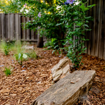
A large piece of petrified rock anchors the scene, with hibiscus blooming in the background and meadow plantings beyond. The combination of stone, flowers, and textured greenery adds depth and character to the garden design.
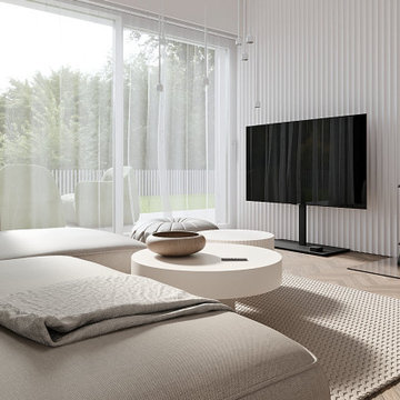
 STUDIO KONDE | Konrad Idaszewski Architect
Visit our page: https://conde.pl/architekt-wnetrz-poznan/
Modbarn house interior designed by STUDIO KONDE Konrad Idaszewski Architekt, a Poznań-based interior architect creating contemporary residential spaces with a strong architectural identity. As part of the Modelowedomy collection of individually configurable houses, Modbarn combines the character of a modern barn with a spacious high-ceilinged living and dining area, while the kitchen is partially separated from the lounge by an openwork shelving unit.
Contemporary living room designed as part of a modern barn house interior project in Poland. The space combines minimalist architecture, natural materials and soft neutral tones to create a calm and timeless atmosphere. Full-height glazing brings the garden directly into the composition, while the impressive ceiling height emphasizes the generous scale of the living area.
Seen from the lounge, the high interior is defined by a light palette and carefully coordinated textures. A large, deep upholstered sofa in warm beige occupies the foreground, accompanied by a folded textured throw and soft cushions. In front of it, two low round coffee tables create a layered arrangement, with a sculptural wooden bowl providing a simple decorative accent. A large woven rug extends across the seating zone, introducing a subtle tactile pattern and visually anchoring the furniture against the light oak herringbone floor.
The television is presented as a freestanding element on a slim black floor stand rather than mounted directly onto the wall, giving the arrangement a lighter and more architectural appearance. Behind it, the entire wall is finished with narrow vertical white slats, creating a distinctive ribbed texture that adds depth to the otherwise monochromatic interior. Several slender pendant lights hang from the high ceiling above the living and dining area, emphasizing the vertical proportions of the room.
Next to the television, a freestanding black wood-burning stove stands on its own protective glass hearth. Its compact, traditional form and visible flame introduce a strong dark accent and a sense of warmth against the predominantly white and beige surroundings. The contrast between the black stove, television stand and pale finishes gives the room a crisp contemporary character without losing its residential feel.
Large windows and glazed doors fill the background with daylight and provide a direct view towards the greenery outside. White vertical blinds soften the extensive glazing, while the light-filled garden becomes a natural backdrop for the neutral interior. The combination of the tall living space, textured wall cladding, freestanding television, wood-burning stove, soft sofa and natural timber flooring illustrates the refined yet comfortable approach to modern interiors developed by STUDIO KONDE, an interior architecture studio in Poznań.
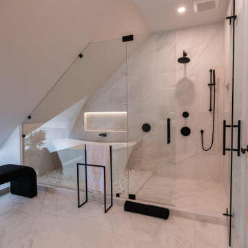
 Infinite Home
The attic, once an afterthought, is now an extension of the home that feels as if it was always meant to be there. The office was designed with depth and refinement, incorporating a built-in library cabinet with a striking black slab background and moody furnishings that add a sense of sophistication.
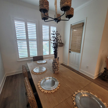
 US Verticals Mfg, Inc.
From this angle, the dining room’s rich mix of textures becomes the star of the space. The woven chairs, layered accessories, and warm natural materials create depth and visual interest without overwhelming the room. In the background, the crisp white plantation shutters provide a clean architectural backdrop, adding structure while allowing the textured elements in the foreground to shine. The combination results in a balanced, thoughtfully curated dining room where every detail contributes to a cohesive, elevated design.
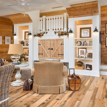

 Rockwell Solutions
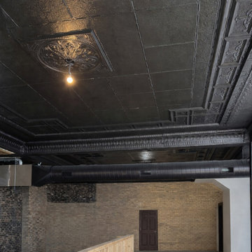
This project focused on restoring and transforming a historic pressed tin ceiling that had accumulated significant wear over time. Years of modifications had left the ceiling with nail holes, damaged areas, missing ornamental details, and inconsistent finishes that hid much of the original craftsmanship.
Our team carefully repaired the damaged sections and rebuilt missing ornamental elements to restore the integrity of the original design. Once the repairs were complete, the entire ceiling was professionally prepared and refinished.
The ceiling and exposed HVAC ductwork were finished in Sherwin-Williams “Caviar,” a deep, rich tone that highlights the intricate patterns and architectural details of the pressed tin panels. The darker finish adds contrast and depth to the space, allowing the historic texture and decorative elements to stand out rather than blend into the background.
The result is a dramatic transformation that brings new life to the historic ceiling while preserving its character. What was once a worn and inconsistent surface is now a striking architectural feature that anchors the room and celebrates the craftsmanship of the original tin work.
 GenStone Products
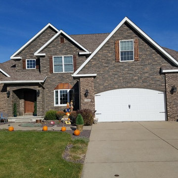
"I installed this product as a DIY project as I do have construction in my background. This product was extremely easy to install and with the offset corners, the product looks as real as it gets. What I especially like is the added benefits of the R value and noise reduction because of the dense foam. I compared this product to others and I think this product has the best definition, meaning it has great lines and a depth that gives it a very real look when installed." -- Doug
 Howard Schoor Art
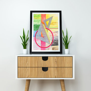
In Depth Triangle Series
Stacked Colorful Triangles with Circle
MEDIUM:
Mixed acrylic paint and spackle paste brushed background with multi colors and markers on stretched canvas.
 PI Photography Wall Art & Fine Art
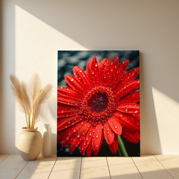
 https://pipafineart.com/pages/after-the-rain-gerbera-daisy-realism-painting-digital-artwork-prints-and-digital-backgrounds. This striking digitally created photorealistic artwork captures the vibrant essence of a red gerbera daisy, freshly kissed by rain. The central focus is undeniably the flower itself, presented in a captivating close-up that highlights its intricate details. Each vivid red petal is adorned with countless shimmering water droplets, catching the light in a way that suggests recent precipitation and infuses the image with a sense of vitality and freshness. The rich, almost fiery red of the petals is beautifully contrasted by the subtly textured, darker hues within the daisy's center, which hints at deeper purples and maroons, adding depth and visual interest. The background is thoughtfully rendered in a soft, dark blur, allowing the brilliant red of the daisy and the crystalline sparkle of the raindrops to truly pop and command attention. It creates a dreamlike, almost ethereal quality, ensuring the flower remains the undisputed star of this botanical tableau. The level of detail achieved here is truly remarkable, mimicking the realism of a high-resolution photograph while retaining the controlled artistry of a digital creation.
After the Rain Gerbera Daisy Photorealistic Floral Digital Artwork Downloadable Printable Art in Living Room Setting
This captivating artwork offers incredible versatility for various interior spaces and decorating styles. In a modern or contemporary living room, its bold color and crisp details would serve as a dynamic focal point against minimalist furniture and neutral palettes, injecting a vibrant burst of life. Imagine it above a sleek, low-profile sofa, bringing an unexpected organic element to a clean-lined aesthetic. For a transitional space, which blends traditional warmth with modern simplicity, this piece would seamlessly integrate, offering both classic floral appeal and a fresh, updated feel. It could perfectly complement a mix of comfortable seating and clean-lined accessories. In a maximalist design scheme, where layers of pattern and color are embraced, this artwork could contribute another rich layer, perhaps contrasting with an ornate wallpaper or complementing other botanical prints.
 Ollin Stone
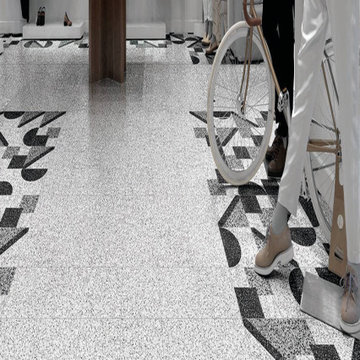
The cutting-edge technology and versatility we have developed over the years have resulted in four main line of Agglotech terrazzo — Unico. Small chips and contrasting background for a harmonious interplay of perspectives that lends this material vibrancy and depth.
 Infinite Home
The attic, once an afterthought, is now an extension of the home that feels as if it was always meant to be there. The office was designed with depth and refinement, incorporating a built-in library cabinet with a striking black slab background and moody furnishings that add a sense of sophistication.

 Ollin Stone
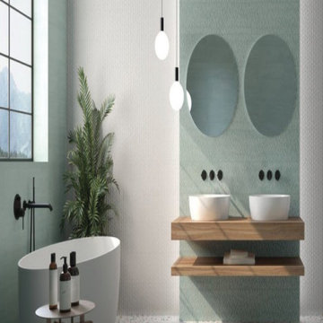
The cutting-edge technology and versatility we have developed over the years have resulted in four main line of Agglotech terrazzo — Unico. Small chips and contrasting background for a harmonious interplay of perspectives that lends this material vibrancy and depth.
 Bianchi Design
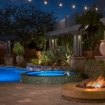
Previously, this yard was burdened by a typical boulder pile pool, that was heaped higher than typical, trying to hide the towering wall behind. At first, the clients sought merely to reconfigure the BBQ that was congesting the patio, but upon further analysis, they decided it was time to strip the entire yard, leaving only the pool shell. Bianchi’s solution introduced an array of four arbors to distract the eye from the wall behind, solving what the boulder waterfall could never do.
Additionally, the wall was painted a dark earth tone to add contrast and depth. This strategy enabled the wall to recede into the distance, while the agave blue grey arbors floated forward visually from the background. Previously, the patios were a hodgepodge of deck islands that were impossible to navigate, and were of insufficient size to arrange furniture on. A well organized patio streamlined the traffic flow and the living space, featuring a cast in place concrete fire pit and banco couch, as well as a new outdoor bistro, glowing with filtered light from the canvas shade sails overhead.
A turquoise glass overflow spa became the yards focal point, sharing the space between the pool and outdoor living. The striking symmetry of the spa and pot pedestal with regal cacti arrangement behind, flanked by the arbors on either side, created a stately first impression from the front door. This teaser was just a glimpse of what could not yet be seen serving as an invitation to explore and enjoy as the yard unfolds.
See more about this project & hear from the homeowner here: https://www.youtube.com/watch?v=7eT3RkLkg5w&feature=youtu.be
 Old Country Ceramic Tile
Florida Tile
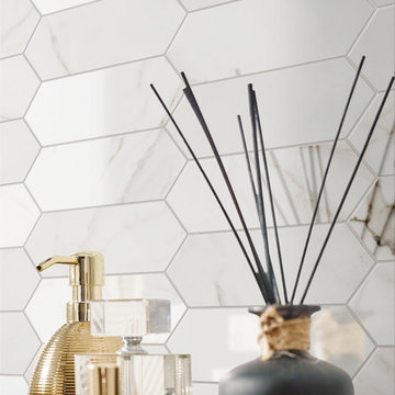
From the exquisite beauty of Calacatta marble emerges PreciousHDP, a collection from Florida Tile that captures the
essence of the most sought after natural stone in the world. Inspired by the unique marked graphics in the Italian
stone, PreciousHDP is a distinct expression of refined taste.
Intense grey and brown veins stand out from a crystalline white background endowing it with a depth and movement
that enlivens spaces. The random pattern, the structured surfaces of the decors, and the natural and polished finishes
are elements that elevate any atmosphere – classical or modern.
Rectified, porcelain floor tiles in a natural finish are available in 12x24, 24x24, and 18x36. Rectified, ceramic wall tiles in
a polished finish are available in 5x14, 14x27, and 14x39. Two mosaics: a 12x12 ceramic wall tile showcasing a modern
mix of the polished and matte finishes combined in an elongated hexagon pattern, and a 12x12 herringbone pattern
in natural finish suitable for wall or floor, provide endless design options.
PreciousHDP also features a 14x27 Curl ceramic wall deco with a chic, three-dimensional wave pattern in a polished
finish, adding a bold twist to the classic Calacatta stone look. A full package of trims including bullnose for floor and
wall, corners, and a chair rail and stop in a polished finish complete the collection.
With the exception of select trim, decorative and ceramic pieces, PreciousHDP is made in the USA of 40% pre-consumer
recycled content, is GREENGUARD® and Porcelain Tile certified
 My Dream Home Design
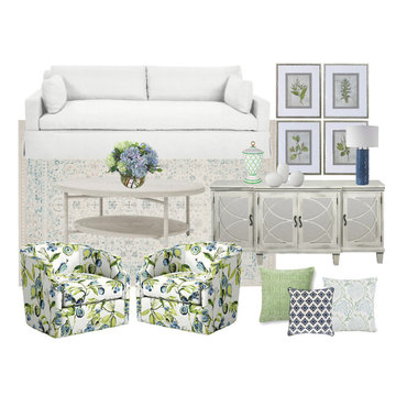
Sofa- Dimensions: Sofa: 96"W x 43" D x 34"H Seat Height: 19"HArm Height: 24.5"H. Material/Finish: Bella Bone. A dedicated team of craftsmen works atop a bench surface to construct each piece by hand, from start to finish.. Kiln-dried hardwood frame is corner-blocked for stability and strength. 8-way, hand-tied spring suspension is designed to distribute weight evenly, ensuring long-lasting comfort and durability. Seat cushions are high-density foam core wrapped in a blend of polyester. The sofa is finished with a 7" skirt on all sides.
Rug- Dimensions: 9' x 12'. Made with polypropylene, polyester and uses the latest colors to create a modern classic look that will be featured in any room. Weave: Machine Made. Material: 70% Polypropylene, 30% Polyester. Origin: Turkey. Thickness approx: 1/4 inch.
Armchair (2) -Material/Finish: Fabric Alana Blue. Dimensions:: 29 1/2"H X 31 1/2"W X 30"DSeat: 19"H X 24"W X 23: Constructed of laminated hardwood frame, tongue and groove joints, cushion surrounded by foam core/down blend encased in channeled down-proof ticking. Down blend seat cushion. Bench-made hardwood frame. Tongue & groove joints
Coffee Table-Size: 18.25 inches high x 48 inches wide x 48 inches deep. Coastal Beach White wrapped with seagrass rope. Constructed from the powder-coated metal frame. Finished in white sand.
Sideboard-Finish:Aged WhiteWidth:72"Height:34"Depth:18"Weight:148.0 LbsMaterial:Antique Mirror, Birch Wood and MDF.
Four "Leaf Study" Prints -Each print is 20.25"L x 24.25"H x 0.9" deep. Shades Of Green, Brown, White, Gray, Blue, And Yellow Are Shown In Each Of The Prints. The Hand-torn Prints Are Placed Against A Stone Gray Background And Are Surrounded By A Simple, Thick White Mat. Elegant Champagne Silver Leaf Frames Complete Each Botanical Print. Each Print Is Set Under Protective Glass.
Table Lamp - Size: 30"Hx16" Wx16"D. With a coral-like texture and a serene ocean hue, Table Lamp will bring in a nautical aura to your living room. Color: Royal Blue. Material: Ceramic, Crystal, Steel. Shade Color: White. Shade Material: Fabric. Shade Size: Bottom: 16" x 16" Side: 10"
Jar, Green/White-Dimensions: 9"Dia x 17"H. COLOR: green/white/brass. MADE OF: porcelain/brass.
Hydrangea in Glass Vase, Faux-Dimensions: 12"Dia x 11"H. COLOR: blue. MADE OF: florals, polyester; vase, glass/acrylic.
Mini Vase set of 3-vase- Dimensions: H 5. 5, H 6. 5, H 8. 5 cm
PILLOW GREEN / IVORY -Fiber: 100% Polyester, Size: 18x18
Pillow-Dimensions: 18" X 18". Material/Finish: 100% Cotton. The coastal-inspired designs showcased meticulously woven construction of these pieces boasts durability and will provide natural charm into your decor space.
Pillow, Floral Sage-Dimensions: 20"L x 20"W. MADE OF cover, cotton; insert, polyester
 Spin Design Limited
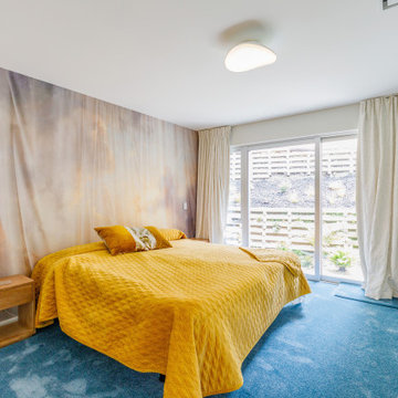
We all crave a space where we can switch off from the world at the end of the day. Bedrooms should therefore be a restful haven. Textures are the ideal way to give the bedroom a restful feel. Wallcovering can create a background to give your sleep space a peaceful feel. Knitted fabrics on the bed and textures in the curtains bring a small dose of pretty pattern into the space. To be really relaxed in your bedroom, you need soft surfaces to sit, walk and sleep on. Layering the space with sumptuous textures that are arranged neatly and a simple colour palette will keep the room feeling calm and harmonious.
The wallpaper print is called Heavenly Drapes and it does create a backdrop that is restful, yet inspirational. The curtain fabric adds texture, while the colour blends into the wall. The wardrobe sliding doors are back painted glass. The colour is the same as the walls, but the glass adds depth and a different level of gloss.
 Ollin Stone
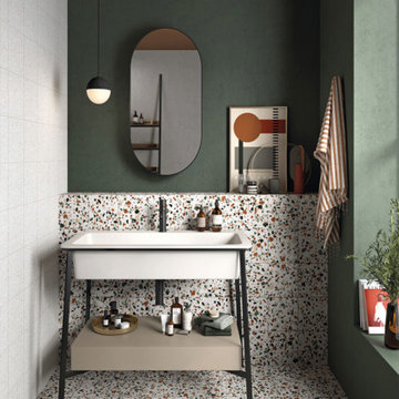
The cutting-edge technology and versatility we have developed over the years have resulted in four main line of Agglotech terrazzo — Unico. Small chips and contrasting background for a harmonious interplay of perspectives that lends this material vibrancy and depth.
 Kehoe Wilson Design LLC
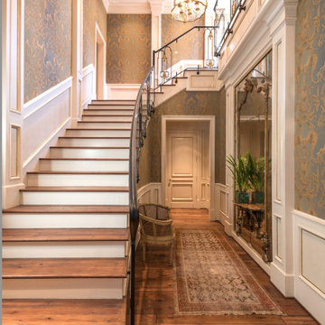
Curved wrought iron handrail glides upward on airy custom ironwork interspersed with Starfire glass panels, Alternating background colors in this handpainted wallpaper adds depth which open the width of the stairhall. Gilt lantern is a from Paris Latin Quarter.
14