
Search results for "Describes" in Home Design Ideas
 Walker Zanger
Stone Mosaic
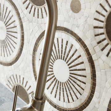
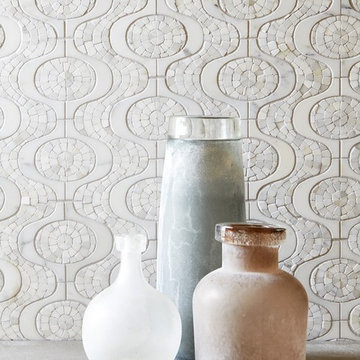
A Tangent is defined as ''a line that touches but does not intersect a curve.'' It is a word that describes geometry, but also one used to describe heading off in directions unknown. Both definitions are appropriate for our new collections of decorative stone mosaics, in which abstract geometry and mid century modern design influences merge with the beauty of natural stone, creating a richness that will beguile you anew each time you see it.
Usage:
Residential: All interior surfaces, including bathroom walls/floors*, shower walls/ floors and kitchen backsplashes. Exterior walls. Commercial: Interior and exterior walls and interior floors. *Flannel not recommended for use in showers or exteriors. See Tools | Usage Guide for more details.
See more on this product on the Walker Zanger website here: http://walkerzanger.com/collections/products.php?view=style&mat=Contemporary&coll=Tangent
 Breathe Design Studio
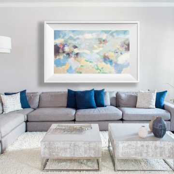
A transitional townhouse for a family with a touch of modern design and blue accents. When I start a project, I always ask a client to describe three words that they want to describe their home. In this instance, the owner asked for a modern, clean, and functional aesthetic that would be family-friendly, while also allowing him to entertain. We worked around the owner's artwork by Ryan Fugate in order to choose a neutral but also sophisticated palette of blues, greys, and green for the entire home. Metallic accents create a more modern feel that plays off of the hardware already in the home. The result is a comfortable and bright home where everyone can relax at the end of a long day.
Photography by Reagen Taylor Photography
Collaboration with lead designer Travis Michael Interiors
 The Iconic Space
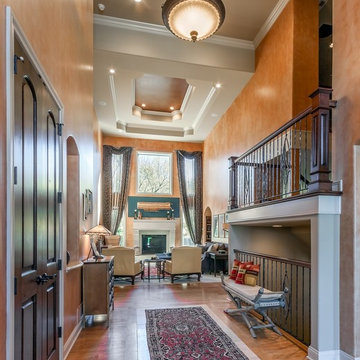
When I first met these clients, they told me that they love to entertain. They really wanted their home to be comfortable and warm, and also “beautiful- but not in a showy way.” As I came to know them, I realized how perfectly this couple, in describing their dream home, had described themselves.
These owners already owned beautiful furniture and accessories, so our goal wasn’t to replace many items. We did need to better utilize them in ways that improved their home’s flow and cohesion.
DaubmanPhotography@Cox.net
Find the right local pro for your project
 Direct Plus Inc
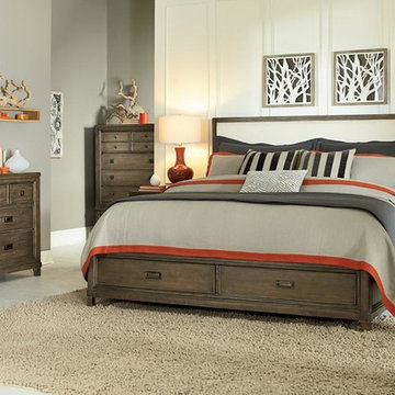
Casual, urban, lifestyle, eclectic, modern, simple, informal and comfortable; all of these adjectives describe Park Studio. Linear and geometric with smaller cases for today’s living spaces. Organic describes the overall feeling with the mix of finishes and fabrics. The finish is weathered taupe with grey wash coat to achieve this casual “cerused” finish on quartered white oak and hardwood solids. Ash burl borders accent table tops and select drawer fronts. The custom hardware has campaign elements with the flat back plate and handle pull, but the dark nickel finish is fresh and updated. The cases are linear and contemporary in structure with flat fronts, bead trim around drawers and a solid base rail with splayed sabre feet and legs. Some traditional elements include overhang tops and heavy moldings. The bedroom is defined by the upholstered sleigh bed in a durable Sunbrella® fabric that has optional footboard storage. Cases are in space saving sizes with plenty of features for the smaller homes of today.
 Walker Zanger
Stone Mosaic
A Tangent is defined as ''a line that touches but does not intersect a curve.'' It is a word that describes geometry, but also one used to describe heading off in directions unknown. Both definitions are appropriate for our new collections of decorative stone mosaics, in which abstract geometry and mid century modern design influences merge with the beauty of natural stone, creating a richness that will beguile you anew each time you see it.
Usage:
Residential: All interior surfaces, including bathroom walls/floors*, shower walls/ floors and kitchen backsplashes. Exterior walls. Commercial: Interior and exterior walls and interior floors.
See more on this product on the Walker Zanger website here: http://walkerzanger.com/collections/products.php?view=style&mat=Contemporary&coll=Tangent
 Advance Design Studio, Ltd.
Jennifer and Dan have lived in their Deer Park Illinois home for 15 years, slowly making minor fixes like painting and decorating; but they had a new plan for their kitchen the entire time. An awkwardly placed garage door, and an island cooktop with a terrible downdraft made a full-scale kitchen remodel an absolute must. Jennifer had many ideas in mind and wanted to work with a company that could provide high-end work, while partnering with a designer that would tailor the kitchen to her ideas.
She was intrigued by the phrase “Common Sense Remodeling” in Advance Design’s feature she discovered while perusing an issue of the community’s Quintessential Barrington Magazine. Doing further research on the company’s website, as she looked through project profiles and read about Advance Design’s “Common Sense Remodeling” philosophy, she promptly scheduled an appointment to see if the people and ideas she read about were truly who they said they were. The more she read, the more she knew that the “Common Sense” approach to remodeling they described was exactly the type of company she was looking for.
The partnership was sealed after an initial consultation with Owner Todd Jurs and Project Designer Michelle Lecinski. They displayed a combination of friendliness, professionalism and respect that was unmatched by any of the other companies Jennifer talked to. She knew that with Advance Design, she would be able to retain the vision that she had in mind with high-quality craftsmanship.
“I reached out to Advance Design because of the ‘Common Sense Remodeling’ tagline,” Jennifer said. “That’s what lingered for me”. “Advance Design was the most respectful- of the house and of my design ideas, and the most professional of the handful of companies that looked at my project”.
Soon after the meeting Jennifer began working with Michelle on the project design. They quickly developed chemistry. Jennifer loved how Michelle researched and located every detail that Jennifer wanted for the kitchen. Between the two of them, every concept and idea was worked through and perfected. “Jennifer had definite ideas about what she wanted the new kitchen to look like, she just didn’t know how to bring it all together. We worked together really well to make her ideas into the practical reality necessary for a well-functioning kitchen, with the look and feel that she had envisioned”, says Michelle.
“Michelle was wonderful in using the CAD system she would show me new drawings every time we changed the layout while working through the design,” Jennifer said. “She was a really wonderful partner in execution, she made sure everything happened quickly and easily.”
The finished design drew out elements of Jennifer’s style and personality. The pair call the look “sophisticated farmhouse” to describe the kitchen renovation to family and friends. The result was a beautifully crafted, authentic-feeling space that satisfied Jennifer’s dreams 15 years in the making. The whole project consisted of a kitchen remodel, mudroom upgrade with powder room, and garage entry relocation. “The projects I personally like the best, are the ones that put the client’s dreams on display,” Project Designer Michelle said. “And this is one of those projects.”
The main focal point of the kitchen is custom zinc and brass ventilation hood with a vintage sheen, which was hand made to order by a small company in Indiana named Vogler Metalworking. “It’s like sculpture, a true work of art”, says Jennifer. Your eye is immediately drawn towards this elegant yet practical hood that eliminated the home’s downdraft problem and added a striking conversation piece at the same time. The carpenters had to use special gloves when transporting and installing it, so they didn’t smudge it with fingerprints. The beautiful hood centers proudly over the stunning black enamel and brass LaCornue Range. “I had a friend who had a LaCornue range and after learning how easy it was to cook perfect meals, I was convinced I wanted to have one”, says Jennifer. This unique, breathtaking combination anchors the entire kitchen and is apparent immediately as you walk into the great room the surrounds the space.
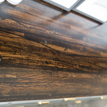
DuraSupreme Crestwood cabinets with a Kendall Panel add function and sophistication. A custom gray paint color paired with a storm blue was developed so that the new kitchen looked like it belonged to the existing space. Unlacquered brass faucets and hardware were important to Jennifer because she wanted the living finishes to age over time. Remarkable brass diamond mesh cabinet door inserts imported from the UK continue to add this one-of-a-kind kitchen renovation; giving it a “you won’t see this everywhere” quality. The use of old railcar flooring for the coffee bar countertop and reclaimed oak for the open shelving gives an authenticity to the space uncommon in kitchens today.
Jennifer and Michelle fell in love with the Limestone Grey Stone while they were investigating unique island countertop ideas. They liked the fact that the limestone as a living finish will age and change over time. Calcutta Miel Quartz countertops made for an excellent pairing around the perimeter, as it’s durable and perfect for cooking preparations. A textured white subway tile backsplash that runs to the ceiling keeps your eye moving towards the open shelving, and to the main focal point of the stunning range hood combination.
“The kitchen functions beautifully, and it’s gorgeous,” beams Jennifer as she gestures with both hands while smiling ear to ear. “The most important thing was I wanted a kitchen that had a wonderful flow, cooked beautiful meals and was a great gathering place for family and friends, and this space does that perfectly! Beauty wise, it turned out exactly how I had envisioned. I felt the function part was the hardest part, and that was nailed”!
Relocating the garage entry to the new mudroom was a huge priority and has finally separated the family’s arriving home functions from their kitchen. Now coats and shoes and bags have their own area for dropping once members arrive home. Matching gray DuraSupreme cabinetry helped create gorgeous, purposeful lockers for the family. A reclaimed vintage sink and custom wall paper were added to the tiny powder room to beautify the once previously only functional space. Advance Design was even able to create a custom space for their dog to sleep while the family is away.
“It was unbelievable that a project of this size was completed in such a short time, and I think that’s because of the large amount of planning and preparation that went into it,” Jennifer marveled, “When we started, we were ready, and everything was prepared”.
When it came to execution, Project Manager Justin Davis and his crew were quick, accessible, and organized. Projects like this kitchen are typically completed in as little as 8-10 weeks. Jennifer’s kitchen however despite the relocation of some challenging HVAC in a soffit and moving of an exterior door was completed remarkably fast in part because the team was working with an existing tile floor that ran throughout the first floor that the client really loved.
“You get to know these people really well because they’re living in your house while you’re living in your house. They were so fast and really good, it didn’t take as long as even planned” reported Jennifer. “I would text Justin and he always responded almost immediately. I got to know all the guys who were working in our house and they were all wonderful people”.
Details in a customized kitchen like this one require skill and care from the people who install it. “All the guys on the job were skilled at what the did. I wanted small details like little feet to look like furniture, that is where their carpentry skill came in to make these all perfect”, said Jennifer. “The tile guys were wonderful. They even let me determine how I wanted the texture with the grout to appear for a salt and pepper look; now that is a very skilled trade person making it custom”.
In Jennifer’s interview, she continued to reference Advance Design’s “Common Sense Remodeling”, so I took a minute to ask her exactly what that phrase meant to her and how it played out in her experience with her project and the Advance Design team. Here is what she said: “I was intrigued about Common Sense Remodeling and in my head that there would be clear costs and prices, great communication between the design team, the execution team and me”, said Jennifer. They did deliver on that, it was so clear about the cost breakdown, what I could expect from everyone who came to my house, and everything that we had ordered. That to me is the Common Sense”!
It’s great to see a client take literally our assertion that a well-planned remodeling project is simply “Common Sense”! She anticipated each step of the way would be clear, concise, and predictable, all the while protecting the outcome due to the careful upfront planning. “Advance Design delivered on their ‘Common Sense Remodeling’ promise,” Jennifer said. “From the design team, to the execution team - everything was straight forward like I imagined. The project turned out exactly how I envisioned, I enjoyed this process and absolutely would recommend Advance Design Studio to anyone.”
 Breathe Design Studio
A transitional townhouse for a family with a touch of modern design and blue accents. When I start a project, I always ask a client to describe three words that they want to describe their home. In this instance, the owner asked for a modern, clean, and functional aesthetic that would be family-friendly, while also allowing him to entertain. We worked around the owner's artwork by Ryan Fugate in order to choose a neutral but also sophisticated palette of blues, greys, and green for the entire home. Metallic accents create a more modern feel that plays off of the hardware already in the home. The result is a comfortable and bright home where everyone can relax at the end of a long day.
Photography by Reagen Taylor Photography
Collaboration with lead designer Travis Michael Interiors
 Art Van Furniture
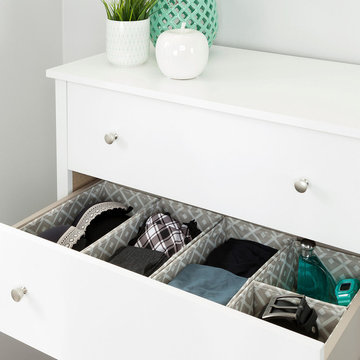
A place for everything, and everything in its place. Help your teen experience the “life-changing magic of tidying up” by setting them up for success. Space-saving drawer organizers help sort and store items away neatly. The eye-catching design makes them a pleasure to use. You’ll never have to answer the question, “Mom, where’s my …?”
Like this look? Grab it by clicking here.
 Techo-Bloc
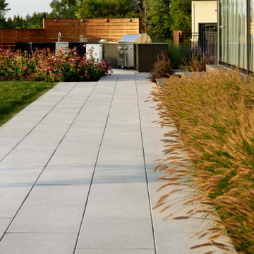
This backyard patio design is inspired by our Para patio slab. Large-scale, ultra-smooth texture and fine lines best describe the all-new Para HD. Manufactured with Techo-Bloc’s patented High Definition technology, an extremely tight surface texture with pores that are virtually invisible. The Para HD provides contemporary styling and design flexibility. Each of its three sizes are packaged and sold separately allowing your projects to reflect your personal creativity. This 60 mm product is available in a 500 mm x 250 mm, 500 mm x 500 mm and 500 mm x 750 mm. It is available in both hyper smooth and polished textures. Check out our website to shop the look! https://www.techo-bloc.com/shop/slabs/para/
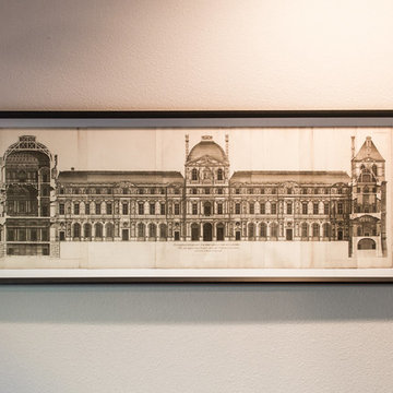 Breathe Design Studio
A transitional townhouse for a family with a touch of modern design and blue accents. When I start a project, I always ask a client to describe three words that they want to describe their home. In this instance, the owner asked for a modern, clean, and functional aesthetic that would be family-friendly, while also allowing him to entertain. We worked around the owner's artwork by Ryan Fugate in order to choose a neutral but also sophisticated palette of blues, greys, and green for the entire home. Metallic accents create a more modern feel that plays off of the hardware already in the home. The result is a comfortable and bright home where everyone can relax at the end of a long day.
Photography by Reagen Taylor Photography
Collaboration with lead designer Travis Michael Interiors
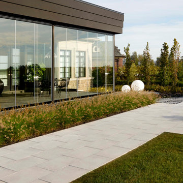 Techo-Bloc
This backyard patio design is inspired by our Para patio slab. Large-scale, ultra-smooth texture and fine lines best describe the all-new Para HD. Manufactured with Techo-Bloc’s patented High Definition technology, an extremely tight surface texture with pores that are virtually invisible. The Para HD provides contemporary styling and design flexibility. Each of its three sizes are packaged and sold separately allowing your projects to reflect your personal creativity. This 60 mm product is available in a 500 mm x 250 mm, 500 mm x 500 mm and 500 mm x 750 mm. It is available in both hyper smooth and polished textures. Check out our website to shop the look! https://www.techo-bloc.com/shop/slabs/para/

 AR Homes Vero Beach | Beachland Homes Corp.
Beautiful Homes, Grand Entryways, Fully Customaziable are a few words to describe Arthur Rutenberg Homes. The Bermuda Model making a statement at The Polo Grounds Vero Beach. This Grand entryway is going to lead to a very spacious and comfortable home with beautiful views! #Entries #Luxury #CustomHomeBuilderVeroBeach #ThePoloGroundsVeroBeach #VeroBeachLuxuryHomeBuilder #CustomHomesVeroBeach JN Genoni
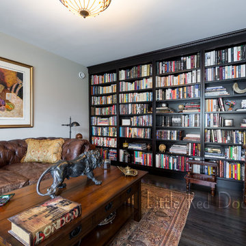
 Little Red Door Inc.
White and bright describes this kitchen, A 4 foot addition across the back of the house allows for the an amazing kitchen with skylights and big beautiful windows.

 INSPIRED KITCHEN DESIGN
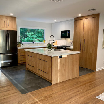
According to Lian, she chose IKEA cabinetry because it made a lot of design — and budget — sense.
“We looked around for a while and realized that most kitchen cabinets were well outside of our budget. Even the cheapest ones we found. We decided to go with IKEA cabinets, using Semihandmade fronts to give them the upscale look we were hoping to achieve,” she describes.
Semihandmade Impression Tahoe fronts are featured on the center island, with ample storage space in the base drawers; as well as on the large dual-door pantry area and the upper cabinetry above the refrigerator. Additional base cabinetry flows from the refrigerator to the pantry area around the oven, and the IKEA RINGHULT fronts highlight the upper cabinetry above the oven. The RINGHULT cabinetry provides more storage options for dishes and glassware as well.
The look is also enhanced by IKEA’s cabinet lighting system, which Lian says she’s very happy with. “It’s such an affordable and beautiful solution to add undercabinets light. We love the remote control feature as well,” she describes.
 Grassi Pietre
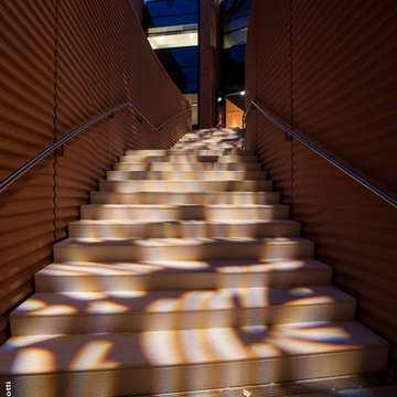
After long waiting, Expo Milan 2015 has finally opened its doors! Among more than 140 pavilions to describe the world, UAE pavilions , an imposing structure , including a theater and the Emir apartment was created . The pavilion, which stands for modernity, is one of the larger lots of Expo Milano 2015, and benefits from a privileged location, right in the center of the exhibition, alongside the main axis Decumanus. The FOSTER+PARTNERS architectural office , who designed it, was able to reflect the country's cultural heritage and in particular its focus on sustainable development. The amazing shape is shaped by a series of rippled walls, with a height over 12 meters, evoking both the shaded streets of country’s historic settlements , and the magnificent sand dunes of its deserts. There is also a charming green space dedicated to the native vegetation. At the end of the World Fair The lot will be dismantled and reassembled in Masdar City.
THE CONTRIBUTION OF GRASSI PIETRE
Grassi Pietre also participated in the creation of this wonderful project by FOSTER+PARTNERS. In particular (on behalf of Tecton, Reggio Emilia - Italy) the company from Nanto (Vicenza - Italy) provided 500 square meters of flooring in Trani Biancone - slabs 120x70x2 cm in honed finish - used for the Emir apartment (located inside the pavilion) and the lower level flooring adjacent to the auditorium.
The Grassi Pietre marble was also used to clad the interior stairs leading to the apartment: Grassi Pietre provided the Trani Biancone for the shaped stairs, 3 cm thick honed surface.
Moreover, Grassi Pietre also supplied 40 square meters of floor in marble Trani Biancone, in sandblasted finish (4 cm thick), for the outside terraces. The external staircase was built instead in Trani Bronzetto. All the outside surface have a non slippery bushhammered surface.
TRANI BIANCONE And BRONZETTO
Trani is a marble that moves between shades of beige (Bronzetto ), ivory (Biancone ) and rosé. The nuance changes depending on the variety. It is characterized by the many thin and sinuous veins.
TECHNICAL INFORMATION
Year of execution: 2014/2015
Lot size: 4386 m²
Height: 12 m
Capacity: 785 people/hour
Location: Milano - Expo 2015
GRASSI PIETRE SRL (material supplier described above)
via Madonetta, 2 | 36024 Nanto (Vi) Italy |
www.grassipietre.it | info@grassipietre.it | www.facebook.com/grassipietre |
TECTON SOC. COOP (Realization)
via Galliano, 10 | 42124 Reggio Emilia Italy |
www.tecton.it | info@tecton.it |
FOSTER + PARTNERS (Design Studio)
www.fosterandpartners.com
PHOTO CREDITS: Cristian Iotti | www.cristianiotti.com |
 Breathe Design Studio
A transitional townhouse for a family with a touch of modern design and blue accents. When I start a project, I always ask a client to describe three words that they want to describe their home. In this instance, the owner asked for a modern, clean, and functional aesthetic that would be family-friendly, while also allowing him to entertain. We worked around the owner's artwork by Ryan Fugate in order to choose a neutral but also sophisticated palette of blues, greys, and green for the entire home. Metallic accents create a more modern feel that plays off of the hardware already in the home. The result is a comfortable and bright home where everyone can relax at the end of a long day.
Photography by Reagen Taylor Photography
Collaboration with lead designer Travis Michael Interiors
 Breathe Design Studio
A transitional townhouse for a family with a touch of modern design and blue accents. When I start a project, I always ask a client to describe three words that they want to describe their home. In this instance, the owner asked for a modern, clean, and functional aesthetic that would be family-friendly, while also allowing him to entertain. We worked around the owner's artwork by Ryan Fugate in order to choose a neutral but also sophisticated palette of blues, greys, and green for the entire home. Metallic accents create a more modern feel that plays off of the hardware already in the home. The result is a comfortable and bright home where everyone can relax at the end of a long day.
Photography by Reagen Taylor Photography
Collaboration with lead designer Travis Michael Interiors
 Breathe Design Studio
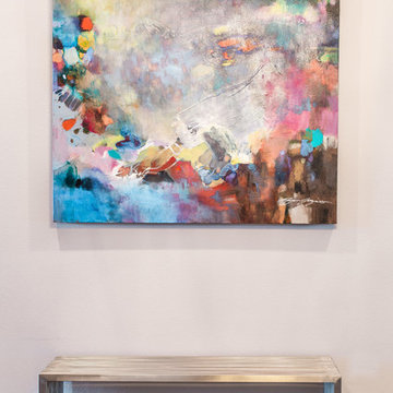
A transitional townhouse for a family with a touch of modern design and blue accents. When I start a project, I always ask a client to describe three words that they want to describe their home. In this instance, the owner asked for a modern, clean, and functional aesthetic that would be family-friendly, while also allowing him to entertain. We worked around the owner's artwork by Ryan Fugate in order to choose a neutral but also sophisticated palette of blues, greys, and green for the entire home. Metallic accents create a more modern feel that plays off of the hardware already in the home. The result is a comfortable and bright home where everyone can relax at the end of a long day.
Photography by Reagen Taylor Photography
Collaboration with lead designer Travis Michael Interiors
 Studio Ridge Residential
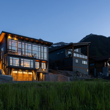
Epic is too small a word to describe the all-encompassing views from this mountainside aerie, with inspiring panoramic views for miles down the valley.
The mountain modern massing of the homes' exterior evolves to become more transitional on the interior to match our client's preference for a less edgy feel, complimented by creative moments where the "wow" factor was pushed up a notch such as the epic fireplace cladding details, the gutsy custom made coffee table and saturated colors which infuse the interior with an energy that reflects the owners personality.
35