
Search results for "Design weighing" in Home Design Ideas

 Shuler Architecture
This classic 1970's rambler was purchased by our clients as their 'forever' retirement home and as a gathering place for their large, extended family. Situated on a large, verdant lot, the house was burdened with extremely dated finishes and poorly conceived spaces. These flaws were more than offset by the overwhelming advantages of a single level plan and spectacular sunset views. Weighing their options, our clients executed their purchase fully intending to hire us to immediately remodel this structure for them.
Our first task was to open up this plan and give the house a fresh, contemporary look that emphasizes views toward Lake Washington and the Olympic Mountains in the distance. Our initial response was to recreate our favorite Great Room plan. This started with the elimination of a large, masonry fireplace awkwardly located in the middle of the plan and to then tear out all the walls. We then flipped the Kitchen and Dining Room and inserted a walk-in pantry between the Garage and new Kitchen location.
While our clients' initial intention was to execute a simple Kitchen remodel, the project scope grew during the design phase. We convinced them that the original ill-conceived entry needed a make-over as well as both bathrooms on the main level. Now, instead of an entry sequence that looks like an afterthought, there is a formal court on axis with an entry art wall that arrests views before moving into the heart of the plan. The master suite was updated by sliding the wall between the bedroom and Great Room into the family area and then placing closets along this wall - in essence, using these closets as an acoustical buffer between the Master Suite and the Great Room. Moving these closets then freed up space for a 5-piece master bath, a more efficient hall bath and a stacking washer/dryer in a closet at the top of the stairs.
 Shuler Architecture
This classic 1970's rambler was purchased by our clients as their 'forever' retirement home and as a gathering place for their large, extended family. Situated on a large, verdant lot, the house was burdened with extremely dated finishes and poorly conceived spaces. These flaws were more than offset by the overwhelming advantages of a single level plan and spectacular sunset views. Weighing their options, our clients executed their purchase fully intending to hire us to immediately remodel this structure for them.
Our first task was to open up this plan and give the house a fresh, contemporary look that emphasizes views toward Lake Washington and the Olympic Mountains in the distance. Our initial response was to recreate our favorite Great Room plan. This started with the elimination of a large, masonry fireplace awkwardly located in the middle of the plan and to then tear out all the walls. We then flipped the Kitchen and Dining Room and inserted a walk-in pantry between the Garage and new Kitchen location.
While our clients' initial intention was to execute a simple Kitchen remodel, the project scope grew during the design phase. We convinced them that the original ill-conceived entry needed a make-over as well as both bathrooms on the main level. Now, instead of an entry sequence that looks like an afterthought, there is a formal court on axis with an entry art wall that arrests views before moving into the heart of the plan. The master suite was updated by sliding the wall between the bedroom and Great Room into the family area and then placing closets along this wall - in essence, using these closets as an acoustical buffer between the Master Suite and the Great Room. Moving these closets then freed up space for a 5-piece master bath, a more efficient hall bath and a stacking washer/dryer in a closet at the top of the stairs.
 Shuler Architecture
This classic 1970's rambler was purchased by our clients as their 'forever' retirement home and as a gathering place for their large, extended family. Situated on a large, verdant lot, the house was burdened with extremely dated finishes and poorly conceived spaces. These flaws were more than offset by the overwhelming advantages of a single level plan and spectacular sunset views. Weighing their options, our clients executed their purchase fully intending to hire us to immediately remodel this structure for them.
Our first task was to open up this plan and give the house a fresh, contemporary look that emphasizes views toward Lake Washington and the Olympic Mountains in the distance. Our initial response was to recreate our favorite Great Room plan. This started with the elimination of a large, masonry fireplace awkwardly located in the middle of the plan and to then tear out all the walls. We then flipped the Kitchen and Dining Room and inserted a walk-in pantry between the Garage and new Kitchen location.
While our clients' initial intention was to execute a simple Kitchen remodel, the project scope grew during the design phase. We convinced them that the original ill-conceived entry needed a make-over as well as both bathrooms on the main level. Now, instead of an entry sequence that looks like an afterthought, there is a formal court on axis with an entry art wall that arrests views before moving into the heart of the plan. The master suite was updated by sliding the wall between the bedroom and Great Room into the family area and then placing closets along this wall - in essence, using these closets as an acoustical buffer between the Master Suite and the Great Room. Moving these closets then freed up space for a 5-piece master bath, a more efficient hall bath and a stacking washer/dryer in a closet at the top of the stairs.
Find the right local pro for your project
 Shuler Architecture
This classic 1970's rambler was purchased by our clients as their 'forever' retirement home and as a gathering place for their large, extended family. Situated on a large, verdant lot, the house was burdened with extremely dated finishes and poorly conceived spaces. These flaws were more than offset by the overwhelming advantages of a single level plan and spectacular sunset views. Weighing their options, our clients executed their purchase fully intending to hire us to immediately remodel this structure for them.
Our first task was to open up this plan and give the house a fresh, contemporary look that emphasizes views toward Lake Washington and the Olympic Mountains in the distance. Our initial response was to recreate our favorite Great Room plan. This started with the elimination of a large, masonry fireplace awkwardly located in the middle of the plan and to then tear out all the walls. We then flipped the Kitchen and Dining Room and inserted a walk-in pantry between the Garage and new Kitchen location.
While our clients' initial intention was to execute a simple Kitchen remodel, the project scope grew during the design phase. We convinced them that the original ill-conceived entry needed a make-over as well as both bathrooms on the main level. Now, instead of an entry sequence that looks like an afterthought, there is a formal court on axis with an entry art wall that arrests views before moving into the heart of the plan. The master suite was updated by sliding the wall between the bedroom and Great Room into the family area and then placing closets along this wall - in essence, using these closets as an acoustical buffer between the Master Suite and the Great Room. Moving these closets then freed up space for a 5-piece master bath, a more efficient hall bath and a stacking washer/dryer in a closet at the top of the stairs.

 AirField Systems, LLC
Market Center Station Grass Pave Fire Lane Kansas City, Kansas.
A grass pave project designed by AMR Architects Inc out of Little Rock, Arkansas and developed by Houston-based The Morgan Group Inc., Market Station is the largest new construction project erected in Downtown Kansas City since Quality Hill in 1984. AirPave was chosen as the solution for porous flexible paving in the 7,100 square foot grass pave fire lane.
AirPave is a synthetic porous paving and drainage system for grass fire lanes, flexible porous paving and swales. With over 400 installations AirPave is 233psi unfilled, 6747psi sand filled and is made of 100% recycled content which can contribute to LEED™ points. AirPave can ship more than 91,000 sqft per truck load and 798 sqft per pallet with each part weighing only 3.1 lbs. AirPave can save the owner up to $0.80 per square foot or more over our competitors.
Benefits of an AirPave Grass Paving System Include:
Incredible load bearing strength
Protects plant root systems
Slows stormwater runoff
Filters stormwater pollutants
Captures airborne dust and pollutants
Safely consumes moderate engine oil drippings
Reduces uncomfortably hot surface temperature
Increased oxygen production
Reduces or eliminates costly stormwater structures
Applications
Overflow Parking
Fire lanes
Event Parking
Driveways
Employee Parking
Utility Access
On-street Parking
Pedestrian Access
Handicap Parking
Emergency Access
Infiltration Basins
To discuss your grass pave construction project, call AirField Systems at (405) 359-3775.
 Shuler Architecture
This classic 1970's rambler was purchased by our clients as their 'forever' retirement home and as a gathering place for their large, extended family. Situated on a large, verdant lot, the house was burdened with extremely dated finishes and poorly conceived spaces. These flaws were more than offset by the overwhelming advantages of a single level plan and spectacular sunset views. Weighing their options, our clients executed their purchase fully intending to hire us to immediately remodel this structure for them.
Our first task was to open up this plan and give the house a fresh, contemporary look that emphasizes views toward Lake Washington and the Olympic Mountains in the distance. Our initial response was to recreate our favorite Great Room plan. This started with the elimination of a large, masonry fireplace awkwardly located in the middle of the plan and to then tear out all the walls. We then flipped the Kitchen and Dining Room and inserted a walk-in pantry between the Garage and new Kitchen location.
While our clients' initial intention was to execute a simple Kitchen remodel, the project scope grew during the design phase. We convinced them that the original ill-conceived entry needed a make-over as well as both bathrooms on the main level. Now, instead of an entry sequence that looks like an afterthought, there is a formal court on axis with an entry art wall that arrests views before moving into the heart of the plan. The master suite was updated by sliding the wall between the bedroom and Great Room into the family area and then placing closets along this wall - in essence, using these closets as an acoustical buffer between the Master Suite and the Great Room. Moving these closets then freed up space for a 5-piece master bath, a more efficient hall bath and a stacking washer/dryer in a closet at the top of the stairs.
 Twelve Stones Designs, LLC
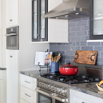
The owners of this kitchen had spent the money to upgrade the finishes in their kitchen upon building the home 12 years ago, but after living in the space for several years they realized how nonfunctional the layout really was. The (then) two preschool aged children had grown into busy, hungry teenagers with many friends who also liked to hang out at the house. So the family needed a more functional kitchen with better traffic flow, space for daily activities revolving around the kitchen at different times of day, and a kitchen that could accommodate cooking for and serving large groups. Furthermore, the dark, traditional finishes no longer reflected the homeowners’ style. They requested a brighter, more relaxed, coastal style that reflected their love of the seaside cities they like to visit.
Originally, the kitchen was U-shaped with a narrow island in the middle. The island created narrow aisles that bottle-necked at the dishwasher, refrigerator, and cooktop areas. There was a pass-through from the foyer into the kitchen, but the owners never liked that the pass-through was also located so close to the powder room. The awkward proximity was unappealing and made guests feel uncomfortable.
The kitchen’s storage was made up of lots of narrow cabinets, apothecary drawers, clipped corner units, and very few drawers. It lacked useful storage for the larger items the family used on a daily basis. And the kitchen’s only pantry was small closet that had only builder-grade, narrow shelving with no illumination to be able to see the contents inside.
Overall, the kitchen’s lighting plan was poorly executed. Only six recessed cans illuminated the entire kitchen and nook areas. The under cabinet lighting was not evenly distributed either. In fact, the builder had mis-placed the under cabinet lighting around the decorative pilasters which made for choppy, dark cubbies. Further, the builder didn’t include any lighting over the sink or the bar area, which meant whoever was doing the dishes was always in their own shadow. That, coupled with the steep overhang of the game room above made the bar area feel like a dim, cavernous space that wasn’t inviting or task oriented. The kitchen looked out into the main living space, but the raised bar and a narrow wall (which held the only large cabinet in the kitchen) created more of a barrier than a relationship to the living room or breakfast nook. In fact, one couldn’t even see the breakfast nook from the cooktop or sink areas due to its orientation. The raised bar top was too narrow to comfortably sit to either dine at or chat from due to the lack of knee space. The the homeowners confided that the kitchen felt more like a dark, dirty prison than place where the family, or their guests, wanted to gather and commune.
The clients' needs and desires were:
➢ to create a kitchen that would be a space the family loved to be in; to relate to the adjacent spaces all around, and to have better flow for entertaining large groups
➢ to remove the walls between the breakfast nook and living area and to be able to utilize the natural light from the windows in both those areas
➢ to incorporate a functional chopping block for prepping fresh food for home cooked meals, an island with a large sink and drain board, 2 pull out trash cans, and seating for at least the 2 teens to eat or do homework
➢ to design a kitchen and breakfast nook with an airy, coastal, relaxed vibe that blended with the rest of the house's coastal theme
➢ to integrate a layered lighting plan which would include ample general illumination, specific task lighting, decorative lighting, and lots of illuminated storage
➢ to design a kitchen with not only more storage for all the husband’s kitchen gadgets and collection of oils and spices, but smart storage, including a coffee/breakfast bar and a place to store and conceal the toaster oven and microwave
➢ to find a way to utilize the large open space between the kitchen, pantry area, and breakfast nook
Twelve Stones Designs achieved the owner's goals by:
➢ removing the walls between the kitchen and living room to allow the natural light to filter in from the adjacent rooms and to create a connection between the kitchen, nook, and living spaces for a sense of unity and communion
➢ removing the existing pantry and designing 3 large pantry style cabinets with LED tape lights and rollout drawers to house lots of kitchen appliances, gadgets, and tons of groceries. We also took the cabinets all the way up to the 9’ ceiling for additional storage for seasonal items and bulk storage.
➢ designing 2 islands - 1 with a gorgeous black walnut chopping block that houses a drawer for chopping and carving knives and a custom double pull out trash unit for point of use utilization - and 1 that houses the dishwasher, a large Blanco Gourmet sink with integrated drain board, woven baskets for fresh root vegetables and kitchen towels, plenty of drawer storage for kitchen items, and bar seating for up to 4 diners.
➢ closing off the space between the kitchen and the powder room to create a beautiful new private alcove for the powder room as well as adding some decorative storage. This also gave us space to include more tall storage near the new range for precision placement of the husband’s extensive oil and spice collection as well as a location for a combo-steam oven the wife wanted for baking and cooking healthy meals.
The project is enhanced functionally by:
➢ incorporated USB and standard receptacles for the kids’ laptops and phone charging in the large island
➢ designing the small island to include additional open shelving for items used on a daily basis such as a variety of bowls, plates, and colanders. This set up also works well for the husband who prefers to “plate” his dinners in restaurant-style fashion before presenting them to the table.
➢ the integration of specific storage units, such as double stacked cutlery drawers, a custom spice pull-out, a Kuerig coffee and tea pod drawer, and custom double stacked utensil drawers
➢ moving the refrigerator to the old oven location - this eliminated the bottle neck as well as created a better relationship to the eating table. It also utilizes the floor space between the pantry, nook, and kitchen
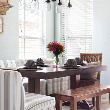
➢ creating a banquet style breakfast nook - this banquette seating not only doubles the amount of seating for large gatherings but it better utilizes the odd space between the kitchen and the previous nook area. It also helps to create a distinct pathway from the mudroom room through the pantry area, kitchen, nook, and living room.
➢ the coffee/breakfast bar area which includes the perfect location for the concealed microwave and toaster oven, convenient storage for the coffee pods and tea accoutrements. Roll-out drawers below also house the smoothie maker, hot water kettle, and a plethora of smoothie-making ingredients such as protein powders, smoothie additives, etc. Furthermore, the drawers below the Keurig house measuring utensil, cutlery, baking supplies and tupperware storage.
➢ incorporating lots of wide drawers and pullouts to accommodate large cookware.
➢ utilizing as much vertical space as possible by building storage to the ceiling which accommodates the family’s abundant amount of serving platters, baking sheets, bakeware, casserole dishes, and additional cutting boards.
The project is enhanced aesthetically by:
➢ new 5-piece Versailles pattern porcelain tile that now seamlessly joins the entire down stairs area together creating a bright, cohesiveness feeling instead of choppy separated spaces - it also adds a coastal feeling
➢ designing a cabinet to conceal the microwave and toaster oven
➢ the coastal influenced light fixtures over the nook table and island
➢ the sandy colors of the Langdon Cambria countertops. The swirling pattern and sparkling quartz pieces remind the homeowner of black-and-tan sandy beaches
➢ the striped banquet seating whose creamy white background and blue-green stripes were the inspiration for the cabinet and wall colors.
➢ All the interior doors were painted black to coordinate with the blacks and grays in the backsplash tile and countertop. This also adds a hint of tailored formality to an otherwise casual space.
➢ the use of WAC's Oculux small aperture LED units for the overhead lighting complimented with Diode LED strips for task lighting under the cabinets and inside the pantry and glass wall cabinets. All of the lighting applications are on separate dimmer switches.
Innovative uses of materials or construction methods by Realty Restoration LLC:
➢ Each 1-1/2” x 3” block of reclaimed end-grain black walnut that makes up the center island chopping block was hand milled and built in the shop. It was designed to look substantial and proportional to the surrounding elements, executed by creating the 4 inch tall top with a solid wood chamfered edge band.
➢ The metal doors on either side of the vent hood were also custom designed for this project and built in the Realty Restoration LLC shop. They are made 1x2, 11-gauge mild steel with ribbed glass. Weighing 60 lbs a piece, heavy duty cabinet hinges were added to support the weight of the door and keep them from sagging.
➢ Under-cabinet receptacles were added along the range wall in order to have a clean, uninterrupted backsplash.
Design obstacles to overcome:
➢ Because we were removing the demising walls between the kitchen and living room, we had to find a way to plumb and vent the new island. We did this by tunneling through the slab (the slab had post tension cables which prevented us from just trenching) to run a new wet vent through a nearby structural wall. We pulled the existing hot and cold lines between upper floor joists and ran them down the structural wall as well and up through a conduit in the tunnel.
➢ Since we were converting from wall overs to a gas range it allowed us to utilize the 220 feed for the wall ovens to provide a new sub panel for all the new kitchen circuits
➢ Due to framing deficiencies inherited from the original build there was a 1-1/2” differential in the floor-to-ceiling height over a 20 foot span; by utilizing the process of cutting and furring coupled with the crown moulding details on the cabinet elevations we were able to mask the problem and provide seamless transitions between the cabinet components.
Evidence of superior craftsmanship:
➢ uniquely designed, one-of-a-kind metal “X” end panels on the large island. The end panels were custom made in the Realty Restoration LLC shop and fitted to the exact dimensions of the island. The welding seams are completely indistinguishable - the posts look like they are cut from a single sheet of metal
➢ square metal posts on the small island were also custom made and designed to compliment and carry through the metal element s throughout the kitchen
➢ the beautiful, oversized end panels on the pantry cabinets which give the breakfast nook a tailored look
➢ integrating a large format 5 piece Versailles tile pattern to seamlessly flow from the existing spaces into the new kitchen space
➢ By constructing a custom cabinet that jogged around a corner we could not remodel (housing the entry way coat closet) we were able to camouflage the adjacent wall offset within the upper and lower cabinets. By designing around the existing jog in the structural walls we accomplished a few things: we were able to find the space to house, and hide, the microwave and toaster oven yet still have a clean cohesive appearance from the kitchen side. Additionally, the owners were able to keep their much needed coat closet and we didn’t have to increase the budget with unnecessary structural work.
Sponsored
Columbus, OH

Hope Restoration & General Contracting
Columbus Design-Build, Kitchen & Bath Remodeling, Historic Renovations

 FOUR POINT DESIGN BUILD INC
LOFT | Luxury Industrial Loft Makeover Downtown LA | FOUR POINT DESIGN BUILD INC
A gorgeous and glamorous 687 sf Loft Apartment in the Heart of Downtown Los Angeles, CA. Small Spaces...BIG IMPACT is the theme this year: A wide open space and infinite possibilities. The Challenge: Only 3 weeks to design, resource, ship, install, stage and photograph a Downtown LA studio loft for the October 2014 issue of @dwellmagazine and the 2014 @dwellondesign home tour! So #Grateful and #honored to partner with the wonderful folks at #MetLofts and #DwellMagazine for the incredible design project!
Photography by Riley Jamison
#interiordesign #loftliving #StudioLoftLiving #smallspacesBIGideas #loft #DTLA
AS SEEN IN
Dwell Magazine
LA Design Magazine
 Shuler Architecture
This classic 1970's rambler was purchased by our clients as their 'forever' retirement home and as a gathering place for their large, extended family. Situated on a large, verdant lot, the house was burdened with extremely dated finishes and poorly conceived spaces. These flaws were more than offset by the overwhelming advantages of a single level plan and spectacular sunset views. Weighing their options, our clients executed their purchase fully intending to hire us to immediately remodel this structure for them.
Our first task was to open up this plan and give the house a fresh, contemporary look that emphasizes views toward Lake Washington and the Olympic Mountains in the distance. Our initial response was to recreate our favorite Great Room plan. This started with the elimination of a large, masonry fireplace awkwardly located in the middle of the plan and to then tear out all the walls. We then flipped the Kitchen and Dining Room and inserted a walk-in pantry between the Garage and new Kitchen location.
While our clients' initial intention was to execute a simple Kitchen remodel, the project scope grew during the design phase. We convinced them that the original ill-conceived entry needed a make-over as well as both bathrooms on the main level. Now, instead of an entry sequence that looks like an afterthought, there is a formal court on axis with an entry art wall that arrests views before moving into the heart of the plan. The master suite was updated by sliding the wall between the bedroom and Great Room into the family area and then placing closets along this wall - in essence, using these closets as an acoustical buffer between the Master Suite and the Great Room. Moving these closets then freed up space for a 5-piece master bath, a more efficient hall bath and a stacking washer/dryer in a closet at the top of the stairs.
 Shuler Architecture
This classic 1970's rambler was purchased by our clients as their 'forever' retirement home and as a gathering place for their large, extended family. Situated on a large, verdant lot, the house was burdened with extremely dated finishes and poorly conceived spaces. These flaws were more than offset by the overwhelming advantages of a single level plan and spectacular sunset views. Weighing their options, our clients executed their purchase fully intending to hire us to immediately remodel this structure for them.
Our first task was to open up this plan and give the house a fresh, contemporary look that emphasizes views toward Lake Washington and the Olympic Mountains in the distance. Our initial response was to recreate our favorite Great Room plan. This started with the elimination of a large, masonry fireplace awkwardly located in the middle of the plan and to then tear out all the walls. We then flipped the Kitchen and Dining Room and inserted a walk-in pantry between the Garage and new Kitchen location.
While our clients' initial intention was to execute a simple Kitchen remodel, the project scope grew during the design phase. We convinced them that the original ill-conceived entry needed a make-over as well as both bathrooms on the main level. Now, instead of an entry sequence that looks like an afterthought, there is a formal court on axis with an entry art wall that arrests views before moving into the heart of the plan. The master suite was updated by sliding the wall between the bedroom and Great Room into the family area and then placing closets along this wall - in essence, using these closets as an acoustical buffer between the Master Suite and the Great Room. Moving these closets then freed up space for a 5-piece master bath, a more efficient hall bath and a stacking washer/dryer in a closet at the top of the stairs.
 AirField Systems, LLC
AirPave Reinforced Turf for Montessori School in Houston
AirPave Reinforced Turf flexible porous paving and drainage system for grass fire lanes, reinforced turf paving and swales. With over 400 installations AirPave is 233psi unfilled, 6747psi sand filled and is made of 100% recycled content which can contribute to LEED™ points. AirPave can ship more than 91,000 sqft per truck load and 798 sqft per pallet with each part weighing only 3.1 lbs.
CSI# 32 12 43 or 32 14 43
Benefits of an AirPave grass paving system include:
• A 40% or more material cost savings over our nearest competitor and over 1,000 more PSI
• Up to 45% cost savings on shipping, compared with rolled grass paving systems
• AirPave has been installed in over 400 flexible porous paving projects
• 100% recycled injection-molded copolymer polypropylene plastic units with an impact modifier added to achieve a (NO-BREAK) plastics classification and a minimum 3% carbon black added for UV protection
• Loading capability is equal to 233 psi empty capacity and 6,747 psi when filled with clean sharp sand, over an appropriate base depth that provides adequate support for project design loads.
• AirPave is shipped palletized at 7 sq. ft. per part 114 parts per pallet and approximately 795 sq. ft. per pallet. Unit weight = 3.10 lbs, volume = 8% solid
Please Contact AirField Systems with any Reinforced Turf questions… 405-359-3775

 Chelsea Sullivan Design
High end residential landscape design and installation in Pacific Palisades. We reimagined hardscape, landscape, outdoor entertainment space, custom fountain, garden entrance with water tolerant planting. Huntington garden cycads procured for a one of a kind design.

 Lori Jolin Design, LLC.
Sutter Photographers
The Hardware Studio - hardware
Martinwood Cabinetry - millwork
Studio GlassWorks - glass countertop
Window Design Center - awning window
Nonn's Showplace - quartz, granite countertops
• The most difficult part of the project was figuring out all the technical details to install the glass counter-top, which would weigh about 300 pounds!
• One goal was to avoid seeing the cabinet supports through the glass. The glass itself proposed problems because it had a wavy texture and separate confetti glass that could be added to the bottom. Therefore, we needed to add something below it.
• A custom steel base was designed to carry the weight yet float the glass so you are able to see the beauty of the glass itself. A small 1/2 inch trim piece on the steel was added to accomplish this task.
• Once the steel was made, we took it to the glass distributor. We turned the very heavy base upside down, traced the 1/2 inch trim piece on a full size piece of paper, and sent it to the glass manufacturer.
• After this, the base was sent to a powder coater and the raw steel was transformed into a beautiful champagne color.
• In the meantime, the glass manufacturer molded a channel for the glass to rest that would suspend the glass 1/2 inch higher than the powder coated steel base.
• The glass manufacturer was instructed to make the top of the glass smooth so it would hold a plate without rocking; they added an extra layer of 1/4 inch glass after it was fired the first time to accomplish this.
• When the base was brought to the job site, the carpenter installed a thick 6 inch block of wood through the tile and into the floor joists. The hollow 6 inch square base of the steel table was glued and screwed into the wood. The base was leveled and ready for the top to arrive several days later.
• The glass installers put it over the base, and it fit PERFECTLY! (whew)
• The steel base is 3 inches smaller than the glass, creating a see-through effect around the entire perimeter of the kidney bean shape.
• The granite was then templated by using a
specialized camera that measured the curve of the glass. However, upon arrival, the fit was less than perfect. Thanks to a patient and skilled granite installer from Nonn's Showroom who spent several hours hand grinding and polishing the curve on site until it fit perfectly.
• A small bead of silicone between the granite and the glass was all that was needed to complete the perfect installation.
• With a few shims under the end of the granite, the top is perfectly level!
• Our client was extremely excited and very patient with the process because they trusted our abilities so that the end result would be spectacular.
Sponsored
Columbus, OH
Hope Restoration & General Contracting
Columbus Design-Build, Kitchen & Bath Remodeling, Historic Renovations

 Outwater Industries Inc
Ideally suited for use on balconies, porches and decking, Outwater has augmented its offering of contractor's grade balusters, baluster rails, newel and porch posts with the introduction of new motifs to accommodate a range of decorative applications.
Comprising lightweight, durable, high-density polyurethane and non-corrosive structural materials, Outwater's Balustrade System is easy to install using traditional woodworking tools and is internally fortified with large diameter, high strength steel or PVC pipes (varies by model) for enhanced structural integrity as well as to meet stringent building codes.
Furthermore, unlike wood balusters, which require fastidious maintenance in order to avoid possible rotting or splitting, consequently diminishing their strength, Outwater's Balustrade System comes factory primed and is impervious to adverse weather conditions, ensuring its uncompromising dimensional stability and steadfast, enduring safety.
Also, in contrast to cement balustrading, which is unwieldy and necessitates laborious installation by masons, not to mention, being highly susceptible to breaking, crumbling and cracking, Outwater's Balustrade System weighs just a portion of cement balustrading, thus significantly reducing its comparative shipping cost.
Offered in approximate heights from 28-in. to 40-in. with 5-in. to 12-in. rail widths, installations can be further customized with the addition of corner and center newel posts, a variety of post tops, accent moldings and ball ornaments.
Product Features:
• Offered with numerous complementary Balusters, Baluster Rails, Newel and Porch Posts from which to choose
• Easy to install without the need of a mason
• Internally fortified with large diameter, high strength steel or PVC pipes for enhanced structural integrity to meet stringent building codes
• Comes factory primed and is impervious to adverse weather conditions
• Weighs just a portion of cement balustrading, thus significantly reducing its comparative shipping cost
• Offered in approximate heights from 28-in. to 40-in. with 5-in. to 12-in. rail widths
• Complementary accessories allow for further customization as desired
Contact:
Architectural Products by Outwater
Sales & Product Information (USA & Canada):
1-800-631-8375 / 1-201-498-8750
Fax (USA & Canada): 1-800-888-3315 / 1-201-498-8751
Sales & Product Information (Outside of the USA & Canada):
1-201-498-8750
Fax (Outside of the USA & Canada): 1-201-498-8751
Email: info@outwaterplastics.com
Web: www.outwater.com
Visit us!
East Coast:
24 River Road
Bogota, NJ 07603
1-201-498-8750
West Coast:
4720 West Van Buren
Phoenix, AZ 85043
1-602-447-0936
About Architectural Products by Outwater:
It really is easy to shop with us!
Relied upon by more than 1,000,000 builders, renovators, architects designers, woodworkers, cabinet and furniture manufacturers, OEM's and retail consumers since 1972, Architectural Products by Outwater is an international manufacturer and distributor of more than 65,000 innovative and traditional Decorative Building Products that you possibly never knew existed or for which you simply could not find a reliable source. This is where Outwater truly shines!
“Now you can design, buy, build and dream like the Pros…”
Outwater’s products are, to say the least, very competitively priced and include interior and exterior architectural mouldings and millwork; columns and capitals; LED lighting and lighting accessories; balustrading; faux stone panels; faux wood beams; genuine stone tiles; decorative wood carvings; wrought iron components; stamped steel and polymer ceiling panels and backsplashes; wainscoting; wall coverings; fireplace surrounds and mantels; plastic "glass" block; period and contemporary hardware; home organization systems; kitchen and bath accessories; kitchen and bath cabinetry; bath vanities; furniture & cabinet components; knobs & pulls; casters; laminates; brass tubing & fittings; surfacing materials… and so much more!
In addition, with warehouse and distribution facilities in New Jersey and Arizona totaling over 300,000 square feet, Outwater facilitates purchases with reduced lead times and shipping costs, enabling us to fulfill and ship over 98% of our orders from stock within one to two business days!
At a time when many companies appear to have rapidly transitioned away from personalized customer service, having replaced their knowledgeable and immensely valuable human sales representatives with inanimate online marketing channels, which can be helpful to you if you were to know exactly what you might need and were not to encounter difficulties in placing your order, here at Outwater, we still believe that human interaction with a live, well versed, non-commissioned sales representative will undoubtedly better serve your needs in the long run. Even though you can always shop with us at www.outwater.com, you can also always deal directly with our extremely well versed and friendly sales and customer service representatives for their unparalleled support and assistance, most of whom have worked at Outwater for more than 15 years.
Whether you have been one of our loyal customers over the years or this is your first time in doing business with us, we would like to thank you for your expressed interest in our company and the products that we carry.
Please feel free to contact us with any questions at 1-800-631-8375 or visit us online at www.outwater.com
We look forward to serving you in the near future.
 Longjin Craft
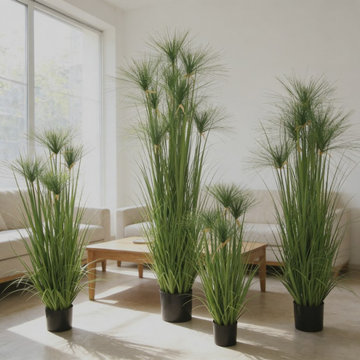
The Art of Wholesale Artificial Grass Potted Plants The demand is skyrocketing. A recent report shows a staggering 35% increase in the wholesale market for artificial potted plants in the last two years. How did we get here? DIY enthusiasts and retail designers alike are gravitating toward artificial options like never before. For instance, a pop-up shop in Austin showcased Longjin Craft’s artificial pampas grass, achieving record sales within the first week. Just imagine the impact such products can have on urban spaces where natural greenery struggles to thrive. Quality varies significantly. Some manufacturers cut corners, using inferior materials that fade or crumble within months. In stark contrast, premium brands such as Longjin Craft utilize advanced UV-resistant technology, ensuring durability and vibrant colors. The weight of high-quality polymer can feel surprising when comparing. Light as a feather? Not exactly. Some high-end options weigh substantially more, signifying their robust build. Trends and Innovations in the Market What’s trending? Sustainability, of course! Buyers are more eco-conscious. Reports indicate over 50% of consumers prefer brands that highlight their sustainability practices. Enter the world of recyclable artificial plants. Brands are innovating, shifting materials from merely synthetic to environmentally friendly composites. How can you not be impressed by this shift? The future looks greener—ironically speaking. Retailers are embracing unique selling propositions to set their brands apart. Take, for example, customizable potted plant arrangements. Imagine a landscape designer creating a bespoke setup featuring various plant species, with artificial variants like those from Longjin Craft fitting seamlessly into the surroundings. It’s a game-changer, keeping costs down while making spaces visually stunning. Practical Applications in Design Interior design is evolving. From coffee shops to luxury hotels, artificial potted grass is popping up everywhere. One case study revealed that a Southern California cafe increased customer dwell time by 25% after introducing strategically placed artificial plants. Imagine sipping your latte surrounded by lush greenery—all without the maintenance headaches. Commercial settings also benefit massively. Large office complexes are opting for artificial potted plants to create inviting environments. The rationale? Reduces maintenance costs and boosts employee morale. Can you believe a single office could save thousands annually by replacing natural greenery with artificial options? Longjin Craft has increasingly become a go-to choice for these installations, thanks to their reputation for striking aesthetics and quality.

 Staci Munic Interiors
North Shore Residence VIII. Should I stay or should I go?
This beautiful, loving family moved into their suburban home when their kids were toddlers and forged friendships and a strong connection to their neighborhood. The time came when they were faced with the decision and the question, “Do we invest in and renovate our kitchen and master suite, or do we move?” These clients were my second, and have been with me since day one. They called upon me to redecorate their dining room and family room 7 years ago, and we met and talked several times weighing the pros and cons of investing in their home or investing in a move. Ultimately, they decided to stay, and here is a glimpse into what we created together with their architect and builder.
Their home has a traditional lay out with a kitchen that connects to the dining room. We purposely designed the dining room to have an inviting, casual yet elegant aesthetic 7 years ago…..a dining room that could also function as a family kitchen table, a homework space, a cozy and also generously proportioned shabbat dinner invite the neighbors over space, and would eventually welcome an updated kitchen.
Our client contemplated replacing their existing kitchen wood floor with tile, but we decided to preserve and refinish the wood floor to add continuity and warmth to the entire first floor. Because the kitchen was adjacent to the dining room, and not to the family room, changing the floor to tile would have created a fragmented feeling, and our goal was to create cohesiveness. Because the kitchen opens to the outdoor living space and swimming pool, wood is not typically ideal with wet slippery feet, but we went for it, and they are happy we did!
We are mixed metal fans, and love to play with scale. Behold the voluptuous island pendants, chunky island countertop, satin bras modern hex pulls and knobs, and a combo of cerused white perimeter flat panel cabinets with a gray shaker island. Our client desired to conceal the clutter, so the walk in pantry and appliance garages came into play. The open floating shelves above the “desert bar” add visual interest and a place for family photos.
We added a home office/man cave for the hubby and a dreamy walk in closet for the wifey along with an upstairs laundry room and zen spa master bath complete with a steam shower, water closet that allows for TV viewing from the vanity mirror, a soaking tub, and a coffee bar by creating a dormering the ceiling above the garage and converting attic space.
Stay tuned for photos of the finished master bathroom. We are currently working on their living room and foyer…….excited to share the progress with you!

 Kitchen Design Concepts
We really opened up and reorganized this kitchen to give the clients a more modern update and increased functionality and storage. The backsplash is a main focal point and the color palette is very sleek while being warm and inviting.
Cabinetry: Ultracraft Destiny, Avon door in Arctic White on the perimeter and Mineral Grey on the island and bar shelving
Hardware: Hamilton-Bowes Ventoux Pull in satin brass
Counters: Aurea Stone Divine, 3cm quartz
Sinks: Blanco Silgranit in white, Precis super single bowl with Performa single in bar
Faucets: California Faucets Poetto series in satin brass, pull down and pull-down prep faucet in bar, matching cold water dispenser, air switch, and air gap
Pot filler: Newport Brass East Linear in satin brass
Backsplash tile: Marble Systems Mod-Glam collection Blocks mosaic in glacier honed - snow white polished - brass accents behind range and hood, using 3x6 snow white as field tile in a brick lay
Appliances: Wolf dual fuel 48" range w/ griddle, 30" microwave drawer, 24" coffee system w/ trim; Best Cologne series 48" hood; GE Monogram wine chiller; Hoshizaki stainless ice maker; Bosch benchmark series dishwasher
Sponsored
Westerville, OH

Custom Home Works
Franklin County's Award-Winning Design, Build and Remodeling Expert

 Warm Timber Saunas & Wine Cellars
This previously unused attic space is now a sauna/yoga room. The left sauna wall follows the attic rafters down diagonally to allow a wider space for leg room on the twin sauna benches.
 Twelve Stones Designs, LLC
The owners of this kitchen had spent the money to upgrade the finishes in their kitchen upon building the home 12 years ago, but after living in the space for several years they realized how nonfunctional the layout really was. The (then) two preschool aged children had grown into busy, hungry teenagers with many friends who also liked to hang out at the house. So the family needed a more functional kitchen with better traffic flow, space for daily activities revolving around the kitchen at different times of day, and a kitchen that could accommodate cooking for and serving large groups. Furthermore, the dark, traditional finishes no longer reflected the homeowners’ style. They requested a brighter, more relaxed, coastal style that reflected their love of the seaside cities they like to visit.
Originally, the kitchen was U-shaped with a narrow island in the middle. The island created narrow aisles that bottle-necked at the dishwasher, refrigerator, and cooktop areas. There was a pass-through from the foyer into the kitchen, but the owners never liked that the pass-through was also located so close to the powder room. The awkward proximity was unappealing and made guests feel uncomfortable.
The kitchen’s storage was made up of lots of narrow cabinets, apothecary drawers, clipped corner units, and very few drawers. It lacked useful storage for the larger items the family used on a daily basis. And the kitchen’s only pantry was small closet that had only builder-grade, narrow shelving with no illumination to be able to see the contents inside.
Overall, the kitchen’s lighting plan was poorly executed. Only six recessed cans illuminated the entire kitchen and nook areas. The under cabinet lighting was not evenly distributed either. In fact, the builder had mis-placed the under cabinet lighting around the decorative pilasters which made for choppy, dark cubbies. Further, the builder didn’t include any lighting over the sink or the bar area, which meant whoever was doing the dishes was always in their own shadow. That, coupled with the steep overhang of the game room above made the bar area feel like a dim, cavernous space that wasn’t inviting or task oriented. The kitchen looked out into the main living space, but the raised bar and a narrow wall (which held the only large cabinet in the kitchen) created more of a barrier than a relationship to the living room or breakfast nook. In fact, one couldn’t even see the breakfast nook from the cooktop or sink areas due to its orientation. The raised bar top was too narrow to comfortably sit to either dine at or chat from due to the lack of knee space. The the homeowners confided that the kitchen felt more like a dark, dirty prison than place where the family, or their guests, wanted to gather and commune.
The clients' needs and desires were:
➢ to create a kitchen that would be a space the family loved to be in; to relate to the adjacent spaces all around, and to have better flow for entertaining large groups
➢ to remove the walls between the breakfast nook and living area and to be able to utilize the natural light from the windows in both those areas
➢ to incorporate a functional chopping block for prepping fresh food for home cooked meals, an island with a large sink and drain board, 2 pull out trash cans, and seating for at least the 2 teens to eat or do homework
➢ to design a kitchen and breakfast nook with an airy, coastal, relaxed vibe that blended with the rest of the house's coastal theme
➢ to integrate a layered lighting plan which would include ample general illumination, specific task lighting, decorative lighting, and lots of illuminated storage
➢ to design a kitchen with not only more storage for all the husband’s kitchen gadgets and collection of oils and spices, but smart storage, including a coffee/breakfast bar and a place to store and conceal the toaster oven and microwave
➢ to find a way to utilize the large open space between the kitchen, pantry area, and breakfast nook
Twelve Stones Designs achieved the owner's goals by:
➢ removing the walls between the kitchen and living room to allow the natural light to filter in from the adjacent rooms and to create a connection between the kitchen, nook, and living spaces for a sense of unity and communion
➢ removing the existing pantry and designing 3 large pantry style cabinets with LED tape lights and rollout drawers to house lots of kitchen appliances, gadgets, and tons of groceries. We also took the cabinets all the way up to the 9’ ceiling for additional storage for seasonal items and bulk storage.
➢ designing 2 islands - 1 with a gorgeous black walnut chopping block that houses a drawer for chopping and carving knives and a custom double pull out trash unit for point of use utilization - and 1 that houses the dishwasher, a large Blanco Gourmet sink with integrated drain board, woven baskets for fresh root vegetables and kitchen towels, plenty of drawer storage for kitchen items, and bar seating for up to 4 diners.
➢ closing off the space between the kitchen and the powder room to create a beautiful new private alcove for the powder room as well as adding some decorative storage. This also gave us space to include more tall storage near the new range for precision placement of the husband’s extensive oil and spice collection as well as a location for a combo-steam oven the wife wanted for baking and cooking healthy meals.
The project is enhanced functionally by:
➢ incorporated USB and standard receptacles for the kids’ laptops and phone charging in the large island
➢ designing the small island to include additional open shelving for items used on a daily basis such as a variety of bowls, plates, and colanders. This set up also works well for the husband who prefers to “plate” his dinners in restaurant-style fashion before presenting them to the table.
➢ the integration of specific storage units, such as double stacked cutlery drawers, a custom spice pull-out, a Kuerig coffee and tea pod drawer, and custom double stacked utensil drawers
➢ moving the refrigerator to the old oven location - this eliminated the bottle neck as well as created a better relationship to the eating table. It also utilizes the floor space between the pantry, nook, and kitchen
➢ creating a banquet style breakfast nook - this banquette seating not only doubles the amount of seating for large gatherings but it better utilizes the odd space between the kitchen and the previous nook area. It also helps to create a distinct pathway from the mudroom room through the pantry area, kitchen, nook, and living room.
➢ the coffee/breakfast bar area which includes the perfect location for the concealed microwave and toaster oven, convenient storage for the coffee pods and tea accoutrements. Roll-out drawers below also house the smoothie maker, hot water kettle, and a plethora of smoothie-making ingredients such as protein powders, smoothie additives, etc. Furthermore, the drawers below the Keurig house measuring utensil, cutlery, baking supplies and tupperware storage.
➢ incorporating lots of wide drawers and pullouts to accommodate large cookware.
➢ utilizing as much vertical space as possible by building storage to the ceiling which accommodates the family’s abundant amount of serving platters, baking sheets, bakeware, casserole dishes, and additional cutting boards.
The project is enhanced aesthetically by:
➢ new 5-piece Versailles pattern porcelain tile that now seamlessly joins the entire down stairs area together creating a bright, cohesiveness feeling instead of choppy separated spaces - it also adds a coastal feeling
➢ designing a cabinet to conceal the microwave and toaster oven
➢ the coastal influenced light fixtures over the nook table and island
➢ the sandy colors of the Langdon Cambria countertops. The swirling pattern and sparkling quartz pieces remind the homeowner of black-and-tan sandy beaches
➢ the striped banquet seating whose creamy white background and blue-green stripes were the inspiration for the cabinet and wall colors.
➢ All the interior doors were painted black to coordinate with the blacks and grays in the backsplash tile and countertop. This also adds a hint of tailored formality to an otherwise casual space.
➢ the use of WAC's Oculux small aperture LED units for the overhead lighting complimented with Diode LED strips for task lighting under the cabinets and inside the pantry and glass wall cabinets. All of the lighting applications are on separate dimmer switches.
Innovative uses of materials or construction methods by Realty Restoration LLC:
➢ Each 1-1/2” x 3” block of reclaimed end-grain black walnut that makes up the center island chopping block was hand milled and built in the shop. It was designed to look substantial and proportional to the surrounding elements, executed by creating the 4 inch tall top with a solid wood chamfered edge band.
➢ The metal doors on either side of the vent hood were also custom designed for this project and built in the Realty Restoration LLC shop. They are made 1x2, 11-gauge mild steel with ribbed glass. Weighing 60 lbs a piece, heavy duty cabinet hinges were added to support the weight of the door and keep them from sagging.
➢ Under-cabinet receptacles were added along the range wall in order to have a clean, uninterrupted backsplash.
Design obstacles to overcome:
➢ Because we were removing the demising walls between the kitchen and living room, we had to find a way to plumb and vent the new island. We did this by tunneling through the slab (the slab had post tension cables which prevented us from just trenching) to run a new wet vent through a nearby structural wall. We pulled the existing hot and cold lines between upper floor joists and ran them down the structural wall as well and up through a conduit in the tunnel.
➢ Since we were converting from wall overs to a gas range it allowed us to utilize the 220 feed for the wall ovens to provide a new sub panel for all the new kitchen circuits
➢ Due to framing deficiencies inherited from the original build there was a 1-1/2” differential in the floor-to-ceiling height over a 20 foot span; by utilizing the process of cutting and furring coupled with the crown moulding details on the cabinet elevations we were able to mask the problem and provide seamless transitions between the cabinet components.
Evidence of superior craftsmanship:
➢ uniquely designed, one-of-a-kind metal “X” end panels on the large island. The end panels were custom made in the Realty Restoration LLC shop and fitted to the exact dimensions of the island. The welding seams are completely indistinguishable - the posts look like they are cut from a single sheet of metal
➢ square metal posts on the small island were also custom made and designed to compliment and carry through the metal element s throughout the kitchen
➢ the beautiful, oversized end panels on the pantry cabinets which give the breakfast nook a tailored look
➢ integrating a large format 5 piece Versailles tile pattern to seamlessly flow from the existing spaces into the new kitchen space
➢ By constructing a custom cabinet that jogged around a corner we could not remodel (housing the entry way coat closet) we were able to camouflage the adjacent wall offset within the upper and lower cabinets. By designing around the existing jog in the structural walls we accomplished a few things: we were able to find the space to house, and hide, the microwave and toaster oven yet still have a clean cohesive appearance from the kitchen side. Additionally, the owners were able to keep their much needed coat closet and we didn’t have to increase the budget with unnecessary structural work.
 Lori Jolin Design, LLC.
Sutter Photographers
The Hardware Studio - hardware
Martinwood Cabinetry - millwork
Studio GlassWorks - glass countertop
Window Design Center - awning window
Nonn's Showplace - quartz, granite countertops
• The most difficult part of the project was figuring out all the technical details to install the glass counter-top, which would weigh about 300 pounds!
• One goal was to avoid seeing the cabinet supports through the glass. The glass itself proposed problems because it had a wavy texture and separate confetti glass that could be added to the bottom. Therefore, we needed to add something below it.
• A custom steel base was designed to carry the weight yet float the glass so you are able to see the beauty of the glass itself. A small 1/2 inch trim piece on the steel was added to accomplish this task.
• Once the steel was made, we took it to the glass distributor. We turned the very heavy base upside down, traced the 1/2 inch trim piece on a full size piece of paper, and sent it to the glass manufacturer.
• After this, the base was sent to a powder coater and the raw steel was transformed into a beautiful champagne color.
• In the meantime, the glass manufacturer molded a channel for the glass to rest that would suspend the glass 1/2 inch higher than the powder coated steel base.
• The glass manufacturer was instructed to make the top of the glass smooth, so it would hold a plate without rocking; they added an extra layer of 1/4 inch glass after it was fired the first time to accomplish this.
• When the base was brought to the job site, the carpenter installed a thick 6 inch block of wood through the tile and into the floor joists. The hollow 6 inch square base of the steel table was glued and screwed into the wood. The base was leveled and ready for the top to arrive several days later.
• The glass installers put it over the base, and it fit PERFECTLY! (whew)
• The steel base is 3 inches smaller than the glass, creating a see-through effect around the entire perimeter of the kidney bean shape.
• The granite was then templated by using a specialized camera that measured the curve of the glass. However, upon arrival, the fit was less than perfect. Thanks to a patient and skilled granite installer from Nonn's Showplace spent several hours hand grinding and polishing the curve on site until it fit perfectly.
• A small bead of silicone between the granite and the glass was all that was needed to complete the perfect installation.
• With a few shims under the end of the granite, the top is perfectly level!
• Our client was extremely excited and very patient with the process because they trusted our abilities so that the end result would be spectacular.
27