
Search results for "Determination" in Home Design Ideas


 The Myers Touch
THE BRIEF
Lengthy consultations with the client and her family over an 18 month period (during which a well was discovered underneath the foundations) revealed their relaxed approach to living and desire for a modern-classic look. The shape of the room and the request for 5 domino hobs determined the need for a large and sociable island. It was also important to provide the perfect place for the family to gather whilst mum cooks. A large kitchen sink was particularly desired by the owners who wanted to be able to use this area as a wet zone work station.
THE CHALLENGE
With such a large number of cabinets within this kitchen we created diversity and interest by introducing three harmonising finishes; sterling grey, walnut and truffle grey; each defining their own zones. Onto these we added 4 different handle types to accent the different areas and create interest and individuality. Integrating a Kohler Stages sink into a Stainless steel work top provided the perfect wet zone area, whereas on the island the Blanco Rivers Silestone offers a more classic and homely appeal without compromising practicality.
THE OUTCOME
This new kitchen is a world apart from the clients original wooden in-frame kitchen. Its understated style is innately calming whilst the careful space planning means that it is fantastically practical and a joy to use. In the main kitchen galley area the user has easy access to sink, cooking and refrigeration within a few steps. The perimeter areas of the kitchen house the ovens and the display storage and allow for easy passage way to the living/dining area without interrupting the working area.
 Prima Construction
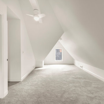
Project Goal: Utilize an unfinished story and a half-space to give each daughter a bedroom on the second floor along with a new full bath.
Challenge 1: The sloped ceilings in the area presented a challenge to how we could most cost-effectively add a bathroom within building code limits.
Solution 1: We’ve come across this challenge often when trying to fit a bathroom in sloped ceiling spaces and the budget or roof doesn't support adding a dormer. In these cases, we built out what we call a "vanity soffit", a tall soffit spanning from higher on the angled portion down to a comfortable height above the faucet bringing the upper portion of the flat wall forward. Its width typically depends on lighting needs and other considerations in the space. The vanity soffit allows the vanity to drop back to the original wall maintaining floor space and clearances while also providing just enough additional height for a practical mirror. For further flexibility, we typically recommend a pivoting mirror.
Challenge 2: Homeowners were told the floor structure was sound to finish for living space. Due to the spans, the first-floor ceiling joists did not meet the requirements to be second-floor floor joists.
Solution 2: In order to provide a solid base for the new living space, we consulted our engineer. The existing 2x6 members spanned beyond the distance they could while still structurally supporting the new living space floor. We determined throughout most of the space we needed to add in (“sister”) 2 additional 2x6 joists between the existing joists.
This additional work also took place during an unseasonably warm spell in June yet we persevered. So proud of our hard-working team.
Find the right local pro for your project

 Jarrett Design
Wrestling is this family’s sport. Applying lessons from the mat, this couple won their dream kitchen. Similar to pinning one’s opponent, the remodeling process takes visualization, determination, and keeping one’s eye on the prize. These clients came to us with a clear vision of their new kitchen. They knew what they wanted it to look like and how they needed the space to function for their family. Their goal was to transform an outdated floor plan that included a dark, small kitchen into a bright, open space with counters galore, an island with seating and room for a large dining table. The couple had recently purchased this home from the husband’s parents. This was where he was raised. The family home was very special to them and now it was time to make it ‘theirs’.
Just as in focus as their vision, was their budget. They knew it was tight, but were willing to make reasonable concessions. Walls were removed, flooring changed and the new kitchen switched places with the dining area. This change allowed the sun porch to become more inviting, an unexpected bonus. Semi-custom cabinetry, in contrasting paint colors, and quartz counter tops brighten the space. The galley design with island seating makes cooking for the family and entertaining larger groups enjoyable. The entire process was smooth and the result aesthetically fabulous with all the function they desired.
This project was one of our favorites because we were thrilled to be able to help provide this dream kitchen on a budget to some of the very nicest clients, a winning result for all.
Matt Villano Photography
 Jarrett Design
Wrestling is this family’s sport. Applying lessons from the mat, this couple won their dream kitchen. Similar to pinning one’s opponent, the remodeling process takes visualization, determination, and keeping one’s eye on the prize. These clients came to us with a clear vision of their new kitchen. They knew what they wanted it to look like and how they needed the space to function for their family. Their goal was to transform an outdated floor plan that included a dark, small kitchen into a bright, open space with counters galore, an island with seating and room for a large dining table. The couple had recently purchased this home from the husband’s parents. This was where he was raised. The family home was very special to them and now it was time to make it ‘theirs’.
Just as in focus as their vision, was their budget. They knew it was tight, but were willing to make reasonable concessions. Walls were removed, flooring changed and the new kitchen switched places with the dining area. This change allowed the sun porch to become more inviting, an unexpected bonus. Semi-custom cabinetry, in contrasting paint colors, and quartz counter tops brighten the space. The galley design with island seating makes cooking for the family and entertaining larger groups enjoyable. The entire process was smooth and the result aesthetically fabulous with all the function they desired.
This project was one of our favorites because we were thrilled to be able to help provide this dream kitchen on a budget to some of the very nicest clients, a winning result for all.
Matt Villano Photography
 The Myers Touch
THE BRIEF
Lengthy consultations with the client and her family over an 18 month period (during which a well was discovered underneath the foundations) revealed their relaxed approach to living and desire for a modern-classic look. The shape of the room and the request for 5 domino hobs determined the need for a large and sociable island. It was also important to provide the perfect place for the family to gather whilst mum cooks. A large kitchen sink was particularly desired by the owners who wanted to be able to use this area as a wet zone work station.
THE CHALLENGE
With such a large number of cabinets within this kitchen we created diversity and interest by introducing three harmonising finishes; sterling grey, walnut and truffle grey; each defining their own zones. Onto these we added 4 different handle types to accent the different areas and create interest and individuality. Integrating a Kohler Stages sink into a Stainless steel work top provided the perfect wet zone area, whereas on the island the Blanco Rivers Silestone offers a more classic and homely appeal without compromising practicality.
THE OUTCOME
This new kitchen is a world apart from the clients original wooden in-frame kitchen. Its understated style is innately calming whilst the careful space planning means that it is fantastically practical and a joy to use. In the main kitchen galley area the user has easy access to sink, cooking and refrigeration within a few steps. The perimeter areas of the kitchen house the ovens and the display storage and allow for easy passage way to the living/dining area without interrupting the working area.
 Jarrett Design
Wrestling is this family’s sport. Applying lessons from the mat, this couple won their dream kitchen. Similar to pinning one’s opponent, the remodeling process takes visualization, determination, and keeping one’s eye on the prize. These clients came to us with a clear vision of their new kitchen. They knew what they wanted it to look like and how they needed the space to function for their family. Their goal was to transform an outdated floor plan that included a dark, small kitchen into a bright, open space with counters galore, an island with seating and room for a large dining table. The couple had recently purchased this home from the husband’s parents. This was where he was raised. The family home was very special to them and now it was time to make it ‘theirs’.
Just as in focus as their vision, was their budget. They knew it was tight, but were willing to make reasonable concessions. Walls were removed, flooring changed and the new kitchen switched places with the dining area. This change allowed the sun porch to become more inviting, an unexpected bonus. Semi-custom cabinetry, in contrasting paint colors, and quartz counter tops brighten the space. The galley design with island seating makes cooking for the family and entertaining larger groups enjoyable. The entire process was smooth and the result aesthetically fabulous with all the function they desired.
This project was one of our favorites because we were thrilled to be able to help provide this dream kitchen on a budget to some of the very nicest clients, a winning result for all.
Matt Villano Photography
 LiLu Interiors
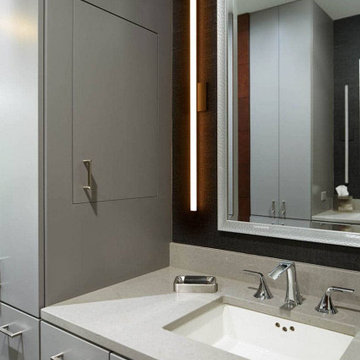
During a recent remodel, these homeowners in North Oaks left their master bath for last. And when it was time to update, they listened to the recommendation of their trusted contractor. “Our contractor said that LiLu really gets what their clients are looking for,” Angi said. “I totally agree.” During the planning stages LiLu determined the footprint didn’t need to change. With those parameters in place, LiLu was free to significantly alter the space plan overall. After gutting everything, they moved walls and rerouted plumbing to make the flow more efficient. By relocating the vanities, and then shifting and enclosing the shower in glass, LiLu dramatically improved the vista from the bedroom. Aesthetically, LiLu combined dark wood with gray lacquered cabinets, they painted the room in lighter gray tones to brighten up the space, and they created a sense of verticality. Above all, the homeowners wanted her master bathroom to feel luxurious. So LiLu included several up-scale details and custom amenities in their design—a towel warmer, a built-in hamper, and a built-in hairdryer all make her dream a reality. Now whether it’s the beginning of a new day or the end of a long one, this space makes family life feel a bit more relaxing.
-------
Project designed by Minneapolis interior design studio LiLu Interiors. They serve the Minneapolis-St. Paul area including Wayzata, Edina, and Rochester, and they travel to the far-flung destinations that their upscale clientele own second homes in.
--------
For more about LiLu Interiors, click here: https://www.liluinteriors.com/
-----
To learn more about this project, click here:
https://www.liluinteriors.com/blog/portfolio-items/blissful-master-bath/

 Matt Fajkus Architecture
The cabin typology redux came out of the owner’s desire to have a house that is warm and familiar, but also “feels like you are on vacation.” The basis of the “Hewn House” design starts with a cabin’s simple form and materiality: a gable roof, a wood-clad body, a prominent fireplace that acts as the hearth, and integrated indoor-outdoor spaces. However, rather than a rustic style, the scheme proposes a clean-lined and “hewned” form, sculpted, to best fit on its urban infill lot.
The plan and elevation geometries are responsive to the unique site conditions. Existing prominent trees determined the faceted shape of the main house, while providing shade that projecting eaves of a traditional log cabin would otherwise offer. Deferring to the trees also allows the house to more readily tuck into its leafy East Austin neighborhood, and is therefore more quiet and secluded.
Natural light and coziness are key inside the home. Both the common zone and the private quarters extend to sheltered outdoor spaces of varying scales: the front porch, the private patios, and the back porch which acts as a transition to the backyard. Similar to the front of the house, a large cedar elm was preserved in the center of the yard. Sliding glass doors open up the interior living zone to the backyard life while clerestory windows bring in additional ambient light and tree canopy views. The wood ceiling adds warmth and connection to the exterior knotted cedar tongue & groove. The iron spot bricks with an earthy, reddish tone around the fireplace cast a new material interest both inside and outside. The gable roof is clad with standing seam to reinforced the clean-lined and faceted form. Furthermore, a dark gray shade of stucco contrasts and complements the warmth of the cedar with its coolness.
A freestanding guest house both separates from and connects to the main house through a small, private patio with a tall steel planter bed.
Photo by Charles Davis Smith

 Renovisions
This kitchen had not been renovated since the salt box colonial house was built in the 1960’s. The new owner felt it was time for a complete refresh with some traditional details and adding in the owner’s contemporary tastes.
At initial observation, we determined the house had good bones; including high ceilings and abundant natural light from a double-hung window and three skylights overhead recently installed by our client. Mixing the homeowners desires required the skillful eyes of Cathy and Ed from Renovisions. The original kitchen had dark stained, worn cabinets, in-adequate lighting and a non-functional coat closet off the kitchen space. In order to achieve a true transitional look, Renovisions incorporated classic details with subtle, simple and cleaner line touches. For example, the backsplash mix of honed and polished 2” x 3” stone-look subway tile is outlined in brushed stainless steel strips creating an edgy feel, especially at the niche above the range. Removing the existing wall that shared the coat closet opened up the kitchen to allow adding an island for seating and entertaining guests.
We chose natural maple, shaker style flat panel cabinetry with longer stainless steel pulls instead of knobs, keeping in line with the clients desire for a sleeker design. This kitchen had to be gutted to accommodate the new layout featuring an island with pull-out trash and recycling and deeper drawers for utensils. Spatial constraints were top of mind and incorporating a convection microwave above the slide-in range made the most sense. Our client was thrilled with the ability to bake, broil and microwave from GE’s advantium oven – how convenient! A custom pull-out cabinet was built for his extensive array of spices and oils. The sink base cabinet provides plenty of area for the large rectangular stainless steel sink, single-lever multi-sprayer faucet and matching filtered water dispenser faucet. The natural, yet sleek green soapstone countertop with distinct white veining created a dynamic visual and principal focal point for the now open space.
While oak wood flooring existed in the entire first floor, as an added element of color and interest we installed multi-color slate-look porcelain tiles in the kitchen area. We also installed a fully programmable floor heating system for those chilly New England days. Overall, out client was thrilled with his Mission Transition.
 MIDWEST CONSTRUCTION & SUPPLY INC
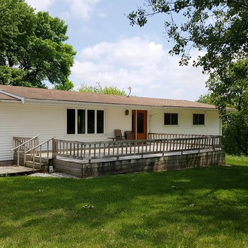
Paul Despenas: Homeowners from Dows, Iowa have done business with Midwest Construction back in 2005 when they purchased replacement windows for, Chad Arndt.
Chad has worked with these homeowners since they started replacing their windows with him and they always told Chad when the time comes we want to discuss the possibility of adding on a sunroom.
In 2016 Chad was issued an appointment to his previous customer stating they wanted to pursue the cost of a sunroom. Chad spent some time with them finding out what their wants and needs for a room the homeowners were determined they wanted to use it all year if that was a possibility.
Chad came up with some designs and pricing and they decided on the Oasis All Season Sunroom!
Midwest Construction installed a 12 x12 Oasis All Season Sunroom by Joyce Manufacturing
Oasis All Season Sunrooms Feature:
Cardinal LoE3 – 366 Insulated Glass
Non-Exposed Fasteners for a clean and finished Appearance
Concealed Electrical Raceway Channels provides concealed electric, cable, telephone and sound system lines
Foam Filled Thermally Broken Inserts for superior insulation
Insul-Deck panels for structurally sound insulated floor panels for increased comport and longevity
We've been providing comprehensive exterior remodeling solutions since 1958, offering "Quality Products & Quality Installation" just like our motto implies...
 Reico Kitchen & Bath
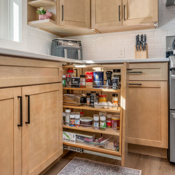
Thomas Valko of Reico Kitchen and Bath in King of Prussia, PA in collaboration with Hounddog Contracting, designed a transitional style kitchen featuring Masterpiece Cabinetry.
The kitchen cabinets are in the Martel 5-piece door style in Maple in a Shortbread finish, complimented by Classic Rock Tesora Vento quartz countertops.
“We love the new layout and design of our kitchen. It is both beautiful and functional! It was a challenge for us to visualize how the project would turn out, so it was extremely helpful to see the Reico 3D images while designing prior to the start of our work. We were very happy with the quality of both the cabinets and quartz we purchased from Reico,” said the client.
Thomas found it challenging to optimize the smaller layout for maximum functionality. "Our biggest hurdle was determining the best spot for the island in such a compact space. Choosing the perfect location was tough," he explained.
He expressed his admiration for the Shortbread color of the cabinetry, noting its consistency and ability to hold the stain well. Thomas also enjoyed the collaborative relationship with Dan from Hounddog Contracting, “The communication between all to ensure we were all on the same page. This was effective as the overall result of the kitchen was a huge success.”
Photos courtesy of Dan Williams Photography.

 Flooret
Part of the Modin Vinyl Plank Collection, Available Exclusively From www.Flooret.com
$3.49 / sq ft, 22.08 sq ft per box
50% WIDER. 25% LONGER. TWICE AS DURABLE
Luxury Vinyl Plank, 5 mm x 9" x 60" (1.0 mm / 40 mil wear-layer)
Lifetime Residential Warranty, 20 year Commercial Warranty
Sleek and chic. In terms of high-impact, going with a dark wire-brush pattern is a sure way to quickly define a space. Never boring, this modern pattern will set the mood immediately.
The most important specification for determining the durability of vinyl flooring is the thickness of the wear-layer. The best wear-layers are made of thick, clear virgin PVC, which covers the paper print-film that gives the floor its unique appearance. Once the wear-layer wears through, the paper is damaged and the floor will need replacement.
Most vinyl floors come with a 8-12 mil wear-layer (0.2-3 mm). The top commercial specs in the industry are higher, at 20-22 mil (0.5 mm). A select few manufacturers offer a “super” commercial spec of 28 mil (0.7 mm).
For Modin, we decided to set a new standard: 40 mil (1.0 mm) of premium virgin PVC. This allows us to offer an industry-leading 20 year Commercial Warranty (Lifetime Residential), compared to nearly all other commercial vinyl floors’ 10 year Commercial Warranty.
Beyond our superior wear-layer, we also use a patented click mechanism for superior hold, and a ceramic-bead coating.
SIZE MATTERS
Wider and longer planks create a sense of space and luxury. Most vinyl floors come in 6” or 7” widths, and 36” or 48” lengths.
For Modin, we designed our planks to be 9” wide, and 60” long. This extra large size allows our gorgeous designs to be fully expressed.
DETAILS THAT COUNT
We made sure to get all the details right. Real texture, to create the feel of wire-brushed wood. Low sheen level, to ensure a natural look that wears well over time. 4-sided bevels, to more accurately emulate the look of real planks. When added together they help create the unique look that is Modin.
DESIGNS THAT INSPIRE
We spent nearly a year just focusing on our designs, to ensure they provide the right mix of color and depth. Focusing on timeless wire-brush and European Oak styles, as well as more contemporary modern washes, our collection offers truly beautiful design that is both functional and inspiring.
 LiLu Interiors
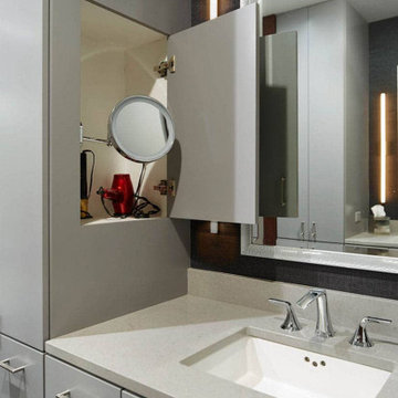
During a recent remodel, these homeowners in North Oaks left their master bath for last. And when it was time to update, they listened to the recommendation of their trusted contractor. “Our contractor said that LiLu really gets what their clients are looking for,” Angi said. “I totally agree.” During the planning stages LiLu determined the footprint didn’t need to change. With those parameters in place, LiLu was free to significantly alter the space plan overall. After gutting everything, they moved walls and rerouted plumbing to make the flow more efficient. By relocating the vanities, and then shifting and enclosing the shower in glass, LiLu dramatically improved the vista from the bedroom. Aesthetically, LiLu combined dark wood with gray lacquered cabinets, they painted the room in lighter gray tones to brighten up the space, and they created a sense of verticality. Above all, the homeowners wanted her master bathroom to feel luxurious. So LiLu included several up-scale details and custom amenities in their design—a towel warmer, a built-in hamper, and a built-in hairdryer all make her dream a reality. Now whether it’s the beginning of a new day or the end of a long one, this space makes family life feel a bit more relaxing.
-------
Project designed by Minneapolis interior design studio LiLu Interiors. They serve the Minneapolis-St. Paul area including Wayzata, Edina, and Rochester, and they travel to the far-flung destinations that their upscale clientele own second homes in.
--------
For more about LiLu Interiors, click here: https://www.liluinteriors.com/
----
To learn more about this project, click here:
https://www.liluinteriors.com/blog/portfolio-items/blissful-master-bath/

 Akuma Design
The main design goal for Akuma’s new office is to build a new style of modern office space that is open, cozy and relaxing without sacrificing work efficiency. The interior looked more like a coffee shop rather than a traditional office. We believed that such a design style will not only generate a lot of interest among guests but also beneficial to our work efficiency since the open cozy environment provides such a comfortable atmosphere that it should naturally stir-up our imagination and creativity.
The highlight of the project is the logo at the front entrance. Upon first impression, most would refer it as just a row of twisted metal hanging from the ceiling. However, it is meant to be a piece of artistic installation that serves as the main logo as well. What really forms the logo is actually the projected shadow image from that row of twisted aluminum metal strips hanging from the ceiling. A spotlight is set at an exact, pre-determined angle towards the hanging metal strips which produced the result of the logo image on the wall behind. So in reality, the logo only exists when the shadow of the twisted art is projected.
As an interior design company, having the nicest and sometimes the coolest looking office interior is the absolute top priority. However, in the path of ultimate fanciness, we still need a decent place to work. The challenge then was how to look stunning but still be an employee friendly work space. With a pivotal design element such as our new front logo, we believe we’ve succeeded in achieving a significant upgrade that’s certainly going to generate quite a splash in our community.
 MIDWEST CONSTRUCTION & SUPPLY INC
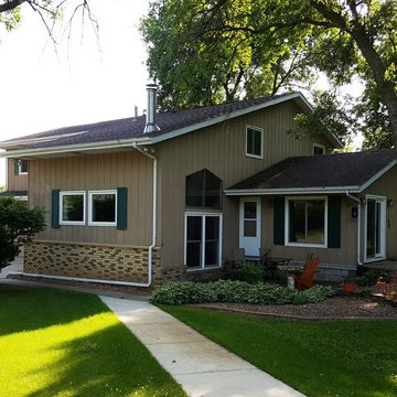
Paul Despenas: EcoSmart Custom Built 2-Lite Sliding windows, picture units and patio door were installed before the siding crew came to do their part.
EcoSmart windows feature Smart Core insulated master and sash frames:
EcoSmart windows come standard with our patented insulation in all primary frame and sash cavities. This is high density insulation provides a NFRC determined R-Value of 7.25 per inch of thickness.
SmartCore insulation provides almost two times the insulating proprieties of typical fiberglass insulation, making EcoSmart windows more energy efficient and your home more comfortable.
Performance Glass Options are the heart and soul of any good window. You’ll find a great selection of options to deliver the energy savings your home deserves.
Fusion-Welded Frames:
The frame and sash on EcoSmart windows are 100% fusion welded for superior sealing against water or air infiltration and no expansion and contraction.
Added strength provided by our I-Beam & Rigid Core Fiberglass Reinforcement.
All EcoSmart windows are custom built to fit into your home.
American Classic Insulated siding features:
Lifetime Non-Fade Protection
Progressive Foam Fullback Insulation is laminated to the back of the siding to add rigid backing to the siding panel to give straight wall lines
Four Times the energy savings value than conventional siding underlayments
High permebiliyty lets your walls breath to minimize the opportunity for mold growth
Deters termites and carpenter ants
The list goes on and on……….American Classic Insulated Vinyl siding and EcoSmart Windows = ENERGY SAVINGS FOR THE LIFETIME OF THE HOME
 Simply Home Decorating
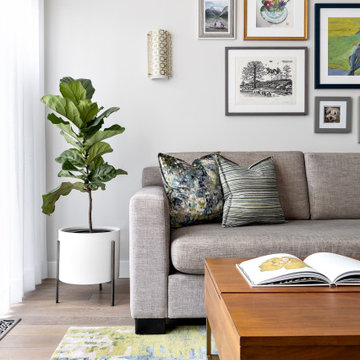
What comes to mind when you envision the perfect multi-faceted living spaces? Is it an expansive amount of counter space at which to cook, work, or entertain freely? Abundant and practical cabinet organization to keep clutter at bay and the space looking beautiful? Or perhaps the answer is all of the above, along with a cosy spot to retreat after the long day is complete.
The project we are sharing with you here has each of these elements in spades: spaces that combine beauty with function, promote comfort and relaxation, and make time at home enjoyable for this active family of three.
Our main focus was to remodel the kitchen, where we hoped to create a functional layout for everyday use. Our clients also hoped to incorporate a home office right into the kitchen itself.
However, the clients realized that renovation the kitchen alone wouldn’t create the full transformation they were looking for. Kitchens interact intimately with their adjacent spaces, especially family rooms, and we were determined to elevate their daily living experience from top to bottom.
We redesigned the kitchen and living area to increase work surfaces and storage solutions, create comfortable and luxurious spaces to unwind, and update the overall aesthetic to fit their more modern, collected taste. Here’s how it turned out…
 BMA Architects
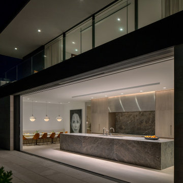
Though it’s located on 5.5 acres of pristine oceanfront in Southampton, this project came with inherent challenges. The clients had purchased the property with approvals in place, which locked in the size and location of the main house and accessory structure. The existing permits allowed for a 12,000 square foot traditional house with six bedrooms, yet the clients were looking to fit 11 bedrooms into the same footprint. Furthermore, the family regularly hosts large-scale gatherings and needed ample space for entertaining including a dining room that seats 50. The site boasts waterfront exposures on both the front and back sides of the property but shifting dunes had completely blocked the first-floor view toward the ocean.
In collaboration with a team of consultants, BMA determined that the tall dunes had grown unstable as ocean winds piled sand onto the site over decades. This created an opportunity to strategically re-sculpt the dunes for stability, with the added benefit of an improved view from the house. The view sequence was choreographed from the moment a visitor approaches the house, where a handful of stairs rise above the floodplain and lead to a dramatic courtyard. Moving toward the entry, views through the living area reveal the glimmering ocean beyond. Seen from the rear, the double-height living area anchors the volume, its minimalist grandeur framed in light limestone and crisp black wood. The design strategy ensures that water is visible from every major space in the house.
Despite the restrictive parameters that accompanied the project, gracious proportions and dramatic spaces transcend the initial limitations, giving the home a luxurious resort-like glamour. Interior spaces flow to the exterior, creating a house that engages with its site and celebrates the indoor-outdoor lifestyle for which the Hamptons are known.
 ASR DESIGN STUDIO
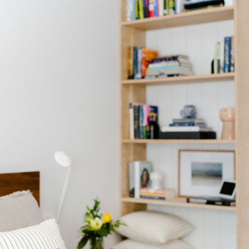
This two-year remodel odyssey saw Ariel and Robert put their design and build skills to the test to transform a two bedroom/two bathroom single-story home – that had never been touched or updated! - into a three-bedroom rental property that was warm and functional.
Some of the highlights? Ariel and Robert’s parents’ laying all the flooring, Robert tiling the guest bathroom by himself, and Ariel and Robert tying the knot in the backyard in 2020.
Ariel and Robert were determined to create a home that was wholly WFH-friendly, so they designed two separate areas that made working from home a breeze.
Ariel’s workspace featured an accent wall in dark teal, wooden desks for warmth and texture, leather chairs for a contrast in material and was loaded with storage for ASR’s paint, fabric and design samples.
Meanwhile, Robert’s space was nerd-proofed and approved with room to showcase his hobbies and support his gaming.
Ariel and Robert love hosting, so their kitchen and living spaces were designed to maximize both space and style.
The kitchen was kept in the same general location, but they opened up the wall between the kitchen and living room to make it feel more inviting.
Robert built the floating shelves and integrated lighting into them while blue and glass tiles were carried all the way up to the ceiling to make the space appear larger.
 S & S Homes, Inc.
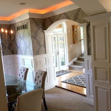
This room encompasses one of the most technical examples of woodwork we’ve seen in a long time. Normally, to create a raised panel wainscot wall, pieces of 1x wood are cut and used to create the boxes, and panel moldings are installed inside the frames to finish off the look. This can be done by typical finish carpenters. The problem is that over time, the numerous joints separate and look bad. In the case of this project, we wanted to avoid that pitfall and do something exquisite AND long-lasting. Over several days, each section of the wall was laid out to determine the appropriate size of each panel. Electrical outlets or switch plates that weren’t centered were moved. Each panel was then specially made at the shop out of 3/4” MDF because its smooth surface is ideal for painting. The raised panels (the pieces that go into each square opening) as well as the panel mouldings (the pieces that frame out each interior panel) were fabricated off site at the shop. Between the set-up, fabrication and the installation, two skilled craftsmen required three solid weeks to make each aspect absolutely perfect. Other finishing details including using a “Back Band” moulding to cap the top of the wainscot and using matching moldings (base, window casings and crown moldings) in areas that needed it for continuity of design.
This room’s woodwork is an exquisite example of true craftsmanship. Words and pictures cannot describe the level of skill required for this project. Once everything was completed, it was sprayed with white enamel paint and wallpaper was installed above the wood wainscot to finish off the room. In a nutshell, each wall panel was constructed like a custom made high end cabinet. Literally.
151