
Search results for "Determination" in Home Design Ideas

 Ernest M. Ferizi
German Embassy in Pristina - Kosovo, contracted the architecture office “Ferizi + Ferizi Architects” to plan and implement an Annex Office building for their purposes. As detached part of this building is designed the waiting area, as alone standing structure.
This Office Building is constructed by assembling of Eight used office containers that were delivered on trucks and set up after only a few hours on the basis of the LEGO principle, according to the planning on strip foundations.
By removing the flexible exterior wall panels, a large room of 115 m² was created, with the counter wall as a room partition between two office spaces, each with seven workstations as well as three counters for agents on one side and a room for visitors on the other side.
With this system, room solutions can be easily implemented in all dimensions.
The container, seen as a geometric shape, is a simple, octagonal, solid box.
The standardized perfection of its dimensions is striking: 2.44 meters wide, 2.59 meters high and 6.06 meters or 12.19 meters long.
Since its introduction in 1956 by the American transport entrepreneur Malcom McLean, the container has become a standardized transport module worldwide, whether on ships, trucks or construction sites.
The shipping containers have additionally revolutionized the transport industry, pushed the globalization noticeably, and thus directly or indirectly influenced all our lives.
But after only a few years, when the first overseas containers wore out, many engineers recognized the positive properties of used shipping containers for building houses, especially since they are robust, flexible, multifunctional and second-hand relatively inexpensive to purchase. The time has long passed by to treat containers exclusively as transport objects.
As a "measure of all things", containers can hardly be ignored in construction.
Their use is no longer limited to temporary use since school containers, information containers, office containers or entire residential buildings are now part of our everyday life in the construction industry.
However, current examples of the container architecture prove that even the most demanding solutions for container building are feasible. For their specific aesthetic and spatial qualities, containers also serve as design parameters for the development of new forms of architecture and urbanity.
The office building as an extension of the visa section, characterized by modern materials and contemporary aesthetics has been designed and built mainly as a low-energy building.
Extensive insulation to achieve a comfortable and sustainable constant temperature in the interior, high window quality and low energy consumption make the building energy-efficient.
The sophisticated lighting technology, networks, heating systems and air-conditioning systems are also components of this equipment.
It creates an overall harmonic picture and guarantees the highest standard in sustainable construction, taking into consideration the fact that environmentally friendly recycling and reutilization have become an increasingly important issue in our society.
West and East side of the wooden facade is compact and has few openings, while the southern facade is completely open with lot of glass. Its spatial openness ensures a transparent, friendly work environment, which allows a lot of light into the space.
This openness allows an uninterrupted, pleasant and close-to-nature view from interior spaces into the beautiful garden. During the installation of sophisticated light sources in the garden, emphasis was not only put on functionality and security, but also on the beauty of the garden shown through the illumination in the evening.
Large, horizontal white “brisole” serve as external sun protection systems, mounted on the canopies of the entrance areas of the modular construction and the enclosure, adeptly cast shade on these areas and at the same time shape the entire architectural language.
While on one hand, the two quadratic ledges suspended in the air, are docked with steel stairs and match the wooden façade, lead the staff to their office space, the artful modern interior, on the other hand, perfectly unites the functionality, innovative technology, culture and positive effects on the employees' efficiency and wellbeing.
A lot of white, interjected by warm wooden and colored accents, determines the ambience.
In the case of the lighting solution, the mainly linear ceiling lighting is used as the overlapping design element both for the offices of the visa section as well as for the counters and the waiting area for the visitors.
They underline the puristic design in order to create a pleasant light for a desired general illumination and ensure optimal light conditions without causing disturbing reflections on the computer screens.
In addition, precisely positioned pendant luminaires are installed at the workstations, which ensure pleasant room brightness.
In the entrance area, the harmonic and uniform lighting effect from the ground highlights the integration of photography and architecture.
Photographs of landscapes, people, places, expressing unforgettable, impressive moments and memories have been lovingly engraved on 8 x 8cm square oak blocks.
The idea of an effective, impressive environment that stimulates and inspires the work was the premiss on which the whole design concept was based. Consequently, the modular construction was no longer viewed through its history of utilization and scars, but rather as a structure of work ambiance, art and elegance.
FERIZI + FERIZI Architects
Photo: Arben Llapashtica

 Advance Design Studio, Ltd.
Jennifer and Dan have lived in their Deer Park Illinois home for 15 years, slowly making minor fixes like painting and decorating; but they had a new plan for their kitchen the entire time. An awkwardly placed garage door, and an island cooktop with a terrible downdraft made a full-scale kitchen remodel an absolute must. Jennifer had many ideas in mind and wanted to work with a company that could provide high-end work, while partnering with a designer that would tailor the kitchen to her ideas.
She was intrigued by the phrase “Common Sense Remodeling” in Advance Design’s feature she discovered while perusing an issue of the community’s Quintessential Barrington Magazine. Doing further research on the company’s website, as she looked through project profiles and read about Advance Design’s “Common Sense Remodeling” philosophy, she promptly scheduled an appointment to see if the people and ideas she read about were truly who they said they were. The more she read, the more she knew that the “Common Sense” approach to remodeling they described was exactly the type of company she was looking for.
The partnership was sealed after an initial consultation with Owner Todd Jurs and Project Designer Michelle Lecinski. They displayed a combination of friendliness, professionalism and respect that was unmatched by any of the other companies Jennifer talked to. She knew that with Advance Design, she would be able to retain the vision that she had in mind with high-quality craftsmanship.
“I reached out to Advance Design because of the ‘Common Sense Remodeling’ tagline,” Jennifer said. “That’s what lingered for me”. “Advance Design was the most respectful- of the house and of my design ideas, and the most professional of the handful of companies that looked at my project”.
Soon after the meeting Jennifer began working with Michelle on the project design. They quickly developed chemistry. Jennifer loved how Michelle researched and located every detail that Jennifer wanted for the kitchen. Between the two of them, every concept and idea was worked through and perfected. “Jennifer had definite ideas about what she wanted the new kitchen to look like, she just didn’t know how to bring it all together. We worked together really well to make her ideas into the practical reality necessary for a well-functioning kitchen, with the look and feel that she had envisioned”, says Michelle.
“Michelle was wonderful in using the CAD system she would show me new drawings every time we changed the layout while working through the design,” Jennifer said. “She was a really wonderful partner in execution, she made sure everything happened quickly and easily.”
The finished design drew out elements of Jennifer’s style and personality. The pair call the look “sophisticated farmhouse” to describe the kitchen renovation to family and friends. The result was a beautifully crafted, authentic-feeling space that satisfied Jennifer’s dreams 15 years in the making. The whole project consisted of a kitchen remodel, mudroom upgrade with powder room, and garage entry relocation. “The projects I personally like the best, are the ones that put the client’s dreams on display,” Project Designer Michelle said. “And this is one of those projects.”
The main focal point of the kitchen is custom zinc and brass ventilation hood with a vintage sheen, which was hand made to order by a small company in Indiana named Vogler Metalworking. “It’s like sculpture, a true work of art”, says Jennifer. Your eye is immediately drawn towards this elegant yet practical hood that eliminated the home’s downdraft problem and added a striking conversation piece at the same time. The carpenters had to use special gloves when transporting and installing it, so they didn’t smudge it with fingerprints. The beautiful hood centers proudly over the stunning black enamel and brass LaCornue Range. “I had a friend who had a LaCornue range and after learning how easy it was to cook perfect meals, I was convinced I wanted to have one”, says Jennifer. This unique, breathtaking combination anchors the entire kitchen and is apparent immediately as you walk into the great room the surrounds the space.
DuraSupreme Crestwood cabinets with a Kendall Panel add function and sophistication. A custom gray paint color paired with a storm blue was developed so that the new kitchen looked like it belonged to the existing space. Unlacquered brass faucets and hardware were important to Jennifer because she wanted the living finishes to age over time. Remarkable brass diamond mesh cabinet door inserts imported from the UK continue to add this one-of-a-kind kitchen renovation; giving it a “you won’t see this everywhere” quality. The use of old railcar flooring for the coffee bar countertop and reclaimed oak for the open shelving gives an authenticity to the space uncommon in kitchens today.
Jennifer and Michelle fell in love with the Limestone Grey Stone while they were investigating unique island countertop ideas. They liked the fact that the limestone as a living finish will age and change over time. Calcutta Miel Quartz countertops made for an excellent pairing around the perimeter, as it’s durable and perfect for cooking preparations. A textured white subway tile backsplash that runs to the ceiling keeps your eye moving towards the open shelving, and to the main focal point of the stunning range hood combination.
“The kitchen functions beautifully, and it’s gorgeous,” beams Jennifer as she gestures with both hands while smiling ear to ear. “The most important thing was I wanted a kitchen that had a wonderful flow, cooked beautiful meals and was a great gathering place for family and friends, and this space does that perfectly! Beauty wise, it turned out exactly how I had envisioned. I felt the function part was the hardest part, and that was nailed”!
Relocating the garage entry to the new mudroom was a huge priority and has finally separated the family’s arriving home functions from their kitchen. Now coats and shoes and bags have their own area for dropping once members arrive home. Matching gray DuraSupreme cabinetry helped create gorgeous, purposeful lockers for the family. A reclaimed vintage sink and custom wall paper were added to the tiny powder room to beautify the once previously only functional space. Advance Design was even able to create a custom space for their dog to sleep while the family is away.
“It was unbelievable that a project of this size was completed in such a short time, and I think that’s because of the large amount of planning and preparation that went into it,” Jennifer marveled, “When we started, we were ready, and everything was prepared”.
When it came to execution, Project Manager Justin Davis and his crew were quick, accessible, and organized. Projects like this kitchen are typically completed in as little as 8-10 weeks. Jennifer’s kitchen however despite the relocation of some challenging HVAC in a soffit and moving of an exterior door was completed remarkably fast in part because the team was working with an existing tile floor that ran throughout the first floor that the client really loved.
“You get to know these people really well because they’re living in your house while you’re living in your house. They were so fast and really good, it didn’t take as long as even planned” reported Jennifer. “I would text Justin and he always responded almost immediately. I got to know all the guys who were working in our house and they were all wonderful people”.
Details in a customized kitchen like this one require skill and care from the people who install it. “All the guys on the job were skilled at what the did. I wanted small details like little feet to look like furniture, that is where their carpentry skill came in to make these all perfect”, said Jennifer. “The tile guys were wonderful. They even let me determine how I wanted the texture with the grout to appear for a salt and pepper look; now that is a very skilled trade person making it custom”.
In Jennifer’s interview, she continued to reference Advance Design’s “Common Sense Remodeling”, so I took a minute to ask her exactly what that phrase meant to her and how it played out in her experience with her project and the Advance Design team. Here is what she said: “I was intrigued about Common Sense Remodeling and in my head that there would be clear costs and prices, great communication between the design team, the execution team and me”, said Jennifer. They did deliver on that, it was so clear about the cost breakdown, what I could expect from everyone who came to my house, and everything that we had ordered. That to me is the Common Sense”!
It’s great to see a client take literally our assertion that a well-planned remodeling project is simply “Common Sense”! She anticipated each step of the way would be clear, concise, and predictable, all the while protecting the outcome due to the careful upfront planning. “Advance Design delivered on their ‘Common Sense Remodeling’ promise,” Jennifer said. “From the design team, to the execution team - everything was straight forward like I imagined. The project turned out exactly how I envisioned, I enjoyed this process and absolutely would recommend Advance Design Studio to anyone.”
 Klopf Architecture
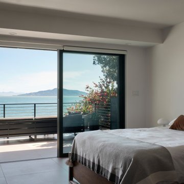
Set on a narrow hillside lot overlooking the San Francisco Bay in Point Richmond, California, Bay Heirloom is a Mid-Century Modern family home restored, modernized and adapted for contemporary living. Oriented south-southwest toward the Marin Headlands, with views of the Golden Gate Bridge, the residence captures shifting Bay light throughout the day, from fog-muted mornings to vivid, glowing sunsets.
The home was built by Karlyn Neel’s grandfather, the owner of the construction company Flo-Crete, one of the Bay Area’s early concrete pumping firms. Flo-Crete completed the foundation and structural concrete work, with family photographs documenting the original cinderblock walls and pours. The firm also contributed to major regional infrastructure projects, including the Transbay BART tube and Candlestick Park, situating the house within a broader legacy of Bay Area construction. Growing up, Neel spent considerable time in the home, developing an early appreciation for mid-century modern principles. Instead of parting with this family heirloom, she purchased the home from her grandfather’s estate.
While her grandfather continued to live in the Point Richmond house, Neel purchased a Mid-Century Modern residence in Palm Desert. In contrast to the Bay Area’s cool temperatures, salt air, and persistent winds, the desert home is shaped by heat and sun and requires a different material response. A substantial renovation she led there emphasized thermal performance, filtered light, and restrained detailing. The experience later informed the restoration of her Bay Area family home.
What began as a modest Mid-Century Modern update expanded when decades of exposure to marine conditions revealed leaks and significant structural and seismic deficiencies. Neel was determined to honor her grandfather’s perseverance and without hesitation pivoted to a much more intensive project. Addressing these challenges required close coordination between Neel, Klopf Architecture and Kasten Builders, with architectural restraint and construction precision guiding each intervention. Rather than alter the home’s defining features, the project focused on reinforcing the structure from within. Discreet beams were embedded along the rear facade and in an upstairs wall, strengthening the building while maximizing the wall of glass facing the Bay and opening the wall between the kitchen and the living space. These structural interventions allowed the space to open fully to the Bay without visual interruption, with the kitchen repositioned as the social and functional core of an open, continuous living space. The building envelope was updated using weather- and corrosion-resistant materials appropriate to the marine environment.
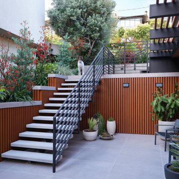
The house unfolds vertically from the street, beginning with a modest garage level and workshop, with the main living spaces located below. Original slate flooring at the entry was preserved, along with select furnishings and artwork collected by Neel’s grandfather, anchoring the restored interior in its past. A restrained palette of black accents and pale, natural finishes replaces darker wood tones, reinforcing openness and calm. A naturally illuminated stair connects to the lowest level, where a former basement was transformed into a guest suite and family room opening onto a deck. From there, steps lead directly to a small concrete boat ramp at the water’s edge.
Throughout the project, decisions were guided by continuity rather than transformation for its own sake. Lessons drawn from both desert and coastal climates informed a material strategy rooted in performance and restraint. Bay Heirloom stands as a measured evolution of a family house, structurally renewed and carefully modernized, grounded in the discipline and care that first shaped it.
Klopf Architecture Project Team: John Klopf, AIA, Angela Todorova and Fernanda Bernardes
Landscape Architect: Huettl Landscape Architecture
General Contractor: Kasten Builders
Photography: ©2025 Mariko Reed
Year Completed: 2022
Location: Point Richmond, CA
Find the right local pro for your project
 Klopf Architecture
Set on a narrow hillside lot overlooking the San Francisco Bay in Point Richmond, California, Bay Heirloom is a Mid-Century Modern family home restored, modernized and adapted for contemporary living. Oriented south-southwest toward the Marin Headlands, with views of the Golden Gate Bridge, the residence captures shifting Bay light throughout the day, from fog-muted mornings to vivid, glowing sunsets.
The home was built by Karlyn Neel’s grandfather, the owner of the construction company Flo-Crete, one of the Bay Area’s early concrete pumping firms. Flo-Crete completed the foundation and structural concrete work, with family photographs documenting the original cinderblock walls and pours. The firm also contributed to major regional infrastructure projects, including the Transbay BART tube and Candlestick Park, situating the house within a broader legacy of Bay Area construction. Growing up, Neel spent considerable time in the home, developing an early appreciation for mid-century modern principles. Instead of parting with this family heirloom, she purchased the home from her grandfather’s estate.
While her grandfather continued to live in the Point Richmond house, Neel purchased a Mid-Century Modern residence in Palm Desert. In contrast to the Bay Area’s cool temperatures, salt air, and persistent winds, the desert home is shaped by heat and sun and requires a different material response. A substantial renovation she led there emphasized thermal performance, filtered light, and restrained detailing. The experience later informed the restoration of her Bay Area family home.
What began as a modest Mid-Century Modern update expanded when decades of exposure to marine conditions revealed leaks and significant structural and seismic deficiencies. Neel was determined to honor her grandfather’s perseverance and without hesitation pivoted to a much more intensive project. Addressing these challenges required close coordination between Neel, Klopf Architecture and Kasten Builders, with architectural restraint and construction precision guiding each intervention. Rather than alter the home’s defining features, the project focused on reinforcing the structure from within. Discreet beams were embedded along the rear facade and in an upstairs wall, strengthening the building while maximizing the wall of glass facing the Bay and opening the wall between the kitchen and the living space. These structural interventions allowed the space to open fully to the Bay without visual interruption, with the kitchen repositioned as the social and functional core of an open, continuous living space. The building envelope was updated using weather- and corrosion-resistant materials appropriate to the marine environment.
The house unfolds vertically from the street, beginning with a modest garage level and workshop, with the main living spaces located below. Original slate flooring at the entry was preserved, along with select furnishings and artwork collected by Neel’s grandfather, anchoring the restored interior in its past. A restrained palette of black accents and pale, natural finishes replaces darker wood tones, reinforcing openness and calm. A naturally illuminated stair connects to the lowest level, where a former basement was transformed into a guest suite and family room opening onto a deck. From there, steps lead directly to a small concrete boat ramp at the water’s edge.
Throughout the project, decisions were guided by continuity rather than transformation for its own sake. Lessons drawn from both desert and coastal climates informed a material strategy rooted in performance and restraint. Bay Heirloom stands as a measured evolution of a family house, structurally renewed and carefully modernized, grounded in the discipline and care that first shaped it.
Klopf Architecture Project Team: John Klopf, AIA, Angela Todorova and Fernanda Bernardes
Landscape Architect: Huettl Landscape Architecture
General Contractor: Kasten Builders
Photography: ©2025 Mariko Reed
Year Completed: 2022
Location: Point Richmond, CA
 Tile Doctor Ltd
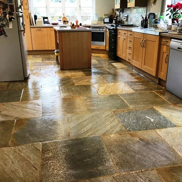
I recently visited a customer living in the village of Ravensthorpe, just outside Northampton to rejuvenate a 15-year-old multi coloured Chinese riven slate floor that needed a deep professional clean. Slate is a hard-wearing tile used for flooring high traffic areas but does need sealing to bring out its best features. In this case the sealer had long since worn off and dirt had become ingrained in the stone making it difficult to clean effectively.
We discussed the client’s requirements and the cleaning process I planned to follow to rejuvenate the floor. I had to check on availability, so I e-mailed over a quote and some dates later that day. They were happy with my proposal and agreed for the work to be done whilst the customers were on holiday.
My first task was to test a small area to determine which products would give the best results. In this case, I decided to start with a strong dilution of Tile Doctor Remove and Go which is a strong alkaline cleaner/coatings remover that’s safe to use on Tile and Stone. I spread this solution across a section of the floor and left it to seep into the pores of the stone and lift out the ingrained dirt.
After allowing the solution adequate time to dwell, I scrubbed the slate with a carbon brush fitted to a rotary machine to gradually reveal the fantastic natural colours of the Slate hidden beneath the dirt. Happy with my choice of cleaning product I repeated this process in sections until it had been carried out throughout the entire area. Following this, I rinsed the entire floor several times with clean water, before soaking up the resulting soiled residue with a wet vacuum.
The next part of the cleaning process entailed paying attention to the grout lines which were scrubbed using Tile Doctor Grout Clean-Up. The resulting residue was promptly extracted with the wet vacuum and I finished by giving the whole floor a rinse with Tile Doctor pH Neutral Tile Cleaner. This is a day to day tile cleaning product which is recommended for stone floors, many supermarket tile cleaning products are only suitable for ceramic tiles due to their acidic formula and can damage a floor over years of use so you should always read the label. However, I always leave my clients with a complimentary bottle of a suitable Tile Doctor product to maintain their floors.
The floor was left to dry off overnight and I returned on the second day to seal the floor. Before starting I checked the floor was dry using a damp meter which confirmed the Slate was dry and ready to seal. The floor must be completely dry before sealing as any excess moisture has the potential to the damage the performance of the sealer. Since my client had specifically requested a silk finish, I opted to use Tile Doctor Seal and Go which dries to leave a lovely subtle sheen that really enhances the look of the stone. Five coats were applied to ensure a good hard-wearing protection.
My client was very pleased with the results, particularly as they hadn’t realised how much colour it had lost over the years and left the following feedback on our website.
”I despaired of having a clean-looking floor again. Phil Vissian assured me that intensive deep cleaning and resealing could restore our fifteen year old, subtly coloured, Chinese riven slate kitchen floor. He has done a fantastic job. Looks like new, and I shall book Phil for an annual professional clean, so that it never gets as bad again.” Sally M, Northampton
Phil Vissian
Northamptonshire Tile Doctor
 Klopf Architecture
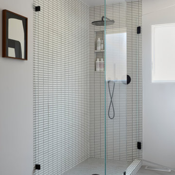
Set on a narrow hillside lot overlooking the San Francisco Bay in Point Richmond, California, Bay Heirloom is a Mid-Century Modern family home restored, modernized and adapted for contemporary living. Oriented south-southwest toward the Marin Headlands, with views of the Golden Gate Bridge, the residence captures shifting Bay light throughout the day, from fog-muted mornings to vivid, glowing sunsets.
The home was built by Karlyn Neel’s grandfather, the owner of the construction company Flo-Crete, one of the Bay Area’s early concrete pumping firms. Flo-Crete completed the foundation and structural concrete work, with family photographs documenting the original cinderblock walls and pours. The firm also contributed to major regional infrastructure projects, including the Transbay BART tube and Candlestick Park, situating the house within a broader legacy of Bay Area construction. Growing up, Neel spent considerable time in the home, developing an early appreciation for mid-century modern principles. Instead of parting with this family heirloom, she purchased the home from her grandfather’s estate.
While her grandfather continued to live in the Point Richmond house, Neel purchased a Mid-Century Modern residence in Palm Desert. In contrast to the Bay Area’s cool temperatures, salt air, and persistent winds, the desert home is shaped by heat and sun and requires a different material response. A substantial renovation she led there emphasized thermal performance, filtered light, and restrained detailing. The experience later informed the restoration of her Bay Area family home.
What began as a modest Mid-Century Modern update expanded when decades of exposure to marine conditions revealed leaks and significant structural and seismic deficiencies. Neel was determined to honor her grandfather’s perseverance and without hesitation pivoted to a much more intensive project. Addressing these challenges required close coordination between Neel, Klopf Architecture and Kasten Builders, with architectural restraint and construction precision guiding each intervention. Rather than alter the home’s defining features, the project focused on reinforcing the structure from within. Discreet beams were embedded along the rear facade and in an upstairs wall, strengthening the building while maximizing the wall of glass facing the Bay and opening the wall between the kitchen and the living space. These structural interventions allowed the space to open fully to the Bay without visual interruption, with the kitchen repositioned as the social and functional core of an open, continuous living space. The building envelope was updated using weather- and corrosion-resistant materials appropriate to the marine environment.
The house unfolds vertically from the street, beginning with a modest garage level and workshop, with the main living spaces located below. Original slate flooring at the entry was preserved, along with select furnishings and artwork collected by Neel’s grandfather, anchoring the restored interior in its past. A restrained palette of black accents and pale, natural finishes replaces darker wood tones, reinforcing openness and calm. A naturally illuminated stair connects to the lowest level, where a former basement was transformed into a guest suite and family room opening onto a deck. From there, steps lead directly to a small concrete boat ramp at the water’s edge.
Throughout the project, decisions were guided by continuity rather than transformation for its own sake. Lessons drawn from both desert and coastal climates informed a material strategy rooted in performance and restraint. Bay Heirloom stands as a measured evolution of a family house, structurally renewed and carefully modernized, grounded in the discipline and care that first shaped it.
Klopf Architecture Project Team: John Klopf, AIA, Angela Todorova and Fernanda Bernardes
Landscape Architect: Huettl Landscape Architecture
General Contractor: Kasten Builders
Photography: ©2025 Mariko Reed
Year Completed: 2022
Location: Point Richmond, CA

 Five Star Tree Care
There are a few reasons why it is critical that your trees have a regular schedule for pruning and maintenance. Pruning helps trees to maintain a tree’s health as well as form it to a pleasing aesthetic shape. Furthermore, pests and diseases are also controlled by regular pruning and care. When pruning is properly performed, your trees will be healthy and attractive all year long. Five Star Tree Services has put together a list of seven things you should keep in mind regarding your tree pruning.
Tree Inspection
Before any tree pruning job, the tree should be properly inspected. This will allow you or our tree care service team to determine which branches should be cut. It will also allow any diseases or pests to be identified and dealt with.
Remove Dead, Weak & Crossed Branches
Dead and weak branches are a hazard to your property and those who happen to walk or lounge under the tree. They also suck vital nutrients away from healthy branches and the tree trunk. Removing them will prevent accidents and allow your tree to thrive. Crossed branches can also cause problems later down the line. They affect the airflow to the crown and can also prevent sunlight from passing through the tree.
Pay Attention to Spacing
It’s important to pay attention to branch spacing when pruning your tree. Lateral branches should be spaced evenly, especially when pruning trees that have yet to mature.
Follow the Basic Pruning Rules
It’s important that the 1/4th and 1/3rd rules of pruning are followed. This means that you should never cut more than a third of the total height of the tree. This length is measured from the bottom up. You should also only cut 1/4th or less of a tree’s crown when you prune at any one time.
Get Your Tools Ready
The tools you use to prune should be ready well before you make the first cut. You should start your project equipped with a pole pruner, pruning saws, hedge shears, loppers, and pruning shears. They also need to be properly sharpened before you start your pruning project. Each of these tools will allow you to reach different parts of the tree and prune them in a safe manner. If your tools are dull, they can damage the tree or even cause accidents when you attempt to cut.
Prune on Schedule
There are schedules for pruning that should be followed according to the type of tree you are caring for. Summer blooming trees should be pruned in early spring while evergreens and hedges should be taken care of in the early part of summer. Fruit-bearing trees should be pruned late in winter ahead of the frost. If there is damage to your tree, it doesn’t matter what time of year it may be, correct the problem as soon as possible.
Avoid Protecting Post-Pruning
Pruning leaves behind wounds, but they will heal. Though they may be unsightly for a while, the marks will heal and return back to its natural beauty. Don’t paint the pruning wounds to protect the tree, it actually has no effect on decay prevention. Painting may even trigger diseases or encourage pests to take up residence.
How We Can Help
Tree pruning is a complication job, but with our tips, you can do it right. It is always a good idea to leave the job to the professionals here at Five Star Tree Services instead. Our Toronto tree care experts have the tools, experience, and skills to get the job done right the first time. Get in touch with us at (416) 990-3355 today for more information.
 May Construction, Inc.
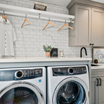
The laundry room was a major transformation that was majorly needed, once a dark and gloomy dungeon is now a bright, and functional room that would make anyone be happy. The Ornate tile flooring brings in a fun funky feel to the well-organized room, while white subway backsplash tile keeps it cool and calm. To accommodate the newest furriest member of the family, a hidden litter box pull-out was included in the cabinetry and cute-custom cat door allows the new kitten to get in and out through its very own purrfect passageway.
 Ernest M. Ferizi
German Embassy in Pristina - Kosovo, contracted the architecture office “Ferizi + Ferizi Architects” to plan and implement an Annex Office building for their purposes. As detached part of this building is designed the waiting area, as alone standing structure.
This Office Building is constructed by assembling of Eight used office containers that were delivered on trucks and set up after only a few hours on the basis of the LEGO principle, according to the planning on strip foundations.
By removing the flexible exterior wall panels, a large room of 115 m² was created, with the counter wall as a room partition between two office spaces, each with seven workstations as well as three counters for agents on one side and a room for visitors on the other side.
With this system, room solutions can be easily implemented in all dimensions.
The container, seen as a geometric shape, is a simple, octagonal, solid box.
The standardized perfection of its dimensions is striking: 2.44 meters wide, 2.59 meters high and 6.06 meters or 12.19 meters long.
Since its introduction in 1956 by the American transport entrepreneur Malcom McLean, the container has become a standardized transport module worldwide, whether on ships, trucks or construction sites.
The shipping containers have additionally revolutionized the transport industry, pushed the globalization noticeably, and thus directly or indirectly influenced all our lives.
But after only a few years, when the first overseas containers wore out, many engineers recognized the positive properties of used shipping containers for building houses, especially since they are robust, flexible, multifunctional and second-hand relatively inexpensive to purchase. The time has long passed by to treat containers exclusively as transport objects.
As a "measure of all things", containers can hardly be ignored in construction.
Their use is no longer limited to temporary use since school containers, information containers, office containers or entire residential buildings are now part of our everyday life in the construction industry.
However, current examples of the container architecture prove that even the most demanding solutions for container building are feasible. For their specific aesthetic and spatial qualities, containers also serve as design parameters for the development of new forms of architecture and urbanity.
The office building as an extension of the visa section, characterized by modern materials and contemporary aesthetics has been designed and built mainly as a low-energy building.
Extensive insulation to achieve a comfortable and sustainable constant temperature in the interior, high window quality and low energy consumption make the building energy-efficient.
The sophisticated lighting technology, networks, heating systems and air-conditioning systems are also components of this equipment.
It creates an overall harmonic picture and guarantees the highest standard in sustainable construction, taking into consideration the fact that environmentally friendly recycling and reutilization have become an increasingly important issue in our society.
West and East side of the wooden facade is compact and has few openings, while the southern facade is completely open with lot of glass. Its spatial openness ensures a transparent, friendly work environment, which allows a lot of light into the space.
This openness allows an uninterrupted, pleasant and close-to-nature view from interior spaces into the beautiful garden. During the installation of sophisticated light sources in the garden, emphasis was not only put on functionality and security, but also on the beauty of the garden shown through the illumination in the evening.
Large, horizontal white “brisole” serve as external sun protection systems, mounted on the canopies of the entrance areas of the modular construction and the enclosure, adeptly cast shade on these areas and at the same time shape the entire architectural language.
While on one hand, the two quadratic ledges suspended in the air, are docked with steel stairs and match the wooden façade, lead the staff to their office space, the artful modern interior, on the other hand, perfectly unites the functionality, innovative technology, culture and positive effects on the employees' efficiency and wellbeing.
A lot of white, interjected by warm wooden and colored accents, determines the ambience.
In the case of the lighting solution, the mainly linear ceiling lighting is used as the overlapping design element both for the offices of the visa section as well as for the counters and the waiting area for the visitors.
They underline the puristic design in order to create a pleasant light for a desired general illumination and ensure optimal light conditions without causing disturbing reflections on the computer screens.
In addition, precisely positioned pendant luminaires are installed at the workstations, which ensure pleasant room brightness.
In the entrance area, the harmonic and uniform lighting effect from the ground highlights the integration of photography and architecture.
Photographs of landscapes, people, places, expressing unforgettable, impressive moments and memories have been lovingly engraved on 8 x 8cm square oak blocks.
The idea of an effective, impressive environment that stimulates and inspires the work was the premiss on which the whole design concept was based. Consequently, the modular construction was no longer viewed through its history of utilization and scars, but rather as a structure of work ambiance, art and elegance.
FERIZI + FERIZI Architects
Photo: Arben Llapashtica
 Advance Design Studio, Ltd.
Raza and Baneen purchased their home in Schaumburg IL. knowing it needed work, but they saw the incredible potential it had with its expanse of beautiful kitchen windows and spacious floor plan.
The kitchen technically functioned fine, but was desperately outdated with its honey oak cabinets and plain countertops. This family loved to cook and host parties so it was an easy decision that the kitchen remodel was the first project they needed to tackle to make their home come to life.
Baneen had very specific ideas for her new dream kitchen and had been thinking about it for over 10 years! When they met Advance Design’s Project Designer Claudia Pop, Baneen felt an instant connection.
“From the first meeting, I knew that Claudia would guide us without putting down our ideas,” Baneen said.
The couple had two fears common among remodeling home owners: Would the project be done on time? And, would the project stay on budget? Advance Design was able to alleviate their fears early on, as Claudia shared the “Common Sense Remodeling” process. Raza and Baneen absolutely loved the custom project analysis that helped them understand how a budget could be accurately predicted and then safeguarded during the design process.
“Advance Design was spot on with both the budget and the project timeframe,” Baneen said. “Overall there were no surprises, and the budget was exactly what we were quoted. The experience was phenomenal, everybody was professional, everybody was courteous, everyone was nice, everyone was friendly. It wasn't stressful for us, they still left the house in a presentable state. It wasn't like we would come home and we were bring the kids in and it was going to be hazardous."
After the relationship was cemented, Raza, Baneen and Claudia began to finalize the kitchen design. The main objective was to create a functional space for preparing meals and to create an inviting space for their family and friends to enjoy, while incorporating interesting design elements such as the iconic blue island and reclaimed Chicago brick walls. Sufficient storage space was really important to Baneen, and high quality appliances were a priority. As the overall layout was being completed, together they reviewed each cabinet to determine exactly what would be stored there.
Because cooking was a high priority for this family, Claudia incorporated spice racks close to the range and included two mixer lift shelves for their larger countertop appliances.
The focal point of the kitchen is the striking blue island constructed from custom colored Dura Supreme cabinets. Designed with decorative shelving and a highly functional prep sink. The couple loves the “galley” prep sink, it adds even more functionality and significantly shortens preparation and cleaning time. This island also includes a 24" Bosch Dishwasher with matching panel to blend in.
"Aesthetically, and in terms of functionality, the island everything I imagined," Baneen said. "I love how beautiful it looks and how functional it is. It just brings everybody together."
The Praa Sands Quartz countertop with an ogee edge profile provides excellent contrast by blending it's subtle tones with the outer cabinetry. It ties the island together with the rest of the space. Overlooking the beautiful backyard through spacious windows, the crisp white farmhouse sink is something that Baneen envisioned in her kitchen for years.
Two tones of Dura Supreme Cabinetry were used throughout the rest of the kitchen. Chestnut Cherry cabinets grace the range and decorative range hood and as panels over the Wolf refrigerator and freezer. Antique White cabinets surround the perimeter, creating a warm balance that beckons guests into the softly rounded space.
Drawing the eye immediately to the custom wood hood hiding a powerful 1,500 CFM ventilation system and spectacular 60” Duel Fuel Wolf range, a creatively patterned Tessen in Café & Brine backsplash detail stands out from the white subway tile backsplash spanning the outer walls. The vibrant space reflects the lively personality of the family who now loves spending time both cooking and enjoying this kitchen as a family.
“The end result is a beautiful and extremely functional kitchen that is able to handle a growing family, lots of parties and lots of cooking,” Claudia said.
“Advance Design was wonderfully professional and a pleasure to work with. They catered to what my needs and ideas were, while skillfully guiding us to make the right choices where we seemed lost,” Baneen said.
 Advance Design Studio, Ltd.
Raza and Baneen purchased their home in Schaumburg IL. knowing it needed work, but they saw the incredible potential it had with its expanse of beautiful kitchen windows and spacious floor plan.
The kitchen technically functioned fine, but was desperately outdated with its honey oak cabinets and plain countertops. This family loved to cook and host parties so it was an easy decision that the kitchen remodel was the first project they needed to tackle to make their home come to life.
Baneen had very specific ideas for her new dream kitchen and had been thinking about it for over 10 years! When they met Advance Design’s Project Designer Claudia Pop, Baneen felt an instant connection.
“From the first meeting, I knew that Claudia would guide us without putting down our ideas,” Baneen said.
The couple had two fears common among remodeling home owners: Would the project be done on time? And, would the project stay on budget? Advance Design was able to alleviate their fears early on, as Claudia shared the “Common Sense Remodeling” process. Raza and Baneen absolutely loved the custom project analysis that helped them understand how a budget could be accurately predicted and then safeguarded during the design process.
“Advance Design was spot on with both the budget and the project timeframe,” Baneen said. “Overall there were no surprises, and the budget was exactly what we were quoted. The experience was phenomenal, everybody was professional, everybody was courteous, everyone was nice, everyone was friendly. It wasn't stressful for us, they still left the house in a presentable state. It wasn't like we would come home and we were bring the kids in and it was going to be hazardous."
After the relationship was cemented, Raza, Baneen and Claudia began to finalize the kitchen design. The main objective was to create a functional space for preparing meals and to create an inviting space for their family and friends to enjoy, while incorporating interesting design elements such as the iconic blue island and reclaimed Chicago brick walls. Sufficient storage space was really important to Baneen, and high quality appliances were a priority. As the overall layout was being completed, together they reviewed each cabinet to determine exactly what would be stored there.
Because cooking was a high priority for this family, Claudia incorporated spice racks close to the range and included two mixer lift shelves for their larger countertop appliances.
The focal point of the kitchen is the striking blue island constructed from custom colored Dura Supreme cabinets. Designed with decorative shelving and a highly functional prep sink. The couple loves the “galley” prep sink, it adds even more functionality and significantly shortens preparation and cleaning time. This island also includes a 24" Bosch Dishwasher with matching panel to blend in.
"Aesthetically, and in terms of functionality, the island everything I imagined," Baneen said. "I love how beautiful it looks and how functional it is. It just brings everybody together."
The Praa Sands Quartz countertop with an ogee edge profile provides excellent contrast by blending it's subtle tones with the outer cabinetry. It ties the island together with the rest of the space. Overlooking the beautiful backyard through spacious windows, the crisp white farmhouse sink is something that Baneen envisioned in her kitchen for years.
Two tones of Dura Supreme Cabinetry were used throughout the rest of the kitchen. Chestnut Cherry cabinets grace the range and decorative range hood and as panels over the Wolf refrigerator and freezer. Antique White cabinets surround the perimeter, creating a warm balance that beckons guests into the softly rounded space.
Drawing the eye immediately to the custom wood hood hiding a powerful 1,500 CFM ventilation system and spectacular 60” Duel Fuel Wolf range, a creatively patterned Tessen in Café & Brine backsplash detail stands out from the white subway tile backsplash spanning the outer walls. The vibrant space reflects the lively personality of the family who now loves spending time both cooking and enjoying this kitchen as a family.
“The end result is a beautiful and extremely functional kitchen that is able to handle a growing family, lots of parties and lots of cooking,” Claudia said.
“Advance Design was wonderfully professional and a pleasure to work with. They catered to what my needs and ideas were, while skillfully guiding us to make the right choices where we seemed lost,” Baneen said.
 Advance Design Studio, Ltd.
Jackie and Sean loved the Algonquin neighborhood they lived in with the peaceful neighborhood and the close proximity to work and school. What they didn’t love was how outdated their home had become. With a cramped kitchen and an unused dining room, they decided a remodel was the perfect solution to their problem. They would be able to continue to live in the area they loved, while at the same time they could have the dream home they envisioned.
After a thorough search, Jackie came across Advance Design Studio. She was impressed by all of the positive reviews she saw on the internet and saw herself identifying with all of the project stories she saw on the website. Once they met with designer Scott Christensen and owner Todd Jurs, they knew Advance Design was the right company to make their dreams a reality.
The project consisted of four main areas: the kitchen/dining/powder room, the laundry room, the master bathroom, and the kid’s bathroom. They wanted to expand the kitchen into the seldom used dining room and add a large island for hosting parties and family gatherings. They also wanted new hardwood flooring throughout the first level. The laundry room needed to be more functional, and all three bathrooms were in dire need of updating.
The closed off kitchen was opened up to create a sweeping space between the new eating area and the much larger kitchen. A handsome dry bar complete with a beverage refrigerator and lighted glass door cabinetry makes an elegant transition across from a peninsula area filled with storage. An additional decorative cabinet lighting up elegant dishware through the mullioned glass sits directly across from the drybar.
An expansive island was critical to the kitchen plans. Jackie, Sean and Scott worked closely together to create just the right details for their design. They wanted the island to be functional in addition to being the centerpiece of the room. Added storage for the kid’s school supplies was hidden behind cabinet doors so the children could do their schoolwork right at the island, and a microwave drawer glides open with the touch of a finger hidden inconspicuously within the island space. The easy to care for Cambria Britannica Quartz island top with its sweeping grey and white marble look perched atop hand-carved Craftsman corbels was absolutely what they were hoping for, blending both beauty and function perfectly.
Adding a nice contrast to the brightness of the quartz and the white cabinetry, Kodiak - Leather granite countertops were used to balance the light and dark tones of the space. Dura Supreme Classic White painted cabinets grace the perimeter, while Maple Poppy Seed stained cabinets with a beautiful soft grey woodgrain were used in the beverage center and island. The two tones compliment the large space balancing it out nicely creating interest and elegance with the simple Craftsman style full overlay doors.
A deep warm Barnwood White Oak flooring was added throughout the lower level. The new floor brings additional contrast to the bright kitchen and provides unity with the now open floorplan as it rolls in to the foyer and family room. Final details like the show-stopping lunar like duo light fixtures complete the space and intermix expertly with crisscross details of the glass door mullions, the island bar seating and even accessories in the space.
The small cluttered laundry room needed more space and more storage. With a busy family it seemed to overflow daily and did not have anywhere to hide the families “in and out stuff.” Scott designed the new space with a stackable washer and dryer and much more efficiently organized cabinetry. Doing laundry is now (almost!) a pleasure and keeping everyone’s “stuff” hidden, but readily accessible is now a snap.
The master bath was not a place where the couple enjoyed spending time getting ready for their day. The tub almost never was used, so removing it made it possible to build an extra-large shower, replacing the small cramped cube of the previous shower they hated. Clean, horizontal lines softly draw your eye around the space with porcelain tile called Driftwood Sea spray. Full overlay cabinetry in a soft white vanity with double sinks makes getting ready for the day much more convenient for the busy couple.
Long floor planks made of porcelain tile mimic real hardwood floors in a soft grey to compliment the shower, but with the ease and care of a tile surface. Cambrian Black Granite counters with a matte finish and under mount porcelain sinks with handsome brushed chrome hardware complete the handsome space. A real bonus in any master bath; a custom built in storage nook was tucked in the corner of the space for linens and heavenly storage.
The kid’s bath was in sad shape because it was original to the house. To keep the budget in control, the tub which was in great condition was retained, but focus was on the new large brick style porcelain charcoal tile on the floor, crisp white new Craftsman style cabinetry with pretty furniture details on the corner base, a striking granite top with white under mount porcelain sinks and fresh hardware and faucets. Some beautiful soft grey wood mirrors to match mom and dads were custom sized and placed under new lighting, and 4 hooks were smartly arranged down the wall for kids’ towels.
This couple was determined not to move, and made their house their dream home. Not only does their home function greatly now, but Jackie says, “When the neighbors come to visit, they’re asking if they can “steal” the design”! The added functionality, elegance, and open floor plan were exactly what this family needed in order to stay.
Advance Design Studio, Joe Nowak

 User
Closeup of a beautiful new custom stamped and colored concrete brick-pattern walkway leading to a new custom concrete porch on a new front addition. Photo credit: tjwhomeservices.com.

 Ernest M. Ferizi
German Embassy in Pristina - Kosovo, contracted the architecture office “Ferizi + Ferizi Architects” to plan and implement an Annex Office building for their purposes. As detached part of this building is designed the waiting area, as alone standing structure.
This Office Building is constructed by assembling of Eight used office containers that were delivered on trucks and set up after only a few hours on the basis of the LEGO principle, according to the planning on strip foundations.
By removing the flexible exterior wall panels, a large room of 115 m² was created, with the counter wall as a room partition between two office spaces, each with seven workstations as well as three counters for agents on one side and a room for visitors on the other side.
With this system, room solutions can be easily implemented in all dimensions.
The container, seen as a geometric shape, is a simple, octagonal, solid box.
The standardized perfection of its dimensions is striking: 2.44 meters wide, 2.59 meters high and 6.06 meters or 12.19 meters long.
Since its introduction in 1956 by the American transport entrepreneur Malcom McLean, the container has become a standardized transport module worldwide, whether on ships, trucks or construction sites.
The shipping containers have additionally revolutionized the transport industry, pushed the globalization noticeably, and thus directly or indirectly influenced all our lives.
But after only a few years, when the first overseas containers wore out, many engineers recognized the positive properties of used shipping containers for building houses, especially since they are robust, flexible, multifunctional and second-hand relatively inexpensive to purchase. The time has long passed by to treat containers exclusively as transport objects.
As a "measure of all things", containers can hardly be ignored in construction.
Their use is no longer limited to temporary use since school containers, information containers, office containers or entire residential buildings are now part of our everyday life in the construction industry.
However, current examples of the container architecture prove that even the most demanding solutions for container building are feasible. For their specific aesthetic and spatial qualities, containers also serve as design parameters for the development of new forms of architecture and urbanity.
The office building as an extension of the visa section, characterized by modern materials and contemporary aesthetics has been designed and built mainly as a low-energy building.
Extensive insulation to achieve a comfortable and sustainable constant temperature in the interior, high window quality and low energy consumption make the building energy-efficient.
The sophisticated lighting technology, networks, heating systems and air-conditioning systems are also components of this equipment.
It creates an overall harmonic picture and guarantees the highest standard in sustainable construction, taking into consideration the fact that environmentally friendly recycling and reutilization have become an increasingly important issue in our society.
West and East side of the wooden facade is compact and has few openings, while the southern facade is completely open with lot of glass. Its spatial openness ensures a transparent, friendly work environment, which allows a lot of light into the space.
This openness allows an uninterrupted, pleasant and close-to-nature view from interior spaces into the beautiful garden. During the installation of sophisticated light sources in the garden, emphasis was not only put on functionality and security, but also on the beauty of the garden shown through the illumination in the evening.
Large, horizontal white “brisole” serve as external sun protection systems, mounted on the canopies of the entrance areas of the modular construction and the enclosure, adeptly cast shade on these areas and at the same time shape the entire architectural language.
While on one hand, the two quadratic ledges suspended in the air, are docked with steel stairs and match the wooden façade, lead the staff to their office space, the artful modern interior, on the other hand, perfectly unites the functionality, innovative technology, culture and positive effects on the employees' efficiency and wellbeing.
A lot of white, interjected by warm wooden and colored accents, determines the ambience.
In the case of the lighting solution, the mainly linear ceiling lighting is used as the overlapping design element both for the offices of the visa section as well as for the counters and the waiting area for the visitors.
They underline the puristic design in order to create a pleasant light for a desired general illumination and ensure optimal light conditions without causing disturbing reflections on the computer screens.
In addition, precisely positioned pendant luminaires are installed at the workstations, which ensure pleasant room brightness.
In the entrance area, the harmonic and uniform lighting effect from the ground highlights the integration of photography and architecture.
Photographs of landscapes, people, places, expressing unforgettable, impressive moments and memories have been lovingly engraved on 8 x 8cm square oak blocks.
The idea of an effective, impressive environment that stimulates and inspires the work was the premiss on which the whole design concept was based. Consequently, the modular construction was no longer viewed through its history of utilization and scars, but rather as a structure of work ambiance, art and elegance.
FERIZI + FERIZI Architects
Photo: Arben Llapashtica

 Dakota Unlimited
Custom aluminum fence over bolder retaining wall. Designed & installed by Dakota Unlimited.
Design ideas for a rustic backyard retaining wall landscape in Minneapolis.
Design ideas for a rustic backyard retaining wall landscape in Minneapolis.

 Vintage Cellars - Luxury Custom Wine Cellars OC
This stunning glass enclosed modern custom wine cellar was designed and installed by Vintage Cellars earlier this year. The Contemporary Custom Wine Room was fitted into an existing fireplace space, turning the visually unappealing sore thumb of the room into a magnificent show stopping centerpiece.
This modern luxury condo on the 31st floor in a downtown San Diego high-rise acted as a very interesting project for the custom wine cellar design team at Vintage Cellars. The modern wine room space has dual paned, insulated glass but because of the nature of glass itself, the cooling unit was recommended to be oversized.
The custom wine room space itself didn't have great options for venting the cooling unit due to the location on the 31st floor. The best option to vent was determined to treat the wine room as a wine cabinet, per se. The Cooling Unit, a CellarPro 1800 XTS, was placed in the ceiling, venting down cool air and circulating vented air back upward. The result works perfectly for a uniquely modern and contemporary space such as this.
This fully enclosed, glass front custom wine cellar boasts a 300 bottle capacity with a sleek, modern, label forward feel that ULTRA Wine Peg racking is known for. The center section is a double stacked full reveal display row, showcasing some of the homeowner's finer wines.
Though no particular space was made within the wine racking area, the design of this modern custom wine cellar was pushed back a couple of feet so that wine case storage could be an option between the glass front and the custom racking.
Additionally, the clean feel goes even further upon looking for the entrance into this wine cellar. The flat panel on the furthest left side opens slowly and almost magically when pushed in slightly. A great, modern touch!
A gorgeous, modern condo such as this is just begging to have a custom wine cellar. This space, with big help from this contemporary wine room, screams luxury upon entering. The clean, modern and sleek style within the home has found its match with an equally stunning custom wine room.
Vintage Cellars has built gorgeous custom wine cellars and wine storage rooms across the United States and World for over 25 years. We are your go-to business for anything wine cellar and wine storage related! Whether you're interested in a wine closet, wine racking, custom wine racks, a custom wine cellar door, or a cooling system for your existing space, Vintage Cellars has you covered!
We carry all kinds of wine cellar cooling and refrigeration systems, incuding: Breezaire, CellarCool, WhisperKool, Wine Guardian, CellarPro and Commercial systems.
We also carry many types of Wine Refrigerators, Wine Cabinets, and wine racking types, including La Cache, Marvel, N'Finity, Transtherm, Vinotheque, Vintage Series, Credenza, Walk in wine rooms, Climadiff, Riedel, Fontenay, and VintageView.
Vintage Cellars also does work in many styles, including Contemporary and Modern, Rustic, Farmhouse, Traditional, Craftsman, Industrial, Mediterranean, Mid-Century, Industrial and Eclectic.
Some locations we cover often include: Agora Hills, Alameda, Albany, Alhambra, Aliso Viejo, Altadena, Anaheim, Angwin, Arcadia, Aromas, Arroyo Grande, Atascadero, Atherton, Avila Beach, Balboa Terrace, Bel Air, Belmont, Belvedere, Benton, Berkeley, Bermuda Dunes, Beverly Hills, Big Sur, Bolinas, Boyle Heights, Bradbury, Bradley, Brea, Brentwood, Bridgeport, Brisbane, Buellton, Buena Park, Burbank, Burlingame, Calabasas, Calistoga, Cambria, Canoga Park, Cardiff, Carlsbad, Carmel, Carmel By The Sea, Carmel Valley, Carnelian Bay, Carpinteria, Casmalia, Castroville, Cathedral City, Cayucos, Chatsworth, Chualar, City of LA, City of SF, Coachella, Coleville, Colma, Corona Del Mar, Coronado, Coronado Island, Corte Madera, Costa Mesa, Coto De Caza, Creston, Crystal Cove, Cupertino, Cypress, Danville, Deer Park, Del Mar, Diablo, Duarte, Eagle Rock, East Palo Alto, East Pasadena, Echo Park, El Granada, El Monte, Emeryville, Encinitas, Encino, Fairfax, Foster City, Fountain Valley, Fremont, Fullerton, Garden Grove, Glendale, Golden Gate Park, Goleta, Gonzales, Granada Hills, Granite Bay, Greenbrae, Greenfield, Grover Beach, Guadalupe, Half Moon Bay, Hancock Park, Harmony, Hidden Hills, Hillsborough, Hollywood, Hollywood Hills, Huntington Beach, Indian Wells, Indio, Industry, Inner Richmond, Inverness, Irvine, Jolon, June Lake, Kentfield, King City, La Canada Flintridge, La Habra, La Honda, La Jolla, La Palma, La Quinta, Ladera Heights, Laguna Beach, Laguna Hills, Laguna Niguel, Laguna Woods, Lake Balboa, Lake Forest, Lake Tahoe, Lake View Terrace, Larkspur, Laurel Canyon, Lee Vining, Lockwood, Lompoc, Long Beach, Los Alamitos, Los Alamos, Los Altos, Los Altos Hills, Los Angeles, Los Gatos, Los Olivos, Los Osos, Malibu, Mammoth Lakes, Manhattan Beach, Marin, Marina, Marshall, Mayflower Village, Menlo Park, Mill Valley, Millbrae, Mission Hills, Mission Viejo, Mono, Monrovia, Montara, Montebello, Monterey, Monterey Park, Morro Bay, Moss Beach, Moss Landing, Mountain View, Napa, New Cuyama, Newark, Newport Beach, Newport Coast, Nicasio, Nipomo, North Hills, Northridge, Novato, Oakland, Oakville, Ocean Beach, Oceano, Orange, Orange County, Pacific Grove, Pacific Palisades, Pacoima, Palm Desert, Palm Springs, Palo Alto, Palos Verdes, Panorama City, Pasadena, Paso Robles, Pebble Beach, Pescadero, Piedmont, Pismo Beach, Placentia, Point Reyes Station, Pope Valley, Portola Valley, Presidio, Presidio Heights, Rancho Mirage, Rancho Santa Fe, Rancho Santa Margarita, Redondo Beach, Redwood City, Reseda, Rosemead, Russian Cliff, Rutherford, Saint Helena, Salinas, San Anselmo, San Ardo, San Bruno, San Carlos, San Clemente, San Diego, San Fernando, San Francisco, San Gabriel, San Gregorio, San Jose, San Juan Capistrano, San Leandro, San Lorenzo, San Lucas, San Luis Obispo, San Marino, San Mateo, San Miguel, San Rafael, San Simeon, Santa Ana, Santa Barbara, Santa Clara, Santa Clarita, Santa Margarita, Santa Maria, Santa Monica, Santa Ynez, Saratoga, Sausalito, Sea Cliff, Seal Beach, Seaside, Shadow Hills, Shandon, Sherman Oaks, Sierra Madre, Silver Lake, Solana Beach, Soledad, Solvang, Sonoma, South El Monte, South Pasadena, South San Gabriel, Spreckels, Squaw Valley, St Helena, Stanford, Stanton, Stinson Beach, Stough Park, Studio City, Summerland, Sun Valley, Sunland, Sunnyvale, Sylmar, Tahoe City, Tahoe Vista, Tarzana, Temple City, Templeton, Thousand Oaks, Thousand Palms, Tiburon, Toluca Lake, Topanga, Topaz, Torrey Pines, Tujanga, Tustin, Union City, Valencia, Verdugo Mountains, Vernon, Villa Park, Walnut, Walnut Creek, West Puente Valley, Westminster, Westwood, Whittier, Woodside, Yorba Linda, Yountville
Contact Vintage Cellars today with any of your Wine Cellar needs!
(800) 876-8789
Vintage Cellars
904 Rancheros Drive
San Marcos, California 92069
(800) 876-8789

 Cure Design Group
KITCHEN RENOVATION CURRENT CRAFTSMAN
This client started off just being curious about our services - what we could do, and if we could even help her update her kitchen. She and her husband with their two teenage kids have lived in their home for several years without updating anything since the house was originally built. They didn’t quite have a budget in mind yet. They didn’t know their style, or even if they had one. Their timeline was simple, “as fast as you can so we’re not without a kitchen for very long” (usually what we hear for kitchen updates).
After a very productive consultation: determining the scope of work and zeroing in on a budget, I was very excited to update this underwhelming space to something that is modern but timeless, something that is theirs. And, it was easy to see what type of design style they gravitated toward looking at the pieces they already own: Craftsman/Prairie Style. I left the meeting so excited to weave in yet another genre of design to my CDG portfolio! We circled in our contractor to discuss the changes they were looking to make and the scope of work that would be theirs. Then I was off to get designing:
// Because the kitchen’s footprint and the defined breakfast space delineated by the bay, we kept the perimeter cabinetry as it was originally laid out. We updated these cabinets to a beautiful soft Alabaster White with a Barn Wood Glaze to highlight the simplicity of the shaker style doors. We added transom cabinets above the uppers, with only the back wall having seeded glass inserts to highlight some of their collectables.
// The original shaped island was counter-productive (See what I did there?) in functionality and design. We squared this off to reduce some of the angles and gain more storage. We highlighted the new island with a contrasting oak cabinet in a dark finish, to pay our respects to the craftsman style, and topped with a concrete-like countertop as a nod to the Prairie Style, allowing the homeowners to gain two extra seats and a massive -uninterrupted- work surface.
// The small section of cabinetry between the garage entry and fridge now is the perfect dump-station for mail, electronics, whatever is in their hands when they come into the house; and completely hidden by the refrigerator.
// The disconnected cabinetry in the breakfast area makes for a great place to have a working office. Accessible from the kitchen or the adjacent great room, this is the perfect place for the kids to do their homework while mom and dad are putting together dinner. The base cabinets are built out for office-type storage: paper and pencil drawers, filing systems, and cord management. Additionally, the long counter provides a ton of worksurface to spread out.
// The largest transformation was the pantry. We raised the height of the doorway and added huge custom designed bypass sliding barndoors. Finished with a dark stain to compliment the island and cut to inset 4 stained glass windows, typical of this style of design, and driving home the concept for the whole space.
// They were desperate to replace their flooring with something extremely durable to flow throughout the kitchen and the whole main level. This beautiful new flooring is actually a textured LVT(!) Which allowed them to save on overall cost and extend the life of their new flooring purchase.
// They loved their copper table, so we kept it and added new simple, mid-century modern chairs around it and a shiny new craftsman-style chandelier above. We added bright barstools in a burnt orange-red accent, and a bright woven rug to tie it all together.
// Because the kitchen renovation was shaping up to be pretty spectacular, they decided they needed to now replace their ‘now-these-look-a-little-too-old’ upholstered seating in the neighboring great room with 2 new sofas. We found the perfect sage-y-grey fabric which we covered on sofa frames that have and exposed oak-wood base, which we finished in a warm weathered grey.
// As every designer knows, a room isn’t finished until there’s something on the windows. Now that the new flooring was installed and every other room on the main level ‘seemed’ to be updated, we needed to update the window treatments in the dining, and great rooms to reflect their new design concept.
I hope you find the ‘after’ photos refreshing (as refreshing as it was for me to work on something that’s not a “Farm House” style that’s saturating the industry right now!) This was such a fun project and a great collaboration with our contractor.
 Advance Design Studio, Ltd.
Raza and Baneen purchased their home in Schaumburg IL. knowing it needed work, but they saw the incredible potential it had with its expanse of beautiful kitchen windows and spacious floor plan.
The kitchen technically functioned fine, but was desperately outdated with its honey oak cabinets and plain countertops. This family loved to cook and host parties so it was an easy decision that the kitchen remodel was the first project they needed to tackle to make their home come to life.
Baneen had very specific ideas for her new dream kitchen and had been thinking about it for over 10 years! When they met Advance Design’s Project Designer Claudia Pop, Baneen felt an instant connection.
“From the first meeting, I knew that Claudia would guide us without putting down our ideas,” Baneen said.
The couple had two fears common among remodeling home owners: Would the project be done on time? And, would the project stay on budget? Advance Design was able to alleviate their fears early on, as Claudia shared the “Common Sense Remodeling” process. Raza and Baneen absolutely loved the custom project analysis that helped them understand how a budget could be accurately predicted and then safeguarded during the design process.
“Advance Design was spot on with both the budget and the project timeframe,” Baneen said. “Overall there were no surprises, and the budget was exactly what we were quoted. The experience was phenomenal, everybody was professional, everybody was courteous, everyone was nice, everyone was friendly. It wasn't stressful for us, they still left the house in a presentable state. It wasn't like we would come home and we were bring the kids in and it was going to be hazardous."
After the relationship was cemented, Raza, Baneen and Claudia began to finalize the kitchen design. The main objective was to create a functional space for preparing meals and to create an inviting space for their family and friends to enjoy, while incorporating interesting design elements such as the iconic blue island and reclaimed Chicago brick walls. Sufficient storage space was really important to Baneen, and high quality appliances were a priority. As the overall layout was being completed, together they reviewed each cabinet to determine exactly what would be stored there.
Because cooking was a high priority for this family, Claudia incorporated spice racks close to the range and included two mixer lift shelves for their larger countertop appliances.
The focal point of the kitchen is the striking blue island constructed from custom colored Dura Supreme cabinets. Designed with decorative shelving and a highly functional prep sink. The couple loves the “galley” prep sink, it adds even more functionality and significantly shortens preparation and cleaning time. This island also includes a 24" Bosch Dishwasher with matching panel to blend in.
"Aesthetically, and in terms of functionality, the island everything I imagined," Baneen said. "I love how beautiful it looks and how functional it is. It just brings everybody together."
The Praa Sands Quartz countertop with an ogee edge profile provides excellent contrast by blending it's subtle tones with the outer cabinetry. It ties the island together with the rest of the space. Overlooking the beautiful backyard through spacious windows, the crisp white farmhouse sink is something that Baneen envisioned in her kitchen for years.
Two tones of Dura Supreme Cabinetry were used throughout the rest of the kitchen. Chestnut Cherry cabinets grace the range and decorative range hood and as panels over the Wolf refrigerator and freezer. Antique White cabinets surround the perimeter, creating a warm balance that beckons guests into the softly rounded space.
Drawing the eye immediately to the custom wood hood hiding a powerful 1,500 CFM ventilation system and spectacular 60” Duel Fuel Wolf range, a creatively patterned Tessen in Café & Brine backsplash detail stands out from the white subway tile backsplash spanning the outer walls. The vibrant space reflects the lively personality of the family who now loves spending time both cooking and enjoying this kitchen as a family.
“The end result is a beautiful and extremely functional kitchen that is able to handle a growing family, lots of parties and lots of cooking,” Claudia said.
“Advance Design was wonderfully professional and a pleasure to work with. They catered to what my needs and ideas were, while skillfully guiding us to make the right choices where we seemed lost,” Baneen said.
 Cure Design Group
KITCHEN RENOVATION CURRENT CRAFTSMAN
This client started off just being curious about our services - what we could do, and if we could even help her update her kitchen. She and her husband with their two teenage kids have lived in their home for several years without updating anything since the house was originally built. They didn’t quite have a budget in mind yet. They didn’t know their style, or even if they had one. Their timeline was simple, “as fast as you can so we’re not without a kitchen for very long” (usually what we hear for kitchen updates).
After a very productive consultation: determining the scope of work and zeroing in on a budget, I was very excited to update this underwhelming space to something that is modern but timeless, something that is theirs. And, it was easy to see what type of design style they gravitated toward looking at the pieces they already own: Craftsman/Prairie Style. I left the meeting so excited to weave in yet another genre of design to my CDG portfolio! We circled in our contractor to discuss the changes they were looking to make and the scope of work that would be theirs. Then I was off to get designing:
// Because the kitchen’s footprint and the defined breakfast space delineated by the bay, we kept the perimeter cabinetry as it was originally laid out. We updated these cabinets to a beautiful soft Alabaster White with a Barn Wood Glaze to highlight the simplicity of the shaker style doors. We added transom cabinets above the uppers, with only the back wall having seeded glass inserts to highlight some of their collectables.
// The original shaped island was counter-productive (See what I did there?) in functionality and design. We squared this off to reduce some of the angles and gain more storage. We highlighted the new island with a contrasting oak cabinet in a dark finish, to pay our respects to the craftsman style, and topped with a concrete-like countertop as a nod to the Prairie Style, allowing the homeowners to gain two extra seats and a massive -uninterrupted- work surface.
// The small section of cabinetry between the garage entry and fridge now is the perfect dump-station for mail, electronics, whatever is in their hands when they come into the house; and completely hidden by the refrigerator.
// The disconnected cabinetry in the breakfast area makes for a great place to have a working office. Accessible from the kitchen or the adjacent great room, this is the perfect place for the kids to do their homework while mom and dad are putting together dinner. The base cabinets are built out for office-type storage: paper and pencil drawers, filing systems, and cord management. Additionally, the long counter provides a ton of worksurface to spread out.
// The largest transformation was the pantry. We raised the height of the doorway and added huge custom designed bypass sliding barndoors. Finished with a dark stain to compliment the island and cut to inset 4 stained glass windows, typical of this style of design, and driving home the concept for the whole space.
// They were desperate to replace their flooring with something extremely durable to flow throughout the kitchen and the whole main level. This beautiful new flooring is actually a textured LVT(!) Which allowed them to save on overall cost and extend the life of their new flooring purchase.
// They loved their copper table, so we kept it and added new simple, mid-century modern chairs around it and a shiny new craftsman-style chandelier above. We added bright barstools in a burnt orange-red accent, and a bright woven rug to tie it all together.
// Because the kitchen renovation was shaping up to be pretty spectacular, they decided they needed to now replace their ‘now-these-look-a-little-too-old’ upholstered seating in the neighboring great room with 2 new sofas. We found the perfect sage-y-grey fabric which we covered on sofa frames that have and exposed oak-wood base, which we finished in a warm weathered grey.
// As every designer knows, a room isn’t finished until there’s something on the windows. Now that the new flooring was installed and every other room on the main level ‘seemed’ to be updated, we needed to update the window treatments in the dining, and great rooms to reflect their new design concept.
I hope you find the ‘after’ photos refreshing (as refreshing as it was for me to work on something that’s not a “Farm House” style that’s saturating the industry right now!) This was such a fun project and a great collaboration with our contractor.
187