
Search results for "Dictate" in Home Design Ideas
 Orren Pickell Building Group
**Project Overview**
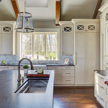
This new construction home built next to a serene lake features a gorgeous, large-scale kitchen that also connects to a bar, home office, breakfast room and great room. The homeowners sought the warmth of traditional styling, updated for today. In addition, they wanted to incorporate unexpected touches that would add personality. Strategic use of furniture details combined with clean lines brings the traditional style forward, making the kitchen feel fresh, new and timeless.
**What Makes This Project Unique?*
Three finishes, including vintage white paint, stained cherry and textured painted gray oak cabinetry, work together beautifully to create a varied, unique space. Above the wall cabinets, glass cabinets with X mullions add interest and decorative storage. Single ovens are tucked in cabinets under a window, and a warming drawer under one perfectly matches the cabinet drawer under the other. Matching furniture-style armoires flank the wall ovens, housing the freezer and a pantry in one and custom designed large scale appliance garage with retractable doors in the other. Other furniture touches can be found on the sink cabinet and range top cabinet that help complete the look. The variety of colors and textures of the stained and painted cabinetry, custom dark finish copper hood, wood ceiling beams, glass cabinets, wood floors and sleek backsplash bring the whole look together.
**Design Challenges*
Even though the space is large, we were challenged by having to work around the two doorways, two windows and many traffic patterns that run through the kitchen. Wall space for large appliances was quickly in short supply. Because we were involved early in the project, we were able to work with the architect to expanded the kitchen footprint in order to make the layout work and get appliance placement just right. We had other architectural elements to work with that we wanted to compliment the kitchen design but also dictated what we could do with the cabinetry. The wall cabinet height was determined based on the beams in the space. The oven wall with furniture armoires was designed around the window with the lake view. The height of the oven cabinets was determined by the window. We were able to use these obstacles and challenges to design creatively and make this kitchen one of a kind.
Photo by MIke Kaskel
 Landis Architects | Builders
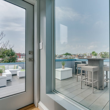
The owners of this Washington, D.C. row house wanted an outdoor area where they could entertain and enjoy views of the Washington Monument and Capitol Building. Our design team worked closely with the clients to help them maximize the usable deck space on the roof and create the relaxing vibe they wanted. As the deck is on a historic row house, we had to work with the Historic Review Board to make sure the design met their requirements. We constructed the supports for the new deck, walls, and provided comfortable access through a structure with a full size door.
Historic Review. Since the roof deck is on a house in the historic district, the city’s historic review board had to approve the design. Any roof structure could not be visible from the street. The roof pitch of the L-shaped structure at the front of the house is located along the sight lines of the building, so you can’t see it from the street. For the review, we actually framed a mock-up out of the structure and then checked if it was visible from the street. The shape and size of the access structure on the roof was dictated by both the historic rules listed above and structural/code issues.
Structural Review/Code. Our designer used every square foot available based on set back and historic requirements. This included creating a two-level deck with steps in between. The roof deck is actually treated as a penthouse, so it has to be set back a certain distance. Structurally, each of side party walls is a bearing wall. The structural beams are excluded as a part of the “structure” and are not included in the setback space. The horizontal setback had to equal the height of the floor above the existing structure. With a pitched roof, that ends up being at 2 levels. The step is as much zoning issue as it is an aesthetic one.
HDBros
 ALL Renovation & Design LLC
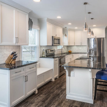
The old Bauman kitchen was terribly partitioned off. The laundry room and closet left a narrow hallway between the kitchen and the dining room. The Bauman’s really wanted an open space.
They connected with ALL Renovation & Design at a home show. And we immediately got to work modifying the existing space. This proved to be a challenge because there was almost nowhere for the ductwork that fed the upstairs to go. But with some creative planning, we rerouted the ducts to go inside the cabinet next to the wine rack. This allowed us to knock out the walls that separated the kitchen and the dining room giving a beautiful open space.
The homeowner had several requests that were designed to make their daily life easier. One was adding a second sink to the island. Another request was extending the kitchen past the window to allow for more cabinets and counter space. In between, we added a comfortable window seat.All the lighting was designed around how the space was going to be used. An example is how where the table was going to be positioned in the dining room next to the pantry and custom wine rack dictated where the ceiling fan and recessed lighting would be installed.The result is a beautiful, functional space that is completely open… just what the Bauman’s wanted.
Maple cabinets painted Simply White, Via Lactea Granite countertops, Arley Anatolia Classic 3”x6” tile backsplash in the Matte Carrara with the Mapei Pewter grout, Coretech Georgetown Oak Luxury Vinyl Tile flooring, and LED i-Lighting undercabinet lighting.
Find the right local pro for your project
 Landis Architects | Builders
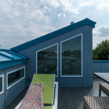
The owners of this Washington, D.C. row house wanted an outdoor area where they could entertain and enjoy views of the Washington Monument and Capitol Building. Our design team worked closely with the clients to help them maximize the usable deck space on the roof and create the relaxing vibe they wanted. As the deck is on a historic row house, we had to work with the Historic Review Board to make sure the design met their requirements. We constructed the supports for the new deck, walls, and provided comfortable access through a structure with a full size door.
Historic Review. Since the roof deck is on a house in the historic district, the city’s historic review board had to approve the design. Any roof structure could not be visible from the street. The roof pitch of the L-shaped structure at the front of the house is located along the sight lines of the building, so you can’t see it from the street. For the review, we actually framed a mock-up out of the structure and then checked if it was visible from the street. The shape and size of the access structure on the roof was dictated by both the historic rules listed above and structural/code issues.
Structural Review/Code. Our designer used every square foot available based on set back and historic requirements. This included creating a two-level deck with steps in between. The roof deck is actually treated as a penthouse, so it has to be set back a certain distance. Structurally, each of side party walls is a bearing wall. The structural beams are excluded as a part of the “structure” and are not included in the setback space. The horizontal setback had to equal the height of the floor above the existing structure. With a pitched roof, that ends up being at 2 levels. The step is as much zoning issue as it is an aesthetic one.
HDBros
 Orren Pickell Building Group
**Project Overview**
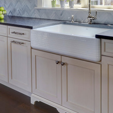
This new construction home built next to a serene lake features a gorgeous, large-scale kitchen that also connects to a bar, home office, breakfast room and great room. The homeowners sought the warmth of traditional styling, updated for today. In addition, they wanted to incorporate unexpected touches that would add personality. Strategic use of furniture details combined with clean lines brings the traditional style forward, making the kitchen feel fresh, new and timeless.
**What Makes This Project Unique?*
Three finishes, including vintage white paint, stained cherry and textured painted gray oak cabinetry, work together beautifully to create a varied, unique space. Above the wall cabinets, glass cabinets with X mullions add interest and decorative storage. Single ovens are tucked in cabinets under a window, and a warming drawer under one perfectly matches the cabinet drawer under the other. Matching furniture-style armoires flank the wall ovens, housing the freezer and a pantry in one and custom designed large scale appliance garage with retractable doors in the other. Other furniture touches can be found on the sink cabinet and range top cabinet that help complete the look. The variety of colors and textures of the stained and painted cabinetry, custom dark finish copper hood, wood ceiling beams, glass cabinets, wood floors and sleek backsplash bring the whole look together.
**Design Challenges*
Even though the space is large, we were challenged by having to work around the two doorways, two windows and many traffic patterns that run through the kitchen. Wall space for large appliances was quickly in short supply. Because we were involved early in the project, we were able to work with the architect to expanded the kitchen footprint in order to make the layout work and get appliance placement just right. We had other architectural elements to work with that we wanted to compliment the kitchen design but also dictated what we could do with the cabinetry. The wall cabinet height was determined based on the beams in the space. The oven wall with furniture armoires was designed around the window with the lake view. The height of the oven cabinets was determined by the window. We were able to use these obstacles and challenges to design creatively and make this kitchen one of a kind.
Photo by MIke Kaskel
 Amanda Martocchio Architecture
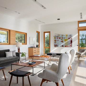
When a world class sailing champion approached us to design a Newport home for his family, with lodging for his sailing crew, we set out to create a clean, light-filled modern home that would integrate with the natural surroundings of the waterfront property, and respect the character of the historic district.
Our approach was to make the marine landscape an integral feature throughout the home. One hundred eighty degree views of the ocean from the top floors are the result of the pinwheel massing. The home is designed as an extension of the curvilinear approach to the property through the woods and reflects the gentle undulating waterline of the adjacent saltwater marsh. Floodplain regulations dictated that the primary occupied spaces be located significantly above grade; accordingly, we designed the first and second floors on a stone “plinth” above a walk-out basement with ample storage for sailing equipment. The curved stone base slopes to grade and houses the shallow entry stair, while the same stone clads the interior’s vertical core to the roof, along which the wood, glass and stainless steel stair ascends to the upper level.
One critical programmatic requirement was enough sleeping space for the sailing crew, and informal party spaces for the end of race-day gatherings. The private master suite is situated on one side of the public central volume, giving the homeowners views of approaching visitors. A “bedroom bar,” designed to accommodate a full house of guests, emerges from the other side of the central volume, and serves as a backdrop for the infinity pool and the cove beyond.
Also essential to the design process was ecological sensitivity and stewardship. The wetlands of the adjacent saltwater marsh were designed to be restored; an extensive geo-thermal heating and cooling system was implemented; low carbon footprint materials and permeable surfaces were used where possible. Native and non-invasive plant species were utilized in the landscape. The abundance of windows and glass railings maximize views of the landscape, and, in deference to the adjacent bird sanctuary, bird-friendly glazing was used throughout.
Photo: Michael Moran/OTTO Photography
 Just the Thing
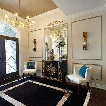
Adding trim to the main wall in the entry integrates the portion of the space below the dropped ceiling with the rest of the wall -- visually and functionally enlarging the space. The depth of the bulkhead dictated the size and proportion of the panels we created. To further distract from the change in ceiling height, we added a carved medallion to the centre panel. We wanted to highlight the trim here, to add interest and definition, so we had them painted antique gold. The ceiling too was given a glam mottled gold finish. The simple, modern chandelier is oversized for the space, but its spare lines keep it from being overwhelming.
A new smaller but bolder console table -- its black and gold echoing the stronger details of the living room beyond -- is given added importance by the full-length mirror behind it. The client's own chairs were moved from the family room -- where they were just "okay". Here their contemporary style nicely contrasts with the ornate chest, while dark teal toss pillows add a powerful note that is repeated throughout the main level. Together with the client's bench on the other side of the door, the chairs create an inviting seating area for parties, as well as a thoughtful aid when donning or doffing footwear.
We found this area rug on the floor in the family room, where it was too small and too strong for the furnishings. Here it takes on a whole new life as the PERFECT finishing touch.
 Landis Architects | Builders
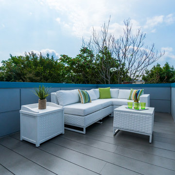
The owners of this Washington, D.C. row house wanted an outdoor area where they could entertain and enjoy views of the Washington Monument and Capitol Building. Our design team worked closely with the clients to help them maximize the usable deck space on the roof and create the relaxing vibe they wanted. As the deck is on a historic row house, we had to work with the Historic Review Board to make sure the design met their requirements. We constructed the supports for the new deck, walls, and provided comfortable access through a structure with a full size door.
Historic Review. Since the roof deck is on a house in the historic district, the city’s historic review board had to approve the design. Any roof structure could not be visible from the street. The roof pitch of the L-shaped structure at the front of the house is located along the sight lines of the building, so you can’t see it from the street. For the review, we actually framed a mock-up out of the structure and then checked if it was visible from the street. The shape and size of the access structure on the roof was dictated by both the historic rules listed above and structural/code issues.
Structural Review/Code. Our designer used every square foot available based on set back and historic requirements. This included creating a two-level deck with steps in between. The roof deck is actually treated as a penthouse, so it has to be set back a certain distance. Structurally, each of side party walls is a bearing wall. The structural beams are excluded as a part of the “structure” and are not included in the setback space. The horizontal setback had to equal the height of the floor above the existing structure. With a pitched roof, that ends up being at 2 levels. The step is as much zoning issue as it is an aesthetic one.
HDBros
 Etheredge Design Associates, Inc.
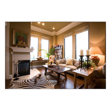
Using a "lifetime of collected pieces" from a sprawling ranch style home and introducing them into an urban mid-rise is an exciting challenge.
Designed for a couple down sizing from the sale of their home, the unit is quite small with a total of 1,807 square feet laid out in an open gallery floor plan with bedrooms at each end. The design was planned to accommodate the couple's extensive art collection, primitive antiques and textiles to maintain an atmosphere which replicated their former home. One of the challenges of this project was a requirement of the owners to incorporate the large scale antique pieces into this small space.
The window walls provide a dramatic view of the city and also dictate that the location for the taller antiques would be on the two remaining walls. The primary living space was divided into three separate areas: a dining area, a media area, and an area for reading and enjoying the fireplace on a winter day or evening. Hardwood flooring throughout creates continuity and an easy transition into the bedrooms adjacent to the primary space. To unify the suite and create the illusion of spaciousness, the walls throughout were painted the same rich yet neutral toast color, and all of the beautiful ceiling and floor molding are finished in a soft white. The finished space is all the owners desired in a residence that reflects their varied tastes, incorporates their interests and provides a comfortable home for entertaining family and friends.
 ALL Renovation & Design LLC
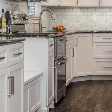
The old Bauman kitchen was terribly partitioned off. The laundry room and closet left a narrow hallway between the kitchen and the dining room. The Bauman’s really wanted an open space.
They connected with ALL Renovation & Design at a home show. And we immediately got to work modifying the existing space. This proved to be a challenge because there was almost nowhere for the ductwork that fed the upstairs to go. But with some creative planning, we rerouted the ducts to go inside the cabinet next to the wine rack. This allowed us to knock out the walls that separated the kitchen and the dining room giving a beautiful open space.
The homeowner had several requests that were designed to make their daily life easier. One was adding a second sink to the island. Another request was extending the kitchen past the window to allow for more cabinets and counter space. In between, we added a comfortable window seat.All the lighting was designed around how the space was going to be used. An example is how where the table was going to be positioned in the dining room next to the pantry and custom wine rack dictated where the ceiling fan and recessed lighting would be installed.The result is a beautiful, functional space that is completely open… just what the Bauman’s wanted.
Maple cabinets painted Simply White, Via Lactea Granite countertops, Arley Anatolia Classic 3”x6” tile backsplash in the Matte Carrara with the Mapei Pewter grout, Coretech Georgetown Oak Luxury Vinyl Tile flooring, and LED i-Lighting undercabinet lighting.
 Etheredge Design Associates, Inc.
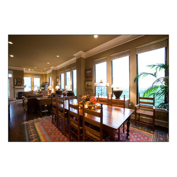
Using a "lifetime of collected pieces" from a sprawling ranch style home and introducing them into an urban mid-rise is an exciting challenge.
Designed for a couple down sizing from the sale of their home, the unit is quite small with a total of 1,807 square feet laid out in an open gallery floor plan with bedrooms at each end. The design was planned to accommodate the couple's extensive art collection, primitive antiques and textiles to maintain an atmosphere which replicated their former home. One of the challenges of this project was a requirement of the owners to incorporate the large scale antique pieces into this small space.
The window walls provide a dramatic view of the city and also dictate that the location for the taller antiques would be on the two remaining walls. The primary living space was divided into three separate areas: a dining area, a media area, and an area for reading and enjoying the fireplace on a winter day or evening. Hardwood flooring throughout creates continuity and an easy transition into the bedrooms adjacent to the primary space. To unify the suite and create the illusion of spaciousness, the walls throughout were painted the same rich yet neutral toast color, and all of the beautiful ceiling and floor molding are finished in a soft white. The finished space is all the owners desired in a residence that reflects their varied tastes, incorporates their interests and provides a comfortable home for entertaining family and friends.
 ALL Renovation & Design LLC
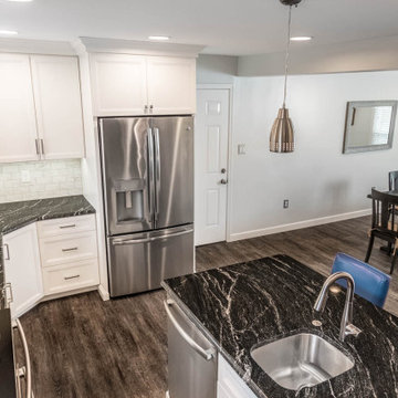
The old Bauman kitchen was terribly partitioned off. The laundry room and closet left a narrow hallway between the kitchen and the dining room. The Bauman’s really wanted an open space.
They connected with ALL Renovation & Design at a home show. And we immediately got to work modifying the existing space. This proved to be a challenge because there was almost nowhere for the ductwork that fed the upstairs to go. But with some creative planning, we rerouted the ducts to go inside the cabinet next to the wine rack. This allowed us to knock out the walls that separated the kitchen and the dining room giving a beautiful open space.
The homeowner had several requests that were designed to make their daily life easier. One was adding a second sink to the island. Another request was extending the kitchen past the window to allow for more cabinets and counter space. In between, we added a comfortable window seat.All the lighting was designed around how the space was going to be used. An example is how where the table was going to be positioned in the dining room next to the pantry and custom wine rack dictated where the ceiling fan and recessed lighting would be installed.The result is a beautiful, functional space that is completely open… just what the Bauman’s wanted.
Maple cabinets painted Simply White, Via Lactea Granite countertops, Arley Anatolia Classic 3”x6” tile backsplash in the Matte Carrara with the Mapei Pewter grout, Coretech Georgetown Oak Luxury Vinyl Tile flooring, and LED i-Lighting undercabinet lighting.
 ALL Renovation & Design LLC
The old Bauman kitchen was terribly partitioned off. The laundry room and closet left a narrow hallway between the kitchen and the dining room. The Bauman’s really wanted an open space.
They connected with ALL Renovation & Design at a home show. And we immediately got to work modifying the existing space. This proved to be a challenge because there was almost nowhere for the ductwork that fed the upstairs to go. But with some creative planning, we rerouted the ducts to go inside the cabinet next to the wine rack. This allowed us to knock out the walls that separated the kitchen and the dining room giving a beautiful open space.
The homeowner had several requests that were designed to make their daily life easier. One was adding a second sink to the island. Another request was extending the kitchen past the window to allow for more cabinets and counter space. In between, we added a comfortable window seat.All the lighting was designed around how the space was going to be used. An example is how where the table was going to be positioned in the dining room next to the pantry and custom wine rack dictated where the ceiling fan and recessed lighting would be installed.The result is a beautiful, functional space that is completely open… just what the Bauman’s wanted.
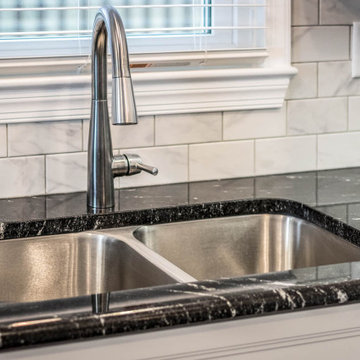
Maple cabinets painted Simply White, Via Lactea Granite countertops, Arley Anatolia Classic 3”x6” tile backsplash in the Matte Carrara with the Mapei Pewter grout, Coretech Georgetown Oak Luxury Vinyl Tile flooring, and LED i-Lighting undercabinet lighting.
 Landis Architects | Builders
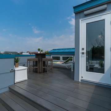
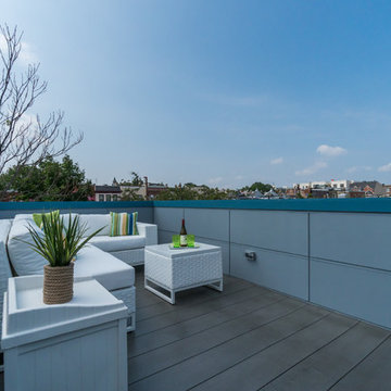
The owners of this Washington, D.C. row house wanted an outdoor area where they could entertain and enjoy views of the Washington Monument and Capitol Building. Our design team worked closely with the clients to help them maximize the usable deck space on the roof and create the relaxing vibe they wanted. As the deck is on a historic row house, we had to work with the Historic Review Board to make sure the design met their requirements. We constructed the supports for the new deck, walls, and provided comfortable access through a structure with a full size door.
Historic Review. Since the roof deck is on a house in the historic district, the city’s historic review board had to approve the design. Any roof structure could not be visible from the street. The roof pitch of the L-shaped structure at the front of the house is located along the sight lines of the building, so you can’t see it from the street. For the review, we actually framed a mock-up out of the structure and then checked if it was visible from the street. The shape and size of the access structure on the roof was dictated by both the historic rules listed above and structural/code issues.
Structural Review/Code. Our designer used every square foot available based on set back and historic requirements. This included creating a two-level deck with steps in between. The roof deck is actually treated as a penthouse, so it has to be set back a certain distance. Structurally, each of side party walls is a bearing wall. The structural beams are excluded as a part of the “structure” and are not included in the setback space. The horizontal setback had to equal the height of the floor above the existing structure. With a pitched roof, that ends up being at 2 levels. The step is as much zoning issue as it is an aesthetic one.
HDBros
 Landis Architects | Builders
The owners of this Washington, D.C. row house wanted an outdoor area where they could entertain and enjoy views of the Washington Monument and Capitol Building. Our design team worked closely with the clients to help them maximize the usable deck space on the roof and create the relaxing vibe they wanted. As the deck is on a historic row house, we had to work with the Historic Review Board to make sure the design met their requirements. We constructed the supports for the new deck, walls, and provided comfortable access through a structure with a full size door.
Historic Review. Since the roof deck is on a house in the historic district, the city’s historic review board had to approve the design. Any roof structure could not be visible from the street. The roof pitch of the L-shaped structure at the front of the house is located along the sight lines of the building, so you can’t see it from the street. For the review, we actually framed a mock-up out of the structure and then checked if it was visible from the street. The shape and size of the access structure on the roof was dictated by both the historic rules listed above and structural/code issues.
Structural Review/Code. Our designer used every square foot available based on set back and historic requirements. This included creating a two-level deck with steps in between. The roof deck is actually treated as a penthouse, so it has to be set back a certain distance. Structurally, each of side party walls is a bearing wall. The structural beams are excluded as a part of the “structure” and are not included in the setback space. The horizontal setback had to equal the height of the floor above the existing structure. With a pitched roof, that ends up being at 2 levels. The step is as much zoning issue as it is an aesthetic one.
HDBros
 ALL Renovation & Design LLC
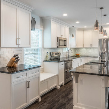
The old Bauman kitchen was terribly partitioned off. The laundry room and closet left a narrow hallway between the kitchen and the dining room. The Bauman’s really wanted an open space.
They connected with ALL Renovation & Design at a home show. And we immediately got to work modifying the existing space. This proved to be a challenge because there was almost nowhere for the ductwork that fed the upstairs to go. But with some creative planning, we rerouted the ducts to go inside the cabinet next to the wine rack. This allowed us to knock out the walls that separated the kitchen and the dining room giving a beautiful open space.
The homeowner had several requests that were designed to make their daily life easier. One was adding a second sink to the island. Another request was extending the kitchen past the window to allow for more cabinets and counter space. In between, we added a comfortable window seat.All the lighting was designed around how the space was going to be used. An example is how where the table was going to be positioned in the dining room next to the pantry and custom wine rack dictated where the ceiling fan and recessed lighting would be installed.The result is a beautiful, functional space that is completely open… just what the Bauman’s wanted.
Maple cabinets painted Simply White, Via Lactea Granite countertops, Arley Anatolia Classic 3”x6” tile backsplash in the Matte Carrara with the Mapei Pewter grout, Coretech Georgetown Oak Luxury Vinyl Tile flooring, and LED i-Lighting undercabinet lighting.
 Sunspace Design, Inc.
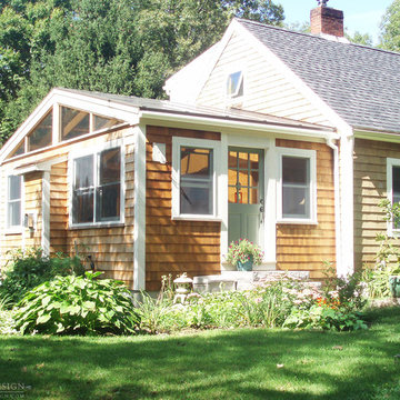
The client was looking to expand an area off of their existing kitchen in order to create a space for dining and relaxation. Unfortunately, the location of the kitchen at the rear of the home meant that any expansion would create a darker kitchen than the client wanted. Enter Sunspace Design. We suggested the use of a glass roof complete with triangular windows to maximize the levels of much needed natural light. This design would allow for the light to flood the new addition, but also penetrate into the existing kitchen and transform the quality of that space as well.
The client’s existing kitchen design was a variation of the “cabin” or country aesthetic, so Sunspace used its natural wood system. This allowed the frame of the glass roof to be stained to match the surrounding style. We are proud of the flexibility of our products when used in conjunction with standard types of construction. Our designs are tailored to achieve whatever goals the clients might have. And because we only use windows from the top US manufacturers, we’re able to pair these designs with stunning levels of natural light. The result is a space that can completely revitalize a home’s atmosphere.
Our use of high performance glass treatments provides us with an important degree of control over both the light levels and the solar gain of a space. This enables us to establish a comfortable year-round environment; our spaces are capable of being efficiently heated or cooled as the seasons dictate. We’ve been in the business for a long time, and we can say with confidence that our glass designs allow any type of addition to become the favorite focal point in anyone’s home.
 ALL Renovation & Design LLC
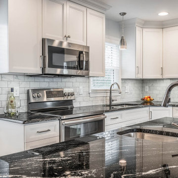
The old Bauman kitchen was terribly partitioned off. The laundry room and closet left a narrow hallway between the kitchen and the dining room. The Bauman’s really wanted an open space.
They connected with ALL Renovation & Design at a home show. And we immediately got to work modifying the existing space. This proved to be a challenge because there was almost nowhere for the ductwork that fed the upstairs to go. But with some creative planning, we rerouted the ducts to go inside the cabinet next to the wine rack. This allowed us to knock out the walls that separated the kitchen and the dining room giving a beautiful open space.
The homeowner had several requests that were designed to make their daily life easier. One was adding a second sink to the island. Another request was extending the kitchen past the window to allow for more cabinets and counter space. In between, we added a comfortable window seat.All the lighting was designed around how the space was going to be used. An example is how where the table was going to be positioned in the dining room next to the pantry and custom wine rack dictated where the ceiling fan and recessed lighting would be installed.The result is a beautiful, functional space that is completely open… just what the Bauman’s wanted.
Maple cabinets painted Simply White, Via Lactea Granite countertops, Arley Anatolia Classic 3”x6” tile backsplash in the Matte Carrara with the Mapei Pewter grout, Coretech Georgetown Oak Luxury Vinyl Tile flooring, and LED i-Lighting undercabinet lighting.
 SkyWindows & Aluminum Products
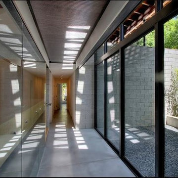
When a potential customer takes that first glimpse at a storefront, an initial impression is being formed and expectations are being set. Our work brings the added value that businesses require in order to showcase their products and increase their sales. The striking designs, that we are known for, are specifically created not only to be aesthetically pleasing, but to lure shoppers into your place of business.
Many individual business owners are unaware of the fact that creating the design that a potential customer sees from the street is an exact science when displaying products and constructing an eye catching visual presentation. We also understand that each business that we work with is unique when it comes to the way potential customers perceive that store. If a storefronts appearance is not constructed correctly, a potential customer may immediately dismiss that particular store as “unprofessional” or worse, they might not even register the presence of that store at all when it just blends into the background!
This is the main reason why we pride ourselves so highly on the work that we do for our clients. The professionals at our company understand the complex guidelines that dictate what attracts buyers with a perfect visual approach to a particular design. But, of course, the quality will also need to be superior so that fading and overall deterioration of that design will not become a detriment to the goals of a business owner. This is why we utilize only the best materials and exact construction standards that will allow a store owner’s exterior presentation to be visually pleasing to the eye for years to come.
Whether you need our assistance just to keep your store front from closing improperly or more extensive construction, we’re here to help you with all your business needs when it comes to the visual perception of your store.
 Amanda Martocchio Architecture
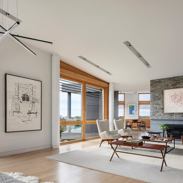
When a world class sailing champion approached us to design a Newport home for his family, with lodging for his sailing crew, we set out to create a clean, light-filled modern home that would integrate with the natural surroundings of the waterfront property, and respect the character of the historic district.
Our approach was to make the marine landscape an integral feature throughout the home. One hundred eighty degree views of the ocean from the top floors are the result of the pinwheel massing. The home is designed as an extension of the curvilinear approach to the property through the woods and reflects the gentle undulating waterline of the adjacent saltwater marsh. Floodplain regulations dictated that the primary occupied spaces be located significantly above grade; accordingly, we designed the first and second floors on a stone “plinth” above a walk-out basement with ample storage for sailing equipment. The curved stone base slopes to grade and houses the shallow entry stair, while the same stone clads the interior’s vertical core to the roof, along which the wood, glass and stainless steel stair ascends to the upper level.
One critical programmatic requirement was enough sleeping space for the sailing crew, and informal party spaces for the end of race-day gatherings. The private master suite is situated on one side of the public central volume, giving the homeowners views of approaching visitors. A “bedroom bar,” designed to accommodate a full house of guests, emerges from the other side of the central volume, and serves as a backdrop for the infinity pool and the cove beyond.
Also essential to the design process was ecological sensitivity and stewardship. The wetlands of the adjacent saltwater marsh were designed to be restored; an extensive geo-thermal heating and cooling system was implemented; low carbon footprint materials and permeable surfaces were used where possible. Native and non-invasive plant species were utilized in the landscape. The abundance of windows and glass railings maximize views of the landscape, and, in deference to the adjacent bird sanctuary, bird-friendly glazing was used throughout.
Photo: Michael Moran/OTTO Photography
40