
Search results for "Differentiation" in Home Design Ideas
 Dimensions in Wood Inc
This client’s vision for their kitchen/hearth room remodel was to create a harmonious space for gathering and socializing with family and friends. Without the before and after photos, you would scarcely believe this was the same home.
This huge home renovation perfectly illustrates that Dimensions In Wood’s expert team can handle every aspect of your remodeling project. Plumbing, flooring, electrical wiring, custom cabinets, structural engineering, appliances, windows, interior and exterior doors, entertainment and more. Contact us today to discuss Translating Your Visions into Reality
The client was interested in new appliance technology, cabinetry to the ceiling, and an Island large enough to seat 3. They also wanted a built-in breakfast nook, improved pantry space, more functional storage on either side of their fireplace, and a built-in appearance for the TV above the mantel. The original built-in desk was not used, and they preferred for that space to serve as a small bar area with refrigeration and a place to store their printer. We designed several plans for the space before selecting the final layout.
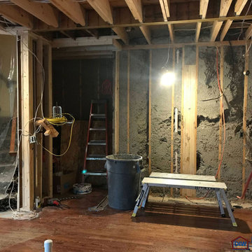
The new design required the removal of the soffit over the old sink, as well as a small wall beside the old refrigerator. The wall beside the stairwell had to be shortened 13 inches and a new beam installed to carry the load of the home’s 2nd story to gain enough space for the large central island. The existing closet pantry walls were also reconfigured as per the new plan.
This serves as a great reminder that Dimensions In Wood is much more than just custom cabinets.
Central to the entire custom kitchen is an 8-foot Walnut island. The huge island, which comfortably seats three, is topped with Essenza Blue quartzite. The stone’s natural striations are beautiful. Quartzite is harder than granite, and less likely to stain than other stones because of its density. The couple had to look through multiple slabs to find a piece they LOVED. The island’s custom Walnut cabinetry, built to resemble a piece of custom furniture, was stained Bronzed Walnut by Sherwin Williams.
The 4-foot Galley Workstation in the island, handles all the kitchen’s prep, serving, and cleanup needs. The Galley’s culinary tools include an upper tier cutting board, upper tier drying rack, 2 lower tier platforms, 11″ colander with non-slip handles, and 11” mixing bowl with lid and non-slip bottom. Learn more about the amazing Galley Workstation here. A Waterstone gantry faucet in a pewter finish combines a pull-down sprayer for maximum mobility and a articulated swivel spout. A water tap with reverse osmosis filter provides the highest quality drinking water. To keep a clean and sleek counter we installed a raised air switch for the garbage disposal and integrated soap dispenser. The island also houses the Thermador Sapphire 7-Program Dishwasher with a hidden touch control panel and a custom Walnut wood front. The cabinetry under the Galley Workstation features a trash roll out, as well as storage for the culinary tools.
Shortening the stairwell wall, and reframing around the stairs, which included shortening the handrail, also made room for a bi-fold door walk-in pantry with extra roll out storage and space for a small microwave. Above the panty doors is a remote controlled, electric motor powered, lift up cabinet door which hides a flat screen TV, used while the family is cooking.
To the right of the walk-in pantry is cold food storage. The Thermador, 30-inch Freedom Collection refrigerator and 24-inch built-in freezer column with internal ice maker are covered with matching cabinetry fronts. An open display space was designed above the units, creating an aesthetically beautiful wall. To the right of the refrigerator & freezer columns is a tall cabinet designed for the built-in Thermador steam and convection oven. The convention steam oven is a relatively new technology for homes, but its versatility and food quality is amazing. To the right of this is a pull-out appliance pantry which provides easy access and storage for a stand mixer, blender, and any other appliance you do not want to clutter the counter.
The most visible wall of the kitchen features the 36-inch Thermador Professional Series Harmony Gas Range with Griddle. Between the range and custom designed wood hood, a framed mosaic tile accent in the backsplash, creates a focal point. To clear the air, the Professional Series Thermador 42-inch ventilation insert provides excellent exhaust capabilities, as well as providing multi-level, vivid LED lights for beautiful illumination.
The wall cabinetry symmetrically flanks the custom hood, utilizing deeper wall cabinetry on each end, allowing for storage of oversized dishware. The base cabinetry on this wall is made up of drawers, except for the corner, which is a Kesseböhmer LeMans II. This specially designed shelf system allows ease of access in underutilized blind corners. The dual action articulation system with soft close mechanism ensures a smooth open and close.
Rounding the corner to the outside wall, the base cabinetry was built to a narrower depth, providing additional space for the island, as well as easier access to the new larger pass-thru window which serves the screen porch. The client selected Black Vermont granite countertops with an ogee edge to contrast the Linen White painted cabinetry.
The door to the screen porch was replaced with a Marvin Exterior Door with a raised panel at the bottom of the 3⁄4 glass door.
Marvin Windows replaced the other windows in the space increasing the energy efficiency and value of the home. To establish the breakfast nook, a bench with drawers and an upholstered seat was built into the bay area of the room.
Custom bookshelves were built with open shelves, cabinet doors, and drawers on either side of the fireplace. A new stone hearth and fireplace surround were installed. Above the existing mantel we built a recessed space for the flat screen television hiding all wiring inside the walls for a completely clean look.
The space that was once a desk was transformed into a bar area. The glass shelves and glass cabinet front liquor cabinet stand out. But this bar area has hidden secrets. Tucked beneath the black granite is a Thermador under-counter double drawer refrigerator with matching wood front panels. They blend in perfectly with the cabinets. A wireless printer is easily accessed on a slide out drawer. Plus, what looks like merely wooden panels on the wall are concealing recessed storage for more bottles and glasses!
Overhead recessed lighting and speaker system provide illumination and entertainment through the entire space.
This luxury home had original, solid oak flooring through most of the first floor which the homeowner obviously wanted to keep but were in desperate need of repair and refinishing. Our master craftsmen wove in new wood flooring to match the old where needed, particularly where walls had been changed and where the floor was damaged. We sanded the floors, smoothing away years of wear and tear. The entire wood floor was then uniformly stained, making it impossible to differentiate where any repairs were made.
If this renovation has inspired you, then contact us today! There is no limit to our Dimensions.
 nC2 architecture llc
A new, ground-up attached house facing Cooper Park in Williamsburg Brooklyn. The site is in a row of small 1950s two-story, split-level brick townhouses, some of which have been modified and enlarged over the years and one of which was replaced by this building.
The exterior is intentionally subdued, reminiscent of the brick warehouse architecture that occupies much of the neighborhood. In contrast, the interior is bright, dynamic and highly-innovative. In a nod to the original house, nC2 opted to explore the idea of a new, urban version of the split-level home.
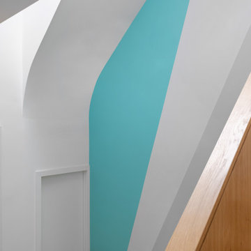
The house is organized around a stair oriented laterally at its center, which becomes a focal point for the free-flowing spaces that surround it. All of the main spaces of the house - entry hall, kitchen/dining area, living room, mezzanine and a tv room on the top floor - are open to each other and to the main stair. The split-level configuration serves to differentiate these spaces while maintaining the open quality of the house.
A four-story high mural by the artist Jerry Inscoe occupies one entire side of the building and creates a dialog with the architecture. Like the building itself, it can only be truly appreciated by moving through the spaces.
 DEANE Inc | Distinctive Design & Cabinetry
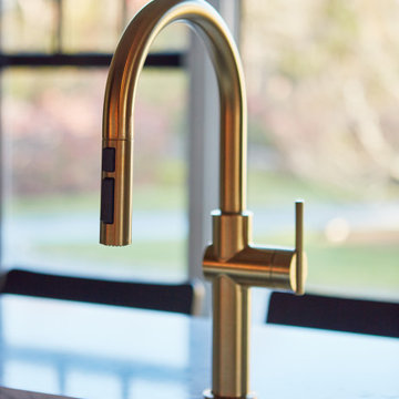
The guest house underwent a massive renovation, transforming a dated space with small rooms into an open, modern, multi-functional area for entertaining, working, and hosting guests. The original galley layout was changed to a long wall with black leather granite countertops and a backsplash in herringbone natural stone. The island is a dark stained walnut with a durable quartz countertop, echoed by the frameless cabinetry painted in a black matte finish. Soft satin brass accents are complemented by the chandelier. The coffee/wine bar area is differentiated by open shelving and a wood plank backsplash painted with walnut shelves to anchor it as a separate area.
Full SubZero columns add true functionality to this guest house, so much so that the homeowners lived here while renovating their main house.
Find the right local pro for your project
 nC2 architecture llc
A new, ground-up attached house facing Cooper Park in Williamsburg Brooklyn. The site is in a row of small 1950s two-story, split-level brick townhouses, some of which have been modified and enlarged over the years and one of which was replaced by this building.
The exterior is intentionally subdued, reminiscent of the brick warehouse architecture that occupies much of the neighborhood. In contrast, the interior is bright, dynamic and highly-innovative. In a nod to the original house, nC2 opted to explore the idea of a new, urban version of the split-level home.
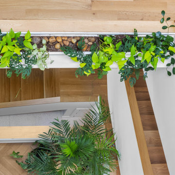
The house is organized around a stair oriented laterally at its center, which becomes a focal point for the free-flowing spaces that surround it. All of the main spaces of the house - entry hall, kitchen/dining area, living room, mezzanine and a tv room on the top floor - are open to each other and to the main stair. The split-level configuration serves to differentiate these spaces while maintaining the open quality of the house.
A four-story high mural by the artist Jerry Inscoe occupies one entire side of the building and creates a dialog with the architecture. Like the building itself, it can only be truly appreciated by moving through the spaces.
 Thayer Hopkins Architects
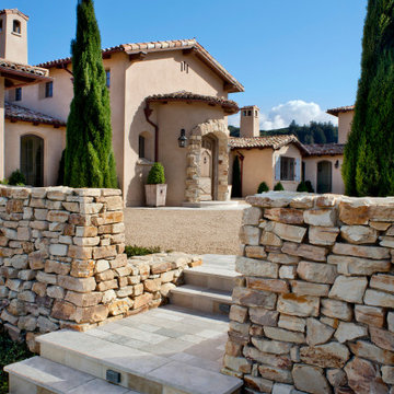
The Santa Lucia Estate is located on a private reserve in Upper Carmel Valley situated on a gentle grassland ridge with dramatic views of the surrounding valleys and coastal range. The house is not immediately visible and is approached from below by a winding drive and the initial view of the house is revealed through a masonry gateway surrounded by curvilinear walls made from local stone that enclose a protected forecourt.
The forms of the house are expressed in two materials, stucco and dry stack stone veneer to differentiate the elements, to reflect the vernacular of the Monterey regional style, and to give the house the appearance of having various elements that have been added over time.
The entry façade and the arched arcade of the entry court are symmetrical, and that formality gives way to asymmetrical enclosing wings. The building elements are placed to reflect both the Owner’s program and to fit in the topography of the site. A dominant gabled roof centers the composition of the front façade and creates space and light for the Entry Foyer and to the Dining and Living areas that open to the views on the opposite side. The Garage is located on the right of the forecourt, and the three arched openings reiterate the arches of the French doors in the main arcade. This wing contains a second story floor and traditional decorative timber balcony with views of the surrounding landscape. The main hallway that runs the length of the house is located at the entry court, forming and enfilade from which the formal living spaces and outdoor terraces are located on the opposite southeast side. The placement of these rooms allows a transition from indoor to outdoor terraces that takes advantage of protection from the prevailing wind, provides optimal solar exposure, and orients the living spaces toward the dramatic view corridor down the Potrero Valley.
Two roof towers at either end of the longitudinal ridge anchor the building and provide space, focal point and daylight to the interior. A stone Caretaker’s Cottage is located down slope from the main residence.

 Done Renovations
Isaac Brown
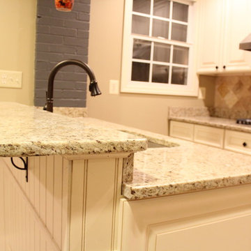
Small elegant galley enclosed kitchen photo in DC Metro with a single-bowl sink, raised-panel cabinets, white cabinets, granite countertops, beige backsplash, ceramic backsplash, stainless steel appliances and a peninsula
Small elegant galley enclosed kitchen photo in DC Metro with a single-bowl sink, raised-panel cabinets, white cabinets, granite countertops, beige backsplash, ceramic backsplash, stainless steel appliances and a peninsula
 Jorge Ulibarri Custom Homes
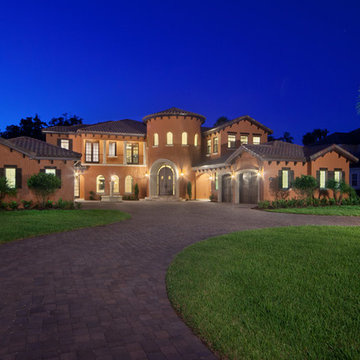
This 6,300 square foot custom home by Orlando Custom Home Builder Jorge Ulibarri is located in the country club community of Heathrow, just north of Orlando, Florida. Curb appeal comes from its two-story tower entry, a signature of Jorge Ulibarri custom homes. The front door features solid distressed wood for an Old World character with wrought iron embellished windows. Specialty glass windows with wrought iron detailing crown the tower and cast a beautiful light grid on the interior entryway . The home’s exterior color of terra cotta purposely makes a statement differentiating itself from the ubiquitous beige exterior colored homes in the neighborhood. The home’s metal garage door mimics the look of wood with faux trim that ties together the corbels. The metal garage doors with wood grain finish are framed in precast and together these materials are much more durable in Florida’s heat and humidity than real wood garage doors. Photo credit: Harvey Smith


 DNM Architecture
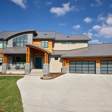
This 1970s vintage residence in Tiburon was ripe for an update. Without changing the house's size or structure, we installed very low-maintenance cement fiber siding, specifically a combination of Nichiha Vintagewood vertical siding and Hardie Plank horizontal siding. This helped to differentiate the shape of the central house from the extensions and to delineate more interesting and cleaner contours. New windows and sliding doors by Fleetwood were also installed. Photography by:
Jonathan Mitchell Photography / jonathanmitchell.co
 nC2 architecture llc
A new, ground-up attached house facing Cooper Park in Williamsburg Brooklyn. The site is in a row of small 1950s two-story, split-level brick townhouses, some of which have been modified and enlarged over the years and one of which was replaced by this building.
The exterior is intentionally subdued, reminiscent of the brick warehouse architecture that occupies much of the neighborhood. In contrast, the interior is bright, dynamic and highly-innovative. In a nod to the original house, nC2 opted to explore the idea of a new, urban version of the split-level home.
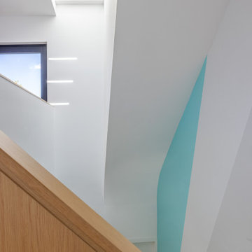
The house is organized around a stair oriented laterally at its center, which becomes a focal point for the free-flowing spaces that surround it. All of the main spaces of the house - entry hall, kitchen/dining area, living room, mezzanine and a tv room on the top floor - are open to each other and to the main stair. The split-level configuration serves to differentiate these spaces while maintaining the open quality of the house.
A four-story high mural by the artist Jerry Inscoe occupies one entire side of the building and creates a dialog with the architecture. Like the building itself, it can only be truly appreciated by moving through the spaces.
 Metropolis Design Group
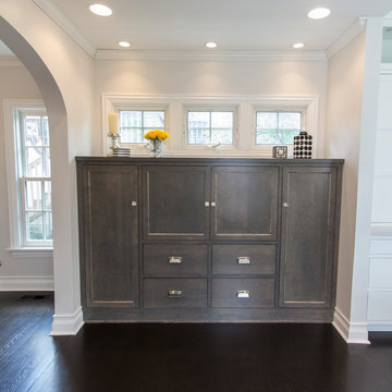
A contrasting gray aniline stain differentiates this nearby pantry. The 3/4 height of the cabinet allows for sunlight to come through while still maintaining visual privacy from neighbors
 Jordan Design Build Group
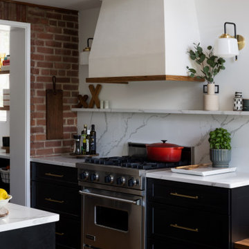
Expanding and updating the kitchen was our top priority – the new layout was designed to straddle the original house and the addition, creating work zones rather than the traditional work triangle. The modified galley layout more than doubled their countertop area and storage space. Extending the kitchen into the addition took full advantage of the vaulted ceilings and light-filled space. To improve flow and connectivity, we opened up a wall between the old kitchen and the front entry hall providing a straight path from front door to the new mudroom/drop zone and kitchen beyond. A door from the dining room into the kitchen was shifted to allow for a more generous kitchen.
The beautifully veined Calacatta Eiffel quartz counters and backsplash provide visual contrast with the black cabinetry and keep the space from feeling too heavy. A continuous ledge and floating shelves replace traditional uppers for a more open and modern feel. Stained wood is used throughout, from the bench top, to shelving, trim and custom millwork; it brings in a natural element and helps unite all of the spaces. A hood with a custom Venetian plaster finish is flanked by vintage inspired sconces and provides a stunning focal point in the room. A deep nook is home to a ‘bubble box’ that dispenses cold sparkling or still water on demand – the marble tile backsplash further differentiates this beverage zone. The brushed brass hardware stands out against the dark cabinets and adds a touch of warmth. With seating for three at the counter and the inclusion of a breakfast area banquette (with drawers), the home is ideal for family time and relaxed gatherings with friends.
 Sebring Design Build
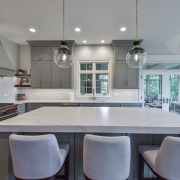
Thick island countertop to differentiate from the perimeter.
Inspiration for a timeless kitchen remodel in Nashville
Inspiration for a timeless kitchen remodel in Nashville
 The Quiet Moose
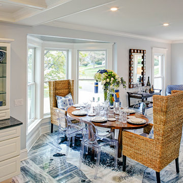
Dining area designed with a light and airy feeling. The ceilings serve to accentuate the height of the room and differentiate the space, without the obstruction of walls.

 Coco Atelier
TER won an honorary mention as a part of the YAC’s Calamity Atelier Competition, in addition to the prestigious A' Design Award for Interior Space & Exhibition Design 2019-2020.
The Calamity Atelier competition was based in the art forest of Arte Sella in northern Italy that was in recent years destroyed by a storm. The focus was to bring back life to the forest through the design of a number of spaces.
Design concept description:
Stability is a universal value one seeks to reach in their lifetime.
Given the recent events that shook the core of Art Sella, the basis of its recovery should be in the form of a stable foundation.
The design concept of TER, Malga Costa’s new restaurant expansion, derives from 3 main ideas:
1. What does a “stable” space feel like? Psychologically and physically.
2. The connection between the forest land and the food that is served at the restaurant.
3. How to integrate this space harmoniously into the forest in a way in which it will live cohesively with the neighboring artwork, nature, and people.
The idea of stability is translated through mass, shape, and materials. Different from most of the forest’s artwork, TER looks like a massive boulder rearing in the forest. The stone exterior makes up the majority of the interior as well, acting as its base material.
With the materials, there is a clear balance of old and new. The old acts as the foundation and pays homage to the area’s roots whereas the new alludes to a burgeoning future. Together, they play a game of layering and develop throughout the space.
The connection between the land and the food comes through the method of cooking in the restaurant- which is campfire cooking. In the center of the plan, there is an open outdoor space that is used to cook foods on an open fire. The plan is designed in a circular motion around the open space in order to fully commit to this concept. Everyone in the four areas of the restaurant can view and enjoy the chefs at work, creating a seemingly interactive dining experience.
The restaurant blends into its surroundings by acting as another rock in the landscape. It is differentiated by the smoke arising from its center, which creates a sense of allure and intrigue. It’s a sight that draws people in toward the center – reestablishing the core essence of Art Sella.
 Katie Hutchison Studio
This project for a builder husband and interior-designer wife involved adding onto and restoring the luster of a c. 1883 Carpenter Gothic cottage in Barrington that they had occupied for years while raising their two sons. They were ready to ditch their small tacked-on kitchen that was mostly isolated from the rest of the house, views/daylight, as well as the yard, and replace it with something more generous, brighter, and more open that would improve flow inside and out. They were also eager for a better mudroom, new first-floor 3/4 bath, new basement stair, and a new second-floor master suite above.
The design challenge was to conceive of an addition and renovations that would be in balanced conversation with the original house without dwarfing or competing with it. The new cross-gable addition echoes the original house form, at a somewhat smaller scale and with a simplified more contemporary exterior treatment that is sympathetic to the old house but clearly differentiated from it.
Renovations included the removal of replacement vinyl windows by others and the installation of new Pella black clad windows in the original house, a new dormer in one of the son’s bedrooms, and in the addition. At the first-floor interior intersection between the existing house and the addition, two new large openings enhance flow and access to daylight/view and are outfitted with pairs of salvaged oversized clear-finished wooden barn-slider doors that lend character and visual warmth.
A new exterior deck off the kitchen addition leads to a new enlarged backyard patio that is also accessible from the new full basement directly below the addition.
(Interior fit-out and interior finishes/fixtures by the Owners)
 Köllen Design
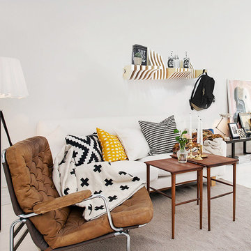
Köllen Bookshelf is a modular shelf design that allows the user to interact with it. This differentiates it from other classic pieces of furniture.
Köllen Bookshelf is a shelf created from the repetition of adaptable pieces in matter of size and shape of the objects on it. Its autonomous structure allows an independent working of each of the strips, so that they can be placed in different positions according to the user’s need. This structure will also allow for it to be a considerably decorative element: it follows a clean structure broken by a curved edge that represents the mountains, in a nod to the piece’s originary region.
 Renovisions
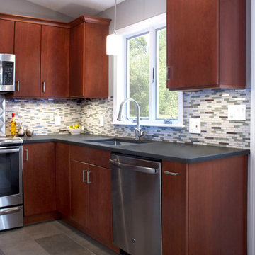
 When our client purchased his mother’s home, the house he grew up in, he knew it was time to update while incorporating his preferred contemporary style. Enter remodeling specialists, Renovisions, who were hired to customize his new look.
The main challenge came with creating a more open floor plan. The kitchen was part of one large room, so making this new space unique and awe-inspiring while differentiating from the surrounding dining room was the goal in mind.
Renovisions accomplished this goal by first removing the walls between the dining room and kitchen to open up the space The idea was to draw your eye into the room with some interesting elements such as a 2-tier island, a functional and creative pull-out storage cabinet, sleek looking stainless steel GE appliances and glass mosaic tiles with stunning stainless steel backsplash in a Harlequin pattern. Cement colored quartz countertops in a suede finish and 12” x 24” larger format textured porcelain floor tile in a varied pattern completed the modern look.
Contemporary designs boast simplicity by focusing on clean lines and an uncluttered look. This is exactly what our client wanted and the contemporary styled frameless cherry cabinetry with a medium dark stain infused a masculine vibe.
 Jordan Design Build Group
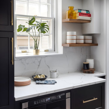
Expanding and updating the kitchen was our top priority – the new layout was designed to straddle the original house and the addition, creating work zones rather than the traditional work triangle. The modified galley layout more than doubled their countertop area and storage space. Extending the kitchen into the addition took full advantage of the vaulted ceilings and light-filled space. To improve flow and connectivity, we opened up a wall between the old kitchen and the front entry hall providing a straight path from front door to the new mudroom/drop zone and kitchen beyond. A door from the dining room into the kitchen was shifted to allow for a more generous kitchen.
The beautifully veined Calacatta Eiffel quartz counters and backsplash provide visual contrast with the black cabinetry and keep the space from feeling too heavy. A continuous ledge and floating shelves replace traditional uppers for a more open and modern feel. Stained wood is used throughout, from the bench top, to shelving, trim and custom millwork; it brings in a natural element and helps unite all of the spaces. A hood with a custom Venetian plaster finish is flanked by vintage inspired sconces and provides a stunning focal point in the room. A deep nook is home to a ‘bubble box’ that dispenses cold sparkling or still water on demand – the marble tile backsplash further differentiates this beverage zone. The brushed brass hardware stands out against the dark cabinets and adds a touch of warmth. With seating for three at the counter and the inclusion of a breakfast area banquette (with drawers), the home is ideal for family time and relaxed gatherings with friends.
42