
Search results for "Difficult activity" in Home Design Ideas
 ASB Architecture
Bruce Bettis Photography
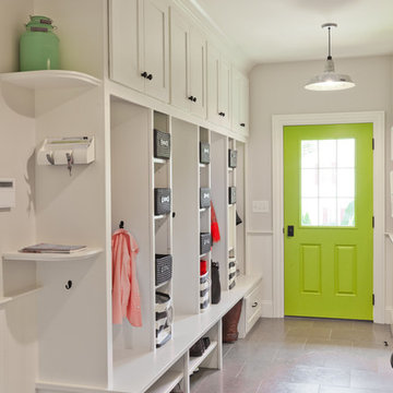
Example of a classic entryway design in Boston with white walls and a green front door
Example of a classic entryway design in Boston with white walls and a green front door
 ZeroEnergy Design
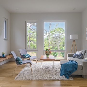
This modern green home offers both a vacation destination on Cape Cod near local family members and an opportunity for rental income.
FAMILY ROOTS. A West Coast couple living in the San Francisco Bay Area sought a permanent East Coast vacation home near family members living on Cape Cod. As academic professionals focused on sustainability, they sought a green, energy efficient home that was well-aligned with their values. With no green homes available for sale on Cape Cod, they decided to purchase land near their family and build their own.
SLOPED SITE. Comprised of a 3/4 acre lot nestled in the pines, the steeply sloping terrain called for a plan that embraced and took advantage of the slope. Of equal priority was optimizing solar exposure, preserving privacy from abutters, and creating outdoor living space. The design accomplished these goals with a simple, rectilinear form, offering living space on the both entry and lower/basement levels. The stepped foundation allows for a walk-out basement level with light-filled living space on the down-hill side of the home. The traditional basement on the eastern, up-hill side houses mechanical equipment and a home gym. The house welcomes natural light throughout, captures views of the forest, and delivers entertainment space that connects indoor living space to outdoor deck and dining patio.
MODERN VISION. The clean building form and uncomplicated finishes pay homage to the modern architectural legacy on the outer Cape. Durable and economical fiber cement panels, fixed with aluminum channels, clad the primary form. Cedar clapboards provide a visual accent at the south-facing living room, which extends a single roof plane to cover the entry porch.
SMART USE OF SPACE. On the entry level, the “L”-shaped living, dining, and kitchen space connects to the exterior living, dining, and grilling spaces to effectively double the home’s summertime entertainment area. Placed at the western end of the entry level (where it can retain privacy but still claim expansive downhill views) is the master suite with a built-in study. The lower level has two guest bedrooms, a second full bathroom, and laundry. The flexibility of the space—crucial in a house with a modest footprint—emerges in one of the guest bedrooms, which doubles as home office by opening the barn-style double doors to connect it to the bright, airy open stair leading up to the entry level. Thoughtful design, generous ceiling heights and large windows transform the modest 1,100 sf* footprint into a well-lit, spacious home. *(total finished space is 1800 sf)
RENTAL INCOME. The property works for its owners by netting rental income when the owners are home in San Francisco. The house especially caters to vacationers bound for nearby Mayo Beach and includes an outdoor shower adjacent to the lower level entry door. In contrast to the bare bones cottages that are typically available on the Cape, this home offers prospective tenants a modern aesthetic, paired with luxurious and green features. Durable finishes inside and out will ensure longevity with the heavier use that comes with a rental property.
COMFORT YEAR-ROUND. The home is super-insulated and air-tight, with mechanical ventilation to provide continuous fresh air from the outside. High performance triple-paned windows complement the building enclosure and maximize passive solar gain while ensuring a warm, draft-free winter, even when sitting close to the glass. A properly sized air source heat pump offers efficient heating & cooling, and includes a carefully designed the duct distribution system to provide even comfort throughout the house. The super-insulated envelope allows us to significantly reduce the equipment capacity, duct size, and airflow quantities, while maintaining unparalleled thermal comfort.
ENERGY EFFICIENT. The building’s shell and mechanical systems play instrumental roles in the home’s exceptional performance. The building enclosure reduces the most significant energy glutton: heating. Continuous super-insulation, thorough air sealing, triple-pane windows, and passive solar gain work together to yield a miniscule heating load. All active energy consumers are extremely efficient: an air source heat pump for heating and cooling, a heat pump hot water heater, LED lighting, energy recovery ventilation (ERV), and high efficiency appliances. The result is a home that uses 70% less energy than a similar new home built to code requirements.
OVERALL. The home embodies the owners’ goals and values while comprehensively enabling thermal comfort, energy efficiency, a vacation respite, and supplementary income.
PROJECT TEAM
ZeroEnergy Design - Architect & Mechanical Designer
A.F. Hultin & Co. - Contractor
Pamet Valley Landscape Design - Landscape & Masonry
Lisa Finch - Original Artwork
European Architectural Supply - Windows
Eric Roth Photography - Photography
 Vision Interiors
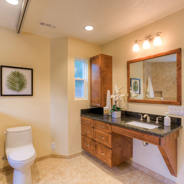
This client has a son with Cerebral Palsy. Our goal was to create a design that was beautiful and function for his daily activities. The cabinets don't go all the way to the ground and there is a drain in the center of the room, creating a wet room for the entire space. The metal on the ceiling is a chair lift so he can be moved around the house in a harness. There is no shower dam so his wheel chair can also be used to bring him from the door into the shower. The sink has no cabinetry under it so that a wheelchair can roll up and he can easily wash his hands.
Find the right local pro for your project
 Windy City Painters
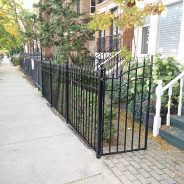
Iron Fence Painting Wicker Park Homeowners Can Trust: A Windy City Painters Case Study
Wicker Park is full of architectural character — ornate 1890s greystone two-flats, vintage brick facades, and wrought iron fencing that has framed these streets for well over a century. However, what iron fence painting Wicker Park properties require is not a simple weekend job. Winters here are brutal on metal, and consequently Windy City Painters has spent years perfecting the restoration process that keeps these fences standing strong. In particular, this case study walks through a recent project completed for a classic Wicker Park property.
Project Overview
The property featured a full wrought iron perimeter fence that had suffered years of freeze-thaw cycling and road salt exposure. Paint had failed across most of the pickets, and oxidation had progressed into active rust at several base rails. Consequently, the homeowners needed more than a fresh coat of paint. They needed a genuine metal restoration, and that is precisely what Windy City Painters delivered.
Materials Used
Windy City Painters selected products specifically rated for Chicago's climate extremes:
Rust-Oleum Professional Rust Inhibitor Primer
Sherwin-Williams DTM Acrylic Enamel (two finish coats)
3M rust converter gel for active oxidation zones
Wire brushes, angle grinders, and detail brushes for precision work
The Process: How Windy City Painters Restores Rusted Iron
Every iron fence painting Wicker Park project follows a disciplined, multi-stage process:
Preparation. Wire brushing and angle grinding remove all loose, flaking, and compromised material. Rust converter gel is applied directly to active oxidation zones, chemically stabilizing the metal underneath.
Repairs. Pitted sections and structurally weak joints are addressed before any coating touches the surface. Notably, skipping this step is the most common reason fence paint fails prematurely.
Priming. A full rust-inhibiting primer coat seals every bare metal surface, preventing moisture from reaching the iron beneath.
Application. Two finish coats of direct-to-metal enamel are applied by hand for even coverage across pickets, finials, and rail joints.
Finishing. A final inspection confirms full coverage, sharp lines, and a smooth, uniform sheen from every angle.
Furthermore, this same process protects the ornate details so common on Wicker Park fencing — decorative finials, scrollwork, and gate hardware — without losing the historic character that makes these properties special.
Advice for Wicker Park Homeowners
Before starting a similar project, homeowners in this neighborhood should keep a few things in mind:
Never paint over active rust. Untreated oxidation will continue spreading beneath the new coating, and the paint will fail within a season or two.
Always prime bare metal before applying a finish coat. Skipping primer is the single fastest path to peeling.
Choose coatings rated for temperature extremes, since Chicago's freeze-thaw cycles are harder on metal than most climates.
Inspect ground-contact areas each spring, as base rails typically rust fastest due to snow melt and road salt runoff.
Budget for prep time. In fact, most of the labor in a quality iron fence painting Wicker Park project happens before a single coat of paint is applied.
Similarly, ask whether the contractor uses rust converter on active oxidation, since skipping this step often shortens the life of the finish considerably.
Moreover, historic greystone properties often have decorative ironwork that requires extra care during grinding and priming so the original detailing is preserved rather than sanded away.
What to Expect: Timeline and Investment
Homeowners often ask how long an iron fence painting Wicker Park project takes from start to finish. In general, prep work — wire brushing, grinding, rust conversion, and repairs — takes up the largest share of the schedule, while primer and enamel application move relatively quickly once the surface is properly stabilized. Cure time between coats also affects the overall timeline, since rushing this stage undermines durability. Consequently, Windy City Painters builds a realistic schedule around weather conditions rather than forcing the job into a tight window. In addition, investment varies based on fence length, the amount of active rust present, and whether ornate detailing requires extra hand-finishing. Homeowners considering this project should request a full on-site walkthrough rather than a rough phone estimate, since rust severity is difficult to judge accurately without seeing the fence in person.
Why Wicker Park Homeowners Choose Windy City Painters
Windy City Painters has become the trusted painting contractor for Chicago's North Side and Near West Side, and iron fence painting Wicker Park residents request most often reflects that reputation directly. In contrast to quick-fix contractors who paint straight over rust, Windy City Painters treats every project as a full restoration. As a result, clients get a finish that holds up through multiple Chicago winters rather than one.
In addition, for related projects, Windy City Painters also offers interior painting, cabinet painting, drywall and plaster repair, and full metal refinishing services for fences, gates, and porches throughout the neighborhood. Ultimately, that range of services is what makes us a true one-stop contractor for Wicker Park homeowners.
See more of our work and request a free estimate at www.windypainters.com.
Ready to transform your Wicker Park home? Contact Windy City Painters for a free estimate — visit www.windypainters.com today. Proudly serving Wicker Park, West Town, Lincoln Park, Roscoe Village, Lakeview, Ukrainian Village, River North, and all of Chicago.
 Klopf Architecture
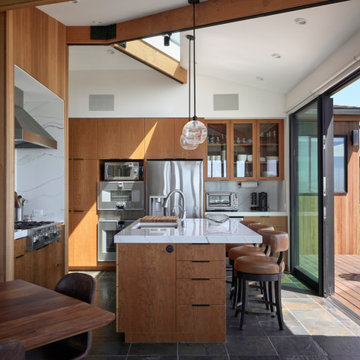
Built for the Bluff, A Sea Ranch Home is Remade from the Inside Out
The house had always been grounded, on an ocean bluff at The Sea Ranch. It sits unencumbered, adjacent to one of the most dramatic stretches of the Sonoma coast with protected commons meadow to the east, uninterrupted Pacific views to the west, and a bluff trail running alongside. What it lacked was the feeling of home, one that could hold up its own against the natural landscape.
The owners are entrepreneurs with deep involvement across tech, real estate, and development and they know how things are built. The Sea Ranch house had been in their lives for years, a second residence and a place for family to gather. Built for a different time, it felt more compromising than comfortable. Sitting in a closed off nook, the kitchen fit one cook at a time and turned its back on the rest of the house. The entry was dim and compressed, divided by a structural column that presented itself at exactly the wrong moment. The primary suite was small relative to the view outside it. A large rear bedroom sat behind a lowered ceiling with a bathroom that had never been added. The house was certainly worth the trouble of doing it right.
What followed was not one project but four, each with its own design challenge, each addressed over a period of time.
Where the House Meets the Ocean
The most complex piece of the project, in both structural and spatial terms, was the kitchen expansion. The existing room was a single-person galley squeezed in as an afterthought with no meaningful connection to the dining room, the living space, or the deck outside. To make it useful for a family that cooks and gathers, it needed to grow outward into an existing patio and flow into the rooms around it.
A big challenge was the roofline. Several planes at different pitches and angles converged directly where additional volume was needed. A new form had to join that geometry without reading as a correction. The solution found the simplest possible connection between the existing angles, a roofline that from outside the structure, appears entirely original. From the bluff trail where the addition is visible, there is no discernible seam.
Inside, the kitchen is now open to the living and dining rooms without interruption. A large sliding glass door connects the space onto the rear deck. The deck itself was expanded and oriented so that the body of the house shields it from the coastal wind which is a common consideration that determines whether outdoor space at The Sea Ranch actually gets used. The result is a room that works for large family gatherings where no one feels cutoff, and one that makes the boundary between being inside and outside easy to ignore.
Welcoming Light
A structural column stood at the convergence of eight distinct roof planes in the entry. It was load-bearing, but it was also the reason the entry had always felt like a hallway rather than a welcoming arrival.
With the structural engineer, a custom steel connector was designed to receive beams from six separate directions, redistributing the load through a single new continuous beam. The column was surgically removed. Three triangular skylights were then cut into the roof above, their shapes drawn from the
existing geometry of the planes around them. The entry is now bright and open. The skylights feel native to the structure because they follow the logic already present in the roof.
Two Suites, Two Views
At opposite ends of the house, the two bedroom suites were each reconfigured, and each found a different way to introduce more of the landscape into the room.
An addition to the primary suite extended the structure outward to create a wraparound plan with a loop from the bedroom through bath and closet that had not been possible before. The expansion opened a slot view from the tub and shower toward the ocean. The view is precise and private. The ocean view is present and deliberate.
The rear bedroom absorbed an adjacent storage room to transform it into a full second suite with a vaulted ceiling, a large bathroom with a tub, a shower, and a sauna. A private fenced garden courtyard sits just beyond the glass bringing the outdoors inside. The tub was placed so that, looking past the courtyard and through the bedroom beyond, the ocean is visible at the far end. It is a long view and it makes the room feel larger and more settled than its footprint would suggest.
Glass on Four Sides, Fire at the Center
The main living and gathering room had always been caught between two competing facts: glass on four sides meant exceptional views but at The Sea Ranch, it also meant a cold room. A 360-degree cylindrical fireplace was added at the center on a raised stone base, providing radiant heat in every direction and giving the room a focal point around which a group naturally orients itself, whether that means two people at the end of the day or the whole family after dinner.
Owners Who Picked Up the Tools
The owner was not a passive client. they came with construction knowledge, specific ideas, and the desire to be an active part of the process, a dynamic that other architects may had found difficult, which Klopf Architecture accepted as an asset. They took it upon themselves to complete some of the work during construction, including the installation of a new radiant heating system beneath the floors.
The radiant system added to the older and less-desirable forced-air setup. At The Sea Ranch, that change matters as the house sits close enough to the ocean and moving air competes with the sound of it, where radiant heat does not. Solar panels were added to the roof as part of the new system. Insulation was upgraded throughout the walls, roof, and crawl space. The house that had always had the right setting now holds warmth the way a house on the bluff should.
They were also deeply involved in the design and selections throughout, and the finished house reflects both of them in ways that are specific rather than generic. The process took longer and moved through more iterations than a more arms-length relationship might have allowed. The result is more defined and personal because of it.
The Landscape Holds Priority
Every exterior decision was shaped by The Sea Ranch Design Standards, which require that buildings defer to the landscape around them rather than compete with it. Because this house sits on the bluff and is visible from the public trail, the additions faced a close review. Existing materials were matched. Geometries were resolved. The additions had to become indistinguishable from the original building.
From the trail, the house reads exactly as it always has — low, cedar-clad, secondary to the meadow and the water. The setting holds priority. Inside, the house has been remade.
Klopf Architecture Project Team: Geoff Campen and Trenton Jewett
Contractor: Shawn Bettega Construction
Photography: ©2025 Mariko Reed
Year Completed: 2023
Location: The Sea Ranch, CA
 Rodwin Architecture & Skycastle Construction
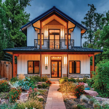
This lovely little modern farmhouse is located at the base of the foothills in one of Boulder’s most prized neighborhoods. Tucked onto a challenging narrow lot, this inviting and sustainably designed 2400 sf., 4 bedroom home lives much larger than its compact form. The open floor plan and vaulted ceilings of the Great room, kitchen and dining room lead to a beautiful covered back patio and lush, private back yard. These rooms are flooded with natural light and blend a warm Colorado material palette and heavy timber accents with a modern sensibility. A lyrical open-riser steel and wood stair floats above the baby grand in the center of the home and takes you to three bedrooms on the second floor. The Master has a covered balcony with exposed beamwork & warm Beetle-kill pine soffits, framing their million-dollar view of the Flatirons.
Its simple and familiar style is a modern twist on a classic farmhouse vernacular. The stone, Hardie board siding and standing seam metal roofing create a resilient and low-maintenance shell. The alley-loaded home has a solar-panel covered garage that was custom designed for the family’s active & athletic lifestyle (aka “lots of toys”). The front yard is a local food & water-wise Master-class, with beautiful rain-chains delivering roof run-off straight to the family garden.

 dRichards Interiors
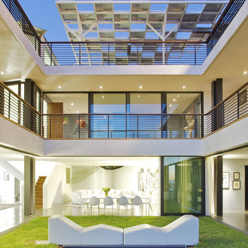
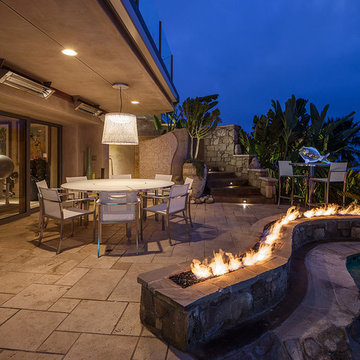
This project combines high end earthy elements with elegant, modern furnishings. We wanted to re invent the beach house concept and create an home which is not your typical coastal retreat. By combining stronger colors and textures, we gave the spaces a bolder and more permanent feel. Yet, as you travel through each room, you can't help but feel invited and at home.
 Alisberg Parker
Wes Tarca
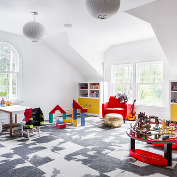
Playroom - contemporary gender-neutral carpeted playroom idea in New York with white walls
Playroom - contemporary gender-neutral carpeted playroom idea in New York with white walls
 HU-884212062
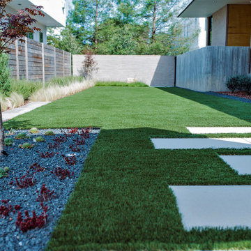
Our client recently purchased a newly-constructed home in order to downsize and have a low- maintenance home and yard. The existing side yard/back yard was undeveloped by the builder, leaving the homeowner with the huge challenge of creating a great outdoor entertaining space for family and friends, while creating privacy and overcoming the over 8-foot steep drop from the existing back porch down to the alley.
The grade was the largest challenge because the space was so narrow with such a large fall from existing porch to the property line. The second largest challenge is that this residence is located in a semi-private community where HOA approval of plans and materials is difficult, as all the residences here share a similar look and feel with a very clean and contemporary aesthetic.
We had to precisely shoot grades to know what kinds of retaining walls would need to be constructed along with how much backfill soil and dirt movement would need to be done. After that the design had to carefully consider the space with maximum functionality for outdoor entertainment with newly constructed walls to ensure it would last for many years to come. All of this was done with multiple meetings with the homeowners who are a retired engineer and active architect themselves. Once a design was settled upon, then submission to the HOA board of approval had to be completed and signed off on with all questions and concerns answered for the community by-laws.
The two biggest difficulties within the construction phase were that the neighbor next to the back yard had a large retaining wall not properly backfilled up to the property line. That neighbor wouldn’t allow us proper access and control to help alleviate the issues, so we had to skillfully work around this to ensure what we constructed would last, despite their property not being properly addressed. We also had to go through multiple shipments from the manufacturer due to large variances in the material’s appearance on the steps and another shipment that was broken during shipping. These two things delayed the project we were working to complete before the spring so the homeowner could have the maximum use of the space this year.
Topping off this challenging construction was a beautiful palette of native grasses, rosemary, groundcover, granite walkways, and synthetic grass to ensure year-round, practically effortless beauty.
 HU-884212062
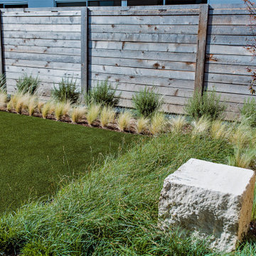
Our client recently purchased a newly-constructed home in order to downsize and have a low- maintenance home and yard. The existing side yard/back yard was undeveloped by the builder, leaving the homeowner with the huge challenge of creating a great outdoor entertaining space for family and friends, while creating privacy and overcoming the over 8-foot steep drop from the existing back porch down to the alley.
The grade was the largest challenge because the space was so narrow with such a large fall from existing porch to the property line. The second largest challenge is that this residence is located in a semi-private community where HOA approval of plans and materials is difficult, as all the residences here share a similar look and feel with a very clean and contemporary aesthetic.
We had to precisely shoot grades to know what kinds of retaining walls would need to be constructed along with how much backfill soil and dirt movement would need to be done. After that the design had to carefully consider the space with maximum functionality for outdoor entertainment with newly constructed walls to ensure it would last for many years to come. All of this was done with multiple meetings with the homeowners who are a retired engineer and active architect themselves. Once a design was settled upon, then submission to the HOA board of approval had to be completed and signed off on with all questions and concerns answered for the community by-laws.
The two biggest difficulties within the construction phase were that the neighbor next to the back yard had a large retaining wall not properly backfilled up to the property line. That neighbor wouldn’t allow us proper access and control to help alleviate the issues, so we had to skillfully work around this to ensure what we constructed would last, despite their property not being properly addressed. We also had to go through multiple shipments from the manufacturer due to large variances in the material’s appearance on the steps and another shipment that was broken during shipping. These two things delayed the project we were working to complete before the spring so the homeowner could have the maximum use of the space this year.
Topping off this challenging construction was a beautiful palette of native grasses, rosemary, groundcover, granite walkways, and synthetic grass to ensure year-round, practically effortless beauty.
 RAJ Kitchen and Bath, LLC
**Check out the video of this transformation on our website**
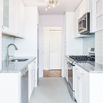
This small kitchen was way too small for this 2 bedrooms, 2 bathrooms apartment. Not only was it a very small kitchen, but the physical location of it made it very difficult to make it any bigger. There wasn't much that could have been done without incurring astronomical cost, which would get little or no return on the investment. The client wanted a kitchen that can be optimized in its current location to add a ton of value for resale.
This was difficult to do, because there was no moving of any mechanical around in the kitchen and even if we wanted to, the management of the building would not allow. For those of you who live in condos, co-ops or apartment building, you know how difficult it is to rework these foot prints. When we showed up, we saw the problems, but we also saw a huge opportunity where we can achieve those goals in the small space. This was accomplished by making some key changes and to incorporate some new things that was not possible when this kitchen was built years ago.
The crucial part of the design that would drive the entire new layout, was selecting the only appliance; that was the Refrigerator. Once we nailed down that refrigerator, we then proceeded to design the kitchen around it. We moved it to the other side of the wall where the sink was so that we can tap into the water line from the sink plumbing. It was crucial that it stays exactly 24" deep, not an inch more because we had to keep the entry as open as possible. Also, it was going to be directly in front of another big storage unit - The pantry. It is not ideal in most cases, but we needed the rest of the space to ramp up the design and open feel towards the side where all of the activities would take place, which happend to be the dining room and the view.
Once all that was figured out, we re-positioned the sink, dishwasher and the range and proceeded to wrap the cabinets around the columns to integrate them into the space. Thirty- six inches cabinets height was used so that they can be installed higher towards the ceiling height to give more room rather than the standard 18" required height between the counter tops. This was done to make the room feel a lot bigger than it really was. Not to mention, we also didn't want the faucet to be buried under the cabinets so that was also a necessary design detail for the space.
We then lowered both knee walls so that the counter top can sit on top of them, by removing that stop point that would have otherwise defined the kitchen area. This allowed us to pick up that extra footprint into the room for added prep space and enabled us to create the illusion of a kitchen that is looking longer than it really is. Every inch mattered when designing this kitchen and we made a conscious decision to use every one of that inch.
White cabinets were selected to do just what white cabinets are design to do; make a small or dark room appear bigger, brighter and more open. In this kitchen, this was amplified the more because of the kitchen location. It was perfect! We knew we did justice to the space because while we were there taking some photos, a few potential buyers walked in and went straight for the kitchen! They said its design just to fit the apartment.
Pantry roll out shelving, Double recycle bin, fancy handles, LED lighting, Quartz counter top, beautiful backslash tiles and grey linen floors finished off the kitchen which looked over a beautiful view of the George Washington Bridge from the top of this lovely 4th floor apartment.
Credit to Masterpiece Tile and Marble (Annmarie on the selection of Tiles and countertop and Val on the Construction to complete this project).
Davor Kokic Photography
 ForeverLawn, Inc.
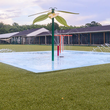
Sterling Meadows Kennel and Cattery is a highly-reputable dog daycare, boarding, and grooming facility in the Virginia Beach area. The staple of their facility is the large outdoor play area that offers a wide range of activities for dogs. While this area was loved by the dogs and customers, it was a very uneven surface that became difficult to maintain after lots of playing, digging, and harsh weather conditions. This created a significant amount of extra work for the facility staff because the dogs would come in dirty from play time and track their mess all around the facility. Owners Sammy and Cindy Hinkle turned to ForeverLawn® for a superior solution that eliminated these issues. The ForeverLawn Southwest Team replaced the hard-to-maintain natural grass dog area with K9Grass® Classic. This upgrade not only reduced the maintenance and cleanliness issues that they were facing, but allowed the owners to incorporate a swimming area for the dogs as well.

 The Closet Doctor
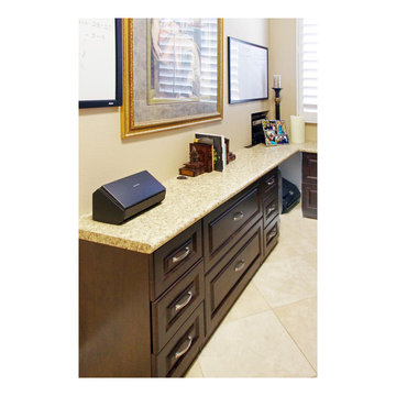
One homeowner of a particular model home in the Sun City Roseville development that came with a rather large space for a laundry room, was faced with this dilemma recently. After relocating her washer and dryer into the garage and setting up a make shift office of her own in the laundry room, the homeowner realized that, although she succeeded in turning the space into a somewhat functional work area, it just wasn’t up to par for all of her wants and needs. Hoping to come up some new small home office ideas that would squeeze all of her needs into the tiny space, she decided to seek help from a home organization specialist and sat down with The Closet Doctor. There were several requirements and obstacles that made the development of an office design which satisfied the homeowner particularly difficult. One was the need for two workstations which would have enough desk space for each person to sit comfortably and not be on top of each other. Another obstacle was the new design had to work around a cut-out in the corner of the wall, which contained built-in shelves for the components of a nearby entertainment center. Finally, the designer also had to be sure to incorporate “lots of legal sized filing drawers” into its new design.
The Closet Doctor went to work and was able to design a solution that, not only met all of the homeowner’s needs, but was attractive, and within her budget. The new built-in design included two work areas that were spacious and each with its own overhead cabinet, storage drawer, and single letter size file drawer for active projects. In between the two overhead cabinets, additional open shelving allowed for display items as well as space for a small TV in the center. Extra storage and organization space was also put behind doors for a clean and neat look. In addition, in order to maintain as much space as possible, the cabinets on the end and left side wall were made just deep enough to fit legal size lateral file drawers. Finally, the built in component shelves were left open in the corner for easy access, with the desk top passing in front of the space at the same height as one of the shelves, which gave the corner a neat and organized appearance as well. To top it off, low energy under cabinet LED lights with a dimmer switch were installed in order to illuminate the work area.
The Client loved the result of her home improvement project, in both the look and functionality of the new design compared to the “temporary setup” she had in place before. With the additional storage space and organization that the new built in office unit provided, the satisfied homeowner was able to achieve the clean and organized look as well as optimum functionality that she preferred.
 Architecture, etc.
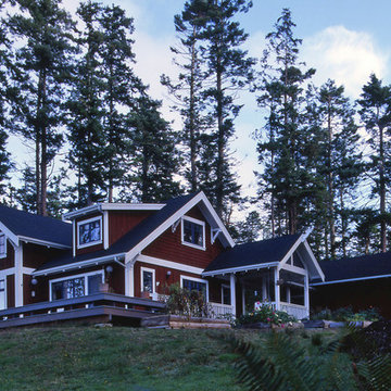
Perched above Puget Sound, this new Scandinavian farmhouse features crossed gable ends, traditional falun red stain, white trim, covered porches & shed dormers. A workshop & garage behind are connected to the back porch by a covered breezeway. Traditional Scandinavian built-in beds allow upstairs rooms to do double duty as both offices & guest rooms. A cook's kitchen in burgeoning with hanging pots & pans, generous pantries, wrap-around display shelves & jam-packed cookbook shelves. Shallow shelves with traditional French doors in the back hall/laundry room allow complete visual access to all things cookery. This retired couple enjoys a busy & active full life in their full-time home by the sea.
photo by David D Livingston
 Landscape Design West, LLC
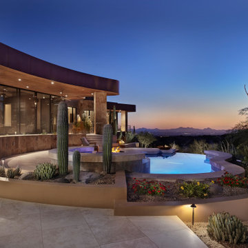
IN 2021, PETE AND BECKY MEIER HIRED LANDSCAPE DESIGN WEST, LLC, TO CREATE AN EXTRAORDINARY RENOVATION DESIGN FOR THE CANYON PASS HOUSE LOCATED IN THE GATED COMMUNITY OF CANYON PASS AT THE PINNACLE OF DOVE MOUNTAIN, IN TUCSON, ARIZONA.
EXISTING LANDSCAPE DID NOT COMPLIMENT THE OUTSTANDING ADJACENT DESERT NOR THE UNIQUE MARK SOLOWAY ARCHITECTURE. GOAL WAS TO CREATE A BEAUTIFUL DIALOGUE WITH THE ADJACENT DESERT AND RESIDENCE.
DESIRED OUTCOME:
INCREASE VISUAL APPEAL/LOWER WATER USE WITH NUMEROUS SPECIMEN SUCCULENTS AND A PLANTING DESIGN THAT IS INVITING, COLORFUL AND GRACIOUS, INCREASE YEAR AROUND COLOR AND BLOOMS TO ATTRACT NATIVE POLLINATORS SUCH AS BIRDS, BATS, HUMMINGBIRDS AND BUTTERFLIES MITIGATE DAMAGE TO PORTIONS OF THE PROPERTY PREVIOUSLY USED AS CONSTRUCTION STAGING AREAS
LOWER WATER USAGE REPLACING EXISTING FAULTY IRRIGATION
LOWER ENERGY/INCREASED NIGHTTIME LIGHTING AESTHETICS WITH A PROFESSIONAL DESIGN AND USING HUNTER/FX LED LIGHTING
CHALLENGES:
HILLSIDE/SLOPE
WILDLIFE
ROCKY SOILS
DIFFICULT ACCESS
Robin Stancliff Photography
 Paradise Found Construction
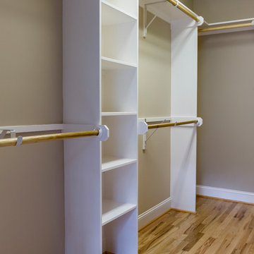
Melissa and Steve purchased our National Award Winning Green Certified Remodeled Home. They had moved to Colorado previously to expand Business opportunities, but found that they missed being near their extended family members and Melissa’s native city and state. They wanted a home in a quiet neighborhood that suited their needs and had been updated to current design trends and amenities. With 2 young children a single-story home appealed to them.
Steve primarily worked from home, using the formal Living Room as his home office which was central to the Kitchen and main living areas. As their children grew, it became increasingly difficult to With 4 children, their daily activities were split between the 1st and second floors, making it difficult to coordinate activities amongst them. Also, with a large extended family close-by, get-togethers were cramped and uncomfortable.
With the added 1st floor living space, they are now able to all comfortably gather together and spend more quality time with their family and friends.
Design Features
Seamless Transition into the adjoining Kitchen and Living Room, separating the two with a light and bright 15-Lite Double French Door.
Light and bright natural hardwood flooring.
A bright and open floor plan achieved by introducing a double 15-Lite French door in the Kitchen and generous amount of double-hung low-e windows.
Window Well in the Roof to accommodate required foot-print placement.
Avoidance of installing a Pull-Down Attic Access.
No-VOC Paints and Finishes.
Durable Exterior Construction
No-Maintenance Composite and PVC Low-E Windows and Doors
Cement Fiber Siding
Cement Fiber and PVC Trim
Life-time Architectural Shingles
Metal Roof Flashing with Gutter Kick-Outs
Superior Window Flashing and Water Intrusion Sealing measures
Energy Efficient and Green Features
1st floor HVAC Compressor and Air Handler replaced with a more efficient 15 Seer unit.
Floor penetrations and perimeter bottom plates caulked and air sealed.
No-VOC Paints and Finishes.
Durable Exterior Construction
No-Maintenance Composite and PVC Low-E Windows
Cement Fiber Siding
Cement Fiber and PVC Trim
Life-time Architectural Shingles
Metal Roof Flashing with Gutter Kick-Outs
Superior Window Flashing and Water Intrusion sealing measures
 RAJ Kitchen and Bath, LLC
**Check out the video of this transformation on our website**
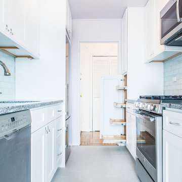
This small kitchen was way too small for this 2 bedrooms, 2 bathrooms apartment. Not only was it a very small kitchen, but the physical location of it made it very difficult to make it any bigger. There wasn't much that could have been done without incurring astronomical cost, which would get little or no return on the investment. The client wanted a kitchen that can be optimized in its current location to add a ton of value for resale.
This was difficult to do, because there was no moving of any mechanical around in the kitchen and even if we wanted to, the management of the building would not allow. For those of you who live in condos, co-ops or apartment building, you know how difficult it is to rework these foot prints. When we showed up, we saw the problems, but we also saw a huge opportunity where we can achieve those goals in the small space. This was accomplished by making some key changes and to incorporate some new things that was not possible when this kitchen was built years ago.
The crucial part of the design that would drive the entire new layout, was selecting the only appliance; that was the Refrigerator. Once we nailed down that refrigerator, we then proceeded to design the kitchen around it. We moved it to the other side of the wall where the sink was so that we can tap into the water line from the sink plumbing. It was crucial that it stays exactly 24" deep, not an inch more because we had to keep the entry as open as possible. Also, it was going to be directly in front of another big storage unit - The pantry. It is not ideal in most cases, but we needed the rest of the space to ramp up the design and open feel towards the side where all of the activities would take place, which happend to be the dining room and the view.
Once all that was figured out, we re-positioned the sink, dishwasher and the range and proceeded to wrap the cabinets around the columns to integrate them into the space. Thirty- six inches cabinets height was used so that they can be installed higher towards the ceiling height to give more room rather than the standard 18" required height between the counter tops. This was done to make the room feel a lot bigger than it really was. Not to mention, we also didn't want the faucet to be buried under the cabinets so that was also a necessary design detail for the space.
We then lowered both knee walls so that the counter top can sit on top of them, by removing that stop point that would have otherwise defined the kitchen area. This allowed us to pick up that extra footprint into the room for added prep space and enabled us to create the illusion of a kitchen that is looking longer than it really is. Every inch mattered when designing this kitchen and we made a conscious decision to use every one of that inch.
White cabinets were selected to do just what white cabinets are design to do; make a small or dark room appear bigger, brighter and more open. In this kitchen, this was amplified the more because of the kitchen location. It was perfect! We knew we did justice to the space because while we were there taking some photos, a few potential buyers walked in and went straight for the kitchen! They said its design just to fit the apartment.
Pantry roll out shelving, Double recycle bin, fancy handles, LED lighting, Quartz counter top, beautiful backslash tiles and grey linen floors finished off the kitchen which looked over a beautiful view of the George Washington Bridge from the top of this lovely 4th floor apartment.
Credit to Masterpiece Tile and Marble (Annmarie on the selection of Tiles and countertop and Val on the Construction to complete this project).
Davor Kokic Photography
 RAJ Kitchen and Bath, LLC
**Check out the video of this transformation on our website**
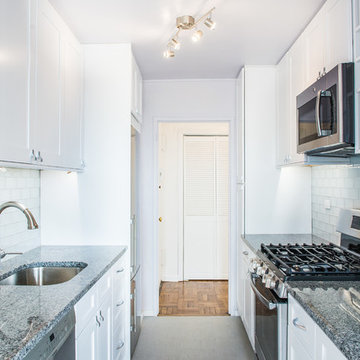
This small kitchen was way too small for this 2 bedrooms, 2 bathrooms apartment. Not only was it a very small kitchen, but the physical location of it made it very difficult to make it any bigger. There wasn't much that could have been done without incurring astronomical cost, which would get little or no return on the investment. The client wanted a kitchen that can be optimized in its current location to add a ton of value for resale.
This was difficult to do, because there was no moving of any mechanical around in the kitchen and even if we wanted to, the management of the building would not allow. For those of you who live in condos, co-ops or apartment building, you know how difficult it is to rework these foot prints. When we showed up, we saw the problems, but we also saw a huge opportunity where we can achieve those goals in the small space. This was accomplished by making some key changes and to incorporate some new things that was not possible when this kitchen was built years ago.
The crucial part of the design that would drive the entire new layout, was selecting the only appliance; that was the Refrigerator. Once we nailed down that refrigerator, we then proceeded to design the kitchen around it. We moved it to the other side of the wall where the sink was so that we can tap into the water line from the sink plumbing. It was crucial that it stays exactly 24" deep, not an inch more because we had to keep the entry as open as possible. Also, it was going to be directly in front of another big storage unit - The pantry. It is not ideal in most cases, but we needed the rest of the space to ramp up the design and open feel towards the side where all of the activities would take place, which happend to be the dining room and the view.
Once all that was figured out, we re-positioned the sink, dishwasher and the range and proceeded to wrap the cabinets around the columns to integrate them into the space. Thirty- six inches cabinets height was used so that they can be installed higher towards the ceiling height to give more room rather than the standard 18" required height between the counter tops. This was done to make the room feel a lot bigger than it really was. Not to mention, we also didn't want the faucet to be buried under the cabinets so that was also a necessary design detail for the space.
We then lowered both knee walls so that the counter top can sit on top of them, by removing that stop point that would have otherwise defined the kitchen area. This allowed us to pick up that extra footprint into the room for added prep space and enabled us to create the illusion of a kitchen that is looking longer than it really is. Every inch mattered when designing this kitchen and we made a conscious decision to use every one of that inch.
White cabinets were selected to do just what white cabinets are design to do; make a small or dark room appear bigger, brighter and more open. In this kitchen, this was amplified the more because of the kitchen location. It was perfect! We knew we did justice to the space because while we were there taking some photos, a few potential buyers walked in and went straight for the kitchen! They said its design just to fit the apartment.
Pantry roll out shelving, Double recycle bin, fancy handles, LED lighting, Quartz counter top, beautiful backslash tiles and grey linen floors finished off the kitchen which looked over a beautiful view of the George Washington Bridge from the top of this lovely 4th floor apartment.
Credit to Masterpiece Tile and Marble (Annmarie on the selection of Tiles and countertop and Val on the Construction to complete this project).
Davor Kokic Photography
2