
Search results for "Difficult activity" in Home Design Ideas
 RAJ Kitchen and Bath, LLC
**Check out the video of this transformation on our website**
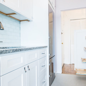
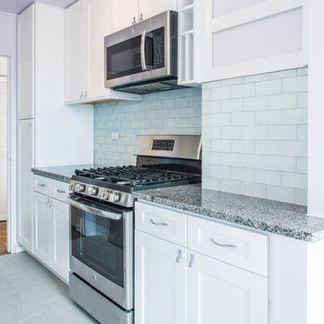
This small kitchen was way too small for this 2 bedrooms, 2 bathrooms apartment. Not only was it a very small kitchen, but the physical location of it made it very difficult to make it any bigger. There wasn't much that could have been done without incurring astronomical cost, which would get little or no return on the investment. The client wanted a kitchen that can be optimized in its current location to add a ton of value for resale.
This was difficult to do, because there was no moving of any mechanical around in the kitchen and even if we wanted to, the management of the building would not allow. For those of you who live in condos, co-ops or apartment building, you know how difficult it is to rework these foot prints. When we showed up, we saw the problems, but we also saw a huge opportunity where we can achieve those goals in the small space. This was accomplished by making some key changes and to incorporate some new things that was not possible when this kitchen was built years ago.
The crucial part of the design that would drive the entire new layout, was selecting the only appliance; that was the Refrigerator. Once we nailed down that refrigerator, we then proceeded to design the kitchen around it. We moved it to the other side of the wall where the sink was so that we can tap into the water line from the sink plumbing. It was crucial that it stays exactly 24" deep, not an inch more because we had to keep the entry as open as possible. Also, it was going to be directly in front of another big storage unit - The pantry. It is not ideal in most cases, but we needed the rest of the space to ramp up the design and open feel towards the side where all of the activities would take place, which happend to be the dining room and the view.
Once all that was figured out, we re-positioned the sink, dishwasher and the range and proceeded to wrap the cabinets around the columns to integrate them into the space. Thirty- six inches cabinets height was used so that they can be installed higher towards the ceiling height to give more room rather than the standard 18" required height between the counter tops. This was done to make the room feel a lot bigger than it really was. Not to mention, we also didn't want the faucet to be buried under the cabinets so that was also a necessary design detail for the space.
We then lowered both knee walls so that the counter top can sit on top of them, by removing that stop point that would have otherwise defined the kitchen area. This allowed us to pick up that extra footprint into the room for added prep space and enabled us to create the illusion of a kitchen that is looking longer than it really is. Every inch mattered when designing this kitchen and we made a conscious decision to use every one of that inch.
White cabinets were selected to do just what white cabinets are design to do; make a small or dark room appear bigger, brighter and more open. In this kitchen, this was amplified the more because of the kitchen location. It was perfect! We knew we did justice to the space because while we were there taking some photos, a few potential buyers walked in and went straight for the kitchen! They said its design just to fit the apartment.
Pantry roll out shelving, Double recycle bin, fancy handles, LED lighting, Quartz counter top, beautiful backslash tiles and grey linen floors finished off the kitchen which looked over a beautiful view of the George Washington Bridge from the top of this lovely 4th floor apartment.
Credit to Masterpiece Tile and Marble (Annmarie on the selection of Tiles and countertop and Val on the Construction to complete this project).
Davor Kokic Photography
 RAJ Kitchen and Bath, LLC
**Check out the video of this transformation on our website**
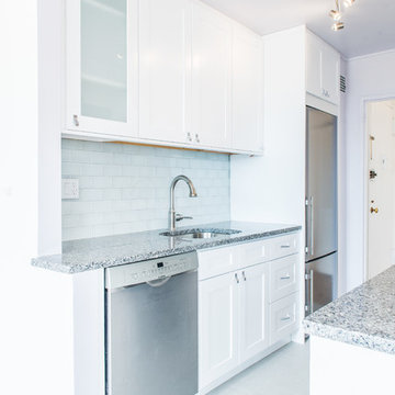
This small kitchen was way too small for this 2 bedrooms, 2 bathrooms apartment. Not only was it a very small kitchen, but the physical location of it made it very difficult to make it any bigger. There wasn't much that could have been done without incurring astronomical cost, which would get little or no return on the investment. The client wanted a kitchen that can be optimized in its current location to add a ton of value for resale.
This was difficult to do, because there was no moving of any mechanical around in the kitchen and even if we wanted to, the management of the building would not allow. For those of you who live in condos, co-ops or apartment building, you know how difficult it is to rework these foot prints. When we showed up, we saw the problems, but we also saw a huge opportunity where we can achieve those goals in the small space. This was accomplished by making some key changes and to incorporate some new things that was not possible when this kitchen was built years ago.
The crucial part of the design that would drive the entire new layout, was selecting the only appliance; that was the Refrigerator. Once we nailed down that refrigerator, we then proceeded to design the kitchen around it. We moved it to the other side of the wall where the sink was so that we can tap into the water line from the sink plumbing. It was crucial that it stays exactly 24" deep, not an inch more because we had to keep the entry as open as possible. Also, it was going to be directly in front of another big storage unit - The pantry. It is not ideal in most cases, but we needed the rest of the space to ramp up the design and open feel towards the side where all of the activities would take place, which happend to be the dining room and the view.
Once all that was figured out, we re-positioned the sink, dishwasher and the range and proceeded to wrap the cabinets around the columns to integrate them into the space. Thirty- six inches cabinets height was used so that they can be installed higher towards the ceiling height to give more room rather than the standard 18" required height between the counter tops. This was done to make the room feel a lot bigger than it really was. Not to mention, we also didn't want the faucet to be buried under the cabinets so that was also a necessary design detail for the space.
We then lowered both knee walls so that the counter top can sit on top of them, by removing that stop point that would have otherwise defined the kitchen area. This allowed us to pick up that extra footprint into the room for added prep space and enabled us to create the illusion of a kitchen that is looking longer than it really is. Every inch mattered when designing this kitchen and we made a conscious decision to use every one of that inch.
White cabinets were selected to do just what white cabinets are design to do; make a small or dark room appear bigger, brighter and more open. In this kitchen, this was amplified the more because of the kitchen location. It was perfect! We knew we did justice to the space because while we were there taking some photos, a few potential buyers walked in and went straight for the kitchen! They said its design just to fit the apartment.
Pantry roll out shelving, Double recycle bin, fancy handles, LED lighting, Quartz counter top, beautiful backslash tiles and grey linen floors finished off the kitchen which looked over a beautiful view of the George Washington Bridge from the top of this lovely 4th floor apartment.
Credit to Masterpiece Tile and Marble (Annmarie on the selection of Tiles and countertop and Val on the Construction to complete this project).
Davor Kokic Photography

Find the right local pro for your project
 Paradise Found Construction
Melissa and Steve purchased our National Award Winning Green Certified Remodeled Home. They had moved to Colorado previously to expand Business opportunities, but found that they missed being near their extended family members and Melissa’s native city and state. They wanted a home in a quiet neighborhood that suited their needs and had been updated to current design trends and amenities. With 2 young children a single-story home appealed to them.
Steve primarily worked from home, using the formal Living Room as his home office which was central to the Kitchen and main living areas. As their children grew, it became increasingly difficult to With 4 children, their daily activities were split between the 1st and second floors, making it difficult to coordinate activities amongst them. Also, with a large extended family close-by, get-togethers were cramped and uncomfortable.
With the added 1st floor living space, they are now able to all comfortably gather together and spend more quality time with their family and friends.
Design Features
Seamless Transition into the adjoining Kitchen and Living Room, separating the two with a light and bright 15-Lite Double French Door.
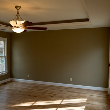
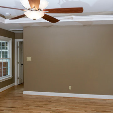
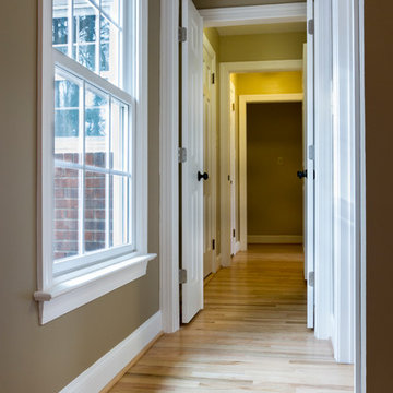
Light and bright natural hardwood flooring.
A bright and open floor plan achieved by introducing a double 15-Lite French door in the Kitchen and generous amount of double-hung low-e windows.
Window Well in the Roof to accommodate required foot-print placement.
Avoidance of installing a Pull-Down Attic Access.
No-VOC Paints and Finishes.
Durable Exterior Construction
No-Maintenance Composite and PVC Low-E Windows and Doors
Cement Fiber Siding
Cement Fiber and PVC Trim
Life-time Architectural Shingles
Metal Roof Flashing with Gutter Kick-Outs
Superior Window Flashing and Water Intrusion Sealing measures
Energy Efficient and Green Features
1st floor HVAC Compressor and Air Handler replaced with a more efficient 15 Seer unit.
Floor penetrations and perimeter bottom plates caulked and air sealed.
No-VOC Paints and Finishes.
Durable Exterior Construction
No-Maintenance Composite and PVC Low-E Windows
Cement Fiber Siding
Cement Fiber and PVC Trim
Life-time Architectural Shingles
Metal Roof Flashing with Gutter Kick-Outs
Superior Window Flashing and Water Intrusion sealing measures
 Inspired Closets Arizona
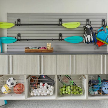
#TipTuesday: With all the activities and equipment being used on a daily basis, summer can be a difficult time to keep your garage neat and organized. To help combat this, stow baseball mitts, balls, and other gear in baskets on a low shelf that way it’s easy for kids to put their own sporting gear away.
Talk with one of our designers for more helpful tips and schedule a FREE design consultation today.
Phoenix | Prescott | Flagstaff | Cottonwood | Tucson
#FirstDayOfSummer
https://linktr.ee/ICAZ
 Sarah Susanka, FAIA
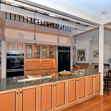
The kitchen is located across from the living room, offering spectacular views to the trees and lake beyond. Although it's difficult to tell from a photo, the experience of being in this kitchen is a bit like being at the helm of a boat. It's definitely the primary activity place, and is connected to all other spaces on the main level.
Architect: Sarah Susanka, FAIA; Photo courtesy of Bob Parish
 RAJ Kitchen and Bath, LLC
**Check out the video of this transformation on our website**
This small kitchen was way too small for this 2 bedrooms, 2 bathrooms apartment. Not only was it a very small kitchen, but the physical location of it made it very difficult to make it any bigger. There wasn't much that could have been done without incurring astronomical cost, which would get little or no return on the investment. The client wanted a kitchen that can be optimized in its current location to add a ton of value for resale.
This was difficult to do, because there was no moving of any mechanical around in the kitchen and even if we wanted to, the management of the building would not allow. For those of you who live in condos, co-ops or apartment building, you know how difficult it is to rework these foot prints. When we showed up, we saw the problems, but we also saw a huge opportunity where we can achieve those goals in the small space. This was accomplished by making some key changes and to incorporate some new things that was not possible when this kitchen was built years ago.
The crucial part of the design that would drive the entire new layout, was selecting the only appliance; that was the Refrigerator. Once we nailed down that refrigerator, we then proceeded to design the kitchen around it. We moved it to the other side of the wall where the sink was so that we can tap into the water line from the sink plumbing. It was crucial that it stays exactly 24" deep, not an inch more because we had to keep the entry as open as possible. Also, it was going to be directly in front of another big storage unit - The pantry. It is not ideal in most cases, but we needed the rest of the space to ramp up the design and open feel towards the side where all of the activities would take place, which happend to be the dining room and the view.
Once all that was figured out, we re-positioned the sink, dishwasher and the range and proceeded to wrap the cabinets around the columns to integrate them into the space. Thirty- six inches cabinets height was used so that they can be installed higher towards the ceiling height to give more room rather than the standard 18" required height between the counter tops. This was done to make the room feel a lot bigger than it really was. Not to mention, we also didn't want the faucet to be buried under the cabinets so that was also a necessary design detail for the space.
We then lowered both knee walls so that the counter top can sit on top of them, by removing that stop point that would have otherwise defined the kitchen area. This allowed us to pick up that extra footprint into the room for added prep space and enabled us to create the illusion of a kitchen that is looking longer than it really is. Every inch mattered when designing this kitchen and we made a conscious decision to use every one of that inch.
White cabinets were selected to do just what white cabinets are design to do; make a small or dark room appear bigger, brighter and more open. In this kitchen, this was amplified the more because of the kitchen location. It was perfect! We knew we did justice to the space because while we were there taking some photos, a few potential buyers walked in and went straight for the kitchen! They said its design just to fit the apartment.
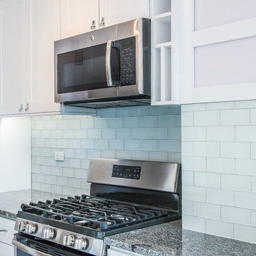
Pantry roll out shelving, Double recycle bin, fancy handles, LED lighting, Quartz counter top, beautiful backslash tiles and grey linen floors finished off the kitchen which looked over a beautiful view of the George Washington Bridge from the top of this lovely 4th floor apartment.
Credit to Masterpiece Tile and Marble (Annmarie on the selection of Tiles and countertop and Val on the Construction to complete this project).
Davor Kokic Photography
 Paradise Found Construction
Melissa and Steve purchased our National Award Winning Green Certified Remodeled Home. They had moved to Colorado previously to expand Business opportunities, but found that they missed being near their extended family members and Melissa’s native city and state. They wanted a home in a quiet neighborhood that suited their needs and had been updated to current design trends and amenities. With 2 young children a single-story home appealed to them.
Steve primarily worked from home, using the formal Living Room as his home office which was central to the Kitchen and main living areas. As their children grew, it became increasingly difficult to With 4 children, their daily activities were split between the 1st and second floors, making it difficult to coordinate activities amongst them. Also, with a large extended family close-by, get-togethers were cramped and uncomfortable.
With the added 1st floor living space, they are now able to all comfortably gather together and spend more quality time with their family and friends.
Design Features
Seamless Transition into the adjoining Kitchen and Living Room, separating the two with a light and bright 15-Lite Double French Door.
Light and bright natural hardwood flooring.
A bright and open floor plan achieved by introducing a double 15-Lite French door in the Kitchen and generous amount of double-hung low-e windows.
Window Well in the Roof to accommodate required foot-print placement.
Avoidance of installing a Pull-Down Attic Access.
No-VOC Paints and Finishes.
Durable Exterior Construction
No-Maintenance Composite and PVC Low-E Windows and Doors
Cement Fiber Siding
Cement Fiber and PVC Trim
Life-time Architectural Shingles
Metal Roof Flashing with Gutter Kick-Outs
Superior Window Flashing and Water Intrusion Sealing measures
Energy Efficient and Green Features
1st floor HVAC Compressor and Air Handler replaced with a more efficient 15 Seer unit.
Floor penetrations and perimeter bottom plates caulked and air sealed.
No-VOC Paints and Finishes.
Durable Exterior Construction
No-Maintenance Composite and PVC Low-E Windows
Cement Fiber Siding
Cement Fiber and PVC Trim
Life-time Architectural Shingles
Metal Roof Flashing with Gutter Kick-Outs
Superior Window Flashing and Water Intrusion sealing measures
 Drury Design
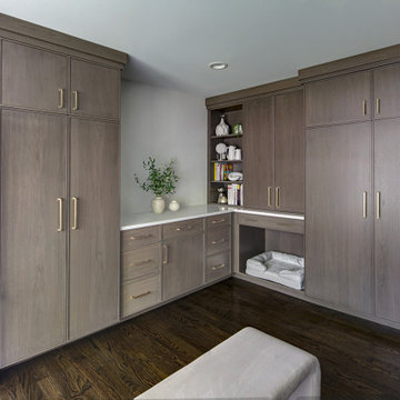
Some rooms never quite find their purpose. That was the case with this space, which had gradually become a combination home office, pantry overflow area, pet zone, and general catch-all for daily life. While it offered plenty of square footage, it wasn’t helping the homeowners stay organized, and valuable storage was scattered between an overcrowded pantry closet and various pieces of furniture throughout the room.
Having previously partnered with Drury Design on a kitchen remodel, these homeowners once again turned to Senior Designer Samantha Schoell to help them rethink how their home could better support the way they actually live. What began as a conversation about adding some cabinetry quickly evolved into a comprehensive storage solution — one designed to accommodate everything from groceries and sports equipment to pet supplies and everyday household essentials.
Design Objectives:
Create Organization: Consolidate pantry overflow, household supplies, and everyday essentials into a single, highly functional space.
Support Family Life: Provide dedicated storage for coats, bags, sports equipment, and the routines of an active household.
Accommodate Pets: Incorporate thoughtful features for the family’s dogs while maintaining a clean, organized appearance.
Maximize Existing Space: Transform an underutilized room without expanding the home’s footprint.
Maintain Flexibility: Preserve the room’s long-term versatility and appeal for future homeowners.
Design Challenges:
Multiple Functions: The room was being used simultaneously as a home office, pantry, storage area, and pet space without a cohesive organizational strategy.
Insufficient Pantry Storage: The nearby pantry closet had become overcrowded and difficult to navigate.
Visual Clutter: Everyday items, pet supplies, and household necessities lacked dedicated storage locations.
Unused Potential: Despite its generous size, the room was not contributing meaningfully to the home’s overall functionality.
Balancing Practicality and Style: The homeowners wanted substantial storage without creating a space that felt overly utilitarian.
Design Solutions:
Purpose-Built Storage Plan: Custom cabinetry was designed to support multiple functions within a unified storage system, allowing the room to serve as a mudroom, pantry extension, household hub, and pet station.
Expanded Pantry Capacity: Floor-to-ceiling cabinetry, a secondary refrigerator, and extensive drawer storage dramatically increased food storage and organization capabilities.
Hidden Organization: Closed cabinetry conceals household items, sports gear, pet supplies, and everyday clutter, creating a calm and orderly appearance.
Full-Room Transformation: Rather than simply adding cabinets to one wall, the design reimagined the entire room, utilizing its footprint to create a true family command center.
Furniture-Inspired Cabinetry: Warm wood finishes, decorative hardware, open display shelving, and thoughtful detailing elevate the room beyond pure utility, helping it feel like a natural extension of the home’s design.
The most successful remodeling projects often solve problems homeowners have simply learned to live with. In this case, a room that once served several purposes — but excelled at none — was transformed into one of the hardest-working spaces in the home.
Today, groceries, pet supplies, seasonal gear, household essentials, and daily routines all have a designated place. Even the family’s dogs were thoughtfully considered, with a built-in resting area integrated into the cabinetry. The result is a room that feels remarkably organized despite supporting countless everyday activities — a reflection of how thoughtful design can bring clarity, efficiency, and calm to the busiest parts of family life.
 Paradise Found Construction
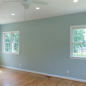
Michelle and Dominic had purchased their home in Wake Forest several years earlier with the idea in mind that it would serve as a family-centric place where they could gather with extended family. Situated in a quiet residential neighborhood with large lots, it was the perfect place for them to raise and home school their 4 children.
As their family grew, the children’s daily activities were split between the 1st and 2nd floors, making it difficult to coordinate activities amongst them all. And their extended family get-togethers had become cramped and increasingly difficult to accommodate everyone comfortably. They were in need of added living space that could serve their family’s needs as well as provide extra entertaining areas to host family gatherings.
With our experience in helping homeowners secure financing for their Home Improvement projects, we worked with Dominic and Michelle to prepare all of the necessary documentation required to apply for an FHA 203K Home Renovation loan. As a result, they were able to finance the full cost of the construction of their new Family Room Addition.
Our solution was to add a 1st floor living space that harmonized with the existing floor plan and décor, was central to the existing Kitchen, and flexible enough to facilitate large groups and accommodate the whole family’s daily activities and access to the outdoors.
As a result of their newly added flexible living area, they are now able to comfortably gather with their extended family as well accommodate the whole family’s needs, giving them the opportunity spend more quality time with their family and friends.
Design Features
Harmony with the home’s existing architecture and décor.
Seamless Transition into the adjoining Kitchen and Living Room, separating the two with a light and bright 15-Lite Double French Door.
Light and bright natural hardwood flooring.
A bright and open floor plan achieved by introducing a double 15-Lite French door in the Kitchen and generous amount of double-hung Low-E windows.
Window Well in the Roof to accommodate required foot-print placement.
Easy access to the outdoors and the large deck and yard.
Extra storage space for tools and outdoor equipment.
Energy Efficient and Green Features
1st floor HVAC Compressor and Air Handler replaced with a more efficient 15 Seer unit.
Floor penetrations and perimeter bottom plates caulked and air sealed.
No-VOC Paints and Finishes.
Durable Exterior Construction
No-Maintenance Composite and PVC Low-E Windows
Cement Fiber Siding
Cement Fiber and PVC Trim
Life-time Architectural Shingles
Metal Roof Flashing with Gutter Kick-Outs
Superior Window Flashing and Water Intrusion sealing measures
 Paradise Found Construction
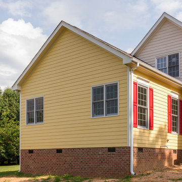
Michelle and Dominic had purchased their home in Wake Forest several years earlier with the idea in mind that it would serve as a family-centric place where they could gather with extended family. Situated in a quiet residential neighborhood with large lots, it was the perfect place for them to raise and home school their 4 children.
As their family grew, the children’s daily activities were split between the 1st and 2nd floors, making it difficult to coordinate activities amongst them all. And their extended family get-togethers had become cramped and increasingly difficult to accommodate everyone comfortably. They were in need of added living space that could serve their family’s needs as well as provide extra entertaining areas to host family gatherings.
With our experience in helping homeowners secure financing for their Home Improvement projects, we worked with Dominic and Michelle to prepare all of the necessary documentation required to apply for an FHA 203K Home Renovation loan. As a result, they were able to finance the full cost of the construction of their new Family Room Addition.
Our solution was to add a 1st floor living space that harmonized with the existing floor plan and décor, was central to the existing Kitchen, and flexible enough to facilitate large groups and accommodate the whole family’s daily activities and access to the outdoors.
As a result of their newly added flexible living area, they are now able to comfortably gather with their extended family as well accommodate the whole family’s needs, giving them the opportunity spend more quality time with their family and friends.
Design Features
Harmony with the home’s existing architecture and décor.
Seamless Transition into the adjoining Kitchen and Living Room, separating the two with a light and bright 15-Lite Double French Door.
Light and bright natural hardwood flooring.
A bright and open floor plan achieved by introducing a double 15-Lite French door in the Kitchen and generous amount of double-hung Low-E windows.
Window Well in the Roof to accommodate required foot-print placement.
Easy access to the outdoors and the large deck and yard.
Extra storage space for tools and outdoor equipment.
Energy Efficient and Green Features
1st floor HVAC Compressor and Air Handler replaced with a more efficient 15 Seer unit.
Floor penetrations and perimeter bottom plates caulked and air sealed.
No-VOC Paints and Finishes.
Durable Exterior Construction
No-Maintenance Composite and PVC Low-E Windows
Cement Fiber Siding
Cement Fiber and PVC Trim
Life-time Architectural Shingles
Metal Roof Flashing with Gutter Kick-Outs
Superior Window Flashing and Water Intrusion sealing measures
 Paradise Found Construction
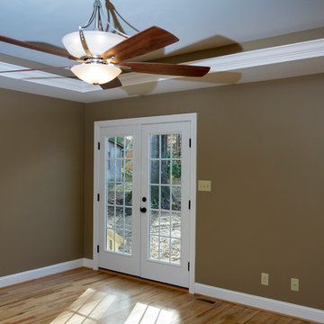
Melissa and Steve purchased our National Award Winning Green Certified Remodeled Home. They had moved to Colorado previously to expand Business opportunities, but found that they missed being near their extended family members and Melissa’s native city and state. They wanted a home in a quiet neighborhood that suited their needs and had been updated to current design trends and amenities. With 2 young children a single-story home appealed to them.
Steve primarily worked from home, using the formal Living Room as his home office which was central to the Kitchen and main living areas. As their children grew, it became increasingly difficult to With 4 children, their daily activities were split between the 1st and second floors, making it difficult to coordinate activities amongst them. Also, with a large extended family close-by, get-togethers were cramped and uncomfortable.
With the added 1st floor living space, they are now able to all comfortably gather together and spend more quality time with their family and friends.
Design Features
Seamless Transition into the adjoining Kitchen and Living Room, separating the two with a light and bright 15-Lite Double French Door.
Light and bright natural hardwood flooring.
A bright and open floor plan achieved by introducing a double 15-Lite French door in the Kitchen and generous amount of double-hung low-e windows.
Window Well in the Roof to accommodate required foot-print placement.
Avoidance of installing a Pull-Down Attic Access.
No-VOC Paints and Finishes.
Durable Exterior Construction
No-Maintenance Composite and PVC Low-E Windows and Doors
Cement Fiber Siding
Cement Fiber and PVC Trim
Life-time Architectural Shingles
Metal Roof Flashing with Gutter Kick-Outs
Superior Window Flashing and Water Intrusion Sealing measures
Energy Efficient and Green Features
1st floor HVAC Compressor and Air Handler replaced with a more efficient 15 Seer unit.
Floor penetrations and perimeter bottom plates caulked and air sealed.
No-VOC Paints and Finishes.
Durable Exterior Construction
No-Maintenance Composite and PVC Low-E Windows
Cement Fiber Siding
Cement Fiber and PVC Trim
Life-time Architectural Shingles
Metal Roof Flashing with Gutter Kick-Outs
Superior Window Flashing and Water Intrusion sealing measures
 Drury Design
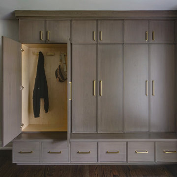
Some rooms never quite find their purpose. That was the case with this space, which had gradually become a combination home office, pantry overflow area, pet zone, and general catch-all for daily life. While it offered plenty of square footage, it wasn’t helping the homeowners stay organized, and valuable storage was scattered between an overcrowded pantry closet and various pieces of furniture throughout the room.
Having previously partnered with Drury Design on a kitchen remodel, these homeowners once again turned to Senior Designer Samantha Schoell to help them rethink how their home could better support the way they actually live. What began as a conversation about adding some cabinetry quickly evolved into a comprehensive storage solution — one designed to accommodate everything from groceries and sports equipment to pet supplies and everyday household essentials.
Design Objectives:
Create Organization: Consolidate pantry overflow, household supplies, and everyday essentials into a single, highly functional space.
Support Family Life: Provide dedicated storage for coats, bags, sports equipment, and the routines of an active household.
Accommodate Pets: Incorporate thoughtful features for the family’s dogs while maintaining a clean, organized appearance.
Maximize Existing Space: Transform an underutilized room without expanding the home’s footprint.
Maintain Flexibility: Preserve the room’s long-term versatility and appeal for future homeowners.
Design Challenges:
Multiple Functions: The room was being used simultaneously as a home office, pantry, storage area, and pet space without a cohesive organizational strategy.
Insufficient Pantry Storage: The nearby pantry closet had become overcrowded and difficult to navigate.
Visual Clutter: Everyday items, pet supplies, and household necessities lacked dedicated storage locations.
Unused Potential: Despite its generous size, the room was not contributing meaningfully to the home’s overall functionality.
Balancing Practicality and Style: The homeowners wanted substantial storage without creating a space that felt overly utilitarian.
Design Solutions:
Purpose-Built Storage Plan: Custom cabinetry was designed to support multiple functions within a unified storage system, allowing the room to serve as a mudroom, pantry extension, household hub, and pet station.
Expanded Pantry Capacity: Floor-to-ceiling cabinetry, a secondary refrigerator, and extensive drawer storage dramatically increased food storage and organization capabilities.
Hidden Organization: Closed cabinetry conceals household items, sports gear, pet supplies, and everyday clutter, creating a calm and orderly appearance.
Full-Room Transformation: Rather than simply adding cabinets to one wall, the design reimagined the entire room, utilizing its footprint to create a true family command center.
Furniture-Inspired Cabinetry: Warm wood finishes, decorative hardware, open display shelving, and thoughtful detailing elevate the room beyond pure utility, helping it feel like a natural extension of the home’s design.
The most successful remodeling projects often solve problems homeowners have simply learned to live with. In this case, a room that once served several purposes — but excelled at none — was transformed into one of the hardest-working spaces in the home.
Today, groceries, pet supplies, seasonal gear, household essentials, and daily routines all have a designated place. Even the family’s dogs were thoughtfully considered, with a built-in resting area integrated into the cabinetry. The result is a room that feels remarkably organized despite supporting countless everyday activities — a reflection of how thoughtful design can bring clarity, efficiency, and calm to the busiest parts of family life.
 Paradise Found Construction
Melissa and Steve purchased our National Award Winning Green Certified Remodeled Home. They had moved to Colorado previously to expand Business opportunities, but found that they missed being near their extended family members and Melissa’s native city and state. They wanted a home in a quiet neighborhood that suited their needs and had been updated to current design trends and amenities. With 2 young children a single-story home appealed to them.
Steve primarily worked from home, using the formal Living Room as his home office which was central to the Kitchen and main living areas. As their children grew, it became increasingly difficult to With 4 children, their daily activities were split between the 1st and second floors, making it difficult to coordinate activities amongst them. Also, with a large extended family close-by, get-togethers were cramped and uncomfortable.
With the added 1st floor living space, they are now able to all comfortably gather together and spend more quality time with their family and friends.
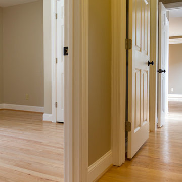
Design Features
Seamless Transition into the adjoining Kitchen and Living Room, separating the two with a light and bright 15-Lite Double French Door.
Light and bright natural hardwood flooring.
A bright and open floor plan achieved by introducing a double 15-Lite French door in the Kitchen and generous amount of double-hung low-e windows.
Window Well in the Roof to accommodate required foot-print placement.
Avoidance of installing a Pull-Down Attic Access.
No-VOC Paints and Finishes.
Durable Exterior Construction
No-Maintenance Composite and PVC Low-E Windows and Doors
Cement Fiber Siding
Cement Fiber and PVC Trim
Life-time Architectural Shingles
Metal Roof Flashing with Gutter Kick-Outs
Superior Window Flashing and Water Intrusion Sealing measures
Energy Efficient and Green Features
1st floor HVAC Compressor and Air Handler replaced with a more efficient 15 Seer unit.
Floor penetrations and perimeter bottom plates caulked and air sealed.
No-VOC Paints and Finishes.
Durable Exterior Construction
No-Maintenance Composite and PVC Low-E Windows
Cement Fiber Siding
Cement Fiber and PVC Trim
Life-time Architectural Shingles
Metal Roof Flashing with Gutter Kick-Outs
Superior Window Flashing and Water Intrusion sealing measures
 Paradise Found Construction
Michelle and Dominic had purchased their home in Wake Forest several years earlier with the idea in mind that it would serve as a family-centric place where they could gather with extended family. Situated in a quiet residential neighborhood with large lots, it was the perfect place for them to raise and home school their 4 children.
As their family grew, the children’s daily activities were split between the 1st and 2nd floors, making it difficult to coordinate activities amongst them all. And their extended family get-togethers had become cramped and increasingly difficult to accommodate everyone comfortably. They were in need of added living space that could serve their family’s needs as well as provide extra entertaining areas to host family gatherings.
With our experience in helping homeowners secure financing for their Home Improvement projects, we worked with Dominic and Michelle to prepare all of the necessary documentation required to apply for an FHA 203K Home Renovation loan. As a result, they were able to finance the full cost of the construction of their new Family Room Addition.
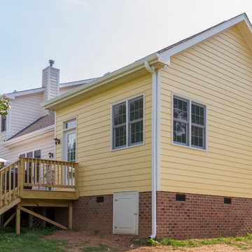
Our solution was to add a 1st floor living space that harmonized with the existing floor plan and décor, was central to the existing Kitchen, and flexible enough to facilitate large groups and accommodate the whole family’s daily activities and access to the outdoors.
As a result of their newly added flexible living area, they are now able to comfortably gather with their extended family as well accommodate the whole family’s needs, giving them the opportunity spend more quality time with their family and friends.
Design Features
Harmony with the home’s existing architecture and décor.
Seamless Transition into the adjoining Kitchen and Living Room, separating the two with a light and bright 15-Lite Double French Door.
Light and bright natural hardwood flooring.
A bright and open floor plan achieved by introducing a double 15-Lite French door in the Kitchen and generous amount of double-hung Low-E windows.
Window Well in the Roof to accommodate required foot-print placement.
Easy access to the outdoors and the large deck and yard.
Extra storage space for tools and outdoor equipment.
Energy Efficient and Green Features
1st floor HVAC Compressor and Air Handler replaced with a more efficient 15 Seer unit.
Floor penetrations and perimeter bottom plates caulked and air sealed.
No-VOC Paints and Finishes.
Durable Exterior Construction
No-Maintenance Composite and PVC Low-E Windows
Cement Fiber Siding
Cement Fiber and PVC Trim
Life-time Architectural Shingles
Metal Roof Flashing with Gutter Kick-Outs
Superior Window Flashing and Water Intrusion sealing measures
 RAJ Kitchen and Bath, LLC
**Check out the video of this transformation on our website**
This small kitchen was way too small for this 2 bedrooms, 2 bathrooms apartment. Not only was it a very small kitchen, but the physical location of it made it very difficult to make it any bigger. There wasn't much that could have been done without incurring astronomical cost, which would get little or no return on the investment. The client wanted a kitchen that can be optimized in its current location to add a ton of value for resale.
This was difficult to do, because there was no moving of any mechanical around in the kitchen and even if we wanted to, the management of the building would not allow. For those of you who live in condos, co-ops or apartment building, you know how difficult it is to rework these foot prints. When we showed up, we saw the problems, but we also saw a huge opportunity where we can achieve those goals in the small space. This was accomplished by making some key changes and to incorporate some new things that was not possible when this kitchen was built years ago.
The crucial part of the design that would drive the entire new layout, was selecting the only appliance; that was the Refrigerator. Once we nailed down that refrigerator, we then proceeded to design the kitchen around it. We moved it to the other side of the wall where the sink was so that we can tap into the water line from the sink plumbing. It was crucial that it stays exactly 24" deep, not an inch more because we had to keep the entry as open as possible. Also, it was going to be directly in front of another big storage unit - The pantry. It is not ideal in most cases, but we needed the rest of the space to ramp up the design and open feel towards the side where all of the activities would take place, which happend to be the dining room and the view.
Once all that was figured out, we re-positioned the sink, dishwasher and the range and proceeded to wrap the cabinets around the columns to integrate them into the space. Thirty- six inches cabinets height was used so that they can be installed higher towards the ceiling height to give more room rather than the standard 18" required height between the counter tops. This was done to make the room feel a lot bigger than it really was. Not to mention, we also didn't want the faucet to be buried under the cabinets so that was also a necessary design detail for the space.
We then lowered both knee walls so that the counter top can sit on top of them, by removing that stop point that would have otherwise defined the kitchen area. This allowed us to pick up that extra footprint into the room for added prep space and enabled us to create the illusion of a kitchen that is looking longer than it really is. Every inch mattered when designing this kitchen and we made a conscious decision to use every one of that inch.
White cabinets were selected to do just what white cabinets are design to do; make a small or dark room appear bigger, brighter and more open. In this kitchen, this was amplified the more because of the kitchen location. It was perfect! We knew we did justice to the space because while we were there taking some photos, a few potential buyers walked in and went straight for the kitchen! They said its design just to fit the apartment.
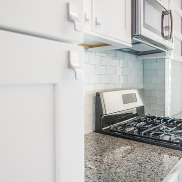
Pantry roll out shelving, Double recycle bin, fancy handles, LED lighting, Quartz counter top, beautiful backslash tiles and grey linen floors finished off the kitchen which looked over a beautiful view of the George Washington Bridge from the top of this lovely 4th floor apartment.
Credit to Masterpiece Tile and Marble (Annmarie on the selection of Tiles and countertop and Val on the Construction to complete this project).
Davor Kokic Photography
 Paradise Found Construction
Melissa and Steve purchased our National Award Winning Green Certified Remodeled Home. They had moved to Colorado previously to expand Business opportunities, but found that they missed being near their extended family members and Melissa’s native city and state. They wanted a home in a quiet neighborhood that suited their needs and had been updated to current design trends and amenities. With 2 young children a single-story home appealed to them.
Steve primarily worked from home, using the formal Living Room as his home office which was central to the Kitchen and main living areas. As their children grew, it became increasingly difficult to With 4 children, their daily activities were split between the 1st and second floors, making it difficult to coordinate activities amongst them. Also, with a large extended family close-by, get-togethers were cramped and uncomfortable.
With the added 1st floor living space, they are now able to all comfortably gather together and spend more quality time with their family and friends.
Design Features
Seamless Transition into the adjoining Kitchen and Living Room, separating the two with a light and bright 15-Lite Double French Door.
Light and bright natural hardwood flooring.
A bright and open floor plan achieved by introducing a double 15-Lite French door in the Kitchen and generous amount of double-hung low-e windows.
Window Well in the Roof to accommodate required foot-print placement.
Avoidance of installing a Pull-Down Attic Access.
No-VOC Paints and Finishes.
Durable Exterior Construction
No-Maintenance Composite and PVC Low-E Windows and Doors
Cement Fiber Siding
Cement Fiber and PVC Trim
Life-time Architectural Shingles
Metal Roof Flashing with Gutter Kick-Outs
Superior Window Flashing and Water Intrusion Sealing measures
Energy Efficient and Green Features
1st floor HVAC Compressor and Air Handler replaced with a more efficient 15 Seer unit.
Floor penetrations and perimeter bottom plates caulked and air sealed.
No-VOC Paints and Finishes.
Durable Exterior Construction
No-Maintenance Composite and PVC Low-E Windows
Cement Fiber Siding
Cement Fiber and PVC Trim
Life-time Architectural Shingles
Metal Roof Flashing with Gutter Kick-Outs
Superior Window Flashing and Water Intrusion sealing measures
 RAJ Kitchen and Bath, LLC
**Check out the video of this transformation on our website**
This small kitchen was way too small for this 2 bedrooms, 2 bathrooms apartment. Not only was it a very small kitchen, but the physical location of it made it very difficult to make it any bigger. There wasn't much that could have been done without incurring astronomical cost, which would get little or no return on the investment. The client wanted a kitchen that can be optimized in its current location to add a ton of value for resale.
This was difficult to do, because there was no moving of any mechanical around in the kitchen and even if we wanted to, the management of the building would not allow. For those of you who live in condos, co-ops or apartment building, you know how difficult it is to rework these foot prints. When we showed up, we saw the problems, but we also saw a huge opportunity where we can achieve those goals in the small space. This was accomplished by making some key changes and to incorporate some new things that was not possible when this kitchen was built years ago.
The crucial part of the design that would drive the entire new layout, was selecting the only appliance; that was the Refrigerator. Once we nailed down that refrigerator, we then proceeded to design the kitchen around it. We moved it to the other side of the wall where the sink was so that we can tap into the water line from the sink plumbing. It was crucial that it stays exactly 24" deep, not an inch more because we had to keep the entry as open as possible. Also, it was going to be directly in front of another big storage unit - The pantry. It is not ideal in most cases, but we needed the rest of the space to ramp up the design and open feel towards the side where all of the activities would take place, which happend to be the dining room and the view.
Once all that was figured out, we re-positioned the sink, dishwasher and the range and proceeded to wrap the cabinets around the columns to integrate them into the space. Thirty- six inches cabinets height was used so that they can be installed higher towards the ceiling height to give more room rather than the standard 18" required height between the counter tops. This was done to make the room feel a lot bigger than it really was. Not to mention, we also didn't want the faucet to be buried under the cabinets so that was also a necessary design detail for the space.
We then lowered both knee walls so that the counter top can sit on top of them, by removing that stop point that would have otherwise defined the kitchen area. This allowed us to pick up that extra footprint into the room for added prep space and enabled us to create the illusion of a kitchen that is looking longer than it really is. Every inch mattered when designing this kitchen and we made a conscious decision to use every one of that inch.
White cabinets were selected to do just what white cabinets are design to do; make a small or dark room appear bigger, brighter and more open. In this kitchen, this was amplified the more because of the kitchen location. It was perfect! We knew we did justice to the space because while we were there taking some photos, a few potential buyers walked in and went straight for the kitchen! They said its design just to fit the apartment.
Pantry roll out shelving, Double recycle bin, fancy handles, LED lighting, Quartz counter top, beautiful backslash tiles and grey linen floors finished off the kitchen which looked over a beautiful view of the George Washington Bridge from the top of this lovely 4th floor apartment.
Credit to Masterpiece Tile and Marble (Annmarie on the selection of Tiles and countertop and Val on the Construction to complete this project).
Davor Kokic Photography
 Paradise Found Construction
Melissa and Steve purchased our National Award Winning Green Certified Remodeled Home. They had moved to Colorado previously to expand Business opportunities, but found that they missed being near their extended family members and Melissa’s native city and state. They wanted a home in a quiet neighborhood that suited their needs and had been updated to current design trends and amenities. With 2 young children a single-story home appealed to them.
Steve primarily worked from home, using the formal Living Room as his home office which was central to the Kitchen and main living areas. As their children grew, it became increasingly difficult to With 4 children, their daily activities were split between the 1st and second floors, making it difficult to coordinate activities amongst them. Also, with a large extended family close-by, get-togethers were cramped and uncomfortable.
With the added 1st floor living space, they are now able to all comfortably gather together and spend more quality time with their family and friends.
Design Features
Seamless Transition into the adjoining Kitchen and Living Room, separating the two with a light and bright 15-Lite Double French Door.
Light and bright natural hardwood flooring.
A bright and open floor plan achieved by introducing a double 15-Lite French door in the Kitchen and generous amount of double-hung low-e windows.
Window Well in the Roof to accommodate required foot-print placement.
Avoidance of installing a Pull-Down Attic Access.
No-VOC Paints and Finishes.
Durable Exterior Construction
No-Maintenance Composite and PVC Low-E Windows and Doors
Cement Fiber Siding
Cement Fiber and PVC Trim
Life-time Architectural Shingles
Metal Roof Flashing with Gutter Kick-Outs
Superior Window Flashing and Water Intrusion Sealing measures
Energy Efficient and Green Features
1st floor HVAC Compressor and Air Handler replaced with a more efficient 15 Seer unit.
Floor penetrations and perimeter bottom plates caulked and air sealed.
No-VOC Paints and Finishes.
Durable Exterior Construction
No-Maintenance Composite and PVC Low-E Windows
Cement Fiber Siding
Cement Fiber and PVC Trim
Life-time Architectural Shingles
Metal Roof Flashing with Gutter Kick-Outs
Superior Window Flashing and Water Intrusion sealing measures
 Paradise Found Construction
Melissa and Steve purchased our National Award Winning Green Certified Remodeled Home. They had moved to Colorado previously to expand Business opportunities, but found that they missed being near their extended family members and Melissa’s native city and state. They wanted a home in a quiet neighborhood that suited their needs and had been updated to current design trends and amenities. With 2 young children a single-story home appealed to them.
Steve primarily worked from home, using the formal Living Room as his home office which was central to the Kitchen and main living areas. As their children grew, it became increasingly difficult to With 4 children, their daily activities were split between the 1st and second floors, making it difficult to coordinate activities amongst them. Also, with a large extended family close-by, get-togethers were cramped and uncomfortable.
With the added 1st floor living space, they are now able to all comfortably gather together and spend more quality time with their family and friends.
Design Features
Seamless Transition into the adjoining Kitchen and Living Room, separating the two with a light and bright 15-Lite Double French Door.
Light and bright natural hardwood flooring.
A bright and open floor plan achieved by introducing a double 15-Lite French door in the Kitchen and generous amount of double-hung low-e windows.
Window Well in the Roof to accommodate required foot-print placement.
Avoidance of installing a Pull-Down Attic Access.
No-VOC Paints and Finishes.
Durable Exterior Construction
No-Maintenance Composite and PVC Low-E Windows and Doors
Cement Fiber Siding
Cement Fiber and PVC Trim
Life-time Architectural Shingles
Metal Roof Flashing with Gutter Kick-Outs
Superior Window Flashing and Water Intrusion Sealing measures
Energy Efficient and Green Features
1st floor HVAC Compressor and Air Handler replaced with a more efficient 15 Seer unit.
Floor penetrations and perimeter bottom plates caulked and air sealed.
No-VOC Paints and Finishes.
Durable Exterior Construction
No-Maintenance Composite and PVC Low-E Windows
Cement Fiber Siding
Cement Fiber and PVC Trim
Life-time Architectural Shingles
Metal Roof Flashing with Gutter Kick-Outs
Superior Window Flashing and Water Intrusion sealing measures
4