
Search results for "Difficulties" in Home Design Ideas
 Frankel Design Build
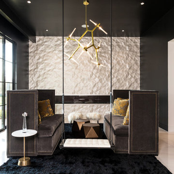
This project, sitting on a little more than 3.5 acres on Rivercrest was completed in 3 years with a total square footage of more than 26,000 square feet.
Typically modern homes are smaller. At a certain size, usually around 4,000 square feet, the difficulty with modern or contemporary architecture becomes scale, and the minimalist idea gets lost. Whenever you get to this scale of house at over 26,000 square feet, this problem adds a layer of complexity.
Connie Anderson Photography
 Lennox Masonry
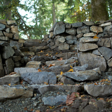
This project entailed the draining of a 200,000 cubic foot pond which was originally constructed in the early 1900s in order to install a water feature. I had previously dammed the lower pond, which was roughly equivalent in size to the upper pond, with stonework to match the existing stone walkways. The lower pond will be utilized as a catch-basin in an effort to keep the upper pond’s water level at a sufficient height through a pump system.
After the removal of over a 100 years worth of sediment, I began constructing several terraces, stone steps, stone walkways, and several stone retaining walls — all stone features were built without the use of mortar so as to allow plant growth, such as vines and flowering plants to grow through the stonework.
The difficulty I faced, oddly enough, was trying to be as random as possible with the placement of the stones, so as to make the stonework appear as though it had been built alongside some of the pre-existing 100-year-old stone walls scattered across other areas of the property. In essence, I forced myself to leave larger gaps in between stones where I typically wouldn’t, as well as leave some stones protruding from the wall, and allowing the wall to slightly fluctuate in height. All of which required me to become a perfectionist of randomness, which was quite trying of me.
The top 2 feet of the 2,000-foot upper pond was then faced and retained with stone.
 Fab N' Frugal Designs
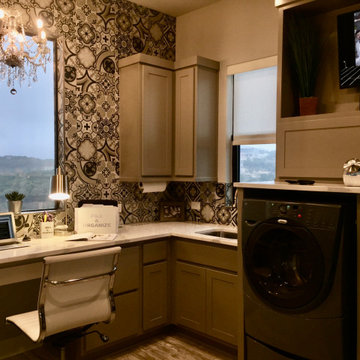
Office in laundry room with lots of cabinets and a chandelier
Large transitional u-shaped porcelain tile and beige floor utility room photo with an undermount sink, shaker cabinets, gray cabinets, ceramic backsplash, gray walls, a side-by-side washer/dryer and white countertops
Large transitional u-shaped porcelain tile and beige floor utility room photo with an undermount sink, shaker cabinets, gray cabinets, ceramic backsplash, gray walls, a side-by-side washer/dryer and white countertops
Find the right local pro for your project
 Sentinel Builders
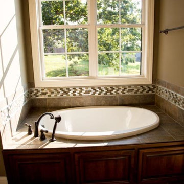
Inspiration for a large timeless master brown tile and ceramic tile porcelain tile bathroom remodel in Other with an undermount sink, raised-panel cabinets, dark wood cabinets, granite countertops, a one-piece toilet and brown walls
 Urban Ironcraft
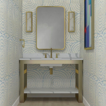
Listed here is our made-to-order "Miles" modern clean-lined metal bathroom vanity. It's perfect for your master, powder or Jack and Jill bathroom. As always, all of our products are built to your specs, so please inquire as to what your needs are.
Construction:
1/4" x 3" strap
1/4" x 1" strap up top to support the stone
Standard Size: 48"L x 21"W x 33"H (ships free)
**We offer custom sizing
Shelf:
This design shows a stone shelf, but you can use glass, wood, metal or not have a shelf at all.
Finishes: (Shown in Roman Gold)
We offer all sorts of designer finishes. Pricing is based on the cost of material and the tiers of difficulty in the process. Some finishes are much more labor intense than others.
**NOTE: Pricing listed is starting pricing only.
 RFK Kitchens
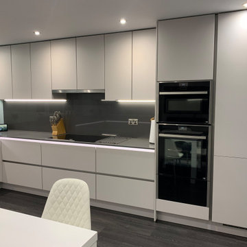
All the way through the design, planning and installation, we felt very comfortable with the team at RFK, especially with the added challenges and difficulties caused by the pandemic. The final result is we now have a fantastic and stunning new kitchen that is exactly what we imagined and hoped.
MALCOM & MICHELE
 Strobel Design Build
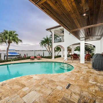
The perk of covered outdoor living spaces…A little rain won’t stop us! Featured home: Bayway Isles, St. Petersburg, Florida.
 Andrew Marshall Designs
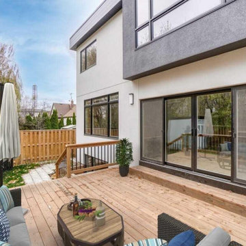
This modern home started off with an exisitng storey andd a half home. Due to site conditions including zoning issues and a large mature tree, to build a brand new house posed some difficulty. So we renovated. The is no evidence showing that it's anything but a new home. A modern feel inside has been maintained throughout with great attention to maintaining a consistent feel throughout the home.. The builder also did a great job.
 Fish Creek Finish Carpentry
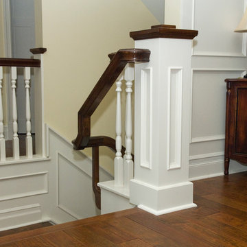
These homeowners came to us through a recommendation from a client who was extremely happy with the work we did for them in the past. This project was in the inner city and the homeowners tore down their old house and built their new home in its place. Keeping with the charm of the original home, the main goal for the home was to make it look like a brand new 100 year old home. We were brought on to work on the entire home with the exception of the kitchen (entry, family room, ceiling work, office/ den, living room, fireplace, window trims, 5 bedrooms, and 4 bathrooms).
In addition to our custom woodworking, these homeowners leaned heavily on our design suggestions. From an execution standpoint, this home was extremely detailed, and getting the balance from room to room and throughout the entire home was crucial for achieving the correct look. In addition, the methods and materials used 100 years ago have since had drastic improvements, making the lifetime and quality of the finished product substantially better, but also adding a higher degree of difficulty to accomplish accurate looking details.
The end result of this project was a work of art. A home that thad the appearance of a 100 year old home, with modern materials and methods to ensure quality and longevity. Everything from their dramatic entry and staircase to their floor-to-ceiling hand-finished den showcases a skill set and eye for detail essential to accomplishing the lofty goals of this home.
 RAJ Kitchen and Bath, LLC
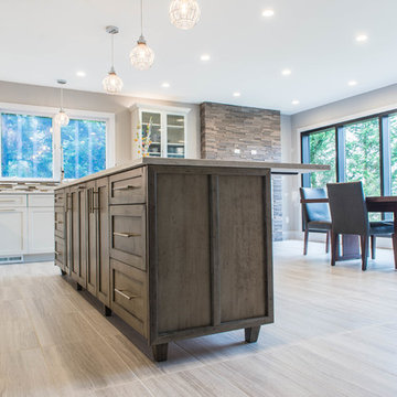
There were a few difficulties in making this kitchen any better than how it was. There was a separate staircase that had access to the second floor which was located in the kitchen. This left just enough room to push the dining room to one side. Then, there was the porch. A really nice panoramic view of the back, but was somehow under-used by the family during the summer months. Then, it was the size of the kitchen. It simply was way too small for a growing family, and while it had a peninsular in place, the flow just didn’t work. I remember watching them one day demonstrating how awkward it was using the kitchen. We got it! We had our marching orders to go and figure out how to make this kitchen work for this family.
Everything in the room was fair play. The design was done to make the kitchen very open. For a few ideas, we incorporated the porch in the kitchen by using the nana wall idea but it ended up being too cost prohibitive to do so. We then decided to do a permanent fix by using a commercial glass wall application. Once we figured that out, we moved back inside and removed the staircase. This gave us two added benefits. One allowed us to really reconfigure the kitchen and the other opened up the second floor for a huge built in closet system.
We relocated the windows, added a fire place with a built In TV above. From there, it was onto the kitchen itself which contained a huge Island with seating, large kitchen sink and built in appliances which was set up in a way to take advantage of the new layout. We re-positioned the kitchen facing the beautiful views outside rather than looking towards a wall. Now, when you enter the house up the entry stairs, the kitchen now draws you into the magnificent new open space. This is now setup for entertaining, relaxation, hanging out and most of all, preparing meals in a room where you only have to leave if you want to.
This one was all about the design. Design was what made this space. Setting this space up for success was crucial, and this kitchen is a great example of how design can cover a multitude of sins in Kitchen designs.
… Just close your eyes for a second and imagine waking up one winter morning and having a cup of coffee and watching the snow fall through those huge windows, leaning up against those 3D feature walls while watching the kids sitting around the table enjoying those warm radiant heated floors in this spacious kitchen…..
 Granit Architects + Interiors
The brief:
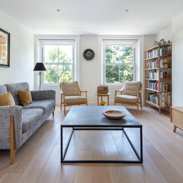
Our clients own an apartment in a mansion block overlooking Clapham Common. They wanted to modernise and bring the apartment up to date and had a few goals:
To change the existing small cellular spaces in the apartment to create a new open-plan room
To extend into the loft and create a new master bedroom suite
To create a roof terrace for some much-needed private outdoor space
The key to the brief was to ensure a good connection between the different levels of the apartment and ensure natural light could flood into all spaces. The apartment is in a conservation area, which was an important consideration.
The solution:
We changed the primary room space to run from the front to the back of the building. This change created the large kitchen dining living space our clients wanted, an area with good natural light throughout and at all times of the day.
We created a master bedroom suite in the loft space, with generous room size and lots of natural light.
The limitations of the building’s form meant that a critical aspect to creating these larger living spaces was carefully considered smaller areas, including the bathrooms and a pocket utility room. The circulation space was carefully considered, too, with the landings used for storage in the form of new joinery.
The stairs were vital in the design. Creating an in-between/half level meant we made the most of the flat roof extension for a bedroom suite and terrace. It also helped natural light get into the centre of the apartment, creating a clear connection between the different floors.
The stairs also help to mark the difference between the existing and the new. We shifted the design from a minimalist take on traditional metal balustraded stairs to open tread steel stairs with a glazed balustrade.
Externally, we kept the design quite simple and in keeping with the context. By adding dormers to the front and back, we created a sculptural and fun loft space.
The result:
A spacious, light and luxurious apartment for our clients Gareth and Mary in a Clapham Common Conservation area.
We asked about their experience with Granit, and we are pleased with their response:
Our experience overall is very good, even with the unexpected difficulties created by Covid.
If you are thinking of appointing an architect and interior design firm, Granit should be seriously considered.
 Pacific Garden Design
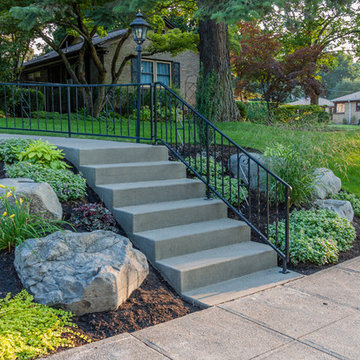
With a narrow driveway and leaning concrete retaining walls, parking was a major challenge at this 1938 brick Tudor on Spokane's South Hill. Crumbling concrete stairs added another layer of difficulty, and after a particularly rough winter, the homeowners were ready for a change. The failing concrete walls were replaced with stacked boulders, which created space for a new, wider driveway. Natural stone steps offer access to the backyard, while the new front stairs and sidewalk provide a safe route to the front door. The original iron railings were preserved and modified to be reused with the new stairs.
 closetsdotcom
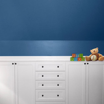
Designed by Greg Cetera of Closet Works
The sloped ceiling in this room creates a cozy atmosphere perfect for a child’s nursery. The problem was that the room originally had no closet. One of the angled walls, however, contained an alcove for accessing the radiant heat system pipes and controls. Adding a closet to a room with a sloped ceiling and walls can present difficulties under the best circumstances. Adding access to the radiant heating system might make some designers throw in the towel, but Closet Works professionals are equal to any challenge.
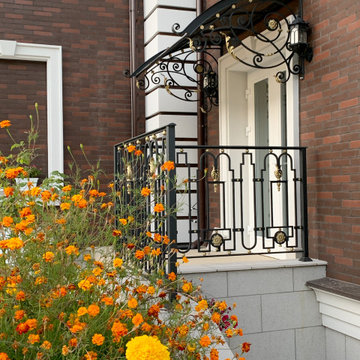
 Studio 68/32
Designing an object was accompanied by certain difficulties. The owners bought a plot on which there was already a house. Its quality and appearance did not suit customers in any way. Moreover, the construction of a house from scratch was not even discussed, so the architects Vitaly Dorokhov and Tatyana Dmitrenko had to take the existing skeleton as a basis. During the reconstruction, the protruding glass volume was demolished, some structural elements of the facade were simplified. The number of storeys was increased and the height of the roof was increased. As a result, the building took the form of a real English home, as customers wanted.
The planning decision was dictated by the terms of reference. And the number of people living in the house. Therefore, in terms of the house acquired 400 m \ 2 extra.
The entire engineering structure and heating system were completely redone. Heating of the house comes from wells and the Ecokolt system.
The climate system of the house itself is integrated into the relay control system that constantly maintains the climate and humidity in the house.
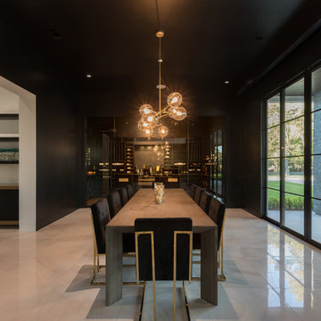 Frankel Design Build
This project, sitting on a little more than 3.5 acres on Rivercrest was completed in 3 years with a total square footage of more than 26,000 square feet.
Typically modern homes are smaller. At a certain size, usually around 4,000 square feet, the difficulty with modern or contemporary architecture becomes scale, and the minimalist idea gets lost. Whenever you get to this scale of house at over 26,000 square feet, this problem adds a layer of complexity.
Connie Anderson Photography
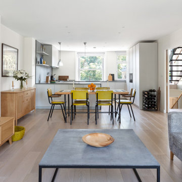 Granit Architects + Interiors
The brief:
Our clients own an apartment in a mansion block overlooking Clapham Common. They wanted to modernise and bring the apartment up to date and had a few goals:
To change the existing small cellular spaces in the apartment to create a new open-plan room
To extend into the loft and create a new master bedroom suite
To create a roof terrace for some much-needed private outdoor space
The key to the brief was to ensure a good connection between the different levels of the apartment and ensure natural light could flood into all spaces. The apartment is in a conservation area, which was an important consideration.
The solution:
We changed the primary room space to run from the front to the back of the building. This change created the large kitchen dining living space our clients wanted, an area with good natural light throughout and at all times of the day.
We created a master bedroom suite in the loft space, with generous room size and lots of natural light.
The limitations of the building’s form meant that a critical aspect to creating these larger living spaces was carefully considered smaller areas, including the bathrooms and a pocket utility room. The circulation space was carefully considered, too, with the landings used for storage in the form of new joinery.
The stairs were vital in the design. Creating an in-between/half level meant we made the most of the flat roof extension for a bedroom suite and terrace. It also helped natural light get into the centre of the apartment, creating a clear connection between the different floors.
The stairs also help to mark the difference between the existing and the new. We shifted the design from a minimalist take on traditional metal balustraded stairs to open tread steel stairs with a glazed balustrade.
Externally, we kept the design quite simple and in keeping with the context. By adding dormers to the front and back, we created a sculptural and fun loft space.
The result:
A spacious, light and luxurious apartment for our clients Gareth and Mary in a Clapham Common Conservation area.
We asked about their experience with Granit, and we are pleased with their response:
Our experience overall is very good, even with the unexpected difficulties created by Covid.
If you are thinking of appointing an architect and interior design firm, Granit should be seriously considered.
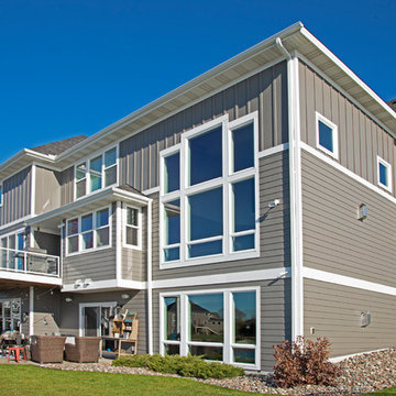
 Hoffman Weber Construction
Large, ganged picture windows added to the degree of difficulty for this Blaine, MN, insurance claim project.
Large craftsman gray three-story mixed siding exterior home idea in Minneapolis with a shingle roof
Large craftsman gray three-story mixed siding exterior home idea in Minneapolis with a shingle roof

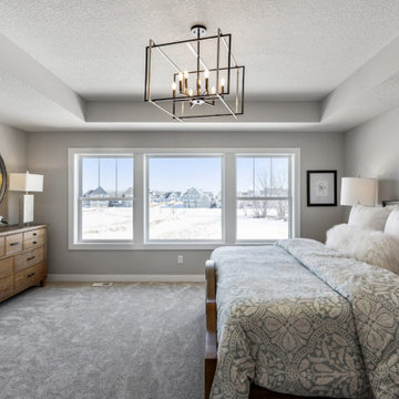
 Robert Thomas Homes
St. Croix III Model - Heritage Collection
Pricing, floorplans, virtual tours, community information & more at https://www.robertthomashomes.com/
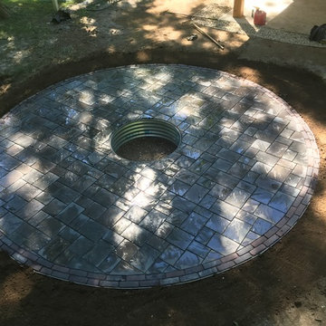
 Platinum Ponds & Landscaping
this incredible fire pit was built with an in-ground fire pit ring. This is a unique fire pit in that most fire pits today are built with a raised fire pit ring. The degree of difficulty is much higher with the in-ground due to the tight inside radius cut that is required around the fire pit ring. Platinum Ponds & Landscaping and their customer were extremely happy with the way this fire pit came to life and transformed the area!
30