
Search results for "Diffused lighting" in Home Design Ideas

 Christopher Simmonds Architect
The client’s brief was to create a space reminiscent of their beloved downtown Chicago industrial loft, in a rural farm setting, while incorporating their unique collection of vintage and architectural salvage. The result is a custom designed space that blends life on the farm with an industrial sensibility.
The new house is located on approximately the same footprint as the original farm house on the property. Barely visible from the road due to the protection of conifer trees and a long driveway, the house sits on the edge of a field with views of the neighbouring 60 acre farm and creek that runs along the length of the property.
The main level open living space is conceived as a transparent social hub for viewing the landscape. Large sliding glass doors create strong visual connections with an adjacent barn on one end and a mature black walnut tree on the other.
The house is situated to optimize views, while at the same time protecting occupants from blazing summer sun and stiff winter winds. The wall to wall sliding doors on the south side of the main living space provide expansive views to the creek, and allow for breezes to flow throughout. The wrap around aluminum louvered sun shade tempers the sun.
The subdued exterior material palette is defined by horizontal wood siding, standing seam metal roofing and large format polished concrete blocks.
The interiors were driven by the owners’ desire to have a home that would properly feature their unique vintage collection, and yet have a modern open layout. Polished concrete floors and steel beams on the main level set the industrial tone and are paired with a stainless steel island counter top, backsplash and industrial range hood in the kitchen. An old drinking fountain is built-in to the mudroom millwork, carefully restored bi-parting doors frame the library entrance, and a vibrant antique stained glass panel is set into the foyer wall allowing diffused coloured light to spill into the hallway. Upstairs, refurbished claw foot tubs are situated to view the landscape.
The double height library with mezzanine serves as a prominent feature and quiet retreat for the residents. The white oak millwork exquisitely displays the homeowners’ vast collection of books and manuscripts. The material palette is complemented by steel counter tops, stainless steel ladder hardware and matte black metal mezzanine guards. The stairs carry the same language, with white oak open risers and stainless steel woven wire mesh panels set into a matte black steel frame.
The overall effect is a truly sublime blend of an industrial modern aesthetic punctuated by personal elements of the owners’ storied life.
Photography: James Brittain
 Bloomin Blinds of North Charlotte
Discover how premium light-filtering materials and smart-home automation can secure street-level entryway glass without losing natural daylight.
Choosing the right window treatments for a home's front entrance is one of the most challenging design decisions a homeowner can face. The front door is the focal point of a home's curb appeal, often featuring expansive glass panels or side-by-side double doors designed to make a grand architectural statement.
During the day, these large glass features are an asset, flooding entryways and foyers with beautiful natural daylight. However, for homes situated on busy local roads or highly trafficked street-level lots, the dynamic completely changes once the sun goes down.
The moment interior lights are switched on in the evening, a stark contrast is created with the dark outdoors. This creates a severe privacy issue, leaving the entire foyer completely exposed to passing traffic and pedestrians. Finding a solution that delivers absolute evening privacy without permanently plunging the front entrance into darkness during the day requires understanding how modern window treatment materials and operating systems interact.
Light-Filtering vs. Blackout Fabrics
The first step in solving street-level privacy is selecting the correct fabric type. Many homeowners mistakenly assume they need heavy, opaque blackout shades to secure their home from outside eyes at night. While blackout fabrics certainly block 100% of the view, they also block 100% of the natural daylight during the day, forcing you to constantly raise and lower the shades just to see inside your own foyer.
A more effective approach for entryways utilizes premium light-filtering materials. These specialized fabrics are engineered with a precise, tight weave that operates on the principles of directional light and optical density.
Daytime Functionality: When the sun is shining outside, the exterior light levels are significantly higher than the interior light levels. The light-filtering fabric diffuses the intense, direct sunlight into a soft, ambient glow throughout the entryway. This keeps the home bright, eliminates harsh glares, and protects interior hardwood flooring, paint, and trim from damaging UV rays.
Night-Time Functionality: At night, the lighting dynamic reverses. The interior foyer lights make the inside bright, while the outside is dark. Because of the specialized tight weave, the fabric blocks the transmission of clear shapes and details. To a person standing out on the street or driving by on a busy road, the view inside is completely obstructed, delivering total privacy when the family is home for the evening.
Challenges of Front Door Installations
Securing privacy for a double wide front entrance introduces unique structural hurdles that standard windows do not face. Traditional blinds with hanging cords or manual pull chains are poorly suited for front doors. They disrupt the clean architectural lines of a grand foyer, create a safety hazard, and can easily get tangled or damaged when the doors are opened and closed.
The window treatments must be mounted high and wide enough above the door trim to ensure that the front doors can swing open and close freely without ever catching on the fabric or the lower hem bar.
How We Applied These Principles in Sherrills Ford, NC
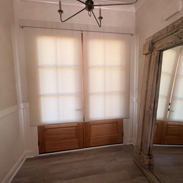
Applying these exact educational principles to real-world homes is what Cole and I do every day at Bloomin' Blinds of North Charlotte. We recently worked with a homeowner in Sherrills Ford whose beautiful new construction property sat on a highly trafficked road. They loved their double wide front door entrance but felt entirely too exposed to the street at night.
We brought our mobile showroom directly to their driveway. This allowed us to hold up premium light-filtering fabric samples directly against their entryway glass, matching the materials perfectly to their home's natural lighting, interior paint, and trim before making a single cut.
To solve their street-level privacy issue, we custom-built and installed two matching light-filtering roller shades, mounting them flawlessly side-by-side above the front door frame. To keep the home’s interior design completely cohesive, we carried the exact same style to the back of the house, installing a matching single roller shade on the rear door.
Smart Home Window Automation at Your Fingertips
Because entryway windows can be tall and awkward to reach manually, our family team integrated advanced smart-home motorization into this Sherrills Ford project.
Beyond the convenience of a handheld remote control, these automated roller shades feature seamless Wi-Fi integration. The homeowners can control their privacy through a dedicated smartphone app or link the system directly to their existing voice-activated smart home networks, including Amazon Alexa, Google Assistant, and Apple HomeKit.
This allows for complete hands-free window automation. The clients can program custom daily routines—such as setting the front entry shades to automatically lower exactly at sunset—or simply use a voice command to secure the foyer instantly from the comfort of the couch.
 Bloomin Blinds of North Charlotte
Discover how premium light-filtering materials and smart-home automation can secure street-level entryway glass without losing natural daylight.
Choosing the right window treatments for a home's front entrance is one of the most challenging design decisions a homeowner can face. The front door is the focal point of a home's curb appeal, often featuring expansive glass panels or side-by-side double doors designed to make a grand architectural statement.
During the day, these large glass features are an asset, flooding entryways and foyers with beautiful natural daylight. However, for homes situated on busy local roads or highly trafficked street-level lots, the dynamic completely changes once the sun goes down.
The moment interior lights are switched on in the evening, a stark contrast is created with the dark outdoors. This creates a severe privacy issue, leaving the entire foyer completely exposed to passing traffic and pedestrians. Finding a solution that delivers absolute evening privacy without permanently plunging the front entrance into darkness during the day requires understanding how modern window treatment materials and operating systems interact.
Light-Filtering vs. Blackout Fabrics
The first step in solving street-level privacy is selecting the correct fabric type. Many homeowners mistakenly assume they need heavy, opaque blackout shades to secure their home from outside eyes at night. While blackout fabrics certainly block 100% of the view, they also block 100% of the natural daylight during the day, forcing you to constantly raise and lower the shades just to see inside your own foyer.
A more effective approach for entryways utilizes premium light-filtering materials. These specialized fabrics are engineered with a precise, tight weave that operates on the principles of directional light and optical density.
Daytime Functionality: When the sun is shining outside, the exterior light levels are significantly higher than the interior light levels. The light-filtering fabric diffuses the intense, direct sunlight into a soft, ambient glow throughout the entryway. This keeps the home bright, eliminates harsh glares, and protects interior hardwood flooring, paint, and trim from damaging UV rays.
Night-Time Functionality: At night, the lighting dynamic reverses. The interior foyer lights make the inside bright, while the outside is dark. Because of the specialized tight weave, the fabric blocks the transmission of clear shapes and details. To a person standing out on the street or driving by on a busy road, the view inside is completely obstructed, delivering total privacy when the family is home for the evening.
Challenges of Front Door Installations
Securing privacy for a double wide front entrance introduces unique structural hurdles that standard windows do not face. Traditional blinds with hanging cords or manual pull chains are poorly suited for front doors. They disrupt the clean architectural lines of a grand foyer, create a safety hazard, and can easily get tangled or damaged when the doors are opened and closed.
The window treatments must be mounted high and wide enough above the door trim to ensure that the front doors can swing open and close freely without ever catching on the fabric or the lower hem bar.
How We Applied These Principles in Sherrills Ford, NC
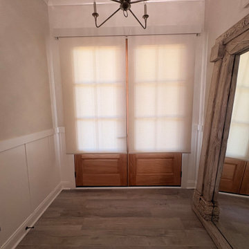
Applying these exact educational principles to real-world homes is what Cole and I do every day at Bloomin' Blinds of North Charlotte. We recently worked with a homeowner in Sherrills Ford whose beautiful new construction property sat on a highly trafficked road. They loved their double wide front door entrance but felt entirely too exposed to the street at night.
We brought our mobile showroom directly to their driveway. This allowed us to hold up premium light-filtering fabric samples directly against their entryway glass, matching the materials perfectly to their home's natural lighting, interior paint, and trim before making a single cut.
To solve their street-level privacy issue, we custom-built and installed two matching light-filtering roller shades, mounting them flawlessly side-by-side above the front door frame. To keep the home’s interior design completely cohesive, we carried the exact same style to the back of the house, installing a matching single roller shade on the rear door.
Smart Home Window Automation at Your Fingertips
Because entryway windows can be tall and awkward to reach manually, our family team integrated advanced smart-home motorization into this Sherrills Ford project.
Beyond the convenience of a handheld remote control, these automated roller shades feature seamless Wi-Fi integration. The homeowners can control their privacy through a dedicated smartphone app or link the system directly to their existing voice-activated smart home networks, including Amazon Alexa, Google Assistant, and Apple HomeKit.
This allows for complete hands-free window automation. The clients can program custom daily routines—such as setting the front entry shades to automatically lower exactly at sunset—or simply use a voice command to secure the foyer instantly from the comfort of the couch.
Find the right local pro for your project
 Bloomin Blinds of North Charlotte
Discover how premium light-filtering materials and smart-home automation can secure street-level entryway glass without losing natural daylight.
Choosing the right window treatments for a home's front entrance is one of the most challenging design decisions a homeowner can face. The front door is the focal point of a home's curb appeal, often featuring expansive glass panels or side-by-side double doors designed to make a grand architectural statement.
During the day, these large glass features are an asset, flooding entryways and foyers with beautiful natural daylight. However, for homes situated on busy local roads or highly trafficked street-level lots, the dynamic completely changes once the sun goes down.
The moment interior lights are switched on in the evening, a stark contrast is created with the dark outdoors. This creates a severe privacy issue, leaving the entire foyer completely exposed to passing traffic and pedestrians. Finding a solution that delivers absolute evening privacy without permanently plunging the front entrance into darkness during the day requires understanding how modern window treatment materials and operating systems interact.
Light-Filtering vs. Blackout Fabrics
The first step in solving street-level privacy is selecting the correct fabric type. Many homeowners mistakenly assume they need heavy, opaque blackout shades to secure their home from outside eyes at night. While blackout fabrics certainly block 100% of the view, they also block 100% of the natural daylight during the day, forcing you to constantly raise and lower the shades just to see inside your own foyer.
A more effective approach for entryways utilizes premium light-filtering materials. These specialized fabrics are engineered with a precise, tight weave that operates on the principles of directional light and optical density.
Daytime Functionality: When the sun is shining outside, the exterior light levels are significantly higher than the interior light levels. The light-filtering fabric diffuses the intense, direct sunlight into a soft, ambient glow throughout the entryway. This keeps the home bright, eliminates harsh glares, and protects interior hardwood flooring, paint, and trim from damaging UV rays.
Night-Time Functionality: At night, the lighting dynamic reverses. The interior foyer lights make the inside bright, while the outside is dark. Because of the specialized tight weave, the fabric blocks the transmission of clear shapes and details. To a person standing out on the street or driving by on a busy road, the view inside is completely obstructed, delivering total privacy when the family is home for the evening.
Challenges of Front Door Installations
Securing privacy for a double wide front entrance introduces unique structural hurdles that standard windows do not face. Traditional blinds with hanging cords or manual pull chains are poorly suited for front doors. They disrupt the clean architectural lines of a grand foyer, create a safety hazard, and can easily get tangled or damaged when the doors are opened and closed.
The window treatments must be mounted high and wide enough above the door trim to ensure that the front doors can swing open and close freely without ever catching on the fabric or the lower hem bar.
How We Applied These Principles in Sherrills Ford, NC
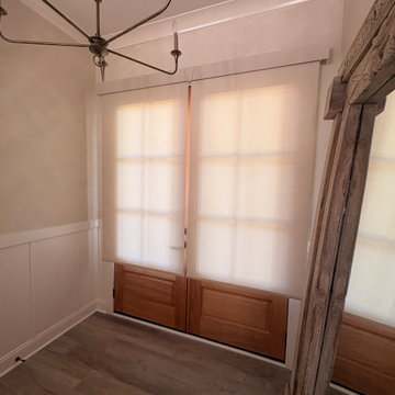
Applying these exact educational principles to real-world homes is what Cole and I do every day at Bloomin' Blinds of North Charlotte. We recently worked with a homeowner in Sherrills Ford whose beautiful new construction property sat on a highly trafficked road. They loved their double wide front door entrance but felt entirely too exposed to the street at night.
We brought our mobile showroom directly to their driveway. This allowed us to hold up premium light-filtering fabric samples directly against their entryway glass, matching the materials perfectly to their home's natural lighting, interior paint, and trim before making a single cut.
To solve their street-level privacy issue, we custom-built and installed two matching light-filtering roller shades, mounting them flawlessly side-by-side above the front door frame. To keep the home’s interior design completely cohesive, we carried the exact same style to the back of the house, installing a matching single roller shade on the rear door.
Smart Home Window Automation at Your Fingertips
Because entryway windows can be tall and awkward to reach manually, our family team integrated advanced smart-home motorization into this Sherrills Ford project.
Beyond the convenience of a handheld remote control, these automated roller shades feature seamless Wi-Fi integration. The homeowners can control their privacy through a dedicated smartphone app or link the system directly to their existing voice-activated smart home networks, including Amazon Alexa, Google Assistant, and Apple HomeKit.
This allows for complete hands-free window automation. The clients can program custom daily routines—such as setting the front entry shades to automatically lower exactly at sunset—or simply use a voice command to secure the foyer instantly from the comfort of the couch.
 Christopher Simmonds Architect
The client’s brief was to create a space reminiscent of their beloved downtown Chicago industrial loft, in a rural farm setting, while incorporating their unique collection of vintage and architectural salvage. The result is a custom designed space that blends life on the farm with an industrial sensibility.
The new house is located on approximately the same footprint as the original farm house on the property. Barely visible from the road due to the protection of conifer trees and a long driveway, the house sits on the edge of a field with views of the neighbouring 60 acre farm and creek that runs along the length of the property.
The main level open living space is conceived as a transparent social hub for viewing the landscape. Large sliding glass doors create strong visual connections with an adjacent barn on one end and a mature black walnut tree on the other.
The house is situated to optimize views, while at the same time protecting occupants from blazing summer sun and stiff winter winds. The wall to wall sliding doors on the south side of the main living space provide expansive views to the creek, and allow for breezes to flow throughout. The wrap around aluminum louvered sun shade tempers the sun.
The subdued exterior material palette is defined by horizontal wood siding, standing seam metal roofing and large format polished concrete blocks.
The interiors were driven by the owners’ desire to have a home that would properly feature their unique vintage collection, and yet have a modern open layout. Polished concrete floors and steel beams on the main level set the industrial tone and are paired with a stainless steel island counter top, backsplash and industrial range hood in the kitchen. An old drinking fountain is built-in to the mudroom millwork, carefully restored bi-parting doors frame the library entrance, and a vibrant antique stained glass panel is set into the foyer wall allowing diffused coloured light to spill into the hallway. Upstairs, refurbished claw foot tubs are situated to view the landscape.
The double height library with mezzanine serves as a prominent feature and quiet retreat for the residents. The white oak millwork exquisitely displays the homeowners’ vast collection of books and manuscripts. The material palette is complemented by steel counter tops, stainless steel ladder hardware and matte black metal mezzanine guards. The stairs carry the same language, with white oak open risers and stainless steel woven wire mesh panels set into a matte black steel frame.
The overall effect is a truly sublime blend of an industrial modern aesthetic punctuated by personal elements of the owners’ storied life.
Photography: James Brittain
 Christopher Simmonds Architect
The client’s brief was to create a space reminiscent of their beloved downtown Chicago industrial loft, in a rural farm setting, while incorporating their unique collection of vintage and architectural salvage. The result is a custom designed space that blends life on the farm with an industrial sensibility.
The new house is located on approximately the same footprint as the original farm house on the property. Barely visible from the road due to the protection of conifer trees and a long driveway, the house sits on the edge of a field with views of the neighbouring 60 acre farm and creek that runs along the length of the property.
The main level open living space is conceived as a transparent social hub for viewing the landscape. Large sliding glass doors create strong visual connections with an adjacent barn on one end and a mature black walnut tree on the other.
The house is situated to optimize views, while at the same time protecting occupants from blazing summer sun and stiff winter winds. The wall to wall sliding doors on the south side of the main living space provide expansive views to the creek, and allow for breezes to flow throughout. The wrap around aluminum louvered sun shade tempers the sun.
The subdued exterior material palette is defined by horizontal wood siding, standing seam metal roofing and large format polished concrete blocks.
The interiors were driven by the owners’ desire to have a home that would properly feature their unique vintage collection, and yet have a modern open layout. Polished concrete floors and steel beams on the main level set the industrial tone and are paired with a stainless steel island counter top, backsplash and industrial range hood in the kitchen. An old drinking fountain is built-in to the mudroom millwork, carefully restored bi-parting doors frame the library entrance, and a vibrant antique stained glass panel is set into the foyer wall allowing diffused coloured light to spill into the hallway. Upstairs, refurbished claw foot tubs are situated to view the landscape.
The double height library with mezzanine serves as a prominent feature and quiet retreat for the residents. The white oak millwork exquisitely displays the homeowners’ vast collection of books and manuscripts. The material palette is complemented by steel counter tops, stainless steel ladder hardware and matte black metal mezzanine guards. The stairs carry the same language, with white oak open risers and stainless steel woven wire mesh panels set into a matte black steel frame.
The overall effect is a truly sublime blend of an industrial modern aesthetic punctuated by personal elements of the owners’ storied life.
Photography: James Brittain
 Neumann & Rudy Architecture
## I. Spatial Composition & Architectural Volume
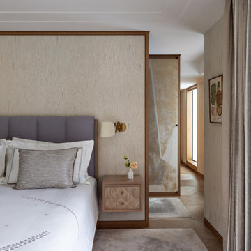
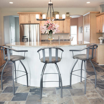
This bedroom operates as an exercise in controlled asymmetry, its plan organized around a freestanding headboard wall that reads less as partition than as inhabited architecture. Framed in a crisp oak reveal that traces its full perimeter, the wall detaches from the ceiling plane and terminates short of the right-hand elevation, generating a threshold that draws the eye into a secondary corridor volume beyond. This device — the *poché* wall as spatial pivot — establishes a layered enfilade: the intimate sleeping zone in the foreground, a transitional dressing passage in the middle distance, and a slot of daylight at the terminus. The ceiling is articulated with a shallow recessed tray and delicate stepped cornice, a restrained gesture toward classical Parisian *moulure* that regulates the room's proportion without ornamental excess. Sightlines are deliberately choreographed: the bed sits low and horizontal, the joinery plinth of the nightstand cantilevers from the wall to preserve floor-plane continuity, and the herringbone parquet visible beyond the threshold introduces a directional pull that animates what would otherwise be a static rectilinear volume. The result is a composition of nested frames — millwork within millwork — that lends considerable depth to a comparatively compact footprint.
## II. Materiality, Color & Texture
The palette is tonal rather than chromatic, calibrated within a narrow band of oatmeal, greige, and pale putty, and enlivened almost entirely through surface incident. The dominant wallcovering — a vertically striated, marquetry-like textile of tessellated ivory and taupe fibers — supplies a subtle warp-and-weft rhythm that shifts under raking light, functioning as texture masquerading as pattern. Against this, rift-sawn white oak framing introduces a honeyed, gently reddish undertone, while the bespoke bedside cabinet deploys a radiating sunburst veneer in a blush-tinged walnut or eucalyptus, its book-matched geometry providing the room's single moment of overt figuration. Textiles carry the tonal counterweight: the channel-tufted headboard in a muted heather-aubergine linen offers the deepest saturation in the frame, cooling the prevailing warmth, while cotton percale with contrast tape borders, a slubbed lumbar cushion, and a hand-stitched matelassé coverlet with tambour scrollwork build a gradient of tactility from crisp to plush. The doorway's parchment-and-verdigris art panel — appearing as a gilded, oxidized *gessoed* screen — supplies a patinated, almost frescoed counterpoint, while unlacquered brass at the sconce introduces the only metallic warmth, deliberately restrained.
## III. Lighting, Atmosphere & Style Profile
Illumination is handled with notable discretion. Natural light enters obliquely from an off-frame source at right, filtered through a floor-to-ceiling striated linen drapery that diffuses rather than admits, producing an even, shadowless wash consistent with northern European daylight. A secondary aperture — the narrow vertical slot glimpsed down the corridor — acts as a luminous punctuation mark, terminating the sightline with a slender bar of brightness that draws the occupant forward. Artificial lighting is intentionally sparse and task-oriented: a brass scissor-arm sconce with an unbleached linen shade, adjustable and near-vernacular in its mechanism, provides articulated reading light while contributing a note of atelier informality against the otherwise refined joinery. The absence of visible downlights or decorative pendants reinforces the room's quietude. Stylistically, the scheme resolves into a sophisticated **Soft Minimalism** inflected with contemporary Parisian classicism — the restraint and tonal discipline of the former, the millwork rigor and proportional literacy of the latter, warmed by a *wabi*-adjacent appreciation for patina and handwork. It is a room that eschews statement in favor of atmosphere, achieving luxury through material intelligence and the calibrated withholding of contrast.
Sponsored
Plain City, OH

The Creative Kitchen Company
Columbus Area Kitchen Remodeling and Refacing Professional
 Christopher Simmonds Architect
The client’s brief was to create a space reminiscent of their beloved downtown Chicago industrial loft, in a rural farm setting, while incorporating their unique collection of vintage and architectural salvage. The result is a custom designed space that blends life on the farm with an industrial sensibility.
The new house is located on approximately the same footprint as the original farm house on the property. Barely visible from the road due to the protection of conifer trees and a long driveway, the house sits on the edge of a field with views of the neighbouring 60 acre farm and creek that runs along the length of the property.
The main level open living space is conceived as a transparent social hub for viewing the landscape. Large sliding glass doors create strong visual connections with an adjacent barn on one end and a mature black walnut tree on the other.
The house is situated to optimize views, while at the same time protecting occupants from blazing summer sun and stiff winter winds. The wall to wall sliding doors on the south side of the main living space provide expansive views to the creek, and allow for breezes to flow throughout. The wrap around aluminum louvered sun shade tempers the sun.
The subdued exterior material palette is defined by horizontal wood siding, standing seam metal roofing and large format polished concrete blocks.
The interiors were driven by the owners’ desire to have a home that would properly feature their unique vintage collection, and yet have a modern open layout. Polished concrete floors and steel beams on the main level set the industrial tone and are paired with a stainless steel island counter top, backsplash and industrial range hood in the kitchen. An old drinking fountain is built-in to the mudroom millwork, carefully restored bi-parting doors frame the library entrance, and a vibrant antique stained glass panel is set into the foyer wall allowing diffused coloured light to spill into the hallway. Upstairs, refurbished claw foot tubs are situated to view the landscape.
The double height library with mezzanine serves as a prominent feature and quiet retreat for the residents. The white oak millwork exquisitely displays the homeowners’ vast collection of books and manuscripts. The material palette is complemented by steel counter tops, stainless steel ladder hardware and matte black metal mezzanine guards. The stairs carry the same language, with white oak open risers and stainless steel woven wire mesh panels set into a matte black steel frame.
The overall effect is a truly sublime blend of an industrial modern aesthetic punctuated by personal elements of the owners’ storied life.
Photography: James Brittain
 Neumann & Rudy Architecture
**Spatial Composition & Architectural Volume**
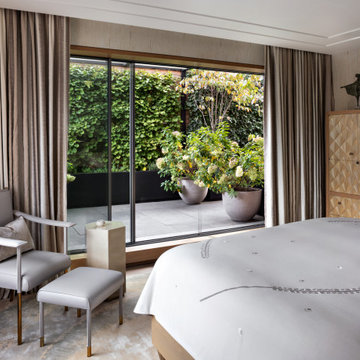
The room is organized around a single, decisive architectural gesture: a full-height sliding glazed wall that dissolves the boundary between the sleeping chamber and an enclosed garden court. The composition is fundamentally horizontal — a low-slung bed platform anchoring the right-hand foreground, a seating vignette calibrated to the left, and between them an uninterrupted sightline drawn through the aperture to the ivy-clad boundary wall beyond. This lateral emphasis is reinforced overhead by a recessed shadow-gap ceiling detail and a stepped perimeter cove that reads as a floating plane, subtly compressing the volume at its edges while lifting it at centre. The glazing itself is elegantly restrained: slim black-framed sliders set within a warm timber reveal, the sill deep enough to function as a threshold rather than a mere junction — an architectural pause between interior and exterior. Circulation is generous and diagonal, the ottoman and lounge chair angled to acknowledge both the bed and the view, establishing a soft triangulation of use. The tall marquetry armoire at the right terminates the composition vertically, providing the single strong axis of ascent in an otherwise recumbent plan, and its sculptural crown — a bronze group of standing figures — punctuates the ceiling zone with deliberate counterpoint.
**Materiality, Color & Texture**
The palette is an exercise in tonal modulation within a narrow chromatic band: greige, taupe, dove, mushroom, all carried on warm grey undertones with no true white and no true black save the slender window mullions. Textural variation, rather than colour contrast, performs the compositional work. The curtains — likely a slubbed silk or textured linen-viscose blend — hang in deep pinch-pleat falls whose vertical striation animates the flanking walls, while the grasscloth wallcovering behind the armoire introduces a fine, dry, horizontal weave. Against these soft-focus surfaces, the armoire delivers the room's most emphatic tactile statement: a hand-carved, faceted diamond-relief pattern in pale limed oak, bleached almost to bone, whose faceted geometry catches and fragments light. Upholstery in supple dove-grey leather on the chair and bench is offset by a crushed-velvet cushion and a finely pleated bolster at the bedhead, layering matte against lustre. Metallics are used sparingly and warmly — antiqued brass sabots on the furniture legs, a brushed bronze plinth-form side table — while the bed's pale coverlet, incised with a fine embroidered arabesque and studded buttoning, contributes a subtle graphic line. Underfoot, a hand-knotted rug in mottled silver-sage over honed stone completes a gradient from cool floor to warm wall.
**Lighting, Atmosphere & Style Profile**
Natural light is the primary luminous instrument here, admitted as a broad, diffuse northern wash through the glazed wall and rendered soft by the surrounding foliage, which filters and greens the light before it enters. The absence of visible decorative fixtures is intentional: illumination is concealed within the ceiling cove and shadow gaps, implying an evening register of low, indirect ambient light supplemented by discreet task sources. This restraint sustains an atmosphere of hushed, cloistered calm — a sanctuary sensibility in which the garden functions as a living tapestry, its verdant saturation supplying the room's only chromatic release. Stylistically, the scheme reads as Soft Minimalism inflected with Contemporary Continental luxury: a lineage traceable to mid-century French decorative tradition — Jean-Michel Frank's plinths, Royère's rounded silhouettes — reinterpreted through a modernist discipline of tonal reduction and planar clarity. The result is neither austere nor decorative but precisely balanced: a quiet, artisanal luxe in which craft (the carved oak, the cast bronze, the hand-finished textiles) supplies the ornament that colour deliberately withholds.


 Christopher Simmonds Architect
The client’s brief was to create a space reminiscent of their beloved downtown Chicago industrial loft, in a rural farm setting, while incorporating their unique collection of vintage and architectural salvage. The result is a custom designed space that blends life on the farm with an industrial sensibility.
The new house is located on approximately the same footprint as the original farm house on the property. Barely visible from the road due to the protection of conifer trees and a long driveway, the house sits on the edge of a field with views of the neighbouring 60 acre farm and creek that runs along the length of the property.
The main level open living space is conceived as a transparent social hub for viewing the landscape. Large sliding glass doors create strong visual connections with an adjacent barn on one end and a mature black walnut tree on the other.
The house is situated to optimize views, while at the same time protecting occupants from blazing summer sun and stiff winter winds. The wall to wall sliding doors on the south side of the main living space provide expansive views to the creek, and allow for breezes to flow throughout. The wrap around aluminum louvered sun shade tempers the sun.
The subdued exterior material palette is defined by horizontal wood siding, standing seam metal roofing and large format polished concrete blocks.
The interiors were driven by the owners’ desire to have a home that would properly feature their unique vintage collection, and yet have a modern open layout. Polished concrete floors and steel beams on the main level set the industrial tone and are paired with a stainless steel island counter top, backsplash and industrial range hood in the kitchen. An old drinking fountain is built-in to the mudroom millwork, carefully restored bi-parting doors frame the library entrance, and a vibrant antique stained glass panel is set into the foyer wall allowing diffused coloured light to spill into the hallway. Upstairs, refurbished claw foot tubs are situated to view the landscape.
The double height library with mezzanine serves as a prominent feature and quiet retreat for the residents. The white oak millwork exquisitely displays the homeowners’ vast collection of books and manuscripts. The material palette is complemented by steel counter tops, stainless steel ladder hardware and matte black metal mezzanine guards. The stairs carry the same language, with white oak open risers and stainless steel woven wire mesh panels set into a matte black steel frame.
The overall effect is a truly sublime blend of an industrial modern aesthetic punctuated by personal elements of the owners’ storied life.
Photography: James Brittain
 Christopher Simmonds Architect
The client’s brief was to create a space reminiscent of their beloved downtown Chicago industrial loft, in a rural farm setting, while incorporating their unique collection of vintage and architectural salvage. The result is a custom designed space that blends life on the farm with an industrial sensibility.
The new house is located on approximately the same footprint as the original farm house on the property. Barely visible from the road due to the protection of conifer trees and a long driveway, the house sits on the edge of a field with views of the neighbouring 60 acre farm and creek that runs along the length of the property.
The main level open living space is conceived as a transparent social hub for viewing the landscape. Large sliding glass doors create strong visual connections with an adjacent barn on one end and a mature black walnut tree on the other.
The house is situated to optimize views, while at the same time protecting occupants from blazing summer sun and stiff winter winds. The wall to wall sliding doors on the south side of the main living space provide expansive views to the creek, and allow for breezes to flow throughout. The wrap around aluminum louvered sun shade tempers the sun.
The subdued exterior material palette is defined by horizontal wood siding, standing seam metal roofing and large format polished concrete blocks.
The interiors were driven by the owners’ desire to have a home that would properly feature their unique vintage collection, and yet have a modern open layout. Polished concrete floors and steel beams on the main level set the industrial tone and are paired with a stainless steel island counter top, backsplash and industrial range hood in the kitchen. An old drinking fountain is built-in to the mudroom millwork, carefully restored bi-parting doors frame the library entrance, and a vibrant antique stained glass panel is set into the foyer wall allowing diffused coloured light to spill into the hallway. Upstairs, refurbished claw foot tubs are situated to view the landscape.
The double height library with mezzanine serves as a prominent feature and quiet retreat for the residents. The white oak millwork exquisitely displays the homeowners’ vast collection of books and manuscripts. The material palette is complemented by steel counter tops, stainless steel ladder hardware and matte black metal mezzanine guards. The stairs carry the same language, with white oak open risers and stainless steel woven wire mesh panels set into a matte black steel frame.
The overall effect is a truly sublime blend of an industrial modern aesthetic punctuated by personal elements of the owners’ storied life.
Photography: James Brittain
 Christopher Simmonds Architect
The client’s brief was to create a space reminiscent of their beloved downtown Chicago industrial loft, in a rural farm setting, while incorporating their unique collection of vintage and architectural salvage. The result is a custom designed space that blends life on the farm with an industrial sensibility.
The new house is located on approximately the same footprint as the original farm house on the property. Barely visible from the road due to the protection of conifer trees and a long driveway, the house sits on the edge of a field with views of the neighbouring 60 acre farm and creek that runs along the length of the property.
The main level open living space is conceived as a transparent social hub for viewing the landscape. Large sliding glass doors create strong visual connections with an adjacent barn on one end and a mature black walnut tree on the other.
The house is situated to optimize views, while at the same time protecting occupants from blazing summer sun and stiff winter winds. The wall to wall sliding doors on the south side of the main living space provide expansive views to the creek, and allow for breezes to flow throughout. The wrap around aluminum louvered sun shade tempers the sun.
The subdued exterior material palette is defined by horizontal wood siding, standing seam metal roofing and large format polished concrete blocks.
The interiors were driven by the owners’ desire to have a home that would properly feature their unique vintage collection, and yet have a modern open layout. Polished concrete floors and steel beams on the main level set the industrial tone and are paired with a stainless steel island counter top, backsplash and industrial range hood in the kitchen. An old drinking fountain is built-in to the mudroom millwork, carefully restored bi-parting doors frame the library entrance, and a vibrant antique stained glass panel is set into the foyer wall allowing diffused coloured light to spill into the hallway. Upstairs, refurbished claw foot tubs are situated to view the landscape.
The double height library with mezzanine serves as a prominent feature and quiet retreat for the residents. The white oak millwork exquisitely displays the homeowners’ vast collection of books and manuscripts. The material palette is complemented by steel counter tops, stainless steel ladder hardware and matte black metal mezzanine guards. The stairs carry the same language, with white oak open risers and stainless steel woven wire mesh panels set into a matte black steel frame.
The overall effect is a truly sublime blend of an industrial modern aesthetic punctuated by personal elements of the owners’ storied life.
Photography: James Brittain
Sponsored
Sunbury, OH

J.Holderby - Renovations
Franklin County's Leading General Contractors - 2X Best of Houzz!

 User
This living room was sad. There was no rug. The massive leather sofa dominated the room. Furniture was strewn all over. There was no focal point or any interest.
First, we changed the wall color from a cold blue color to a warmer beige color to make the room feel more inviting.
We have a custom rug created from wall-to-wall carpet with a leather edge banding detail that was mitered at the corners.
The existing sectional and separated it. The pillows that came with the sofa were donated to charity and new pillows were handcrafted created of luxurious silk velvet and a metallic woven geometric.
A new midcentury style chair was added and styled with a cashmere through in a strawberry and magenta stria; a woven geometric pillow in neutral tones was added as an accent.
The existing cocktail was placed between the two sofas and we styled it with white orchids in an organic wood bowl with moss and other succulents draping the edge. The client had this beautiful piece of amethyst that provided an organic and colorful accent.
A local artist created the art above the sofa made with later cut aluminum that reads, "this would look great over your sofa", which I thought was clever.
Our client's dogs are very important to her. We had the photos from their photoshoot framed in black frames with white mats to showcase the family.
The luxury leather wrapped nesting tables with polished chrome bases were placed to the arm side of the sofa and accessories with finds from local specialty showrooms and mixed with the client's own collection of priceless treasures and memories.
With the corner of the room, we chose a fiddle leaf fig tree to provide some color and bring in a organic element.
The large window provide plenty of natural light in this space, so we diffused it with a soft white sheet and custom drapery on rings with a satin nickel rod specially crafted for this home in keeping with the style.
Finally, we purchased the seven foot tall male and female statues to take advantage of the vaulted ceiling and to give a sense of drama.
So, tell us, what do you think of our transformation?
 Christopher Simmonds Architect
The client’s brief was to create a space reminiscent of their beloved downtown Chicago industrial loft, in a rural farm setting, while incorporating their unique collection of vintage and architectural salvage. The result is a custom designed space that blends life on the farm with an industrial sensibility.
The new house is located on approximately the same footprint as the original farm house on the property. Barely visible from the road due to the protection of conifer trees and a long driveway, the house sits on the edge of a field with views of the neighbouring 60 acre farm and creek that runs along the length of the property.
The main level open living space is conceived as a transparent social hub for viewing the landscape. Large sliding glass doors create strong visual connections with an adjacent barn on one end and a mature black walnut tree on the other.
The house is situated to optimize views, while at the same time protecting occupants from blazing summer sun and stiff winter winds. The wall to wall sliding doors on the south side of the main living space provide expansive views to the creek, and allow for breezes to flow throughout. The wrap around aluminum louvered sun shade tempers the sun.
The subdued exterior material palette is defined by horizontal wood siding, standing seam metal roofing and large format polished concrete blocks.
The interiors were driven by the owners’ desire to have a home that would properly feature their unique vintage collection, and yet have a modern open layout. Polished concrete floors and steel beams on the main level set the industrial tone and are paired with a stainless steel island counter top, backsplash and industrial range hood in the kitchen. An old drinking fountain is built-in to the mudroom millwork, carefully restored bi-parting doors frame the library entrance, and a vibrant antique stained glass panel is set into the foyer wall allowing diffused coloured light to spill into the hallway. Upstairs, refurbished claw foot tubs are situated to view the landscape.
The double height library with mezzanine serves as a prominent feature and quiet retreat for the residents. The white oak millwork exquisitely displays the homeowners’ vast collection of books and manuscripts. The material palette is complemented by steel counter tops, stainless steel ladder hardware and matte black metal mezzanine guards. The stairs carry the same language, with white oak open risers and stainless steel woven wire mesh panels set into a matte black steel frame.
The overall effect is a truly sublime blend of an industrial modern aesthetic punctuated by personal elements of the owners’ storied life.
Photography: James Brittain
 Fiorito Interior Design
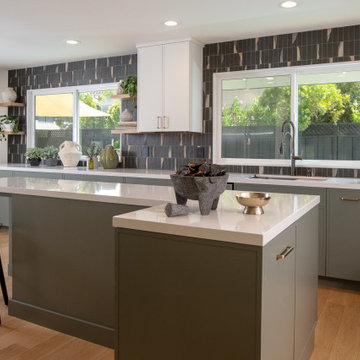
When I began this kitchen project, the space was constrained by an awkward peninsula and a dropped ceiling that compressed the room both physically and visually. Fluorescent fixtures sat behind a plastic diffuser, and the refrigerator was wedged beside the range, leaving the kitchen feeling crowded while also making poor use of the available space. The transformation began by taking things away. The dropped ceiling was removed, the fluorescent tubes went with it, and the room suddenly gained height and light. The peninsula was removed too, opening the floor plan and allowing the cabinetry to continue down an adjacent wall and incorporate a second window. What had been a small, enclosed kitchen became a generous working space with room for a slim, functional L-shaped island, additional cabinetry and, perhaps most importantly, a much more natural relationship between the different parts of the kitchen.
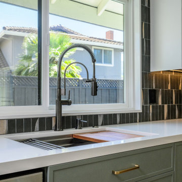
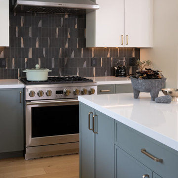
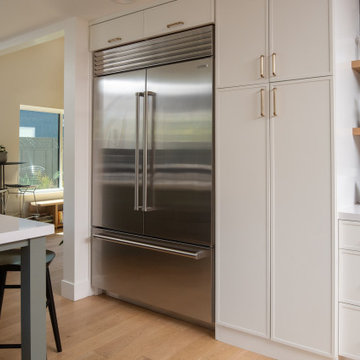
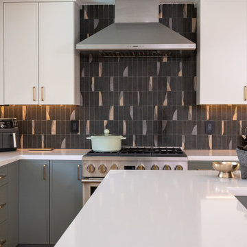
The palette is quiet, but there is a lot happening within it. Soft sage cabinetry grounds the room, while warm white upper cabinets and pantry cabinetry lift the space. A pure white quartz countertop provides a crisp surface against the cabinetry, and soft brass hardware adds just enough warmth. The new Sub Zero refrigerator was given its own wall, beside a full pantry, freeing the range wall to become a strong focal point. A Monogram range now sits centered beneath an angular stainless-steel Zephyr hood, framed by the kitchen's most distinctive element: a graphite backsplash made from WOW Design's Pottery tile. Inspired by Japanese handmade ceramics, the tiles have a wonderfully tactile, imperfect character. Most are deep graphite, but here and there the surface breaks into strokes of camel, dusty peach and deep blue-gunmetal glaze. There is an almost painterly quality to the way those colors move across the wall, giving the kitchen something that is difficult to achieve with a more uniform material—the feeling that someone actually made it.
The rest of the room was designed around that same balance of simplicity and warmth. New pale oak flooring runs throughout the ground floor, bringing a natural material and a soft golden tone beneath the cooler sage and graphite. Floating oak shelves flank the windows and provide a home for plants, ceramics and a few favorite objects, while another pair of shelves beside the refrigerator creates a small landing place for the things that inevitably arrive with you at the end of the day—keys, mail, bags and whatever else happens to be in your hands. The island occupies a surprisingly small footprint, yet its L-shaped form provides both additional work surface and seating without interrupting the flow of the room. A deep sink with an integrated cutting board and roll-up drying rack, a commercial-style faucet and under-cabinet LED lighting bring the practical details up to the same level of thoughtfulness as the larger design decisions. In the end, the renovation did more than just enlarge the kitchen; it created a space that feels calm, contemporary, warm, and a little unexpected … and, most importantly, we created a kitchen that finally makes sense for the way my clients live.
AFTER photos: Bernardo Grijalva
 Fiorito Interior Design
When I began this kitchen project, the space was constrained by an awkward peninsula and a dropped ceiling that compressed the room both physically and visually. Fluorescent fixtures sat behind a plastic diffuser, and the refrigerator was wedged beside the range, leaving the kitchen feeling crowded while also making poor use of the available space. The transformation began by taking things away. The dropped ceiling was removed, the fluorescent tubes went with it, and the room suddenly gained height and light. The peninsula was removed too, opening the floor plan and allowing the cabinetry to continue down an adjacent wall and incorporate a second window. What had been a small, enclosed kitchen became a generous working space with room for a slim, functional L-shaped island, additional cabinetry and, perhaps most importantly, a much more natural relationship between the different parts of the kitchen.
The palette is quiet, but there is a lot happening within it. Soft sage cabinetry grounds the room, while warm white upper cabinets and pantry cabinetry lift the space. A pure white quartz countertop provides a crisp surface against the cabinetry, and soft brass hardware adds just enough warmth. The new Sub Zero refrigerator was given its own wall, beside a full pantry, freeing the range wall to become a strong focal point. A Monogram range now sits centered beneath an angular stainless-steel Zephyr hood, framed by the kitchen's most distinctive element: a graphite backsplash made from WOW Design's Pottery tile. Inspired by Japanese handmade ceramics, the tiles have a wonderfully tactile, imperfect character. Most are deep graphite, but here and there the surface breaks into strokes of camel, dusty peach and deep blue-gunmetal glaze. There is an almost painterly quality to the way those colors move across the wall, giving the kitchen something that is difficult to achieve with a more uniform material—the feeling that someone actually made it.
The rest of the room was designed around that same balance of simplicity and warmth. New pale oak flooring runs throughout the ground floor, bringing a natural material and a soft golden tone beneath the cooler sage and graphite. Floating oak shelves flank the windows and provide a home for plants, ceramics and a few favorite objects, while another pair of shelves beside the refrigerator creates a small landing place for the things that inevitably arrive with you at the end of the day—keys, mail, bags and whatever else happens to be in your hands. The island occupies a surprisingly small footprint, yet its L-shaped form provides both additional work surface and seating without interrupting the flow of the room. A deep sink with an integrated cutting board and roll-up drying rack, a commercial-style faucet and under-cabinet LED lighting bring the practical details up to the same level of thoughtfulness as the larger design decisions. In the end, the renovation did more than just enlarge the kitchen; it created a space that feels calm, contemporary, warm, and a little unexpected … and, most importantly, we created a kitchen that finally makes sense for the way my clients live.
AFTER photos: Bernardo Grijalva
Sponsored
Fredericksburg, OH

High Point Cabinets
Columbus' Experienced Custom Cabinet Builder | 4x Best of Houzz Winner
 Fiorito Interior Design
When I began this kitchen project, the space was constrained by an awkward peninsula and a dropped ceiling that compressed the room both physically and visually. Fluorescent fixtures sat behind a plastic diffuser, and the refrigerator was wedged beside the range, leaving the kitchen feeling crowded while also making poor use of the available space. The transformation began by taking things away. The dropped ceiling was removed, the fluorescent tubes went with it, and the room suddenly gained height and light. The peninsula was removed too, opening the floor plan and allowing the cabinetry to continue down an adjacent wall and incorporate a second window. What had been a small, enclosed kitchen became a generous working space with room for a slim, functional L-shaped island, additional cabinetry and, perhaps most importantly, a much more natural relationship between the different parts of the kitchen.
The palette is quiet, but there is a lot happening within it. Soft sage cabinetry grounds the room, while warm white upper cabinets and pantry cabinetry lift the space. A pure white quartz countertop provides a crisp surface against the cabinetry, and soft brass hardware adds just enough warmth. The new Sub Zero refrigerator was given its own wall, beside a full pantry, freeing the range wall to become a strong focal point. A Monogram range now sits centered beneath an angular stainless-steel Zephyr hood, framed by the kitchen's most distinctive element: a graphite backsplash made from WOW Design's Pottery tile. Inspired by Japanese handmade ceramics, the tiles have a wonderfully tactile, imperfect character. Most are deep graphite, but here and there the surface breaks into strokes of camel, dusty peach and deep blue-gunmetal glaze. There is an almost painterly quality to the way those colors move across the wall, giving the kitchen something that is difficult to achieve with a more uniform material—the feeling that someone actually made it.
The rest of the room was designed around that same balance of simplicity and warmth. New pale oak flooring runs throughout the ground floor, bringing a natural material and a soft golden tone beneath the cooler sage and graphite. Floating oak shelves flank the windows and provide a home for plants, ceramics and a few favorite objects, while another pair of shelves beside the refrigerator creates a small landing place for the things that inevitably arrive with you at the end of the day—keys, mail, bags and whatever else happens to be in your hands. The island occupies a surprisingly small footprint, yet its L-shaped form provides both additional work surface and seating without interrupting the flow of the room. A deep sink with an integrated cutting board and roll-up drying rack, a commercial-style faucet and under-cabinet LED lighting bring the practical details up to the same level of thoughtfulness as the larger design decisions. In the end, the renovation did more than just enlarge the kitchen; it created a space that feels calm, contemporary, warm, and a little unexpected … and, most importantly, we created a kitchen that finally makes sense for the way my clients live.
AFTER photos: Bernardo Grijalva
 Fiorito Interior Design
When I began this kitchen project, the space was constrained by an awkward peninsula and a dropped ceiling that compressed the room both physically and visually. Fluorescent fixtures sat behind a plastic diffuser, and the refrigerator was wedged beside the range, leaving the kitchen feeling crowded while also making poor use of the available space. The transformation began by taking things away. The dropped ceiling was removed, the fluorescent tubes went with it, and the room suddenly gained height and light. The peninsula was removed too, opening the floor plan and allowing the cabinetry to continue down an adjacent wall and incorporate a second window. What had been a small, enclosed kitchen became a generous working space with room for a slim, functional L-shaped island, additional cabinetry and, perhaps most importantly, a much more natural relationship between the different parts of the kitchen.
The palette is quiet, but there is a lot happening within it. Soft sage cabinetry grounds the room, while warm white upper cabinets and pantry cabinetry lift the space. A pure white quartz countertop provides a crisp surface against the cabinetry, and soft brass hardware adds just enough warmth. The new Sub Zero refrigerator was given its own wall, beside a full pantry, freeing the range wall to become a strong focal point. A Monogram range now sits centered beneath an angular stainless-steel Zephyr hood, framed by the kitchen's most distinctive element: a graphite backsplash made from WOW Design's Pottery tile. Inspired by Japanese handmade ceramics, the tiles have a wonderfully tactile, imperfect character. Most are deep graphite, but here and there the surface breaks into strokes of camel, dusty peach and deep blue-gunmetal glaze. There is an almost painterly quality to the way those colors move across the wall, giving the kitchen something that is difficult to achieve with a more uniform material—the feeling that someone actually made it.
The rest of the room was designed around that same balance of simplicity and warmth. New pale oak flooring runs throughout the ground floor, bringing a natural material and a soft golden tone beneath the cooler sage and graphite. Floating oak shelves flank the windows and provide a home for plants, ceramics and a few favorite objects, while another pair of shelves beside the refrigerator creates a small landing place for the things that inevitably arrive with you at the end of the day—keys, mail, bags and whatever else happens to be in your hands. The island occupies a surprisingly small footprint, yet its L-shaped form provides both additional work surface and seating without interrupting the flow of the room. A deep sink with an integrated cutting board and roll-up drying rack, a commercial-style faucet and under-cabinet LED lighting bring the practical details up to the same level of thoughtfulness as the larger design decisions. In the end, the renovation did more than just enlarge the kitchen; it created a space that feels calm, contemporary, warm, and a little unexpected … and, most importantly, we created a kitchen that finally makes sense for the way my clients live.
AFTER photos: Bernardo Grijalva
 Fiorito Interior Design
When I began this kitchen project, the space was constrained by an awkward peninsula and a dropped ceiling that compressed the room both physically and visually. Fluorescent fixtures sat behind a plastic diffuser, and the refrigerator was wedged beside the range, leaving the kitchen feeling crowded while also making poor use of the available space. The transformation began by taking things away. The dropped ceiling was removed, the fluorescent tubes went with it, and the room suddenly gained height and light. The peninsula was removed too, opening the floor plan and allowing the cabinetry to continue down an adjacent wall and incorporate a second window. What had been a small, enclosed kitchen became a generous working space with room for a slim, functional L-shaped island, additional cabinetry and, perhaps most importantly, a much more natural relationship between the different parts of the kitchen.
The palette is quiet, but there is a lot happening within it. Soft sage cabinetry grounds the room, while warm white upper cabinets and pantry cabinetry lift the space. A pure white quartz countertop provides a crisp surface against the cabinetry, and soft brass hardware adds just enough warmth. The new Sub Zero refrigerator was given its own wall, beside a full pantry, freeing the range wall to become a strong focal point. A Monogram range now sits centered beneath an angular stainless-steel Zephyr hood, framed by the kitchen's most distinctive element: a graphite backsplash made from WOW Design's Pottery tile. Inspired by Japanese handmade ceramics, the tiles have a wonderfully tactile, imperfect character. Most are deep graphite, but here and there the surface breaks into strokes of camel, dusty peach and deep blue-gunmetal glaze. There is an almost painterly quality to the way those colors move across the wall, giving the kitchen something that is difficult to achieve with a more uniform material—the feeling that someone actually made it.
The rest of the room was designed around that same balance of simplicity and warmth. New pale oak flooring runs throughout the ground floor, bringing a natural material and a soft golden tone beneath the cooler sage and graphite. Floating oak shelves flank the windows and provide a home for plants, ceramics and a few favorite objects, while another pair of shelves beside the refrigerator creates a small landing place for the things that inevitably arrive with you at the end of the day—keys, mail, bags and whatever else happens to be in your hands. The island occupies a surprisingly small footprint, yet its L-shaped form provides both additional work surface and seating without interrupting the flow of the room. A deep sink with an integrated cutting board and roll-up drying rack, a commercial-style faucet and under-cabinet LED lighting bring the practical details up to the same level of thoughtfulness as the larger design decisions. In the end, the renovation did more than just enlarge the kitchen; it created a space that feels calm, contemporary, warm, and a little unexpected … and, most importantly, we created a kitchen that finally makes sense for the way my clients live.
AFTER photos: Bernardo Grijalva
144