
Search results for "Direct result" in Home Design Ideas
 Lincoln Lighthill Architect
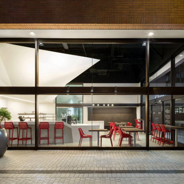
How do you make an impact within a familiar project typology? For our first cafe for Spro Coffee Lab, and their flagship location, we combined a long-held vision of a cafe with a faceted ceiling, their red & white material palette, and the building owner’s desire for an iconic street presence into a unified, minimalist language of angles and facets that extends throughout the cafe.
Overhead, a faceted soffit juts out dramatically over the service bar, the two objects mirroring each other’s footprints and satisfying Health Code requirements for a smooth, cleanable surface overhead. Concealing an egress corridor above that bisects the space, the soffit presents a bold visual gesture through the floor-to-ceiling glass walls of this corner space, beckoning passersby inside.
The service bar points toward the entry, with a minimalist espresso-tap system as the focal point, and angled sections branching off in both directions to create seating and service areas and direct customer flow.
Throughout the space, surfaces customers interact with are clad in chocolate-colored cork, providing a highly textured, tactile contrast to the smooth, white primary materials and complementing the bronze window system, red logos, and customer seating. The unfinished cork is durable and stain-resistant, resilient to the touch, provides acoustic dampening, and is highly sustainable.
The result is a cafe that goes far beyond the project brief, creating a memorable experience and an iconic presence for the brand.
 Klopf Architecture
Set in a quiet neighborhood and framed by mature trees, this residence presented a unique opportunity: to thoughtfully evolve a custom mid-century modern home into a space that supports the everyday rhythms of a growing family. With a deep respect for the home’s original architecture, Klopf Architecture reimagined the house to better meet the needs of its owners—introducing functional improvements while preserving the spirit and character of its mid-century roots.
The clients approached Klopf Architecture with a clear vision: refresh their home while seamlessly integrating new programmatic elements. Key goals included clarifying and enhancing the entry sequence; connecting the detached garage to the main house with a practical yet architecturally intentional intervention; adding functional spaces such as a mudroom and laundry room; expanding and remodeling the primary suite’s bathroom and closet; and creating a more engaging outdoor space that capitalized on the site’s impressive views, featuring a fire pit and outdoor kitchen.
As a couple with distinct yet complementary perspectives—one focused on modern functionality and technology, and the other dedicated to preserving the home’s architectural integrity—their collaboration with Klopf Architecture resulted in a solution that harmonized both ideals. Their shared commitment to improving the livability of their home led to a design dialogue rooted in balance. This dynamic partnership shaped the direction of the renovation, ensuring that every decision honored the spirit of the original home while aligning with the practical needs of their growing family.
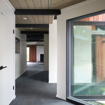
Designing within the constraints of the sloped site posed one of the project’s central challenges. The detached garage sat at a higher elevation than the main house, requiring a solution that ensured architectural and geometric compatibility between the two structures. Rather than create a purely utilitarian link, Klopf Architecture introduced an intentional connection that contributes to the overall architectural language. A notable pinch point in the plan—where differing geometries converged—was treated as a hinge point, turning a potentially awkward juncture into an architectural feature. This area now functions as both a transition and a moment of design interest that unifies the overall plan.
The design also addressed the underutilized outdoor area, which was located in a shadowed portion of the site with geometrical limitations. A new connection to the rear deck was created in this same area, making the outdoor space more useful and inviting. Klopf Architecture introduced carefully positioned openings and spatial improvements that forged a strong visual and functional connection between indoor and outdoor spaces. The outdoor area now reads as a deliberate extension of the home, embracing natural light and emphasizing the dramatic views.
Working through multiple design iterations, Klopf Architecture crafted a solution that preserved the architectural language of the original home while supporting the functional needs of modern life. The garage-to-house connection became more than a passage—it evolved into an architectural moment of transition. A new mudroom and laundry space enhanced convenience without compromising the clean lines of the design. The primary suite was expanded to create a private, serene retreat. The reimagined backyard, complete with fire pit and kitchen, now plays a vital role in the family’s daily routine and social life.
Outcomes and Lasting Impact
The result is a home that balances heritage with contemporary design, technical precision with design sensibility. The redesign not only met the clients’ initial goals but also exceeded expectations in its ability to seamlessly blend past and present, function and beauty, making the outdoor kitchen a favorite gathering place.
Beyond aesthetics, the renovation has significantly improved daily life for the family. The newly integrated garage connection has streamlined routines, providing a seamless transition between arriving home, storing belongings, and entering the main living spaces. The expanded primary suite offers a retreat-like atmosphere, creating a private space to unwind at the end of the day. The redesigned outdoor areas have also become an extension of their lifestyle—whether it's casual family dinners around the fire pit, entertaining friends in the outdoor kitchen, or simply enjoying the view from the reimagined backyard.
Through a thoughtful and strategic approach, the house has been successfully evolved into a home that remains true to its mid-century modern roots while enhancing livability, functionality, and the overall quality of life for the modern-day owners.
Klopf Architecture Team: Geoffrey Campen, Fernanda Bernardes
Architectural Interior Design: Klopf Architecture
Structural Engineer: Base Design Inc.
Contractor: Golden Snail Builders
Photography: Mariko Reed
Year Completed:2022
 JAM Architects Ltd
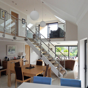
This unique opportunity to design a new home in Millport was one which JAM Architects relished. The location of the site on a hill on the outskirts of the village presented an opportunity to design a new two bedroom home taking advantage of the views of the ocean. The unusual floorplan design with a ‘kink’ at the centre point of the building is as a result of this with the front of the home orientated to address the street and the rear half positioned to ensure the best views from the corner window in the livingroom and the master bedroom window.
As a result of a recent accident our client for this project was unfortunately left with some mobility issues and our brief was therefore to design a two bedroom home with all the primary accomodation on the ground floor, with a studio space, guest bedroom and guest shower room on the first floor. The ground floor consists of a open plan kitchen, dining and living room with direct access to a generous outside patio area. In addition to this living space there is also a utility room, w.c, master bedroom and ensuite bathroom.
On the first floor our client was also keen to take advantage of the sea views from this elevated position and a sheletered balcony area has been incorporated adjacent to the studio space.
Find the right local pro for your project
 Costa del Sol Interiors | Interior Designer
This interior design project involved a comprehensive renovation that completely transformed the appearance and features of an apartment located on the Costa del Sol, Spain. The goal was to modernize the space, enhance functionality, and create a more sophisticated and welcoming atmosphere, aligned with a Nordic style that emphasizes warmth and natural elements.
### Space Redistribution:
Originally, the apartment had only one bedroom and one bathroom. The first phase of the renovation involved redistributing the space to add a second bathroom, with one of them becoming an en-suite connected directly to the master bedroom. This addition significantly improved comfort and privacy, allowing each bedroom to have its own bathroom. Additionally, a new laundry area was created, providing a dedicated space for the washing machine, water heater, and cleaning supplies, optimizing the home's functionality without compromising aesthetics.
### Flooring and Visual Continuity:
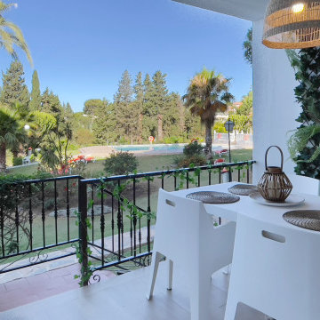
The old dark, square-patterned flooring was replaced with porcelain tiles that mimic the texture and tone of wood. This new material was extended from the interior to the terrace, creating a sense of continuity and spaciousness. This change not only modernized the apartment's appearance but also reinforced the visual harmony between indoor and outdoor spaces, inviting residents to enjoy the natural light and views offered by the coastal location.
### Bathroom Renovation:
With the addition of a second bathroom, both spaces were completely renovated. The old tiles and bathtub were removed in favor of a more modern and functional design. Light-colored ceramics reflecting the Nordic style were installed, along with contemporary fixtures and clean lines. The en-suite bathroom was designed to offer an intimate and luxurious space, while the second bathroom, though equally modern, provides comfort and accessibility for the rest of the home.
### Style and Décor:
The predominant Nordic style was reflected in the choice of materials and colors. The walls were adorned with wooden slats, a detail that adds texture and warmth to the space, while the décor focused on natural elements like wood, linen, and plant fibers, creating a serene and relaxing atmosphere. Neutral tones and simple lines prevail, achieving a perfect balance between sophistication and comfort.
### Final Result:
The result is an apartment that not only looks more spacious and modern but also exudes a sense of tranquility and comfort. The renovation has transformed the space into a home that invites you to enjoy sunny days on the Costa del Sol, with a terrace seamlessly integrated with the interior and living spaces that reflect a sophisticated, functional, and inviting lifestyle.
Este proyecto de interiorismo consistió en una reforma integral que transformó por completo el aspecto y las características de un apartamento ubicado en la Costa del Sol, España. El objetivo era modernizar el espacio, mejorar la funcionalidad y crear un ambiente más sofisticado y acogedor, alineado con un estilo nórdico que resalta la calidez y la naturalidad.
### Redistribución del Espacio:
Inicialmente, el apartamento contaba con una sola habitación y un solo baño. La primera fase de la reforma implicó una redistribución del espacio, añadiendo un segundo baño, de los cuales uno se convirtió en suite, conectado directamente con la habitación principal. Esta ampliación mejoró significativamente la comodidad y privacidad, permitiendo que cada habitación tuviera su propio baño. Además, se creó una nueva zona de lavadero, un espacio dedicado para la lavadora, el termotanque y los elementos de limpieza, optimizando la funcionalidad del hogar sin sacrificar la estética.
### Suelos y Continuidad Visual:
Se reemplazaron los antiguos suelos de color oscuro, de apariencia cuadrada, por un porcelánico que imita la textura y el tono de la madera. Este nuevo material se extendió desde el interior hasta la terraza, creando una sensación de continuidad y amplitud. Este cambio no solo modernizó el aspecto del apartamento, sino que también reforzó la armonía visual entre los espacios interiores y exteriores, invitando a disfrutar de la luz natural y las vistas que ofrece la ubicación costera.
### Renovación de Baños:
Con la adición de un segundo baño, ambos espacios fueron completamente renovados. Se eliminaron los viejos azulejos y la bañera en favor de un diseño más moderno y funcional. Se instalaron cerámicas de tonos claros que reflejan el estilo nórdico, junto con elementos contemporáneos y líneas limpias. El baño en suite, en particular, fue diseñado para ofrecer un espacio íntimo y lujoso, mientras que el segundo baño, aunque igualmente moderno, ofrece comodidad y accesibilidad para el resto de la casa.
### Estilo y Decoración:
El estilo nórdico predominante se reflejó en la elección de materiales y colores. Las paredes fueron adornadas con palillería, un detalle que aporta textura y calidez al espacio, mientras que la decoración se basó en elementos naturales como madera, lino y fibras vegetales, creando una atmósfera serena y relajante. Los tonos neutros y las líneas simples predominan, logrando un equilibrio perfecto entre sofisticación y comodidad.
### Resultado Final:
El resultado es un apartamento que no solo se ve más amplio y moderno, sino que también transmite una sensación de tranquilidad y confort. La reforma ha transformado el espacio en un hogar que invita a disfrutar de los días soleados en la Costa del Sol, con una terraza que se integra perfectamente con el interior, y unos ambientes interiores que reflejan un estilo de vida sofisticado, funcional y acogedor.

 gardenaar
Does your orange tree drop its fruit before it reaches full size, or worse, does it drop flowers before the fruit starts to form?
Trees photosynthesize to produce carbohydrates like sugar which they store as a source of energy. They can maintain a limited amount, which is used to drive the growth of new leaves, branches, roots and stem. Fruitfulness requires the tree to divert its limited energy sources away from these vital functions to the production of flowers, blossoms and fruits.
Fruit development involves maturity followed by fertilization, growth, maturity and maturity. This process takes between 6-7 months in warmer climates, which requires a large number of tree energy sources as a result.
Trees are able to manage their resources, and will also divert them to emergencies ...
Fruit Drop and Crop Depression
In regions where oranges produce one crop per year, they go through a series of growth stages as follows:
Sprout formation and flower launching (mid-winter)
Flowers and fruit set (early spring)
Fruit growth - cell division (late spring to early summer)
Fruit growth - cell proliferation (mid-summer to early autumn)
Fruit ripening (autumn to late winter)
The difference is in the regions where most citrus crops are produced year-round. In these cases, the different stages of development will take place simultaneously.
The orange tree can handle its plant load well, and it will bear as much fruit as we can support. It is natural for all citrus trees to produce too little fruit and too little flowers in early spring to prevent overproduction. There is no need to worry too much about flowering, as an orange tree needs only 1% to 2% of flowers to produce a good crop, and sometimes even less than 1% is enough.
If a tree is depressed because it does not get enough water in hot, dry weather, and if it dies of nitrogen starvation because it is not given enough fertilizer, fruit set will be very difficult in the spring. There may also be a small number of fruit losses in the summer under stressful conditions.
Solution: Provide enough water, and water often in hot weather and strong winds. Orange feed with moderate fertilizer in early spring (September in Southern hemisphere, March in the Northern Hemisphere)
Fruit Drop and Lack of Potassium Nutrient
When orange trees are heavy, the decline in fruit can be exacerbated by low potassium levels.
Potassium, also known as potash (represented by the chemical mark K on fertilizer labels meaning N-P-K or nitrogen-phosphorus-potassium ratio) is a major macronutrient needed for flowering and fruit formation. Next to nitrogen, plants absorb more potassium than any other nutrient. Without potassium, the trees stop flowering and fruiting, which is what happens if they are not fed regularly.
Before any smug horticulturist declares to you that potassium has no direct effect on flowering and fruit set, let me say that as a horticulturist and biochemist, plant chemistry, like the chemistry of all living things is complex, but some input it is necessary to produce certain results. , and the references I have made to the end of this article support what I am saying!
Entering science, Potassium (K) is essential for water, nutrients and the movement of carbohydrates in plant tissues. It also activates enzymes that facilitate the synthesis of complex chemicals within the plant - such as starch, protein and adenosine triphosphate (ATP) production. The role of ATP is to transport the energy needed for all cellular metabolic activities to all living things, and in plants ATP production can regulate the level of photosynthesis.
Potassium also helps regulate the opening and closing of stomata, holes or cavities under which oxygen and carbon dioxide are exchanged with the atmosphere, and respiratory losses are controlled. It increases root growth which increases the absorption of nutrients and improves drought resistance, and increases resistance to frost, pests and diseases. High potassium levels produce similar maturity and fruit growth rate, as well as better nutritional quality, taste and range.
Agricultural extension agencies suggest that large amounts of potash are needed in many crops, and that potassium deficiency or macronutrient deficiency leads to reduced crop growth and reduced yields, and that potassium levels not only affect yield, but fruit size, juice. quality and shelf life.
Since potassium plays an important role in water regulation, deficiency can clearly increase the pressures associated with the declining fruit mentioned in the previous section.
Solution: Make sure that the orange trees are fertilized with the right fertilizer as previously discussed. Extra potassium can be brought in using seaweed extract (which is not a fertilizer but contains a good amount of potassium), wood ash (used in small quantities only as it is very alkaline), or potash sulphate (potassium sulphate) - all this is guaranteed. as acceptable in a natural garden.
Never use potassium chloride as it can be harmful to plants, it is a very inexpensive alternative to fertilizer manufacturers to save money!
Even if there are sufficient levels of potassium in the soil, it may not be accessible to plants, unless we make some improvements.
 Vetter Architects
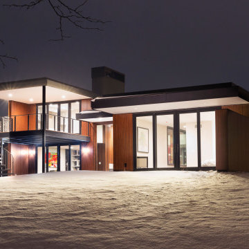
The mHouse is the brainchild of a magazine publisher intent on changing the way houses are constructed and how their owners relate to them. Named after one of the company’s website, the mHouse serves as a built manifesto of innovative panel materials such as rice hull composites and thermally fused laminate – becoming a case study house for over 30 international material suppliers.
The design challenge was quite clear – how to use a series of new materials unproven in the US building trades to create a beautiful house that meets the unique needs of today’s family. The result is a building that is highly rational in its construction systems, while encouraging social gathering.
The mHouse serves as a direct counterpoint to the typical suburban builder home – creating unique outdoor spaces in place of the typical open lawn, a variety of different views in contrast to one major view, and expressing a confidence in the future over nostalgia for the past.
Through a series of layers and nodes, the landscape grounds the house and heightens the views from inside, using indigenous plantings applied in non-traditional ways, the landscape mirrors the house in rethinking the suburban home.
The mHouse strikes a balance between proven methods and innovative solutions, resulting in one version of what is possible with these materials and setting the stage for future iterations and new possibilities.
Size
Total Finished Area: 3,405 sf
Completion Date
September 2015
Services
Architecture
Interior Design Consultant: Amy Carman Design
Landscape Consultant: Texten
 StoneUnlimited Kitchen and Bath Remodeling
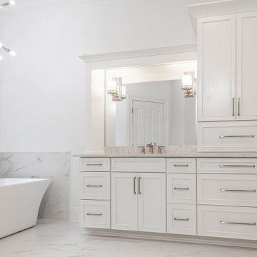
This expansive elegant marble master bathroom is classic and rates highly on our list of favorite projects. Marble is always a good choice as it is a timeless look and adds to the value of your home. Marble can be one of the higher priced materials and also requires regular maintenance however marble bathrooms are gorgeous and allow flexibility and a vast amount of possibilities for application. This marble inspired bathroom was achieved by mixing real marble with porcelain tile that mimics the look of marble. The result is breath taking, low maintenance and a fraction of the cost!
This master bath was expansive with over 300 square feet of usable space and a beautiful high ceiling. Sherry balanced out the room by creating a large double vanity designed with Waypoint cabinetry in painted linen. The higher elevation of the large tower between the vanities make it appear like a customized piece of furniture and the 4 sconces directly mounted to the mirrors are a nice detail that elevate the piece. The Ranier quartz countertops and Mayfair Volakas Giorgio Porcelain tile provide the subtle contrast of grey veining throughout the room.
A 66” Draque tub with floor mounted waterfall faucet is beautifully surrounded with the same Volakes Giorgio tile. It is the perfect spot for our client to relax and take a load off while being showered by the light of the unique Alexandria Abstract Chandelier hanging above the tub.
When designing the shower enclosure, Sherry blended different types of tile and tile sizes to create interest and movement. Cornice Perla Marble pieces create a beautiful transition between the glossy subway and the marble patterned tile. A bench for sitting is topped off with the same Ranier quartz used for the countertops and was added for the comfort of our client while using the Kohler handshower with extended hose. Bianco Perla basketweave marble are located in the niche and floor which add a different design component for interest.
Our client opted to have her half bath remodeled as well. Many of the same components that we used in the master bathroom were used to make this other wise small space appear larger.
Overall, we can’t say enough about how happy we were with the end result of this project. We were even happier to know that our client was over the moon about her dream master bathroom.
Are you dreaming about your master bathroom and what possibilities we could accomplish in a marble look for you? We would love to hear from you, the options are amazing! .


 Klopf Architecture
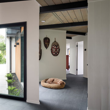
Set in a quiet neighborhood and framed by mature trees, this residence presented a unique opportunity: to thoughtfully evolve a custom mid-century modern home into a space that supports the everyday rhythms of a growing family. With a deep respect for the home’s original architecture, Klopf Architecture reimagined the house to better meet the needs of its owners—introducing functional improvements while preserving the spirit and character of its mid-century roots.
The clients approached Klopf Architecture with a clear vision: refresh their home while seamlessly integrating new programmatic elements. Key goals included clarifying and enhancing the entry sequence; connecting the detached garage to the main house with a practical yet architecturally intentional intervention; adding functional spaces such as a mudroom and laundry room; expanding and remodeling the primary suite’s bathroom and closet; and creating a more engaging outdoor space that capitalized on the site’s impressive views, featuring a fire pit and outdoor kitchen.
As a couple with distinct yet complementary perspectives—one focused on modern functionality and technology, and the other dedicated to preserving the home’s architectural integrity—their collaboration with Klopf Architecture resulted in a solution that harmonized both ideals. Their shared commitment to improving the livability of their home led to a design dialogue rooted in balance. This dynamic partnership shaped the direction of the renovation, ensuring that every decision honored the spirit of the original home while aligning with the practical needs of their growing family.
Designing within the constraints of the sloped site posed one of the project’s central challenges. The detached garage sat at a higher elevation than the main house, requiring a solution that ensured architectural and geometric compatibility between the two structures. Rather than create a purely utilitarian link, Klopf Architecture introduced an intentional connection that contributes to the overall architectural language. A notable pinch point in the plan—where differing geometries converged—was treated as a hinge point, turning a potentially awkward juncture into an architectural feature. This area now functions as both a transition and a moment of design interest that unifies the overall plan.
The design also addressed the underutilized outdoor area, which was located in a shadowed portion of the site with geometrical limitations. A new connection to the rear deck was created in this same area, making the outdoor space more useful and inviting. Klopf Architecture introduced carefully positioned openings and spatial improvements that forged a strong visual and functional connection between indoor and outdoor spaces. The outdoor area now reads as a deliberate extension of the home, embracing natural light and emphasizing the dramatic views.
Working through multiple design iterations, Klopf Architecture crafted a solution that preserved the architectural language of the original home while supporting the functional needs of modern life. The garage-to-house connection became more than a passage—it evolved into an architectural moment of transition. A new mudroom and laundry space enhanced convenience without compromising the clean lines of the design. The primary suite was expanded to create a private, serene retreat. The reimagined backyard, complete with fire pit and kitchen, now plays a vital role in the family’s daily routine and social life.
Outcomes and Lasting Impact
The result is a home that balances heritage with contemporary design, technical precision with design sensibility. The redesign not only met the clients’ initial goals but also exceeded expectations in its ability to seamlessly blend past and present, function and beauty, making the outdoor kitchen a favorite gathering place.
Beyond aesthetics, the renovation has significantly improved daily life for the family. The newly integrated garage connection has streamlined routines, providing a seamless transition between arriving home, storing belongings, and entering the main living spaces. The expanded primary suite offers a retreat-like atmosphere, creating a private space to unwind at the end of the day. The redesigned outdoor areas have also become an extension of their lifestyle—whether it's casual family dinners around the fire pit, entertaining friends in the outdoor kitchen, or simply enjoying the view from the reimagined backyard.
Through a thoughtful and strategic approach, the house has been successfully evolved into a home that remains true to its mid-century modern roots while enhancing livability, functionality, and the overall quality of life for the modern-day owners.
Klopf Architecture Team: Geoffrey Campen, Fernanda Bernardes
Architectural Interior Design: Klopf Architecture
Structural Engineer: Base Design Inc.
Contractor: Golden Snail Builders
Photography: Mariko Reed
Year Completed:2022
 ArtCraft Homes LLC
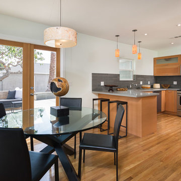
From neglected hoarder house to showplace! This post-war traditional ranch was remodeled into a sophisticated contemporary home by Tim Braseth of ArtCraft Homes, completed in 2013. Located in the Crenshaw Manor neighborhood of central Los Angeles with direct access to neighboring Culver City and downtown L.A. via the new Expo line. Space reconfiguration resulted in 3 spacious bedrooms and 2 full bathrooms. Features include all-new custom kitchen with stainless steel appliances, glass tile bathrooms, and solid oak floors throughout. The private master retreat features its own glass-tiled en suite bathroom with dual vanities, generously-sized walk-in closet, vaulted ceiling and French doors to the expansive patio with a direct view to the distant Hollywood sign. Remodel by ArtCraft Homes. Kitchen by Ikea. Staging by Leslie Whitlock. "After" photography by Marc Angeles of Unlimited Style.
 Decorating Den Interiors- Clark Team Designs
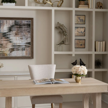
This home office was crafted within an unconventional footprint—a space that originally served as a hallway and bathroom in a former golf course clubhouse before its conversion into a private residence. Our primary challenge was transforming this narrow, unique area into a functional, visually refined workspace that brought the client’s vision for custom-painted shelving alcoves to life.
Through close collaboration with the builder, we designed shelving with precise proportions, ensuring every alcove felt intentional and balanced. To maximize openness and visual continuity, we finished both the walls and shelving in SW 9019 Natural Linen. Carrying this warm tone throughout the entire space prevented visual fragmentation, allowing the architectural detailing to feel perfectly integrated. While a contrasting white finish was considered, we chose the monochromatic approach to preserve the cohesion and softness of the room.
The result is a space defined by elegance, sophistication, and quiet distinction. A cherished photographic art piece served as our focal point, establishing a color direction filled with warm neutrals, subtle depth, and organic movement. We carefully curated and scaled accessories to each alcove, including soft gold sculptural elements, clear resin accents, and earth-inspired objects, to create interest without the clutter.
We are honored that this space has been recognized with 3rd Place in the Dream Room Awards and 1st Place in the People's Choice Awards for the Home Office category.
At Clark Team Designs, we believe in "Real-Life Luxury". By managing every detail of this complex transformation, we provided an effortless, elevated experience that resulted in a home office our clients truly love.
 Cavé Studio
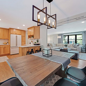
This is a view from the dining room to the kitchen and living room.
DTSH Interiors brought in furniture for the eat in kitchen, dining, and living room as well as added Belgian Linen window treatments.
The exterior of the home received a major facelift and transformation, including new light fixtures, updated roof and facia, updated wood beams, wood door, wood ceiling and stone added to the entrance and more. This took the home from a dated look to an updated and fresh "modern farmhouse" aesthetic.
The kitchen layout remained intact, while appliances, fixtures, hardware, countertops and backsplashes were upgraded . All three bathrooms in the house were also renovated, original hardwood floors were refinished and carpet and tile flooring throughout replaced. Additionally, the dated built-in brick fireplace on the ground floor game room was redesigned. The new fireplace design would now directly tie in with the modern farmhouse style of the exterior, complete with the addition of a large wooden mantle.
DTSH Interiors formulated a plan for six rooms; the living room, dining room, master bedroom, two children's bedrooms and ground floor game room, with the inclusion of the complete fireplace re-design.
The interior also received major upgrades during the whole-house renovation. All of the walls and ceilings were resurfaced, the windows, doors and all interior trim was re-done.
The end result was a giant leap forward for this family; in design, style and functionality. The home felt completely new and refreshed, and once fully furnished, all elements of the renovation came together seamlessly and seemed to make all of the renovations shine.
During the "big reveal" moment, the day the family finally returned home for their summer away, it was difficult for me to decide who was more excited, the adults or the kids!
The home owners kept saying, with a look of delighted disbelief "I can't believe this is our house!"
As a designer, I absolutely loved this project, because it shows the potential of an average, older Pittsburgh area home, and how it can become a well designed and updated space.
It was rewarding to be part of a project which resulted in creating an elegant and serene living space the family loves coming home to everyday, while the exterior of the home became a standout gem in the neighborhood.
 Almesedoors
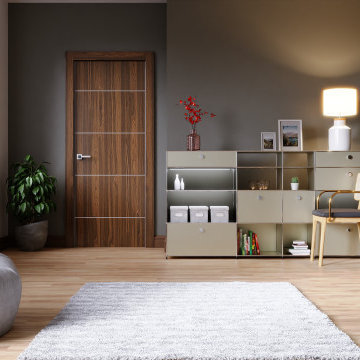
THE DOOR NAME ORIGIN - "ALLUMINIO ELIVIA VERTICAL WOOD GRAIN 4HS"
Of all the interior door models in the Elivia collection, this one is perhaps the most unapologetically elegant. Why? Hmm … That which is self-evident can be the most difficult to explain.
Is it because it is built using the latest breakthroughs in interior door making technology? Look at the finish: the process of applying it utilizes something called “stretching” by professionals, which is to say that instead of simply slapping the finish on top of the interior door’s surface, our company fuses (for lack of a better word) the materials (on molecular level, no less), the result being that the finished product is more warp-resistant, scratch-resistant, and fade-proof than any interior door put together in the past. This is especially important in climates known for their high humidity levels. Yes, but this has more to do with engineering than aesthetics, right?
Okay, so, is this interior door super-elegant because it features all the wonderful state-of-the-art hardware, specifically, the 3D adjustable, self-lubricating concealed hinges (made in Italy, by the way – a country which is, arguably, the birthplace of elegance as a concept)? Self-lubricating means your interior door will never creak. 3D-adjustable means that the installation is quick and precise (far more so than what you’d expect from ordinary hinges). Concealed means, of course, that the pin will not be visible from either side of the interior door when it’s closed. Actually, there is no pin. Neat, isn’t it? Would that be it?
Perhaps. Elegance in interior doors is a tricky concept. It combines (well, at least in the case of this particular interior door model it does) the “wow!” effect with the long-term agreeability. How so, you might ask. Well. It gets your favorable attention the first time you set eyes on it (the “wow” part); after which, you’ll never get tired of looking at it. For as long as you own it, it’ll always be easy on the eyes.
That must be it.
Maybe. Maybe not. There’s more.
This interior door is almost certainly Italian in spirit. Italian culture is rooted in Greco-Roman (Italian designers are very proud of that fact). Look at the vertical latitudinal orientation (which is to say the direction) of the wood grain. Pointing upward means creating additional visual space, pushing the ceiling higher (because your ceilings can never be too high). This is a time-proven architectural trick which ancient Greeks, with their characteristic tongue-in-cheek humor, referred to as “optical correction.” (By the way, if you’d sooner increase, the visual horizontal space of your room, you should look into this interior door’s sister – with the appropriate direction of the wood grain).
And then there’s the 4HS part, which stands for four horizontal stripes – resembling the four strings on the violin: the ultimate elegant musical instrument if there ever was one.
In its present form, the violin appeared in early Sixteenth Century in (guess …) northern Italy. Of course. To be fair, it quickly gained popularity throughout Europe, and the rest of the world soon after.
It’s elegance (the appearance as well as the sound) agreed with both street musicians and the nobility. The French king Charles IX ordered an Italian master to construct twenty-four violins for him in the year 1560.
Was the violin the source of inspiration for our designers?
Let’s move on to the finish.
 Klopf Architecture
Malibu Glass Box House by Klopf Architecture
Following the devastating Woolsey Fire of 2018, the site in Malibu offered a unique opportunity to rebuild not just a home, but a new architectural composition that highlighted the property’s potential while navigating strict fire-rebuild codes in the area. Designed by Klopf Architecture, this project embraced a set of limitations and translated them into an architectural asset.
The city’s fire-rebuild process required the new structure to remain close to the original footprint, size and bulk, a constraint that ultimately clarified the architectural direction. Perched near the front of a long, narrow lot, the new home frames and overlooks a private, park-like rear expanse, an uncommon luxury especially in this part of Malibu .
Without a fixed program, the design process allowed for a different kind of creative focus allowing Klopf Architecture the opportunity to explore how a modernist home could best respond to this site. The team approached the project not with a list of requirements, but with a question: How might a modernist live here? What spatial qualities would inspire calm, connection, and a sense of wonder in this setting? The process became less about problem-solving and more about architectural storytelling—letting the site, the light, and the principles of modern design guide the form and flow of the home.
The response emerged in the form of a glass-box pavilion, an open, Mid-Century Modern inspired living, dining, and kitchen space that floats at the edge of the property’s natural descent. Connected to the more enclosed, private areas of the home by a glass-walled hallway, the living pavilion becomes a distinct centerpiece of the design. It opens on all four sides to the landscape with decks and patios on the flanks, an internal garden and water feature to the north, and a dramatic unguarded view of the expansive backyard and ocean horizon to the south.
Because of the mandated footprint, careful planning was required to ensure every space could still engage with light, landscape, or both. Strategic voids in the form of atriums and courtyards allow daylight to filter deep into the home’s core, while offering moments of surprise and retreat. These design gestures allow natural light to filter deep into the interior, creating a sense of brightness and openness throughout the day. At the same time, they expand the perceptual boundaries between inside and out, making the home feel more expansive while anchoring its connection to the surrounding landscape.
The siting of the house is what gives it its unique character. Rather than receding into the backyard like the neighboring homes, the house holds a slight prominence. From the central living pavilion, stepping down into the landscape feels more like entering a secluded park where a separate existing accessory structure, trail, and recreational areas await. The home’s modest street presence gives way to this unfolding drama of space, view, and nature.
Fire-resilient materials and assemblies are integrated seamlessly throughout including triple-pane glazing, under-slab and roof insulation, and locally sourced fire-rated cladding ensure the house not only meets Calfornia’s rigorous wildland-urban interface (WUI) standards, but feels effortlessly aligned with them. While technical decisions like fire-hardening and mechanical systems presented some construction challenges, particularly around the cantilevered glass box, the team found a functional compromise that preserved the integrity of the design.
Inside, a restrained palette and exposed post and beam design celebrate the ethos of mid-century modernism. A central circulation spine extends from the entry to the rear glass wall, offering a continuous visual link from street to ocean. Spaces such as the library and office, though more intimate in scale, are never cut off from nature as each opens to its own unique courtyard or garden view.
Though born out of a strict regulatory framework and developed without a specific client, the rebuild design unfolded with remarkable clarity. Grounded in site logic, refined by limitations and an emphasis on timeless spatial relationships – light, proportion, and a strong connection to nature, the resulting design feels both effortless and uplifting. The home lives lightly on the land, opens generously to its surroundings, and strikes a careful balance between privacy, openness, and calm. For Klopf Architecture, it stands as a compelling case study in how site, code, and circumstantial constraints can inspire enduring, modernist architecture. With years of experience reimagining mid-century modern design for how people live today, the firm took the project’s limitations as an opportunity. The result is a home shaped by open, flowing spaces, strong indoor-outdoor connections, and a calm, clear sense of structure. It’s a good reminder that even with strict constraints, there’s still room for architecture to breathe—and for modernism to keep moving forward.
Klopf Architecture project team: Geoff Campen, John Klopf, AIA, and Sherry Tan
Structural Engineer: ZFA
Contractor: Maison D’Artiste
Photography: ©2025 Mariko Reed
Year Completed: 2023

 StoneUnlimited Kitchen and Bath Remodeling
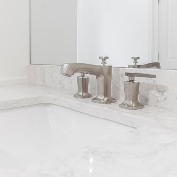
This expansive elegant marble master bathroom is classic and rates highly on our list of favorite projects. Marble is always a good choice as it is a timeless look and adds to the value of your home. Marble can be one of the higher priced materials and also requires regular maintenance however marble bathrooms are gorgeous and allow flexibility and a vast amount of possibilities for application. This marble inspired bathroom was achieved by mixing real marble with porcelain tile that mimics the look of marble. The result is breath taking, low maintenance and a fraction of the cost!
This master bath was expansive with over 300 square feet of usable space and a beautiful high ceiling. Sherry balanced out the room by creating a large double vanity designed with Waypoint cabinetry in painted linen. The higher elevation of the large tower between the vanities make it appear like a customized piece of furniture and the 4 sconces directly mounted to the mirrors are a nice detail that elevate the piece. The Ranier quartz countertops and Mayfair Volakas Giorgio Porcelain tile provide the subtle contrast of grey veining throughout the room.
A 66” Draque tub with floor mounted waterfall faucet is beautifully surrounded with the same Volakes Giorgio tile. It is the perfect spot for our client to relax and take a load off while being showered by the light of the unique Alexandria Abstract Chandelier hanging above the tub.
When designing the shower enclosure, Sherry blended different types of tile and tile sizes to create interest and movement. Cornice Perla Marble pieces create a beautiful transition between the glossy subway and the marble patterned tile. A bench for sitting is topped off with the same Ranier quartz used for the countertops and was added for the comfort of our client while using the Kohler handshower with extended hose. Bianco Perla basketweave marble are located in the niche and floor which add a different design component for interest.
Our client opted to have her half bath remodeled as well. Many of the same components that we used in the master bathroom were used to make this other wise small space appear larger.
Overall, we can’t say enough about how happy we were with the end result of this project. We were even happier to know that our client was over the moon about her dream master bathroom.
Are you dreaming about your master bathroom and what possibilities we could accomplish in a marble look for you? We would love to hear from you, the options are amazing! .
 Klopf Architecture
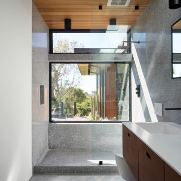
Malibu Glass Box House by Klopf Architecture
Following the devastating Woolsey Fire of 2018, the site in Malibu offered a unique opportunity to rebuild not just a home, but a new architectural composition that highlighted the property’s potential while navigating strict fire-rebuild codes in the area. Designed by Klopf Architecture, this project embraced a set of limitations and translated them into an architectural asset.
The city’s fire-rebuild process required the new structure to remain close to the original footprint, size and bulk, a constraint that ultimately clarified the architectural direction. Perched near the front of a long, narrow lot, the new home frames and overlooks a private, park-like rear expanse, an uncommon luxury especially in this part of Malibu .
Without a fixed program, the design process allowed for a different kind of creative focus allowing Klopf Architecture the opportunity to explore how a modernist home could best respond to this site. The team approached the project not with a list of requirements, but with a question: How might a modernist live here? What spatial qualities would inspire calm, connection, and a sense of wonder in this setting? The process became less about problem-solving and more about architectural storytelling—letting the site, the light, and the principles of modern design guide the form and flow of the home.
The response emerged in the form of a glass-box pavilion, an open, Mid-Century Modern inspired living, dining, and kitchen space that floats at the edge of the property’s natural descent. Connected to the more enclosed, private areas of the home by a glass-walled hallway, the living pavilion becomes a distinct centerpiece of the design. It opens on all four sides to the landscape with decks and patios on the flanks, an internal garden and water feature to the north, and a dramatic unguarded view of the expansive backyard and ocean horizon to the south.
Because of the mandated footprint, careful planning was required to ensure every space could still engage with light, landscape, or both. Strategic voids in the form of atriums and courtyards allow daylight to filter deep into the home’s core, while offering moments of surprise and retreat. These design gestures allow natural light to filter deep into the interior, creating a sense of brightness and openness throughout the day. At the same time, they expand the perceptual boundaries between inside and out, making the home feel more expansive while anchoring its connection to the surrounding landscape.
The siting of the house is what gives it its unique character. Rather than receding into the backyard like the neighboring homes, the house holds a slight prominence. From the central living pavilion, stepping down into the landscape feels more like entering a secluded park where a separate existing accessory structure, trail, and recreational areas await. The home’s modest street presence gives way to this unfolding drama of space, view, and nature.
Fire-resilient materials and assemblies are integrated seamlessly throughout including triple-pane glazing, under-slab and roof insulation, and locally sourced fire-rated cladding ensure the house not only meets Calfornia’s rigorous wildland-urban interface (WUI) standards, but feels effortlessly aligned with them. While technical decisions like fire-hardening and mechanical systems presented some construction challenges, particularly around the cantilevered glass box, the team found a functional compromise that preserved the integrity of the design.
Inside, a restrained palette and exposed post and beam design celebrate the ethos of mid-century modernism. A central circulation spine extends from the entry to the rear glass wall, offering a continuous visual link from street to ocean. Spaces such as the library and office, though more intimate in scale, are never cut off from nature as each opens to its own unique courtyard or garden view.
Though born out of a strict regulatory framework and developed without a specific client, the rebuild design unfolded with remarkable clarity. Grounded in site logic, refined by limitations and an emphasis on timeless spatial relationships – light, proportion, and a strong connection to nature, the resulting design feels both effortless and uplifting. The home lives lightly on the land, opens generously to its surroundings, and strikes a careful balance between privacy, openness, and calm. For Klopf Architecture, it stands as a compelling case study in how site, code, and circumstantial constraints can inspire enduring, modernist architecture. With years of experience reimagining mid-century modern design for how people live today, the firm took the project’s limitations as an opportunity. The result is a home shaped by open, flowing spaces, strong indoor-outdoor connections, and a calm, clear sense of structure. It’s a good reminder that even with strict constraints, there’s still room for architecture to breathe—and for modernism to keep moving forward.
Klopf Architecture project team: Geoff Campen, John Klopf, AIA, and Sherry Tan
Structural Engineer: ZFA
Contractor: Maison D’Artiste
Photography: ©2025 Mariko Reed
Year Completed: 2023
 SM Design
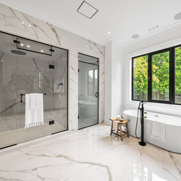
St. Andrews Project — Primary Bathroom & Spa Retreat
This St. Andrews primary bathroom is conceived as a private spa retreat, where material continuity, sculptural forms, and architectural restraint create a sense of understated luxury. The design intentionally avoids visual clutter, allowing the quality of the materials and precision of the detailing to define the space.
The room is anchored by a dramatic marble-look stone that extends continuously across the shower enclosure and floor, creating a seamless visual envelope. The expressive veining introduces movement and natural variation, transforming what could otherwise be a minimal white bathroom into a richly layered composition. Carrying the stone through multiple surfaces also gives the room a sense of scale and architectural cohesion.
The freestanding bathtub is treated as a sculptural object rather than simply a functional fixture. Its softly curved silhouette and vertically fluted exterior introduce an organic counterpoint to the linear geometry of the surrounding architecture. Positioned directly beneath the large black-framed window, the tub becomes a quiet focal point while taking advantage of abundant natural light and views toward the greenery beyond.
Black-framed glass creates another important layer of contrast. The expansive shower enclosure and adjacent glazed opening establish a crisp graphic framework against the pale stone, while black plumbing fixtures and hardware reinforce the same architectural language. This repeated use of black creates visual continuity without overwhelming the light palette.
The oversized window is particularly important to the atmosphere of the room. Instead of treating the bathroom as an enclosed, highly private environment, the design establishes a connection to nature, allowing daylight and greenery to become part of the experience. The result is a space that feels bright, open, and restorative.
A restrained wooden stool introduces warmth and an organic material note against the stone and glass. Its natural finish prevents the monochromatic palette from feeling overly clinical, while the simple form complements the sculptural bathtub.
The overall design is based on material continuity, contrast, and calm geometry. Veined stone provides movement, fluted surfaces provide texture, black metal provides definition, and natural wood introduces warmth. The result is a contemporary luxury bathroom that feels architectural, serene, and highly considered, more like a private wellness retreat than a conventional ensuite.
 Kreativ Kitchens
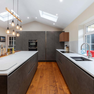
This modern kitchen in Leeds was designed to combine innovative layout planning with a rich mix of materials, resulting in a space that feels both striking and highly functional.
The cabinetry is from the X-Line range, finished in a combination of Fluted Walnut Veneer and Artstone Laminate, creating depth and visual interest throughout the space. Wall units in fluted walnut reinforce this texture, adding a distinctive architectural element.
Worktops are in 24mm Corian, offering a smooth, seamless surface that complements the kitchen's clean lines while providing durability for everyday use.
Feature elements include a bespoke pantry, designed to maximise storage while keeping the layout streamlined, and a matt mirror splashback that softly reflects light, enhancing the sense of space without overpowering the design.
Appliances are by Siemens, paired with a BORA hob that integrates extraction directly into the cooking surface, maintaining the uncluttered aesthetic and improving functionality.
The result is a kitchen that brings together a variety of materials and finishes in a considered way, delivering both visual impact and practical performance for modern living.
Sponsored
Sunbury, OH

J.Holderby - Renovations
Franklin County's Leading General Contractors - 2X Best of Houzz!
 StoneUnlimited Kitchen and Bath Remodeling
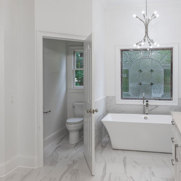
This expansive elegant marble master bathroom is classic and rates highly on our list of favorite projects. Marble is always a good choice as it is a timeless look and adds to the value of your home. Marble can be one of the higher priced materials and also requires regular maintenance however marble bathrooms are gorgeous and allow flexibility and a vast amount of possibilities for application. This marble inspired bathroom was achieved by mixing real marble with porcelain tile that mimics the look of marble. The result is breath taking, low maintenance and a fraction of the cost!
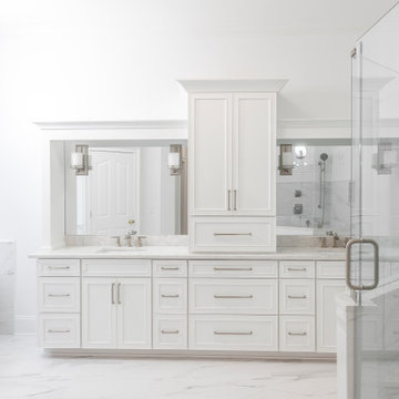
This master bath was expansive with over 300 square feet of usable space and a beautiful high ceiling. Sherry balanced out the room by creating a large double vanity designed with Waypoint cabinetry in painted linen. The higher elevation of the large tower between the vanities make it appear like a customized piece of furniture and the 4 sconces directly mounted to the mirrors are a nice detail that elevate the piece. The Ranier quartz countertops and Mayfair Volakas Giorgio Porcelain tile provide the subtle contrast of grey veining throughout the room.
A 66” Draque tub with floor mounted waterfall faucet is beautifully surrounded with the same Volakes Giorgio tile. It is the perfect spot for our client to relax and take a load off while being showered by the light of the unique Alexandria Abstract Chandelier hanging above the tub.
When designing the shower enclosure, Sherry blended different types of tile and tile sizes to create interest and movement. Cornice Perla Marble pieces create a beautiful transition between the glossy subway and the marble patterned tile. A bench for sitting is topped off with the same Ranier quartz used for the countertops and was added for the comfort of our client while using the Kohler handshower with extended hose. Bianco Perla basketweave marble are located in the niche and floor which add a different design component for interest.
Our client opted to have her half bath remodeled as well. Many of the same components that we used in the master bathroom were used to make this other wise small space appear larger.
Overall, we can’t say enough about how happy we were with the end result of this project. We were even happier to know that our client was over the moon about her dream master bathroom.
Are you dreaming about your master bathroom and what possibilities we could accomplish in a marble look for you? We would love to hear from you, the options are amazing! .
 StoneUnlimited Kitchen and Bath Remodeling
This expansive elegant marble master bathroom is classic and rates highly on our list of favorite projects. Marble is always a good choice as it is a timeless look and adds to the value of your home. Marble can be one of the higher priced materials and also requires regular maintenance however marble bathrooms are gorgeous and allow flexibility and a vast amount of possibilities for application. This marble inspired bathroom was achieved by mixing real marble with porcelain tile that mimics the look of marble. The result is breath taking, low maintenance and a fraction of the cost!
This master bath was expansive with over 300 square feet of usable space and a beautiful high ceiling. Sherry balanced out the room by creating a large double vanity designed with Waypoint cabinetry in painted linen. The higher elevation of the large tower between the vanities make it appear like a customized piece of furniture and the 4 sconces directly mounted to the mirrors are a nice detail that elevate the piece. The Ranier quartz countertops and Mayfair Volakas Giorgio Porcelain tile provide the subtle contrast of grey veining throughout the room.
A 66” Draque tub with floor mounted waterfall faucet is beautifully surrounded with the same Volakes Giorgio tile. It is the perfect spot for our client to relax and take a load off while being showered by the light of the unique Alexandria Abstract Chandelier hanging above the tub.
When designing the shower enclosure, Sherry blended different types of tile and tile sizes to create interest and movement. Cornice Perla Marble pieces create a beautiful transition between the glossy subway and the marble patterned tile. A bench for sitting is topped off with the same Ranier quartz used for the countertops and was added for the comfort of our client while using the Kohler handshower with extended hose. Bianco Perla basketweave marble are located in the niche and floor which add a different design component for interest.
Our client opted to have her half bath remodeled as well. Many of the same components that we used in the master bathroom were used to make this other wise small space appear larger.
Overall, we can’t say enough about how happy we were with the end result of this project. We were even happier to know that our client was over the moon about her dream master bathroom.
Are you dreaming about your master bathroom and what possibilities we could accomplish in a marble look for you? We would love to hear from you, the options are amazing! .
 Klopf Architecture
Malibu Glass Box House by Klopf Architecture
Following the devastating Woolsey Fire of 2018, the site in Malibu offered a unique opportunity to rebuild not just a home, but a new architectural composition that highlighted the property’s potential while navigating strict fire-rebuild codes in the area. Designed by Klopf Architecture, this project embraced a set of limitations and translated them into an architectural asset.
The city’s fire-rebuild process required the new structure to remain close to the original footprint, size and bulk, a constraint that ultimately clarified the architectural direction. Perched near the front of a long, narrow lot, the new home frames and overlooks a private, park-like rear expanse, an uncommon luxury especially in this part of Malibu .
Without a fixed program, the design process allowed for a different kind of creative focus allowing Klopf Architecture the opportunity to explore how a modernist home could best respond to this site. The team approached the project not with a list of requirements, but with a question: How might a modernist live here? What spatial qualities would inspire calm, connection, and a sense of wonder in this setting? The process became less about problem-solving and more about architectural storytelling—letting the site, the light, and the principles of modern design guide the form and flow of the home.
The response emerged in the form of a glass-box pavilion, an open, Mid-Century Modern inspired living, dining, and kitchen space that floats at the edge of the property’s natural descent. Connected to the more enclosed, private areas of the home by a glass-walled hallway, the living pavilion becomes a distinct centerpiece of the design. It opens on all four sides to the landscape with decks and patios on the flanks, an internal garden and water feature to the north, and a dramatic unguarded view of the expansive backyard and ocean horizon to the south.
Because of the mandated footprint, careful planning was required to ensure every space could still engage with light, landscape, or both. Strategic voids in the form of atriums and courtyards allow daylight to filter deep into the home’s core, while offering moments of surprise and retreat. These design gestures allow natural light to filter deep into the interior, creating a sense of brightness and openness throughout the day. At the same time, they expand the perceptual boundaries between inside and out, making the home feel more expansive while anchoring its connection to the surrounding landscape.
The siting of the house is what gives it its unique character. Rather than receding into the backyard like the neighboring homes, the house holds a slight prominence. From the central living pavilion, stepping down into the landscape feels more like entering a secluded park where a separate existing accessory structure, trail, and recreational areas await. The home’s modest street presence gives way to this unfolding drama of space, view, and nature.
Fire-resilient materials and assemblies are integrated seamlessly throughout including triple-pane glazing, under-slab and roof insulation, and locally sourced fire-rated cladding ensure the house not only meets Calfornia’s rigorous wildland-urban interface (WUI) standards, but feels effortlessly aligned with them. While technical decisions like fire-hardening and mechanical systems presented some construction challenges, particularly around the cantilevered glass box, the team found a functional compromise that preserved the integrity of the design.
Inside, a restrained palette and exposed post and beam design celebrate the ethos of mid-century modernism. A central circulation spine extends from the entry to the rear glass wall, offering a continuous visual link from street to ocean. Spaces such as the library and office, though more intimate in scale, are never cut off from nature as each opens to its own unique courtyard or garden view.
Though born out of a strict regulatory framework and developed without a specific client, the rebuild design unfolded with remarkable clarity. Grounded in site logic, refined by limitations and an emphasis on timeless spatial relationships – light, proportion, and a strong connection to nature, the resulting design feels both effortless and uplifting. The home lives lightly on the land, opens generously to its surroundings, and strikes a careful balance between privacy, openness, and calm. For Klopf Architecture, it stands as a compelling case study in how site, code, and circumstantial constraints can inspire enduring, modernist architecture. With years of experience reimagining mid-century modern design for how people live today, the firm took the project’s limitations as an opportunity. The result is a home shaped by open, flowing spaces, strong indoor-outdoor connections, and a calm, clear sense of structure. It’s a good reminder that even with strict constraints, there’s still room for architecture to breathe—and for modernism to keep moving forward.
Klopf Architecture project team: Geoff Campen, John Klopf, AIA, and Sherry Tan
Structural Engineer: ZFA
Contractor: Maison D’Artiste
Photography: ©2025 Mariko Reed
Year Completed: 2023
46