
Search results for "Direct result" in Home Design Ideas
 Klopf Architecture
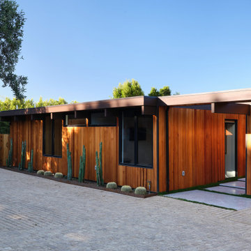
Malibu Glass Box House by Klopf Architecture
Following the devastating Woolsey Fire of 2018, the site in Malibu offered a unique opportunity to rebuild not just a home, but a new architectural composition that highlighted the property’s potential while navigating strict fire-rebuild codes in the area. Designed by Klopf Architecture, this project embraced a set of limitations and translated them into an architectural asset.
The city’s fire-rebuild process required the new structure to remain close to the original footprint, size and bulk, a constraint that ultimately clarified the architectural direction. Perched near the front of a long, narrow lot, the new home frames and overlooks a private, park-like rear expanse, an uncommon luxury especially in this part of Malibu .
Without a fixed program, the design process allowed for a different kind of creative focus allowing Klopf Architecture the opportunity to explore how a modernist home could best respond to this site. The team approached the project not with a list of requirements, but with a question: How might a modernist live here? What spatial qualities would inspire calm, connection, and a sense of wonder in this setting? The process became less about problem-solving and more about architectural storytelling—letting the site, the light, and the principles of modern design guide the form and flow of the home.
The response emerged in the form of a glass-box pavilion, an open, Mid-Century Modern inspired living, dining, and kitchen space that floats at the edge of the property’s natural descent. Connected to the more enclosed, private areas of the home by a glass-walled hallway, the living pavilion becomes a distinct centerpiece of the design. It opens on all four sides to the landscape with decks and patios on the flanks, an internal garden and water feature to the north, and a dramatic unguarded view of the expansive backyard and ocean horizon to the south.
Because of the mandated footprint, careful planning was required to ensure every space could still engage with light, landscape, or both. Strategic voids in the form of atriums and courtyards allow daylight to filter deep into the home’s core, while offering moments of surprise and retreat. These design gestures allow natural light to filter deep into the interior, creating a sense of brightness and openness throughout the day. At the same time, they expand the perceptual boundaries between inside and out, making the home feel more expansive while anchoring its connection to the surrounding landscape.
The siting of the house is what gives it its unique character. Rather than receding into the backyard like the neighboring homes, the house holds a slight prominence. From the central living pavilion, stepping down into the landscape feels more like entering a secluded park where a separate existing accessory structure, trail, and recreational areas await. The home’s modest street presence gives way to this unfolding drama of space, view, and nature.
Fire-resilient materials and assemblies are integrated seamlessly throughout including triple-pane glazing, under-slab and roof insulation, and locally sourced fire-rated cladding ensure the house not only meets Calfornia’s rigorous wildland-urban interface (WUI) standards, but feels effortlessly aligned with them. While technical decisions like fire-hardening and mechanical systems presented some construction challenges, particularly around the cantilevered glass box, the team found a functional compromise that preserved the integrity of the design.
Inside, a restrained palette and exposed post and beam design celebrate the ethos of mid-century modernism. A central circulation spine extends from the entry to the rear glass wall, offering a continuous visual link from street to ocean. Spaces such as the library and office, though more intimate in scale, are never cut off from nature as each opens to its own unique courtyard or garden view.
Though born out of a strict regulatory framework and developed without a specific client, the rebuild design unfolded with remarkable clarity. Grounded in site logic, refined by limitations and an emphasis on timeless spatial relationships – light, proportion, and a strong connection to nature, the resulting design feels both effortless and uplifting. The home lives lightly on the land, opens generously to its surroundings, and strikes a careful balance between privacy, openness, and calm. For Klopf Architecture, it stands as a compelling case study in how site, code, and circumstantial constraints can inspire enduring, modernist architecture. With years of experience reimagining mid-century modern design for how people live today, the firm took the project’s limitations as an opportunity. The result is a home shaped by open, flowing spaces, strong indoor-outdoor connections, and a calm, clear sense of structure. It’s a good reminder that even with strict constraints, there’s still room for architecture to breathe—and for modernism to keep moving forward.
Klopf Architecture project team: Geoff Campen, John Klopf, AIA, and Sherry Tan
Structural Engineer: ZFA
Contractor: Maison D’Artiste
Photography: ©2025 Mariko Reed
Year Completed: 2023
 Klopf Architecture
Malibu Glass Box House by Klopf Architecture
Following the devastating Woolsey Fire of 2018, the site in Malibu offered a unique opportunity to rebuild not just a home, but a new architectural composition that highlighted the property’s potential while navigating strict fire-rebuild codes in the area. Designed by Klopf Architecture, this project embraced a set of limitations and translated them into an architectural asset.
The city’s fire-rebuild process required the new structure to remain close to the original footprint, size and bulk, a constraint that ultimately clarified the architectural direction. Perched near the front of a long, narrow lot, the new home frames and overlooks a private, park-like rear expanse, an uncommon luxury especially in this part of Malibu .
Without a fixed program, the design process allowed for a different kind of creative focus allowing Klopf Architecture the opportunity to explore how a modernist home could best respond to this site. The team approached the project not with a list of requirements, but with a question: How might a modernist live here? What spatial qualities would inspire calm, connection, and a sense of wonder in this setting? The process became less about problem-solving and more about architectural storytelling—letting the site, the light, and the principles of modern design guide the form and flow of the home.
The response emerged in the form of a glass-box pavilion, an open, Mid-Century Modern inspired living, dining, and kitchen space that floats at the edge of the property’s natural descent. Connected to the more enclosed, private areas of the home by a glass-walled hallway, the living pavilion becomes a distinct centerpiece of the design. It opens on all four sides to the landscape with decks and patios on the flanks, an internal garden and water feature to the north, and a dramatic unguarded view of the expansive backyard and ocean horizon to the south.
Because of the mandated footprint, careful planning was required to ensure every space could still engage with light, landscape, or both. Strategic voids in the form of atriums and courtyards allow daylight to filter deep into the home’s core, while offering moments of surprise and retreat. These design gestures allow natural light to filter deep into the interior, creating a sense of brightness and openness throughout the day. At the same time, they expand the perceptual boundaries between inside and out, making the home feel more expansive while anchoring its connection to the surrounding landscape.
The siting of the house is what gives it its unique character. Rather than receding into the backyard like the neighboring homes, the house holds a slight prominence. From the central living pavilion, stepping down into the landscape feels more like entering a secluded park where a separate existing accessory structure, trail, and recreational areas await. The home’s modest street presence gives way to this unfolding drama of space, view, and nature.
Fire-resilient materials and assemblies are integrated seamlessly throughout including triple-pane glazing, under-slab and roof insulation, and locally sourced fire-rated cladding ensure the house not only meets Calfornia’s rigorous wildland-urban interface (WUI) standards, but feels effortlessly aligned with them. While technical decisions like fire-hardening and mechanical systems presented some construction challenges, particularly around the cantilevered glass box, the team found a functional compromise that preserved the integrity of the design.
Inside, a restrained palette and exposed post and beam design celebrate the ethos of mid-century modernism. A central circulation spine extends from the entry to the rear glass wall, offering a continuous visual link from street to ocean. Spaces such as the library and office, though more intimate in scale, are never cut off from nature as each opens to its own unique courtyard or garden view.
Though born out of a strict regulatory framework and developed without a specific client, the rebuild design unfolded with remarkable clarity. Grounded in site logic, refined by limitations and an emphasis on timeless spatial relationships – light, proportion, and a strong connection to nature, the resulting design feels both effortless and uplifting. The home lives lightly on the land, opens generously to its surroundings, and strikes a careful balance between privacy, openness, and calm. For Klopf Architecture, it stands as a compelling case study in how site, code, and circumstantial constraints can inspire enduring, modernist architecture. With years of experience reimagining mid-century modern design for how people live today, the firm took the project’s limitations as an opportunity. The result is a home shaped by open, flowing spaces, strong indoor-outdoor connections, and a calm, clear sense of structure. It’s a good reminder that even with strict constraints, there’s still room for architecture to breathe—and for modernism to keep moving forward.
Klopf Architecture project team: Geoff Campen, John Klopf, AIA, and Sherry Tan
Structural Engineer: ZFA
Contractor: Maison D’Artiste
Photography: ©2025 Mariko Reed
Year Completed: 2023
 Mi Tile Installation Experts
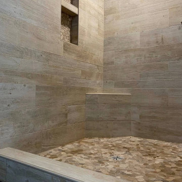
Almost five years ago, we completed this shower remodel using the Schluter waterproofing system and our full transparency approach.
From day one, our client knew every detail — every step, every deadline, and every material. No surprises. No delays. Just clear communication and results that stand the test of time.
Today, this shower still looks as beautiful and solid as the day it was finished. That same client continues to recommend us to friends and neighbors — and thanks to our Referral Program, he earns rewards for every new project that comes from his recommendation.
From that one neighborhood alone, we’ve completed four more full remodels, each one built on trust, craftsmanship, and proven results.
We take pride in knowing that our clients are not only satisfied — they’re proud to show their homes to others.
You can visit any of our past projects in person and see the same precision, durability, and beauty that define every Mi Tile Installation Experts project.
? Mikhailbelov37@gmail.com
? https://micatile.com
?️ Free Remodel Audit
Want to avoid hidden issues, costly delays, and budget surprises?
Comment “AUDIT” and we’ll provide a free expert review of your remodel — whether you’re just starting, already in progress, or recently completed.
We’ll help you:
✔️ Plan your project efficiently
✔️ Know what to expect
✔️ Identify common contractor shortcuts
✔️ Protect your investment from day one
? Exclusive Client Benefits
✨ Bonus Program — earn up to 15% back in bonus points to use toward your next project or gift to family/friends.
✨ Referral Program — get 10% cash back from every direct referral project, plus 3% from their referrals.
✨ Returning Client Discount — receive 10% off per sq ft on your second project.
Want the full details? Comment BONUS and we’ll send you the complete guide.
#longlastingquality #showerremodel #schlutersystem #trustworthycontractor #tileinstallation #referralprogram #customremodel #waterproofing #qualitycraftsmanship #loomis #granitebay #eldoradohills #mitileinstallationexperts #miauditmyremodel #beforeandafter #remodeljourney
Find the right local pro for your project
 Klopf Architecture
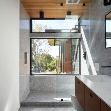
Malibu Glass Box House by Klopf Architecture
Following the devastating Woolsey Fire of 2018, the site in Malibu offered a unique opportunity to rebuild not just a home, but a new architectural composition that highlighted the property’s potential while navigating strict fire-rebuild codes in the area. Designed by Klopf Architecture, this project embraced a set of limitations and translated them into an architectural asset.
The city’s fire-rebuild process required the new structure to remain close to the original footprint, size and bulk, a constraint that ultimately clarified the architectural direction. Perched near the front of a long, narrow lot, the new home frames and overlooks a private, park-like rear expanse, an uncommon luxury especially in this part of Malibu .
Without a fixed program, the design process allowed for a different kind of creative focus allowing Klopf Architecture the opportunity to explore how a modernist home could best respond to this site. The team approached the project not with a list of requirements, but with a question: How might a modernist live here? What spatial qualities would inspire calm, connection, and a sense of wonder in this setting? The process became less about problem-solving and more about architectural storytelling—letting the site, the light, and the principles of modern design guide the form and flow of the home.
The response emerged in the form of a glass-box pavilion, an open, Mid-Century Modern inspired living, dining, and kitchen space that floats at the edge of the property’s natural descent. Connected to the more enclosed, private areas of the home by a glass-walled hallway, the living pavilion becomes a distinct centerpiece of the design. It opens on all four sides to the landscape with decks and patios on the flanks, an internal garden and water feature to the north, and a dramatic unguarded view of the expansive backyard and ocean horizon to the south.
Because of the mandated footprint, careful planning was required to ensure every space could still engage with light, landscape, or both. Strategic voids in the form of atriums and courtyards allow daylight to filter deep into the home’s core, while offering moments of surprise and retreat. These design gestures allow natural light to filter deep into the interior, creating a sense of brightness and openness throughout the day. At the same time, they expand the perceptual boundaries between inside and out, making the home feel more expansive while anchoring its connection to the surrounding landscape.
The siting of the house is what gives it its unique character. Rather than receding into the backyard like the neighboring homes, the house holds a slight prominence. From the central living pavilion, stepping down into the landscape feels more like entering a secluded park where a separate existing accessory structure, trail, and recreational areas await. The home’s modest street presence gives way to this unfolding drama of space, view, and nature.
Fire-resilient materials and assemblies are integrated seamlessly throughout including triple-pane glazing, under-slab and roof insulation, and locally sourced fire-rated cladding ensure the house not only meets Calfornia’s rigorous wildland-urban interface (WUI) standards, but feels effortlessly aligned with them. While technical decisions like fire-hardening and mechanical systems presented some construction challenges, particularly around the cantilevered glass box, the team found a functional compromise that preserved the integrity of the design.
Inside, a restrained palette and exposed post and beam design celebrate the ethos of mid-century modernism. A central circulation spine extends from the entry to the rear glass wall, offering a continuous visual link from street to ocean. Spaces such as the library and office, though more intimate in scale, are never cut off from nature as each opens to its own unique courtyard or garden view.
Though born out of a strict regulatory framework and developed without a specific client, the rebuild design unfolded with remarkable clarity. Grounded in site logic, refined by limitations and an emphasis on timeless spatial relationships – light, proportion, and a strong connection to nature, the resulting design feels both effortless and uplifting. The home lives lightly on the land, opens generously to its surroundings, and strikes a careful balance between privacy, openness, and calm. For Klopf Architecture, it stands as a compelling case study in how site, code, and circumstantial constraints can inspire enduring, modernist architecture. With years of experience reimagining mid-century modern design for how people live today, the firm took the project’s limitations as an opportunity. The result is a home shaped by open, flowing spaces, strong indoor-outdoor connections, and a calm, clear sense of structure. It’s a good reminder that even with strict constraints, there’s still room for architecture to breathe—and for modernism to keep moving forward.
Klopf Architecture project team: Geoff Campen, John Klopf, AIA, and Sherry Tan
Structural Engineer: ZFA
Contractor: Maison D’Artiste
Photography: ©2025 Mariko Reed
Year Completed: 2023
 StoneUnlimited Kitchen and Bath Remodeling
This expansive elegant marble master bathroom is classic and rates highly on our list of favorite projects. Marble is always a good choice as it is a timeless look and adds to the value of your home. Marble can be one of the higher priced materials and also requires regular maintenance however marble bathrooms are gorgeous and allow flexibility and a vast amount of possibilities for application. This marble inspired bathroom was achieved by mixing real marble with porcelain tile that mimics the look of marble. The result is breath taking, low maintenance and a fraction of the cost!
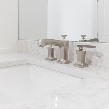
This master bath was expansive with over 300 square feet of usable space and a beautiful high ceiling. Sherry balanced out the room by creating a large double vanity designed with Waypoint cabinetry in painted linen. The higher elevation of the large tower between the vanities make it appear like a customized piece of furniture and the 4 sconces directly mounted to the mirrors are a nice detail that elevate the piece. The Ranier quartz countertops and Mayfair Volakas Giorgio Porcelain tile provide the subtle contrast of grey veining throughout the room.
A 66” Draque tub with floor mounted waterfall faucet is beautifully surrounded with the same Volakes Giorgio tile. It is the perfect spot for our client to relax and take a load off while being showered by the light of the unique Alexandria Abstract Chandelier hanging above the tub.
When designing the shower enclosure, Sherry blended different types of tile and tile sizes to create interest and movement. Cornice Perla Marble pieces create a beautiful transition between the glossy subway and the marble patterned tile. A bench for sitting is topped off with the same Ranier quartz used for the countertops and was added for the comfort of our client while using the Kohler handshower with extended hose. Bianco Perla basketweave marble are located in the niche and floor which add a different design component for interest.
Our client opted to have her half bath remodeled as well. Many of the same components that we used in the master bathroom were used to make this other wise small space appear larger.
Overall, we can’t say enough about how happy we were with the end result of this project. We were even happier to know that our client was over the moon about her dream master bathroom.
Are you dreaming about your master bathroom and what possibilities we could accomplish in a marble look for you? We would love to hear from you, the options are amazing! .
 Almesedoors
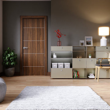
THE DOOR NAME ORIGIN - "ALLUMINIO ELIVIA VERTICAL WOOD GRAIN 4HS"
Of all the interior door models in the Elivia collection, this one is perhaps the most unapologetically elegant. Why? Hmm … That which is self-evident can be the most difficult to explain.
Is it because it is built using the latest breakthroughs in interior door making technology? Look at the finish: the process of applying it utilizes something called “stretching” by professionals, which is to say that instead of simply slapping the finish on top of the interior door’s surface, our company fuses (for lack of a better word) the materials (on molecular level, no less), the result being that the finished product is more warp-resistant, scratch-resistant, and fade-proof than any interior door put together in the past. This is especially important in climates known for their high humidity levels. Yes, but this has more to do with engineering than aesthetics, right?
Okay, so, is this interior door super-elegant because it features all the wonderful state-of-the-art hardware, specifically, the 3D adjustable, self-lubricating concealed hinges (made in Italy, by the way – a country which is, arguably, the birthplace of elegance as a concept)? Self-lubricating means your interior door will never creak. 3D-adjustable means that the installation is quick and precise (far more so than what you’d expect from ordinary hinges). Concealed means, of course, that the pin will not be visible from either side of the interior door when it’s closed. Actually, there is no pin. Neat, isn’t it? Would that be it?
Perhaps. Elegance in interior doors is a tricky concept. It combines (well, at least in the case of this particular interior door model it does) the “wow!” effect with the long-term agreeability. How so, you might ask. Well. It gets your favorable attention the first time you set eyes on it (the “wow” part); after which, you’ll never get tired of looking at it. For as long as you own it, it’ll always be easy on the eyes.
That must be it.
Maybe. Maybe not. There’s more.
This interior door is almost certainly Italian in spirit. Italian culture is rooted in Greco-Roman (Italian designers are very proud of that fact). Look at the vertical latitudinal orientation (which is to say the direction) of the wood grain. Pointing upward means creating additional visual space, pushing the ceiling higher (because your ceilings can never be too high). This is a time-proven architectural trick which ancient Greeks, with their characteristic tongue-in-cheek humor, referred to as “optical correction.” (By the way, if you’d sooner increase, the visual horizontal space of your room, you should look into this interior door’s sister – with the appropriate direction of the wood grain).
And then there’s the 4HS part, which stands for four horizontal stripes – resembling the four strings on the violin: the ultimate elegant musical instrument if there ever was one.
In its present form, the violin appeared in early Sixteenth Century in (guess …) northern Italy. Of course. To be fair, it quickly gained popularity throughout Europe, and the rest of the world soon after.
It’s elegance (the appearance as well as the sound) agreed with both street musicians and the nobility. The French king Charles IX ordered an Italian master to construct twenty-four violins for him in the year 1560.
Was the violin the source of inspiration for our designers?
Let’s move on to the finish.
 lavish
When a professional office space needs to make a lasting impression on clients and create an inspiring environment for staff, the design details matter just as much as they do at home. This thoughtful commercial interior refresh transformed a dated, purely functional office into a warm, sophisticated, and beautifully layered space — one that feels more like a high-end boutique or luxury residence than a typical workplace.
The guiding philosophy throughout was clear: every space, no matter how utilitarian its purpose, deserves intentional design. From the reception corridor to the staff break room, from the client restrooms to the storage corridor, each area received careful attention to finish, color, and texture.
Restrooms Reimagined
The two client-facing restrooms were the most dramatic transformations in the project. Rather than the builder-grade wallpaper and basic fixtures typically found in commercial spaces, both were treated as true design moments.
The first features floor-to-ceiling wallpaper in a rich taupe with a delicate white botanical branch pattern, creating an immersive, jewel-box feel. A white shaker vanity with dark granite countertop grounds the space, while an arched frameless mirror and brushed gold wall sconce add glamour. A tall gold and glass etagere serves as both decorative storage and a sculptural element, styled with woven baskets, greenery, and stacked accessories. Framed landscape watercolor art adds a serene, organic note, and a freestanding brass toilet paper holder elevates a typically overlooked detail.
The second restroom takes an entirely different but equally compelling direction — soft, dusty blue-grey grasscloth-style wallpaper printed with a tone-on-tone chevron leaf stripe wraps every wall, creating a calm, spa-like atmosphere. A weathered wood console provides casual charm beneath a large-scale botanical tulip artwork in sage and cream. The wall-mount sink with exposed plumbing adds an intentional, editorial touch. An arched mirror with a sleek multi-bulb bar sconce in brushed nickel completes the look, while a pair of sculptural brass branch wall sculptures mounted directly to the wallpaper serve as unexpected, memorable art.
Storage Made Beautiful
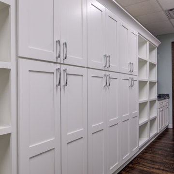
The internal storage corridor received a full wall of custom floor-to-ceiling white shaker cabinetry with chrome pulls, flanked by open shelving sections for accessible display and storage. Clean, crisp, and highly organized — this space proves that even a purely functional corridor can be architectural and refined.
The Break Room & Kitchenette
The staff break room was updated with white shaker cabinetry, light speckled granite countertops, stainless appliances — including a French door refrigerator, dishwasher, and over-counter microwave — and warm sage green walls that bring a restful, refreshing energy to the space. Dark hardwood luxury vinyl plank flooring runs throughout the room, warming the look considerably. A round walnut dining table with upholstered chairs creates a proper gathering space for the team, and framed landscape oil art in an ornate gold frame adds a touch of collected character to the room.
Reception & Corridor Details
The reception and corridor spaces were treated with deep navy blue paint — bold, sophisticated, and unexpected in a commercial setting. A large abstract landscape painting in warm blues, blush, and gold hangs in a gilded frame against the navy wall, making an immediate statement. A brass and lucite table lamp sits on a floating brass-trimmed shelf alongside a sculptural art object, creating a vignette that communicates creativity and intentionality from the moment clients arrive.
The result is a professional environment that communicates confidence, taste, and care — one that clients will remember long after their visit, and one that staff will genuinely enjoy working in every day.


 Klopf Architecture
Malibu Glass Box House by Klopf Architecture
Following the devastating Woolsey Fire of 2018, the site in Malibu offered a unique opportunity to rebuild not just a home, but a new architectural composition that highlighted the property’s potential while navigating strict fire-rebuild codes in the area. Designed by Klopf Architecture, this project embraced a set of limitations and translated them into an architectural asset.
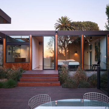
The city’s fire-rebuild process required the new structure to remain close to the original footprint, size and bulk, a constraint that ultimately clarified the architectural direction. Perched near the front of a long, narrow lot, the new home frames and overlooks a private, park-like rear expanse, an uncommon luxury especially in this part of Malibu .
Without a fixed program, the design process allowed for a different kind of creative focus allowing Klopf Architecture the opportunity to explore how a modernist home could best respond to this site. The team approached the project not with a list of requirements, but with a question: How might a modernist live here? What spatial qualities would inspire calm, connection, and a sense of wonder in this setting? The process became less about problem-solving and more about architectural storytelling—letting the site, the light, and the principles of modern design guide the form and flow of the home.
The response emerged in the form of a glass-box pavilion, an open, Mid-Century Modern inspired living, dining, and kitchen space that floats at the edge of the property’s natural descent. Connected to the more enclosed, private areas of the home by a glass-walled hallway, the living pavilion becomes a distinct centerpiece of the design. It opens on all four sides to the landscape with decks and patios on the flanks, an internal garden and water feature to the north, and a dramatic unguarded view of the expansive backyard and ocean horizon to the south.
Because of the mandated footprint, careful planning was required to ensure every space could still engage with light, landscape, or both. Strategic voids in the form of atriums and courtyards allow daylight to filter deep into the home’s core, while offering moments of surprise and retreat. These design gestures allow natural light to filter deep into the interior, creating a sense of brightness and openness throughout the day. At the same time, they expand the perceptual boundaries between inside and out, making the home feel more expansive while anchoring its connection to the surrounding landscape.
The siting of the house is what gives it its unique character. Rather than receding into the backyard like the neighboring homes, the house holds a slight prominence. From the central living pavilion, stepping down into the landscape feels more like entering a secluded park where a separate existing accessory structure, trail, and recreational areas await. The home’s modest street presence gives way to this unfolding drama of space, view, and nature.
Fire-resilient materials and assemblies are integrated seamlessly throughout including triple-pane glazing, under-slab and roof insulation, and locally sourced fire-rated cladding ensure the house not only meets Calfornia’s rigorous wildland-urban interface (WUI) standards, but feels effortlessly aligned with them. While technical decisions like fire-hardening and mechanical systems presented some construction challenges, particularly around the cantilevered glass box, the team found a functional compromise that preserved the integrity of the design.
Inside, a restrained palette and exposed post and beam design celebrate the ethos of mid-century modernism. A central circulation spine extends from the entry to the rear glass wall, offering a continuous visual link from street to ocean. Spaces such as the library and office, though more intimate in scale, are never cut off from nature as each opens to its own unique courtyard or garden view.
Though born out of a strict regulatory framework and developed without a specific client, the rebuild design unfolded with remarkable clarity. Grounded in site logic, refined by limitations and an emphasis on timeless spatial relationships – light, proportion, and a strong connection to nature, the resulting design feels both effortless and uplifting. The home lives lightly on the land, opens generously to its surroundings, and strikes a careful balance between privacy, openness, and calm. For Klopf Architecture, it stands as a compelling case study in how site, code, and circumstantial constraints can inspire enduring, modernist architecture. With years of experience reimagining mid-century modern design for how people live today, the firm took the project’s limitations as an opportunity. The result is a home shaped by open, flowing spaces, strong indoor-outdoor connections, and a calm, clear sense of structure. It’s a good reminder that even with strict constraints, there’s still room for architecture to breathe—and for modernism to keep moving forward.
Klopf Architecture project team: Geoff Campen, John Klopf, AIA, and Sherry Tan
Structural Engineer: ZFA
Contractor: Maison D’Artiste
Photography: ©2025 Mariko Reed
Year Completed: 2023
 Kreativ Kitchens
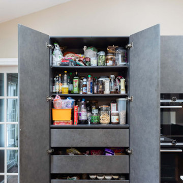
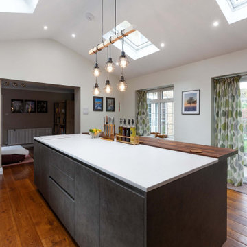
This modern kitchen in Leeds was designed to combine innovative layout planning with a rich mix of materials, resulting in a space that feels both striking and highly functional.
The cabinetry is from the X-Line range, finished in a combination of Fluted Walnut Veneer and Artstone Laminate, creating depth and visual interest throughout the space. Wall units in fluted walnut reinforce this texture, adding a distinctive architectural element.
Worktops are in 24mm Corian, offering a smooth, seamless surface that complements the kitchen's clean lines while providing durability for everyday use.
Feature elements include a bespoke pantry, designed to maximise storage while keeping the layout streamlined, and a matt mirror splashback that softly reflects light, enhancing the sense of space without overpowering the design.
Appliances are by Siemens, paired with a BORA hob that integrates extraction directly into the cooking surface, maintaining the uncluttered aesthetic and improving functionality.
The result is a kitchen that brings together a variety of materials and finishes in a considered way, delivering both visual impact and practical performance for modern living.
 OakWood Designers & Builders
When local business owners with four kids and an extended family decided to build their custom home with OakWood, they knew what they wanted – a luxurious yet functional space.
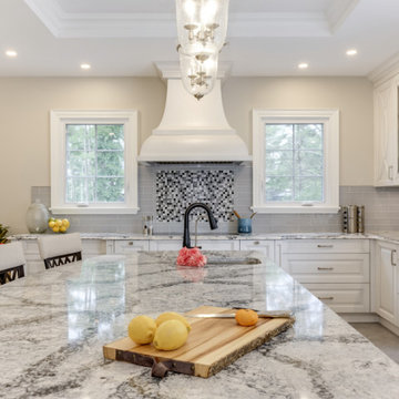
This kitchen was designed with the intention of considering the fast-paced lives the family members while also looking to provide a space where everyone can interact and spend time together. Not only was this spacious kitchen inspired by a love of cooking, it was configured to easily facilitate informal dining for the whole large family. A large window behind the main sink brings natural light into the space but also provides a nice view into the backyard so mom can be in the kitchen and see the kids in the backyard.
The kitchen was also designed with a variety of entry points; clients can access the kitchen from their sunroom, mudroom, formal dining area and more. As a result, the space is a central space for the family. Directly adjacent to this space is the informal dining area and a desk with a computer which allows the clients to work while still being present for the comings and goings of everyone in this family space.
Although two colours and textures are used for the cabinetry, there is harmony created between them as a result of the raised panel being used. The cloudy glass backsplash not only breaks up the light toned cabinetry but also adds a glossy finish that contrasts with the smooth wood finishes. Seagrove quartz is present on both the counter and island. This highly detailed quartz adds a great deal of texture and also helps to guide the viewer’s eye around the space. Pendant lights placed above the island help to draw attention toward the center of the space while also mimicking the glass seen in the cabinetry.
This project was a finalist for the GOHBA Awards in the category Traditional Custom Kitchen and was also featured in the Fall issue of LUXE Magazine Ottawa. You can read the full story here: https://console.virtualpaper.com/luxe/luxe-fall-2020/#42/
 Klopf Architecture
Malibu Glass Box House by Klopf Architecture
Following the devastating Woolsey Fire of 2018, the site in Malibu offered a unique opportunity to rebuild not just a home, but a new architectural composition that highlighted the property’s potential while navigating strict fire-rebuild codes in the area. Designed by Klopf Architecture, this project embraced a set of limitations and translated them into an architectural asset.
The city’s fire-rebuild process required the new structure to remain close to the original footprint, size and bulk, a constraint that ultimately clarified the architectural direction. Perched near the front of a long, narrow lot, the new home frames and overlooks a private, park-like rear expanse, an uncommon luxury especially in this part of Malibu .
Without a fixed program, the design process allowed for a different kind of creative focus allowing Klopf Architecture the opportunity to explore how a modernist home could best respond to this site. The team approached the project not with a list of requirements, but with a question: How might a modernist live here? What spatial qualities would inspire calm, connection, and a sense of wonder in this setting? The process became less about problem-solving and more about architectural storytelling—letting the site, the light, and the principles of modern design guide the form and flow of the home.
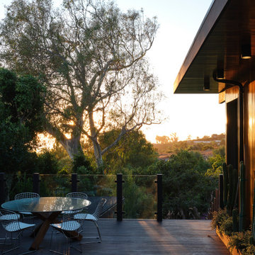
The response emerged in the form of a glass-box pavilion, an open, Mid-Century Modern inspired living, dining, and kitchen space that floats at the edge of the property’s natural descent. Connected to the more enclosed, private areas of the home by a glass-walled hallway, the living pavilion becomes a distinct centerpiece of the design. It opens on all four sides to the landscape with decks and patios on the flanks, an internal garden and water feature to the north, and a dramatic unguarded view of the expansive backyard and ocean horizon to the south.
Because of the mandated footprint, careful planning was required to ensure every space could still engage with light, landscape, or both. Strategic voids in the form of atriums and courtyards allow daylight to filter deep into the home’s core, while offering moments of surprise and retreat. These design gestures allow natural light to filter deep into the interior, creating a sense of brightness and openness throughout the day. At the same time, they expand the perceptual boundaries between inside and out, making the home feel more expansive while anchoring its connection to the surrounding landscape.
The siting of the house is what gives it its unique character. Rather than receding into the backyard like the neighboring homes, the house holds a slight prominence. From the central living pavilion, stepping down into the landscape feels more like entering a secluded park where a separate existing accessory structure, trail, and recreational areas await. The home’s modest street presence gives way to this unfolding drama of space, view, and nature.
Fire-resilient materials and assemblies are integrated seamlessly throughout including triple-pane glazing, under-slab and roof insulation, and locally sourced fire-rated cladding ensure the house not only meets Calfornia’s rigorous wildland-urban interface (WUI) standards, but feels effortlessly aligned with them. While technical decisions like fire-hardening and mechanical systems presented some construction challenges, particularly around the cantilevered glass box, the team found a functional compromise that preserved the integrity of the design.
Inside, a restrained palette and exposed post and beam design celebrate the ethos of mid-century modernism. A central circulation spine extends from the entry to the rear glass wall, offering a continuous visual link from street to ocean. Spaces such as the library and office, though more intimate in scale, are never cut off from nature as each opens to its own unique courtyard or garden view.
Though born out of a strict regulatory framework and developed without a specific client, the rebuild design unfolded with remarkable clarity. Grounded in site logic, refined by limitations and an emphasis on timeless spatial relationships – light, proportion, and a strong connection to nature, the resulting design feels both effortless and uplifting. The home lives lightly on the land, opens generously to its surroundings, and strikes a careful balance between privacy, openness, and calm. For Klopf Architecture, it stands as a compelling case study in how site, code, and circumstantial constraints can inspire enduring, modernist architecture. With years of experience reimagining mid-century modern design for how people live today, the firm took the project’s limitations as an opportunity. The result is a home shaped by open, flowing spaces, strong indoor-outdoor connections, and a calm, clear sense of structure. It’s a good reminder that even with strict constraints, there’s still room for architecture to breathe—and for modernism to keep moving forward.
Klopf Architecture project team: Geoff Campen, John Klopf, AIA, and Sherry Tan
Structural Engineer: ZFA
Contractor: Maison D’Artiste
Photography: ©2025 Mariko Reed
Year Completed: 2023
 Vetter Architects
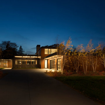
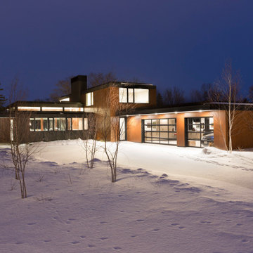
The mHouse is the brainchild of a magazine publisher intent on changing the way houses are constructed and how their owners relate to them. Named after one of the company’s website, the mHouse serves as a built manifesto of innovative panel materials such as rice hull composites and thermally fused laminate – becoming a case study house for over 30 international material suppliers.
The design challenge was quite clear – how to use a series of new materials unproven in the US building trades to create a beautiful house that meets the unique needs of today’s family. The result is a building that is highly rational in its construction systems, while encouraging social gathering.
The mHouse serves as a direct counterpoint to the typical suburban builder home – creating unique outdoor spaces in place of the typical open lawn, a variety of different views in contrast to one major view, and expressing a confidence in the future over nostalgia for the past.
Through a series of layers and nodes, the landscape grounds the house and heightens the views from inside, using indigenous plantings applied in non-traditional ways, the landscape mirrors the house in rethinking the suburban home.
The mHouse strikes a balance between proven methods and innovative solutions, resulting in one version of what is possible with these materials and setting the stage for future iterations and new possibilities.
Size
Total Finished Area: 3,405 sf
Completion Date
September 2015
Services
Architecture
Interior Design Consultant: Amy Carman Design
Landscape Consultant: Texten
 Aardvark Architecture
Lauren's property backs right up to a large retail building and parking lot with tall looming parking lot lights flooding her rear yard with far too much harsh night lighting. Based on this site context (and her desire to allow her feline friends outdoors while still keeping them safely contained) it was desirable to design a courtyard home that focuses on inward views rather than focusing on the connection just to the rear yard.
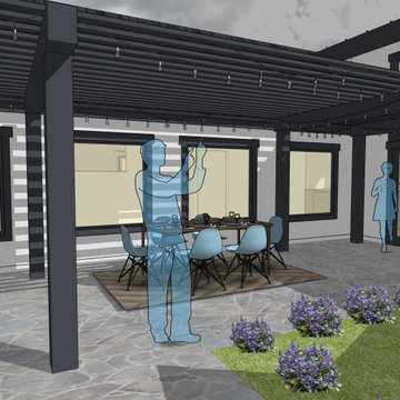
The courtyard is fully appreciated on all four sides. The foyer has a direct connection that immediately ushers guests into the large courtyard; the vaulted great room enjoys views into both the courtyard and the backyard area; the vaulted master suite also opens directly onto both outdoor spaces. And finally, the hallway that leads to the home office, home gym, and guest suite is lined with full height windows to flood that main circulation route with both light and the exciting shadows of the slatted pergola just outside.
Lauren's stylistic preferences are interesting and eclectic. Based on her well-organized inspiration boards, we arrived at a mix of roof shapes including steeply pitched gable roofs, as well as both concave and convex curved roof sections. Combined with a varied mix of traditional exterior finishes such as siding, shingles, and stucco, the result is a home with a look and feel that that is uniquely hers.

 Kreativ Kitchens
This modern kitchen in Leeds was designed to combine innovative layout planning with a rich mix of materials, resulting in a space that feels both striking and highly functional.
The cabinetry is from the X-Line range, finished in a combination of Fluted Walnut Veneer and Artstone Laminate, creating depth and visual interest throughout the space. Wall units in fluted walnut reinforce this texture, adding a distinctive architectural element.
Worktops are in 24mm Corian, offering a smooth, seamless surface that complements the kitchen's clean lines while providing durability for everyday use.
Feature elements include a bespoke pantry, designed to maximise storage while keeping the layout streamlined, and a matt mirror splashback that softly reflects light, enhancing the sense of space without overpowering the design.
Appliances are by Siemens, paired with a BORA hob that integrates extraction directly into the cooking surface, maintaining the uncluttered aesthetic and improving functionality.
The result is a kitchen that brings together a variety of materials and finishes in a considered way, delivering both visual impact and practical performance for modern living.
 Vetter Architects
The mHouse is the brainchild of a magazine publisher intent on changing the way houses are constructed and how their owners relate to them. Named after one of the company’s website, the mHouse serves as a built manifesto of innovative panel materials such as rice hull composites and thermally fused laminate – becoming a case study house for over 30 international material suppliers.
The design challenge was quite clear – how to use a series of new materials unproven in the US building trades to create a beautiful house that meets the unique needs of today’s family. The result is a building that is highly rational in its construction systems, while encouraging social gathering.
The mHouse serves as a direct counterpoint to the typical suburban builder home – creating unique outdoor spaces in place of the typical open lawn, a variety of different views in contrast to one major view, and expressing a confidence in the future over nostalgia for the past.
Through a series of layers and nodes, the landscape grounds the house and heightens the views from inside, using indigenous plantings applied in non-traditional ways, the landscape mirrors the house in rethinking the suburban home.
The mHouse strikes a balance between proven methods and innovative solutions, resulting in one version of what is possible with these materials and setting the stage for future iterations and new possibilities.
Size
Total Finished Area: 3,405 sf
Completion Date
September 2015
Services
Architecture
Interior Design Consultant: Amy Carman Design
Landscape Consultant: Texten
 Gabriela Postole
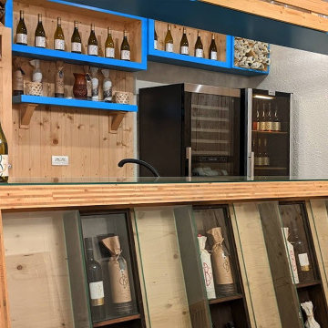
The BG winery was the subject of a renovation in order to improve for the needs of its visitors.
The famous and delicious wine presentations and tastings are the main attractions at this fabulous place. Therefore, we placed the bar in front of the entrance to be directly seen when entering. As a decorative element it is featuring displays of soils.
Because the groups of visitor vary in size, but also because the space is used as an exquisite breakfast area for the guests of the nearby inn, we came up with a new idea: The division of the space by a glass wall. Consequently, this results in an event space or a private dining room. The convertible approach adds flexibility and dynamic to the whole place.
Furthermore, we enabled the large hallway of the winery going towards the restrooms to be used as a wardrobe for larger gatherings. Meanwhile, the additional room serves as a VIP lounge for only the finest guests.
The design team took everything into consideration while preparing layouts, developing individual objects and finetuning details: clients’ needs, the nice location and the usage of the attractive space. We designed in detail all furniture elements, while using reclaimed wood from old wine barrels for table tops and accent walls. In this regard the winery as a location of joy and community feels and breathes authentic. The whole interior design is rustic with fine touches of modern, resulting in a suiting atmosphere.
As for the color scheme, we proposed a pastel blue as a contrast to the reclaimed wood. Touches of color in the Patchwork tiles around the bar area and a mixture of hand-made lamps mix to roud up the rustic vibe.
Share your ideas for your location with us in a brief introductory call, free of charge.
 SM Design
St. Andrews Project — Primary Bathroom & Spa Retreat
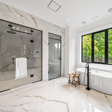
This St. Andrews primary bathroom is conceived as a private spa retreat, where material continuity, sculptural forms, and architectural restraint create a sense of understated luxury. The design intentionally avoids visual clutter, allowing the quality of the materials and precision of the detailing to define the space.
The room is anchored by a dramatic marble-look stone that extends continuously across the shower enclosure and floor, creating a seamless visual envelope. The expressive veining introduces movement and natural variation, transforming what could otherwise be a minimal white bathroom into a richly layered composition. Carrying the stone through multiple surfaces also gives the room a sense of scale and architectural cohesion.
The freestanding bathtub is treated as a sculptural object rather than simply a functional fixture. Its softly curved silhouette and vertically fluted exterior introduce an organic counterpoint to the linear geometry of the surrounding architecture. Positioned directly beneath the large black-framed window, the tub becomes a quiet focal point while taking advantage of abundant natural light and views toward the greenery beyond.
Black-framed glass creates another important layer of contrast. The expansive shower enclosure and adjacent glazed opening establish a crisp graphic framework against the pale stone, while black plumbing fixtures and hardware reinforce the same architectural language. This repeated use of black creates visual continuity without overwhelming the light palette.
The oversized window is particularly important to the atmosphere of the room. Instead of treating the bathroom as an enclosed, highly private environment, the design establishes a connection to nature, allowing daylight and greenery to become part of the experience. The result is a space that feels bright, open, and restorative.
A restrained wooden stool introduces warmth and an organic material note against the stone and glass. Its natural finish prevents the monochromatic palette from feeling overly clinical, while the simple form complements the sculptural bathtub.
The overall design is based on material continuity, contrast, and calm geometry. Veined stone provides movement, fluted surfaces provide texture, black metal provides definition, and natural wood introduces warmth. The result is a contemporary luxury bathroom that feels architectural, serene, and highly considered, more like a private wellness retreat than a conventional ensuite.

 Kreativ Kitchens
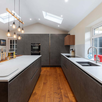
This modern kitchen in Leeds was designed to combine innovative layout planning with a rich mix of materials, resulting in a space that feels both striking and highly functional.
The cabinetry is from the X-Line range, finished in a combination of Fluted Walnut Veneer and Artstone Laminate, creating depth and visual interest throughout the space. Wall units in fluted walnut reinforce this texture, adding a distinctive architectural element.
Worktops are in 24mm Corian, offering a smooth, seamless surface that complements the kitchen's clean lines while providing durability for everyday use.
Feature elements include a bespoke pantry, designed to maximise storage while keeping the layout streamlined, and a matt mirror splashback that softly reflects light, enhancing the sense of space without overpowering the design.
Appliances are by Siemens, paired with a BORA hob that integrates extraction directly into the cooking surface, maintaining the uncluttered aesthetic and improving functionality.
The result is a kitchen that brings together a variety of materials and finishes in a considered way, delivering both visual impact and practical performance for modern living.
 Gabriela Postole
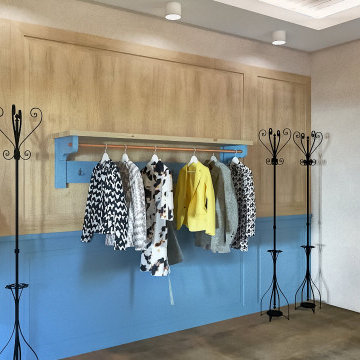
The BG winery was the subject of a renovation in order to improve for the needs of its visitors.
The famous and delicious wine presentations and tastings are the main attractions at this fabulous place. Therefore, we placed the bar in front of the entrance to be directly seen when entering. As a decorative element it is featuring displays of soils.
Because the groups of visitor vary in size, but also because the space is used as an exquisite breakfast area for the guests of the nearby inn, we came up with a new idea: The division of the space by a glass wall. Consequently, this results in an event space or a private dining room. The convertible approach adds flexibility and dynamic to the whole place.
Furthermore, we enabled the large hallway of the winery going towards the restrooms to be used as a wardrobe for larger gatherings. Meanwhile, the additional room serves as a VIP lounge for only the finest guests.
The design team took everything into consideration while preparing layouts, developing individual objects and finetuning details: clients’ needs, the nice location and the usage of the attractive space. We designed in detail all furniture elements, while using reclaimed wood from old wine barrels for table tops and accent walls. In this regard the winery as a location of joy and community feels and breathes authentic. The whole interior design is rustic with fine touches of modern, resulting in a suiting atmosphere.
As for the color scheme, we proposed a pastel blue as a contrast to the reclaimed wood. Touches of color in the Patchwork tiles around the bar area and a mixture of hand-made lamps mix to roud up the rustic vibe.
Share your ideas for your location with us in a brief introductory call, free of charge.
 Klassen Remodeling & Design, Inc.
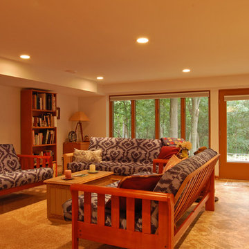
Example of a mid-sized 1960s underground ceramic tile basement design in Milwaukee with beige walls
47