
Search results for "Disconnections" in Home Design Ideas

 Klopf Architecture
Joseph Eichler developed his moderately priced houses for the mass-market starting in 1949. His homes were designed using affordable materials and simple construction techniques. Nearly 70 years later these homes are in need of updating and remodeling an Eichler home today can become an imposing and costly project if you’re not careful. For this project the clients, who had undergone several previous house renovations, were determined to stick with an established budget from the beginning. Klopf Architecture helped them modernize their Eichler with a premium appearance on a reasonable budget.
The clients challenged the Klopf team to create a design that had a high-end feel and nicely done while adhering to their budget. That meant not all of the initial project scope could be built. Like many other Eichler homes, the original floor plan did not meet the family’s needs leaving them feeling disconnected from one room to another. While an early goal was to expand the house into a carport and create a larger garage, it did not survive the contractor pricing phase of the project.
The goals that did survive through to the end of the project included blurring some of the boundaries and opening up some of the spaces, making them more functional and creating a smoother flow in the house. The Klopf team joined the former separate kitchen and formal living room into one large space and shift the dining room where it is now connected to the kitchen. Klopf swapped the family room to the front alongside the living room, so the spaces feel more cohesive and are now better suited for family activities. The functional layout of the master bathroom was changed to include a large, curbless shower.
Installing a complete IKEA kitchen including cabinets, countertops, appliances, light fixtures, and furnishings was key to staying within budget. Bath fixtures in this house are also exclusively IKEA. Klopf Architecture has designed many homes using IKEA products, which are quite compatible offering an affordable, contemporary take on Eichler homes. The clients saved additional money from the simplicity and availability of IKEA products and by orchestrating the orders and purchases themselves. Following each construction meeting, the clients would make a run to IKEA and purchase items, pick up needed spare parts, and bring them back right away to stay ahead of the contractor’s schedule and minimize the chance of delays and bottlenecks.
Klopf balanced material selections by retaining some of the original woodwork and simply refinishing the mahogany paneling. They were able to retain the original windows and sliding doors which were still in good shape, avoiding some of the most costly replacement expenses. Additionally interior doors were simply refinished and the exterior siding cleaned up and repainted. Formerly dark interiors are now illuminated with new slimmer semi-recessed lighting eliminating the need for costly roof work.
Attention to design details allowed the Klopf team to ensure the house ended up with a high quality feel. Key visual elements were strictly aligned and Klopf worked with the clients to select a unified materials palette throughout the spaces so the house flows seamlessly together. Aligning the tile layout with the trusses and keeping it level with the concrete slab outside allowed them to achieve a level of quality that may otherwise be missed.
The clients were able to keep their budget on track by determining clear goals and making critical decisions upfront, choosing materials and furnishings wisely, working with the right design and construction teams in place and to a large part, their willingness to participate throughout the process. In the end the clients were much happier with their reconfigured Eichler home and Klopf Architecture managed to keep their remodeling costs to about $325/sf – a good amount below the average Bay Area Eichler remodel.
Project Team: John Klopf, Angela Todorova, Sherry Tan
Contractor: Keycon Construction
Structural Engineer: Sezen & Moon
Photography: Sabrina Huang
Year Completed: 2020

 Ehrlich Yanai Rhee Chaney Architects
The ground floor volumes wrapped in an elongated hand-fired brick, emphasizing the horizontality of the architecture that lays solidly on the land.
(Photography by: Matthew Millman)
 Klopf Architecture
Joseph Eichler developed his moderately priced houses for the mass-market starting in 1949. His homes were designed using affordable materials and simple construction techniques. Nearly 70 years later these homes are in need of updating and remodeling an Eichler home today can become an imposing and costly project if you’re not careful. For this project the clients, who had undergone several previous house renovations, were determined to stick with an established budget from the beginning. Klopf Architecture helped them modernize their Eichler with a premium appearance on a reasonable budget.
The clients challenged the Klopf team to create a design that had a high-end feel and nicely done while adhering to their budget. That meant not all of the initial project scope could be built. Like many other Eichler homes, the original floor plan did not meet the family’s needs leaving them feeling disconnected from one room to another. While an early goal was to expand the house into a carport and create a larger garage, it did not survive the contractor pricing phase of the project.
The goals that did survive through to the end of the project included blurring some of the boundaries and opening up some of the spaces, making them more functional and creating a smoother flow in the house. The Klopf team joined the former separate kitchen and formal living room into one large space and shift the dining room where it is now connected to the kitchen. Klopf swapped the family room to the front alongside the living room, so the spaces feel more cohesive and are now better suited for family activities. The functional layout of the master bathroom was changed to include a large, curbless shower.
Installing a complete IKEA kitchen including cabinets, countertops, appliances, light fixtures, and furnishings was key to staying within budget. Bath fixtures in this house are also exclusively IKEA. Klopf Architecture has designed many homes using IKEA products, which are quite compatible offering an affordable, contemporary take on Eichler homes. The clients saved additional money from the simplicity and availability of IKEA products and by orchestrating the orders and purchases themselves. Following each construction meeting, the clients would make a run to IKEA and purchase items, pick up needed spare parts, and bring them back right away to stay ahead of the contractor’s schedule and minimize the chance of delays and bottlenecks.
Klopf balanced material selections by retaining some of the original woodwork and simply refinishing the mahogany paneling. They were able to retain the original windows and sliding doors which were still in good shape, avoiding some of the most costly replacement expenses. Additionally interior doors were simply refinished and the exterior siding cleaned up and repainted. Formerly dark interiors are now illuminated with new slimmer semi-recessed lighting eliminating the need for costly roof work.
Attention to design details allowed the Klopf team to ensure the house ended up with a high quality feel. Key visual elements were strictly aligned and Klopf worked with the clients to select a unified materials palette throughout the spaces so the house flows seamlessly together. Aligning the tile layout with the trusses and keeping it level with the concrete slab outside allowed them to achieve a level of quality that may otherwise be missed.
The clients were able to keep their budget on track by determining clear goals and making critical decisions upfront, choosing materials and furnishings wisely, working with the right design and construction teams in place and to a large part, their willingness to participate throughout the process. In the end the clients were much happier with their reconfigured Eichler home and Klopf Architecture managed to keep their remodeling costs to about $325/sf – a good amount below the average Bay Area Eichler remodel.
Project Team: John Klopf, Angela Todorova, Sherry Tan
Contractor: Keycon Construction
Structural Engineer: Sezen & Moon
Photography: Sabrina Huang
Year Completed: 2020
Find the right local pro for your project
 Klopf Architecture
Joseph Eichler developed his moderately priced houses for the mass-market starting in 1949. His homes were designed using affordable materials and simple construction techniques. Nearly 70 years later these homes are in need of updating and remodeling an Eichler home today can become an imposing and costly project if you’re not careful. For this project the clients, who had undergone several previous house renovations, were determined to stick with an established budget from the beginning. Klopf Architecture helped them modernize their Eichler with a premium appearance on a reasonable budget.
The clients challenged the Klopf team to create a design that had a high-end feel and nicely done while adhering to their budget. That meant not all of the initial project scope could be built. Like many other Eichler homes, the original floor plan did not meet the family’s needs leaving them feeling disconnected from one room to another. While an early goal was to expand the house into a carport and create a larger garage, it did not survive the contractor pricing phase of the project.
The goals that did survive through to the end of the project included blurring some of the boundaries and opening up some of the spaces, making them more functional and creating a smoother flow in the house. The Klopf team joined the former separate kitchen and formal living room into one large space and shift the dining room where it is now connected to the kitchen. Klopf swapped the family room to the front alongside the living room, so the spaces feel more cohesive and are now better suited for family activities. The functional layout of the master bathroom was changed to include a large, curbless shower.
Installing a complete IKEA kitchen including cabinets, countertops, appliances, light fixtures, and furnishings was key to staying within budget. Bath fixtures in this house are also exclusively IKEA. Klopf Architecture has designed many homes using IKEA products, which are quite compatible offering an affordable, contemporary take on Eichler homes. The clients saved additional money from the simplicity and availability of IKEA products and by orchestrating the orders and purchases themselves. Following each construction meeting, the clients would make a run to IKEA and purchase items, pick up needed spare parts, and bring them back right away to stay ahead of the contractor’s schedule and minimize the chance of delays and bottlenecks.
Klopf balanced material selections by retaining some of the original woodwork and simply refinishing the mahogany paneling. They were able to retain the original windows and sliding doors which were still in good shape, avoiding some of the most costly replacement expenses. Additionally interior doors were simply refinished and the exterior siding cleaned up and repainted. Formerly dark interiors are now illuminated with new slimmer semi-recessed lighting eliminating the need for costly roof work.
Attention to design details allowed the Klopf team to ensure the house ended up with a high quality feel. Key visual elements were strictly aligned and Klopf worked with the clients to select a unified materials palette throughout the spaces so the house flows seamlessly together. Aligning the tile layout with the trusses and keeping it level with the concrete slab outside allowed them to achieve a level of quality that may otherwise be missed.
The clients were able to keep their budget on track by determining clear goals and making critical decisions upfront, choosing materials and furnishings wisely, working with the right design and construction teams in place and to a large part, their willingness to participate throughout the process. In the end the clients were much happier with their reconfigured Eichler home and Klopf Architecture managed to keep their remodeling costs to about $325/sf – a good amount below the average Bay Area Eichler remodel.
Project Team: John Klopf, Angela Todorova, Sherry Tan
Contractor: Keycon Construction
Structural Engineer: Sezen & Moon
Photography: Sabrina Huang
Year Completed: 2020
 Klopf Architecture
Joseph Eichler developed his moderately priced houses for the mass-market starting in 1949. His homes were designed using affordable materials and simple construction techniques. Nearly 70 years later these homes are in need of updating and remodeling an Eichler home today can become an imposing and costly project if you’re not careful. For this project the clients, who had undergone several previous house renovations, were determined to stick with an established budget from the beginning. Klopf Architecture helped them modernize their Eichler with a premium appearance on a reasonable budget.
The clients challenged the Klopf team to create a design that had a high-end feel and nicely done while adhering to their budget. That meant not all of the initial project scope could be built. Like many other Eichler homes, the original floor plan did not meet the family’s needs leaving them feeling disconnected from one room to another. While an early goal was to expand the house into a carport and create a larger garage, it did not survive the contractor pricing phase of the project.
The goals that did survive through to the end of the project included blurring some of the boundaries and opening up some of the spaces, making them more functional and creating a smoother flow in the house. The Klopf team joined the former separate kitchen and formal living room into one large space and shift the dining room where it is now connected to the kitchen. Klopf swapped the family room to the front alongside the living room, so the spaces feel more cohesive and are now better suited for family activities. The functional layout of the master bathroom was changed to include a large, curbless shower.
Installing a complete IKEA kitchen including cabinets, countertops, appliances, light fixtures, and furnishings was key to staying within budget. Bath fixtures in this house are also exclusively IKEA. Klopf Architecture has designed many homes using IKEA products, which are quite compatible offering an affordable, contemporary take on Eichler homes. The clients saved additional money from the simplicity and availability of IKEA products and by orchestrating the orders and purchases themselves. Following each construction meeting, the clients would make a run to IKEA and purchase items, pick up needed spare parts, and bring them back right away to stay ahead of the contractor’s schedule and minimize the chance of delays and bottlenecks.
Klopf balanced material selections by retaining some of the original woodwork and simply refinishing the mahogany paneling. They were able to retain the original windows and sliding doors which were still in good shape, avoiding some of the most costly replacement expenses. Additionally interior doors were simply refinished and the exterior siding cleaned up and repainted. Formerly dark interiors are now illuminated with new slimmer semi-recessed lighting eliminating the need for costly roof work.
Attention to design details allowed the Klopf team to ensure the house ended up with a high quality feel. Key visual elements were strictly aligned and Klopf worked with the clients to select a unified materials palette throughout the spaces so the house flows seamlessly together. Aligning the tile layout with the trusses and keeping it level with the concrete slab outside allowed them to achieve a level of quality that may otherwise be missed.
The clients were able to keep their budget on track by determining clear goals and making critical decisions upfront, choosing materials and furnishings wisely, working with the right design and construction teams in place and to a large part, their willingness to participate throughout the process. In the end the clients were much happier with their reconfigured Eichler home and Klopf Architecture managed to keep their remodeling costs to about $325/sf – a good amount below the average Bay Area Eichler remodel.
Project Team: John Klopf, Angela Todorova, Sherry Tan
Contractor: Keycon Construction
Structural Engineer: Sezen & Moon
Photography: Sabrina Huang
Year Completed: 2020
 Klopf Architecture
Joseph Eichler developed his moderately priced houses for the mass-market starting in 1949. His homes were designed using affordable materials and simple construction techniques. Nearly 70 years later these homes are in need of updating and remodeling an Eichler home today can become an imposing and costly project if you’re not careful. For this project the clients, who had undergone several previous house renovations, were determined to stick with an established budget from the beginning. Klopf Architecture helped them modernize their Eichler with a premium appearance on a reasonable budget.
The clients challenged the Klopf team to create a design that had a high-end feel and nicely done while adhering to their budget. That meant not all of the initial project scope could be built. Like many other Eichler homes, the original floor plan did not meet the family’s needs leaving them feeling disconnected from one room to another. While an early goal was to expand the house into a carport and create a larger garage, it did not survive the contractor pricing phase of the project.
The goals that did survive through to the end of the project included blurring some of the boundaries and opening up some of the spaces, making them more functional and creating a smoother flow in the house. The Klopf team joined the former separate kitchen and formal living room into one large space and shift the dining room where it is now connected to the kitchen. Klopf swapped the family room to the front alongside the living room, so the spaces feel more cohesive and are now better suited for family activities. The functional layout of the master bathroom was changed to include a large, curbless shower.
Installing a complete IKEA kitchen including cabinets, countertops, appliances, light fixtures, and furnishings was key to staying within budget. Bath fixtures in this house are also exclusively IKEA. Klopf Architecture has designed many homes using IKEA products, which are quite compatible offering an affordable, contemporary take on Eichler homes. The clients saved additional money from the simplicity and availability of IKEA products and by orchestrating the orders and purchases themselves. Following each construction meeting, the clients would make a run to IKEA and purchase items, pick up needed spare parts, and bring them back right away to stay ahead of the contractor’s schedule and minimize the chance of delays and bottlenecks.
Klopf balanced material selections by retaining some of the original woodwork and simply refinishing the mahogany paneling. They were able to retain the original windows and sliding doors which were still in good shape, avoiding some of the most costly replacement expenses. Additionally interior doors were simply refinished and the exterior siding cleaned up and repainted. Formerly dark interiors are now illuminated with new slimmer semi-recessed lighting eliminating the need for costly roof work.
Attention to design details allowed the Klopf team to ensure the house ended up with a high quality feel. Key visual elements were strictly aligned and Klopf worked with the clients to select a unified materials palette throughout the spaces so the house flows seamlessly together. Aligning the tile layout with the trusses and keeping it level with the concrete slab outside allowed them to achieve a level of quality that may otherwise be missed.
The clients were able to keep their budget on track by determining clear goals and making critical decisions upfront, choosing materials and furnishings wisely, working with the right design and construction teams in place and to a large part, their willingness to participate throughout the process. In the end the clients were much happier with their reconfigured Eichler home and Klopf Architecture managed to keep their remodeling costs to about $325/sf – a good amount below the average Bay Area Eichler remodel.
Project Team: John Klopf, Angela Todorova, Sherry Tan
Contractor: Keycon Construction
Structural Engineer: Sezen & Moon
Photography: Sabrina Huang
Year Completed: 2020
 Fabco Sanctuary
The architect and designer Guy Derwent was approached by his client with a clear and compelling brief: to completely transform a grand Victorian terrace house they were planning to renovate. The client envisioned something far beyond a standard renovation – this was to be a bold and dramatic reimagining of a family home that could grow with them over time.
With the property having remained largely untouched for more than fifty years, the architects saw an opportunity to unlock its potential and deliver a contemporary design that would contrast beautifully with its Victorian heritage.
The existing layout consisted of a series of small, disconnected rooms to the rear of the house. To respond to the client’s need for openness and flexibility, the architect proposed a radical restructuring of the ground floor:
The rear rooms were completely removed
Suspended timber floors were lowered by up to two metres to align with the garden
Two bold extensions were added
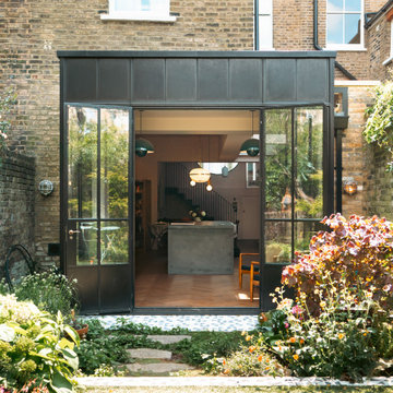
The first extension filled in the side return with a London stock brick facade and a glazed roof, while the second – a striking black steel and glass pavilion was glazed on three sides and placed along the garden elevation.
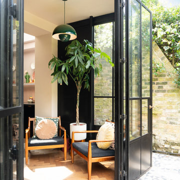
This new pavilion redefined the building’s relationship with the garden. Its steel-framed glazing created a seamless dialogue between interior and exterior, offering a sense of immersion in the surrounding landscape.
At the heart of the plan sits a dramatic, five-metre-tall dining space that acts as a transition from the original entrance hall into the new addition. A large, circular cast-glass window, framed in steel, provides a visual and spatial link between old and new, allowing light and movement to travel through the depth of the home.
Throughout the project, a series of black metal elements were introduced as sculptural interventions – each marking moments of transformation within the house. These included the bespoke steel framed circular window, a custom metal staircase, a cylindrical support column, and the striking steel and glass garden pavilion. Together, they formed a coherent architectural language that underscored the project’s bold intent.
Our steel windows and doors played a vital role in delivering the project’s vision. The architects chose steel for its refined sight lines and distinctive material character, which helped bridge the gap between the historical context of the building and the bold new additions.
The black steel frames provided a crisp contrast to the pale London stock brick and added definition to the glazed pavilion, reinforcing the sense of architectural precision. In particular, the fine steel profiles of the garden room allowed the extension to feel both lightweight and immersive, blurring the boundary between the house and its garden.
The architect drew inspiration from the Bauhaus Movement, particularly the work of Walter Gropius, whose approach to functional beauty and industrial materials informed the design of the garden pavilion.
Here, our glazing system was used not just for transparency, but as an expressive architectural element. The carefully proportioned panels help to conceal the roof thickness and reinforce the pavilion’s industrial yet abstract character – a deliberate nod to product design and modernist detailing.
Sustainability was an important factor in the selection of materials. Our steel systems, made from 99% recycled content and 100% recyclable, aligned with the project’s broader environmental goals.
The architects noted that this commitment to material longevity and circularity was central to their decision to use steel. The durability and recyclability of the windows and doors ensured the project met both aesthetic and ethical criteria.
This London terrace house now stands as a celebration of contrast – between heritage and innovation, solidity and transparency, tradition and transformation. Our steel windows and doors were not simply components; they were essential tools in crafting a home that is as bold and expressive as it is functional.
The result is a home designed for modern family life, where light, space, and materiality come together in perfect harmony.
 Fabco Sanctuary
The architect and designer Guy Derwent was approached by his client with a clear and compelling brief: to completely transform a grand Victorian terrace house they were planning to renovate. The client envisioned something far beyond a standard renovation – this was to be a bold and dramatic reimagining of a family home that could grow with them over time.
With the property having remained largely untouched for more than fifty years, the architects saw an opportunity to unlock its potential and deliver a contemporary design that would contrast beautifully with its Victorian heritage.
The existing layout consisted of a series of small, disconnected rooms to the rear of the house. To respond to the client’s need for openness and flexibility, the architect proposed a radical restructuring of the ground floor:
The rear rooms were completely removed
Suspended timber floors were lowered by up to two metres to align with the garden
Two bold extensions were added
The first extension filled in the side return with a London stock brick facade and a glazed roof, while the second – a striking black steel and glass pavilion was glazed on three sides and placed along the garden elevation.
This new pavilion redefined the building’s relationship with the garden. Its steel-framed glazing created a seamless dialogue between interior and exterior, offering a sense of immersion in the surrounding landscape.
At the heart of the plan sits a dramatic, five-metre-tall dining space that acts as a transition from the original entrance hall into the new addition. A large, circular cast-glass window, framed in steel, provides a visual and spatial link between old and new, allowing light and movement to travel through the depth of the home.
Throughout the project, a series of black metal elements were introduced as sculptural interventions – each marking moments of transformation within the house. These included the bespoke steel framed circular window, a custom metal staircase, a cylindrical support column, and the striking steel and glass garden pavilion. Together, they formed a coherent architectural language that underscored the project’s bold intent.
Our steel windows and doors played a vital role in delivering the project’s vision. The architects chose steel for its refined sight lines and distinctive material character, which helped bridge the gap between the historical context of the building and the bold new additions.
The black steel frames provided a crisp contrast to the pale London stock brick and added definition to the glazed pavilion, reinforcing the sense of architectural precision. In particular, the fine steel profiles of the garden room allowed the extension to feel both lightweight and immersive, blurring the boundary between the house and its garden.
The architect drew inspiration from the Bauhaus Movement, particularly the work of Walter Gropius, whose approach to functional beauty and industrial materials informed the design of the garden pavilion.
Here, our glazing system was used not just for transparency, but as an expressive architectural element. The carefully proportioned panels help to conceal the roof thickness and reinforce the pavilion’s industrial yet abstract character – a deliberate nod to product design and modernist detailing.
Sustainability was an important factor in the selection of materials. Our steel systems, made from 99% recycled content and 100% recyclable, aligned with the project’s broader environmental goals.
The architects noted that this commitment to material longevity and circularity was central to their decision to use steel. The durability and recyclability of the windows and doors ensured the project met both aesthetic and ethical criteria.
This London terrace house now stands as a celebration of contrast – between heritage and innovation, solidity and transparency, tradition and transformation. Our steel windows and doors were not simply components; they were essential tools in crafting a home that is as bold and expressive as it is functional.
The result is a home designed for modern family life, where light, space, and materiality come together in perfect harmony.
 Klopf Architecture
Joseph Eichler developed his moderately priced houses for the mass-market starting in 1949. His homes were designed using affordable materials and simple construction techniques. Nearly 70 years later these homes are in need of updating and remodeling an Eichler home today can become an imposing and costly project if you’re not careful. For this project the clients, who had undergone several previous house renovations, were determined to stick with an established budget from the beginning. Klopf Architecture helped them modernize their Eichler with a premium appearance on a reasonable budget.
The clients challenged the Klopf team to create a design that had a high-end feel and nicely done while adhering to their budget. That meant not all of the initial project scope could be built. Like many other Eichler homes, the original floor plan did not meet the family’s needs leaving them feeling disconnected from one room to another. While an early goal was to expand the house into a carport and create a larger garage, it did not survive the contractor pricing phase of the project.
The goals that did survive through to the end of the project included blurring some of the boundaries and opening up some of the spaces, making them more functional and creating a smoother flow in the house. The Klopf team joined the former separate kitchen and formal living room into one large space and shift the dining room where it is now connected to the kitchen. Klopf swapped the family room to the front alongside the living room, so the spaces feel more cohesive and are now better suited for family activities. The functional layout of the master bathroom was changed to include a large, curbless shower.
Installing a complete IKEA kitchen including cabinets, countertops, appliances, light fixtures, and furnishings was key to staying within budget. Bath fixtures in this house are also exclusively IKEA. Klopf Architecture has designed many homes using IKEA products, which are quite compatible offering an affordable, contemporary take on Eichler homes. The clients saved additional money from the simplicity and availability of IKEA products and by orchestrating the orders and purchases themselves. Following each construction meeting, the clients would make a run to IKEA and purchase items, pick up needed spare parts, and bring them back right away to stay ahead of the contractor’s schedule and minimize the chance of delays and bottlenecks.
Klopf balanced material selections by retaining some of the original woodwork and simply refinishing the mahogany paneling. They were able to retain the original windows and sliding doors which were still in good shape, avoiding some of the most costly replacement expenses. Additionally interior doors were simply refinished and the exterior siding cleaned up and repainted. Formerly dark interiors are now illuminated with new slimmer semi-recessed lighting eliminating the need for costly roof work.
Attention to design details allowed the Klopf team to ensure the house ended up with a high quality feel. Key visual elements were strictly aligned and Klopf worked with the clients to select a unified materials palette throughout the spaces so the house flows seamlessly together. Aligning the tile layout with the trusses and keeping it level with the concrete slab outside allowed them to achieve a level of quality that may otherwise be missed.
The clients were able to keep their budget on track by determining clear goals and making critical decisions upfront, choosing materials and furnishings wisely, working with the right design and construction teams in place and to a large part, their willingness to participate throughout the process. In the end the clients were much happier with their reconfigured Eichler home and Klopf Architecture managed to keep their remodeling costs to about $325/sf – a good amount below the average Bay Area Eichler remodel.
Project Team: John Klopf, Angela Todorova, Sherry Tan
Contractor: Keycon Construction
Structural Engineer: Sezen & Moon
Photography: Sabrina Huang
Year Completed: 2020
 Fabco Sanctuary
The architect and designer Guy Derwent was approached by his client with a clear and compelling brief: to completely transform a grand Victorian terrace house they were planning to renovate. The client envisioned something far beyond a standard renovation – this was to be a bold and dramatic reimagining of a family home that could grow with them over time.
With the property having remained largely untouched for more than fifty years, the architects saw an opportunity to unlock its potential and deliver a contemporary design that would contrast beautifully with its Victorian heritage.
The existing layout consisted of a series of small, disconnected rooms to the rear of the house. To respond to the client’s need for openness and flexibility, the architect proposed a radical restructuring of the ground floor:
The rear rooms were completely removed
Suspended timber floors were lowered by up to two metres to align with the garden
Two bold extensions were added
The first extension filled in the side return with a London stock brick facade and a glazed roof, while the second – a striking black steel and glass pavilion was glazed on three sides and placed along the garden elevation.
This new pavilion redefined the building’s relationship with the garden. Its steel-framed glazing created a seamless dialogue between interior and exterior, offering a sense of immersion in the surrounding landscape.
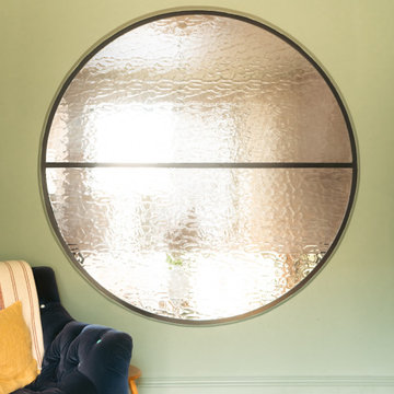
At the heart of the plan sits a dramatic, five-metre-tall dining space that acts as a transition from the original entrance hall into the new addition. A large, circular cast-glass window, framed in steel, provides a visual and spatial link between old and new, allowing light and movement to travel through the depth of the home.
Throughout the project, a series of black metal elements were introduced as sculptural interventions – each marking moments of transformation within the house. These included the bespoke steel framed circular window, a custom metal staircase, a cylindrical support column, and the striking steel and glass garden pavilion. Together, they formed a coherent architectural language that underscored the project’s bold intent.
Our steel windows and doors played a vital role in delivering the project’s vision. The architects chose steel for its refined sight lines and distinctive material character, which helped bridge the gap between the historical context of the building and the bold new additions.
The black steel frames provided a crisp contrast to the pale London stock brick and added definition to the glazed pavilion, reinforcing the sense of architectural precision. In particular, the fine steel profiles of the garden room allowed the extension to feel both lightweight and immersive, blurring the boundary between the house and its garden.
The architect drew inspiration from the Bauhaus Movement, particularly the work of Walter Gropius, whose approach to functional beauty and industrial materials informed the design of the garden pavilion.
Here, our glazing system was used not just for transparency, but as an expressive architectural element. The carefully proportioned panels help to conceal the roof thickness and reinforce the pavilion’s industrial yet abstract character – a deliberate nod to product design and modernist detailing.
Sustainability was an important factor in the selection of materials. Our steel systems, made from 99% recycled content and 100% recyclable, aligned with the project’s broader environmental goals.
The architects noted that this commitment to material longevity and circularity was central to their decision to use steel. The durability and recyclability of the windows and doors ensured the project met both aesthetic and ethical criteria.
This London terrace house now stands as a celebration of contrast – between heritage and innovation, solidity and transparency, tradition and transformation. Our steel windows and doors were not simply components; they were essential tools in crafting a home that is as bold and expressive as it is functional.
The result is a home designed for modern family life, where light, space, and materiality come together in perfect harmony.
 THE Remodel Group
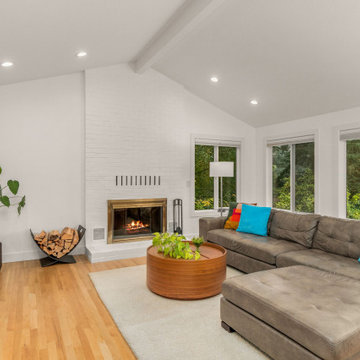
Behind the unassuming exterior of this 1985 split-level home in Southwest Portland lies a dramatic whole-home transformation that blends thoughtful functionality with bold postmodern design. What began as a series of disconnected, dated spaces evolved into a cohesive living environment tailored to the homeowners' everyday routines, entertaining style, and appreciation for distinctive design.
The kitchen served as the anchor of the renovation and set the tone for the home's updated aesthetic. Rich Sapele cabinetry, geometric white tile, and sleek contemporary finishes create a sophisticated gathering space that balances warmth with modern refinement. The original layout suffered from limited storage, inefficient workflow, and underutilized square footage. Through comprehensive space planning, the kitchen was completely reimagined with highly customized storage solutions, including dedicated organization for cookware, utensils, baking supplies, waste management, and small appliances. Panel-ready appliances, concealed storage features, and a striking waterfall island maintain clean visual lines while enhancing everyday functionality.
Entertaining was a major priority for the homeowners and inspired the creation of a dedicated hospitality zone adjacent to the kitchen. A previously overlooked nook was transformed into a custom beverage station complete with a kegerator, wine refrigerator, beverage refrigerator, illuminated display shelving, and storage designed specifically for the homeowners' collection of glassware and spirits. The result is a welcoming destination for gathering with friends and family.
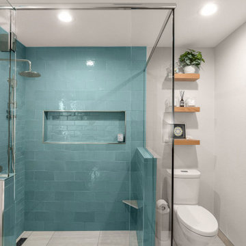
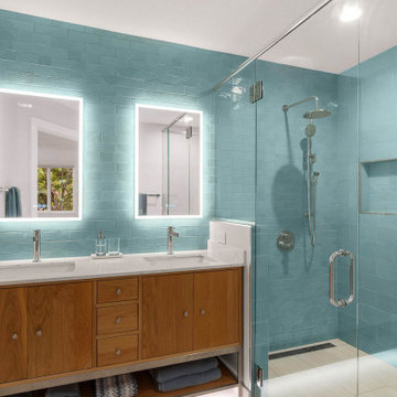
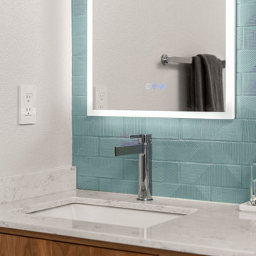
Beyond the kitchen, the renovation extended throughout the home to create a more functional and cohesive living experience. The primary bathroom was completely reconfigured to improve storage, accessibility, and comfort. By reshaping the shower into a more efficient footprint, space was gained for a larger custom walnut double vanity with integrated storage and open shelving. Layered tile selections introduce texture and visual interest, combining porcelain floor tile with blue-gray ceramic wall tile and coordinating patterned accents throughout the space. A Toto bidet toilet, updated plumbing, and provisions for future accessibility enhancements ensure the bathroom is both beautiful and practical.
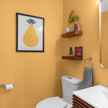
A nearby powder room received its own bold personality through the use of geometric flooring, warm honey-gold wall color, floating walnut-toned shelving, and a vanity featuring linear detailing that echoes the patterns found throughout the space. The combination of warm wood tones, graphic shapes, and contemporary fixtures creates a memorable guest experience while complementing the home's overall design language.
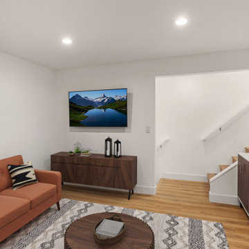
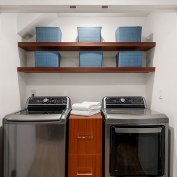
The basement level was also transformed from a dated and underutilized area into functional living space designed to support the homeowners' evolving needs. Luxury vinyl plank flooring was installed throughout to coordinate with the main floor finishes, while outdated wall coverings were removed in favor of fresh drywall and modern finishes. An existing closet was converted into a dedicated laundry area with integrated storage, and new spaces were created for a guest bedroom and home gym, adding versatility and value to the home.
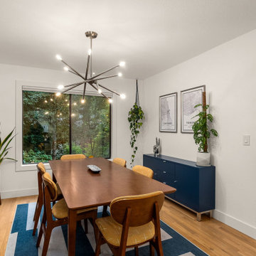
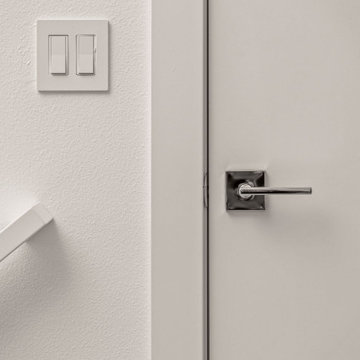
To unify the renovation, updates were carried throughout the entire residence. Flat-panel interior doors, modern chrome hardware, simplified flat-stock trim, and updated lighting establish a cohesive mid-century-inspired aesthetic from room to room. Electrical improvements throughout the home support the new fixtures while enhancing overall functionality and comfort. New lighting in the dining room, entry, primary bedroom, outdoor living areas, and throughout the home further reinforces the clean, modern design approach.
What makes this remodel especially compelling is the balance between bold design expression and everyday livability. Every decision, from the custom cabinetry and specialized storage to the carefully selected finishes and lighting, was made with both aesthetics and function in mind. The completed renovation transforms an ordinary split-level home into a highly personalized environment where modern convenience, thoughtful organization, and distinctive design come together seamlessly.
 THE Remodel Group
Behind the unassuming exterior of this 1985 split-level home in Southwest Portland lies a dramatic whole-home transformation that blends thoughtful functionality with bold postmodern design. What began as a series of disconnected, dated spaces evolved into a cohesive living environment tailored to the homeowners' everyday routines, entertaining style, and appreciation for distinctive design.
The kitchen served as the anchor of the renovation and set the tone for the home's updated aesthetic. Rich Sapele cabinetry, geometric white tile, and sleek contemporary finishes create a sophisticated gathering space that balances warmth with modern refinement. The original layout suffered from limited storage, inefficient workflow, and underutilized square footage. Through comprehensive space planning, the kitchen was completely reimagined with highly customized storage solutions, including dedicated organization for cookware, utensils, baking supplies, waste management, and small appliances. Panel-ready appliances, concealed storage features, and a striking waterfall island maintain clean visual lines while enhancing everyday functionality.
Entertaining was a major priority for the homeowners and inspired the creation of a dedicated hospitality zone adjacent to the kitchen. A previously overlooked nook was transformed into a custom beverage station complete with a kegerator, wine refrigerator, beverage refrigerator, illuminated display shelving, and storage designed specifically for the homeowners' collection of glassware and spirits. The result is a welcoming destination for gathering with friends and family.
Beyond the kitchen, the renovation extended throughout the home to create a more functional and cohesive living experience. The primary bathroom was completely reconfigured to improve storage, accessibility, and comfort. By reshaping the shower into a more efficient footprint, space was gained for a larger custom walnut double vanity with integrated storage and open shelving. Layered tile selections introduce texture and visual interest, combining porcelain floor tile with blue-gray ceramic wall tile and coordinating patterned accents throughout the space. A Toto bidet toilet, updated plumbing, and provisions for future accessibility enhancements ensure the bathroom is both beautiful and practical.
A nearby powder room received its own bold personality through the use of geometric flooring, warm honey-gold wall color, floating walnut-toned shelving, and a vanity featuring linear detailing that echoes the patterns found throughout the space. The combination of warm wood tones, graphic shapes, and contemporary fixtures creates a memorable guest experience while complementing the home's overall design language.
The basement level was also transformed from a dated and underutilized area into functional living space designed to support the homeowners' evolving needs. Luxury vinyl plank flooring was installed throughout to coordinate with the main floor finishes, while outdated wall coverings were removed in favor of fresh drywall and modern finishes. An existing closet was converted into a dedicated laundry area with integrated storage, and new spaces were created for a guest bedroom and home gym, adding versatility and value to the home.
To unify the renovation, updates were carried throughout the entire residence. Flat-panel interior doors, modern chrome hardware, simplified flat-stock trim, and updated lighting establish a cohesive mid-century-inspired aesthetic from room to room. Electrical improvements throughout the home support the new fixtures while enhancing overall functionality and comfort. New lighting in the dining room, entry, primary bedroom, outdoor living areas, and throughout the home further reinforces the clean, modern design approach.
What makes this remodel especially compelling is the balance between bold design expression and everyday livability. Every decision, from the custom cabinetry and specialized storage to the carefully selected finishes and lighting, was made with both aesthetics and function in mind. The completed renovation transforms an ordinary split-level home into a highly personalized environment where modern convenience, thoughtful organization, and distinctive design come together seamlessly.
 THE Remodel Group
Behind the unassuming exterior of this 1985 split-level home in Southwest Portland lies a dramatic whole-home transformation that blends thoughtful functionality with bold postmodern design. What began as a series of disconnected, dated spaces evolved into a cohesive living environment tailored to the homeowners' everyday routines, entertaining style, and appreciation for distinctive design.
The kitchen served as the anchor of the renovation and set the tone for the home's updated aesthetic. Rich Sapele cabinetry, geometric white tile, and sleek contemporary finishes create a sophisticated gathering space that balances warmth with modern refinement. The original layout suffered from limited storage, inefficient workflow, and underutilized square footage. Through comprehensive space planning, the kitchen was completely reimagined with highly customized storage solutions, including dedicated organization for cookware, utensils, baking supplies, waste management, and small appliances. Panel-ready appliances, concealed storage features, and a striking waterfall island maintain clean visual lines while enhancing everyday functionality.
Entertaining was a major priority for the homeowners and inspired the creation of a dedicated hospitality zone adjacent to the kitchen. A previously overlooked nook was transformed into a custom beverage station complete with a kegerator, wine refrigerator, beverage refrigerator, illuminated display shelving, and storage designed specifically for the homeowners' collection of glassware and spirits. The result is a welcoming destination for gathering with friends and family.
Beyond the kitchen, the renovation extended throughout the home to create a more functional and cohesive living experience. The primary bathroom was completely reconfigured to improve storage, accessibility, and comfort. By reshaping the shower into a more efficient footprint, space was gained for a larger custom walnut double vanity with integrated storage and open shelving. Layered tile selections introduce texture and visual interest, combining porcelain floor tile with blue-gray ceramic wall tile and coordinating patterned accents throughout the space. A Toto bidet toilet, updated plumbing, and provisions for future accessibility enhancements ensure the bathroom is both beautiful and practical.
A nearby powder room received its own bold personality through the use of geometric flooring, warm honey-gold wall color, floating walnut-toned shelving, and a vanity featuring linear detailing that echoes the patterns found throughout the space. The combination of warm wood tones, graphic shapes, and contemporary fixtures creates a memorable guest experience while complementing the home's overall design language.
The basement level was also transformed from a dated and underutilized area into functional living space designed to support the homeowners' evolving needs. Luxury vinyl plank flooring was installed throughout to coordinate with the main floor finishes, while outdated wall coverings were removed in favor of fresh drywall and modern finishes. An existing closet was converted into a dedicated laundry area with integrated storage, and new spaces were created for a guest bedroom and home gym, adding versatility and value to the home.
To unify the renovation, updates were carried throughout the entire residence. Flat-panel interior doors, modern chrome hardware, simplified flat-stock trim, and updated lighting establish a cohesive mid-century-inspired aesthetic from room to room. Electrical improvements throughout the home support the new fixtures while enhancing overall functionality and comfort. New lighting in the dining room, entry, primary bedroom, outdoor living areas, and throughout the home further reinforces the clean, modern design approach.
What makes this remodel especially compelling is the balance between bold design expression and everyday livability. Every decision, from the custom cabinetry and specialized storage to the carefully selected finishes and lighting, was made with both aesthetics and function in mind. The completed renovation transforms an ordinary split-level home into a highly personalized environment where modern convenience, thoughtful organization, and distinctive design come together seamlessly.
 THE Remodel Group
Behind the unassuming exterior of this 1985 split-level home in Southwest Portland lies a dramatic whole-home transformation that blends thoughtful functionality with bold postmodern design. What began as a series of disconnected, dated spaces evolved into a cohesive living environment tailored to the homeowners' everyday routines, entertaining style, and appreciation for distinctive design.
The kitchen served as the anchor of the renovation and set the tone for the home's updated aesthetic. Rich Sapele cabinetry, geometric white tile, and sleek contemporary finishes create a sophisticated gathering space that balances warmth with modern refinement. The original layout suffered from limited storage, inefficient workflow, and underutilized square footage. Through comprehensive space planning, the kitchen was completely reimagined with highly customized storage solutions, including dedicated organization for cookware, utensils, baking supplies, waste management, and small appliances. Panel-ready appliances, concealed storage features, and a striking waterfall island maintain clean visual lines while enhancing everyday functionality.
Entertaining was a major priority for the homeowners and inspired the creation of a dedicated hospitality zone adjacent to the kitchen. A previously overlooked nook was transformed into a custom beverage station complete with a kegerator, wine refrigerator, beverage refrigerator, illuminated display shelving, and storage designed specifically for the homeowners' collection of glassware and spirits. The result is a welcoming destination for gathering with friends and family.
Beyond the kitchen, the renovation extended throughout the home to create a more functional and cohesive living experience. The primary bathroom was completely reconfigured to improve storage, accessibility, and comfort. By reshaping the shower into a more efficient footprint, space was gained for a larger custom walnut double vanity with integrated storage and open shelving. Layered tile selections introduce texture and visual interest, combining porcelain floor tile with blue-gray ceramic wall tile and coordinating patterned accents throughout the space. A Toto bidet toilet, updated plumbing, and provisions for future accessibility enhancements ensure the bathroom is both beautiful and practical.
A nearby powder room received its own bold personality through the use of geometric flooring, warm honey-gold wall color, floating walnut-toned shelving, and a vanity featuring linear detailing that echoes the patterns found throughout the space. The combination of warm wood tones, graphic shapes, and contemporary fixtures creates a memorable guest experience while complementing the home's overall design language.
The basement level was also transformed from a dated and underutilized area into functional living space designed to support the homeowners' evolving needs. Luxury vinyl plank flooring was installed throughout to coordinate with the main floor finishes, while outdated wall coverings were removed in favor of fresh drywall and modern finishes. An existing closet was converted into a dedicated laundry area with integrated storage, and new spaces were created for a guest bedroom and home gym, adding versatility and value to the home.
To unify the renovation, updates were carried throughout the entire residence. Flat-panel interior doors, modern chrome hardware, simplified flat-stock trim, and updated lighting establish a cohesive mid-century-inspired aesthetic from room to room. Electrical improvements throughout the home support the new fixtures while enhancing overall functionality and comfort. New lighting in the dining room, entry, primary bedroom, outdoor living areas, and throughout the home further reinforces the clean, modern design approach.
What makes this remodel especially compelling is the balance between bold design expression and everyday livability. Every decision, from the custom cabinetry and specialized storage to the carefully selected finishes and lighting, was made with both aesthetics and function in mind. The completed renovation transforms an ordinary split-level home into a highly personalized environment where modern convenience, thoughtful organization, and distinctive design come together seamlessly.
 THE Remodel Group
Behind the unassuming exterior of this 1985 split-level home in Southwest Portland lies a dramatic whole-home transformation that blends thoughtful functionality with bold postmodern design. What began as a series of disconnected, dated spaces evolved into a cohesive living environment tailored to the homeowners' everyday routines, entertaining style, and appreciation for distinctive design.
The kitchen served as the anchor of the renovation and set the tone for the home's updated aesthetic. Rich Sapele cabinetry, geometric white tile, and sleek contemporary finishes create a sophisticated gathering space that balances warmth with modern refinement. The original layout suffered from limited storage, inefficient workflow, and underutilized square footage. Through comprehensive space planning, the kitchen was completely reimagined with highly customized storage solutions, including dedicated organization for cookware, utensils, baking supplies, waste management, and small appliances. Panel-ready appliances, concealed storage features, and a striking waterfall island maintain clean visual lines while enhancing everyday functionality.
Entertaining was a major priority for the homeowners and inspired the creation of a dedicated hospitality zone adjacent to the kitchen. A previously overlooked nook was transformed into a custom beverage station complete with a kegerator, wine refrigerator, beverage refrigerator, illuminated display shelving, and storage designed specifically for the homeowners' collection of glassware and spirits. The result is a welcoming destination for gathering with friends and family.
Beyond the kitchen, the renovation extended throughout the home to create a more functional and cohesive living experience. The primary bathroom was completely reconfigured to improve storage, accessibility, and comfort. By reshaping the shower into a more efficient footprint, space was gained for a larger custom walnut double vanity with integrated storage and open shelving. Layered tile selections introduce texture and visual interest, combining porcelain floor tile with blue-gray ceramic wall tile and coordinating patterned accents throughout the space. A Toto bidet toilet, updated plumbing, and provisions for future accessibility enhancements ensure the bathroom is both beautiful and practical.
A nearby powder room received its own bold personality through the use of geometric flooring, warm honey-gold wall color, floating walnut-toned shelving, and a vanity featuring linear detailing that echoes the patterns found throughout the space. The combination of warm wood tones, graphic shapes, and contemporary fixtures creates a memorable guest experience while complementing the home's overall design language.
The basement level was also transformed from a dated and underutilized area into functional living space designed to support the homeowners' evolving needs. Luxury vinyl plank flooring was installed throughout to coordinate with the main floor finishes, while outdated wall coverings were removed in favor of fresh drywall and modern finishes. An existing closet was converted into a dedicated laundry area with integrated storage, and new spaces were created for a guest bedroom and home gym, adding versatility and value to the home.
To unify the renovation, updates were carried throughout the entire residence. Flat-panel interior doors, modern chrome hardware, simplified flat-stock trim, and updated lighting establish a cohesive mid-century-inspired aesthetic from room to room. Electrical improvements throughout the home support the new fixtures while enhancing overall functionality and comfort. New lighting in the dining room, entry, primary bedroom, outdoor living areas, and throughout the home further reinforces the clean, modern design approach.
What makes this remodel especially compelling is the balance between bold design expression and everyday livability. Every decision, from the custom cabinetry and specialized storage to the carefully selected finishes and lighting, was made with both aesthetics and function in mind. The completed renovation transforms an ordinary split-level home into a highly personalized environment where modern convenience, thoughtful organization, and distinctive design come together seamlessly.
 THE Remodel Group
Behind the unassuming exterior of this 1985 split-level home in Southwest Portland lies a dramatic whole-home transformation that blends thoughtful functionality with bold postmodern design. What began as a series of disconnected, dated spaces evolved into a cohesive living environment tailored to the homeowners' everyday routines, entertaining style, and appreciation for distinctive design.
The kitchen served as the anchor of the renovation and set the tone for the home's updated aesthetic. Rich Sapele cabinetry, geometric white tile, and sleek contemporary finishes create a sophisticated gathering space that balances warmth with modern refinement. The original layout suffered from limited storage, inefficient workflow, and underutilized square footage. Through comprehensive space planning, the kitchen was completely reimagined with highly customized storage solutions, including dedicated organization for cookware, utensils, baking supplies, waste management, and small appliances. Panel-ready appliances, concealed storage features, and a striking waterfall island maintain clean visual lines while enhancing everyday functionality.
Entertaining was a major priority for the homeowners and inspired the creation of a dedicated hospitality zone adjacent to the kitchen. A previously overlooked nook was transformed into a custom beverage station complete with a kegerator, wine refrigerator, beverage refrigerator, illuminated display shelving, and storage designed specifically for the homeowners' collection of glassware and spirits. The result is a welcoming destination for gathering with friends and family.
Beyond the kitchen, the renovation extended throughout the home to create a more functional and cohesive living experience. The primary bathroom was completely reconfigured to improve storage, accessibility, and comfort. By reshaping the shower into a more efficient footprint, space was gained for a larger custom walnut double vanity with integrated storage and open shelving. Layered tile selections introduce texture and visual interest, combining porcelain floor tile with blue-gray ceramic wall tile and coordinating patterned accents throughout the space. A Toto bidet toilet, updated plumbing, and provisions for future accessibility enhancements ensure the bathroom is both beautiful and practical.
A nearby powder room received its own bold personality through the use of geometric flooring, warm honey-gold wall color, floating walnut-toned shelving, and a vanity featuring linear detailing that echoes the patterns found throughout the space. The combination of warm wood tones, graphic shapes, and contemporary fixtures creates a memorable guest experience while complementing the home's overall design language.
The basement level was also transformed from a dated and underutilized area into functional living space designed to support the homeowners' evolving needs. Luxury vinyl plank flooring was installed throughout to coordinate with the main floor finishes, while outdated wall coverings were removed in favor of fresh drywall and modern finishes. An existing closet was converted into a dedicated laundry area with integrated storage, and new spaces were created for a guest bedroom and home gym, adding versatility and value to the home.
To unify the renovation, updates were carried throughout the entire residence. Flat-panel interior doors, modern chrome hardware, simplified flat-stock trim, and updated lighting establish a cohesive mid-century-inspired aesthetic from room to room. Electrical improvements throughout the home support the new fixtures while enhancing overall functionality and comfort. New lighting in the dining room, entry, primary bedroom, outdoor living areas, and throughout the home further reinforces the clean, modern design approach.
What makes this remodel especially compelling is the balance between bold design expression and everyday livability. Every decision, from the custom cabinetry and specialized storage to the carefully selected finishes and lighting, was made with both aesthetics and function in mind. The completed renovation transforms an ordinary split-level home into a highly personalized environment where modern convenience, thoughtful organization, and distinctive design come together seamlessly.
 THE Remodel Group
Behind the unassuming exterior of this 1985 split-level home in Southwest Portland lies a dramatic whole-home transformation that blends thoughtful functionality with bold postmodern design. What began as a series of disconnected, dated spaces evolved into a cohesive living environment tailored to the homeowners' everyday routines, entertaining style, and appreciation for distinctive design.
The kitchen served as the anchor of the renovation and set the tone for the home's updated aesthetic. Rich Sapele cabinetry, geometric white tile, and sleek contemporary finishes create a sophisticated gathering space that balances warmth with modern refinement. The original layout suffered from limited storage, inefficient workflow, and underutilized square footage. Through comprehensive space planning, the kitchen was completely reimagined with highly customized storage solutions, including dedicated organization for cookware, utensils, baking supplies, waste management, and small appliances. Panel-ready appliances, concealed storage features, and a striking waterfall island maintain clean visual lines while enhancing everyday functionality.
Entertaining was a major priority for the homeowners and inspired the creation of a dedicated hospitality zone adjacent to the kitchen. A previously overlooked nook was transformed into a custom beverage station complete with a kegerator, wine refrigerator, beverage refrigerator, illuminated display shelving, and storage designed specifically for the homeowners' collection of glassware and spirits. The result is a welcoming destination for gathering with friends and family.
Beyond the kitchen, the renovation extended throughout the home to create a more functional and cohesive living experience. The primary bathroom was completely reconfigured to improve storage, accessibility, and comfort. By reshaping the shower into a more efficient footprint, space was gained for a larger custom walnut double vanity with integrated storage and open shelving. Layered tile selections introduce texture and visual interest, combining porcelain floor tile with blue-gray ceramic wall tile and coordinating patterned accents throughout the space. A Toto bidet toilet, updated plumbing, and provisions for future accessibility enhancements ensure the bathroom is both beautiful and practical.
A nearby powder room received its own bold personality through the use of geometric flooring, warm honey-gold wall color, floating walnut-toned shelving, and a vanity featuring linear detailing that echoes the patterns found throughout the space. The combination of warm wood tones, graphic shapes, and contemporary fixtures creates a memorable guest experience while complementing the home's overall design language.
The basement level was also transformed from a dated and underutilized area into functional living space designed to support the homeowners' evolving needs. Luxury vinyl plank flooring was installed throughout to coordinate with the main floor finishes, while outdated wall coverings were removed in favor of fresh drywall and modern finishes. An existing closet was converted into a dedicated laundry area with integrated storage, and new spaces were created for a guest bedroom and home gym, adding versatility and value to the home.
To unify the renovation, updates were carried throughout the entire residence. Flat-panel interior doors, modern chrome hardware, simplified flat-stock trim, and updated lighting establish a cohesive mid-century-inspired aesthetic from room to room. Electrical improvements throughout the home support the new fixtures while enhancing overall functionality and comfort. New lighting in the dining room, entry, primary bedroom, outdoor living areas, and throughout the home further reinforces the clean, modern design approach.
What makes this remodel especially compelling is the balance between bold design expression and everyday livability. Every decision, from the custom cabinetry and specialized storage to the carefully selected finishes and lighting, was made with both aesthetics and function in mind. The completed renovation transforms an ordinary split-level home into a highly personalized environment where modern convenience, thoughtful organization, and distinctive design come together seamlessly.
 THE Remodel Group
Behind the unassuming exterior of this 1985 split-level home in Southwest Portland lies a dramatic whole-home transformation that blends thoughtful functionality with bold postmodern design. What began as a series of disconnected, dated spaces evolved into a cohesive living environment tailored to the homeowners' everyday routines, entertaining style, and appreciation for distinctive design.
The kitchen served as the anchor of the renovation and set the tone for the home's updated aesthetic. Rich Sapele cabinetry, geometric white tile, and sleek contemporary finishes create a sophisticated gathering space that balances warmth with modern refinement. The original layout suffered from limited storage, inefficient workflow, and underutilized square footage. Through comprehensive space planning, the kitchen was completely reimagined with highly customized storage solutions, including dedicated organization for cookware, utensils, baking supplies, waste management, and small appliances. Panel-ready appliances, concealed storage features, and a striking waterfall island maintain clean visual lines while enhancing everyday functionality.
Entertaining was a major priority for the homeowners and inspired the creation of a dedicated hospitality zone adjacent to the kitchen. A previously overlooked nook was transformed into a custom beverage station complete with a kegerator, wine refrigerator, beverage refrigerator, illuminated display shelving, and storage designed specifically for the homeowners' collection of glassware and spirits. The result is a welcoming destination for gathering with friends and family.
Beyond the kitchen, the renovation extended throughout the home to create a more functional and cohesive living experience. The primary bathroom was completely reconfigured to improve storage, accessibility, and comfort. By reshaping the shower into a more efficient footprint, space was gained for a larger custom walnut double vanity with integrated storage and open shelving. Layered tile selections introduce texture and visual interest, combining porcelain floor tile with blue-gray ceramic wall tile and coordinating patterned accents throughout the space. A Toto bidet toilet, updated plumbing, and provisions for future accessibility enhancements ensure the bathroom is both beautiful and practical.
A nearby powder room received its own bold personality through the use of geometric flooring, warm honey-gold wall color, floating walnut-toned shelving, and a vanity featuring linear detailing that echoes the patterns found throughout the space. The combination of warm wood tones, graphic shapes, and contemporary fixtures creates a memorable guest experience while complementing the home's overall design language.
The basement level was also transformed from a dated and underutilized area into functional living space designed to support the homeowners' evolving needs. Luxury vinyl plank flooring was installed throughout to coordinate with the main floor finishes, while outdated wall coverings were removed in favor of fresh drywall and modern finishes. An existing closet was converted into a dedicated laundry area with integrated storage, and new spaces were created for a guest bedroom and home gym, adding versatility and value to the home.
To unify the renovation, updates were carried throughout the entire residence. Flat-panel interior doors, modern chrome hardware, simplified flat-stock trim, and updated lighting establish a cohesive mid-century-inspired aesthetic from room to room. Electrical improvements throughout the home support the new fixtures while enhancing overall functionality and comfort. New lighting in the dining room, entry, primary bedroom, outdoor living areas, and throughout the home further reinforces the clean, modern design approach.
What makes this remodel especially compelling is the balance between bold design expression and everyday livability. Every decision, from the custom cabinetry and specialized storage to the carefully selected finishes and lighting, was made with both aesthetics and function in mind. The completed renovation transforms an ordinary split-level home into a highly personalized environment where modern convenience, thoughtful organization, and distinctive design come together seamlessly.
 THE Remodel Group
Behind the unassuming exterior of this 1985 split-level home in Southwest Portland lies a dramatic whole-home transformation that blends thoughtful functionality with bold postmodern design. What began as a series of disconnected, dated spaces evolved into a cohesive living environment tailored to the homeowners' everyday routines, entertaining style, and appreciation for distinctive design.
The kitchen served as the anchor of the renovation and set the tone for the home's updated aesthetic. Rich Sapele cabinetry, geometric white tile, and sleek contemporary finishes create a sophisticated gathering space that balances warmth with modern refinement. The original layout suffered from limited storage, inefficient workflow, and underutilized square footage. Through comprehensive space planning, the kitchen was completely reimagined with highly customized storage solutions, including dedicated organization for cookware, utensils, baking supplies, waste management, and small appliances. Panel-ready appliances, concealed storage features, and a striking waterfall island maintain clean visual lines while enhancing everyday functionality.
Entertaining was a major priority for the homeowners and inspired the creation of a dedicated hospitality zone adjacent to the kitchen. A previously overlooked nook was transformed into a custom beverage station complete with a kegerator, wine refrigerator, beverage refrigerator, illuminated display shelving, and storage designed specifically for the homeowners' collection of glassware and spirits. The result is a welcoming destination for gathering with friends and family.
Beyond the kitchen, the renovation extended throughout the home to create a more functional and cohesive living experience. The primary bathroom was completely reconfigured to improve storage, accessibility, and comfort. By reshaping the shower into a more efficient footprint, space was gained for a larger custom walnut double vanity with integrated storage and open shelving. Layered tile selections introduce texture and visual interest, combining porcelain floor tile with blue-gray ceramic wall tile and coordinating patterned accents throughout the space. A Toto bidet toilet, updated plumbing, and provisions for future accessibility enhancements ensure the bathroom is both beautiful and practical.
A nearby powder room received its own bold personality through the use of geometric flooring, warm honey-gold wall color, floating walnut-toned shelving, and a vanity featuring linear detailing that echoes the patterns found throughout the space. The combination of warm wood tones, graphic shapes, and contemporary fixtures creates a memorable guest experience while complementing the home's overall design language.
The basement level was also transformed from a dated and underutilized area into functional living space designed to support the homeowners' evolving needs. Luxury vinyl plank flooring was installed throughout to coordinate with the main floor finishes, while outdated wall coverings were removed in favor of fresh drywall and modern finishes. An existing closet was converted into a dedicated laundry area with integrated storage, and new spaces were created for a guest bedroom and home gym, adding versatility and value to the home.
To unify the renovation, updates were carried throughout the entire residence. Flat-panel interior doors, modern chrome hardware, simplified flat-stock trim, and updated lighting establish a cohesive mid-century-inspired aesthetic from room to room. Electrical improvements throughout the home support the new fixtures while enhancing overall functionality and comfort. New lighting in the dining room, entry, primary bedroom, outdoor living areas, and throughout the home further reinforces the clean, modern design approach.
What makes this remodel especially compelling is the balance between bold design expression and everyday livability. Every decision, from the custom cabinetry and specialized storage to the carefully selected finishes and lighting, was made with both aesthetics and function in mind. The completed renovation transforms an ordinary split-level home into a highly personalized environment where modern convenience, thoughtful organization, and distinctive design come together seamlessly.
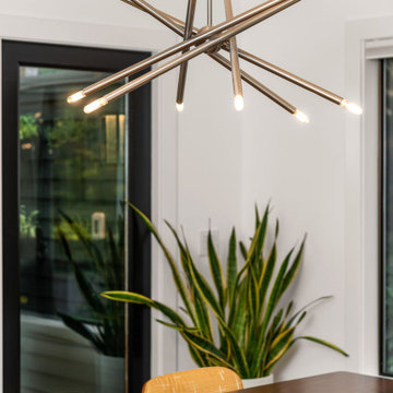 THE Remodel Group
Behind the unassuming exterior of this 1985 split-level home in Southwest Portland lies a dramatic whole-home transformation that blends thoughtful functionality with bold postmodern design. What began as a series of disconnected, dated spaces evolved into a cohesive living environment tailored to the homeowners' everyday routines, entertaining style, and appreciation for distinctive design.
The kitchen served as the anchor of the renovation and set the tone for the home's updated aesthetic. Rich Sapele cabinetry, geometric white tile, and sleek contemporary finishes create a sophisticated gathering space that balances warmth with modern refinement. The original layout suffered from limited storage, inefficient workflow, and underutilized square footage. Through comprehensive space planning, the kitchen was completely reimagined with highly customized storage solutions, including dedicated organization for cookware, utensils, baking supplies, waste management, and small appliances. Panel-ready appliances, concealed storage features, and a striking waterfall island maintain clean visual lines while enhancing everyday functionality.
Entertaining was a major priority for the homeowners and inspired the creation of a dedicated hospitality zone adjacent to the kitchen. A previously overlooked nook was transformed into a custom beverage station complete with a kegerator, wine refrigerator, beverage refrigerator, illuminated display shelving, and storage designed specifically for the homeowners' collection of glassware and spirits. The result is a welcoming destination for gathering with friends and family.
Beyond the kitchen, the renovation extended throughout the home to create a more functional and cohesive living experience. The primary bathroom was completely reconfigured to improve storage, accessibility, and comfort. By reshaping the shower into a more efficient footprint, space was gained for a larger custom walnut double vanity with integrated storage and open shelving. Layered tile selections introduce texture and visual interest, combining porcelain floor tile with blue-gray ceramic wall tile and coordinating patterned accents throughout the space. A Toto bidet toilet, updated plumbing, and provisions for future accessibility enhancements ensure the bathroom is both beautiful and practical.
A nearby powder room received its own bold personality through the use of geometric flooring, warm honey-gold wall color, floating walnut-toned shelving, and a vanity featuring linear detailing that echoes the patterns found throughout the space. The combination of warm wood tones, graphic shapes, and contemporary fixtures creates a memorable guest experience while complementing the home's overall design language.
The basement level was also transformed from a dated and underutilized area into functional living space designed to support the homeowners' evolving needs. Luxury vinyl plank flooring was installed throughout to coordinate with the main floor finishes, while outdated wall coverings were removed in favor of fresh drywall and modern finishes. An existing closet was converted into a dedicated laundry area with integrated storage, and new spaces were created for a guest bedroom and home gym, adding versatility and value to the home.
To unify the renovation, updates were carried throughout the entire residence. Flat-panel interior doors, modern chrome hardware, simplified flat-stock trim, and updated lighting establish a cohesive mid-century-inspired aesthetic from room to room. Electrical improvements throughout the home support the new fixtures while enhancing overall functionality and comfort. New lighting in the dining room, entry, primary bedroom, outdoor living areas, and throughout the home further reinforces the clean, modern design approach.
What makes this remodel especially compelling is the balance between bold design expression and everyday livability. Every decision, from the custom cabinetry and specialized storage to the carefully selected finishes and lighting, was made with both aesthetics and function in mind. The completed renovation transforms an ordinary split-level home into a highly personalized environment where modern convenience, thoughtful organization, and distinctive design come together seamlessly.
74