
Search results for "Distinct segment" in Home Design Ideas
 Drury Design
THE SETUP
Sam’s client had lived in her downtown townhome home for less than a year when she decided to remodel the spacious second level. This open area consisted of three sections: a TV and fireplace zone, a sparsely furnished dining area, and a dominant central kitchen. The kitchen featured a long back wall with three segmented sections and a massive island housing the cooktop. She found the kitchen’s functionality lacking and its presence overwhelming – it dominated the entire floor, regardless of where you stood.
Design objectives:
- Reconfigure key kitchen elements (sink, cooktop, oven) while minimizing the kitchen’s visual impact
- Optimize the kitchen’s back wall, eliminating existing dead space
- Create a purposeful, well-defined dining area
- Establish a distinct, comfortable living area
- Reuse existing appliances and flooring
- Maintain an overall modern design aesthetic
THE REMODEL
Design challenges to be solved:
- Redesign the island to reduce its overwhelming presence
- Create a comfortable, dedicated living room within the available space
- Establish a distinct, inviting dining area within spatial constraints
- Enhance kitchen functionality and style without dominating the entire floor
THE RENEWED SPACE
Design solutions:
- Sam created raised end caps for the island. This separated the kitchen from adjacent living and dining areas while focusing the kitchen’s functionality. The new sink location offers ample workspace, allowing the cook to interact with guests seated at the island. The redesigned island also provides additional storage.
- For the living area, Sam opted for a functional-yet-minimalist approach. Large-format tile creates a natural stone look for the fireplace and TV wall. The recessed TV and extended fireplace shelf maintain a sleek profile. - Artistic wallpaper adds depth and texture, while the intentional lack of extensive shelving keeps the space open and distinct.
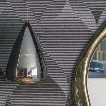
- Sam transformed the dining area’s blank wall into a feature, adding a unique dry bar with counter space, open shelves, cabinet storage and a beverage fridge. - - - Wallpaper behind and above the bar contributes to the area’s personality. A mirror adds depth while pendant lights add style and visual interest.
Relocating the cooktop to the back wall facilitates hidden ventilation, reducing visual clutter. Sam balanced transitional and modern elements for a contemporary yet comfortable feel. The digital control panel on the convection cooktop maintains a sleek look, while the wall oven is now at an easy-to-use height. ----- Mirrored base cabinet fronts and a paneled fridge prevent cabinetry monotony.
The redesign has delighted Sam’s client, achieving her main goal of creating a more inviting and visually appealing space. Each section now has its own visual personality and functionality while harmonizing within a monochromatic palette. The entire floor offers wow-factor pop upon first glance, with each area maintaining its distinct character while contributing to a cohesive, modern aesthetic.
 Drury Design
THE SETUP
Sam’s client had lived in her downtown townhome home for less than a year when she decided to remodel the spacious second level. This open area consisted of three sections: a TV and fireplace zone, a sparsely furnished dining area, and a dominant central kitchen. The kitchen featured a long back wall with three segmented sections and a massive island housing the cooktop. She found the kitchen’s functionality lacking and its presence overwhelming – it dominated the entire floor, regardless of where you stood.
Design objectives:
- Reconfigure key kitchen elements (sink, cooktop, oven) while minimizing the kitchen’s visual impact
- Optimize the kitchen’s back wall, eliminating existing dead space
- Create a purposeful, well-defined dining area
- Establish a distinct, comfortable living area
- Reuse existing appliances and flooring
- Maintain an overall modern design aesthetic
THE REMODEL
Design challenges to be solved:
- Redesign the island to reduce its overwhelming presence
- Create a comfortable, dedicated living room within the available space
- Establish a distinct, inviting dining area within spatial constraints
- Enhance kitchen functionality and style without dominating the entire floor
THE RENEWED SPACE
Design solutions:
- Sam created raised end caps for the island. This separated the kitchen from adjacent living and dining areas while focusing the kitchen’s functionality. The new sink location offers ample workspace, allowing the cook to interact with guests seated at the island. The redesigned island also provides additional storage.
- For the living area, Sam opted for a functional-yet-minimalist approach. Large-format tile creates a natural stone look for the fireplace and TV wall. The recessed TV and extended fireplace shelf maintain a sleek profile. - Artistic wallpaper adds depth and texture, while the intentional lack of extensive shelving keeps the space open and distinct.
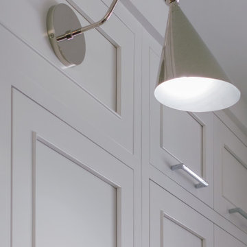
- Sam transformed the dining area’s blank wall into a feature, adding a unique dry bar with counter space, open shelves, cabinet storage and a beverage fridge. - - - Wallpaper behind and above the bar contributes to the area’s personality. A mirror adds depth while pendant lights add style and visual interest.
Relocating the cooktop to the back wall facilitates hidden ventilation, reducing visual clutter. Sam balanced transitional and modern elements for a contemporary yet comfortable feel. The digital control panel on the convection cooktop maintains a sleek look, while the wall oven is now at an easy-to-use height. ----- Mirrored base cabinet fronts and a paneled fridge prevent cabinetry monotony.
The redesign has delighted Sam’s client, achieving her main goal of creating a more inviting and visually appealing space. Each section now has its own visual personality and functionality while harmonizing within a monochromatic palette. The entire floor offers wow-factor pop upon first glance, with each area maintaining its distinct character while contributing to a cohesive, modern aesthetic.
 Drury Design
THE SETUP
Sam’s client had lived in her downtown townhome home for less than a year when she decided to remodel the spacious second level. This open area consisted of three sections: a TV and fireplace zone, a sparsely furnished dining area, and a dominant central kitchen. The kitchen featured a long back wall with three segmented sections and a massive island housing the cooktop. She found the kitchen’s functionality lacking and its presence overwhelming – it dominated the entire floor, regardless of where you stood.
Design objectives:
- Reconfigure key kitchen elements (sink, cooktop, oven) while minimizing the kitchen’s visual impact
- Optimize the kitchen’s back wall, eliminating existing dead space
- Create a purposeful, well-defined dining area
- Establish a distinct, comfortable living area
- Reuse existing appliances and flooring
- Maintain an overall modern design aesthetic
THE REMODEL
Design challenges to be solved:
- Redesign the island to reduce its overwhelming presence
- Create a comfortable, dedicated living room within the available space
- Establish a distinct, inviting dining area within spatial constraints
- Enhance kitchen functionality and style without dominating the entire floor
THE RENEWED SPACE
Design solutions:
- Sam created raised end caps for the island. This separated the kitchen from adjacent living and dining areas while focusing the kitchen’s functionality. The new sink location offers ample workspace, allowing the cook to interact with guests seated at the island. The redesigned island also provides additional storage.
- For the living area, Sam opted for a functional-yet-minimalist approach. Large-format tile creates a natural stone look for the fireplace and TV wall. The recessed TV and extended fireplace shelf maintain a sleek profile. - Artistic wallpaper adds depth and texture, while the intentional lack of extensive shelving keeps the space open and distinct.
- Sam transformed the dining area’s blank wall into a feature, adding a unique dry bar with counter space, open shelves, cabinet storage and a beverage fridge. - - - Wallpaper behind and above the bar contributes to the area’s personality. A mirror adds depth while pendant lights add style and visual interest.
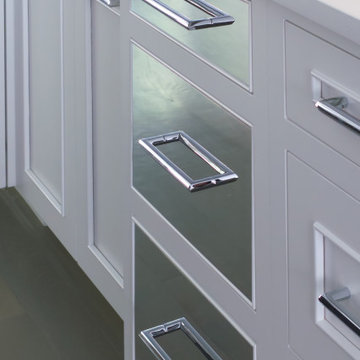
Relocating the cooktop to the back wall facilitates hidden ventilation, reducing visual clutter. Sam balanced transitional and modern elements for a contemporary yet comfortable feel. The digital control panel on the convection cooktop maintains a sleek look, while the wall oven is now at an easy-to-use height. ----- Mirrored base cabinet fronts and a paneled fridge prevent cabinetry monotony.
The redesign has delighted Sam’s client, achieving her main goal of creating a more inviting and visually appealing space. Each section now has its own visual personality and functionality while harmonizing within a monochromatic palette. The entire floor offers wow-factor pop upon first glance, with each area maintaining its distinct character while contributing to a cohesive, modern aesthetic.
Find the right local pro for your project
 Walczak Design And Build
What once felt dark, segmented, and inefficient is now a bright, connected, and highly functional first floor designed for real family living.
Our clients, Terry and Lou, came to us with a home that simply wasn’t keeping up with their growing family. The kitchen was cramped, with tight working lanes and limited light. The laundry room doubled as a powder room—yet functioned poorly as both. Sightlines between spaces were cut off, making it difficult to stay connected to their young children throughout the day. Across the board, the home felt dated and disconnected.
Through thoughtful planning and strategic structural changes, we reimagined the entire first floor to better support how this family truly lives.
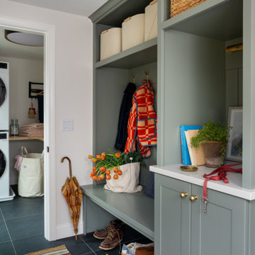
We began by redefining the entry experience—creating a true foyer complete with a dedicated drop zone and custom cubby storage. This space now acts as a natural landing point, bringing order and intention to everyday comings and goings.
Adjacent to the new entry, we relocated and redesigned the laundry room. Now positioned exactly where it needs to be, it functions as a hardworking utility space with countertops for folding, a utility sink for immediate stain treatment, and the ability to be closed off—keeping daily life contained when needed.
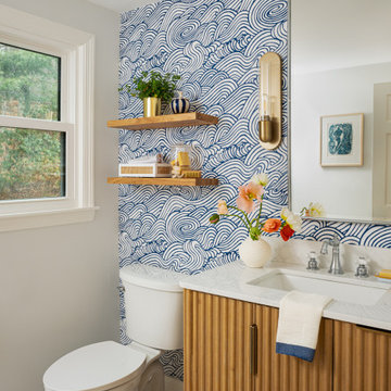
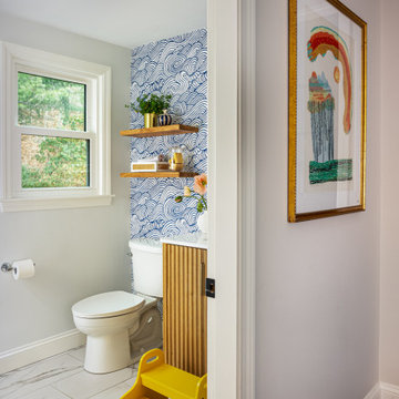
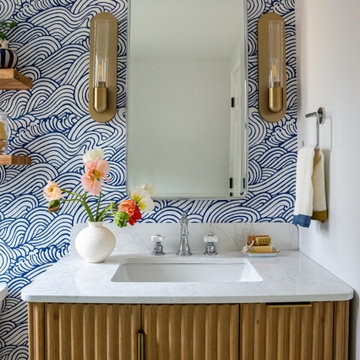
Separating the previous shared function allowed us to carve out a distinct, personality-filled powder room. Wrapped in a bold wave-patterned wallpaper and grounded by a custom reeded oak vanity with warm brass accents, this space delivers a moment of delight and individuality within the home.
The kitchen transformation is where the impact is felt most deeply.
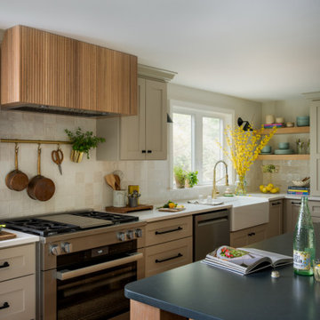
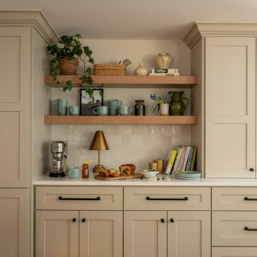
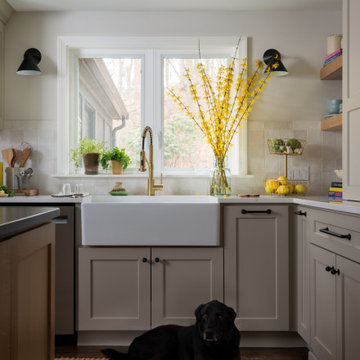
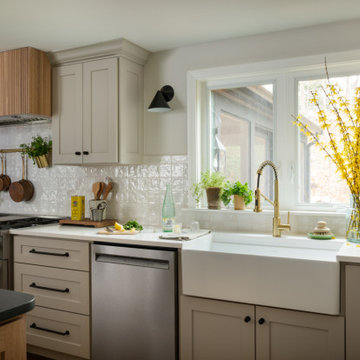
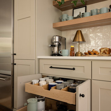
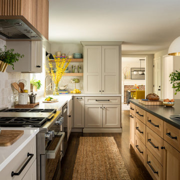
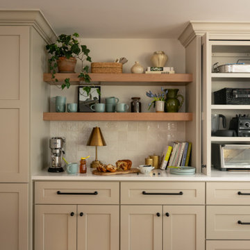
What was once a dark, restrictive layout has been opened into a spacious, highly efficient U-shaped kitchen with generous clearances and an oversized island for gathering. A thoughtful mix of painted cabinetry and rift white oak introduces warmth and balance, while the custom reeded hood becomes a sculptural focal point. Open shelving, integrated pantry storage, and layered lighting ensure the space is as functional as it is beautiful.
Beyond aesthetics, the redesign prioritizes flow—both in movement and in connection. Sightlines between the kitchen, dining, and living areas were intentionally opened, allowing for ease of interaction and visibility throughout the main living spaces.
To unify the home, existing hardwood floors were refinished and extended, creating continuity and a seamless visual experience from one space to the next.
The result is a home that feels lighter, more open, and deeply aligned with how this family lives day to day—designed not just to look beautiful, but to support everything from busy mornings to slow, shared evenings.
 Walczak Design And Build
What once felt dark, segmented, and inefficient is now a bright, connected, and highly functional first floor designed for real family living.
Our clients, Terry and Lou, came to us with a home that simply wasn’t keeping up with their growing family. The kitchen was cramped, with tight working lanes and limited light. The laundry room doubled as a powder room—yet functioned poorly as both. Sightlines between spaces were cut off, making it difficult to stay connected to their young children throughout the day. Across the board, the home felt dated and disconnected.
Through thoughtful planning and strategic structural changes, we reimagined the entire first floor to better support how this family truly lives.
We began by redefining the entry experience—creating a true foyer complete with a dedicated drop zone and custom cubby storage. This space now acts as a natural landing point, bringing order and intention to everyday comings and goings.
Adjacent to the new entry, we relocated and redesigned the laundry room. Now positioned exactly where it needs to be, it functions as a hardworking utility space with countertops for folding, a utility sink for immediate stain treatment, and the ability to be closed off—keeping daily life contained when needed.
Separating the previous shared function allowed us to carve out a distinct, personality-filled powder room. Wrapped in a bold wave-patterned wallpaper and grounded by a custom reeded oak vanity with warm brass accents, this space delivers a moment of delight and individuality within the home.
The kitchen transformation is where the impact is felt most deeply.
What was once a dark, restrictive layout has been opened into a spacious, highly efficient U-shaped kitchen with generous clearances and an oversized island for gathering. A thoughtful mix of painted cabinetry and rift white oak introduces warmth and balance, while the custom reeded hood becomes a sculptural focal point. Open shelving, integrated pantry storage, and layered lighting ensure the space is as functional as it is beautiful.
Beyond aesthetics, the redesign prioritizes flow—both in movement and in connection. Sightlines between the kitchen, dining, and living areas were intentionally opened, allowing for ease of interaction and visibility throughout the main living spaces.
To unify the home, existing hardwood floors were refinished and extended, creating continuity and a seamless visual experience from one space to the next.
The result is a home that feels lighter, more open, and deeply aligned with how this family lives day to day—designed not just to look beautiful, but to support everything from busy mornings to slow, shared evenings.
 Walczak Design And Build
What once felt dark, segmented, and inefficient is now a bright, connected, and highly functional first floor designed for real family living.
Our clients, Terry and Lou, came to us with a home that simply wasn’t keeping up with their growing family. The kitchen was cramped, with tight working lanes and limited light. The laundry room doubled as a powder room—yet functioned poorly as both. Sightlines between spaces were cut off, making it difficult to stay connected to their young children throughout the day. Across the board, the home felt dated and disconnected.
Through thoughtful planning and strategic structural changes, we reimagined the entire first floor to better support how this family truly lives.
We began by redefining the entry experience—creating a true foyer complete with a dedicated drop zone and custom cubby storage. This space now acts as a natural landing point, bringing order and intention to everyday comings and goings.
Adjacent to the new entry, we relocated and redesigned the laundry room. Now positioned exactly where it needs to be, it functions as a hardworking utility space with countertops for folding, a utility sink for immediate stain treatment, and the ability to be closed off—keeping daily life contained when needed.
Separating the previous shared function allowed us to carve out a distinct, personality-filled powder room. Wrapped in a bold wave-patterned wallpaper and grounded by a custom reeded oak vanity with warm brass accents, this space delivers a moment of delight and individuality within the home.
The kitchen transformation is where the impact is felt most deeply.
What was once a dark, restrictive layout has been opened into a spacious, highly efficient U-shaped kitchen with generous clearances and an oversized island for gathering. A thoughtful mix of painted cabinetry and rift white oak introduces warmth and balance, while the custom reeded hood becomes a sculptural focal point. Open shelving, integrated pantry storage, and layered lighting ensure the space is as functional as it is beautiful.
Beyond aesthetics, the redesign prioritizes flow—both in movement and in connection. Sightlines between the kitchen, dining, and living areas were intentionally opened, allowing for ease of interaction and visibility throughout the main living spaces.
To unify the home, existing hardwood floors were refinished and extended, creating continuity and a seamless visual experience from one space to the next.
The result is a home that feels lighter, more open, and deeply aligned with how this family lives day to day—designed not just to look beautiful, but to support everything from busy mornings to slow, shared evenings.
 Walczak Design And Build
What once felt dark, segmented, and inefficient is now a bright, connected, and highly functional first floor designed for real family living.
Our clients, Terry and Lou, came to us with a home that simply wasn’t keeping up with their growing family. The kitchen was cramped, with tight working lanes and limited light. The laundry room doubled as a powder room—yet functioned poorly as both. Sightlines between spaces were cut off, making it difficult to stay connected to their young children throughout the day. Across the board, the home felt dated and disconnected.
Through thoughtful planning and strategic structural changes, we reimagined the entire first floor to better support how this family truly lives.
We began by redefining the entry experience—creating a true foyer complete with a dedicated drop zone and custom cubby storage. This space now acts as a natural landing point, bringing order and intention to everyday comings and goings.
Adjacent to the new entry, we relocated and redesigned the laundry room. Now positioned exactly where it needs to be, it functions as a hardworking utility space with countertops for folding, a utility sink for immediate stain treatment, and the ability to be closed off—keeping daily life contained when needed.
Separating the previous shared function allowed us to carve out a distinct, personality-filled powder room. Wrapped in a bold wave-patterned wallpaper and grounded by a custom reeded oak vanity with warm brass accents, this space delivers a moment of delight and individuality within the home.
The kitchen transformation is where the impact is felt most deeply.
What was once a dark, restrictive layout has been opened into a spacious, highly efficient U-shaped kitchen with generous clearances and an oversized island for gathering. A thoughtful mix of painted cabinetry and rift white oak introduces warmth and balance, while the custom reeded hood becomes a sculptural focal point. Open shelving, integrated pantry storage, and layered lighting ensure the space is as functional as it is beautiful.
Beyond aesthetics, the redesign prioritizes flow—both in movement and in connection. Sightlines between the kitchen, dining, and living areas were intentionally opened, allowing for ease of interaction and visibility throughout the main living spaces.
To unify the home, existing hardwood floors were refinished and extended, creating continuity and a seamless visual experience from one space to the next.
The result is a home that feels lighter, more open, and deeply aligned with how this family lives day to day—designed not just to look beautiful, but to support everything from busy mornings to slow, shared evenings.
 Walczak Design And Build
What once felt dark, segmented, and inefficient is now a bright, connected, and highly functional first floor designed for real family living.
Our clients, Terry and Lou, came to us with a home that simply wasn’t keeping up with their growing family. The kitchen was cramped, with tight working lanes and limited light. The laundry room doubled as a powder room—yet functioned poorly as both. Sightlines between spaces were cut off, making it difficult to stay connected to their young children throughout the day. Across the board, the home felt dated and disconnected.
Through thoughtful planning and strategic structural changes, we reimagined the entire first floor to better support how this family truly lives.
We began by redefining the entry experience—creating a true foyer complete with a dedicated drop zone and custom cubby storage. This space now acts as a natural landing point, bringing order and intention to everyday comings and goings.
Adjacent to the new entry, we relocated and redesigned the laundry room. Now positioned exactly where it needs to be, it functions as a hardworking utility space with countertops for folding, a utility sink for immediate stain treatment, and the ability to be closed off—keeping daily life contained when needed.
Separating the previous shared function allowed us to carve out a distinct, personality-filled powder room. Wrapped in a bold wave-patterned wallpaper and grounded by a custom reeded oak vanity with warm brass accents, this space delivers a moment of delight and individuality within the home.
The kitchen transformation is where the impact is felt most deeply.
What was once a dark, restrictive layout has been opened into a spacious, highly efficient U-shaped kitchen with generous clearances and an oversized island for gathering. A thoughtful mix of painted cabinetry and rift white oak introduces warmth and balance, while the custom reeded hood becomes a sculptural focal point. Open shelving, integrated pantry storage, and layered lighting ensure the space is as functional as it is beautiful.
Beyond aesthetics, the redesign prioritizes flow—both in movement and in connection. Sightlines between the kitchen, dining, and living areas were intentionally opened, allowing for ease of interaction and visibility throughout the main living spaces.
To unify the home, existing hardwood floors were refinished and extended, creating continuity and a seamless visual experience from one space to the next.
The result is a home that feels lighter, more open, and deeply aligned with how this family lives day to day—designed not just to look beautiful, but to support everything from busy mornings to slow, shared evenings.
 Walczak Design And Build
What once felt dark, segmented, and inefficient is now a bright, connected, and highly functional first floor designed for real family living.
Our clients, Terry and Lou, came to us with a home that simply wasn’t keeping up with their growing family. The kitchen was cramped, with tight working lanes and limited light. The laundry room doubled as a powder room—yet functioned poorly as both. Sightlines between spaces were cut off, making it difficult to stay connected to their young children throughout the day. Across the board, the home felt dated and disconnected.
Through thoughtful planning and strategic structural changes, we reimagined the entire first floor to better support how this family truly lives.
We began by redefining the entry experience—creating a true foyer complete with a dedicated drop zone and custom cubby storage. This space now acts as a natural landing point, bringing order and intention to everyday comings and goings.
Adjacent to the new entry, we relocated and redesigned the laundry room. Now positioned exactly where it needs to be, it functions as a hardworking utility space with countertops for folding, a utility sink for immediate stain treatment, and the ability to be closed off—keeping daily life contained when needed.
Separating the previous shared function allowed us to carve out a distinct, personality-filled powder room. Wrapped in a bold wave-patterned wallpaper and grounded by a custom reeded oak vanity with warm brass accents, this space delivers a moment of delight and individuality within the home.
The kitchen transformation is where the impact is felt most deeply.
What was once a dark, restrictive layout has been opened into a spacious, highly efficient U-shaped kitchen with generous clearances and an oversized island for gathering. A thoughtful mix of painted cabinetry and rift white oak introduces warmth and balance, while the custom reeded hood becomes a sculptural focal point. Open shelving, integrated pantry storage, and layered lighting ensure the space is as functional as it is beautiful.
Beyond aesthetics, the redesign prioritizes flow—both in movement and in connection. Sightlines between the kitchen, dining, and living areas were intentionally opened, allowing for ease of interaction and visibility throughout the main living spaces.
To unify the home, existing hardwood floors were refinished and extended, creating continuity and a seamless visual experience from one space to the next.
The result is a home that feels lighter, more open, and deeply aligned with how this family lives day to day—designed not just to look beautiful, but to support everything from busy mornings to slow, shared evenings.
 Walczak Design And Build
What once felt dark, segmented, and inefficient is now a bright, connected, and highly functional first floor designed for real family living.
Our clients, Terry and Lou, came to us with a home that simply wasn’t keeping up with their growing family. The kitchen was cramped, with tight working lanes and limited light. The laundry room doubled as a powder room—yet functioned poorly as both. Sightlines between spaces were cut off, making it difficult to stay connected to their young children throughout the day. Across the board, the home felt dated and disconnected.
Through thoughtful planning and strategic structural changes, we reimagined the entire first floor to better support how this family truly lives.
We began by redefining the entry experience—creating a true foyer complete with a dedicated drop zone and custom cubby storage. This space now acts as a natural landing point, bringing order and intention to everyday comings and goings.
Adjacent to the new entry, we relocated and redesigned the laundry room. Now positioned exactly where it needs to be, it functions as a hardworking utility space with countertops for folding, a utility sink for immediate stain treatment, and the ability to be closed off—keeping daily life contained when needed.
Separating the previous shared function allowed us to carve out a distinct, personality-filled powder room. Wrapped in a bold wave-patterned wallpaper and grounded by a custom reeded oak vanity with warm brass accents, this space delivers a moment of delight and individuality within the home.
The kitchen transformation is where the impact is felt most deeply.
What was once a dark, restrictive layout has been opened into a spacious, highly efficient U-shaped kitchen with generous clearances and an oversized island for gathering. A thoughtful mix of painted cabinetry and rift white oak introduces warmth and balance, while the custom reeded hood becomes a sculptural focal point. Open shelving, integrated pantry storage, and layered lighting ensure the space is as functional as it is beautiful.
Beyond aesthetics, the redesign prioritizes flow—both in movement and in connection. Sightlines between the kitchen, dining, and living areas were intentionally opened, allowing for ease of interaction and visibility throughout the main living spaces.
To unify the home, existing hardwood floors were refinished and extended, creating continuity and a seamless visual experience from one space to the next.
The result is a home that feels lighter, more open, and deeply aligned with how this family lives day to day—designed not just to look beautiful, but to support everything from busy mornings to slow, shared evenings.
 Walczak Design And Build
What once felt dark, segmented, and inefficient is now a bright, connected, and highly functional first floor designed for real family living.
Our clients, Terry and Lou, came to us with a home that simply wasn’t keeping up with their growing family. The kitchen was cramped, with tight working lanes and limited light. The laundry room doubled as a powder room—yet functioned poorly as both. Sightlines between spaces were cut off, making it difficult to stay connected to their young children throughout the day. Across the board, the home felt dated and disconnected.
Through thoughtful planning and strategic structural changes, we reimagined the entire first floor to better support how this family truly lives.
We began by redefining the entry experience—creating a true foyer complete with a dedicated drop zone and custom cubby storage. This space now acts as a natural landing point, bringing order and intention to everyday comings and goings.
Adjacent to the new entry, we relocated and redesigned the laundry room. Now positioned exactly where it needs to be, it functions as a hardworking utility space with countertops for folding, a utility sink for immediate stain treatment, and the ability to be closed off—keeping daily life contained when needed.
Separating the previous shared function allowed us to carve out a distinct, personality-filled powder room. Wrapped in a bold wave-patterned wallpaper and grounded by a custom reeded oak vanity with warm brass accents, this space delivers a moment of delight and individuality within the home.
The kitchen transformation is where the impact is felt most deeply.
What was once a dark, restrictive layout has been opened into a spacious, highly efficient U-shaped kitchen with generous clearances and an oversized island for gathering. A thoughtful mix of painted cabinetry and rift white oak introduces warmth and balance, while the custom reeded hood becomes a sculptural focal point. Open shelving, integrated pantry storage, and layered lighting ensure the space is as functional as it is beautiful.
Beyond aesthetics, the redesign prioritizes flow—both in movement and in connection. Sightlines between the kitchen, dining, and living areas were intentionally opened, allowing for ease of interaction and visibility throughout the main living spaces.
To unify the home, existing hardwood floors were refinished and extended, creating continuity and a seamless visual experience from one space to the next.
The result is a home that feels lighter, more open, and deeply aligned with how this family lives day to day—designed not just to look beautiful, but to support everything from busy mornings to slow, shared evenings.
 Walczak Design And Build
What once felt dark, segmented, and inefficient is now a bright, connected, and highly functional first floor designed for real family living.
Our clients, Terry and Lou, came to us with a home that simply wasn’t keeping up with their growing family. The kitchen was cramped, with tight working lanes and limited light. The laundry room doubled as a powder room—yet functioned poorly as both. Sightlines between spaces were cut off, making it difficult to stay connected to their young children throughout the day. Across the board, the home felt dated and disconnected.
Through thoughtful planning and strategic structural changes, we reimagined the entire first floor to better support how this family truly lives.
We began by redefining the entry experience—creating a true foyer complete with a dedicated drop zone and custom cubby storage. This space now acts as a natural landing point, bringing order and intention to everyday comings and goings.
Adjacent to the new entry, we relocated and redesigned the laundry room. Now positioned exactly where it needs to be, it functions as a hardworking utility space with countertops for folding, a utility sink for immediate stain treatment, and the ability to be closed off—keeping daily life contained when needed.
Separating the previous shared function allowed us to carve out a distinct, personality-filled powder room. Wrapped in a bold wave-patterned wallpaper and grounded by a custom reeded oak vanity with warm brass accents, this space delivers a moment of delight and individuality within the home.
The kitchen transformation is where the impact is felt most deeply.
What was once a dark, restrictive layout has been opened into a spacious, highly efficient U-shaped kitchen with generous clearances and an oversized island for gathering. A thoughtful mix of painted cabinetry and rift white oak introduces warmth and balance, while the custom reeded hood becomes a sculptural focal point. Open shelving, integrated pantry storage, and layered lighting ensure the space is as functional as it is beautiful.
Beyond aesthetics, the redesign prioritizes flow—both in movement and in connection. Sightlines between the kitchen, dining, and living areas were intentionally opened, allowing for ease of interaction and visibility throughout the main living spaces.
To unify the home, existing hardwood floors were refinished and extended, creating continuity and a seamless visual experience from one space to the next.
The result is a home that feels lighter, more open, and deeply aligned with how this family lives day to day—designed not just to look beautiful, but to support everything from busy mornings to slow, shared evenings.
 Walczak Design And Build
What once felt dark, segmented, and inefficient is now a bright, connected, and highly functional first floor designed for real family living.
Our clients, Terry and Lou, came to us with a home that simply wasn’t keeping up with their growing family. The kitchen was cramped, with tight working lanes and limited light. The laundry room doubled as a powder room—yet functioned poorly as both. Sightlines between spaces were cut off, making it difficult to stay connected to their young children throughout the day. Across the board, the home felt dated and disconnected.
Through thoughtful planning and strategic structural changes, we reimagined the entire first floor to better support how this family truly lives.
We began by redefining the entry experience—creating a true foyer complete with a dedicated drop zone and custom cubby storage. This space now acts as a natural landing point, bringing order and intention to everyday comings and goings.
Adjacent to the new entry, we relocated and redesigned the laundry room. Now positioned exactly where it needs to be, it functions as a hardworking utility space with countertops for folding, a utility sink for immediate stain treatment, and the ability to be closed off—keeping daily life contained when needed.
Separating the previous shared function allowed us to carve out a distinct, personality-filled powder room. Wrapped in a bold wave-patterned wallpaper and grounded by a custom reeded oak vanity with warm brass accents, this space delivers a moment of delight and individuality within the home.
The kitchen transformation is where the impact is felt most deeply.
What was once a dark, restrictive layout has been opened into a spacious, highly efficient U-shaped kitchen with generous clearances and an oversized island for gathering. A thoughtful mix of painted cabinetry and rift white oak introduces warmth and balance, while the custom reeded hood becomes a sculptural focal point. Open shelving, integrated pantry storage, and layered lighting ensure the space is as functional as it is beautiful.
Beyond aesthetics, the redesign prioritizes flow—both in movement and in connection. Sightlines between the kitchen, dining, and living areas were intentionally opened, allowing for ease of interaction and visibility throughout the main living spaces.
To unify the home, existing hardwood floors were refinished and extended, creating continuity and a seamless visual experience from one space to the next.
The result is a home that feels lighter, more open, and deeply aligned with how this family lives day to day—designed not just to look beautiful, but to support everything from busy mornings to slow, shared evenings.
 Walczak Design And Build
What once felt dark, segmented, and inefficient is now a bright, connected, and highly functional first floor designed for real family living.
Our clients, Terry and Lou, came to us with a home that simply wasn’t keeping up with their growing family. The kitchen was cramped, with tight working lanes and limited light. The laundry room doubled as a powder room—yet functioned poorly as both. Sightlines between spaces were cut off, making it difficult to stay connected to their young children throughout the day. Across the board, the home felt dated and disconnected.
Through thoughtful planning and strategic structural changes, we reimagined the entire first floor to better support how this family truly lives.
We began by redefining the entry experience—creating a true foyer complete with a dedicated drop zone and custom cubby storage. This space now acts as a natural landing point, bringing order and intention to everyday comings and goings.
Adjacent to the new entry, we relocated and redesigned the laundry room. Now positioned exactly where it needs to be, it functions as a hardworking utility space with countertops for folding, a utility sink for immediate stain treatment, and the ability to be closed off—keeping daily life contained when needed.
Separating the previous shared function allowed us to carve out a distinct, personality-filled powder room. Wrapped in a bold wave-patterned wallpaper and grounded by a custom reeded oak vanity with warm brass accents, this space delivers a moment of delight and individuality within the home.
The kitchen transformation is where the impact is felt most deeply.
What was once a dark, restrictive layout has been opened into a spacious, highly efficient U-shaped kitchen with generous clearances and an oversized island for gathering. A thoughtful mix of painted cabinetry and rift white oak introduces warmth and balance, while the custom reeded hood becomes a sculptural focal point. Open shelving, integrated pantry storage, and layered lighting ensure the space is as functional as it is beautiful.
Beyond aesthetics, the redesign prioritizes flow—both in movement and in connection. Sightlines between the kitchen, dining, and living areas were intentionally opened, allowing for ease of interaction and visibility throughout the main living spaces.
To unify the home, existing hardwood floors were refinished and extended, creating continuity and a seamless visual experience from one space to the next.
The result is a home that feels lighter, more open, and deeply aligned with how this family lives day to day—designed not just to look beautiful, but to support everything from busy mornings to slow, shared evenings.
 Walczak Design And Build
What once felt dark, segmented, and inefficient is now a bright, connected, and highly functional first floor designed for real family living.
Our clients, Terry and Lou, came to us with a home that simply wasn’t keeping up with their growing family. The kitchen was cramped, with tight working lanes and limited light. The laundry room doubled as a powder room—yet functioned poorly as both. Sightlines between spaces were cut off, making it difficult to stay connected to their young children throughout the day. Across the board, the home felt dated and disconnected.
Through thoughtful planning and strategic structural changes, we reimagined the entire first floor to better support how this family truly lives.
We began by redefining the entry experience—creating a true foyer complete with a dedicated drop zone and custom cubby storage. This space now acts as a natural landing point, bringing order and intention to everyday comings and goings.
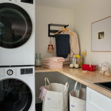
Adjacent to the new entry, we relocated and redesigned the laundry room. Now positioned exactly where it needs to be, it functions as a hardworking utility space with countertops for folding, a utility sink for immediate stain treatment, and the ability to be closed off—keeping daily life contained when needed.
Separating the previous shared function allowed us to carve out a distinct, personality-filled powder room. Wrapped in a bold wave-patterned wallpaper and grounded by a custom reeded oak vanity with warm brass accents, this space delivers a moment of delight and individuality within the home.
The kitchen transformation is where the impact is felt most deeply.
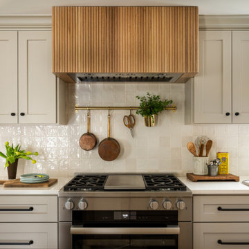
What was once a dark, restrictive layout has been opened into a spacious, highly efficient U-shaped kitchen with generous clearances and an oversized island for gathering. A thoughtful mix of painted cabinetry and rift white oak introduces warmth and balance, while the custom reeded hood becomes a sculptural focal point. Open shelving, integrated pantry storage, and layered lighting ensure the space is as functional as it is beautiful.
Beyond aesthetics, the redesign prioritizes flow—both in movement and in connection. Sightlines between the kitchen, dining, and living areas were intentionally opened, allowing for ease of interaction and visibility throughout the main living spaces.
To unify the home, existing hardwood floors were refinished and extended, creating continuity and a seamless visual experience from one space to the next.
The result is a home that feels lighter, more open, and deeply aligned with how this family lives day to day—designed not just to look beautiful, but to support everything from busy mornings to slow, shared evenings.
 Walczak Design And Build
What once felt dark, segmented, and inefficient is now a bright, connected, and highly functional first floor designed for real family living.
Our clients, Terry and Lou, came to us with a home that simply wasn’t keeping up with their growing family. The kitchen was cramped, with tight working lanes and limited light. The laundry room doubled as a powder room—yet functioned poorly as both. Sightlines between spaces were cut off, making it difficult to stay connected to their young children throughout the day. Across the board, the home felt dated and disconnected.
Through thoughtful planning and strategic structural changes, we reimagined the entire first floor to better support how this family truly lives.
We began by redefining the entry experience—creating a true foyer complete with a dedicated drop zone and custom cubby storage. This space now acts as a natural landing point, bringing order and intention to everyday comings and goings.
Adjacent to the new entry, we relocated and redesigned the laundry room. Now positioned exactly where it needs to be, it functions as a hardworking utility space with countertops for folding, a utility sink for immediate stain treatment, and the ability to be closed off—keeping daily life contained when needed.
Separating the previous shared function allowed us to carve out a distinct, personality-filled powder room. Wrapped in a bold wave-patterned wallpaper and grounded by a custom reeded oak vanity with warm brass accents, this space delivers a moment of delight and individuality within the home.
The kitchen transformation is where the impact is felt most deeply.
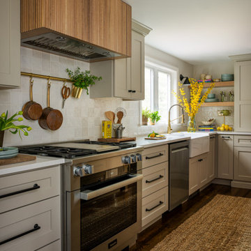
What was once a dark, restrictive layout has been opened into a spacious, highly efficient U-shaped kitchen with generous clearances and an oversized island for gathering. A thoughtful mix of painted cabinetry and rift white oak introduces warmth and balance, while the custom reeded hood becomes a sculptural focal point. Open shelving, integrated pantry storage, and layered lighting ensure the space is as functional as it is beautiful.
Beyond aesthetics, the redesign prioritizes flow—both in movement and in connection. Sightlines between the kitchen, dining, and living areas were intentionally opened, allowing for ease of interaction and visibility throughout the main living spaces.
To unify the home, existing hardwood floors were refinished and extended, creating continuity and a seamless visual experience from one space to the next.
The result is a home that feels lighter, more open, and deeply aligned with how this family lives day to day—designed not just to look beautiful, but to support everything from busy mornings to slow, shared evenings.
 Walczak Design And Build
What once felt dark, segmented, and inefficient is now a bright, connected, and highly functional first floor designed for real family living.
Our clients, Terry and Lou, came to us with a home that simply wasn’t keeping up with their growing family. The kitchen was cramped, with tight working lanes and limited light. The laundry room doubled as a powder room—yet functioned poorly as both. Sightlines between spaces were cut off, making it difficult to stay connected to their young children throughout the day. Across the board, the home felt dated and disconnected.
Through thoughtful planning and strategic structural changes, we reimagined the entire first floor to better support how this family truly lives.
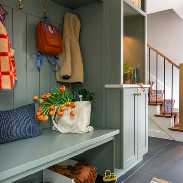
We began by redefining the entry experience—creating a true foyer complete with a dedicated drop zone and custom cubby storage. This space now acts as a natural landing point, bringing order and intention to everyday comings and goings.
Adjacent to the new entry, we relocated and redesigned the laundry room. Now positioned exactly where it needs to be, it functions as a hardworking utility space with countertops for folding, a utility sink for immediate stain treatment, and the ability to be closed off—keeping daily life contained when needed.
Separating the previous shared function allowed us to carve out a distinct, personality-filled powder room. Wrapped in a bold wave-patterned wallpaper and grounded by a custom reeded oak vanity with warm brass accents, this space delivers a moment of delight and individuality within the home.
The kitchen transformation is where the impact is felt most deeply.
What was once a dark, restrictive layout has been opened into a spacious, highly efficient U-shaped kitchen with generous clearances and an oversized island for gathering. A thoughtful mix of painted cabinetry and rift white oak introduces warmth and balance, while the custom reeded hood becomes a sculptural focal point. Open shelving, integrated pantry storage, and layered lighting ensure the space is as functional as it is beautiful.
Beyond aesthetics, the redesign prioritizes flow—both in movement and in connection. Sightlines between the kitchen, dining, and living areas were intentionally opened, allowing for ease of interaction and visibility throughout the main living spaces.
To unify the home, existing hardwood floors were refinished and extended, creating continuity and a seamless visual experience from one space to the next.
The result is a home that feels lighter, more open, and deeply aligned with how this family lives day to day—designed not just to look beautiful, but to support everything from busy mornings to slow, shared evenings.
 Walczak Design And Build
What once felt dark, segmented, and inefficient is now a bright, connected, and highly functional first floor designed for real family living.
Our clients, Terry and Lou, came to us with a home that simply wasn’t keeping up with their growing family. The kitchen was cramped, with tight working lanes and limited light. The laundry room doubled as a powder room—yet functioned poorly as both. Sightlines between spaces were cut off, making it difficult to stay connected to their young children throughout the day. Across the board, the home felt dated and disconnected.
Through thoughtful planning and strategic structural changes, we reimagined the entire first floor to better support how this family truly lives.
We began by redefining the entry experience—creating a true foyer complete with a dedicated drop zone and custom cubby storage. This space now acts as a natural landing point, bringing order and intention to everyday comings and goings.
Adjacent to the new entry, we relocated and redesigned the laundry room. Now positioned exactly where it needs to be, it functions as a hardworking utility space with countertops for folding, a utility sink for immediate stain treatment, and the ability to be closed off—keeping daily life contained when needed.
Separating the previous shared function allowed us to carve out a distinct, personality-filled powder room. Wrapped in a bold wave-patterned wallpaper and grounded by a custom reeded oak vanity with warm brass accents, this space delivers a moment of delight and individuality within the home.
The kitchen transformation is where the impact is felt most deeply.
What was once a dark, restrictive layout has been opened into a spacious, highly efficient U-shaped kitchen with generous clearances and an oversized island for gathering. A thoughtful mix of painted cabinetry and rift white oak introduces warmth and balance, while the custom reeded hood becomes a sculptural focal point. Open shelving, integrated pantry storage, and layered lighting ensure the space is as functional as it is beautiful.
Beyond aesthetics, the redesign prioritizes flow—both in movement and in connection. Sightlines between the kitchen, dining, and living areas were intentionally opened, allowing for ease of interaction and visibility throughout the main living spaces.
To unify the home, existing hardwood floors were refinished and extended, creating continuity and a seamless visual experience from one space to the next.
The result is a home that feels lighter, more open, and deeply aligned with how this family lives day to day—designed not just to look beautiful, but to support everything from busy mornings to slow, shared evenings.
 Walczak Design And Build
What once felt dark, segmented, and inefficient is now a bright, connected, and highly functional first floor designed for real family living.
Our clients, Terry and Lou, came to us with a home that simply wasn’t keeping up with their growing family. The kitchen was cramped, with tight working lanes and limited light. The laundry room doubled as a powder room—yet functioned poorly as both. Sightlines between spaces were cut off, making it difficult to stay connected to their young children throughout the day. Across the board, the home felt dated and disconnected.
Through thoughtful planning and strategic structural changes, we reimagined the entire first floor to better support how this family truly lives.
We began by redefining the entry experience—creating a true foyer complete with a dedicated drop zone and custom cubby storage. This space now acts as a natural landing point, bringing order and intention to everyday comings and goings.
Adjacent to the new entry, we relocated and redesigned the laundry room. Now positioned exactly where it needs to be, it functions as a hardworking utility space with countertops for folding, a utility sink for immediate stain treatment, and the ability to be closed off—keeping daily life contained when needed.
Separating the previous shared function allowed us to carve out a distinct, personality-filled powder room. Wrapped in a bold wave-patterned wallpaper and grounded by a custom reeded oak vanity with warm brass accents, this space delivers a moment of delight and individuality within the home.
The kitchen transformation is where the impact is felt most deeply.
What was once a dark, restrictive layout has been opened into a spacious, highly efficient U-shaped kitchen with generous clearances and an oversized island for gathering. A thoughtful mix of painted cabinetry and rift white oak introduces warmth and balance, while the custom reeded hood becomes a sculptural focal point. Open shelving, integrated pantry storage, and layered lighting ensure the space is as functional as it is beautiful.
Beyond aesthetics, the redesign prioritizes flow—both in movement and in connection. Sightlines between the kitchen, dining, and living areas were intentionally opened, allowing for ease of interaction and visibility throughout the main living spaces.
To unify the home, existing hardwood floors were refinished and extended, creating continuity and a seamless visual experience from one space to the next.
The result is a home that feels lighter, more open, and deeply aligned with how this family lives day to day—designed not just to look beautiful, but to support everything from busy mornings to slow, shared evenings.
 Walczak Design And Build
What once felt dark, segmented, and inefficient is now a bright, connected, and highly functional first floor designed for real family living.
Our clients, Terry and Lou, came to us with a home that simply wasn’t keeping up with their growing family. The kitchen was cramped, with tight working lanes and limited light. The laundry room doubled as a powder room—yet functioned poorly as both. Sightlines between spaces were cut off, making it difficult to stay connected to their young children throughout the day. Across the board, the home felt dated and disconnected.
Through thoughtful planning and strategic structural changes, we reimagined the entire first floor to better support how this family truly lives.
We began by redefining the entry experience—creating a true foyer complete with a dedicated drop zone and custom cubby storage. This space now acts as a natural landing point, bringing order and intention to everyday comings and goings.
Adjacent to the new entry, we relocated and redesigned the laundry room. Now positioned exactly where it needs to be, it functions as a hardworking utility space with countertops for folding, a utility sink for immediate stain treatment, and the ability to be closed off—keeping daily life contained when needed.
Separating the previous shared function allowed us to carve out a distinct, personality-filled powder room. Wrapped in a bold wave-patterned wallpaper and grounded by a custom reeded oak vanity with warm brass accents, this space delivers a moment of delight and individuality within the home.
The kitchen transformation is where the impact is felt most deeply.
What was once a dark, restrictive layout has been opened into a spacious, highly efficient U-shaped kitchen with generous clearances and an oversized island for gathering. A thoughtful mix of painted cabinetry and rift white oak introduces warmth and balance, while the custom reeded hood becomes a sculptural focal point. Open shelving, integrated pantry storage, and layered lighting ensure the space is as functional as it is beautiful.
Beyond aesthetics, the redesign prioritizes flow—both in movement and in connection. Sightlines between the kitchen, dining, and living areas were intentionally opened, allowing for ease of interaction and visibility throughout the main living spaces.
To unify the home, existing hardwood floors were refinished and extended, creating continuity and a seamless visual experience from one space to the next.
The result is a home that feels lighter, more open, and deeply aligned with how this family lives day to day—designed not just to look beautiful, but to support everything from busy mornings to slow, shared evenings.
4