
Search results for "Downloader" in Home Design Ideas
 TKS Design Group
Download our free ebook, Creating the Ideal Kitchen. DOWNLOAD NOW
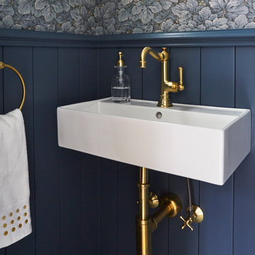
The homeowners came to us looking to update the kitchen in their historic 1897 home. The home had gone through an extensive renovation several years earlier that added a master bedroom suite and updates to the front façade. The kitchen however was not part of that update and a prior 1990’s update had left much to be desired. The client is an avid cook, and it was just not very functional for the family.
The original kitchen was very choppy and included a large eat in area that took up more than its fair share of the space. On the wish list was a place where the family could comfortably congregate, that was easy and to cook in, that feels lived in and in check with the rest of the home’s décor. They also wanted a space that was not cluttered and dark – a happy, light and airy room. A small powder room off the space also needed some attention so we set out to include that in the remodel as well.
See that arch in the neighboring dining room? The homeowner really wanted to make the opening to the dining room an arch to match, so we incorporated that into the design.
Another unfortunate eyesore was the state of the ceiling and soffits. Turns out it was just a series of shortcuts from the prior renovation, and we were surprised and delighted that we were easily able to flatten out almost the entire ceiling with a couple of little reworks.
Other changes we made were to add new windows that were appropriate to the new design, which included moving the sink window over slightly to give the work zone more breathing room. We also adjusted the height of the windows in what was previously the eat-in area that were too low for a countertop to work. We tried to keep an old island in the plan since it was a well-loved vintage find, but the tradeoff for the function of the new island was not worth it in the end. We hope the old found a new home, perhaps as a potting table.
Designed by: Susan Klimala, CKD, CBD
Photography by: Michael Kaskel
For more information on kitchen and bath design ideas go to: www.kitchenstudio-ge.com
 JWT Associates
Lee Manning Photography
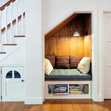
Mid-sized farmhouse wooden straight staircase photo in Los Angeles with painted risers
Mid-sized farmhouse wooden straight staircase photo in Los Angeles with painted risers
 TKS Design Group
Download our free ebook, Creating the Ideal Kitchen. DOWNLOAD NOW
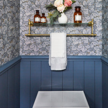
The homeowners came to us looking to update the kitchen in their historic 1897 home. The home had gone through an extensive renovation several years earlier that added a master bedroom suite and updates to the front façade. The kitchen however was not part of that update and a prior 1990’s update had left much to be desired. The client is an avid cook, and it was just not very functional for the family.
The original kitchen was very choppy and included a large eat in area that took up more than its fair share of the space. On the wish list was a place where the family could comfortably congregate, that was easy and to cook in, that feels lived in and in check with the rest of the home’s décor. They also wanted a space that was not cluttered and dark – a happy, light and airy room. A small powder room off the space also needed some attention so we set out to include that in the remodel as well.
See that arch in the neighboring dining room? The homeowner really wanted to make the opening to the dining room an arch to match, so we incorporated that into the design.
Another unfortunate eyesore was the state of the ceiling and soffits. Turns out it was just a series of shortcuts from the prior renovation, and we were surprised and delighted that we were easily able to flatten out almost the entire ceiling with a couple of little reworks.
Other changes we made were to add new windows that were appropriate to the new design, which included moving the sink window over slightly to give the work zone more breathing room. We also adjusted the height of the windows in what was previously the eat-in area that were too low for a countertop to work. We tried to keep an old island in the plan since it was a well-loved vintage find, but the tradeoff for the function of the new island was not worth it in the end. We hope the old found a new home, perhaps as a potting table.
Designed by: Susan Klimala, CKD, CBD
Photography by: Michael Kaskel
For more information on kitchen and bath design ideas go to: www.kitchenstudio-ge.com
Find the right local pro for your project
 TKS Design Group
Free ebook, Creating the Ideal Kitchen. DOWNLOAD NOW
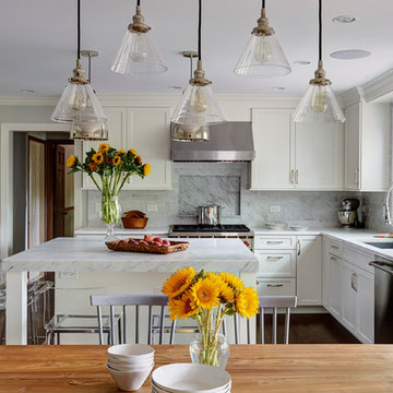
Starting out with a project that has good bones is always a bonus as was the case with the project. This young family has a great house on a great street in a great location. The kitchen was a large space with ample room and great view to the backyard. The dated cabinets and large peninsula layout however were not working for them, so they came in looking for a fresh start.
Goals for the project included adding a large island with seating for four and a bright, open and cheerful space for daily meals and entertaining. Our clients also wanted to keep the existing breakfast table, but the original space did not allow for an island and breakfast table. Our solution was to create banquette seating which gave us the extra inches necessary to accomplish both.
The larger awning window over the kitchen sink allows for ample light in the new space. The wall between the kitchen and family room was partially removed to provide the more open feeling our clients desired.
The work triangle is centered on the island which serves as a big open prep space conveniently located across from the large pro style range. The island also houses the microwave and a 2nd oven for larger gatherings. A new counter depth fridge and beverage center provide options for refrigeration.
A simple pallet of white cabinetry, Carrera marble countertops and polished nickel fixtures will be a timeless look and provide a lovely backdrop for entertaining and spending time with family.
Designed by: Susan Klimala, CKD, CBD
Photography by: Mike Kaskel
For more information on kitchen and bath design ideas go to: www.kitchenstudio-ge.com
 BDS Design Build Remodel
Download our free ebook, Remodeling a House, Creating a Home. DOWNLOAD NOW
Studio West Photography
 TKS Design Group
Download our free ebook, Creating the Ideal Kitchen. DOWNLOAD NOW
This family from Wheaton was ready to remodel their kitchen, dining room and powder room. The project didn’t call for any structural or space planning changes but the makeover still had a massive impact on their home. The homeowners wanted to change their dated 1990’s brown speckled granite and light maple kitchen. They liked the welcoming feeling they got from the wood and warm tones in their current kitchen, but this style clashed with their vision of a deVOL type kitchen, a London-based furniture company. Their inspiration came from the country homes of the UK that mix the warmth of traditional detail with clean lines and modern updates.
To create their vision, we started with all new framed cabinets with a modified overlay painted in beautiful, understated colors. Our clients were adamant about “no white cabinets.” Instead we used an oyster color for the perimeter and a custom color match to a specific shade of green chosen by the homeowner. The use of a simple color pallet reduces the visual noise and allows the space to feel open and welcoming. We also painted the trim above the cabinets the same color to make the cabinets look taller. The room trim was painted a bright clean white to match the ceiling.
In true English fashion our clients are not coffee drinkers, but they LOVE tea. We created a tea station for them where they can prepare and serve tea. We added plenty of glass to showcase their tea mugs and adapted the cabinetry below to accommodate storage for their tea items. Function is also key for the English kitchen and the homeowners. They requested a deep farmhouse sink and a cabinet devoted to their heavy mixer because they bake a lot. We then got rid of the stovetop on the island and wall oven and replaced both of them with a range located against the far wall. This gives them plenty of space on the island to roll out dough and prepare any number of baked goods. We then removed the bifold pantry doors and created custom built-ins with plenty of usable storage for all their cooking and baking needs.
The client wanted a big change to the dining room but still wanted to use their own furniture and rug. We installed a toile-like wallpaper on the top half of the room and supported it with white wainscot paneling. We also changed out the light fixture, showing us once again that small changes can have a big impact.
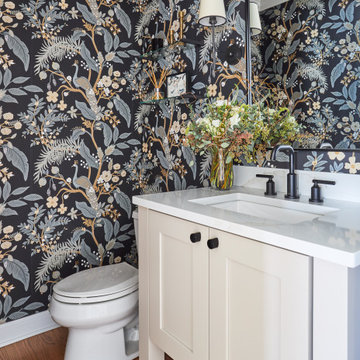
As the final touch, we also re-did the powder room to be in line with the rest of the first floor. We had the new vanity painted in the same oyster color as the kitchen cabinets and then covered the walls in a whimsical patterned wallpaper. Although the homeowners like subtle neutral colors they were willing to go a bit bold in the powder room for something unexpected. For more design inspiration go to: www.kitchenstudio-ge.com
 TKS Design Group
Download our free ebook, Creating the Ideal Kitchen. DOWNLOAD NOW
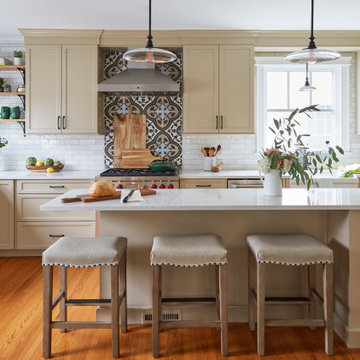
The homeowners came to us looking to update the kitchen in their historic 1897 home. The home had gone through an extensive renovation several years earlier that added a master bedroom suite and updates to the front façade. The kitchen however was not part of that update and a prior 1990’s update had left much to be desired. The client is an avid cook, and it was just not very functional for the family.
The original kitchen was very choppy and included a large eat in area that took up more than its fair share of the space. On the wish list was a place where the family could comfortably congregate, that was easy and to cook in, that feels lived in and in check with the rest of the home’s décor. They also wanted a space that was not cluttered and dark – a happy, light and airy room. A small powder room off the space also needed some attention so we set out to include that in the remodel as well.
See that arch in the neighboring dining room? The homeowner really wanted to make the opening to the dining room an arch to match, so we incorporated that into the design.
Another unfortunate eyesore was the state of the ceiling and soffits. Turns out it was just a series of shortcuts from the prior renovation, and we were surprised and delighted that we were easily able to flatten out almost the entire ceiling with a couple of little reworks.
Other changes we made were to add new windows that were appropriate to the new design, which included moving the sink window over slightly to give the work zone more breathing room. We also adjusted the height of the windows in what was previously the eat-in area that were too low for a countertop to work. We tried to keep an old island in the plan since it was a well-loved vintage find, but the tradeoff for the function of the new island was not worth it in the end. We hope the old found a new home, perhaps as a potting table.
Designed by: Susan Klimala, CKD, CBD
Photography by: Michael Kaskel
For more information on kitchen and bath design ideas go to: www.kitchenstudio-ge.com
 TKS Design Group
Download our free ebook, Creating the Ideal Kitchen. DOWNLOAD NOW
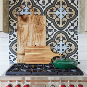
The homeowners came to us looking to update the kitchen in their historic 1897 home. The home had gone through an extensive renovation several years earlier that added a master bedroom suite and updates to the front façade. The kitchen however was not part of that update and a prior 1990’s update had left much to be desired. The client is an avid cook, and it was just not very functional for the family.
The original kitchen was very choppy and included a large eat in area that took up more than its fair share of the space. On the wish list was a place where the family could comfortably congregate, that was easy and to cook in, that feels lived in and in check with the rest of the home’s décor. They also wanted a space that was not cluttered and dark – a happy, light and airy room. A small powder room off the space also needed some attention so we set out to include that in the remodel as well.
See that arch in the neighboring dining room? The homeowner really wanted to make the opening to the dining room an arch to match, so we incorporated that into the design.
Another unfortunate eyesore was the state of the ceiling and soffits. Turns out it was just a series of shortcuts from the prior renovation, and we were surprised and delighted that we were easily able to flatten out almost the entire ceiling with a couple of little reworks.
Other changes we made were to add new windows that were appropriate to the new design, which included moving the sink window over slightly to give the work zone more breathing room. We also adjusted the height of the windows in what was previously the eat-in area that were too low for a countertop to work. We tried to keep an old island in the plan since it was a well-loved vintage find, but the tradeoff for the function of the new island was not worth it in the end. We hope the old found a new home, perhaps as a potting table.
Designed by: Susan Klimala, CKD, CBD
Photography by: Michael Kaskel
For more information on kitchen and bath design ideas go to: www.kitchenstudio-ge.com
 TKS Design Group
Download our free ebook, Creating the Ideal Kitchen. DOWNLOAD NOW
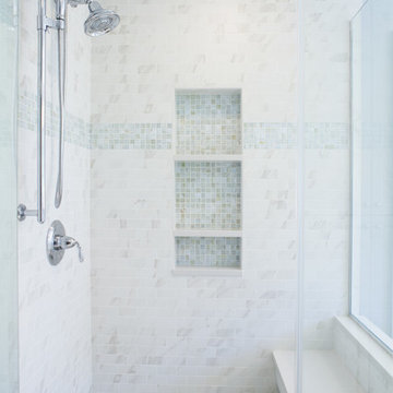
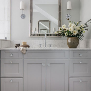
Our clients were in the market for an upgrade from builder grade in their Glen Ellyn bathroom! They came to us requesting a more spa like experience and a designer’s eye to create a more refined space.
A large steam shower, bench and rain head replaced a dated corner bathtub. In addition, we added heated floors for those cool Chicago months and several storage niches and built-in cabinets to keep extra towels and toiletries out of sight. The use of circles in the tile, cabinetry and new window in the shower give this primary bath the character it was lacking, while lowering and modifying the unevenly vaulted ceiling created symmetry in the space. The end result is a large luxurious spa shower, more storage space and improvements to the overall comfort of the room. A nice upgrade from the existing builder grade space!
Photography by @margaretrajic
Photo stylist @brandidevers
Do you have an older home that has great bones but needs an upgrade? Contact us here to see how we can help!
 Conklin Limestone
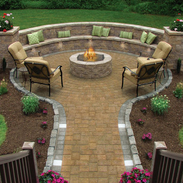
A perfect addition to your outdoor living is a seating wall surrounding a firepit. Cambridge Maytrx wall, Pyzique Fire Pit, Round table Pavers. Installed by Natural Green Landsacpe & Design in Lincoln, RI
 Interiors by Steven G
Barry Grossman Photography
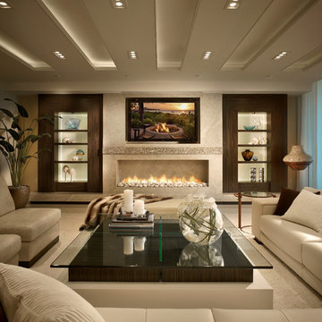
Example of a trendy white floor living room design in Miami with a ribbon fireplace
Example of a trendy white floor living room design in Miami with a ribbon fireplace
 TKS Design Group
Free ebook, Creating the Ideal Kitchen. DOWNLOAD NOW
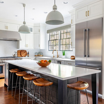
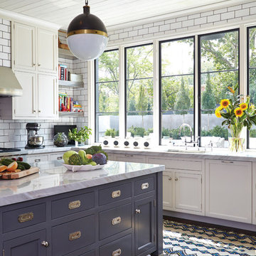
We went with a minimalist, clean, industrial look that feels light, bright and airy. The island is a dark charcoal with cool undertones that coordinates with the cabinetry and transom work in both the neighboring mudroom and breakfast area. White subway tile, quartz countertops, white enamel pendants and gold fixtures complete the update. The ends of the island are shiplap material that is also used on the fireplace in the next room.
In the new mudroom, we used a fun porcelain tile on the floor to get a pop of pattern, and walnut accents add some warmth. Each child has their own cubby, and there is a spot for shoes below a long bench. Open shelving with spots for baskets provides additional storage for the room.
Designed by: Susan Klimala, CKBD
Photography by: LOMA Studios
For more information on kitchen and bath design ideas go to: www.kitchenstudio-ge.com
Kitchen - transitional dark wood floor kitchen idea in Nashville with shaker cabinets, white cabinets, white backsplash, subway tile backsplash, an island and white countertops
 TKS Design Group
Free ebook, Creating the Ideal Kitchen. DOWNLOAD NOW
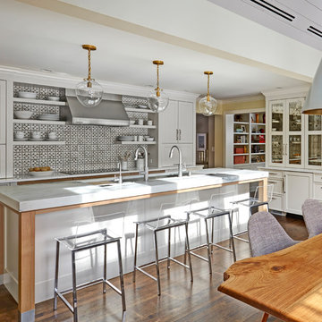
This large open concept kitchen and dining space was created by removing a load bearing wall between the old kitchen and a porch area. The new porch was insulated and incorporated into the overall space. The kitchen remodel was part of a whole house remodel so new quarter sawn oak flooring, a vaulted ceiling, windows and skylights were added.
A large calcutta marble topped island takes center stage. It houses a 5’ galley workstation - a sink that provides a convenient spot for prepping, serving, entertaining and clean up. A 36” induction cooktop is located directly across from the island for easy access. Two appliance garages on either side of the cooktop house small appliances that are used on a daily basis.
Honeycomb tile by Ann Sacks and open shelving along the cooktop wall add an interesting focal point to the room. Antique mirrored glass faces the storage unit housing dry goods and a beverage center. “I chose details for the space that had a bit of a mid-century vibe that would work well with what was originally a 1950s ranch. Along the way a previous owner added a 2nd floor making it more of a Cape Cod style home, a few eclectic details felt appropriate”, adds Klimala.
The wall opposite the cooktop houses a full size fridge, freezer, double oven, coffee machine and microwave. “There is a lot of functionality going on along that wall”, adds Klimala. A small pull out countertop below the coffee machine provides a spot for hot items coming out of the ovens.
The rooms creamy cabinetry is accented by quartersawn white oak at the island and wrapped ceiling beam. The golden tones are repeated in the antique brass light fixtures.
“This is the second kitchen I’ve had the opportunity to design for myself. My taste has gotten a little less traditional over the years, and although I’m still a traditionalist at heart, I had some fun with this kitchen and took some chances. The kitchen is super functional, easy to keep clean and has lots of storage to tuck things away when I’m done using them. The casual dining room is fabulous and is proving to be a great spot to linger after dinner. We love it!”
Designed by: Susan Klimala, CKD, CBD
For more information on kitchen and bath design ideas go to: www.kitchenstudio-ge.com
 TKS Design Group
Download our free ebook, Creating the Ideal Kitchen. DOWNLOAD NOW
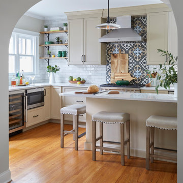
The homeowners came to us looking to update the kitchen in their historic 1897 home. The home had gone through an extensive renovation several years earlier that added a master bedroom suite and updates to the front façade. The kitchen however was not part of that update and a prior 1990’s update had left much to be desired. The client is an avid cook, and it was just not very functional for the family.
The original kitchen was very choppy and included a large eat in area that took up more than its fair share of the space. On the wish list was a place where the family could comfortably congregate, that was easy and to cook in, that feels lived in and in check with the rest of the home’s décor. They also wanted a space that was not cluttered and dark – a happy, light and airy room. A small powder room off the space also needed some attention so we set out to include that in the remodel as well.
See that arch in the neighboring dining room? The homeowner really wanted to make the opening to the dining room an arch to match, so we incorporated that into the design.
Another unfortunate eyesore was the state of the ceiling and soffits. Turns out it was just a series of shortcuts from the prior renovation, and we were surprised and delighted that we were easily able to flatten out almost the entire ceiling with a couple of little reworks.
Other changes we made were to add new windows that were appropriate to the new design, which included moving the sink window over slightly to give the work zone more breathing room. We also adjusted the height of the windows in what was previously the eat-in area that were too low for a countertop to work. We tried to keep an old island in the plan since it was a well-loved vintage find, but the tradeoff for the function of the new island was not worth it in the end. We hope the old found a new home, perhaps as a potting table.
Designed by: Susan Klimala, CKD, CBD
Photography by: Michael Kaskel
For more information on kitchen and bath design ideas go to: www.kitchenstudio-ge.com

 Eleven Interiors
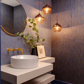
Inspiration for a contemporary blue tile and mosaic tile mosaic tile floor, blue floor and wallpaper powder room remodel in Boston with brown walls, a vessel sink and white countertops
 TKS Design Group
Free ebook, Creating the Ideal Kitchen. DOWNLOAD NOW
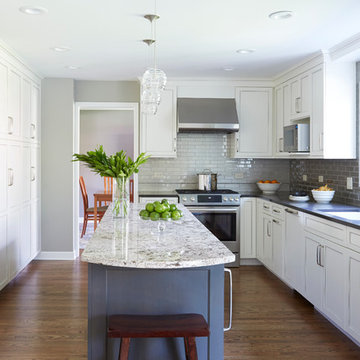
The homeowners of this mid-century Colonial and family of four were frustrated with the layout of their existing kitchen which was a small, narrow peninsula layout but that was adjoining a large space that they could not figure out how to use. Stealing part of the unused space seemed like an easy solution, except that there was an existing transition in floor height which made that a bit tricky. The solution of bringing the floor height up to meet the height of the existing kitchen allowed us to do just that.
This solution also offered some challenges. The exterior door had to be raised which resulted in some exterior rework, and the floor transition had to happen somewhere to get out to the garage, so we ended up “pushing” it towards what is now a new mudroom and powder room area. This solution allows for a small but functional and hidden mudroom area and more private powder room situation.
Another challenge of the design was the very narrow space. To minimize issues with this, we moved the location of the refrigerator into the newly found space which gave us an L-shaped layout allowing for an island and even some shallow pantry storage. The windows over the kitchen sink were expanded in size and relocated to allow more light into the room. A breakfast table fits perfectly in the area adjacent to the existing French doors and there was even room for a small bar area that helps transition from inside to outside for entertaining. The confusing unused space now makes sense and provides functionality on a daily basis.
To help bring some calm to this busy family, a pallet of soft neutrals was chosen -- gray glass tile with a simple metal accent strip, clear modern pendant lights and a neutral color scheme for cabinetry and countertops.
For more information on kitchen and bath design ideas go to: www.kitchenstudio-ge.com
 TKS Design Group
Download our free ebook, Creating the Ideal Kitchen. DOWNLOAD NOW
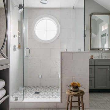
Our clients were in the market for an upgrade from builder grade in their Glen Ellyn bathroom! They came to us requesting a more spa like experience and a designer’s eye to create a more refined space.
A large steam shower, bench and rain head replaced a dated corner bathtub. In addition, we added heated floors for those cool Chicago months and several storage niches and built-in cabinets to keep extra towels and toiletries out of sight. The use of circles in the tile, cabinetry and new window in the shower give this primary bath the character it was lacking, while lowering and modifying the unevenly vaulted ceiling created symmetry in the space. The end result is a large luxurious spa shower, more storage space and improvements to the overall comfort of the room. A nice upgrade from the existing builder grade space!
Photography by @margaretrajic
Photo stylist @brandidevers
Do you have an older home that has great bones but needs an upgrade? Contact us here to see how we can help!
2