
Search results for "Downsizing" in Home Design Ideas
 Drury Design
THE SETUP
Once these empty nest homeowners decided to stay put, they knew a new kitchen was in order. Passionate about cooking, entertaining, and hosting holiday gatherings, they found their existing kitchen inadequate. The space, with its traditional style and outdated layout, was far from ideal. They longed for an elegant, timeless kitchen that was not only show-stopping but also functional, seamlessly catering to both their daily routines and special occasions with friends and family. Another key factor was its future appeal to potential buyers, as they’re ready to enjoy their new kitchen while also considering downsizing in the future.
Design Objectives:
Create a more streamlined, open space
Eliminate traditional elements
Improve flow for entertaining and everyday use
Omit dated posts and soffits
Include storage for small appliances to keep counters clutter-free
Address mail organization and phone charging concerns
THE REMODEL
Design Challenges:
Compensate for lost storage from omitted wall cabinets
Revise floorplan to feature a single, spacious island
Enhance island seating proximity for a more engaging atmosphere
Address awkward space above existing built-ins
Improve natural light blocked by wall cabinet near the window
Create a highly functional space tailored for entertaining
Design Solutions:
Tall cabinetry and pull-outs maximize storage efficiency
A generous single island promotes seamless flow and ample prep space
Strategic island seating arrangement fosters easy conversation
New built-ins fill arched openings, ensuring a custom, clutter-free look
Replace wall cabinet with lighted open shelves for an airy feel
Galley Dresser and Workstation offer impeccable organization and versatility, creating the perfect setup for entertaining with everything easily accessible.
THE RENEWED SPACE
The new kitchen exceeded every expectation, thrilling the clients with its revitalized, expansive design and thoughtful functionality. The transformation brought to life an open space adorned with marble accents, a state-of-the-art steam oven, and the seamless integration of the Galley Dresser, crafting a kitchen not just to be used, but to be cherished. This is more than a culinary space; it’s a new heart of their home, ready to host countless memories and culinary adventures.
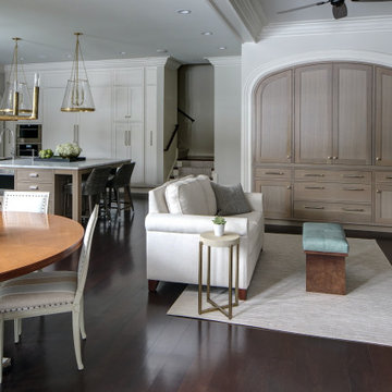
This photo features the new custom built-ins in light oak finish in the adjacent seating area, the dining area, and interesting pendant light fixtures pulling the entire design together.

 Design Vision Studio
James Latta of Rancho Images -
MOVIE COLONY
When we met these wonderful Palm Springs clients, they were overwhelmed with the task of downsizing their vast collection of fine art, antiques, and sculptures. The problem was it was an amazing collection so the task was not easy. What do we keep? What do we let go? Design Vision Studio to the rescue! We realized that to really showcase these beautiful pieces, we needed to pick and choose the right ones and ensure they were showcased properly.
Lighting was improved throughout the home. We installed and updated recessed lights and cabinet lighting. Outdated ceiling fans and chandeliers were replaced. The walls were painted with a warm, soft ivory color and the moldings, door and windows also were given a complimentary fresh coat of paint. The overall impact was a clean bright room.
We replaced the outdated oak front doors with modern glass doors. The fireplace received a facelift with new tile, a custom mantle and crushed glass to replace the old fake logs. Custom draperies frame the views. The dining room was brought to life with recycled magazine grass cloth wallpaper on the ceiling, new red leather upholstery on the chairs, and a custom red paint treatment on the new chandelier to tie it all together. (The chandelier was actually powder-coated at an auto paint shop!)
Once crammed with too much, too little and no style, the Asian Modern Bedroom Suite is now a DREAM COME TRUE. We even incorporated their much loved (yet horribly out-of-date) small sofa by recovering it with teal velvet to give it new life.
Underutilized hall coat closets were removed and transformed with custom cabinetry to create art niches. We also designed a custom built-in media cabinet with "breathing room" to display more of their treasures. The new furniture was intentionally selected with modern lines to give the rooms layers and texture.
When we suggested a crystal ship chandelier to our clients, they wanted US to walk the plank. Luckily, after months of consideration, the tides turned and they gained the confidence to follow our suggestion. Now their powder room is one of their favorite spaces in their home.
Our clients (and all of their friends) are amazed at the total transformation of this home and with how well it "fits" them. We love the results too. This home now tells a story through their beautiful life-long collections. The design may have a gallery look but the feeling is all comfort and style.
 Design Vision Studio
James Latta of Rancho Images -
MOVIE COLONY
When we met these wonderful Palm Springs clients, they were overwhelmed with the task of downsizing their vast collection of fine art, antiques, and sculptures. The problem was it was an amazing collection so the task was not easy. What do we keep? What do we let go? Design Vision Studio to the rescue! We realized that to really showcase these beautiful pieces, we needed to pick and choose the right ones and ensure they were showcased properly.
Lighting was improved throughout the home. We installed and updated recessed lights and cabinet lighting. Outdated ceiling fans and chandeliers were replaced. The walls were painted with a warm, soft ivory color and the moldings, door and windows also were given a complimentary fresh coat of paint. The overall impact was a clean bright room.
We replaced the outdated oak front doors with modern glass doors. The fireplace received a facelift with new tile, a custom mantle and crushed glass to replace the old fake logs. Custom draperies frame the views. The dining room was brought to life with recycled magazine grass cloth wallpaper on the ceiling, new red leather upholstery on the chairs, and a custom red paint treatment on the new chandelier to tie it all together. (The chandelier was actually powder-coated at an auto paint shop!)
Once crammed with too much, too little and no style, the Asian Modern Bedroom Suite is now a DREAM COME TRUE. We even incorporated their much loved (yet horribly out-of-date) small sofa by recovering it with teal velvet to give it new life.
Underutilized hall coat closets were removed and transformed with custom cabinetry to create art niches. We also designed a custom built-in media cabinet with "breathing room" to display more of their treasures. The new furniture was intentionally selected with modern lines to give the rooms layers and texture.
When we suggested a crystal ship chandelier to our clients, they wanted US to walk the plank. Luckily, after months of consideration, the tides turned and they gained the confidence to follow our suggestion. Now their powder room is one of their favorite spaces in their home.
Our clients (and all of their friends) are amazed at the total transformation of this home and with how well it "fits" them. We love the results too. This home now tells a story through their beautiful life-long collections. The design may have a gallery look but the feeling is all comfort and style.
Find the right local pro for your project
 Design Vision Studio
James Latta Photography -
As an interior designer, I liked my home but was not "in love" with it. I didn't feel in sync with the style and architecture despite compliments from friends and family. It was time for a change. I sold my Floating Home (see Sleepless in Portland: Houseboat Diary) and my La Quinta home (see Transitional Living, La Quinta) and downsized to a house that's a better fit.
The home was lacking sufficient storage so I added a beverage center with storage cabinets and a butcher block countertop to the dining room. An Ikea table frame was powder coated in dark grey and fitted with a Cambria Quartz dining top. A matching quartz piece was added to create a kitchen bar seating area and includes a beautiful waterfall edge. Reclaimed wood square tiles were added to the kitchen pop up ceiling and the living room fireplace to add warmth and texture. Black and white photography of the local desert landscape frame the fireplace. Although the home is mainly grey, black and white, pops of red are a recurring theme thought the interior and exterior, including a red barn door at the kitchen pantry.
I broke design rules and didnt take the "safe" route. Quirky accent items can be found throughout the home. These include a wall-mounted family accordion, framed movie quotes in one of the guest rooms, a custom canvas photo of my miniature schnauzer, and dragon print accent pillows throughout. A Tongue and Groove (T&G) wood ceiling transformed the master bedroom and a beautiful red area rug adds color and warmth. The result is DARING and yet comfortable.
The backyard was completely renovated. Tons of white rock were removed and beautiful landscaping and lighting were added as well as an additional 500 square feet of pavers. A sun shade, red umbrellas, and patio misters create inviting seating areas for friends and family. Tongue and Groove wood was also added to the outdoor patio ceilings. A high end surround sound system and built in BBQ with patterned cement tiles complete this outdoor living space.
The process was exhausting and time consuming but now that it is over, I am thrilled with the results.
I now live in a home that nourishes my soul and better represents my style and tastes.
 Drury Design
THE SETUP
Once these empty nest homeowners decided to stay put, they knew a new kitchen was in order. Passionate about cooking, entertaining, and hosting holiday gatherings, they found their existing kitchen inadequate. The space, with its traditional style and outdated layout, was far from ideal. They longed for an elegant, timeless kitchen that was not only show-stopping but also functional, seamlessly catering to both their daily routines and special occasions with friends and family. Another key factor was its future appeal to potential buyers, as they’re ready to enjoy their new kitchen while also considering downsizing in the future.
Design Objectives:
Create a more streamlined, open space
Eliminate traditional elements
Improve flow for entertaining and everyday use
Omit dated posts and soffits
Include storage for small appliances to keep counters clutter-free
Address mail organization and phone charging concerns
THE REMODEL
Design Challenges:
Compensate for lost storage from omitted wall cabinets
Revise floorplan to feature a single, spacious island
Enhance island seating proximity for a more engaging atmosphere
Address awkward space above existing built-ins
Improve natural light blocked by wall cabinet near the window
Create a highly functional space tailored for entertaining
Design Solutions:
Tall cabinetry and pull-outs maximize storage efficiency
A generous single island promotes seamless flow and ample prep space
Strategic island seating arrangement fosters easy conversation
New built-ins fill arched openings, ensuring a custom, clutter-free look
Replace wall cabinet with lighted open shelves for an airy feel
Galley Dresser and Workstation offer impeccable organization and versatility, creating the perfect setup for entertaining with everything easily accessible.
THE RENEWED SPACE
The new kitchen exceeded every expectation, thrilling the clients with its revitalized, expansive design and thoughtful functionality. The transformation brought to life an open space adorned with marble accents, a state-of-the-art steam oven, and the seamless integration of the Galley Dresser, crafting a kitchen not just to be used, but to be cherished. This is more than a culinary space; it’s a new heart of their home, ready to host countless memories and culinary adventures.
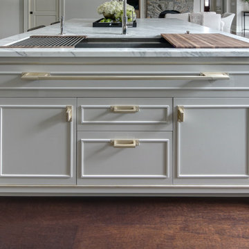
The Galley Dresser prep sink thinks of all attachments and necessities possible for the ultimate entertaining.

 HU-884212062
Our client recently purchased a newly-constructed home in order to downsize and have a low- maintenance home and yard. The existing side yard/back yard was undeveloped by the builder, leaving the homeowner with the huge challenge of creating a great outdoor entertaining space for family and friends, while creating privacy and overcoming the over 8-foot steep drop from the existing back porch down to the alley.
The grade was the largest challenge because the space was so narrow with such a large fall from existing porch to the property line. The second largest challenge is that this residence is located in a semi-private community where HOA approval of plans and materials is difficult, as all the residences here share a similar look and feel with a very clean and contemporary aesthetic.
We had to precisely shoot grades to know what kinds of retaining walls would need to be constructed along with how much backfill soil and dirt movement would need to be done. After that the design had to carefully consider the space with maximum functionality for outdoor entertainment with newly constructed walls to ensure it would last for many years to come. All of this was done with multiple meetings with the homeowners who are a retired engineer and active architect themselves. Once a design was settled upon, then submission to the HOA board of approval had to be completed and signed off on with all questions and concerns answered for the community by-laws.
The two biggest difficulties within the construction phase were that the neighbor next to the back yard had a large retaining wall not properly backfilled up to the property line. That neighbor wouldn’t allow us proper access and control to help alleviate the issues, so we had to skillfully work around this to ensure what we constructed would last, despite their property not being properly addressed. We also had to go through multiple shipments from the manufacturer due to large variances in the material’s appearance on the steps and another shipment that was broken during shipping. These two things delayed the project we were working to complete before the spring so the homeowner could have the maximum use of the space this year.
Topping off this challenging construction was a beautiful palette of native grasses, rosemary, groundcover, granite walkways, and synthetic grass to ensure year-round, practically effortless beauty.

 B Designs Interior's
Before and afters at Susan's. I promise a complete story once the custom glass shower door is installed but it's nice to look at photos along with the video. Their is a lot here to talk about. The project started as part of a five year'ish plan to downsize. Susan wanted something that would help resale value without over-improving, but also wanted to enjoy her Bathroom while still there. That meant classic white. I noticed immediately that their was enough space to add a double vanity. That's huge in a Master Bath. The two, large, beveled frameless mirrors add depth and light, while larger floor tiles makes the space [though you can't tell from these photos] seem much larger. Susan really liked her original light gray walls so we kept them. They do harmonize with the marble finishes and that tiny toilet was replaced with a Koehler Cimarron comfort height with water sense technology. I like the Cimarron for its value and interchangeable style. It also has a great flush. The bathroom also had a tiny window at an odd height that bothered me, so I suggested replacing it with a larger window, which also adds more light and helps to make the bathroom appear larger. Susan wanted a simple shade for privacy. Here we used a Graber faux silk pleated shade with bottom up top down. Let's not forget the cherry on the top, the stunning Herringbone Marble Shower that replaced a dated and small, fiberglass shower surrounded. All in all we doubled the storage and added a lot more light, while updating to create a very classic Bathroom. -B Designs, "Creating beautiful livable spaces as unique as you!" #anotherbdesigns #bathroomdesigner #classicbathroomdesign #allnthedetails #Bdesignsbsthroomdesign #whitebathrooms #jackandjill #Kohler #grohe #grabercustomshades #saratogainteriordesigner #albanyinteriordesigner #loudonvilleinteriordesigner #niskayunainteriordesigner #bathroomdesign #albanymarble #whitebathroomvanities #vanitymirrors #herringbonebathrooms #herringbonetile #herringboneshower

 User
Wool Patterned Field Carpet with Linen Wide Binding & Chrome Upholstery Nails
Mid-sized transitional carpeted u-shaped staircase photo in Chicago with carpeted risers
Mid-sized transitional carpeted u-shaped staircase photo in Chicago with carpeted risers
 B Designs Interior's
Before and afters at Susan's. I promise a complete story once the custom glass shower door is installed but it's nice to look at photos along with the video. Their is a lot here to talk about. The project started as part of a five year'ish plan to downsize. Susan wanted something that would help resale value without over-improving, but also wanted to enjoy her Bathroom while still there. That meant classic white. I noticed immediately that their was enough space to add a double vanity. That's huge in a Master Bath. The two, large, beveled frameless mirrors add depth and light, while larger floor tiles makes the space [though you can't tell from these photos] seem much larger. Susan really liked her original light gray walls so we kept them. They do harmonize with the marble finishes and that tiny toilet was replaced with a Koehler Cimarron comfort height with water sense technology. I like the Cimarron for its value and interchangeable style. It also has a great flush. The bathroom also had a tiny window at an odd height that bothered me, so I suggested replacing it with a larger window, which also adds more light and helps to make the bathroom appear larger. Susan wanted a simple shade for privacy. Here we used a Graber faux silk pleated shade with bottom up top down. Let's not forget the cherry on the top, the stunning Herringbone Marble Shower that replaced a dated and small, fiberglass shower surrounded. All in all we doubled the storage and added a lot more light, while updating to create a very classic Bathroom. -B Designs, "Creating beautiful livable spaces as unique as you!" #anotherbdesigns #bathroomdesigner #classicbathroomdesign #allnthedetails #Bdesignsbsthroomdesign #whitebathrooms #jackandjill #Kohler #grohe #grabercustomshades #saratogainteriordesigner #albanyinteriordesigner #loudonvilleinteriordesigner #niskayunainteriordesigner #bathroomdesign #albanymarble #whitebathroomvanities #vanitymirrors #herringbonebathrooms #herringbonetile #herringboneshower

 TVL Creative Ltd.
These wonderful clients returned to us for their newest home remodel adventure. Their newly purchased custom built 1970s modern ranch sits in one of the loveliest neighborhoods south of the city but the current conditions of the home were out-dated and not so lovely. Upon entering the front door through the court you were greeted abruptly by a very boring staircase and an excessive number of doors. Just to the left of the double door entry was a large slider and on your right once inside the home was a soldier line up of doors. This made for an uneasy and uninviting entry that guests would quickly forget and our clients would often avoid. We also had our hands full in the kitchen. The existing space included many elements that felt out of place in a modern ranch including a rustic mountain scene backsplash, cherry cabinets with raised panel and detailed profile, and an island so massive you couldn’t pass a drink across the stone. Our design sought to address the functional pain points of the home and transform the overall aesthetic into something that felt like home for our clients.
For the entry, we re-worked the front door configuration by switching from the double door to a large single door with side lights. The sliding door next to the main entry door was replaced with a large window to eliminate entry door confusion. In our re-work of the entry staircase, guesta are now greeted into the foyer which features the Coral Pendant by David Trubridge. Guests are drawn into the home by stunning views of the front range via the large floor-to-ceiling glass wall in the living room. To the left, the staircases leading down to the basement and up to the master bedroom received a massive aesthetic upgrade. The rebuilt 2nd-floor staircase has a center spine with wood rise and run appearing to float upwards towards the master suite. A slatted wall of wood separates the two staircases which brings more light into the basement stairwell. Black metal railings add a stunning contrast to the light wood.
Other fabulous upgrades to this home included new wide plank flooring throughout the home, which offers both modernity and warmth. The once too-large kitchen island was downsized to create a functional focal point that is still accessible and intimate. The old dark and heavy kitchen cabinetry was replaced with sleek white cabinets, brightening up the space and elevating the aesthetic of the entire room. The kitchen countertops are marble look quartz with dramatic veining that offers an artistic feature behind the range and across all horizontal surfaces in the kitchen. As a final touch, cascading island pendants were installed which emphasize the gorgeous ceiling vault and provide warm feature lighting over the central point of the kitchen.
This transformation reintroduces light and simplicity to this gorgeous home, and we are so happy that our clients can reap the benefits of this elegant and functional design for years to come.

 Bella Domicile
Dale Hall Photography, LLC
Dura Supreme Cabinetry
Inspiration for a mid-sized eclectic enclosed carpeted family room library remodel in Milwaukee with blue walls and a concealed tv
Inspiration for a mid-sized eclectic enclosed carpeted family room library remodel in Milwaukee with blue walls and a concealed tv
 Design Vision Studio
James Latta Photography -
As an interior designer, I liked my home but was not "in love" with it. I didn't feel in sync with the style and architecture despite compliments from friends and family. It was time for a change. I sold my Floating Home (see Sleepless in Portland: Houseboat Diary) and my La Quinta home (see Transitional Living, La Quinta) and downsized to a house that's a better fit.
The home was lacking sufficient storage so I added a beverage center with storage cabinets and a butcher block countertop to the dining room. An Ikea table frame was powder coated in dark grey and fitted with a Cambria Quartz dining top. A matching quartz piece was added to create a kitchen bar seating area and includes a beautiful waterfall edge. Reclaimed wood square tiles were added to the kitchen pop up ceiling and the living room fireplace to add warmth and texture. Black and white photography of the local desert landscape frame the fireplace. Although the home is mainly grey, black and white, pops of red are a recurring theme thought the interior and exterior, including a red barn door at the kitchen pantry.
I broke design rules and didnt take the "safe" route. Quirky accent items can be found throughout the home. These include a wall-mounted family accordion, framed movie quotes in one of the guest rooms, a custom canvas photo of my miniature schnauzer, and dragon print accent pillows throughout. A Tongue and Groove (T&G) wood ceiling transformed the master bedroom and a beautiful red area rug adds color and warmth. The result is DARING and yet comfortable.
The backyard was completely renovated. Tons of white rock were removed and beautiful landscaping and lighting were added as well as an additional 500 square feet of pavers. A sun shade, red umbrellas, and patio misters create inviting seating areas for friends and family. Tongue and Groove wood was also added to the outdoor patio ceilings. A high end surround sound system and built in BBQ with patterned cement tiles complete this outdoor living space.
The process was exhausting and time consuming but now that it is over, I am thrilled with the results.
I now live in a home that nourishes my soul and better represents my style and tastes.
 Design Vision Studio
Raychelle Devilla Photography -
MOVIE COLONY
When we met these wonderful Palm Springs clients, they were overwhelmed with the task of downsizing their vast collection of fine art, antiques, and sculptures. The problem was it was an amazing collection so the task was not easy. What do we keep? What do we let go? Design Vision Studio to the rescue! We realized that to really showcase these beautiful pieces, we needed to pick and choose the right ones and ensure they were showcased properly.
Lighting was improved throughout the home. We installed and updated recessed lights and cabinet lighting. Outdated ceiling fans and chandeliers were replaced. The walls were painted with a warm, soft ivory color and the moldings, door and windows also were given a complimentary fresh coat of paint. The overall impact was a clean bright room.
We replaced the outdated oak front doors with modern glass doors. The fireplace received a facelift with new tile, a custom mantle and crushed glass to replace the old fake logs. Custom draperies frame the views. The dining room was brought to life with recycled magazine grass cloth wallpaper on the ceiling, new red leather upholstery on the chairs, and a custom red paint treatment on the new chandelier to tie it all together. (The chandelier was actually powder-coated at an auto paint shop!)
Once crammed with too much, too little and no style, the Asian Modern Bedroom Suite is now a DREAM COME TRUE. We even incorporated their much loved (yet horribly out-of-date) small sofa by recovering it with teal velvet to give it new life.
Underutilized hall coat closets were removed and transformed with custom cabinetry to create art niches. We also designed a custom built-in media cabinet with "breathing room" to display more of their treasures. The new furniture was intentionally selected with modern lines to give the rooms layers and texture.
When we suggested a crystal ship chandelier to our clients, they wanted US to walk the plank. Luckily, after months of consideration, the tides turned and they gained the confidence to follow our suggestion. Now their powder room is one of their favorite spaces in their home.
Our clients (and all of their friends) are amazed at the total transformation of this home and with how well it "fits" them. We love the results too. This home now tells a story through their beautiful life-long collections. The design may have a gallery look but the feeling is all comfort and style.
 TVL Creative Ltd.
These wonderful clients returned to us for their newest home remodel adventure. Their newly purchased custom built 1970s modern ranch sits in one of the loveliest neighborhoods south of the city but the current conditions of the home were out-dated and not so lovely. Upon entering the front door through the court you were greeted abruptly by a very boring staircase and an excessive number of doors. Just to the left of the double door entry was a large slider and on your right once inside the home was a soldier line up of doors. This made for an uneasy and uninviting entry that guests would quickly forget and our clients would often avoid. We also had our hands full in the kitchen. The existing space included many elements that felt out of place in a modern ranch including a rustic mountain scene backsplash, cherry cabinets with raised panel and detailed profile, and an island so massive you couldn’t pass a drink across the stone. Our design sought to address the functional pain points of the home and transform the overall aesthetic into something that felt like home for our clients.
For the entry, we re-worked the front door configuration by switching from the double door to a large single door with side lights. The sliding door next to the main entry door was replaced with a large window to eliminate entry door confusion. In our re-work of the entry staircase, guesta are now greeted into the foyer which features the Coral Pendant by David Trubridge. Guests are drawn into the home by stunning views of the front range via the large floor-to-ceiling glass wall in the living room. To the left, the staircases leading down to the basement and up to the master bedroom received a massive aesthetic upgrade. The rebuilt 2nd-floor staircase has a center spine with wood rise and run appearing to float upwards towards the master suite. A slatted wall of wood separates the two staircases which brings more light into the basement stairwell. Black metal railings add a stunning contrast to the light wood.
Other fabulous upgrades to this home included new wide plank flooring throughout the home, which offers both modernity and warmth. The once too-large kitchen island was downsized to create a functional focal point that is still accessible and intimate. The old dark and heavy kitchen cabinetry was replaced with sleek white cabinets, brightening up the space and elevating the aesthetic of the entire room. The kitchen countertops are marble look quartz with dramatic veining that offers an artistic feature behind the range and across all horizontal surfaces in the kitchen. As a final touch, cascading island pendants were installed which emphasize the gorgeous ceiling vault and provide warm feature lighting over the central point of the kitchen.
This transformation reintroduces light and simplicity to this gorgeous home, and we are so happy that our clients can reap the benefits of this elegant and functional design for years to come.

 InnovationLand
Houston Interior Designer Lisha Maxey took this Museum District condo from the dated, mirrored walls of the 1980s to Mid Century Modern with a gallery look featuring the client's art collection.
"The place was covered with glued-down, floor-to-ceiling mirrors," says Lisha Maxey, senior designer for Homescapes of Houston and principal at LGH Design Services in Houston. "When we took them off the walls, the walls came apart. We ended up taking them down to the studs."
The makeover took six months to complete, primarily because of strict condo association rules that only gave the Houston interior designers very limited access to the elevator - through which all materials and team members had to go.
"Monday through Friday, we could only be noisy from 10 a.m. to 2 p.m., and if we had to do something extra loud, like sawing or drilling, we had to schedule it with the management and they had to communicate that to the condo owners. So it was just a lot of coordination. But a lot of Inner City Loopers live in these kinds of buildings, so we're used to handling that kind of thing."
The client, a child psychiatrist in her 60s, recently moved to Houston from northeast Texas to be with friends. After being widowed three years ago, she decided it was time to let go of the traditionally styled estate that wasn't really her style anyway. An avid diver who has traveled around the world to pursue her passion, she has amassed a large collection of art from her travels. Downsizing to 1,600 feet and wanting to go more contemporary, she wanted the display - and the look - more streamlined.
"She wanted clean lines and muted colors, with the main focus being her artwork," says Maxey. "So we made the space a palette for that."
Enter the white, gallery-grade paint she chose for the walls: "It's halfway between satin and flat," explains Maxey. "It's not glossy and it's not chalky - just very smooth and clean."
Adding to the gallery theme is the satin nickel track lighting with lamps aimed to highlight pieces of art. "This lighting has no wires," notes Maxey. "It's powered by a positive and negative conduit."
The new flooring throughout is a blended-grey porcelain tile that looks like wood planks. "It's gorgeous, natural-looking and combines all the beauty of wood with the durability of tile," says Maxey. "We used it throughout the condo to unify the space."
After Maxey started looking at the client's bright, vibrant, colorful artwork, she felt the palette couldn't stay as muted anymore. Hence the Mid Century Modern orange leather sofas from West Elm and bright green chairs from Joybird, plus the throw pillows in different textures, patterns and shades of gold, orange and green.
The concave lines of the Danish-inspired chairs, she notes, help them look beautiful from all the way around - a key to designing spaces for loft living.
"The table in the living room is very interesting," notes Maxey. "It was handmade for the client in 1974 and has a signature on it from the artist. She was adamant about including the piece, which has all these hand-painted black-and-white art tiles on the top. I took one look at it and said 'It's not really going to go.'"
However, after cutting 6 inches off the bottom and making it look a little distressed, the table ended up being the perfect complement to the sofas.
The dining room table - from Design Within Reach - is a solid piece of mahogany, the chair upholstery a mix of grey velvet and leather and the legs a shiny brass. "The side chairs are leather and the end ones are velvet," says Maxey. "It's a nice textural mix that lends depth and texture."
The galley kitchen, meanwhile, has been lightened and brightened, with white quartz countertops and backsplashes mimicking the look of Carrara marble, stainless steel appliances and a velvet green bench seat for a punch of color. The cabinets are painted a cool grey color called "Silverplate."
The two bathrooms have been updated with contemporary white vanities and vessel sinks and the master bath now features a walk-in shower tiled in Dolomite white marble (the floor is Bianco Carrara marble mosaic, done in a herringbone pattern.
In the master bedroom, Homescapes of Houston knocked down a wall between two smaller closets with swing doors to make one large walk-in closet with pocket doors. The closet in the guest bedroom also came out 13 more inches.
The client's artwork throughout personalizes the space and tells the story of a life. There's a huge bowl of shells from the client's diving adventures, framed art from her child psychiatry patients and a 16th century wood carving from a monastery that's been in her family forever.
"Her collection is quite impressive," says Maxey. "There's even a framed piece of autographed songs written by John Lennon." (You can see this black-framed piece of art on the wall in the photo above of two green chairs).
"We're extremely happy with how the project turned out, and so is the client," says Maxey. "No expense was spared for her. It was a labor of love and we were excited to do it."

 Jennifer Butler Design
We created this built-in cabinet for china and linens. By giving the cabinet a furniture-like look it breaks up the plane of cabinetry that stretches floor to ceiling. We placed it in the kitchen to conserve space in the open living area. We also had this odd angle going on from the stairs that we were able to claim as display space.
(photo by Bill Lindhout)
 Drury Design
THE SETUP
Once these empty nest homeowners decided to stay put, they knew a new kitchen was in order. Passionate about cooking, entertaining, and hosting holiday gatherings, they found their existing kitchen inadequate. The space, with its traditional style and outdated layout, was far from ideal. They longed for an elegant, timeless kitchen that was not only show-stopping but also functional, seamlessly catering to both their daily routines and special occasions with friends and family. Another key factor was its future appeal to potential buyers, as they’re ready to enjoy their new kitchen while also considering downsizing in the future.
Design Objectives:
Create a more streamlined, open space
Eliminate traditional elements
Improve flow for entertaining and everyday use
Omit dated posts and soffits
Include storage for small appliances to keep counters clutter-free
Address mail organization and phone charging concerns
THE REMODEL
Design Challenges:
Compensate for lost storage from omitted wall cabinets
Revise floorplan to feature a single, spacious island
Enhance island seating proximity for a more engaging atmosphere
Address awkward space above existing built-ins
Improve natural light blocked by wall cabinet near the window
Create a highly functional space tailored for entertaining
Design Solutions:
Tall cabinetry and pull-outs maximize storage efficiency
A generous single island promotes seamless flow and ample prep space
Strategic island seating arrangement fosters easy conversation
New built-ins fill arched openings, ensuring a custom, clutter-free look
Replace wall cabinet with lighted open shelves for an airy feel
Galley Dresser and Workstation offer impeccable organization and versatility, creating the perfect setup for entertaining with everything easily accessible.
THE RENEWED SPACE
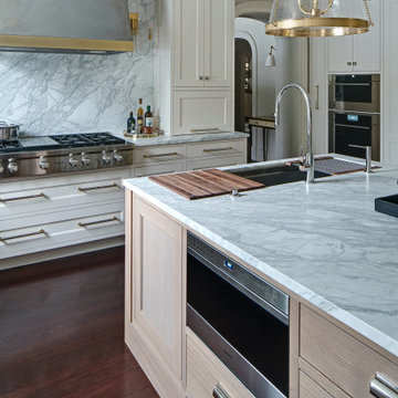
The new kitchen exceeded every expectation, thrilling the clients with its revitalized, expansive design and thoughtful functionality. The transformation brought to life an open space adorned with marble accents, a state-of-the-art steam oven, and the seamless integration of the Galley Dresser, crafting a kitchen not just to be used, but to be cherished. This is more than a culinary space; it’s a new heart of their home, ready to host countless memories and culinary adventures.

 Davis & Daughters
Robineve Interiors
Living room - large transitional open concept carpeted living room idea in Boise with yellow walls, a standard fireplace and a plaster fireplace
Living room - large transitional open concept carpeted living room idea in Boise with yellow walls, a standard fireplace and a plaster fireplace
 Drury Design
THE SETUP
Once these empty nest homeowners decided to stay put, they knew a new kitchen was in order. Passionate about cooking, entertaining, and hosting holiday gatherings, they found their existing kitchen inadequate. The space, with its traditional style and outdated layout, was far from ideal. They longed for an elegant, timeless kitchen that was not only show-stopping but also functional, seamlessly catering to both their daily routines and special occasions with friends and family. Another key factor was its future appeal to potential buyers, as they’re ready to enjoy their new kitchen while also considering downsizing in the future.
Design Objectives:
Create a more streamlined, open space
Eliminate traditional elements
Improve flow for entertaining and everyday use
Omit dated posts and soffits
Include storage for small appliances to keep counters clutter-free
Address mail organization and phone charging concerns
THE REMODEL
Design Challenges:
Compensate for lost storage from omitted wall cabinets
Revise floorplan to feature a single, spacious island
Enhance island seating proximity for a more engaging atmosphere
Address awkward space above existing built-ins
Improve natural light blocked by wall cabinet near the window
Create a highly functional space tailored for entertaining
Design Solutions:
Tall cabinetry and pull-outs maximize storage efficiency
A generous single island promotes seamless flow and ample prep space
Strategic island seating arrangement fosters easy conversation
New built-ins fill arched openings, ensuring a custom, clutter-free look
Replace wall cabinet with lighted open shelves for an airy feel
Galley Dresser and Workstation offer impeccable organization and versatility, creating the perfect setup for entertaining with everything easily accessible.
THE RENEWED SPACE
The new kitchen exceeded every expectation, thrilling the clients with its revitalized, expansive design and thoughtful functionality. The transformation brought to life an open space adorned with marble accents, a state-of-the-art steam oven, and the seamless integration of the Galley Dresser, crafting a kitchen not just to be used, but to be cherished. This is more than a culinary space; it’s a new heart of their home, ready to host countless memories and culinary adventures.

 Crystal Kitchen + Bath
Every square inch must serve a function when you are downsizing. In this kitchen designer Carol Kornak replaced a desk area (a home office is located in another part of the home) with a beverage center for coffee, wine and other beverages. The location keeps traffic out of the main cooking area and allows guests to help themselves. The cabinets were custom painted a warm off-white to match the existing woodwork throughout the home. The glittery Cambria countertops complement the crystal pendant lights and crystal hardware.
190