
Search results for "Drawbacks" in Home Design Ideas
 RDM Architecture
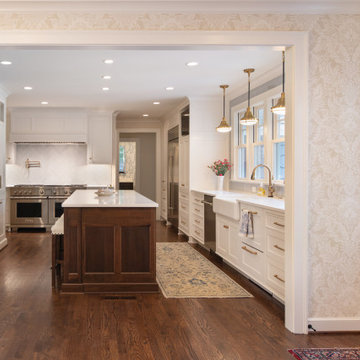
Inspiration for a large timeless galley dark wood floor and brown floor eat-in kitchen remodel in Kansas City with a farmhouse sink, shaker cabinets, white cabinets, quartzite countertops, gray backsplash, porcelain backsplash, stainless steel appliances, an island and white countertops
 CRC Builders, Inc.
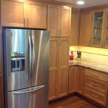
Among the new surfaces are shaker style cherry cabinets with a clear finish, soft closing doors & drawers, and furniture grade domestic maple interiors. The cabinetry was trimmed and carefully installed by our CRC artisans and made by Signature Cabinetry & Design. The countertops are a gorgeous cut of Crema Bordeaux granite slab, fabricated and installed by Marble Fino. The appliances are beautiful KitchenAid stainless steel models the homeowner purchased from Pearson's Appliance, and installed by us.
The floor is a new wood look vinyl product by DuChateau Floors called Vinyl Deluxe recommended by Jim Pitcher, Owner of CRC. This is not your mother's vinyl floor! This is cutting edge technology. Can you tell the difference? There are astonishingly similar alternatives to hardwood flooring available today. Banned from kitchens and bathrooms no more! You too can have the look of hardwood without the drawbacks of wood products in wet and high traffic areas.
Lighting in the kitchen was enhanced by LED ceiling can lights and under cabinet LED strip lights. Notice there are no visible outlets interrupting the backsplash. We tucked outlets under the upper cabinets giving plenty of power where the homeowner needs it without the outlets being visible. Little details make a big difference.
 Drury Design
This beautiful kitchen was remodeled for a growing family in the Chicago suburbs. As they were purchasing a new home, they realized there were many drawbacks to the kitchen. It needed to be redesigned to meet their lifestyle and it made sense to do it before moving in.
It was a large kitchen but the functional work space was very small. The work triangle was cumbersome and traffic flowed right through it. The existing kitchen had new red oak floors. They were beautiful, but dark red floors just aren’t practical for a growing family with dogs.
THE REMODEL
The first thing we did was redesign the space and reorient the layout with two islands. Incorporating a built-in banquette, instead of a table, freed up plenty of room for them. The islands are strategically placed in the opposite direction of the previous layout’s single island. This not only creates a better view from the family room, it keeps the traffic flow out of the work area while facilitating two separate workspaces. The small island incorporates a new prep sink. It’s right across from the cooking area, which is a new focal point with a gorgeous new metal hood. The larger island incorporates a Galley Workstation with accessories for efficient prep, expediting and serving. The 4′ sink makes post-meal clean-up a breeze.
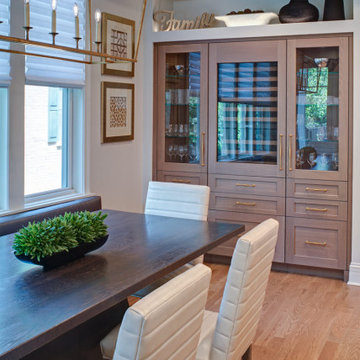
The butler’s pantry just outside the kitchen was large enough to create a new beverage center for morning coffee and cocktail prep. An ice maker was added to this area but there wasn’t enough room for a new wine cooler and refrigerator drawers. A separate area using previously unused space was added to the kitchen (by the table) – it includes a new wine cooler and cold beverage drawers. This is framed nicely with some glass door cabinets and a lighted open niche above for decorative display.
STRATEGIC DESIGN
A combination of colors and finishes highlight different focal points in the kitchen – this includes a slate blue, a soft grey and a light whitewashed stain on rift-cut oak. The stained white oak makes the wine cooler and refrigeration areas look more like furniture pieces instead of kitchen cabinets.
The floors were refinished with a very light grey stain that enabled us to lighten up the color and get the red out of the finish.
A new ceiling was designed to add architectural detail to the space – it includes three separate tray areas with new crown molding and lighting.
THE RENEWED SPACE
This stunning new kitchen is the perfect fit for the family and their home – the finishes and design elements flow beautifully into the adjoining spaces. It fulfills all of the family’s dreams for a beautiful and comfortable space that is functional and versatile.
Find the right local pro for your project
 COSWICK LTD
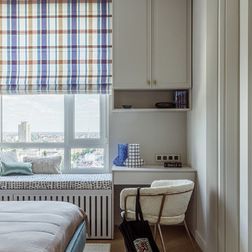
Apartment with an area of 90 sq. m. is located in the center of Voronezh, in the new residential complex “Solar Olympus”. The main drawback was a very impressive L-shaped and non-functional corridor with a window. By dividing it into several rooms, we gave the space the right shape, organize an entrance hall, a guest toilet and even a laundry room.
There were also interesting solutions in the non-standard junction of the engineering board and porcelain stoneware. The scale and shape of the art object slightly knocked down the correct and verified lines in space, and the idea of the neighborhood of recycled materials with noble ones (in particular, with leather upholstery of coffee tables and silver vintage modernist candlesticks) added irony, while maintaining its elegance.”
The interior is filled with air and light, the pleasant shade of the walls goes to the ceiling, envelops and hugs, helps to relax after a hard day, and color accents cheer up and saturate with energy.
Coswick oak Pastel Herringbone hardwood flooring was used in the project.
Design by Bovykina Ganna and Julia Janson.
Photography by Mikhail Chekalov.
Coswick’s partner in Voronezh polvamvdom.ru

 AdvantageLumber.com
Using Cumaru decking for this project gave the homeowners a traditional color look without the drawbacks of domestic woods used for decks.
Elegant backyard deck photo in Los Angeles
Elegant backyard deck photo in Los Angeles
 Matt Fajkus Architecture
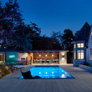
Situated within a one-acre lot in Austin’s Tarry Trail neighborhood, the backyard of this existing 1933- vintage historical house was underutilized. The owners felt that the main drawbacks of the existing backyard were a general disconnection between each outdoor area and a general lack of relationship to the house proper. Therefore, the primary goal of the redesign was a scheme that would promote the use of the outdoor zones, with the pool as a centerpiece.
The first major design move was to frame the pool with a new structure as a backdrop. This cabana is perpendicular to the main house and creates a clear “bookend” to the upper level deck while housing indoor and outdoor activities. Under the cabana’s overhang, an integrated seating space offers a balance of sunlight and shade while an outdoor grill and bar area facilitate the family’s outdoor lifestyle. The only enclosed program exists as a naturally lit perch within the canopy of the trees, providing a serene environment to exercise within the comfort of a climate-controlled space.
A corollary focus was to create sectional variation within the volume of the pool to encourage dynamic use at both ends while relating to the interior program of the home. A shallow beach zone for children to play is located near the family room and the access to the play space in the yard below. At the opposite end of the pool, outside the formal living room, another shallow space is made to be a splash-free sunbathing area perfect for enjoying an adult beverage.
The functional separation set up by the pool creates a subtle and natural division between the energetic family spaces for playing, lounging, and grilling, and the composed, entertaining and dining spaces. The pool also enhances the formal program of the house by acting as a reflecting pool within a composed view from the front entry that draws visitors to an outdoor dining area under a majestic oak tree.
By acting as a connector between the house and the yard, the elongated pool bridges the day-to-day activities within the house and the lush, sprawling backyard. Planter beds and low walls provide loose constraints to organize the overall outdoor living area, while allowing the space to spill out into the yard. Terraces navigate the sectional change in the landscape, offering a passage to the lower yard where children can play on the grass as the parents lounge by the outdoor fireplace.
 Drury Design
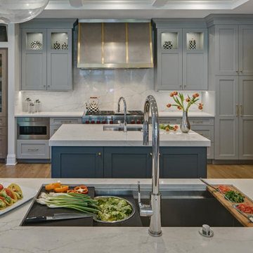
This beautiful kitchen was remodeled for a growing family in the Chicago suburbs. As they were purchasing a new home, they realized there were many drawbacks to the kitchen. It needed to be redesigned to meet their lifestyle and it made sense to do it before moving in.
It was a large kitchen but the functional work space was very small. The work triangle was cumbersome and traffic flowed right through it. The existing kitchen had new red oak floors. They were beautiful, but dark red floors just aren’t practical for a growing family with dogs.
THE REMODEL
The first thing we did was redesign the space and reorient the layout with two islands. Incorporating a built-in banquette, instead of a table, freed up plenty of room for them. The islands are strategically placed in the opposite direction of the previous layout’s single island. This not only creates a better view from the family room, it keeps the traffic flow out of the work area while facilitating two separate workspaces. The small island incorporates a new prep sink. It’s right across from the cooking area, which is a new focal point with a gorgeous new metal hood. The larger island incorporates a Galley Workstation with accessories for efficient prep, expediting and serving. The 4′ sink makes post-meal clean-up a breeze.
The butler’s pantry just outside the kitchen was large enough to create a new beverage center for morning coffee and cocktail prep. An ice maker was added to this area but there wasn’t enough room for a new wine cooler and refrigerator drawers. A separate area using previously unused space was added to the kitchen (by the table) – it includes a new wine cooler and cold beverage drawers. This is framed nicely with some glass door cabinets and a lighted open niche above for decorative display.
STRATEGIC DESIGN
A combination of colors and finishes highlight different focal points in the kitchen – this includes a slate blue, a soft grey and a light whitewashed stain on rift-cut oak. The stained white oak makes the wine cooler and refrigeration areas look more like furniture pieces instead of kitchen cabinets.
The floors were refinished with a very light grey stain that enabled us to lighten up the color and get the red out of the finish.
A new ceiling was designed to add architectural detail to the space – it includes three separate tray areas with new crown molding and lighting.
THE RENEWED SPACE
This stunning new kitchen is the perfect fit for the family and their home – the finishes and design elements flow beautifully into the adjoining spaces. It fulfills all of the family’s dreams for a beautiful and comfortable space that is functional and versatile.
13