
Search results for "Earnings" in Home Design Ideas
 Rocky Tops Granite & Marble LLC
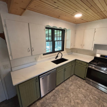
We put MSI Calacatta Elysio into a kitchen in Columbia, and it's one of those quartzes that just works in a room where people actually cook and live. Elysio's an engineered quartz manufactured right here in the great state of South Carolina. It features a bright clean background with soft gray and gold veining moving through it, the kind of look that reads calm from across the room but still gives you something to study up close at the counter.
Engineered quartz like this is consistent in a way natural stone just can't be. Every slab off the line looks close enough to the next that we're not fighting to match veining across seams or worrying about a wild vein hitting the sink cutout wrong. That consistency matters in a kitchen with multiple runs of counter, because the eye catches it immediately if the pattern jumps from one section to the next. Templating still has to be dead on, and we take the time at the seams to keep that veining looking like it keeps moving instead of stopping and starting over.
Day to day, Elysio holds up the way good quartz should. It doesn't need sealing, it resists stains from coffee, wine, and the everyday mess of a working kitchen, and it shrugs off scratches better than people expect. We still tell folks to use a trivet for hot pans straight off the stove, just good practice with any engineered surface. The edge is eased, clean and simple, the kind of detail you settle on at the end and then don't think about again because it just looks right.
Columbia kitchens see a lot of real use, families cooking, kids doing homework at the island, company gathered around while dinner's going. A quartz like Elysio fits that life. It's bright enough to open the room up, patterned enough to keep from looking flat, and tough enough that it's still going to look this good years from now. That's what we're after on every job in the Midlands, something that looks sharp walking in and keeps earning its keep long after we've packed up the tools.
 Rocky Tops Granite & Marble LLC
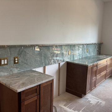
Tiffany Crystal quartzite is one of those stones that earns its keep in a kitchen. It's got that cool, crystalline background, whites and grays moving quietly across the surface with enough sparkle in the light to keep it from feeling flat. It reads clean and bright without going stark, which is why it works so well in a kitchen where people actually cook and gather, not just admire counters from across the room.
Quartzite is real stone, not engineered, so it comes with natural hardness that holds up to daily kitchen abuse. It resists scratching and handles heat well, though we still tell folks to use a trivet, because no counter needs a hot pan set straight on it just to prove a point. Sealing it right after install and keeping up with it over the years keeps the surface performing the way it should, and Tiffany Crystal takes a seal well because of its tight, dense structure.
Fabricating a slab like this takes some care in the layout. We spend real time bookmatching and dry-fitting pieces so the movement in the stone flows across seams instead of fighting itself at the corners. On a kitchen island or a run of perimeter counters, getting that continuity right is what separates a good installation from one that just gets the measurements correct. We kept the edge eased here, which is the right call on a stone with this much personality. It doesn't need extra shaping to draw the eye, the stone's already doing that work.
Day to day, this is a kitchen counter that's going to live hard and look good doing it. Quartzite shrugs off knife marks, stands up to acidic spills, and cleans up with regular dish soap and water. It's the kind of surface you stop babying after the first few months because it simply holds up.
Jobs like this one in Lexington are what we like seeing come through the shop. It's a straightforward kitchen application done with a stone that's got real depth to it, installed by people who care about how the seams and the veining line up when the job's done. That's the kind of work that keeps the Midlands trade honest.
 Rocky Tops Granite & Marble LLC
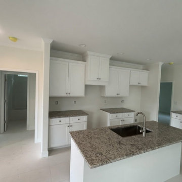
This kitchen in Bamberg came together in Dallas White granite, a stone that reads clean and bright without going stark. The background carries soft grays with subtle movement through it, enough character to keep the eye interested but calm enough to work with just about any cabinet color a builder picks for a spec house like this one. That's part of why it gets used so often in kitchens meant to show well and live well at the same time.
Granite's still one of the best choices you can make for a kitchen countertop, and Dallas White in particular holds up the way granite's supposed to. It's dense, it resists heat, and you can set a hot pan on it without worrying about scorching. Scratches aren't a concern with normal use, and the surface takes a polish that lasts for years. We seal it going in and that's about all the maintenance it ever needs.
Getting a granite slab like this into a kitchen right takes more than just cutting to size. We template the space first to make sure the seams land where they won't draw attention, usually tucked near the sink or stove, and any countertop longer than about 8 to 9 feet is going to need one. Matching the pattern across a seam so it reads as one continuous piece is where the work actually happens. The edge here is eased, a clean, simple line that lets the stone itself do the talking instead of competing with it.
Day to day, this is the kind of countertop that just works. Wipe it down, don't worry about it, and it'll look the same ten years from now as it does today. That durability is exactly what a spec house kitchen needs, something that shows well to a buyer walking through and keeps performing long after they've moved in.
We do a lot of work through the Midlands, and Bamberg jobs like this one are a good example of what granite still does better than almost anything else on the market. It's a straightforward material that never stops earning its keep in a kitchen, and this one turned out exactly the way it should.
Find the right local pro for your project

 User
This hillside home in Piedmont, CA was remodeled to change the style from a 1940's rancher with eight foot ceilings and dark interiors, into a modern geometric composition with vast white interiors for casual living and generous daylighting for displaying the artist-owner's works.
In a city known for rigorous and difficult design review, an addition, two variances, and a full stylistic change were unanimously approved on the first round. All sloped roofs and attics were eliminated and replaced by a series of stacked and overlapping flat roofs. This made the house taller on the inside and shorter on the outside, which helped earn design review cooperation in the community. Windows were concentrated toward the rear yard views or moved up high on the side walls for daylight and privacy, benefitting the owners as well as the neighbors.
At the start, the owner husband was so enthusiastic and engaged in transforming his house into something modern that he presented the architect with a scaled foamcore model, rather than the usual magazine clippings and wish list. He participated in the design decisions throughout the process. The owner wife is the artist who did all the artwork in the house. She had been craving a display space with large walls and good natural light. Both of them loved the location and great views.
The project was an opportunity to transform the style of an older traditional home into a modern one, while solving numerous problems. By rebuilding the 1800 ft2 top of the 3-story home it was possible to change the style of the whole building, since the lower floors were a neutral base, and also to change the lifestyle of the owners, who wanted to move their master suite upstairs and live primarily on the top floor as empty nesters.
Going into the project, the architect knew there were multiple encroachments into the setbacks and potential privacy issues with close by neighbors. He approached this as a complex puzzle made up of architectural and political pieces which all had to fit together elegantly. It took many careful moves, small and large, to arrive at a serene and cohesive result that tied old and new together seamlessly.
The design-build contractor worked closely with the owners and handled all of the construction phase documents and design adjustments, adding ideas of their own to make the project really sing.
The project was a collaboration in three acts. The owner had a strong design concept from the start. The architect developed it into a realistic project and garnered the design approvals. Then the contractor executed brilliantly.

 Truitt and White Window and Door Showroom
This hillside home in Piedmont, CA was remodeled to change the style from a 1940's rancher with eight foot ceilings and dark interiors, into a modern geometric composition with vast white interiors for casual living and generous daylighting for displaying the artist-owner's works.
In a city known for rigorous and difficult design review, an addition, two variances, and a full stylistic change were unanimously approved on the first round. All sloped roofs and attics were eliminated and replaced by a series of stacked and overlapping flat roofs. This made the house taller on the inside and shorter on the outside, which helped earn design review cooperation in the community. Windows were concentrated toward the rear yard views or moved up high on the side walls for daylight and privacy, benefitting the owners as well as the neighbors.
At the start, the owner husband was so enthusiastic and engaged in transforming his house into something modern that he presented the architect with a scaled foamcore model, rather than the usual magazine clippings and wish list. He participated in the design decisions throughout the process. The owner wife is the artist who did all the artwork in the house. She had been craving a display space with large walls and good natural light. Both of them loved the location and great views.
The project was an opportunity to transform the style of an older traditional home into a modern one, while solving numerous problems. By rebuilding the 1800 ft2 top of the 3-story home it was possible to change the style of the whole building, since the lower floors were a neutral base, and also to change the lifestyle of the owners, who wanted to move their master suite upstairs and live primarily on the top floor as empty nesters.
Going into the project, the architect knew there were multiple encroachments into the setbacks and potential privacy issues with close by neighbors. He approached this as a complex puzzle made up of architectural and political pieces which all had to fit together elegantly. It took many careful moves, small and large, to arrive at a serene and cohesive result that tied old and new together seamlessly.
The design-build contractor worked closely with the owners and handled all of the construction phase documents and design adjustments, adding ideas of their own to make the project really sing.
The project was a collaboration in three acts. The owner had a strong design concept from the start. The architect developed it into a realistic project and garnered the design approvals. Then the contractor executed brilliantly
 Lindy Architect
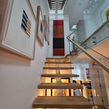
This project was never really about the architecture. It was about a family that collects — art, ceramics, books, ideas — and needed a home that could hold all of that without turning into a museum.
The existing unit had good bones: generous ceiling heights, a floating stair, and enough square footage to work with. What it lacked was a coherent logic — a way of moving through the space that felt intentional, where each transition earned its moment.
We rebuilt that logic from the ground up.
The ground floor is organized around a single corridor that runs from the kitchen island through to the living room, with the staircase serving as the spine of the whole sequence. Rather than treating the stair as purely functional, we kept the glass balustrade open and lit the treads from below, so it reads as a light source as much as a passage. The console beneath it became a natural landing for ceramics and found objects — not styled, just placed.
In the living room, the brief was simple: make room for a very large painting without the room feeling like a gallery. The answer was to keep everything else quiet — a white built-in that does its job, sheer linen curtains that diffuse the light, black leather chairs that anchor the space without competing. The painting does the rest.
Upstairs, the landing is lit by a skylight that washes the hallway in natural light through most of the day. We lined one side with a burl wood console and let the ceramics and framed works speak for themselves. The mix of abstract prints, a bold red canvas, and handmade vessels gives the corridor a rhythm that feels accumulated over time rather than installed all at once — because it was.
Throughout, the material palette is deliberately restrained: white oak floors, white walls, white millwork. The restraint isn't minimalism for its own sake — it's a backdrop. The owners bring the color, texture, and personality. Our job was to give them the right walls to hang things on.
 Rocky Tops Granite & Marble LLC
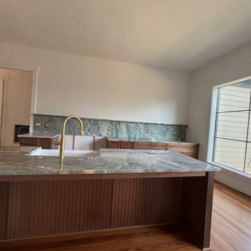
Tiffany Crystal quartzite is one of those stones that earns its keep in a kitchen. It's got that cool, crystalline background, whites and grays moving quietly across the surface with enough sparkle in the light to keep it from feeling flat. It reads clean and bright without going stark, which is why it works so well in a kitchen where people actually cook and gather, not just admire counters from across the room.
Quartzite is real stone, not engineered, so it comes with natural hardness that holds up to daily kitchen abuse. It resists scratching and handles heat well, though we still tell folks to use a trivet, because no counter needs a hot pan set straight on it just to prove a point. Sealing it right after install and keeping up with it over the years keeps the surface performing the way it should, and Tiffany Crystal takes a seal well because of its tight, dense structure.
Fabricating a slab like this takes some care in the layout. We spend real time bookmatching and dry-fitting pieces so the movement in the stone flows across seams instead of fighting itself at the corners. On a kitchen island or a run of perimeter counters, getting that continuity right is what separates a good installation from one that just gets the measurements correct. We kept the edge eased here, which is the right call on a stone with this much personality. It doesn't need extra shaping to draw the eye, the stone's already doing that work.
Day to day, this is a kitchen counter that's going to live hard and look good doing it. Quartzite shrugs off knife marks, stands up to acidic spills, and cleans up with regular dish soap and water. It's the kind of surface you stop babying after the first few months because it simply holds up.
Jobs like this one in Lexington are what we like seeing come through the shop. It's a straightforward kitchen application done with a stone that's got real depth to it, installed by people who care about how the seams and the veining line up when the job's done. That's the kind of work that keeps the Midlands trade honest.

 The Masons Co and Dionysian Artificers Landscape
The Masons Co and Dionysian Artificers has provided historic preservation consulting and contracting services on countless structures throughout entire Midwest region including several dozen on the National Register of Historic Places. We believe that a multi-disciplinary approach to the planning of all aspects of historic preservation projects is necessary to preserve the heritage of our built environment. As active participants in the preservation community we are appreciative of the limited resources available for the preservation and maintenance of the cultural heritage embodied in historic structures. We endeavor to provide historically appropriate, sensitive, creative, and responsible solutions to the stewards of these treasures. Our solutions are applicable to the repair of all structures including, Brick, Stone, Masonry Restoration, Fountain, Water features - buildings, high-rise structures, parking structures, airports, bridges, tanks, plaza decks, and historic structures.
The Masons Co and Dionysian Artificers is an operated business which provides high quality masonry restoration and fountain repair service in the state of Arkansas, Nebraska, Des Moines IA, Memphis TN, Nashville TN, Denver Co, Oklahoma City, Springfield IL, Dallas TX, Florida and entire Midwest region. Our commitment to quality and a standard of excellence on every level is the foundation the company has been built upon. Our skilled and conscientious craftsmen specialize in the historic repair, renovation, replication and restoration of any structure we are contracted to work on. Our nearly 30 years of experience assures efficiency, safety and quality by using the proper materials and installation procedures. This unparalleled experience has earned us a reputation for providing clients with the highest quality repair and installation services available.

 RoomService 360
Near Italy’s northeast border lies the small town of Moimacco. Once an important stop along ancient trade routes, today, all of the modern furnishings offered by the Italian design house Bross are crafted in the quaint Italian town. Hallmarks of the Bross line of contemporary furniture are an attention to detail and a careful selection of quality materials, in particular, fine European woods. The Bross focus on fine craftsmanship lends an appealing, organic element to homes decorated in the modern interior design style.
The company’s commitment to producing high quality modern furniture has attracted some of the finest designers, including Paolo Piva, Gerd Lange, Enzo Berti, Laprell and Althaus and Ennio Arosio. The room service 360° collection of Bross furnishings includes buffets, consoles and dining and coffee tables that demonstrate the extraordinary technical prowess and artistic vision of these world-renowned designers. Bross is the perfect choice for contemporary homes.
Welcome to room service 360°, the premier destination for the world’s finest modern furniture. As an authorized dealer of the most respected furniture manufacturers in Europe, room service 360° is uniquely positioned to offer the most complete, most comprehensive and most exclusive collections of custom contemporary and modern furniture available on the market today. From world renowned designers at Bonaldo, Cattelan Italia, Fiam Italia, Foscarini, Gamma Arredamenti, Pianca, Presotto Italia, Tonelli and Tonin Casa, only the finest Italian furniture collections are represented at room service 360°.
On our website you will find the latest collections from top European contemporary/modern furniture designers, leading Italian furniture manufacturers and many exclusive products. We are also proud and excited to offer our interior design blog as an ongoing resource for design fanatics, curious souls and anyone who is looking to be inspired.
In our Philadelphia showroom we carefully select our products and change them frequently to provide our customers with the best possible mix through which they can envision their room’s décor and their life. This is the reason why many of our customers (thank you all!!!) travel for hours, and some fly to our store. This is the reason why we have earned the privilege to be the starting point for modern living for many of you.
 Manomin Resawn Timbers
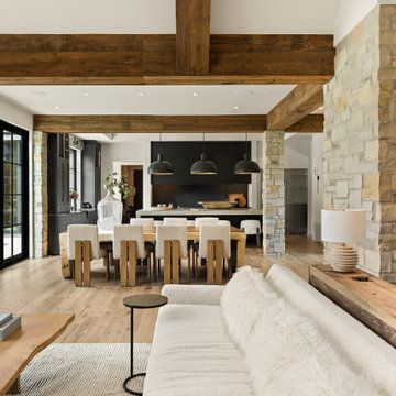
This open concept living space at Sunset on St. Croix, a rustic modern luxury home, is framed by weathered antique box beams crossing the ceiling, with antique white oak flooring extending from the living room into the dining area and kitchen beyond. Stone columns anchor the space, while black steel doors bring in natural light from the patio. A live edge console table, dining table, and boucle sofa complete the room's blend of rustic texture and modern comfort.
Our weathered antique box beams are milled from a mix of softwoods, ranging from hemlock to pine, salvaged from joists, roof boards, decking, and walls of late 19th and early 20th century structures. The natural patina from a century of weathering gives them a darker, moodier character. Our antique white oak flooring takes the light and bright aesthetic of the species further, with a subtle grey patina earned over years of natural weathering, milled from timberstock salvaged from 19th century industrial buildings and displaying the unique grain patterns and durability old growth oak is known for.
Whether you are a homebuilder, a home remodeling contractor, a homeowner, or a designer planning a living space like this, Manomin Resawn Timbers has the reclaimed wood box beams and flooring to bring warmth and character to your home. Visit our showroom in Hugo, MN or reach out to us with a call or a message. 15152 Freeland Avenue North, Hugo MN 55038. Mon–Thu 8am–4:30pm, Fri 8am–4pm. 651.464.1771.
 Truitt and White Window and Door Showroom
This hillside home in Piedmont, CA was remodeled to change the style from a 1940's rancher with eight foot ceilings and dark interiors, into a modern geometric composition with vast white interiors for casual living and generous daylighting for displaying the artist-owner's works.
In a city known for rigorous and difficult design review, an addition, two variances, and a full stylistic change were unanimously approved on the first round. All sloped roofs and attics were eliminated and replaced by a series of stacked and overlapping flat roofs. This made the house taller on the inside and shorter on the outside, which helped earn design review cooperation in the community. Windows were concentrated toward the rear yard views or moved up high on the side walls for daylight and privacy, benefitting the owners as well as the neighbors.
At the start, the owner husband was so enthusiastic and engaged in transforming his house into something modern that he presented the architect with a scaled foamcore model, rather than the usual magazine clippings and wish list. He participated in the design decisions throughout the process. The owner wife is the artist who did all the artwork in the house. She had been craving a display space with large walls and good natural light. Both of them loved the location and great views.
The project was an opportunity to transform the style of an older traditional home into a modern one, while solving numerous problems. By rebuilding the 1800 ft2 top of the 3-story home it was possible to change the style of the whole building, since the lower floors were a neutral base, and also to change the lifestyle of the owners, who wanted to move their master suite upstairs and live primarily on the top floor as empty nesters.
Going into the project, the architect knew there were multiple encroachments into the setbacks and potential privacy issues with close by neighbors. He approached this as a complex puzzle made up of architectural and political pieces which all had to fit together elegantly. It took many careful moves, small and large, to arrive at a serene and cohesive result that tied old and new together seamlessly.
The design-build contractor worked closely with the owners and handled all of the construction phase documents and design adjustments, adding ideas of their own to make the project really sing.
The project was a collaboration in three acts. The owner had a strong design concept from the start. The architect developed it into a realistic project and garnered the design approvals. Then the contractor executed brilliantly
 Decks & More, Inc.
SPECIALTY: Designing and Building Custom Decks
As a homeowner, you want a design that speaks to your personality and lifestyle coupled with excellent craftsmanship and quality materials. Decks & More is a member of the National Association of the Remodeling Industry (NARI) and their commitment to building quality decks has once again brought them the honor of three NARI Atlanta 2020 Contractor of the Year (CotY) Awards. They won in the categories of Residential Exterior – $100,001 to $200,000, and Residential Landscape Design/ Outdoor Living – $100,000 to $250,000 and have received many more local and national CotY awards in the past.
Landscape Design/Outdoor Living – $100,000 to $250,000:
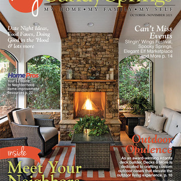
The goal of this project was to create a relaxing retreat with both covered and outdoor elements. The Decks & More team constructed a screened in porch with a gable roof and stone fireplace that leads out to a large paved patio with a firepit.
NARI Atlanta’s 2020 CotY Award – Residential Exterior-$100,001 to $200,000
Residential Exterior – $100,001 to $200,000, and Residential:
For this project, the homeowners wanted to make the most use of their vertical space. Decks & More created a multi-level design with a screened in porch and upperdeck with outdoors stairs that provided access to the stone patio below, giving them outdoor space to enjoy year-round!
Recently, Decks and More, Inc. was also honored with five International Construction Awards from the North American Deck and Railing Association (NADRA).
They won one First Place for Best Covered Porch, three Second Places for Limitless Creation, Wood Deck from $50,000 – $100,000 and Closed Porch and one Third Place for Unique Features.
• Frank Pologruto, founder and owner of Decks and More, Inc. has been building award-winning designs of outdoor living spaces since 2001.
• He is a professional member of the National Association of the Remodeling Industry (NARI) and the North American Deck and Railing Association (NADRA).
• He ensures that his company stays current with trends and building codes.
• Decks and More has been in business for 20 years and has completed more than 1,000 remodeling jobs and earned more than 120 major design and contractor awards.
• Since 2010, Decks and More has donated more than $250,000 to area churches and charities.
Our standard: Impeccable service & design | The highest quality materials | 3-year limited warranty on new jobs | Professional craftsmen
 Truitt and White Window and Door Showroom
This hillside home in Piedmont, CA was remodeled to change the style from a 1940's rancher with eight foot ceilings and dark interiors, into a modern geometric composition with vast white interiors for casual living and generous daylighting for displaying the artist-owner's works.
In a city known for rigorous and difficult design review, an addition, two variances, and a full stylistic change were unanimously approved on the first round. All sloped roofs and attics were eliminated and replaced by a series of stacked and overlapping flat roofs. This made the house taller on the inside and shorter on the outside, which helped earn design review cooperation in the community. Windows were concentrated toward the rear yard views or moved up high on the side walls for daylight and privacy, benefitting the owners as well as the neighbors.
At the start, the owner husband was so enthusiastic and engaged in transforming his house into something modern that he presented the architect with a scaled foamcore model, rather than the usual magazine clippings and wish list. He participated in the design decisions throughout the process. The owner wife is the artist who did all the artwork in the house. She had been craving a display space with large walls and good natural light. Both of them loved the location and great views.
The project was an opportunity to transform the style of an older traditional home into a modern one, while solving numerous problems. By rebuilding the 1800 ft2 top of the 3-story home it was possible to change the style of the whole building, since the lower floors were a neutral base, and also to change the lifestyle of the owners, who wanted to move their master suite upstairs and live primarily on the top floor as empty nesters.
Going into the project, the architect knew there were multiple encroachments into the setbacks and potential privacy issues with close by neighbors. He approached this as a complex puzzle made up of architectural and political pieces which all had to fit together elegantly. It took many careful moves, small and large, to arrive at a serene and cohesive result that tied old and new together seamlessly.
The design-build contractor worked closely with the owners and handled all of the construction phase documents and design adjustments, adding ideas of their own to make the project really sing.
The project was a collaboration in three acts. The owner had a strong design concept from the start. The architect developed it into a realistic project and garnered the design approvals. Then the contractor executed brilliantly
 Rocky Tops Granite & Marble LLC
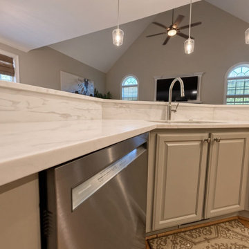
We installed Mystery White marble into a kitchen and matching fireplace surround in Irmo, and it's the kind of stone that makes a room feel brighter the second you walk in. The background is a clean white field, and the veining moves through it in soft gray threads, drifting rather than cutting straight lines. No two slabs are quite the same way, which is part of what makes marble like this worth the extra care in templating and layout.
Marble asks more of us than a lot of other stones. It's softer, it etches if you leave lemon juice sitting on it, and it needs a good sealer to keep it looking the way it did the day it was installed. But in a kitchen, that trade-off is worth it for a lot of people. The look is warmer and more alive than a lot of surfaces, and the veining gives the counters a sense of movement that holds your eye. We templated this one carefully to keep the veining reading naturally across the seams, so the pattern doesn't stop and start in a way that catches your attention for the wrong reason.
Getting the seams tight and the veins matched up means slowing down in the shop. We do a layout digitally before we ever cut, aligning the tops to find where the book-matching works best and where the color shifts are most forgiving. For a kitchen like this, with counters meeting at corners, that planning is what keeps the stone looking like one continuous surface instead of pieced-together slabs. We finished the edges eased, simple and clean, letting the stone itself carry the room instead of the profile.
Day to day, this kitchen will earn its keep. Marble takes heat well, so hot pans off the stove aren't a worry, but we always tell folks to use a cutting board and wipe up acidic spills quickly. Sealed properly and maintained with a little attention, it ages the way good marble always has, developing a soft patina over the years that a lot of homeowners come to like rather than fight.
Irmo's seen a good bit of kitchen work come through our shop, and a stone like Mystery White marble fits right into the character of these Midlands homes. It's classic without being predictable, and in this kitchen it does exactly what good marble should: it makes the whole room feel finished.
 Rocky Tops Granite & Marble LLC
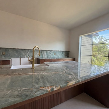
Tiffany Crystal quartzite is one of those stones that earns its keep in a kitchen. It's got that cool, crystalline background, whites and grays moving quietly across the surface with enough sparkle in the light to keep it from feeling flat. It reads clean and bright without going stark, which is why it works so well in a kitchen where people actually cook and gather, not just admire counters from across the room.
Quartzite is real stone, not engineered, so it comes with natural hardness that holds up to daily kitchen abuse. It resists scratching and handles heat well, though we still tell folks to use a trivet, because no counter needs a hot pan set straight on it just to prove a point. Sealing it right after install and keeping up with it over the years keeps the surface performing the way it should, and Tiffany Crystal takes a seal well because of its tight, dense structure.
Fabricating a slab like this takes some care in the layout. We spend real time bookmatching and dry-fitting pieces so the movement in the stone flows across seams instead of fighting itself at the corners. On a kitchen island or a run of perimeter counters, getting that continuity right is what separates a good installation from one that just gets the measurements correct. We kept the edge eased here, which is the right call on a stone with this much personality. It doesn't need extra shaping to draw the eye, the stone's already doing that work.
Day to day, this is a kitchen counter that's going to live hard and look good doing it. Quartzite shrugs off knife marks, stands up to acidic spills, and cleans up with regular dish soap and water. It's the kind of surface you stop babying after the first few months because it simply holds up.
Jobs like this one in Lexington are what we like seeing come through the shop. It's a straightforward kitchen application done with a stone that's got real depth to it, installed by people who care about how the seams and the veining line up when the job's done. That's the kind of work that keeps the Midlands trade honest.
 The Masons Co and Dionysian Artificers Landscape
The Masons Co and Dionysian Artificers has provided historic preservation consulting and contracting services on countless structures throughout entire Midwest region including several dozen on the National Register of Historic Places. We believe that a multi-disciplinary approach to the planning of all aspects of historic preservation projects is necessary to preserve the heritage of our built environment. As active participants in the preservation community we are appreciative of the limited resources available for the preservation and maintenance of the cultural heritage embodied in historic structures. We endeavor to provide historically appropriate, sensitive, creative, and responsible solutions to the stewards of these treasures. Our solutions are applicable to the repair of all structures including, Brick, Stone, Masonry Restoration, Fountain, Water features - buildings, high-rise structures, parking structures, airports, bridges, tanks, plaza decks, and historic structures.
The Masons Co and Dionysian Artificers is an operated business which provides high quality masonry restoration and fountain repair service in the state of Arkansas, Nebraska, Des Moines IA, Memphis TN, Nashville TN, Denver Co, Oklahoma City, Springfield IL, Dallas TX, Florida and entire Midwest region. Our commitment to quality and a standard of excellence on every level is the foundation the company has been built upon. Our skilled and conscientious craftsmen specialize in the historic repair, renovation, replication and restoration of any structure we are contracted to work on. Our nearly 30 years of experience assures efficiency, safety and quality by using the proper materials and installation procedures. This unparalleled experience has earned us a reputation for providing clients with the highest quality repair and installation services available.
 Rocky Tops Granite & Marble LLC
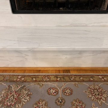
We installed Mystery White marble into a kitchen and matching fireplace surround in Irmo, and it's the kind of stone that makes a room feel brighter the second you walk in. The background is a clean white field, and the veining moves through it in soft gray threads, drifting rather than cutting straight lines. No two slabs are quite the same way, which is part of what makes marble like this worth the extra care in templating and layout.
Marble asks more of us than a lot of other stones. It's softer, it etches if you leave lemon juice sitting on it, and it needs a good sealer to keep it looking the way it did the day it was installed. But in a kitchen, that trade-off is worth it for a lot of people. The look is warmer and more alive than a lot of surfaces, and the veining gives the counters a sense of movement that holds your eye. We templated this one carefully to keep the veining reading naturally across the seams, so the pattern doesn't stop and start in a way that catches your attention for the wrong reason.
Getting the seams tight and the veins matched up means slowing down in the shop. We do a layout digitally before we ever cut, aligning the tops to find where the book-matching works best and where the color shifts are most forgiving. For a kitchen like this, with counters meeting at corners, that planning is what keeps the stone looking like one continuous surface instead of pieced-together slabs. We finished the edges eased, simple and clean, letting the stone itself carry the room instead of the profile.
Day to day, this kitchen will earn its keep. Marble takes heat well, so hot pans off the stove aren't a worry, but we always tell folks to use a cutting board and wipe up acidic spills quickly. Sealed properly and maintained with a little attention, it ages the way good marble always has, developing a soft patina over the years that a lot of homeowners come to like rather than fight.
Irmo's seen a good bit of kitchen work come through our shop, and a stone like Mystery White marble fits right into the character of these Midlands homes. It's classic without being predictable, and in this kitchen it does exactly what good marble should: it makes the whole room feel finished.
 Rocky Tops Granite & Marble LLC
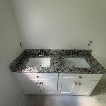
This kitchen in Bamberg came together in Dallas White granite, a stone that reads clean and bright without going stark. The background carries soft grays with subtle movement through it, enough character to keep the eye interested but calm enough to work with just about any cabinet color a builder picks for a spec house like this one. That's part of why it gets used so often in kitchens meant to show well and live well at the same time.
Granite's still one of the best choices you can make for a kitchen countertop, and Dallas White in particular holds up the way granite's supposed to. It's dense, it resists heat, and you can set a hot pan on it without worrying about scorching. Scratches aren't a concern with normal use, and the surface takes a polish that lasts for years. We seal it going in and that's about all the maintenance it ever needs.
Getting a granite slab like this into a kitchen right takes more than just cutting to size. We template the space first to make sure the seams land where they won't draw attention, usually tucked near the sink or stove, and any countertop longer than about 8 to 9 feet is going to need one. Matching the pattern across a seam so it reads as one continuous piece is where the work actually happens. The edge here is eased, a clean, simple line that lets the stone itself do the talking instead of competing with it.
Day to day, this is the kind of countertop that just works. Wipe it down, don't worry about it, and it'll look the same ten years from now as it does today. That durability is exactly what a spec house kitchen needs, something that shows well to a buyer walking through and keeps performing long after they've moved in.
We do a lot of work through the Midlands, and Bamberg jobs like this one are a good example of what granite still does better than almost anything else on the market. It's a straightforward material that never stops earning its keep in a kitchen, and this one turned out exactly the way it should.
 Rocky Tops Granite & Marble LLC
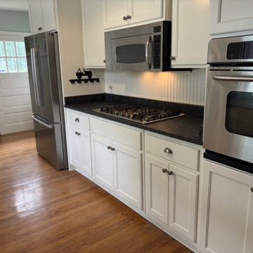
This kitchen in Forest Acres came together around a solid granite countertop, and it's the kind of stone that does the quiet work of holding a whole room together. Granite's been the go-to for kitchen counters for decades because it earns it. It's igneous rock, formed under heat and pressure, and that history is why it laughs off the stuff a real kitchen throws at it. Hot pans, knife work, everyday spills, granite takes it and keeps looking good.
We went with an eased edge on this one, which is the clean, simple line that a lot of Midlands homeowners want. It's not flashy, but that's the point. An eased edge softens the sharp corner just enough to be comfortable to lean against and easy to wipe down, and it lets the granite itself, the movement, the flecks, the depth in the stone, do the talking instead of a fussy edge profile competing for attention.
Getting a countertop like this right starts before the stone ever gets cut. We template the kitchen precisely, accounting for the cabinets, the appliances, and any out-of-square walls that always show up in real houses. Then it's cut, the edges are worked by hand to get that eased profile even and consistent around every corner, and the seams, if there are any, get lined up so the pattern reads as close to continuous as we can get it. Granite doesn't forgive sloppy fabrication. Every joint and cutout has to be tight because the stone's not going anywhere once it's set.
Day to day, this is a countertop that's built for actual cooking and actual life, not just for photos. Granite resists scratching, it handles heat better than almost anything else you'd put in a kitchen, and with a good sealer it shrugs off staining from wine, oil, or lemon juice. It's low maintenance once it's in, just a wipe down and, depending on the specific granite, a reseal every year or two to keep it performing at its best.
Forest Acres has a good mix of older homes getting updated and newer builds going in, and granite fits both. It's a material that's stood the test of time in kitchens across the Midlands, and this one's a solid, honest example of why. Clean lines, real stone, and a countertop that's going to outlast most everything else in that kitchen.
 Suzanne Christie - Decorating Den Interiors
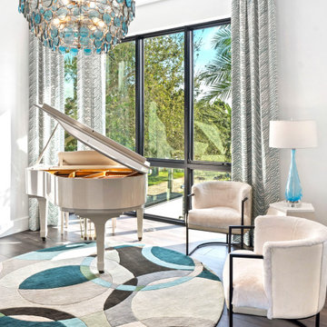
Suzanne’s Clearwater music room earned her two awards in the 2023 Dream Room competition. It was a 3rd place winner in the overall competition, and it also won 2nd place in the People’s Choice category, which allows for public voting. The room impressed judges and voters alike with its beauty and functionality as a space for making and enjoying music.
2023 Dream Room Winner and 2023 People's Choice Award.
Suzanne’s client wanted a place to show off her baby grand piano. She also wanted to incorporate color and loves shades of blues and greens. The windows provided plenty of light but left almost no usable wall space as the room was open to a walkway, the main great room and the front door. The client wanted the space to have a WOW factor!
Since the piano is the focal point, it was positioned with the open end facing out into the room. This highlighted the design and shape of the baby grand. Two side chairs in bronzed metal with white faux bunny fur and leather were placed together to provide seating for guests listening to the pianist. A contemporary pentagon end table with a mother of pearl top was placed between the chairs.
Now for the WOW factor — a 43" triple tiered glass and metal chandelier in clear and cerulean-blue was hung over the area becoming an anchoring focal point for the space. A teal, turquoise and lime green round area rug repeating the circle design of the chandelier was chosen and placed center of the room.
An embroidered turquoise wavy pattern fabric was selected for custom window treatments to frame the large windows and soften the space. To control the early morning east exposure from the sun, neutral motorized solar shades were selected and installed into the ceiling.
Suzanne’s client loves this surprise as you enter the front door of her home.
121