
Search results for "Easily access" in Home Design Ideas

 Valley Tile & Stone Inc.
White Marble Water jet Mosaic Tile Shower
Floral pattern feature wall
Example of a white tile and marble tile doorless shower design in San Luis Obispo with white cabinets and a hinged shower door
Example of a white tile and marble tile doorless shower design in San Luis Obispo with white cabinets and a hinged shower door

 Sierra Living Concepts Inc
Dimension:
43" L X 25" D X 83" H
Handcrafted of robust solid wood, our Tipton Hand Carved Reclaimed Wood Rustic Armoire With Shelves becomes the perfect accent for your study, living room, entryway, or dining room.
This stately wood armoire is a work of stunning old world craftsmanship with modern day functionality to house all of your clutter as well as keep you organized. Open the double doors to reveal a plethora of shelving for at-a-glance selection of canned goods or other non-perishables, as well as folded clothing, board games, dishware, and more. Tucked away at the bottom of the cabinet, pull out the lower drawer for additional space to keep your smaller etceteras including dinner linens, utensils, and other bric-a-brac easily on hand. The metal ring pull hardware makes it easy to access your goods any time you need them.
With a rectangular frame and a rich texture of carved cabinets and doors, this rustic piece evokes a strong sense of refinement to bring lasting beauty and timeless practicality to your home decor. Intricate scrollwork, floral detail, and medallion carvings grace the entire front of the cabinet to create a dimensional work of art. Broad plank sides and an antiqued gray finish showcase the rich, variegated grain of the natural wood that is at once an arresting accent in any room of the house.
Special Features:
• 100% Handcrafted
• Solid hardwood frame
• Hand carved scroll and floral details
• 2 doors with inner shelving
• 1 drawer
• Metal ring pull hardware
• Antique gray finish
• Anti-tip kit included
Note: Custom Options such as Size, Shape, Shade & Design are not applicable to this item. Furniture is subjected to have Slight Variations. Real wood is a product of nature, and as such, no two pieces are alike. Variations in solid wood grain patterns are to be expected and make each furniture uniquely beautiful, just like us humans.
 Drury Design
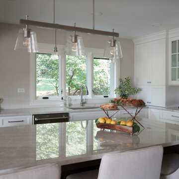
This house was 45 years old and the most recent kitchen update was past its due date. It was also time to update an adjacent family room, eating area and a nearby bar. The idea was to refresh the space with a transitional design that leaned classic – something that would be elegant and comfortable. Something that would welcome and enhance natural light.
The objectives were:
-Keep things simple – classic, comfortable and easy to keep clean
-Cohesive design between the kitchen, family room, eating area and bar
-Comfortable walkways, especially between the island and sofa
-Get rid of the kitchen’s dated 3D vegetable tile and island top shaped like a painters pallet
Design challenges:
-Incorporate a structural beam so that it flows with the entire space
-Proper ventilation for the hood
-Update the floor finish to get rid of the ’90s red oak
Design solutions:
-After reviewing multiple design options we decided on keeping appliances in their existing locations
-Made the cabinet on the back wall deeper than standard to fit and conceal the exhaust vent within the crown molding space and provide proper ventilation for the rangetop
-Omitted the sink on the island because it was not being used
-Squared off the island to provide more seating and functionality
-Relocated the microwave from the wall to the island and fitted a warming drawer directly below
-Added a tray partition over the oven so that cookie sheets and cutting boards are easily accessible and neatly stored
-Omitted all the decorative fillers to make the kitchen feel current
-Detailed yet simple tile backsplash design to add interest
Refinished the already functional entertainment cabinetry to match new cabinets – good flow throughout area
Even though the appliances all stayed in the same locations, the cabinet finish created a dramatic change. This is a very large kitchen and the client embraces minimalist design so we decided to omit quite a few wall cabinets.
Find the right local pro for your project
 Reico Kitchen & Bath
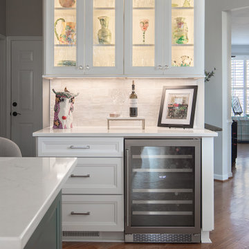
Sheryl Manning of Reico Kitchen and Bath in Charlotte, NC, in collaboration with Lynn Schafer Interiors, designed a transitional kitchen design featuring Masterpiece cabinetry and Merillat cabinetry.
The kitchen perimeter and coffee bar cabinets highlight Merillat Classic in the door style Rowan with a Cotton finish. The kitchen island cabinets feature Masterpiece in the Sawyer door style with a Rainfall finish.
Additionally, the kitchen includes MSI Q Calacatta Miraggio Duo quartz countertops, a Splendours White 3x12 backsplash and KitchenAid appliances.
The client shared their appreciation, saying, "Sheryl was absolutely wonderful to work with and really made this project stress-free for us. Her expertise in kitchen layouts and maximizing space for our needs, along with updating the dark cherry wood to a lovely white and timeless look, were invaluable. I knew Sheryl and I would get along immediately when she walked in and said, 'I love the pot rack,' as it was one of the key things I wanted to keep in our new kitchen!"
“I love the pull out drawers & the pull out shelves that were installed. I worked in the housewares industry for years and probably have every gadget on the market - I now have an easily organized and accessible space to store everything,” said the client.
Sheryl described the clients as a dream to work with. “The client is an accomplished chef and wanted to be sure that all the pots, pans, accessories and gadgets had a home that was convenient and ergonomic. The end result was a classic and calm white kitchen perimeter with a rich rainfall island, a color that appears in other furniture and artwork.”
Photos courtesy of Six Cents Media.
 Drury Design
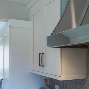
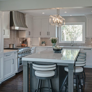
Design objectives for the remodel were aimed at giving the kitchen a larger feel, more room for cooking and extra seating for entertaining:
-Island with seating
-Space for a larger range/cooking area
-More storage with cabinets to the ceiling
-Making the original dining room blend with the kitchen so it all feels like one space
Design challenges to be solved:
-Making the header between the kitchen and the old dining room make sense as we combined the two spaces
-Avoid feeling crammed – a large island with seating still needed space for people walking around the space
-Refrigerator location – the header and window placements needed to stay, so finding a new and functional place for the fridge was a priority
-Add a large hood for wow-factor appeal
Design solutions fell into place as the overall layout came together:
-A large island to seat their four-person family comfortably. -Seating on two sides of the island improves conversation and has a great look.
-Knocking out a dining room wall gave us more room for the island. The leftover part of the dining was perfect for a dry bar/beverage area.
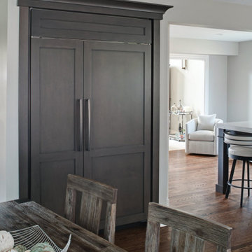
-The refrigerator needed to blend in and also be easily accessible. We removed the built-in pantry and used this space to house the refrigerator/freezer. Then we added tall pantry cabinets throughout the kitchen to make up for the loss of space.
-A large metal hood broke up the space and made for a fun statement piece
The new space is perfect for family time when the kids are back. It’s more conducive for being together, hanging out together, and entertaining with different friend groups together… the family simply spends more time together when they’re together in their new space.
“It’s the design and the openness,” the mom says. “Everybody loves it and gathers around the island all the time. It’s the lighting, too – it’s brighter in here. It’s just more open. We love it!”
 Drury Design
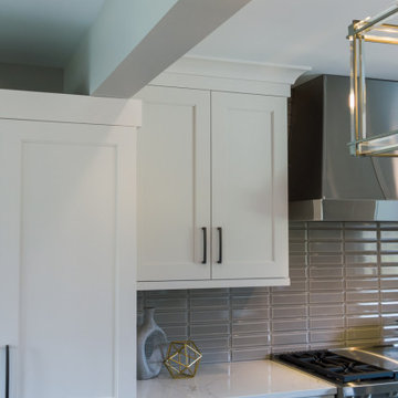
Design objectives for the remodel were aimed at giving the kitchen a larger feel, more room for cooking and extra seating for entertaining:
-Island with seating
-Space for a larger range/cooking area
-More storage with cabinets to the ceiling
-Making the original dining room blend with the kitchen so it all feels like one space
Design challenges to be solved:
-Making the header between the kitchen and the old dining room make sense as we combined the two spaces
-Avoid feeling crammed – a large island with seating still needed space for people walking around the space
-Refrigerator location – the header and window placements needed to stay, so finding a new and functional place for the fridge was a priority
-Add a large hood for wow-factor appeal
Design solutions fell into place as the overall layout came together:
-A large island to seat their four-person family comfortably. -Seating on two sides of the island improves conversation and has a great look.
-Knocking out a dining room wall gave us more room for the island. The leftover part of the dining was perfect for a dry bar/beverage area.
-The refrigerator needed to blend in and also be easily accessible. We removed the built-in pantry and used this space to house the refrigerator/freezer. Then we added tall pantry cabinets throughout the kitchen to make up for the loss of space.
-A large metal hood broke up the space and made for a fun statement piece
The new space is perfect for family time when the kids are back. It’s more conducive for being together, hanging out together, and entertaining with different friend groups together… the family simply spends more time together when they’re together in their new space.
“It’s the design and the openness,” the mom says. “Everybody loves it and gathers around the island all the time. It’s the lighting, too – it’s brighter in here. It’s just more open. We love it!”
 Drury Design
Design objectives for the remodel were aimed at giving the kitchen a larger feel, more room for cooking and extra seating for entertaining:
-Island with seating
-Space for a larger range/cooking area
-More storage with cabinets to the ceiling
-Making the original dining room blend with the kitchen so it all feels like one space
Design challenges to be solved:
-Making the header between the kitchen and the old dining room make sense as we combined the two spaces
-Avoid feeling crammed – a large island with seating still needed space for people walking around the space
-Refrigerator location – the header and window placements needed to stay, so finding a new and functional place for the fridge was a priority
-Add a large hood for wow-factor appeal
Design solutions fell into place as the overall layout came together:
-A large island to seat their four-person family comfortably. -Seating on two sides of the island improves conversation and has a great look.
-Knocking out a dining room wall gave us more room for the island. The leftover part of the dining was perfect for a dry bar/beverage area.
-The refrigerator needed to blend in and also be easily accessible. We removed the built-in pantry and used this space to house the refrigerator/freezer. Then we added tall pantry cabinets throughout the kitchen to make up for the loss of space.
-A large metal hood broke up the space and made for a fun statement piece
The new space is perfect for family time when the kids are back. It’s more conducive for being together, hanging out together, and entertaining with different friend groups together… the family simply spends more time together when they’re together in their new space.
“It’s the design and the openness,” the mom says. “Everybody loves it and gathers around the island all the time. It’s the lighting, too – it’s brighter in here. It’s just more open. We love it!”
Sponsored
Sunbury, OH

J.Holderby - Renovations
Franklin County's Leading General Contractors - 2X Best of Houzz!
 Drury Design
Design objectives for the remodel were aimed at giving the kitchen a larger feel, more room for cooking and extra seating for entertaining:
-Island with seating
-Space for a larger range/cooking area
-More storage with cabinets to the ceiling
-Making the original dining room blend with the kitchen so it all feels like one space
Design challenges to be solved:
-Making the header between the kitchen and the old dining room make sense as we combined the two spaces
-Avoid feeling crammed – a large island with seating still needed space for people walking around the space
-Refrigerator location – the header and window placements needed to stay, so finding a new and functional place for the fridge was a priority
-Add a large hood for wow-factor appeal
Design solutions fell into place as the overall layout came together:
-A large island to seat their four-person family comfortably. -Seating on two sides of the island improves conversation and has a great look.
-Knocking out a dining room wall gave us more room for the island. The leftover part of the dining was perfect for a dry bar/beverage area.
-The refrigerator needed to blend in and also be easily accessible. We removed the built-in pantry and used this space to house the refrigerator/freezer. Then we added tall pantry cabinets throughout the kitchen to make up for the loss of space.
-A large metal hood broke up the space and made for a fun statement piece
The new space is perfect for family time when the kids are back. It’s more conducive for being together, hanging out together, and entertaining with different friend groups together… the family simply spends more time together when they’re together in their new space.
“It’s the design and the openness,” the mom says. “Everybody loves it and gathers around the island all the time. It’s the lighting, too – it’s brighter in here. It’s just more open. We love it!”
 The Dan Company
Indulge in the epitome of luxury with this master suite addition project in Nashville, TN. The bathroom exudes contemporary elegance, featuring sleek heated tile floors by Daltile that provide comfort and warmth. The centerpiece of the room is a luxurious freestanding tub by Signature Hardware, perfect for relaxing after a long day. Adjacent, the walk-in glass shower offers a spa-like experience with high-end fixtures by Grohe and Delta, and finishes that reflect modern sophistication.
The bathroom also includes a state-of-the-art bidet by Toto, adding a touch of sophistication and modern convenience. A sophisticated bathroom sink by Kohler enhances the functionality and aesthetic appeal of the space. Southern Stone countertops throughout the bathroom add a layer of elegance and durability, harmonizing with the serene palette of whites and grays.
Adjacent to the bathroom is a spacious walk-in closet featuring rich hardwood floors that add a touch of elegance and practicality. This closet offers ample storage space and custom shelving solutions, designed to keep your wardrobe organized and easily accessible.
The contemporary interior design is highlighted by natural light that floods the space, underscoring the meticulous craftsmanship and attention to detail that define this high-end renovation. Explore our portfolio to discover more of our meticulously designed high-end residential projects and contemporary bathroom designs. Whether you're envisioning a similar master suite addition or exploring new home renovation ideas, our team is dedicated to bringing your vision to life with personalized service and expertise.
Contact us today to schedule a consultation and begin your journey towards transforming your living space into a sanctuary of luxury and style.
Interior Design: Kevin Corn Design
Photography: Joseph Bradshaw
 Drury Design
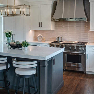
Design objectives for the remodel were aimed at giving the kitchen a larger feel, more room for cooking and extra seating for entertaining:
-Island with seating
-Space for a larger range/cooking area
-More storage with cabinets to the ceiling
-Making the original dining room blend with the kitchen so it all feels like one space
Design challenges to be solved:
-Making the header between the kitchen and the old dining room make sense as we combined the two spaces
-Avoid feeling crammed – a large island with seating still needed space for people walking around the space
-Refrigerator location – the header and window placements needed to stay, so finding a new and functional place for the fridge was a priority
-Add a large hood for wow-factor appeal
Design solutions fell into place as the overall layout came together:
-A large island to seat their four-person family comfortably. -Seating on two sides of the island improves conversation and has a great look.
-Knocking out a dining room wall gave us more room for the island. The leftover part of the dining was perfect for a dry bar/beverage area.
-The refrigerator needed to blend in and also be easily accessible. We removed the built-in pantry and used this space to house the refrigerator/freezer. Then we added tall pantry cabinets throughout the kitchen to make up for the loss of space.
-A large metal hood broke up the space and made for a fun statement piece
The new space is perfect for family time when the kids are back. It’s more conducive for being together, hanging out together, and entertaining with different friend groups together… the family simply spends more time together when they’re together in their new space.
“It’s the design and the openness,” the mom says. “Everybody loves it and gathers around the island all the time. It’s the lighting, too – it’s brighter in here. It’s just more open. We love it!”
 Drury Design
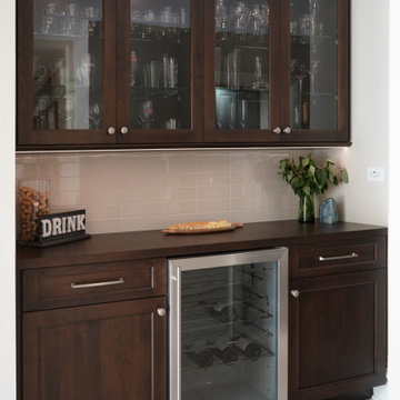
This house was 45 years old and the most recent kitchen update was past its due date. It was also time to update an adjacent family room, eating area and a nearby bar. The idea was to refresh the space with a transitional design that leaned classic – something that would be elegant and comfortable. Something that would welcome and enhance natural light.
The objectives were:
-Keep things simple – classic, comfortable and easy to keep clean
-Cohesive design between the kitchen, family room, eating area and bar
-Comfortable walkways, especially between the island and sofa
-Get rid of the kitchen’s dated 3D vegetable tile and island top shaped like a painters pallet
Design challenges:
-Incorporate a structural beam so that it flows with the entire space
-Proper ventilation for the hood
-Update the floor finish to get rid of the ’90s red oak
Design solutions:
-After reviewing multiple design options we decided on keeping appliances in their existing locations
-Made the cabinet on the back wall deeper than standard to fit and conceal the exhaust vent within the crown molding space and provide proper ventilation for the rangetop
-Omitted the sink on the island because it was not being used
-Squared off the island to provide more seating and functionality
-Relocated the microwave from the wall to the island and fitted a warming drawer directly below
-Added a tray partition over the oven so that cookie sheets and cutting boards are easily accessible and neatly stored
-Omitted all the decorative fillers to make the kitchen feel current
-Detailed yet simple tile backsplash design to add interest
Refinished the already functional entertainment cabinetry to match new cabinets – good flow throughout area
Even though the appliances all stayed in the same locations, the cabinet finish created a dramatic change. This is a very large kitchen and the client embraces minimalist design so we decided to omit quite a few wall cabinets.

 Kuhl Design Build LLC
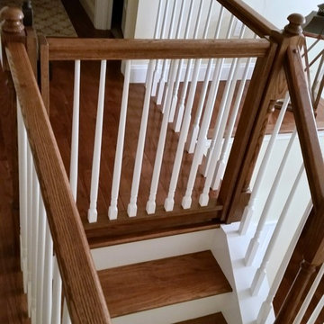
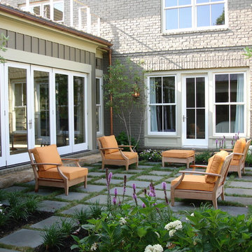
We are a full service, residential design/build company specializing in large remodels and whole house renovations. Our way of doing business is dynamic, interactive and fully transparent. It's your house, and it's your money. Recognition of this fact is seen in every facet of our business because we respect our clients enough to be honest about the numbers. In exchange, they trust us to do the right thing. Pretty simple when you think about it.

Sponsored
Columbus, OH
Free consultation for landscape design!

Peabody Landscape Group
Franklin County's Reliable Landscape Design & Contracting
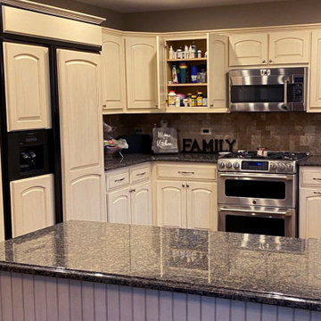 Drury Design
Design objectives for the remodel were aimed at giving the kitchen a larger feel, more room for cooking and extra seating for entertaining:
-Island with seating
-Space for a larger range/cooking area
-More storage with cabinets to the ceiling
-Making the original dining room blend with the kitchen so it all feels like one space
Design challenges to be solved:
-Making the header between the kitchen and the old dining room make sense as we combined the two spaces
-Avoid feeling crammed – a large island with seating still needed space for people walking around the space
-Refrigerator location – the header and window placements needed to stay, so finding a new and functional place for the fridge was a priority
-Add a large hood for wow-factor appeal
Design solutions fell into place as the overall layout came together:
-A large island to seat their four-person family comfortably. -Seating on two sides of the island improves conversation and has a great look.
-Knocking out a dining room wall gave us more room for the island. The leftover part of the dining was perfect for a dry bar/beverage area.
-The refrigerator needed to blend in and also be easily accessible. We removed the built-in pantry and used this space to house the refrigerator/freezer. Then we added tall pantry cabinets throughout the kitchen to make up for the loss of space.
-A large metal hood broke up the space and made for a fun statement piece
The new space is perfect for family time when the kids are back. It’s more conducive for being together, hanging out together, and entertaining with different friend groups together… the family simply spends more time together when they’re together in their new space.
“It’s the design and the openness,” the mom says. “Everybody loves it and gathers around the island all the time. It’s the lighting, too – it’s brighter in here. It’s just more open. We love it!”
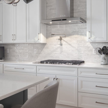 Reico Kitchen & Bath
Sheryl Manning of Reico Kitchen and Bath in Charlotte, NC, in collaboration with Lynn Schafer Interiors, designed a transitional kitchen design featuring Masterpiece cabinetry and Merillat cabinetry.
The kitchen perimeter and coffee bar cabinets highlight Merillat Classic in the door style Rowan with a Cotton finish. The kitchen island cabinets feature Masterpiece in the Sawyer door style with a Rainfall finish.
Additionally, the kitchen includes MSI Q Calacatta Miraggio Duo quartz countertops, a Splendours White 3x12 backsplash and KitchenAid appliances.
The client shared their appreciation, saying, "Sheryl was absolutely wonderful to work with and really made this project stress-free for us. Her expertise in kitchen layouts and maximizing space for our needs, along with updating the dark cherry wood to a lovely white and timeless look, were invaluable. I knew Sheryl and I would get along immediately when she walked in and said, 'I love the pot rack,' as it was one of the key things I wanted to keep in our new kitchen!"
“I love the pull out drawers & the pull out shelves that were installed. I worked in the housewares industry for years and probably have every gadget on the market - I now have an easily organized and accessible space to store everything,” said the client.
Sheryl described the clients as a dream to work with. “The client is an accomplished chef and wanted to be sure that all the pots, pans, accessories and gadgets had a home that was convenient and ergonomic. The end result was a classic and calm white kitchen perimeter with a rich rainfall island, a color that appears in other furniture and artwork.”
Photos courtesy of Six Cents Media.

 Hudson Place Realty
Unmatched sophistication on Castle Point Terrace with world class New York City and Hudson River views. The innovative design of this unique home incorporates mid-century design characteristics for the 21st century; harmonious indoor/outdoor flow, expert use of organic materials & smart, elegant built-in cabinetry. Designed & built by award-winning Hoboken architect, John Nastasi, 907 Castle Point is in a class of its own. The sun-filled kitchen features a large Calacatta marble island with Wolf, SubZero and Viking appliances, built-in Mahogany banquette and distinctive pine ceilings. Completing the parlor floor is the formal living room, family room with built in entertainment center and convenient powder room. The rear yard, an extension of the living space, features an Ipé deck with glass railings, flamed limestone patio, pristine lawn, irrigated all season garden and a unique stainless steel plunge pool.
Steel stair case leads to the garden level offering a private bedroom/office with powder room that is easily converted to a full bath for the perfect in-law or au pair suite. The top floor master retreat features dramatic windows, en-suite terrace, gas fireplace and sitting room with built-in mahogany wet bar. Rivaling many spas, the master bathroom features timeless teak vanity, oversized walk-in shower and freestanding concrete soaking tub with dramatic 3form organics backdrop.
Additional fine details through this extraordinary home include 5+ bedrooms, 3 full baths , 2 half baths, hand scraped walnut floors, radiant heated floors throughout, security system with cameras, Elan sound system, blackout and sheer window treatments, recessed gallery lighting, floor outlets, full laundry room with laundry chute, and multi-zone HVAC system. Welcoming you at the end of Castle Point Terrace is Hoboken’s Elysian Park as well as easy access to NYC bus, ferry and private rental parking garages.
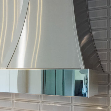 Drury Design
Design objectives for the remodel were aimed at giving the kitchen a larger feel, more room for cooking and extra seating for entertaining:
-Island with seating
-Space for a larger range/cooking area
-More storage with cabinets to the ceiling
-Making the original dining room blend with the kitchen so it all feels like one space
Design challenges to be solved:
-Making the header between the kitchen and the old dining room make sense as we combined the two spaces
-Avoid feeling crammed – a large island with seating still needed space for people walking around the space
-Refrigerator location – the header and window placements needed to stay, so finding a new and functional place for the fridge was a priority
-Add a large hood for wow-factor appeal
Design solutions fell into place as the overall layout came together:
-A large island to seat their four-person family comfortably. -Seating on two sides of the island improves conversation and has a great look.
-Knocking out a dining room wall gave us more room for the island. The leftover part of the dining was perfect for a dry bar/beverage area.
-The refrigerator needed to blend in and also be easily accessible. We removed the built-in pantry and used this space to house the refrigerator/freezer. Then we added tall pantry cabinets throughout the kitchen to make up for the loss of space.
-A large metal hood broke up the space and made for a fun statement piece
The new space is perfect for family time when the kids are back. It’s more conducive for being together, hanging out together, and entertaining with different friend groups together… the family simply spends more time together when they’re together in their new space.
“It’s the design and the openness,” the mom says. “Everybody loves it and gathers around the island all the time. It’s the lighting, too – it’s brighter in here. It’s just more open. We love it!”
Sponsored
Sunbury, OH
J.Holderby - Renovations
Franklin County's Leading General Contractors - 2X Best of Houzz!
 Drury Design
Design objectives for the remodel were aimed at giving the kitchen a larger feel, more room for cooking and extra seating for entertaining:
-Island with seating
-Space for a larger range/cooking area
-More storage with cabinets to the ceiling
-Making the original dining room blend with the kitchen so it all feels like one space
Design challenges to be solved:
-Making the header between the kitchen and the old dining room make sense as we combined the two spaces
-Avoid feeling crammed – a large island with seating still needed space for people walking around the space
-Refrigerator location – the header and window placements needed to stay, so finding a new and functional place for the fridge was a priority
-Add a large hood for wow-factor appeal
Design solutions fell into place as the overall layout came together:
-A large island to seat their four-person family comfortably. -Seating on two sides of the island improves conversation and has a great look.
-Knocking out a dining room wall gave us more room for the island. The leftover part of the dining was perfect for a dry bar/beverage area.
-The refrigerator needed to blend in and also be easily accessible. We removed the built-in pantry and used this space to house the refrigerator/freezer. Then we added tall pantry cabinets throughout the kitchen to make up for the loss of space.
-A large metal hood broke up the space and made for a fun statement piece
The new space is perfect for family time when the kids are back. It’s more conducive for being together, hanging out together, and entertaining with different friend groups together… the family simply spends more time together when they’re together in their new space.
“It’s the design and the openness,” the mom says. “Everybody loves it and gathers around the island all the time. It’s the lighting, too – it’s brighter in here. It’s just more open. We love it!”
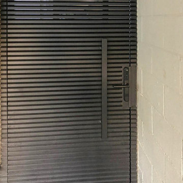
 MULHOLLAND BRAND
You'll feel safe and secure when your home is surrounded by fencing. This aluminum project is called the HiTech 45. The horizontal fence rails are placed at 45 degree angles to add privacy while allowing air flow.
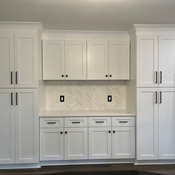
 7 Day Kitchens
This lovely home in Lake Wylie, SC was in dire need of some sprucing up. The builder-grade cabinets and countertops were outdated and ready for a modern upgrade.
The kitchen had a classic U-shape design that didn’t quite fit with today’s trend of open-concept living. The peninsula was a hindrance to the flow of the space and really cramped movement. While the work triangle was perfect, the dark wood cabinets and laminate countertops were definitely a thing of the past. So, we decided to make some big changes to improve functionality.
The two most transformative changes were the removal of the peninsula and the opening up of the wall between the kitchen and living room. This created a more open and spacious feel in both the kitchen and living room areas. The wall opening now has bar height seating for dining and doubles as a buffet during entertaining. Plus, we added new pendant lighting to the bar area.
We also said goodbye to the built-in pantry and hello to a full height pantry cabinet, providing more storage space. The addition of roll-out trays made everyday items easily accessible, and a built-in trash can pullout made hiding trash cans a breeze. We increased the height of the cabinets from 30 inches to 36 inches and trimmed the tops to the ceiling, giving the kitchen a fresh and modern look and more storage space.
We wrapped up the project by removing the popcorn ceiling texture and installing durable luxury vinyl plank flooring, along with a fresh coat of paint. This elevated the overall look and feel of the home to a more modern style. All of these changes were completed in just 8 days, from start to finish!
235