
Search results for "Engaging ads" in Home Design Ideas
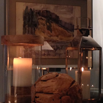
 GMI Design Group
Breezy Coastal-Inspired Hearth Room
Sustainable, natural, wholly engaging, and a showcase for their cultural pieces and art was the concept for this home. The couple wanted to use sustainable and environmentally friendly products throughout their home as much as possible.
Being from both California and Florida, they wanted a coastal influence that didn’t look contrived or over-stylized in a Midwestern home. Also, they desired a serene, peaceful space where all senses were engaged. Incorporating the Feng Shui elements of wood, fire, earth, metal and water in color, texture and product choice was used in this design.
A problem area with the original room was a large, blocky oak fireplace. The top half was removed and the hearth was painted white, opening up the space considerably. The back wall was painted a serene blue as an accent.
An overall neutral palette of taupe, blues and grey balanced the wood tones found in the flooring and teak accents the couple acquired on their travels. We recovered their existing love seat with taupe diamond-stripe cotton in a slipcover style, adding to the casual atmosphere of a beach house. Organic cotton, hand-blocked pillows with red cherry blossoms provide a pop of color to the seating. A swivel rocker gives flexibility to multiple focal points and conversation.
The 100% hemp rug has a turquoise oversized damask print and is a plush anchor to the hearth setting. A long grey-washed rattan bench serves as a cocktail table and woven Roman shades provide needed contrast to the back wall. A distressed, reclaimed bench sits below bold art as a bright accent area to an overall neutral space.
The centerpiece of the room is a large cerulean blue buffet with fretwork & glass doors. A large Buddha head serves as a meditative focal point with Asian-inspired art and lighting.
Julie Austin Photography
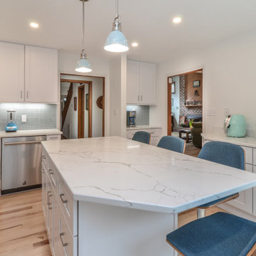
 Reico Kitchen & Bath
Designed by Jens Bunte of Reico Kitchen & Bath in Chesapeake, VA this transitional style kitchen design features Green Forest Cabinetry in Park Place shaker door style with White finish. Kitchen countertops are Q by MSI engineered quartz in the color Calacatta Laza. The tile backsplash features the Glazzio Crystile Series in the color Morning Mist.
According to the client, “On her initial visit, Jens asked many insightful questions and offered several helpful recommendations that appealed to us immediately. These included installing ceiling height cabinets by removing the soffit, adding a full depth cabinet above the refrigerator, considering a larger island with more countertop, storage and seating space, incorporating efficient cabinet accessories in our base cabinets and transforming a bi-fold door pantry into a coffee bar. From project kickoff to concept design, planning, communication, logistics, installation and follow up, Jens was attentive, enthusiastic, engaged and meticulous. It was truly a pleasure to work with her!” Added Jens, “The Barbers knew what they wanted but also allowed me to offer ideas and solutions throughout the entire project so the end result was a definite combination of all of our efforts coming together cohesively.”
Photos courtesy of Frank Biganski, AgentsChoice360.
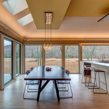
 Nautilus Architects
Located on a marsh in the upper reaches of the Lieutenant River in Old Lyme, the existing house was well-sited and well-built, but the design failed to exploit the views and more importantly was a confused combination of contemporary and traditional elements. The new homeowners, a successful businesswoman and an accomplished artist and photographer, were interested in creating a fully-contemporary environment to open up space, connect indoors with outdoors, display artwork and showcase the husband’s distinctive photographs.
One glaring deficiency was the curb appeal and approach sequence: the grade sloped down and the path to the house followed, but this led to an uncomfortable dip and abrupt rise to the front door. By creating a virtual “moat,” occupied by a grid of raised-bed grasses contained in aluminum-clad boxes, and spanning the moat with an ipe bridge, the approach becomes level and engaging. The façade of the existing house was blank and bland, and with no cover. Adding a deep overhang with a wide porch creates a welcoming, covered condition, accentuated by a 6’ wide pivoting front door that feels more like a moving piece of wall.
Another deficiency was the connection to the outdoors. By adding glass to the front and back of the house, and removing interior walls selectively, the house takes on a diaphanous quality that allows one to see through to the marsh beyond, even when in the driveway. The raised-bed grasses act as abstract, geometric versions of the marsh beyond. A large, pyramidal skylight establishes a spatial hierarchy around which the rooms revolve.
The house featured several tray-ceilinged spaces – living room, kitchen, and master bedroom – that were poorly-proportioned and with panels at the top that resembled inset flat panel doors. The solution was to use a different strategy for each: the bedroom turns the ceiling into an eggshell through the use of a creative trim detail; the living room has an oversized sculptural, backlit lighting element; and the kitchen has a collage of painted rectangular forms that support or include lighting pieces.
A palette of concrete, blackened steel, stainless steel and colors carefully chosen by homeowner and architect create an interior and exterior environment punctuated by moments that are as artistic as the featured works in the black-ceilinged gallery.
Find the right local pro for your project
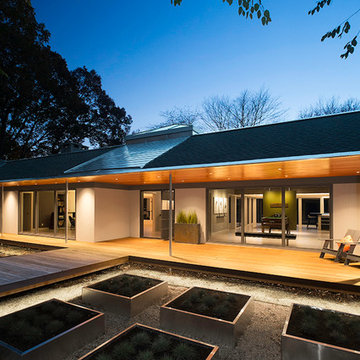 Nautilus Architects
Located on a marsh in the upper reaches of the Lieutenant River in Old Lyme, the existing house was well-sited and well-built, but the design failed to exploit the views and more importantly was a confused combination of contemporary and traditional elements. The new homeowners, a successful businesswoman and an accomplished artist and photographer, were interested in creating a fully-contemporary environment to open up space, connect indoors with outdoors, display artwork and showcase the husband’s distinctive photographs.
One glaring deficiency was the curb appeal and approach sequence: the grade sloped down and the path to the house followed, but this led to an uncomfortable dip and abrupt rise to the front door. By creating a virtual “moat,” occupied by a grid of raised-bed grasses contained in aluminum-clad boxes, and spanning the moat with an ipe bridge, the approach becomes level and engaging. The façade of the existing house was blank and bland, and with no cover. Adding a deep overhang with a wide porch creates a welcoming, covered condition, accentuated by a 6’ wide pivoting front door that feels more like a moving piece of wall.
Another deficiency was the connection to the outdoors. By adding glass to the front and back of the house, and removing interior walls selectively, the house takes on a diaphanous quality that allows one to see through to the marsh beyond, even when in the driveway. The raised-bed grasses act as abstract, geometric versions of the marsh beyond. A large, pyramidal skylight establishes a spatial hierarchy around which the rooms revolve.
The house featured several tray-ceilinged spaces – living room, kitchen, and master bedroom – that were poorly-proportioned and with panels at the top that resembled inset flat panel doors. The solution was to use a different strategy for each: the bedroom turns the ceiling into an eggshell through the use of a creative trim detail; the living room has an oversized sculptural, backlit lighting element; and the kitchen has a collage of painted rectangular forms that support or include lighting pieces.
A palette of concrete, blackened steel, stainless steel and colors carefully chosen by homeowner and architect create an interior and exterior environment punctuated by moments that are as artistic as the featured works in the black-ceilinged gallery.
 Kitchen Solvers of Grayslake
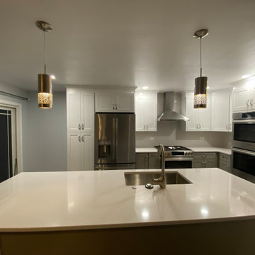
Our homeowners love to cook, bake, and entertain. They were dealing with the original builder grade cabinets that were falling apart and coming off the walls. They initially reached out to consider refacing, but realized a remodel was what they needed to reimagine the kitchen space and achieve the functionality they were looking for. We went to work understanding how they use their kitchen creating a design for the chef to be able to work while keeping people engaged and out of her workspace. They decided on a two-toned kitchen with Polar White and Pebble Gray cabinets. The countertops were done in Smoked Pearl quartz with a matching full splash creating a clean and continuous flow. We removed the existing peninsula and built a large island/prep area. Their guests can now walk directly into the living area without having to go through the kitchen. We also added seating on two sides of the island. To provide more functionality and storage, we relocated the refrigerator and added a double oven and pantry cabinets, rollout shelves, and various pullout storage solutions. Now our homeowners have the kitchen they never thought they could have. We are glad we could solve this kitchen for them!
 Nautilus Architects
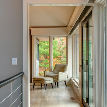
Located on a marsh in the upper reaches of the Lieutenant River in Old Lyme, the existing house was well-sited and well-built, but the design failed to exploit the views and more importantly was a confused combination of contemporary and traditional elements. The new homeowners, a successful businesswoman and an accomplished artist and photographer, were interested in creating a fully-contemporary environment to open up space, connect indoors with outdoors, display artwork and showcase the husband’s distinctive photographs.
One glaring deficiency was the curb appeal and approach sequence: the grade sloped down and the path to the house followed, but this led to an uncomfortable dip and abrupt rise to the front door. By creating a virtual “moat,” occupied by a grid of raised-bed grasses contained in aluminum-clad boxes, and spanning the moat with an ipe bridge, the approach becomes level and engaging. The façade of the existing house was blank and bland, and with no cover. Adding a deep overhang with a wide porch creates a welcoming, covered condition, accentuated by a 6’ wide pivoting front door that feels more like a moving piece of wall.
Another deficiency was the connection to the outdoors. By adding glass to the front and back of the house, and removing interior walls selectively, the house takes on a diaphanous quality that allows one to see through to the marsh beyond, even when in the driveway. The raised-bed grasses act as abstract, geometric versions of the marsh beyond. A large, pyramidal skylight establishes a spatial hierarchy around which the rooms revolve.
The house featured several tray-ceilinged spaces – living room, kitchen, and master bedroom – that were poorly-proportioned and with panels at the top that resembled inset flat panel doors. The solution was to use a different strategy for each: the bedroom turns the ceiling into an eggshell through the use of a creative trim detail; the living room has an oversized sculptural, backlit lighting element; and the kitchen has a collage of painted rectangular forms that support or include lighting pieces.
A palette of concrete, blackened steel, stainless steel and colors carefully chosen by homeowner and architect create an interior and exterior environment punctuated by moments that are as artistic as the featured works in the black-ceilinged gallery.
 GMI Design Group
Breezy Coastal-Inspired Hearth Room
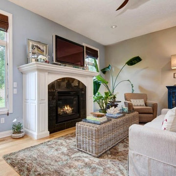
Sustainable, natural, wholly engaging, and a showcase for their cultural pieces and art was the concept for this home. The couple wanted to use sustainable and environmentally friendly products throughout their home as much as possible.
Being from both California and Florida, they wanted a coastal influence that didn’t look contrived or over-stylized in a Midwestern home. Also, they desired a serene, peaceful space where all senses were engaged. Incorporating the Feng Shui elements of wood, fire, earth, metal and water in color, texture and product choice was used in this design.
A problem area with the original room was a large, blocky oak fireplace. The top half was removed and the hearth was painted white, opening up the space considerably. The back wall was painted a serene blue as an accent.
An overall neutral palette of taupe, blues and grey balanced the wood tones found in the flooring and teak accents the couple acquired on their travels. We recovered their existing love seat with taupe diamond-stripe cotton in a slipcover style, adding to the casual atmosphere of a beach house. Organic cotton, hand-blocked pillows with red cherry blossoms provide a pop of color to the seating. A swivel rocker gives flexibility to multiple focal points and conversation.
The 100% hemp rug has a turquoise oversized damask print and is a plush anchor to the hearth setting. A long grey-washed rattan bench serves as a cocktail table and woven Roman shades provide needed contrast to the back wall. A distressed, reclaimed bench sits below bold art as a bright accent area to an overall neutral space.
The centerpiece of the room is a large cerulean blue buffet with fretwork & glass doors. A large Buddha head serves as a meditative focal point with Asian-inspired art and lighting.
Julie Austin Photography

Sponsored
Columbus, OH

Hope Restoration & General Contracting
Columbus Design-Build, Kitchen & Bath Remodeling, Historic Renovations
 Kitchen Solvers of Grayslake
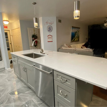
Our homeowners love to cook, bake, and entertain. They were dealing with the original builder grade cabinets that were falling apart and coming off the walls. They initially reached out to consider refacing, but realized a remodel was what they needed to reimagine the kitchen space and achieve the functionality they were looking for. We went to work understanding how they use their kitchen creating a design for the chef to be able to work while keeping people engaged and out of her workspace. They decided on a two-toned kitchen with Polar White and Pebble Gray cabinets. The countertops were done in Smoked Pearl quartz with a matching full splash creating a clean and continuous flow. We removed the existing peninsula and built a large island/prep area. Their guests can now walk directly into the living area without having to go through the kitchen. We also added seating on two sides of the island. To provide more functionality and storage, we relocated the refrigerator and added a double oven and pantry cabinets, rollout shelves, and various pullout storage solutions. Now our homeowners have the kitchen they never thought they could have. We are glad we could solve this kitchen for them!
 Reico Kitchen & Bath
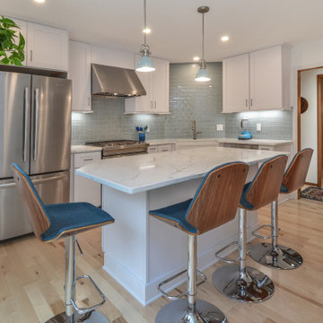
Designed by Jens Bunte of Reico Kitchen & Bath in Chesapeake, VA this transitional style kitchen design features Green Forest Cabinetry in Park Place shaker door style with White finish. Kitchen countertops are Q by MSI engineered quartz in the color Calacatta Laza. The tile backsplash features the Glazzio Crystile Series in the color Morning Mist.
According to the client, “On her initial visit, Jens asked many insightful questions and offered several helpful recommendations that appealed to us immediately. These included installing ceiling height cabinets by removing the soffit, adding a full depth cabinet above the refrigerator, considering a larger island with more countertop, storage and seating space, incorporating efficient cabinet accessories in our base cabinets and transforming a bi-fold door pantry into a coffee bar. From project kickoff to concept design, planning, communication, logistics, installation and follow up, Jens was attentive, enthusiastic, engaged and meticulous. It was truly a pleasure to work with her!” Added Jens, “The Barbers knew what they wanted but also allowed me to offer ideas and solutions throughout the entire project so the end result was a definite combination of all of our efforts coming together cohesively.”
Photos courtesy of Frank Biganski, AgentsChoice360.
 Interlocking Concrete Pavement Institute
2018 HNA Awards Honorable Mention - Concrete Paver - Commercial (size more than 15,000 sf)
Contractor: B&D Contractors Inc.
Producer: Keystone Hardscapes
Designer: OJB Landscape Architects
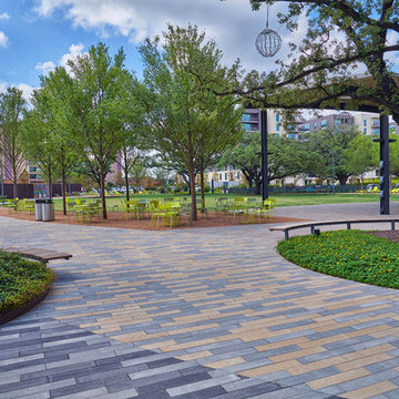
Once modest and tucked away off a dead end road, Levy Park received a revitalization to re-engage the local community. CityStone, Holland, Roman Cobble and Verona pavers were chosen in the design to help separate different areas of the park, add a sense of playfulness and accentuate natural features.
The transformation included native landscaping, interactive water features, a dog park, garden, park pavilion and children’s play area. Pavers helped create and define each of these spaces through use of colors, shapes and inlay patterns. Variegated and whimsical paver patterns invoke a sense of spirited movement and fun.
The use of multiple paver shapes, colors, and upgraded textures added depth and beauty to this cunningly conceived urban space, by accenting native grass areas and designating different park sections. The central grand walkways gracefully arc throughout the space with large plank style pavers, creating a modern boardwalk feel.
Recognizing the park’s development history dating back to 1941, incorporating new design elements while maintaining original aspects was important to the redesign. The chosen pavers were able to integrate with the longstanding historical elements, while adding an artful refresh to the park.
A local resident stated, “This is hands down the most gorgeous and well-designed park I’ve ever seen. I fell in love the second I stepped foot into it.” Through thoughtful design and paver choices utilizing different shapes, colors and textures, Levy Park is now a community hot spot.
 Kitchen Solvers of Grayslake
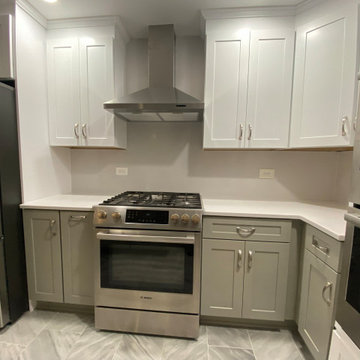
Our homeowners love to cook, bake, and entertain. They were dealing with the original builder grade cabinets that were falling apart and coming off the walls. They initially reached out to consider refacing, but realized a remodel was what they needed to reimagine the kitchen space and achieve the functionality they were looking for. We went to work understanding how they use their kitchen creating a design for the chef to be able to work while keeping people engaged and out of her workspace. They decided on a two-toned kitchen with Polar White and Pebble Gray cabinets. The countertops were done in Smoked Pearl quartz with a matching full splash creating a clean and continuous flow. We removed the existing peninsula and built a large island/prep area. Their guests can now walk directly into the living area without having to go through the kitchen. We also added seating on two sides of the island. To provide more functionality and storage, we relocated the refrigerator and added a double oven and pantry cabinets, rollout shelves, and various pullout storage solutions. Now our homeowners have the kitchen they never thought they could have. We are glad we could solve this kitchen for them!
 Christopher D. Marshall Architect, LLC
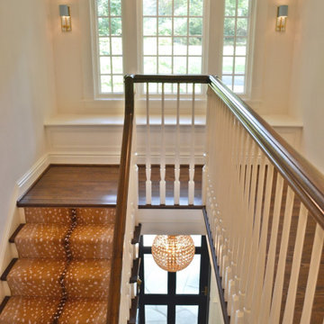
The existing entry hall was narrow, and uninviting. The front porch was bland. The solution was to expand the entry hall out four feet with a two story piece that allowed for a new straight run of stairs, a larger foyer at the entry door with sidelights and a fanlight window above. A Palladian window was added at the stair landing with a window seat.. A new semi circular porch with a stone floor marks the main entry for the house.
Existing Dining Room bay had a low ceiling which separated it from the main room. We removed the old bay and added a taller rectangular bay window with engaged columns to complement the entry porch.
The new dining bay, front porch and new vertical brick element fit the scale of the large front facade and most importantly give it visual delight!
 Safferstone Interiors
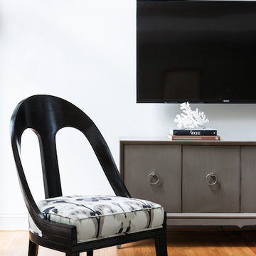
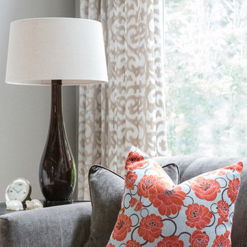
Dennis and Joe have a large, light-filled house. New construction meant lofted space and open floor plans with traditional styling. Running a busy dental practice by day and engaged in a rich social life by night, this couple needed a professional to take the lead on making their house a home.
That’s my cue!
They wanted to take risks, and stay away from “matchy-matchy”. We gussied up a plain ol’ TV room and gave it a healthy dose of luxury.
Our plan was initially inspired by an abstract painting hanging over their stone fireplace. We brought in their love of the outdoors to make things cozy and used family furniture whenever possible for nostalgia and comfort.
I took their love for one-of-a-kind objects and started making a design plan, aiming to solve their biggest frustration: the family room. They had a tortured relationship with a “forgotten family room,” a great space that was spacious and bright, but not at all cozy or joyful, and certainly not “them.”
I wanted to create a cozy space functional for everyday curling up with puppies and watching TV after dinner, yet chic enough for hosting the pre-dinner kitchen overflow and cocktails during parties.
I went looking for contrasting textures and materials. I wanted to balance patterns and scale, and use non-traditional colors as neutrals to create an overall sense of “BAM!”
Dennis and Joe loved the nod to the classics juxtaposed with new and different globally-inspired pieces. For this project our design aesthetic can be described as Middle Eastern/tribal meets mid-century modern. We played to their sensible side with proportion and balance, and stayed as far away from boring/bleh as we could.
You could say this room was pretty successful...It was featured in DC Modern Luxury. (#nobigdeal, right?)
From there we moved on to other spaces.. We added colorful pillows and sheer drapery to finish off their formal living room. We kept an inherited bedroom set from Dennis’ Mom and added color, draperies, and pillows to overhaul the guest bedroom.
Their project was not a rip-and-replace, we weren’t starting from scratch with a blank piece of paper.
Rather, our goal was to take what was already there and make it better, more like them. Using functionality first, we focused on giving the house a soothing, joyful aesthetic. We upped the chic factor by a gajillion and helped them find their ‘happy’ at home. See more Safferstone stuff at www.safferstone.com. Connect with us on Facebook, get inspired on Pinterest, and share modern musings on life & design on Instagram. Or, send us a love note at hello@safferstone.com.
Photo: Angie Seckinger

Sponsored
Columbus, OH
Hope Restoration & General Contracting
Columbus Design-Build, Kitchen & Bath Remodeling, Historic Renovations
 Safferstone Interiors
Dennis and Joe have a large, light-filled house. New construction meant lofted space and open floor plans with traditional styling. Running a busy dental practice by day and engaged in a rich social life by night, this couple needed a professional to take the lead on making their house a home.
That’s my cue!
They wanted to take risks, and stay away from “matchy-matchy”. We gussied up a plain ol’ TV room and gave it a healthy dose of luxury.
Our plan was initially inspired by an abstract painting hanging over their stone fireplace. We brought in their love of the outdoors to make things cozy and used family furniture whenever possible for nostalgia and comfort.
I took their love for one-of-a-kind objects and started making a design plan, aiming to solve their biggest frustration: the family room. They had a tortured relationship with a “forgotten family room,” a great space that was spacious and bright, but not at all cozy or joyful, and certainly not “them.”
I wanted to create a cozy space functional for everyday curling up with puppies and watching TV after dinner, yet chic enough for hosting the pre-dinner kitchen overflow and cocktails during parties.
I went looking for contrasting textures and materials. I wanted to balance patterns and scale, and use non-traditional colors as neutrals to create an overall sense of “BAM!”
Dennis and Joe loved the nod to the classics juxtaposed with new and different globally-inspired pieces. For this project our design aesthetic can be described as Middle Eastern/tribal meets mid-century modern. We played to their sensible side with proportion and balance, and stayed as far away from boring/bleh as we could.
You could say this room was pretty successful...It was featured in DC Modern Luxury. (#nobigdeal, right?)
From there we moved on to other spaces.. We added colorful pillows and sheer drapery to finish off their formal living room. We kept an inherited bedroom set from Dennis’ Mom and added color, draperies, and pillows to overhaul the guest bedroom.
Their project was not a rip-and-replace, we weren’t starting from scratch with a blank piece of paper.
Rather, our goal was to take what was already there and make it better, more like them. Using functionality first, we focused on giving the house a soothing, joyful aesthetic. We upped the chic factor by a gajillion and helped them find their ‘happy’ at home. See more Safferstone stuff at www.safferstone.com. Connect with us on Facebook, get inspired on Pinterest, and share modern musings on life & design on Instagram. Or, send us a love note at hello@safferstone.com.
Photo: Angie Seckinger
 Nautilus Architects
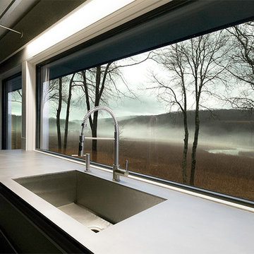
Located on a marsh in the upper reaches of the Lieutenant River in Old Lyme, the existing house was well-sited and well-built, but the design failed to exploit the views and more importantly was a confused combination of contemporary and traditional elements. The new homeowners, a successful businesswoman and an accomplished artist and photographer, were interested in creating a fully-contemporary environment to open up space, connect indoors with outdoors, display artwork and showcase the husband’s distinctive photographs.
One glaring deficiency was the curb appeal and approach sequence: the grade sloped down and the path to the house followed, but this led to an uncomfortable dip and abrupt rise to the front door. By creating a virtual “moat,” occupied by a grid of raised-bed grasses contained in aluminum-clad boxes, and spanning the moat with an ipe bridge, the approach becomes level and engaging. The façade of the existing house was blank and bland, and with no cover. Adding a deep overhang with a wide porch creates a welcoming, covered condition, accentuated by a 6’ wide pivoting front door that feels more like a moving piece of wall.
Another deficiency was the connection to the outdoors. By adding glass to the front and back of the house, and removing interior walls selectively, the house takes on a diaphanous quality that allows one to see through to the marsh beyond, even when in the driveway. The raised-bed grasses act as abstract, geometric versions of the marsh beyond. A large, pyramidal skylight establishes a spatial hierarchy around which the rooms revolve.
The house featured several tray-ceilinged spaces – living room, kitchen, and master bedroom – that were poorly-proportioned and with panels at the top that resembled inset flat panel doors. The solution was to use a different strategy for each: the bedroom turns the ceiling into an eggshell through the use of a creative trim detail; the living room has an oversized sculptural, backlit lighting element; and the kitchen has a collage of painted rectangular forms that support or include lighting pieces.
A palette of concrete, blackened steel, stainless steel and colors carefully chosen by homeowner and architect create an interior and exterior environment punctuated by moments that are as artistic as the featured works in the black-ceilinged gallery.
 Kitchen Solvers of Grayslake
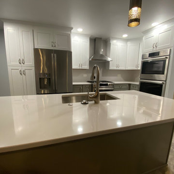
Our homeowners love to cook, bake, and entertain. They were dealing with the original builder grade cabinets that were falling apart and coming off the walls. They initially reached out to consider refacing, but realized a remodel was what they needed to reimagine the kitchen space and achieve the functionality they were looking for. We went to work understanding how they use their kitchen creating a design for the chef to be able to work while keeping people engaged and out of her workspace. They decided on a two-toned kitchen with Polar White and Pebble Gray cabinets. The countertops were done in Smoked Pearl quartz with a matching full splash creating a clean and continuous flow. We removed the existing peninsula and built a large island/prep area. Their guests can now walk directly into the living area without having to go through the kitchen. We also added seating on two sides of the island. To provide more functionality and storage, we relocated the refrigerator and added a double oven and pantry cabinets, rollout shelves, and various pullout storage solutions. Now our homeowners have the kitchen they never thought they could have. We are glad we could solve this kitchen for them!
 Reico Kitchen & Bath
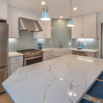
Designed by Jens Bunte of Reico Kitchen & Bath in Chesapeake, VA this transitional style kitchen design features Green Forest Cabinetry in Park Place shaker door style with White finish. Kitchen countertops are Q by MSI engineered quartz in the color Calacatta Laza. The tile backsplash features the Glazzio Crystile Series in the color Morning Mist.
According to the client, “On her initial visit, Jens asked many insightful questions and offered several helpful recommendations that appealed to us immediately. These included installing ceiling height cabinets by removing the soffit, adding a full depth cabinet above the refrigerator, considering a larger island with more countertop, storage and seating space, incorporating efficient cabinet accessories in our base cabinets and transforming a bi-fold door pantry into a coffee bar. From project kickoff to concept design, planning, communication, logistics, installation and follow up, Jens was attentive, enthusiastic, engaged and meticulous. It was truly a pleasure to work with her!” Added Jens, “The Barbers knew what they wanted but also allowed me to offer ideas and solutions throughout the entire project so the end result was a definite combination of all of our efforts coming together cohesively.”
Photos courtesy of Frank Biganski, AgentsChoice360.

Sponsored
Columbus, OH
Hope Restoration & General Contracting
Columbus Design-Build, Kitchen & Bath Remodeling, Historic Renovations
 Reico Kitchen & Bath
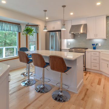
Designed by Jens Bunte of Reico Kitchen & Bath in Chesapeake, VA this transitional style kitchen design features Green Forest Cabinetry in Park Place shaker door style with White finish. Kitchen countertops are Q by MSI engineered quartz in the color Calacatta Laza. The tile backsplash features the Glazzio Crystile Series in the color Morning Mist.
According to the client, “On her initial visit, Jens asked many insightful questions and offered several helpful recommendations that appealed to us immediately. These included installing ceiling height cabinets by removing the soffit, adding a full depth cabinet above the refrigerator, considering a larger island with more countertop, storage and seating space, incorporating efficient cabinet accessories in our base cabinets and transforming a bi-fold door pantry into a coffee bar. From project kickoff to concept design, planning, communication, logistics, installation and follow up, Jens was attentive, enthusiastic, engaged and meticulous. It was truly a pleasure to work with her!” Added Jens, “The Barbers knew what they wanted but also allowed me to offer ideas and solutions throughout the entire project so the end result was a definite combination of all of our efforts coming together cohesively.”
Photos courtesy of Frank Biganski, AgentsChoice360.
 Christopher D. Marshall Architect, LLC
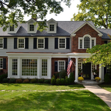
The existing entry hall was narrow, and uninviting. The front porch was bland. The solution was to expand the entry hall out four feet with a two story piece that allowed for a new straight run of stairs, a larger foyer at the entry door with sidelights and a fanlight window above. A Palladian window was added at the stair landing with a window seat.. A new semi circular porch with a stone floor marks the main entry for the house.
Existing Dining Room bay had a low ceiling which separated it from the main room. We removed the old bay and added a taller rectangular bay window with engaged columns to complement the entry porch.
The new dining bay, front porch and new vertical brick element fit the scale of the large front facade and most importantly give it visual delight!
 Nautilus Architects
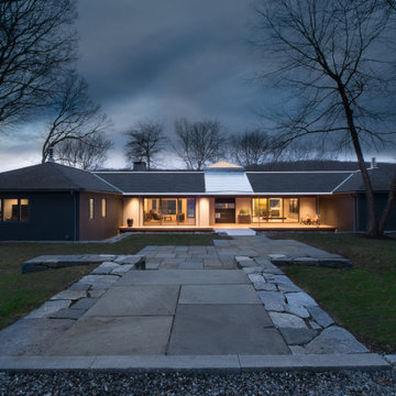
Located on a marsh in the upper reaches of the Lieutenant River in Old Lyme, the existing house was well-sited and well-built, but the design failed to exploit the views and more importantly was a confused combination of contemporary and traditional elements. The new homeowners, a successful businesswoman and an accomplished artist and photographer, were interested in creating a fully-contemporary environment to open up space, connect indoors with outdoors, display artwork and showcase the husband’s distinctive photographs.
One glaring deficiency was the curb appeal and approach sequence: the grade sloped down and the path to the house followed, but this led to an uncomfortable dip and abrupt rise to the front door. By creating a virtual “moat,” occupied by a grid of raised-bed grasses contained in aluminum-clad boxes, and spanning the moat with an ipe bridge, the approach becomes level and engaging. The façade of the existing house was blank and bland, and with no cover. Adding a deep overhang with a wide porch creates a welcoming, covered condition, accentuated by a 6’ wide pivoting front door that feels more like a moving piece of wall.
Another deficiency was the connection to the outdoors. By adding glass to the front and back of the house, and removing interior walls selectively, the house takes on a diaphanous quality that allows one to see through to the marsh beyond, even when in the driveway. The raised-bed grasses act as abstract, geometric versions of the marsh beyond. A large, pyramidal skylight establishes a spatial hierarchy around which the rooms revolve.
The house featured several tray-ceilinged spaces – living room, kitchen, and master bedroom – that were poorly-proportioned and with panels at the top that resembled inset flat panel doors. The solution was to use a different strategy for each: the bedroom turns the ceiling into an eggshell through the use of a creative trim detail; the living room has an oversized sculptural, backlit lighting element; and the kitchen has a collage of painted rectangular forms that support or include lighting pieces.
A palette of concrete, blackened steel, stainless steel and colors carefully chosen by homeowner and architect create an interior and exterior environment punctuated by moments that are as artistic as the featured works in the black-ceilinged gallery.
12