
Search results for "Enhancement supplement" in Home Design Ideas

 kimberly peck architect
This loft is situated in the former International Tailoring Company Building in New York’s East Village. The clients bought a top-floor loft and an abandoned mechanical room directly above it. Our task was to combine the rooftop space with the loft to create a cohesive triplex apartment. We achieved this by carefully opening up the roof’s 100-year-old structural members to install a staircase connecting the existing loft to the additional upper two levels. On the main floor, the first run of the staircase is located in the apartment's entry and is made of a sculptural form of dark oak. The second run of the staircase is more open, allowing light from the top level's many windows to filter into the spaces below. The existing main loft was gut-renovated to create a more open space. The open kitchen/living space was strategically positioned to be surrounded by the building’s huge industrial steel windows, taking advantage of the apartment's high vantage over Union Square. Opposite the windows, custom woodwork serves to unify the kitchen with the living room. The built-in spans the full width of the apartment with dark textured oak panels concealing the appliances, the TV, and creating ample storage. The blackened steel paneled backsplash and chunky black granite countertops complete the dark color palette used in the kitchen. Throughout the apartment, a play of dark and light elements creates a distinctive atmosphere. In the open living areas, the light pouring in from the large windows contrasts with the dark colors selected for the built environment. The more private spaces, such as the bedroom, have a darker feel, with walls and ceilings painted in a deep purple that borders on black alongside more dark oak custom built-ins. The dining room functions as a bridge between the public and private spaces, with walls and ceiling painted in the same moody purple and a vintage mirrored tile accent wall reflecting natural light from the adjacent room’s windows. The middle floor, which has fewer windows, is painted bright white to enhance light in the home office located there.. On the penthouse level, panoramic views were achieved by installing new floor-to-ceiling sliding glass panels, supplementing the existing industrial steel windows, and opening onto an adjacent roof terrace. The top floor functions as a lounge overlooking the city and includes unique custom features, such as a steel multi-drop lighting fixture above the stairs, hanging glass and steel shelving, and a built-in wet bar. Here again, dark-colored finishes and materials are used as a counterpoint to the abundant light entering the space. A future plan for the apartment is to create a private roof garden on top of the penthouse with an outdoor stair connecting it to the roof terrace below.
 kimberly peck architect
This loft is situated in the former International Tailoring Company Building in New York’s East Village. The clients bought a top-floor loft and an abandoned mechanical room directly above it. Our task was to combine the rooftop space with the loft to create a cohesive triplex apartment. We achieved this by carefully opening up the roof’s 100-year-old structural members to install a staircase connecting the existing loft to the additional upper two levels. On the main floor, the first run of the staircase is located in the apartment's entry and is made of a sculptural form of dark oak. The second run of the staircase is more open, allowing light from the top level's many windows to filter into the spaces below. The existing main loft was gut-renovated to create a more open space. The open kitchen/living space was strategically positioned to be surrounded by the building’s huge industrial steel windows, taking advantage of the apartment's high vantage over Union Square. Opposite the windows, custom woodwork serves to unify the kitchen with the living room. The built-in spans the full width of the apartment with dark textured oak panels concealing the appliances, the TV, and creating ample storage. The blackened steel paneled backsplash and chunky black granite countertops complete the dark color palette used in the kitchen. Throughout the apartment, a play of dark and light elements creates a distinctive atmosphere. In the open living areas, the light pouring in from the large windows contrasts with the dark colors selected for the built environment. The more private spaces, such as the bedroom, have a darker feel, with walls and ceilings painted in a deep purple that borders on black alongside more dark oak custom built-ins. The dining room functions as a bridge between the public and private spaces, with walls and ceiling painted in the same moody purple and a vintage mirrored tile accent wall reflecting natural light from the adjacent room’s windows. The middle floor, which has fewer windows, is painted bright white to enhance light in the home office located there.. On the penthouse level, panoramic views were achieved by installing new floor-to-ceiling sliding glass panels, supplementing the existing industrial steel windows, and opening onto an adjacent roof terrace. The top floor functions as a lounge overlooking the city and includes unique custom features, such as a steel multi-drop lighting fixture above the stairs, hanging glass and steel shelving, and a built-in wet bar. Here again, dark-colored finishes and materials are used as a counterpoint to the abundant light entering the space. A future plan for the apartment is to create a private roof garden on top of the penthouse with an outdoor stair connecting it to the roof terrace below.
 WOCA USA
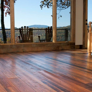
This beautiful residence is located in Flat Rock, North Carolina. In order to supplement the rustic style the antique, reclaimed oak floor has been treated with WOCA Colour Oil with a mix of 40% Brazil Brown and 60% Natural to get a lighter colour. The oil enhances the natural appearance and glow of the wood - a style that goes hand in hand with the spectacular landscape.
Floor Contract: Whole Log Lumber Co., Asheville, NC, USA
Floor Installer: Whole Log Lumber Co., Asheville, NC, USA
Floor: Reclaimed oak wood
WOCA Denmark surface treatment
Basic finishing: WOCA Colour Oil (40 % Brazil Brown and 60 % Natural)
Maintenance: This job has not needed any maintenance yet
Cleaning: WOCA Soap and WOCA Oil Refresher
Find the right local pro for your project
 kimberly peck architect
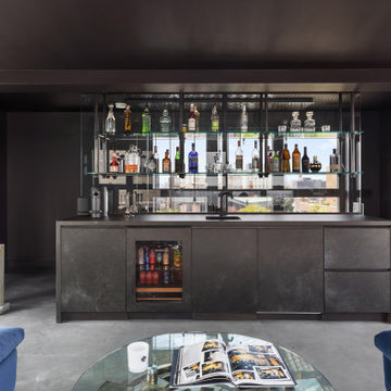
This loft is situated in the former International Tailoring Company Building in New York’s East Village. The clients bought a top-floor loft and an abandoned mechanical room directly above it. Our task was to combine the rooftop space with the loft to create a cohesive triplex apartment. We achieved this by carefully opening up the roof’s 100-year-old structural members to install a staircase connecting the existing loft to the additional upper two levels. On the main floor, the first run of the staircase is located in the apartment's entry and is made of a sculptural form of dark oak. The second run of the staircase is more open, allowing light from the top level's many windows to filter into the spaces below. The existing main loft was gut-renovated to create a more open space. The open kitchen/living space was strategically positioned to be surrounded by the building’s huge industrial steel windows, taking advantage of the apartment's high vantage over Union Square. Opposite the windows, custom woodwork serves to unify the kitchen with the living room. The built-in spans the full width of the apartment with dark textured oak panels concealing the appliances, the TV, and creating ample storage. The blackened steel paneled backsplash and chunky black granite countertops complete the dark color palette used in the kitchen. Throughout the apartment, a play of dark and light elements creates a distinctive atmosphere. In the open living areas, the light pouring in from the large windows contrasts with the dark colors selected for the built environment. The more private spaces, such as the bedroom, have a darker feel, with walls and ceilings painted in a deep purple that borders on black alongside more dark oak custom built-ins. The dining room functions as a bridge between the public and private spaces, with walls and ceiling painted in the same moody purple and a vintage mirrored tile accent wall reflecting natural light from the adjacent room’s windows. The middle floor, which has fewer windows, is painted bright white to enhance light in the home office located there.. On the penthouse level, panoramic views were achieved by installing new floor-to-ceiling sliding glass panels, supplementing the existing industrial steel windows, and opening onto an adjacent roof terrace. The top floor functions as a lounge overlooking the city and includes unique custom features, such as a steel multi-drop lighting fixture above the stairs, hanging glass and steel shelving, and a built-in wet bar. Here again, dark-colored finishes and materials are used as a counterpoint to the abundant light entering the space. A future plan for the apartment is to create a private roof garden on top of the penthouse with an outdoor stair connecting it to the roof terrace below.
 kimberly peck architect
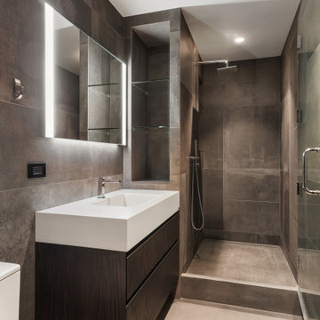
This loft is situated in the former International Tailoring Company Building in New York’s East Village. The clients bought a top-floor loft and an abandoned mechanical room directly above it. Our task was to combine the rooftop space with the loft to create a cohesive triplex apartment. We achieved this by carefully opening up the roof’s 100-year-old structural members to install a staircase connecting the existing loft to the additional upper two levels. On the main floor, the first run of the staircase is located in the apartment's entry and is made of a sculptural form of dark oak. The second run of the staircase is more open, allowing light from the top level's many windows to filter into the spaces below. The existing main loft was gut-renovated to create a more open space. The open kitchen/living space was strategically positioned to be surrounded by the building’s huge industrial steel windows, taking advantage of the apartment's high vantage over Union Square. Opposite the windows, custom woodwork serves to unify the kitchen with the living room. The built-in spans the full width of the apartment with dark textured oak panels concealing the appliances, the TV, and creating ample storage. The blackened steel paneled backsplash and chunky black granite countertops complete the dark color palette used in the kitchen. Throughout the apartment, a play of dark and light elements creates a distinctive atmosphere. In the open living areas, the light pouring in from the large windows contrasts with the dark colors selected for the built environment. The more private spaces, such as the bedroom, have a darker feel, with walls and ceilings painted in a deep purple that borders on black alongside more dark oak custom built-ins. The dining room functions as a bridge between the public and private spaces, with walls and ceiling painted in the same moody purple and a vintage mirrored tile accent wall reflecting natural light from the adjacent room’s windows. The middle floor, which has fewer windows, is painted bright white to enhance light in the home office located there.. On the penthouse level, panoramic views were achieved by installing new floor-to-ceiling sliding glass panels, supplementing the existing industrial steel windows, and opening onto an adjacent roof terrace. The top floor functions as a lounge overlooking the city and includes unique custom features, such as a steel multi-drop lighting fixture above the stairs, hanging glass and steel shelving, and a built-in wet bar. Here again, dark-colored finishes and materials are used as a counterpoint to the abundant light entering the space. A future plan for the apartment is to create a private roof garden on top of the penthouse with an outdoor stair connecting it to the roof terrace below.
 Kittrell & Associates Interior Design
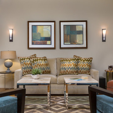
In this space, we started with the artwork as our inspiration to lead the way for our color palette. This contemporary living room is ultra-comfortable and has multiple uses. The sofa is actually a super-comfortable sleeper sofa to accommodate overnight guests and the two blue chairs swivel around to allow "theater style" TV viewing on the large LCD behind them. We used graphic designs in the area rug and accent pillows to lend a casual and masculine feeling to this space.
Martin King Photography
 Adaptiv DC
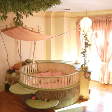
THEME Every element of this room evokes images from the Enchanted Forest. Tiny lights twinkle like fireflies; curtains swing from real tree limbs and sticker stones lay a pathway to the bed. Ceramic mushrooms and birdhouses are scattered throughout the room, creating perfect hiding spots for fairies, pixies and other magical friends. The dominant color of both bedroom and bathroom — a soft, feminine pink — creates a soothing, yet wondrous atmosphere. In the corner sits a large tree with a child-size door at the base, promising a child-size adventure on the other side. FOCUS Illuminated by two beautiful flower-shaped lamps, the six-footdiameter circular bed becomes the centerpiece of the room. Imitation bark on the bed’s exterior augments the room’s theme and makes it easy for a child to believe they have stepped out of the suburbs and into the forest. Three lily pads extending from tree bark serve as both steps to the bed and stools to sit on. Ready-made for princess parties and sleepovers, the bed easily accommodates two to three small children or an adult. Twelvefoot ceilings enhance the sense of openness, while soft lighting and comfy pillows make this a cozy reading and resting spot. STORAGE The shelves on the rear of the bed and the two compartments in the tree — one covered by a doubledoor, the other by a miniature door — supplement the storage capacity of the room’s giant closet without interrupting the theme. GROWTH The bed meets standard specifications for a baby crib, and can accommodate both children and adults. The railing is easily removed when baby girl becomes a “big girl,” and eventually, a teenager. SAFETY Rounded edges on all of the room’s furnishings help prevent nasty bumps, and lamps are positioned well out-of-reach of small children. The mattress is designed to fit snugly to meet current crib safety standards, while a 26-inch railing allows this bed to act as a safe, comfortable and fun play area.
 Integrity Design + Build
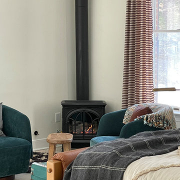
Cozy Primary Suite Retreat with Wood-Burning Stove in Charlottesville, VA
Description:
Transform your private quarters into the ultimate sanctuary with a dedicated wellness-focused retreat. As a centerpiece of this Charlottesville whole-home renovation, Integrity Design + Build integrated a classic cast iron wood-burning stove into the primary bedroom, creating a warm, "hygge"-inspired atmosphere that is a top trending search for 2026.
The design creates a curated cozy reading nook featuring deep teal velvet swivel chairs and organic wood accents, perfectly positioned to enjoy the fire. The sleek black flue serves as a bold vertical architectural element against the soft, neutral walls, bridging the gap between traditional cottage charm and modern minimalist style. This addition was part of a larger structural overhaul to ensure the primary suite serves as a true escape from the daily grind.
Key Design Features:
Traditional Cast Iron Stove: Provides both high-efficiency supplemental heat and a timeless aesthetic focal point.
Curated Lounge Seating: A sophisticated pairing of jewel-toned velvet and leather textures for a multi-layered, luxury feel.
Natural Light Integration: Positioned near large windows to balance the warmth of the fire with views of the Charlottesville landscape.
Modern Transitional Styling: Seamlessly blends rustic elements with clean lines and contemporary furniture.
Whether you are looking to add a luxury fireplace to your suite or planning a complete home transformation in Charlottesville, Integrity Design + Build specializes in creating intentional, high-end spaces that enhance your lifestyle.
 Drury Design
The Setup:
After purchasing this home, the homeowners faced a unique opportunity to reimagine their kitchen and nearby spaces. Water damage from a burst pipe had left much of the home’s interior in need of repair, and while the existing kitchen was functional and in relatively good shape, it didn’t align with the family’s vision for their new home. The layout included a peninsula that wasn’t ideal, and there were some druthers with the nearby pantry.
Since the space needed to be rebuilt anyway, the homeowners saw this as a chance to create a kitchen that was both highly functional for their four young children and timeless in its design. The project also included a refresh of the adjacent message center and dining room — spaces that play key roles in the family’s daily life. The goal was to create a cohesive flow between these areas, balancing modern functionality with the craftsman-inspired character of the rest of the home.
Design Objectives:
- Replace the outdated peninsula with a large island to maximize counter space and create new seating options.
- Open up the space visually by removing soffits and rethinking the cabinetry layout.
Incorporate concealed refrigeration and freezer units to provide significant storage for the family while maintaining a streamlined aesthetic.
- Integrate black cabinetry into the design without making the space feel harsh or heavy.
- Ensure the lighting plan balances functional task lighting with ambient accent lighting.
- Avoid visual clutter in the cabinetry design while still giving a nod to the craftsman aesthetic.
- Incorporate a slab backsplash as a key design feature.
Design Challenges:
- The outdated peninsula left dead space in the kitchen and lacked sufficient seating for the family.
- The cooktop wall was cramped, with small cabinets flanking the hood, limited storage, and soffits that made the space feel closed-in.
- The family needed significant refrigeration space (two refrigerators and a freezer) but wanted to avoid a cluttered look with visible stainless steel appliances.
- Adding black cabinetry risked making the space feel too dark or heavy.
- The original lighting plan was insufficient, particularly over the dining table where a decorative fixture proved too dim.
- The family wanted shaker-style drawer fronts to match the home’s arts-and-crafts design but worried that too much shaker cabinetry might look overly busy.
- Prioritizing a slab backsplash in the wish list priority planning.
The Renewed Space
Design Solutions:
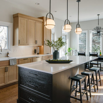
- A functional island: The peninsula was replaced with a large island that provides continuous countertop space for prepping and serving. The island also features seating for four people, creating a central hub for informal meals and activities.
- Streamlined cooktop wall: The soffits were removed, and the upper cabinets on the cooktop wall were eliminated to create a more open, streamlined design. A custom oversized hood became the focal point of the wall, with the blower unit offset inside it to align with the cooktop while maintaining exterior visual symmetry.
- Concealed refrigeration: Two column refrigerators and one freezer were integrated into the cabinetry, concealing them behind wood paneling that blends seamlessly with the overall design.
- Warm black cabinetry: The black cabinetry was crafted from hickory with a visible grain, softening its appearance and adding warmth. The grain detail gives the cabinetry a rich, textured look that avoids feeling stark or overpowering.
- Additional lighting: In the dining area, recessed can lights were added during an additional installation phase to supplement the gorgeous decorative fixture’s dim output. The new lighting plan creates a layered effect, combining functional task lighting with softer ambient lighting.
- Simplified cabinetry details: Slab drawer fronts were used on the upper drawers, while five-piece shaker fronts (with slightly less prominent rail and stile pieces) were reserved for the middle and lower drawers. This approach simplified the overall look while maintaining the craftsman-inspired aesthetic.
- Slab backsplash priority: The slab backsplash was prioritized by making thoughtful adjustments elsewhere, like opting not to extend cabinetry to the ceiling, which also helped visually prioritize the gorgeous slab backsplash. This decision also enhanced the kitchen’s furniture-like feel, aligning with the home’s craftsman character.
- This kitchen perfectly balances practicality with timeless style. By addressing the family’s functional needs — ample seating, smart storage, and effective lighting — while incorporating thoughtful design elements like warm black cabinetry and a striking slab backsplash, Alicia created a space that works beautifully for a busy household. The result is a cohesive, inviting kitchen that honors the home’s craftsman roots and will serve the family well for years to come.
 Drury Design
The Setup:
After purchasing this home, the homeowners faced a unique opportunity to reimagine their kitchen and nearby spaces. Water damage from a burst pipe had left much of the home’s interior in need of repair, and while the existing kitchen was functional and in relatively good shape, it didn’t align with the family’s vision for their new home. The layout included a peninsula that wasn’t ideal, and there were some druthers with the nearby pantry.
Since the space needed to be rebuilt anyway, the homeowners saw this as a chance to create a kitchen that was both highly functional for their four young children and timeless in its design. The project also included a refresh of the adjacent message center and dining room — spaces that play key roles in the family’s daily life. The goal was to create a cohesive flow between these areas, balancing modern functionality with the craftsman-inspired character of the rest of the home.
Design Objectives:
- Replace the outdated peninsula with a large island to maximize counter space and create new seating options.
- Open up the space visually by removing soffits and rethinking the cabinetry layout.
Incorporate concealed refrigeration and freezer units to provide significant storage for the family while maintaining a streamlined aesthetic.
- Integrate black cabinetry into the design without making the space feel harsh or heavy.
- Ensure the lighting plan balances functional task lighting with ambient accent lighting.
- Avoid visual clutter in the cabinetry design while still giving a nod to the craftsman aesthetic.
- Incorporate a slab backsplash as a key design feature.
Design Challenges:
- The outdated peninsula left dead space in the kitchen and lacked sufficient seating for the family.
- The cooktop wall was cramped, with small cabinets flanking the hood, limited storage, and soffits that made the space feel closed-in.
- The family needed significant refrigeration space (two refrigerators and a freezer) but wanted to avoid a cluttered look with visible stainless steel appliances.
- Adding black cabinetry risked making the space feel too dark or heavy.
- The original lighting plan was insufficient, particularly over the dining table where a decorative fixture proved too dim.
- The family wanted shaker-style drawer fronts to match the home’s arts-and-crafts design but worried that too much shaker cabinetry might look overly busy.
- Prioritizing a slab backsplash in the wish list priority planning.
The Renewed Space
Design Solutions:
- A functional island: The peninsula was replaced with a large island that provides continuous countertop space for prepping and serving. The island also features seating for four people, creating a central hub for informal meals and activities.
- Streamlined cooktop wall: The soffits were removed, and the upper cabinets on the cooktop wall were eliminated to create a more open, streamlined design. A custom oversized hood became the focal point of the wall, with the blower unit offset inside it to align with the cooktop while maintaining exterior visual symmetry.
- Concealed refrigeration: Two column refrigerators and one freezer were integrated into the cabinetry, concealing them behind wood paneling that blends seamlessly with the overall design.
- Warm black cabinetry: The black cabinetry was crafted from hickory with a visible grain, softening its appearance and adding warmth. The grain detail gives the cabinetry a rich, textured look that avoids feeling stark or overpowering.
- Additional lighting: In the dining area, recessed can lights were added during an additional installation phase to supplement the gorgeous decorative fixture’s dim output. The new lighting plan creates a layered effect, combining functional task lighting with softer ambient lighting.
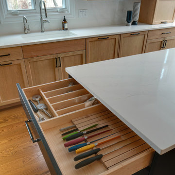
- Simplified cabinetry details: Slab drawer fronts were used on the upper drawers, while five-piece shaker fronts (with slightly less prominent rail and stile pieces) were reserved for the middle and lower drawers. This approach simplified the overall look while maintaining the craftsman-inspired aesthetic.
- Slab backsplash priority: The slab backsplash was prioritized by making thoughtful adjustments elsewhere, like opting not to extend cabinetry to the ceiling, which also helped visually prioritize the gorgeous slab backsplash. This decision also enhanced the kitchen’s furniture-like feel, aligning with the home’s craftsman character.
- This kitchen perfectly balances practicality with timeless style. By addressing the family’s functional needs — ample seating, smart storage, and effective lighting — while incorporating thoughtful design elements like warm black cabinetry and a striking slab backsplash, Alicia created a space that works beautifully for a busy household. The result is a cohesive, inviting kitchen that honors the home’s craftsman roots and will serve the family well for years to come.
 kimberly peck architect
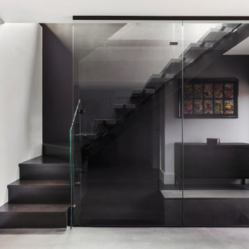
This loft is situated in the former International Tailoring Company Building in New York’s East Village. The clients bought a top-floor loft and an abandoned mechanical room directly above it. Our task was to combine the rooftop space with the loft to create a cohesive triplex apartment. We achieved this by carefully opening up the roof’s 100-year-old structural members to install a staircase connecting the existing loft to the additional upper two levels. On the main floor, the first run of the staircase is located in the apartment's entry and is made of a sculptural form of dark oak. The second run of the staircase is more open, allowing light from the top level's many windows to filter into the spaces below. The existing main loft was gut-renovated to create a more open space. The open kitchen/living space was strategically positioned to be surrounded by the building’s huge industrial steel windows, taking advantage of the apartment's high vantage over Union Square. Opposite the windows, custom woodwork serves to unify the kitchen with the living room. The built-in spans the full width of the apartment with dark textured oak panels concealing the appliances, the TV, and creating ample storage. The blackened steel paneled backsplash and chunky black granite countertops complete the dark color palette used in the kitchen. Throughout the apartment, a play of dark and light elements creates a distinctive atmosphere. In the open living areas, the light pouring in from the large windows contrasts with the dark colors selected for the built environment. The more private spaces, such as the bedroom, have a darker feel, with walls and ceilings painted in a deep purple that borders on black alongside more dark oak custom built-ins. The dining room functions as a bridge between the public and private spaces, with walls and ceiling painted in the same moody purple and a vintage mirrored tile accent wall reflecting natural light from the adjacent room’s windows. The middle floor, which has fewer windows, is painted bright white to enhance light in the home office located there.. On the penthouse level, panoramic views were achieved by installing new floor-to-ceiling sliding glass panels, supplementing the existing industrial steel windows, and opening onto an adjacent roof terrace. The top floor functions as a lounge overlooking the city and includes unique custom features, such as a steel multi-drop lighting fixture above the stairs, hanging glass and steel shelving, and a built-in wet bar. Here again, dark-colored finishes and materials are used as a counterpoint to the abundant light entering the space. A future plan for the apartment is to create a private roof garden on top of the penthouse with an outdoor stair connecting it to the roof terrace below.
 Drury Design
The Setup:
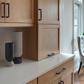
After purchasing this home, the homeowners faced a unique opportunity to reimagine their kitchen and nearby spaces. Water damage from a burst pipe had left much of the home’s interior in need of repair, and while the existing kitchen was functional and in relatively good shape, it didn’t align with the family’s vision for their new home. The layout included a peninsula that wasn’t ideal, and there were some druthers with the nearby pantry.
Since the space needed to be rebuilt anyway, the homeowners saw this as a chance to create a kitchen that was both highly functional for their four young children and timeless in its design. The project also included a refresh of the adjacent message center and dining room — spaces that play key roles in the family’s daily life. The goal was to create a cohesive flow between these areas, balancing modern functionality with the craftsman-inspired character of the rest of the home.
Design Objectives:
- Replace the outdated peninsula with a large island to maximize counter space and create new seating options.
- Open up the space visually by removing soffits and rethinking the cabinetry layout.
Incorporate concealed refrigeration and freezer units to provide significant storage for the family while maintaining a streamlined aesthetic.
- Integrate black cabinetry into the design without making the space feel harsh or heavy.
- Ensure the lighting plan balances functional task lighting with ambient accent lighting.
- Avoid visual clutter in the cabinetry design while still giving a nod to the craftsman aesthetic.
- Incorporate a slab backsplash as a key design feature.
Design Challenges:
- The outdated peninsula left dead space in the kitchen and lacked sufficient seating for the family.
- The cooktop wall was cramped, with small cabinets flanking the hood, limited storage, and soffits that made the space feel closed-in.
- The family needed significant refrigeration space (two refrigerators and a freezer) but wanted to avoid a cluttered look with visible stainless steel appliances.
- Adding black cabinetry risked making the space feel too dark or heavy.
- The original lighting plan was insufficient, particularly over the dining table where a decorative fixture proved too dim.
- The family wanted shaker-style drawer fronts to match the home’s arts-and-crafts design but worried that too much shaker cabinetry might look overly busy.
- Prioritizing a slab backsplash in the wish list priority planning.
The Renewed Space
Design Solutions:
- A functional island: The peninsula was replaced with a large island that provides continuous countertop space for prepping and serving. The island also features seating for four people, creating a central hub for informal meals and activities.
- Streamlined cooktop wall: The soffits were removed, and the upper cabinets on the cooktop wall were eliminated to create a more open, streamlined design. A custom oversized hood became the focal point of the wall, with the blower unit offset inside it to align with the cooktop while maintaining exterior visual symmetry.
- Concealed refrigeration: Two column refrigerators and one freezer were integrated into the cabinetry, concealing them behind wood paneling that blends seamlessly with the overall design.
- Warm black cabinetry: The black cabinetry was crafted from hickory with a visible grain, softening its appearance and adding warmth. The grain detail gives the cabinetry a rich, textured look that avoids feeling stark or overpowering.
- Additional lighting: In the dining area, recessed can lights were added during an additional installation phase to supplement the gorgeous decorative fixture’s dim output. The new lighting plan creates a layered effect, combining functional task lighting with softer ambient lighting.
- Simplified cabinetry details: Slab drawer fronts were used on the upper drawers, while five-piece shaker fronts (with slightly less prominent rail and stile pieces) were reserved for the middle and lower drawers. This approach simplified the overall look while maintaining the craftsman-inspired aesthetic.
- Slab backsplash priority: The slab backsplash was prioritized by making thoughtful adjustments elsewhere, like opting not to extend cabinetry to the ceiling, which also helped visually prioritize the gorgeous slab backsplash. This decision also enhanced the kitchen’s furniture-like feel, aligning with the home’s craftsman character.
- This kitchen perfectly balances practicality with timeless style. By addressing the family’s functional needs — ample seating, smart storage, and effective lighting — while incorporating thoughtful design elements like warm black cabinetry and a striking slab backsplash, Alicia created a space that works beautifully for a busy household. The result is a cohesive, inviting kitchen that honors the home’s craftsman roots and will serve the family well for years to come.
 Staging Spaces
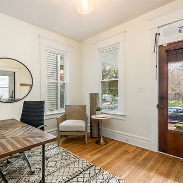
We brought in some supplemental staging to redesign and enhance and refine the space and help achieve their highest asking price.
Columbus Pics
Entryway - contemporary entryway idea in Columbus
Entryway - contemporary entryway idea in Columbus
 kimberly peck architect
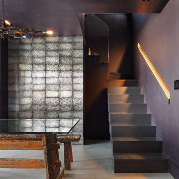
This loft is situated in the former International Tailoring Company Building in New York’s East Village. The clients bought a top-floor loft and an abandoned mechanical room directly above it. Our task was to combine the rooftop space with the loft to create a cohesive triplex apartment. We achieved this by carefully opening up the roof’s 100-year-old structural members to install a staircase connecting the existing loft to the additional upper two levels. On the main floor, the first run of the staircase is located in the apartment's entry and is made of a sculptural form of dark oak. The second run of the staircase is more open, allowing light from the top level's many windows to filter into the spaces below. The existing main loft was gut-renovated to create a more open space. The open kitchen/living space was strategically positioned to be surrounded by the building’s huge industrial steel windows, taking advantage of the apartment's high vantage over Union Square. Opposite the windows, custom woodwork serves to unify the kitchen with the living room. The built-in spans the full width of the apartment with dark textured oak panels concealing the appliances, the TV, and creating ample storage. The blackened steel paneled backsplash and chunky black granite countertops complete the dark color palette used in the kitchen. Throughout the apartment, a play of dark and light elements creates a distinctive atmosphere. In the open living areas, the light pouring in from the large windows contrasts with the dark colors selected for the built environment. The more private spaces, such as the bedroom, have a darker feel, with walls and ceilings painted in a deep purple that borders on black alongside more dark oak custom built-ins. The dining room functions as a bridge between the public and private spaces, with walls and ceiling painted in the same moody purple and a vintage mirrored tile accent wall reflecting natural light from the adjacent room’s windows. The middle floor, which has fewer windows, is painted bright white to enhance light in the home office located there.. On the penthouse level, panoramic views were achieved by installing new floor-to-ceiling sliding glass panels, supplementing the existing industrial steel windows, and opening onto an adjacent roof terrace. The top floor functions as a lounge overlooking the city and includes unique custom features, such as a steel multi-drop lighting fixture above the stairs, hanging glass and steel shelving, and a built-in wet bar. Here again, dark-colored finishes and materials are used as a counterpoint to the abundant light entering the space. A future plan for the apartment is to create a private roof garden on top of the penthouse with an outdoor stair connecting it to the roof terrace below.
 Drury Design
The Setup:
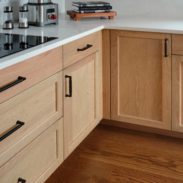
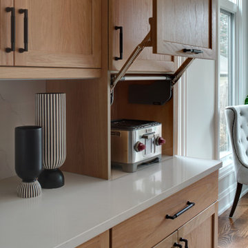
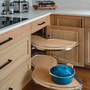
After purchasing this home, the homeowners faced a unique opportunity to reimagine their kitchen and nearby spaces. Water damage from a burst pipe had left much of the home’s interior in need of repair, and while the existing kitchen was functional and in relatively good shape, it didn’t align with the family’s vision for their new home. The layout included a peninsula that wasn’t ideal, and there were some druthers with the nearby pantry.
Since the space needed to be rebuilt anyway, the homeowners saw this as a chance to create a kitchen that was both highly functional for their four young children and timeless in its design. The project also included a refresh of the adjacent message center and dining room — spaces that play key roles in the family’s daily life. The goal was to create a cohesive flow between these areas, balancing modern functionality with the craftsman-inspired character of the rest of the home.
Design Objectives:
- Replace the outdated peninsula with a large island to maximize counter space and create new seating options.
- Open up the space visually by removing soffits and rethinking the cabinetry layout.
Incorporate concealed refrigeration and freezer units to provide significant storage for the family while maintaining a streamlined aesthetic.
- Integrate black cabinetry into the design without making the space feel harsh or heavy.
- Ensure the lighting plan balances functional task lighting with ambient accent lighting.
- Avoid visual clutter in the cabinetry design while still giving a nod to the craftsman aesthetic.
- Incorporate a slab backsplash as a key design feature.
Design Challenges:
- The outdated peninsula left dead space in the kitchen and lacked sufficient seating for the family.
- The cooktop wall was cramped, with small cabinets flanking the hood, limited storage, and soffits that made the space feel closed-in.
- The family needed significant refrigeration space (two refrigerators and a freezer) but wanted to avoid a cluttered look with visible stainless steel appliances.
- Adding black cabinetry risked making the space feel too dark or heavy.
- The original lighting plan was insufficient, particularly over the dining table where a decorative fixture proved too dim.
- The family wanted shaker-style drawer fronts to match the home’s arts-and-crafts design but worried that too much shaker cabinetry might look overly busy.
- Prioritizing a slab backsplash in the wish list priority planning.
The Renewed Space
Design Solutions:
- A functional island: The peninsula was replaced with a large island that provides continuous countertop space for prepping and serving. The island also features seating for four people, creating a central hub for informal meals and activities.
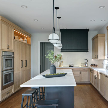
- Streamlined cooktop wall: The soffits were removed, and the upper cabinets on the cooktop wall were eliminated to create a more open, streamlined design. A custom oversized hood became the focal point of the wall, with the blower unit offset inside it to align with the cooktop while maintaining exterior visual symmetry.
- Concealed refrigeration: Two column refrigerators and one freezer were integrated into the cabinetry, concealing them behind wood paneling that blends seamlessly with the overall design.
- Warm black cabinetry: The black cabinetry was crafted from hickory with a visible grain, softening its appearance and adding warmth. The grain detail gives the cabinetry a rich, textured look that avoids feeling stark or overpowering.
- Additional lighting: In the dining area, recessed can lights were added during an additional installation phase to supplement the gorgeous decorative fixture’s dim output. The new lighting plan creates a layered effect, combining functional task lighting with softer ambient lighting.
- Simplified cabinetry details: Slab drawer fronts were used on the upper drawers, while five-piece shaker fronts (with slightly less prominent rail and stile pieces) were reserved for the middle and lower drawers. This approach simplified the overall look while maintaining the craftsman-inspired aesthetic.
- Slab backsplash priority: The slab backsplash was prioritized by making thoughtful adjustments elsewhere, like opting not to extend cabinetry to the ceiling, which also helped visually prioritize the gorgeous slab backsplash. This decision also enhanced the kitchen’s furniture-like feel, aligning with the home’s craftsman character.
- This kitchen perfectly balances practicality with timeless style. By addressing the family’s functional needs — ample seating, smart storage, and effective lighting — while incorporating thoughtful design elements like warm black cabinetry and a striking slab backsplash, Alicia created a space that works beautifully for a busy household. The result is a cohesive, inviting kitchen that honors the home’s craftsman roots and will serve the family well for years to come.
 Drury Design
The Setup:
After purchasing this home, the homeowners faced a unique opportunity to reimagine their kitchen and nearby spaces. Water damage from a burst pipe had left much of the home’s interior in need of repair, and while the existing kitchen was functional and in relatively good shape, it didn’t align with the family’s vision for their new home. The layout included a peninsula that wasn’t ideal, and there were some druthers with the nearby pantry.
Since the space needed to be rebuilt anyway, the homeowners saw this as a chance to create a kitchen that was both highly functional for their four young children and timeless in its design. The project also included a refresh of the adjacent message center and dining room — spaces that play key roles in the family’s daily life. The goal was to create a cohesive flow between these areas, balancing modern functionality with the craftsman-inspired character of the rest of the home.
Design Objectives:
- Replace the outdated peninsula with a large island to maximize counter space and create new seating options.
- Open up the space visually by removing soffits and rethinking the cabinetry layout.
Incorporate concealed refrigeration and freezer units to provide significant storage for the family while maintaining a streamlined aesthetic.
- Integrate black cabinetry into the design without making the space feel harsh or heavy.
- Ensure the lighting plan balances functional task lighting with ambient accent lighting.
- Avoid visual clutter in the cabinetry design while still giving a nod to the craftsman aesthetic.
- Incorporate a slab backsplash as a key design feature.
Design Challenges:
- The outdated peninsula left dead space in the kitchen and lacked sufficient seating for the family.
- The cooktop wall was cramped, with small cabinets flanking the hood, limited storage, and soffits that made the space feel closed-in.
- The family needed significant refrigeration space (two refrigerators and a freezer) but wanted to avoid a cluttered look with visible stainless steel appliances.
- Adding black cabinetry risked making the space feel too dark or heavy.
- The original lighting plan was insufficient, particularly over the dining table where a decorative fixture proved too dim.
- The family wanted shaker-style drawer fronts to match the home’s arts-and-crafts design but worried that too much shaker cabinetry might look overly busy.
- Prioritizing a slab backsplash in the wish list priority planning.
The Renewed Space
Design Solutions:
- A functional island: The peninsula was replaced with a large island that provides continuous countertop space for prepping and serving. The island also features seating for four people, creating a central hub for informal meals and activities.
- Streamlined cooktop wall: The soffits were removed, and the upper cabinets on the cooktop wall were eliminated to create a more open, streamlined design. A custom oversized hood became the focal point of the wall, with the blower unit offset inside it to align with the cooktop while maintaining exterior visual symmetry.
- Concealed refrigeration: Two column refrigerators and one freezer were integrated into the cabinetry, concealing them behind wood paneling that blends seamlessly with the overall design.
- Warm black cabinetry: The black cabinetry was crafted from hickory with a visible grain, softening its appearance and adding warmth. The grain detail gives the cabinetry a rich, textured look that avoids feeling stark or overpowering.
- Additional lighting: In the dining area, recessed can lights were added during an additional installation phase to supplement the gorgeous decorative fixture’s dim output. The new lighting plan creates a layered effect, combining functional task lighting with softer ambient lighting.
- Simplified cabinetry details: Slab drawer fronts were used on the upper drawers, while five-piece shaker fronts (with slightly less prominent rail and stile pieces) were reserved for the middle and lower drawers. This approach simplified the overall look while maintaining the craftsman-inspired aesthetic.
- Slab backsplash priority: The slab backsplash was prioritized by making thoughtful adjustments elsewhere, like opting not to extend cabinetry to the ceiling, which also helped visually prioritize the gorgeous slab backsplash. This decision also enhanced the kitchen’s furniture-like feel, aligning with the home’s craftsman character.
- This kitchen perfectly balances practicality with timeless style. By addressing the family’s functional needs — ample seating, smart storage, and effective lighting — while incorporating thoughtful design elements like warm black cabinetry and a striking slab backsplash, Alicia created a space that works beautifully for a busy household. The result is a cohesive, inviting kitchen that honors the home’s craftsman roots and will serve the family well for years to come.

 FormLA Landscaping
Prickly Phlox (Leptodactylon californium). Covered in showy pink flowers in late spring, Prickly Phlox is low-growing and modest-sized for small gardens. This one added a bright pop of color to a slope deep in the Santa Monica Mountains with no irrigation. Supplemental water would have enhanced its greenery.
Photo: Lesly Hall Photography
 Drury Design
The Setup:
After purchasing this home, the homeowners faced a unique opportunity to reimagine their kitchen and nearby spaces. Water damage from a burst pipe had left much of the home’s interior in need of repair, and while the existing kitchen was functional and in relatively good shape, it didn’t align with the family’s vision for their new home. The layout included a peninsula that wasn’t ideal, and there were some druthers with the nearby pantry.
Since the space needed to be rebuilt anyway, the homeowners saw this as a chance to create a kitchen that was both highly functional for their four young children and timeless in its design. The project also included a refresh of the adjacent message center and dining room — spaces that play key roles in the family’s daily life. The goal was to create a cohesive flow between these areas, balancing modern functionality with the craftsman-inspired character of the rest of the home.
Design Objectives:
- Replace the outdated peninsula with a large island to maximize counter space and create new seating options.
- Open up the space visually by removing soffits and rethinking the cabinetry layout.
Incorporate concealed refrigeration and freezer units to provide significant storage for the family while maintaining a streamlined aesthetic.
- Integrate black cabinetry into the design without making the space feel harsh or heavy.
- Ensure the lighting plan balances functional task lighting with ambient accent lighting.
- Avoid visual clutter in the cabinetry design while still giving a nod to the craftsman aesthetic.
- Incorporate a slab backsplash as a key design feature.
Design Challenges:
- The outdated peninsula left dead space in the kitchen and lacked sufficient seating for the family.
- The cooktop wall was cramped, with small cabinets flanking the hood, limited storage, and soffits that made the space feel closed-in.
- The family needed significant refrigeration space (two refrigerators and a freezer) but wanted to avoid a cluttered look with visible stainless steel appliances.
- Adding black cabinetry risked making the space feel too dark or heavy.
- The original lighting plan was insufficient, particularly over the dining table where a decorative fixture proved too dim.
- The family wanted shaker-style drawer fronts to match the home’s arts-and-crafts design but worried that too much shaker cabinetry might look overly busy.
- Prioritizing a slab backsplash in the wish list priority planning.
The Renewed Space
Design Solutions:
- A functional island: The peninsula was replaced with a large island that provides continuous countertop space for prepping and serving. The island also features seating for four people, creating a central hub for informal meals and activities.
- Streamlined cooktop wall: The soffits were removed, and the upper cabinets on the cooktop wall were eliminated to create a more open, streamlined design. A custom oversized hood became the focal point of the wall, with the blower unit offset inside it to align with the cooktop while maintaining exterior visual symmetry.
- Concealed refrigeration: Two column refrigerators and one freezer were integrated into the cabinetry, concealing them behind wood paneling that blends seamlessly with the overall design.
- Warm black cabinetry: The black cabinetry was crafted from hickory with a visible grain, softening its appearance and adding warmth. The grain detail gives the cabinetry a rich, textured look that avoids feeling stark or overpowering.
- Additional lighting: In the dining area, recessed can lights were added during an additional installation phase to supplement the gorgeous decorative fixture’s dim output. The new lighting plan creates a layered effect, combining functional task lighting with softer ambient lighting.
- Simplified cabinetry details: Slab drawer fronts were used on the upper drawers, while five-piece shaker fronts (with slightly less prominent rail and stile pieces) were reserved for the middle and lower drawers. This approach simplified the overall look while maintaining the craftsman-inspired aesthetic.
- Slab backsplash priority: The slab backsplash was prioritized by making thoughtful adjustments elsewhere, like opting not to extend cabinetry to the ceiling, which also helped visually prioritize the gorgeous slab backsplash. This decision also enhanced the kitchen’s furniture-like feel, aligning with the home’s craftsman character.
- This kitchen perfectly balances practicality with timeless style. By addressing the family’s functional needs — ample seating, smart storage, and effective lighting — while incorporating thoughtful design elements like warm black cabinetry and a striking slab backsplash, Alicia created a space that works beautifully for a busy household. The result is a cohesive, inviting kitchen that honors the home’s craftsman roots and will serve the family well for years to come.
 Drury Design
The Setup:
After purchasing this home, the homeowners faced a unique opportunity to reimagine their kitchen and nearby spaces. Water damage from a burst pipe had left much of the home’s interior in need of repair, and while the existing kitchen was functional and in relatively good shape, it didn’t align with the family’s vision for their new home. The layout included a peninsula that wasn’t ideal, and there were some druthers with the nearby pantry.
Since the space needed to be rebuilt anyway, the homeowners saw this as a chance to create a kitchen that was both highly functional for their four young children and timeless in its design. The project also included a refresh of the adjacent message center and dining room — spaces that play key roles in the family’s daily life. The goal was to create a cohesive flow between these areas, balancing modern functionality with the craftsman-inspired character of the rest of the home.
Design Objectives:
- Replace the outdated peninsula with a large island to maximize counter space and create new seating options.
- Open up the space visually by removing soffits and rethinking the cabinetry layout.
Incorporate concealed refrigeration and freezer units to provide significant storage for the family while maintaining a streamlined aesthetic.
- Integrate black cabinetry into the design without making the space feel harsh or heavy.
- Ensure the lighting plan balances functional task lighting with ambient accent lighting.
- Avoid visual clutter in the cabinetry design while still giving a nod to the craftsman aesthetic.
- Incorporate a slab backsplash as a key design feature.
Design Challenges:
- The outdated peninsula left dead space in the kitchen and lacked sufficient seating for the family.
- The cooktop wall was cramped, with small cabinets flanking the hood, limited storage, and soffits that made the space feel closed-in.
- The family needed significant refrigeration space (two refrigerators and a freezer) but wanted to avoid a cluttered look with visible stainless steel appliances.
- Adding black cabinetry risked making the space feel too dark or heavy.
- The original lighting plan was insufficient, particularly over the dining table where a decorative fixture proved too dim.
- The family wanted shaker-style drawer fronts to match the home’s arts-and-crafts design but worried that too much shaker cabinetry might look overly busy.
- Prioritizing a slab backsplash in the wish list priority planning.
The Renewed Space
Design Solutions:
- A functional island: The peninsula was replaced with a large island that provides continuous countertop space for prepping and serving. The island also features seating for four people, creating a central hub for informal meals and activities.
- Streamlined cooktop wall: The soffits were removed, and the upper cabinets on the cooktop wall were eliminated to create a more open, streamlined design. A custom oversized hood became the focal point of the wall, with the blower unit offset inside it to align with the cooktop while maintaining exterior visual symmetry.
- Concealed refrigeration: Two column refrigerators and one freezer were integrated into the cabinetry, concealing them behind wood paneling that blends seamlessly with the overall design.
- Warm black cabinetry: The black cabinetry was crafted from hickory with a visible grain, softening its appearance and adding warmth. The grain detail gives the cabinetry a rich, textured look that avoids feeling stark or overpowering.
- Additional lighting: In the dining area, recessed can lights were added during an additional installation phase to supplement the gorgeous decorative fixture’s dim output. The new lighting plan creates a layered effect, combining functional task lighting with softer ambient lighting.
- Simplified cabinetry details: Slab drawer fronts were used on the upper drawers, while five-piece shaker fronts (with slightly less prominent rail and stile pieces) were reserved for the middle and lower drawers. This approach simplified the overall look while maintaining the craftsman-inspired aesthetic.
- Slab backsplash priority: The slab backsplash was prioritized by making thoughtful adjustments elsewhere, like opting not to extend cabinetry to the ceiling, which also helped visually prioritize the gorgeous slab backsplash. This decision also enhanced the kitchen’s furniture-like feel, aligning with the home’s craftsman character.
- This kitchen perfectly balances practicality with timeless style. By addressing the family’s functional needs — ample seating, smart storage, and effective lighting — while incorporating thoughtful design elements like warm black cabinetry and a striking slab backsplash, Alicia created a space that works beautifully for a busy household. The result is a cohesive, inviting kitchen that honors the home’s craftsman roots and will serve the family well for years to come.
 Elizabeth Dudley Landscape Architecture
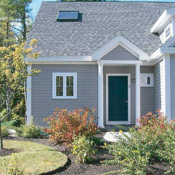
Corner lot enhanced with erosion control measures, rebuilt stonewall and native plants. Natural forest trees thinned and pruned for optimal growth. Invasive shrubs and vines removed as native woods are refined for conservation development housing. Supplemented with additional native trees and shrubs. Driveway graded to onsite stormwater infiltration and to prevent ice build up in winter.
2