
Search results for "Essential extensively" in Home Design Ideas
 Saeed shenakhteh
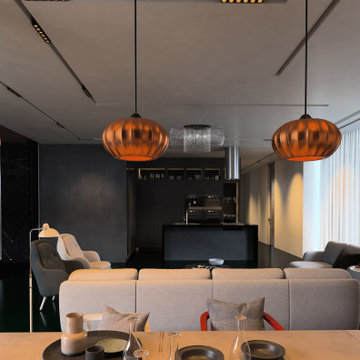
INSPIRATION: local settlements in northern Iran formed by a simple adaptation of the nature, geography and climate of that region. The local architecture of this place is so intertwined with nature and in harmony with the climate that it can be called naturalistic architecture. We are looking to redefining the region's former architecture, which needs protection, into today's language.
Unique properties: Extroverted architecture is a solution that is necessary to respond to the hot and humid climate of the location of this project. But in Iranian culture, introverted architecture is unavoidable therefore, in this residential apartment where several families live together and also have common spaces, providing a response to introversion and extroversion at the same time has been considered.
Description: Extreme use of the porch refers to the deep structures of the Iranian Architecture The "primitive cottage", which is a favorite of the residents of this small town, when converted into a contemporary apartment, must include several basic spaces to implement the residential scenario. Private and semi-private balconies are the most important of those spaces. Extensive vista is the potential of this project. because in addition to the forest view from the south and the beach view on the north side, the other two sides of the project have a unique view due to their height from the city.
Therefore, the location and type of openings affect the quality of the space. Each space has a pleasant view, light and proper air circulation. Roofed and non-roofed yards equally divided at different levels. These independent courtyards in the vertical surfaces seen as a vertical and integrated garden in the urban context.
CHALENGE: The value that the project pursues is to answer: How contemporary architecture can be faithful to culture, nature and context? How architecture can affect the audience without showing off?
this challenge arose for us when we noticed that the surrounding new buildings had nothing to do with local architecture except for adhering to a form such as a sloping roof. Audience tastes have also gone in a direction that is not compatible with contextual factors. So having a few touches of culture and context can be a turning point in the contemporary architecture of this Small scale area.
 iCork Floor
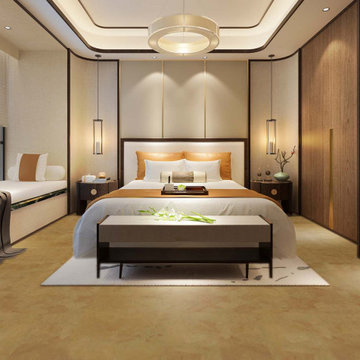
Fusion Cork flooring is clean, durable as stone, and warm to walk on, and is fabulous for people suffering from allergies and asthma
 Trilogy Construction Company
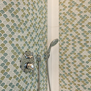
Great glass scallop tile detail. This tile is bordered by slabs of white marble.
Bathroom - modern bathroom idea in Miami
Bathroom - modern bathroom idea in Miami
Find the right local pro for your project
 Rudloff Custom Builders
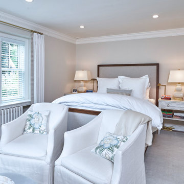
In the master bedroom, we added crown moulding to the ceiling and created custom built in storage with full extension drawers.
Rudloff Custom Builders has won Best of Houzz for Customer Service in 2014, 2015 2016, 2017, 2019, and 2020. We also were voted Best of Design in 2016, 2017, 2018, 2019 and 2020, which only 2% of professionals receive. Rudloff Custom Builders has been featured on Houzz in their Kitchen of the Week, What to Know About Using Reclaimed Wood in the Kitchen as well as included in their Bathroom WorkBook article. We are a full service, certified remodeling company that covers all of the Philadelphia suburban area. This business, like most others, developed from a friendship of young entrepreneurs who wanted to make a difference in their clients’ lives, one household at a time. This relationship between partners is much more than a friendship. Edward and Stephen Rudloff are brothers who have renovated and built custom homes together paying close attention to detail. They are carpenters by trade and understand concept and execution. Rudloff Custom Builders will provide services for you with the highest level of professionalism, quality, detail, punctuality and craftsmanship, every step of the way along our journey together.
Specializing in residential construction allows us to connect with our clients early in the design phase to ensure that every detail is captured as you imagined. One stop shopping is essentially what you will receive with Rudloff Custom Builders from design of your project to the construction of your dreams, executed by on-site project managers and skilled craftsmen. Our concept: envision our client’s ideas and make them a reality. Our mission: CREATING LIFETIME RELATIONSHIPS BUILT ON TRUST AND INTEGRITY.
Photo Credit: Linda McManus Images
 Fabco Sanctuary
The architect and designer Guy Derwent was approached by his client with a clear and compelling brief: to completely transform a grand Victorian terrace house they were planning to renovate. The client envisioned something far beyond a standard renovation – this was to be a bold and dramatic reimagining of a family home that could grow with them over time.
With the property having remained largely untouched for more than fifty years, the architects saw an opportunity to unlock its potential and deliver a contemporary design that would contrast beautifully with its Victorian heritage.
The existing layout consisted of a series of small, disconnected rooms to the rear of the house. To respond to the client’s need for openness and flexibility, the architect proposed a radical restructuring of the ground floor:
The rear rooms were completely removed
Suspended timber floors were lowered by up to two metres to align with the garden
Two bold extensions were added
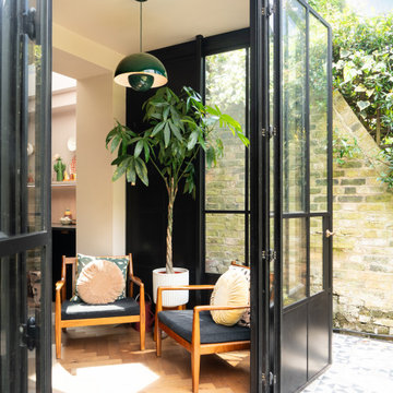
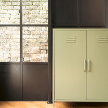
The first extension filled in the side return with a London stock brick facade and a glazed roof, while the second – a striking black steel and glass pavilion was glazed on three sides and placed along the garden elevation.
This new pavilion redefined the building’s relationship with the garden. Its steel-framed glazing created a seamless dialogue between interior and exterior, offering a sense of immersion in the surrounding landscape.
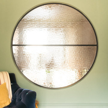
At the heart of the plan sits a dramatic, five-metre-tall dining space that acts as a transition from the original entrance hall into the new addition. A large, circular cast-glass window, framed in steel, provides a visual and spatial link between old and new, allowing light and movement to travel through the depth of the home.
Throughout the project, a series of black metal elements were introduced as sculptural interventions – each marking moments of transformation within the house. These included the bespoke steel framed circular window, a custom metal staircase, a cylindrical support column, and the striking steel and glass garden pavilion. Together, they formed a coherent architectural language that underscored the project’s bold intent.
Our steel windows and doors played a vital role in delivering the project’s vision. The architects chose steel for its refined sight lines and distinctive material character, which helped bridge the gap between the historical context of the building and the bold new additions.
The black steel frames provided a crisp contrast to the pale London stock brick and added definition to the glazed pavilion, reinforcing the sense of architectural precision. In particular, the fine steel profiles of the garden room allowed the extension to feel both lightweight and immersive, blurring the boundary between the house and its garden.
The architect drew inspiration from the Bauhaus Movement, particularly the work of Walter Gropius, whose approach to functional beauty and industrial materials informed the design of the garden pavilion.
Here, our glazing system was used not just for transparency, but as an expressive architectural element. The carefully proportioned panels help to conceal the roof thickness and reinforce the pavilion’s industrial yet abstract character – a deliberate nod to product design and modernist detailing.
Sustainability was an important factor in the selection of materials. Our steel systems, made from 99% recycled content and 100% recyclable, aligned with the project’s broader environmental goals.
The architects noted that this commitment to material longevity and circularity was central to their decision to use steel. The durability and recyclability of the windows and doors ensured the project met both aesthetic and ethical criteria.
This London terrace house now stands as a celebration of contrast – between heritage and innovation, solidity and transparency, tradition and transformation. Our steel windows and doors were not simply components; they were essential tools in crafting a home that is as bold and expressive as it is functional.
The result is a home designed for modern family life, where light, space, and materiality come together in perfect harmony.
 Rudloff Custom Builders
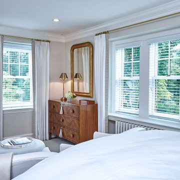
In the master bedroom, we added crown moulding to the ceiling and created custom built in storage with full extension drawers.
Rudloff Custom Builders has won Best of Houzz for Customer Service in 2014, 2015 2016, 2017, 2019, and 2020. We also were voted Best of Design in 2016, 2017, 2018, 2019 and 2020, which only 2% of professionals receive. Rudloff Custom Builders has been featured on Houzz in their Kitchen of the Week, What to Know About Using Reclaimed Wood in the Kitchen as well as included in their Bathroom WorkBook article. We are a full service, certified remodeling company that covers all of the Philadelphia suburban area. This business, like most others, developed from a friendship of young entrepreneurs who wanted to make a difference in their clients’ lives, one household at a time. This relationship between partners is much more than a friendship. Edward and Stephen Rudloff are brothers who have renovated and built custom homes together paying close attention to detail. They are carpenters by trade and understand concept and execution. Rudloff Custom Builders will provide services for you with the highest level of professionalism, quality, detail, punctuality and craftsmanship, every step of the way along our journey together.
Specializing in residential construction allows us to connect with our clients early in the design phase to ensure that every detail is captured as you imagined. One stop shopping is essentially what you will receive with Rudloff Custom Builders from design of your project to the construction of your dreams, executed by on-site project managers and skilled craftsmen. Our concept: envision our client’s ideas and make them a reality. Our mission: CREATING LIFETIME RELATIONSHIPS BUILT ON TRUST AND INTEGRITY.
Photo Credit: Linda McManus Images
 Fabco Sanctuary
The architect and designer Guy Derwent was approached by his client with a clear and compelling brief: to completely transform a grand Victorian terrace house they were planning to renovate. The client envisioned something far beyond a standard renovation – this was to be a bold and dramatic reimagining of a family home that could grow with them over time.
With the property having remained largely untouched for more than fifty years, the architects saw an opportunity to unlock its potential and deliver a contemporary design that would contrast beautifully with its Victorian heritage.
The existing layout consisted of a series of small, disconnected rooms to the rear of the house. To respond to the client’s need for openness and flexibility, the architect proposed a radical restructuring of the ground floor:
The rear rooms were completely removed
Suspended timber floors were lowered by up to two metres to align with the garden
Two bold extensions were added
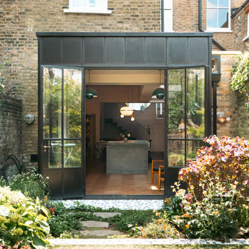
The first extension filled in the side return with a London stock brick facade and a glazed roof, while the second – a striking black steel and glass pavilion was glazed on three sides and placed along the garden elevation.
This new pavilion redefined the building’s relationship with the garden. Its steel-framed glazing created a seamless dialogue between interior and exterior, offering a sense of immersion in the surrounding landscape.
At the heart of the plan sits a dramatic, five-metre-tall dining space that acts as a transition from the original entrance hall into the new addition. A large, circular cast-glass window, framed in steel, provides a visual and spatial link between old and new, allowing light and movement to travel through the depth of the home.
Throughout the project, a series of black metal elements were introduced as sculptural interventions – each marking moments of transformation within the house. These included the bespoke steel framed circular window, a custom metal staircase, a cylindrical support column, and the striking steel and glass garden pavilion. Together, they formed a coherent architectural language that underscored the project’s bold intent.
Our steel windows and doors played a vital role in delivering the project’s vision. The architects chose steel for its refined sight lines and distinctive material character, which helped bridge the gap between the historical context of the building and the bold new additions.
The black steel frames provided a crisp contrast to the pale London stock brick and added definition to the glazed pavilion, reinforcing the sense of architectural precision. In particular, the fine steel profiles of the garden room allowed the extension to feel both lightweight and immersive, blurring the boundary between the house and its garden.
The architect drew inspiration from the Bauhaus Movement, particularly the work of Walter Gropius, whose approach to functional beauty and industrial materials informed the design of the garden pavilion.
Here, our glazing system was used not just for transparency, but as an expressive architectural element. The carefully proportioned panels help to conceal the roof thickness and reinforce the pavilion’s industrial yet abstract character – a deliberate nod to product design and modernist detailing.
Sustainability was an important factor in the selection of materials. Our steel systems, made from 99% recycled content and 100% recyclable, aligned with the project’s broader environmental goals.
The architects noted that this commitment to material longevity and circularity was central to their decision to use steel. The durability and recyclability of the windows and doors ensured the project met both aesthetic and ethical criteria.
This London terrace house now stands as a celebration of contrast – between heritage and innovation, solidity and transparency, tradition and transformation. Our steel windows and doors were not simply components; they were essential tools in crafting a home that is as bold and expressive as it is functional.
The result is a home designed for modern family life, where light, space, and materiality come together in perfect harmony.


 down2earth Interior Design, LLC.
Is your closet busting at the seams? Or do you perhaps have no closet at all? Time to consider adding a mudroom to your house. Mudrooms are a popular interior design trend these days, and for good reason - they can house far more than a simple coat closet can. They can serve as a family command center for kids' school flyers and menus, for backpacks and shoes, for art supplies and sports equipment. Some mudrooms contain a laundry area, and some contain a mail station. Some mudrooms serve as a home base for a dog or a cat, with easy to clean, low maintenance building materials. A mudroom may consist of custom built-ins, or may simply be a corner of an existing room with pulled some clever, freestanding furniture, hooks, or shelves to house your most essential mudroom items.
Whatever your storage needs, extensive or streamlined, carving out a mudroom area can keep the whole family more organized. And, being more organized saves you stress and countless hours that would otherwise be spent searching for misplaced items.
While we love to design mudroom niches, a full mudroom interior design allows us to do what we do best here at Down2Earth Interior Design: elevate a space that is primarily driven by pragmatic requirements into a space that is also beautiful to look at and comfortable to occupy. I find myself voluntarily taking phone calls while sitting on the bench of my mudroom, simply because it's a comfortable place to be. My kids do their homework in the mudroom sometimes. My cat loves to curl up on sweatshirts temporarily left on the bench, or cuddle up in boxes on their way out to the recycling bins, just outside the door. Designing a custom mudroom for our family has elevated our lifestyle in so many ways, and I look forward to the opportunity to help make your mudroom design dreams a reality as well.
Photos by Ryan Macchione
 Rudloff Custom Builders
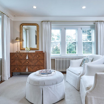
In the master bedroom, we added crown moulding to the ceiling and created custom built in storage with full extension drawers.
Rudloff Custom Builders has won Best of Houzz for Customer Service in 2014, 2015 2016, 2017, 2019, and 2020. We also were voted Best of Design in 2016, 2017, 2018, 2019 and 2020, which only 2% of professionals receive. Rudloff Custom Builders has been featured on Houzz in their Kitchen of the Week, What to Know About Using Reclaimed Wood in the Kitchen as well as included in their Bathroom WorkBook article. We are a full service, certified remodeling company that covers all of the Philadelphia suburban area. This business, like most others, developed from a friendship of young entrepreneurs who wanted to make a difference in their clients’ lives, one household at a time. This relationship between partners is much more than a friendship. Edward and Stephen Rudloff are brothers who have renovated and built custom homes together paying close attention to detail. They are carpenters by trade and understand concept and execution. Rudloff Custom Builders will provide services for you with the highest level of professionalism, quality, detail, punctuality and craftsmanship, every step of the way along our journey together.
Specializing in residential construction allows us to connect with our clients early in the design phase to ensure that every detail is captured as you imagined. One stop shopping is essentially what you will receive with Rudloff Custom Builders from design of your project to the construction of your dreams, executed by on-site project managers and skilled craftsmen. Our concept: envision our client’s ideas and make them a reality. Our mission: CREATING LIFETIME RELATIONSHIPS BUILT ON TRUST AND INTEGRITY.
Photo Credit: Linda McManus Images
 Fabco Sanctuary
The architect and designer Guy Derwent was approached by his client with a clear and compelling brief: to completely transform a grand Victorian terrace house they were planning to renovate. The client envisioned something far beyond a standard renovation – this was to be a bold and dramatic reimagining of a family home that could grow with them over time.
With the property having remained largely untouched for more than fifty years, the architects saw an opportunity to unlock its potential and deliver a contemporary design that would contrast beautifully with its Victorian heritage.
The existing layout consisted of a series of small, disconnected rooms to the rear of the house. To respond to the client’s need for openness and flexibility, the architect proposed a radical restructuring of the ground floor:
The rear rooms were completely removed
Suspended timber floors were lowered by up to two metres to align with the garden
Two bold extensions were added
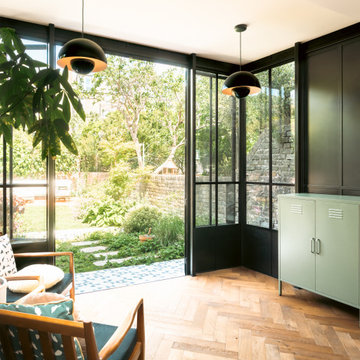
The first extension filled in the side return with a London stock brick facade and a glazed roof, while the second – a striking black steel and glass pavilion was glazed on three sides and placed along the garden elevation.
This new pavilion redefined the building’s relationship with the garden. Its steel-framed glazing created a seamless dialogue between interior and exterior, offering a sense of immersion in the surrounding landscape.
At the heart of the plan sits a dramatic, five-metre-tall dining space that acts as a transition from the original entrance hall into the new addition. A large, circular cast-glass window, framed in steel, provides a visual and spatial link between old and new, allowing light and movement to travel through the depth of the home.
Throughout the project, a series of black metal elements were introduced as sculptural interventions – each marking moments of transformation within the house. These included the bespoke steel framed circular window, a custom metal staircase, a cylindrical support column, and the striking steel and glass garden pavilion. Together, they formed a coherent architectural language that underscored the project’s bold intent.
Our steel windows and doors played a vital role in delivering the project’s vision. The architects chose steel for its refined sight lines and distinctive material character, which helped bridge the gap between the historical context of the building and the bold new additions.
The black steel frames provided a crisp contrast to the pale London stock brick and added definition to the glazed pavilion, reinforcing the sense of architectural precision. In particular, the fine steel profiles of the garden room allowed the extension to feel both lightweight and immersive, blurring the boundary between the house and its garden.
The architect drew inspiration from the Bauhaus Movement, particularly the work of Walter Gropius, whose approach to functional beauty and industrial materials informed the design of the garden pavilion.
Here, our glazing system was used not just for transparency, but as an expressive architectural element. The carefully proportioned panels help to conceal the roof thickness and reinforce the pavilion’s industrial yet abstract character – a deliberate nod to product design and modernist detailing.
Sustainability was an important factor in the selection of materials. Our steel systems, made from 99% recycled content and 100% recyclable, aligned with the project’s broader environmental goals.
The architects noted that this commitment to material longevity and circularity was central to their decision to use steel. The durability and recyclability of the windows and doors ensured the project met both aesthetic and ethical criteria.
This London terrace house now stands as a celebration of contrast – between heritage and innovation, solidity and transparency, tradition and transformation. Our steel windows and doors were not simply components; they were essential tools in crafting a home that is as bold and expressive as it is functional.
The result is a home designed for modern family life, where light, space, and materiality come together in perfect harmony.
 Marwood Design
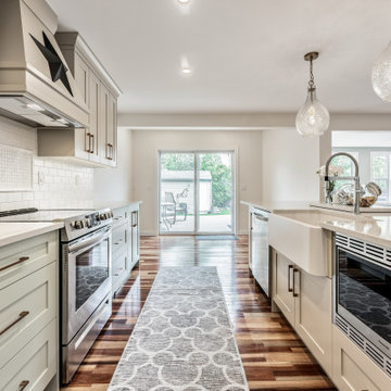
The goal of this project was to have a modern kitchen with a country home elegance. In this example, we mix three essential ingredients for creating a country homestyle cooking space: modern features, rustic elements, and industrial-inspired accents. When blended just right, the result is a sophisticated kitchen that's also warm and inviting keeping the charm of an old country kitchen. There are no hard-set rules for modern farmhouse colors. However, a winning palette seen in many spaces combines pastels, black, and natural wood tones. We loved the original walnut floor and worked with earthy colours of light greens and coffee hues to make the kitchen inviting to an old farmhouse with all the functions of modern appliances.
We were able to accomplish all the needs of the client’s project that started out as kitchen renovation. The project scope refocused to renovating the main floor living area, a new kitchen, updated laundry room and new powder room. The main floor kitchen space felt cramped due to a small dining room near the sliding doors. To gain space we started with a smaller foot print of the kitchen island and moved the dining area to the right of the island opening up the kitchen, gaining space with natural light flowing through the sliding doors. We removed the old dated popcorn ceilings and relocated the pot lights to give better lighting in areas that needed it and removed lights that didn’t need it. The end result is a country kitchen with character and charm.

 Fabco Sanctuary
The architect and designer Guy Derwent was approached by his client with a clear and compelling brief: to completely transform a grand Victorian terrace house they were planning to renovate. The client envisioned something far beyond a standard renovation – this was to be a bold and dramatic reimagining of a family home that could grow with them over time.
With the property having remained largely untouched for more than fifty years, the architects saw an opportunity to unlock its potential and deliver a contemporary design that would contrast beautifully with its Victorian heritage.
The existing layout consisted of a series of small, disconnected rooms to the rear of the house. To respond to the client’s need for openness and flexibility, the architect proposed a radical restructuring of the ground floor:
The rear rooms were completely removed
Suspended timber floors were lowered by up to two metres to align with the garden
Two bold extensions were added
The first extension filled in the side return with a London stock brick facade and a glazed roof, while the second – a striking black steel and glass pavilion was glazed on three sides and placed along the garden elevation.
This new pavilion redefined the building’s relationship with the garden. Its steel-framed glazing created a seamless dialogue between interior and exterior, offering a sense of immersion in the surrounding landscape.
At the heart of the plan sits a dramatic, five-metre-tall dining space that acts as a transition from the original entrance hall into the new addition. A large, circular cast-glass window, framed in steel, provides a visual and spatial link between old and new, allowing light and movement to travel through the depth of the home.
Throughout the project, a series of black metal elements were introduced as sculptural interventions – each marking moments of transformation within the house. These included the bespoke steel framed circular window, a custom metal staircase, a cylindrical support column, and the striking steel and glass garden pavilion. Together, they formed a coherent architectural language that underscored the project’s bold intent.
Our steel windows and doors played a vital role in delivering the project’s vision. The architects chose steel for its refined sight lines and distinctive material character, which helped bridge the gap between the historical context of the building and the bold new additions.
The black steel frames provided a crisp contrast to the pale London stock brick and added definition to the glazed pavilion, reinforcing the sense of architectural precision. In particular, the fine steel profiles of the garden room allowed the extension to feel both lightweight and immersive, blurring the boundary between the house and its garden.
The architect drew inspiration from the Bauhaus Movement, particularly the work of Walter Gropius, whose approach to functional beauty and industrial materials informed the design of the garden pavilion.
Here, our glazing system was used not just for transparency, but as an expressive architectural element. The carefully proportioned panels help to conceal the roof thickness and reinforce the pavilion’s industrial yet abstract character – a deliberate nod to product design and modernist detailing.
Sustainability was an important factor in the selection of materials. Our steel systems, made from 99% recycled content and 100% recyclable, aligned with the project’s broader environmental goals.
The architects noted that this commitment to material longevity and circularity was central to their decision to use steel. The durability and recyclability of the windows and doors ensured the project met both aesthetic and ethical criteria.
This London terrace house now stands as a celebration of contrast – between heritage and innovation, solidity and transparency, tradition and transformation. Our steel windows and doors were not simply components; they were essential tools in crafting a home that is as bold and expressive as it is functional.
The result is a home designed for modern family life, where light, space, and materiality come together in perfect harmony.

 Fabco Sanctuary
The architect and designer Guy Derwent was approached by his client with a clear and compelling brief: to completely transform a grand Victorian terrace house they were planning to renovate. The client envisioned something far beyond a standard renovation – this was to be a bold and dramatic reimagining of a family home that could grow with them over time.
With the property having remained largely untouched for more than fifty years, the architects saw an opportunity to unlock its potential and deliver a contemporary design that would contrast beautifully with its Victorian heritage.
The existing layout consisted of a series of small, disconnected rooms to the rear of the house. To respond to the client’s need for openness and flexibility, the architect proposed a radical restructuring of the ground floor:
The rear rooms were completely removed
Suspended timber floors were lowered by up to two metres to align with the garden
Two bold extensions were added
The first extension filled in the side return with a London stock brick facade and a glazed roof, while the second – a striking black steel and glass pavilion was glazed on three sides and placed along the garden elevation.
This new pavilion redefined the building’s relationship with the garden. Its steel-framed glazing created a seamless dialogue between interior and exterior, offering a sense of immersion in the surrounding landscape.
At the heart of the plan sits a dramatic, five-metre-tall dining space that acts as a transition from the original entrance hall into the new addition. A large, circular cast-glass window, framed in steel, provides a visual and spatial link between old and new, allowing light and movement to travel through the depth of the home.
Throughout the project, a series of black metal elements were introduced as sculptural interventions – each marking moments of transformation within the house. These included the bespoke steel framed circular window, a custom metal staircase, a cylindrical support column, and the striking steel and glass garden pavilion. Together, they formed a coherent architectural language that underscored the project’s bold intent.
Our steel windows and doors played a vital role in delivering the project’s vision. The architects chose steel for its refined sight lines and distinctive material character, which helped bridge the gap between the historical context of the building and the bold new additions.
The black steel frames provided a crisp contrast to the pale London stock brick and added definition to the glazed pavilion, reinforcing the sense of architectural precision. In particular, the fine steel profiles of the garden room allowed the extension to feel both lightweight and immersive, blurring the boundary between the house and its garden.
The architect drew inspiration from the Bauhaus Movement, particularly the work of Walter Gropius, whose approach to functional beauty and industrial materials informed the design of the garden pavilion.
Here, our glazing system was used not just for transparency, but as an expressive architectural element. The carefully proportioned panels help to conceal the roof thickness and reinforce the pavilion’s industrial yet abstract character – a deliberate nod to product design and modernist detailing.
Sustainability was an important factor in the selection of materials. Our steel systems, made from 99% recycled content and 100% recyclable, aligned with the project’s broader environmental goals.
The architects noted that this commitment to material longevity and circularity was central to their decision to use steel. The durability and recyclability of the windows and doors ensured the project met both aesthetic and ethical criteria.
This London terrace house now stands as a celebration of contrast – between heritage and innovation, solidity and transparency, tradition and transformation. Our steel windows and doors were not simply components; they were essential tools in crafting a home that is as bold and expressive as it is functional.
The result is a home designed for modern family life, where light, space, and materiality come together in perfect harmony.
 Sky Marble & Granite Inc
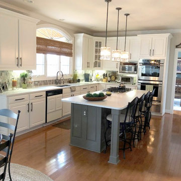
Who wouldn’t feel at home in this beautiful eat-in kitchen? The open layout, classy white cabinets, and the sunshine streaming through the window combine to form a kitchen that’s functional and welcoming—the kind where you can easily imagine the delightful odors of fresh herbs and fragrant spices mingling with the laughter and chatter of friends and family. A closer look reveals a number of design ideas that might be useful if you’re looking to create a similar ambiance in your own home.
This design takes advantage of natural sunlight by pairing a large window with a light color scheme that makes the space bright and airy. No detail has been overlooked, as evidenced by the glass hexagon backsplash that serves as an accent. The interlocking glass tiles create a lovely pattern of varying neutral tones that gives just the right amount of energy to the space. The cabinets are equally as tasteful, finished with an elegant crown molding. The gray cabinet island with white cabinets creates a stylish two-tone look and adds a splash of contrast, and the spacious island includes both an impressive cooktop and a bar—adding more seating and extra workspace.
Of course, the countertop is an essential part of any kitchen, but it’s especially important to choose the right one in a design that includes such a large work surface. The kitchen countertop has to look good—after all, it’s the element that ties the rest of the design together—but it also needs to be a functional surface that can handle the tomato sauce or red wine spill, whatever might be on the kids’ sticky fingers, and the wear and tear of everyday use. A quartz kitchen, like this one, doesn’t have to sacrifice its looks to be practical. This luxurious white quartz countertop with delicate, swirling gray veins ties the color palette together and glitters in the sun—but it’s also a durable work space. The engineered stone used here is a Calacatta Verona Quartz, one of many choices that Sky Marble offers as part of our extensive quartz selection. Calacatta Verona Quartz has all the classic beauty of marble, doesn’t require ongoing maintenance, and can stand up to many, many years of family dinners or cocktail parties. And it’s an excellent choice for this kitchen’s color scheme, maximizing the natural lighting and seamlessly uniting the gray of the island and the white of the other cabinets.
Altogether, this contemporary kitchen style strikes the perfect balance between elegance and warmth. At Sky Marble in Sterling, VA, we can help you find just the right look to make your kitchen ideas for make your new build or renovation project a similar success.
 Drury Design
THE SETUP
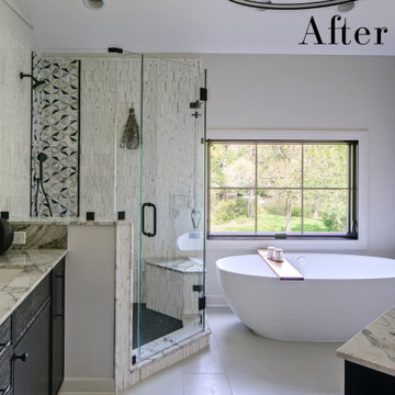
While the existing layout wasn’t inherently flawed, this primary bathroom felt outdated and lacked the desired aesthetic appeal for our client. The goal was to revitalize the space, catering to her refined taste while ensuring a bright, inviting ambiance. The client wanted a comfortable and classy gender-neutral design that would retain its updated look and have broad appeal for eventual resale.
Design Objectives:
Create a spacious, luxurious shower enclosure
Incorporate ample storage for towels, linens and an extensive hair care collection
Embrace a transitional design style that blends contemporary and classic elements
Establish a harmonious color palette that complements the home’s new black window frames
Ensure a future-proof design to maximize resale potential
Design Challenges:
Integrating a spacious shower within the existing layout
Ensuring accessible towel and robe storage near the shower and tub areas
Providing ample lighting and mirror space without cluttering the vanity area
Finding dedicated storage for hair care essentials and accessories
Maximizing linen storage while minimizing clutter
Decluttering the tub niche area
Tall angled ceiling almost too dramatic
THE RENEWED SPACE
Design Solutions:
Frameless glass shower enclosure with a recessed niche (in the half wall) for body care products
Strategically placed robe/towel hooks on shower glass facing shower and tub
Illuminated, oversized mirrors with integrated lighting
Multiple large pull-out drawers with electrical outlets in the vanity
Dedicated base cabinet with countertop for towel/linen storage and decor
Single, spacious tub niche for products and decorative accents
Subtle horizontal trim lines at standard ceiling height to visually ground the space
This primary bathroom remodel seamlessly blends style and functionality, catering to the client’s discerning taste while ensuring adaptability for future needs. The harmonious fusion of contemporary and classic design elements, coupled with innovative storage solutions and thoughtful lighting choices, creates a timeless sanctuary that exudes elegance and comfort.
 LandFluent Landscape Architecture
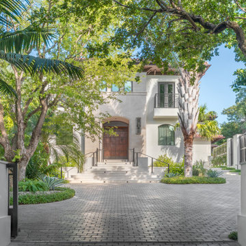
Everfall is set within a pristine 20,000-square-foot property in one of Coral Gables’ oldest and most storied neighborhoods. Here, mature canopy trees, towering palms, and historic architecture define a sense of place often referred to as the “real Miami.”
While the residence showcases exquisitely modernized architecture and unobstructed views of Biscayne Bay, the pre-existing garden fell short of its potential. Our design challenge is twofold: to reimagine vehicular and pedestrian circulation in harmony with the site’s topography, and to create a garden that respects and reinforces the character of its historic setting.
Circulation was addressed first. The driveway was redesigned to ease steep slopes and form a welcoming motor court that blends hardscape and planting. Pedestrian access was reoriented to highlight the east–west axis, and the former unsightly pedestrian ramp was replaced with platform steps, expansive landings, and lush planting; establishing a tranquil and clearly defined entry sequence.
The planting design emphasizes native species along the perimeter and public right-of-way, aligning with the evolving character of surrounding gardens. Within the property, sculptural specimen trees, epiphytes, and lithophytes evoke the feeling of a long-established landscape. A palette of Mediterranean textures and cliff-dwelling Date Palm species were integrated as elegant accents. Color plays a vital role in the sensory experience, introduced through climbing vines and profusely flowering shrubs and groundcovers in shades of pink, purple, and white.
Above all, the garden is designed as a reflection of our clients—their personalities, passions, and way of life. It is a living extension of their home, offering beauty, comfort, and an immersive connection to the natural world.
We are honored to shape the vision for the Everfall. This landscape is essential to the experience of the property, and our design seeks to honor its rich context, architectural sophistication, and breathtaking views of the Miami skyline.
Scale
0.47 ACRES
Scope
HARDSCAPE + PLANTING DESIGN
Year
2025
Photography
Studio PYG
Architecture Renovation
Bravo Architecture
Interior Design
Miriam Moore Design Studio
Landscape Architecture
LandFluent
General Contractor
Artisan Custom Homes of South Florida
Landscape Contractor
Signature Trees & Palms
Lighting Design / Contractor
PCL Lighting
Sponsored
Columbus, OH

Snider & Metcalf Interior Design, LTD
Leading Interior Designers in Columbus, Ohio & Ponte Vedra, Florida
 Drury Design
THE SETUP
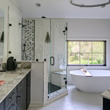
While the existing layout wasn’t inherently flawed, this primary bathroom felt outdated and lacked the desired aesthetic appeal for our client. The goal was to revitalize the space, catering to her refined taste while ensuring a bright, inviting ambiance. The client wanted a comfortable and classy gender-neutral design that would retain its updated look and have broad appeal for eventual resale.
Design Objectives:
Create a spacious, luxurious shower enclosure
Incorporate ample storage for towels, linens and an extensive hair care collection
Embrace a transitional design style that blends contemporary and classic elements
Establish a harmonious color palette that complements the home’s new black window frames
Ensure a future-proof design to maximize resale potential
Design Challenges:
Integrating a spacious shower within the existing layout
Ensuring accessible towel and robe storage near the shower and tub areas
Providing ample lighting and mirror space without cluttering the vanity area
Finding dedicated storage for hair care essentials and accessories
Maximizing linen storage while minimizing clutter
Decluttering the tub niche area
Tall angled ceiling almost too dramatic
THE RENEWED SPACE
Design Solutions:
Frameless glass shower enclosure with a recessed niche (in the half wall) for body care products
Strategically placed robe/towel hooks on shower glass facing shower and tub
Illuminated, oversized mirrors with integrated lighting
Multiple large pull-out drawers with electrical outlets in the vanity
Dedicated base cabinet with countertop for towel/linen storage and decor
Single, spacious tub niche for products and decorative accents
Subtle horizontal trim lines at standard ceiling height to visually ground the space
This primary bathroom remodel seamlessly blends style and functionality, catering to the client’s discerning taste while ensuring adaptability for future needs. The harmonious fusion of contemporary and classic design elements, coupled with innovative storage solutions and thoughtful lighting choices, creates a timeless sanctuary that exudes elegance and comfort.
 Drury Design
THE SETUP
While the existing layout wasn’t inherently flawed, this primary bathroom felt outdated and lacked the desired aesthetic appeal for our client. The goal was to revitalize the space, catering to her refined taste while ensuring a bright, inviting ambiance. The client wanted a comfortable and classy gender-neutral design that would retain its updated look and have broad appeal for eventual resale.
Design Objectives:
Create a spacious, luxurious shower enclosure
Incorporate ample storage for towels, linens and an extensive hair care collection
Embrace a transitional design style that blends contemporary and classic elements
Establish a harmonious color palette that complements the home’s new black window frames
Ensure a future-proof design to maximize resale potential
Design Challenges:
Integrating a spacious shower within the existing layout
Ensuring accessible towel and robe storage near the shower and tub areas
Providing ample lighting and mirror space without cluttering the vanity area
Finding dedicated storage for hair care essentials and accessories
Maximizing linen storage while minimizing clutter
Decluttering the tub niche area
Tall angled ceiling almost too dramatic
THE RENEWED SPACE
Design Solutions:
Frameless glass shower enclosure with a recessed niche (in the half wall) for body care products
Strategically placed robe/towel hooks on shower glass facing shower and tub
Illuminated, oversized mirrors with integrated lighting
Multiple large pull-out drawers with electrical outlets in the vanity
Dedicated base cabinet with countertop for towel/linen storage and decor
Single, spacious tub niche for products and decorative accents
Subtle horizontal trim lines at standard ceiling height to visually ground the space
This primary bathroom remodel seamlessly blends style and functionality, catering to the client’s discerning taste while ensuring adaptability for future needs. The harmonious fusion of contemporary and classic design elements, coupled with innovative storage solutions and thoughtful lighting choices, creates a timeless sanctuary that exudes elegance and comfort.
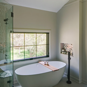 Drury Design
THE SETUP
While the existing layout wasn’t inherently flawed, this primary bathroom felt outdated and lacked the desired aesthetic appeal for our client. The goal was to revitalize the space, catering to her refined taste while ensuring a bright, inviting ambiance. The client wanted a comfortable and classy gender-neutral design that would retain its updated look and have broad appeal for eventual resale.
Design Objectives:
Create a spacious, luxurious shower enclosure
Incorporate ample storage for towels, linens and an extensive hair care collection
Embrace a transitional design style that blends contemporary and classic elements
Establish a harmonious color palette that complements the home’s new black window frames
Ensure a future-proof design to maximize resale potential
Design Challenges:
Integrating a spacious shower within the existing layout
Ensuring accessible towel and robe storage near the shower and tub areas
Providing ample lighting and mirror space without cluttering the vanity area
Finding dedicated storage for hair care essentials and accessories
Maximizing linen storage while minimizing clutter
Decluttering the tub niche area
Tall angled ceiling almost too dramatic
THE RENEWED SPACE
Design Solutions:
Frameless glass shower enclosure with a recessed niche (in the half wall) for body care products
Strategically placed robe/towel hooks on shower glass facing shower and tub
Illuminated, oversized mirrors with integrated lighting
Multiple large pull-out drawers with electrical outlets in the vanity
Dedicated base cabinet with countertop for towel/linen storage and decor
Single, spacious tub niche for products and decorative accents
Subtle horizontal trim lines at standard ceiling height to visually ground the space
This primary bathroom remodel seamlessly blends style and functionality, catering to the client’s discerning taste while ensuring adaptability for future needs. The harmonious fusion of contemporary and classic design elements, coupled with innovative storage solutions and thoughtful lighting choices, creates a timeless sanctuary that exudes elegance and comfort.
26