
Search results for "Establishing effective" in Home Design Ideas
 Ferrarini & Co. Kitchens & Interiors
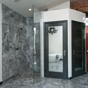
Entertaining in a bathroom never looked so good. Probably a thought that never crossed your mind, but a space as unique as this can do just that. The fusion of so many elements: an open concept shower, freestanding tub, washer/dryer organization, toilet room and urinal created an exciting spacial plan. Ultimately, the freestanding tub creates the first vantage point. This breathtaking view creates a calming effect and each angle pivoting off this point exceeds the next. Following the open concept shower, is the washer/dryer and storage closets which double as decor, incorporating mirror into their doors. The double vanity stands in front of a textured wood plank tile laid horizontally establishing a modern backdrop. Lastly, a rustic barn door separates a toilet and a urinal, an uncharacteristic residential choice that pairs well with beer, wings, and hockey.
 David Heide Design Studio
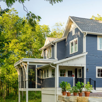
In coming to Minnesota from Iceland, the owners of Home 4 found themselves more than 3,000 miles away from home, hoping to build something new – literally and figuratively – that would feel like home for their family of five. They purchased a scenic piece of land in Rochester and identified a general idea of the spaces they would need, but they struggled with how to define a sense of character that would incorporate their culture and identity into the design. The architect-led design team was tasked with creating a house that would help establish the homeowners’ roots in a new country while still recalling familiar comforts of their heritage.
The result is a warm family home that combines elements of Nordic design with a touch of American farmhouse aesthetic. Gracious proportions, custom woodworking, and cheerful details create a welcoming atmosphere, while modern conveniences like a large mudroom and second-floor laundry help day-to-day life feel easy.
Around each corner, a new detail greets the eye, from the Lundie-inspired column at the staircase, to the double-heart detail inscribed in the woodwork, to the custom table designed for the breakfast nook. Each element is lovely individually, but experiencing the holistic effect as the details intentionally pair and play together helps to craft a house that feels like home.
Most important, the homeowners’ history, heritage, and hopes are melded together into a home that represents their family. Each unique element and carefully considered material combine to form a house that feels as if it could have belonged to this family for generations, even though it is brand new.
 Bassett Furniture
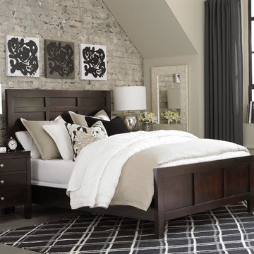
Available in Queen, King and Cal King
The clean lines of Redin Park provide a sleek, sophisticated style. The texture of the open grain in the Cathedral walnut veneers establishes a rich finish that highlights the linear design of the cases. Enhanced by turned hardware pulls in a Satin Nickel finish.
Find the right local pro for your project
 User
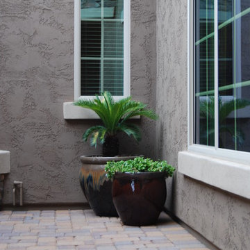
UserThis view of two planters that establish the triangular design in the courtyard have the same color scheme so as not to take away from the overall effect of the earth tones with the pop of green color.
 Field Architecture
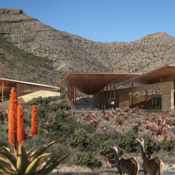
The architecture of the Karoo Wilderness Center is a result of a thorough process of investigation into the origins and character of the Karoo landscape and the flora and fauna that result from its particular qualities. The tectonic events that produced the specific topography of the site, trajectories of water runoff, wind movement, soil composition, and effects of plant and animal species on the landscape have converged to create the conditions of the site chosen for the Center. Each of these factors have in turn been subject to the impact of human inhabitation and vernacular building practices, amplified in recent generations to a harmful degree by shortsighted agricultural strategies and their associated effects of overgrazing, water over-manipulation and erosion.
Fundamental to the architectural response is the premise that the human species is an inherent part of the conditions that comprise and affect the landscape. The significance of the Center, enhanced and informed by the activities that occur within and as an extension of it, lies in the co-dependence of the Center and the ecosystem as inherently bound entities. The architecture of the Center is intended to make evident the natural processes of the Karoo and establish a new precedent for building within and through an ecosystem defined by dynamic flux.
 Field Architecture
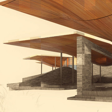
The architecture of the Karoo Wilderness Center is a result of a thorough process of investigation into the origins and character of the Karoo landscape and the flora and fauna that result from its particular qualities. The tectonic events that produced the specific topography of the site, trajectories of water runoff, wind movement, soil composition, and effects of plant and animal species on the landscape have converged to create the conditions of the site chosen for the Center. Each of these factors have in turn been subject to the impact of human inhabitation and vernacular building practices, amplified in recent generations to a harmful degree by shortsighted agricultural strategies and their associated effects of overgrazing, water over-manipulation and erosion.
Fundamental to the architectural response is the premise that the human species is an inherent part of the conditions that comprise and affect the landscape. The significance of the Center, enhanced and informed by the activities that occur within and as an extension of it, lies in the co-dependence of the Center and the ecosystem as inherently bound entities. The architecture of the Center is intended to make evident the natural processes of the Karoo and establish a new precedent for building within and through an ecosystem defined by dynamic flux.
 David Heide Design Studio
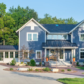
In coming to Minnesota from Iceland, the owners of Home 4 found themselves more than 3,000 miles away from home, hoping to build something new – literally and figuratively – that would feel like home for their family of five. They purchased a scenic piece of land in Rochester and identified a general idea of the spaces they would need, but they struggled with how to define a sense of character that would incorporate their culture and identity into the design. The architect-led design team was tasked with creating a house that would help establish the homeowners’ roots in a new country while still recalling familiar comforts of their heritage.
The result is a warm family home that combines elements of Nordic design with a touch of American farmhouse aesthetic. Gracious proportions, custom woodworking, and cheerful details create a welcoming atmosphere, while modern conveniences like a large mudroom and second-floor laundry help day-to-day life feel easy.
Around each corner, a new detail greets the eye, from the Lundie-inspired column at the staircase, to the double-heart detail inscribed in the woodwork, to the custom table designed for the breakfast nook. Each element is lovely individually, but experiencing the holistic effect as the details intentionally pair and play together helps to craft a house that feels like home.
Most important, the homeowners’ history, heritage, and hopes are melded together into a home that represents their family. Each unique element and carefully considered material combine to form a house that feels as if it could have belonged to this family for generations, even though it is brand new.

Sponsored
Sunbury, OH

J.Holderby - Renovations
Franklin County's Leading General Contractors - 2X Best of Houzz!
 Skill Construction & Design, LLC
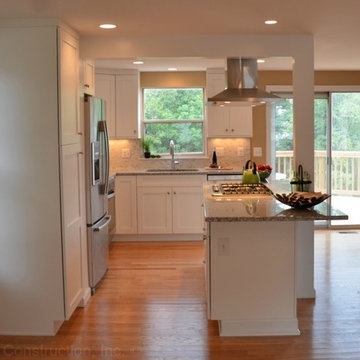
There are so many design elements to this kitchen, I almost don’t know where to start. Bright and airy with crisp clean white cabinets, the kitchen is open and welcoming. Still crisp but gently contrasting, the stainless steel appliance add depth amid the white. To keep this kitchen warm, natural oak covers the floors and a toasted wheat color washes the walls. And then there is the architectural elements. You know. That post and beam in the middle of the room. It’s the center of attention.
When you walk into a room your eyes roam around, establishing the size and shape of the room as your feet take you forward. From the front door of this home straight ahead you encountered this wall. The dining area to the right gives you a glimpse of things to come. Where there is a dining room you will usually find a kitchen.
The architecture of years gone by consistently hides the kitchen, the heart of the home, behind walls. I sympathize with my Mom, and all the other Moms, who have had to spend so much time tucked into a tight kitchen, away from the family. This wall had to go, but it was structural. We needed its support but not its bulk.
So we got rid of the bulk and only the bulk. Instead of a wall we have a post and beam, offering all of the structure we need. We could have installed a huge steel beam and reconfigure the joists to upset the beam, but why? The small beam and post add an incredible architectural element. It’s turning lemons into lemon, we simply made the most of what we had. It may be functional but it’s so fantastic. It looks like we created the effect just for the drama.
The original kitchen may have had a working triangle and some counter space, but it was fairly small, with each area only a step or two away. The dark cabinets made the space feel even smaller and the butcher block patterned laminate counter tops were very dated. The appliances were feeling their age as well, from a coil burner electric stove to a top freezer refrigerator. To keep this kitchen within its space, a half wall separated it from the dining area.
With the wall gone we borrowed some space from the living room and extended what was a U shaped kitchen into an L. At the living room window we start our new kitchen. We kept a small part of the wall to support the other end of our decorative beam. Sandwiched between a large pantry and our new French door refrigerator, the wall disappears. With our new open floor plan a sizable island was in order.
We split our cooking areas and installed a continuous grill gas cooktop into the island. A sleek island hood takes care of exhaust and adds an extra element to our architectural feature. Under the cooktop we added over-sized drawers for pots and pan storage. The frameless cabinets from New River Cabinetry are maple, painted white, with the Herndon door style. With the cooktop safely nestled into our island, we still had to add an oven.
We used the space where the old range sat for a large single oven of stainless steel and glass. If it worked for one, why not two? We created a home for a microwave in the wall cabinets. It’s perfect for heating leftovers so close to the refrigerator.
An important consideration for hot spots in your kitchen is landing zones. Each of our cooking areas have generous landing zones, one on each side of the cooktop and an entire counter area above or below the ovens, depending on which one you’re using.
We wanted to give the sink area more room so the half wall had to come out. We moved the trash and recycle cans into a cabinet, removed the heavy soffits and kept the sink under the window.
With that little bit of extra space we were able to add a larger cabinet above the dishwasher and slide it all down. This used to be where the carpeting met the vinyl floor, but all of it is gone. Long oak planks eliminate that final divide between the kitchen and the dining area, while adding visual length to the area. White wall cabinets on each side of the window reflect the sunlight for a brighter view.
With all of the darker cabinetry the backsplash walls had been painted white. Even still, there was a darkness in the corners and it wasn’t very exciting. We wanted to add visual interest and reflect the new under-cabinet lighting, eliminating the shadows in this corner.
With 1″x 2″ Arabescato Honed marble mosaics and those under-cabinet lights, we achieved the perfect balance. The marble has subtle swirls in gray and beige on a clean white background, but with the honed finish the light is softly reflected instead of glaring. For granite, we chose the soft gray tones of Luna Pearl. The speckles of gray and beige are a gentle contrast to the white cabinets and emulate the color of the stainless steel.
Between the carpet, red half wall, dark railing and dated light fixture, the dining area felt tired. Since the kitchen lacked sufficient storage, a large utility cabinet crowded the table space without adding any decorate elements.
Although it didn’t get any bigger, our dining area feels fresher and more open too. With the oak flooring joining the area to the rest of our space and the toasted wheat on the walls, the white table and chairs compliment the cabinetry while contrasting the warmer colors. We replaced the chandelier with recessed lighting and changed that railing too.
With our new open floor plan, we ended up with a fairly open area in between our foyer closet and the living room window. Not one to miss an opportunity, we filled the space with a multi-functional work space.
With the sunlight streaming in this bright corner works for anything this family needs.
There’s plenty of space for a chair under this large desk drawer. A closed cabinet below, glass doors above and lots of open shelving let you store and or showcase your belongings. We added a lite area at the top to keep away the darker corners.
The transformation is complete. This kitchen and all of its features are truly the center of attention in this home.
http://www.designsbyskill.com/
http://www.rjkconstructioninc.com/
 Domus Constructors, LLC.
“Compelling.” That’s how one of our judges characterized this stair, which manages to embody both reassuring solidity and airy weightlessness. Architect Mahdad Saniee specified beefy maple treads—each laminated from two boards, to resist twisting and cupping—and supported them at the wall with hidden steel hangers. “We wanted to make them look like they are floating,” he says, “so they sit away from the wall by about half an inch.” The stainless steel rods that seem to pierce the treads’ opposite ends are, in fact, joined by threaded couplings hidden within the thickness of the wood. The result is an assembly whose stiffness underfoot defies expectation, Saniee says. “It feels very solid, much more solid than average stairs.” With the rods working in tension from above and compression below, “it’s very hard for those pieces of wood to move.”
The interplay of wood and steel makes abstract reference to a Steinway concert grand, Saniee notes. “It’s taking elements of a piano and playing with them.” A gently curved soffit in the ceiling reinforces the visual rhyme. The jury admired the effect but was equally impressed with the technical acumen required to achieve it. “The rhythm established by the vertical rods sets up a rigorous discipline that works with the intricacies of stair dimensions,” observed one judge. “That’s really hard to do.”
 Hawkeye Landscape Design
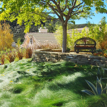
We began this project with the idea of making a friendly entryway and social area under the Mulberry tree which provides much needed shade in this hot, mountainous area. The 'red fescue' meadow grass has a cooling effect and the agaves reduce the need for excess water and maintenance.
The backyard has a covered dining area with a corner lounge and fireplace. The large barbecue offers a cantilevered counter for entertaining. The waterfall into the pool is surrounded with bamboo and plantings that emulate the hillside beyond the property. The permeable paving and mix of Vitex and Olive trees provide shade for smaller seating areas to enjoy the variety of succulents throughout the garden
 Che Interiors
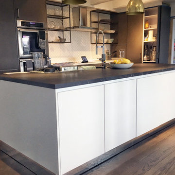
The client came to us looking for a remodeled kitchen and living space for their single-family home. They wanted to create a sleek, modern aesthetic with a touch of bling.
Built in the ‘70s, the home sits atop the San Rafael hills, giving it incredible views of the Bay. Our first priority: knock a few walls down to open the living space up to the dramatic landscape.
Then, we sourced a kitchen set that made bling feel like an understatement—frameless, umbra Siematic cabinets with golden bronze hardware, matching open glass shelves, mirrored toe kicks, and a glitter backsplash grout.
For further impact, we designed an island in a near-inverse color scheme—dark faux marble top, simple white walls, and a metallic border for a floating effect. Above this, we sourced distinctive glossy gold pendants that are hyper-modern but with a retro-influence.
Finally, we completed the space by consulting on and sourcing elegant dining furniture that echoed the design language established, including a large white table with a uniquely artful stand.
 Field Architecture
The architecture of the Karoo Wilderness Center is a result of a thorough process of investigation into the origins and character of the Karoo landscape and the flora and fauna that result from its particular qualities. The tectonic events that produced the specific topography of the site, trajectories of water runoff, wind movement, soil composition, and effects of plant and animal species on the landscape have converged to create the conditions of the site chosen for the Center. Each of these factors have in turn been subject to the impact of human inhabitation and vernacular building practices, amplified in recent generations to a harmful degree by shortsighted agricultural strategies and their associated effects of overgrazing, water over-manipulation and erosion.
Fundamental to the architectural response is the premise that the human species is an inherent part of the conditions that comprise and affect the landscape. The significance of the Center, enhanced and informed by the activities that occur within and as an extension of it, lies in the co-dependence of the Center and the ecosystem as inherently bound entities. The architecture of the Center is intended to make evident the natural processes of the Karoo and establish a new precedent for building within and through an ecosystem defined by dynamic flux.
 Domus Constructors, LLC.
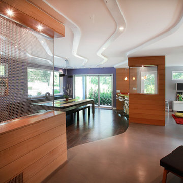
“Compelling.” That’s how one of our judges characterized this stair, which manages to embody both reassuring solidity and airy weightlessness. Architect Mahdad Saniee specified beefy maple treads—each laminated from two boards, to resist twisting and cupping—and supported them at the wall with hidden steel hangers. “We wanted to make them look like they are floating,” he says, “so they sit away from the wall by about half an inch.” The stainless steel rods that seem to pierce the treads’ opposite ends are, in fact, joined by threaded couplings hidden within the thickness of the wood. The result is an assembly whose stiffness underfoot defies expectation, Saniee says. “It feels very solid, much more solid than average stairs.” With the rods working in tension from above and compression below, “it’s very hard for those pieces of wood to move.”
The interplay of wood and steel makes abstract reference to a Steinway concert grand, Saniee notes. “It’s taking elements of a piano and playing with them.” A gently curved soffit in the ceiling reinforces the visual rhyme. The jury admired the effect but was equally impressed with the technical acumen required to achieve it. “The rhythm established by the vertical rods sets up a rigorous discipline that works with the intricacies of stair dimensions,” observed one judge. “That’s really hard to do.”
Sponsored
Sunbury, OH
J.Holderby - Renovations
Franklin County's Leading General Contractors - 2X Best of Houzz!
 INSPIRED KITCHEN DESIGN
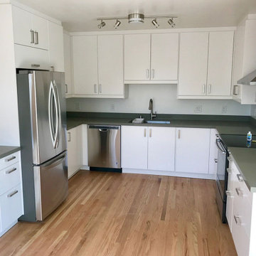
So after checking out online design sites like HOUZZ for examples of kitchen designs and researching the IKEA installation process, Justin decided that he needed IKD’s design services to make the kitchen work.
“Since we were remodeling our kitchen, it was really important for us to have someone assist with design who understood the flow of kitchens: where to place appliances, common practice for counter space, etc. There’s an art to a well balanced and organized room, especially when it comes to kitchens,” he says.
To that end, along with IKEA’s SEKTION cabinetry framework, Justin and his family selected IKEA VEDDINGE cabinetry in white along with IKEA MAXIMERA drawers, IKEA UTRUSTA door fronts and IKEA KASKER countertops in custom light gray with sleek concrete effect from Granite Expo.
The kitchen also features a clever IKEA hack of concealed storage using the IKEA VEDDINGE cabinetry retrofitted to conceal a washer-dryer combo set.
This creates a very clean, inviting look and establishes ample storage along the perimeter of the kitchen.
This look is complemented by a Whirlpool Front-Control Built-in Tall Tub Dishwasher in Monochromatic Stainless-Steel; a GE 30” Electric Range with Self-Cleaning Convection Oven in Stainless Steel and LG French Door Refrigerator in Stainless Steel, as well as light wood flooring and ample natural lighting.
And this was all accomplished within a budget of $20,000.
Justin concludes: “We love how light and spacious the kitchen feels. We also love the soft close cabinets and pantry.”

 Business_Name_Placeholder
?? 24/7 Support
⭐️ Top-Rated Service
? Fast Response
? Premium Quality
✈️◆► Telegram: @Pvatopzone
?◆► WhatsApp: +1 (579) 550-8030
?◆► Discord: accountservice
✈️◆► https://t.me/Pvatopzone
?◆► Email: Pvatopzone@gmail.com
 Skill Construction & Design, LLC
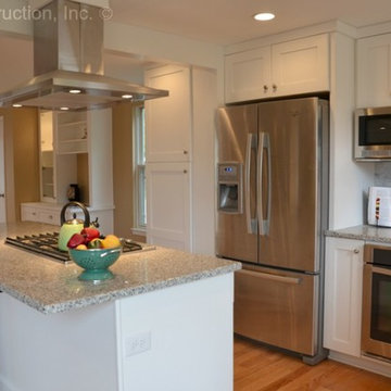
There are so many design elements to this kitchen, I almost don’t know where to start. Bright and airy with crisp clean white cabinets, the kitchen is open and welcoming. Still crisp but gently contrasting, the stainless steel appliance add depth amid the white. To keep this kitchen warm, natural oak covers the floors and a toasted wheat color washes the walls. And then there is the architectural elements. You know. That post and beam in the middle of the room. It’s the center of attention.
When you walk into a room your eyes roam around, establishing the size and shape of the room as your feet take you forward. From the front door of this home straight ahead you encountered this wall. The dining area to the right gives you a glimpse of things to come. Where there is a dining room you will usually find a kitchen.
The architecture of years gone by consistently hides the kitchen, the heart of the home, behind walls. I sympathize with my Mom, and all the other Moms, who have had to spend so much time tucked into a tight kitchen, away from the family. This wall had to go, but it was structural. We needed its support but not its bulk.
So we got rid of the bulk and only the bulk. Instead of a wall we have a post and beam, offering all of the structure we need. We could have installed a huge steel beam and reconfigure the joists to upset the beam, but why? The small beam and post add an incredible architectural element. It’s turning lemons into lemon, we simply made the most of what we had. It may be functional but it’s so fantastic. It looks like we created the effect just for the drama.
The original kitchen may have had a working triangle and some counter space, but it was fairly small, with each area only a step or two away. The dark cabinets made the space feel even smaller and the butcher block patterned laminate counter tops were very dated. The appliances were feeling their age as well, from a coil burner electric stove to a top freezer refrigerator. To keep this kitchen within its space, a half wall separated it from the dining area.
With the wall gone we borrowed some space from the living room and extended what was a U shaped kitchen into an L. At the living room window we start our new kitchen. We kept a small part of the wall to support the other end of our decorative beam. Sandwiched between a large pantry and our new French door refrigerator, the wall disappears. With our new open floor plan a sizable island was in order.
We split our cooking areas and installed a continuous grill gas cooktop into the island. A sleek island hood takes care of exhaust and adds an extra element to our architectural feature. Under the cooktop we added over-sized drawers for pots and pan storage. The frameless cabinets from New River Cabinetry are maple, painted white, with the Herndon door style. With the cooktop safely nestled into our island, we still had to add an oven.
We used the space where the old range sat for a large single oven of stainless steel and glass. If it worked for one, why not two? We created a home for a microwave in the wall cabinets. It’s perfect for heating leftovers so close to the refrigerator.
An important consideration for hot spots in your kitchen is landing zones. Each of our cooking areas have generous landing zones, one on each side of the cooktop and an entire counter area above or below the ovens, depending on which one you’re using.
We wanted to give the sink area more room so the half wall had to come out. We moved the trash and recycle cans into a cabinet, removed the heavy soffits and kept the sink under the window.
With that little bit of extra space we were able to add a larger cabinet above the dishwasher and slide it all down. This used to be where the carpeting met the vinyl floor, but all of it is gone. Long oak planks eliminate that final divide between the kitchen and the dining area, while adding visual length to the area. White wall cabinets on each side of the window reflect the sunlight for a brighter view.
With all of the darker cabinetry the backsplash walls had been painted white. Even still, there was a darkness in the corners and it wasn’t very exciting. We wanted to add visual interest and reflect the new under-cabinet lighting, eliminating the shadows in this corner.
With 1″x 2″ Arabescato Honed marble mosaics and those under-cabinet lights, we achieved the perfect balance. The marble has subtle swirls in gray and beige on a clean white background, but with the honed finish the light is softly reflected instead of glaring. For granite, we chose the soft gray tones of Luna Pearl. The speckles of gray and beige are a gentle contrast to the white cabinets and emulate the color of the stainless steel.
Between the carpet, red half wall, dark railing and dated light fixture, the dining area felt tired. Since the kitchen lacked sufficient storage, a large utility cabinet crowded the table space without adding any decorate elements.
Although it didn’t get any bigger, our dining area feels fresher and more open too. With the oak flooring joining the area to the rest of our space and the toasted wheat on the walls, the white table and chairs compliment the cabinetry while contrasting the warmer colors. We replaced the chandelier with recessed lighting and changed that railing too.
With our new open floor plan, we ended up with a fairly open area in between our foyer closet and the living room window. Not one to miss an opportunity, we filled the space with a multi-functional work space.
With the sunlight streaming in this bright corner works for anything this family needs.
There’s plenty of space for a chair under this large desk drawer. A closed cabinet below, glass doors above and lots of open shelving let you store and or showcase your belongings. We added a lite area at the top to keep away the darker corners.
The transformation is complete. This kitchen and all of its features are truly the center of attention in this home.
http://www.designsbyskill.com/
http://www.rjkconstructioninc.com/
 Sunspace Design, Inc.
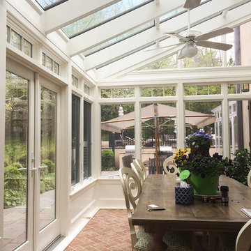
The clients approached us with the goal of enlarging the kitchen and dining area of their estate style home in the town of Weston, Massachusetts. It was critical that the space fit precisely into an existing corner of the home while tying into the stucco façade. The traditional style of the room was to include classic conservatory elements.
We achieved the desired look by utilizing large windows with a clerestory unit above. We also added crown moldings to the interior which established the classic style and feel the client sought. The room was fully opened to the adjacent space, thereby enlarging the grand kitchen and allowing a flood of natural light to enter the beautiful dining area.
Because the room was opened to the house (and effectively became part of the living area), we fully conditioned the space which allowed for a balance with the existing environment. The use of energy efficient windows and doors as well as high performance insulated glass added to the comfort. To transition from the interior to the exterior, we installed an outswing French door which allowed easy access to the lovely patio area just outside. The completed conservatory adds space, natural light, and a luxurious dining area to an already beautiful home.


 Stone Creations of Long Island Pavers & Masonry
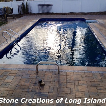
Based in Deer Park N. Y, Stone Creations of Long Island provides Masonry Home Improvements to customers throughout Long Island. Established in 2009 Stone Creations of Long Island's team has over 20 years experience in the Masonry and Concrete Business.
Helping customers to improve and update their homes, Stone Creations of Long Island provides residential and commercial work. With a desire to excel and a trained workforce, Stone Creations of Long Island provides cost-effective solutions to increase your property's value and safety.
Stone Creations of Long Island offers a variety of services to fit all your home exterior needs. Providing year-round services to keep your property safe and clean throughout the changing seasons. From driveways and masonry to powerwashing and paver sealing, Stone Creations of Long Island is the only company you need to call.
• Paving Stone Systems for Patios & Driveways
• Outdoor Cooking, Entertainment Design & Installations
• Complete Landscape Design & Services
Stone Creations of Long Island looks forward to hearing from you.
Call for a free estimate:
Paul Saladino
(631) 678-6896
(631) 404-5410
www.stonecreationsoflongisland.net
 Musso Design Group
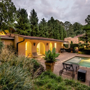
The garden accentuates and continues the central axis established by the alignment of the front and back doors of the house, which is key to classic villa design. The homeowners sought to establish a traditional villa garden, one that would be essentially an additional room and which would flow easily from the interior. The garden has a formal layout and uses classic boxwoods to establish the formality and expand on the existing walled courtyard, another feature of authentic villa gardens. Plant selections create a tapestry effect through the use of large blocks of various leaf shapes and foliage colors. Ferns and grasses chosen for ground cover offer the benefit of reduced maintenance. Taking inspiration from the name of the house, Villa Mira Flores, Musso and Cooke added blooming shrubs, trees and perennials including hydrangea, gardenia, crepe myrtle, clematis, iris, laurel and holly.

 Jackie and the Beanstalk
I planted Marvel of Four Season lettuce seeds, which are heat tolerant, directly next to the soaker hose so they stay constantly moist. Seeds must never be allowed to dry out. I will divide these seedlings in the next few weeks
5