
Search results for "Excessive value installment" in Home Design Ideas

 RAJ Kitchen and Bath, LLC
**Check out the video of this transformation on our website**
This small kitchen was way too small for this 2 bedrooms, 2 bathrooms apartment. Not only was it a very small kitchen, but the physical location of it made it very difficult to make it any bigger. There wasn't much that could have been done without incurring astronomical cost, which would get little or no return on the investment. The client wanted a kitchen that can be optimized in its current location to add a ton of value for resale.
This was difficult to do, because there was no moving of any mechanical around in the kitchen and even if we wanted to, the management of the building would not allow. For those of you who live in condos, co-ops or apartment building, you know how difficult it is to rework these foot prints. When we showed up, we saw the problems, but we also saw a huge opportunity where we can achieve those goals in the small space. This was accomplished by making some key changes and to incorporate some new things that was not possible when this kitchen was built years ago.
The crucial part of the design that would drive the entire new layout, was selecting the only appliance; that was the Refrigerator. Once we nailed down that refrigerator, we then proceeded to design the kitchen around it. We moved it to the other side of the wall where the sink was so that we can tap into the water line from the sink plumbing. It was crucial that it stays exactly 24" deep, not an inch more because we had to keep the entry as open as possible. Also, it was going to be directly in front of another big storage unit - The pantry. It is not ideal in most cases, but we needed the rest of the space to ramp up the design and open feel towards the side where all of the activities would take place, which happend to be the dining room and the view.
Once all that was figured out, we re-positioned the sink, dishwasher and the range and proceeded to wrap the cabinets around the columns to integrate them into the space. Thirty- six inches cabinets height was used so that they can be installed higher towards the ceiling height to give more room rather than the standard 18" required height between the counter tops. This was done to make the room feel a lot bigger than it really was. Not to mention, we also didn't want the faucet to be buried under the cabinets so that was also a necessary design detail for the space.
We then lowered both knee walls so that the counter top can sit on top of them, by removing that stop point that would have otherwise defined the kitchen area. This allowed us to pick up that extra footprint into the room for added prep space and enabled us to create the illusion of a kitchen that is looking longer than it really is. Every inch mattered when designing this kitchen and we made a conscious decision to use every one of that inch.
White cabinets were selected to do just what white cabinets are design to do; make a small or dark room appear bigger, brighter and more open. In this kitchen, this was amplified the more because of the kitchen location. It was perfect! We knew we did justice to the space because while we were there taking some photos, a few potential buyers walked in and went straight for the kitchen! They said its design just to fit the apartment.
Pantry roll out shelving, Double recycle bin, fancy handles, LED lighting, Quartz counter top, beautiful backslash tiles and grey linen floors finished off the kitchen which looked over a beautiful view of the George Washington Bridge from the top of this lovely 4th floor apartment.
Credit to Masterpiece Tile and Marble (Annmarie on the selection of Tiles and countertop and Val on the Construction to complete this project).
Davor Kokic Photography
 RAJ Kitchen and Bath, LLC
**Check out the video of this transformation on our website**
This small kitchen was way too small for this 2 bedrooms, 2 bathrooms apartment. Not only was it a very small kitchen, but the physical location of it made it very difficult to make it any bigger. There wasn't much that could have been done without incurring astronomical cost, which would get little or no return on the investment. The client wanted a kitchen that can be optimized in its current location to add a ton of value for resale.
This was difficult to do, because there was no moving of any mechanical around in the kitchen and even if we wanted to, the management of the building would not allow. For those of you who live in condos, co-ops or apartment building, you know how difficult it is to rework these foot prints. When we showed up, we saw the problems, but we also saw a huge opportunity where we can achieve those goals in the small space. This was accomplished by making some key changes and to incorporate some new things that was not possible when this kitchen was built years ago.
The crucial part of the design that would drive the entire new layout, was selecting the only appliance; that was the Refrigerator. Once we nailed down that refrigerator, we then proceeded to design the kitchen around it. We moved it to the other side of the wall where the sink was so that we can tap into the water line from the sink plumbing. It was crucial that it stays exactly 24" deep, not an inch more because we had to keep the entry as open as possible. Also, it was going to be directly in front of another big storage unit - The pantry. It is not ideal in most cases, but we needed the rest of the space to ramp up the design and open feel towards the side where all of the activities would take place, which happend to be the dining room and the view.
Once all that was figured out, we re-positioned the sink, dishwasher and the range and proceeded to wrap the cabinets around the columns to integrate them into the space. Thirty- six inches cabinets height was used so that they can be installed higher towards the ceiling height to give more room rather than the standard 18" required height between the counter tops. This was done to make the room feel a lot bigger than it really was. Not to mention, we also didn't want the faucet to be buried under the cabinets so that was also a necessary design detail for the space.
We then lowered both knee walls so that the counter top can sit on top of them, by removing that stop point that would have otherwise defined the kitchen area. This allowed us to pick up that extra footprint into the room for added prep space and enabled us to create the illusion of a kitchen that is looking longer than it really is. Every inch mattered when designing this kitchen and we made a conscious decision to use every one of that inch.
White cabinets were selected to do just what white cabinets are design to do; make a small or dark room appear bigger, brighter and more open. In this kitchen, this was amplified the more because of the kitchen location. It was perfect! We knew we did justice to the space because while we were there taking some photos, a few potential buyers walked in and went straight for the kitchen! They said its design just to fit the apartment.
Pantry roll out shelving, Double recycle bin, fancy handles, LED lighting, Quartz counter top, beautiful backslash tiles and grey linen floors finished off the kitchen which looked over a beautiful view of the George Washington Bridge from the top of this lovely 4th floor apartment.
Credit to Masterpiece Tile and Marble (Annmarie on the selection of Tiles and countertop and Val on the Construction to complete this project).
Davor Kokic Photography
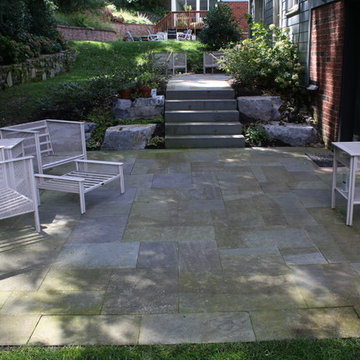
 Pennsylvania Landscape & Nursery Association
Terren Landscapes http://www.terrenlandscapes.com
2014 PLNA Awards for Landscape Excellence Winner
Category: Residential $60,000-$120,000
Award Level: Silver
Project Description:
We were contracted by the family to create a master plan for the property. They
were experiencing extreme drainage and erosion problems due to the surrounding properties’
drastic grade changes. Erosion had caused the rear lawn to sink in various areas and the existing
rear patio spaces were failing. The client wanted to rebuild their patios and walkways, repave
their driveway and give their home more visual appeal. Most importantly, they wanted an
environmentally friendly solution.
Our design solution was to create a rain garden that would slow storm water runoff, allow
for percolation, and promote infiltration, while permitting excess clean water to enter the storm
drain at the street with slower velocity. The rain garden acts as a temporary holding space that
allows the earth to slowly absorb water, rather than overwhelm the nearby storm drain. Our first
objective was to conduct a percolation test to determine the amount of clay soil that needed to be
removed before reaching the sandy loam layer. A percolation test and storm water calculations
were generated to accommodate a 1” rain event. Based on our calculations and the small size of
the property, we determined a depth of 18” was necessary for optimal holding capacity. We
removed 18” of clay soil until a layer of sandy loam was encountered. Next, the soil was amended
with compost and sand to create a highly porous planting media for the basin of the garden. We
piped the three existing rear downspouts to the rain garden area to capture for infiltration and
alleviate runoff throughout the rear lawn and patio space. We installed an 18” wide over-flow
standpipe at a 24” depth into the ground that outlets to a stone swale that carries the water to the
property edge. As an added means of holding the maximum amount of water, we designed the
standpipe to sit 14” above grade. The height of this standpipe allows this rain garden to capture
14” of water before reaching the overflow capacity. We placed geotextile fabric to help reduce
migration of the stones into the soil and aid in the prevention of weeds and erosion. We heavily
planted the rain garden to further aid in absorption and to attract local wildlife. A native plant
palette of butterfly weed, Panicum, Joe-Pye weed, and asters form a colorful backdrop while the
basin was filled with obligate wetland plants such as royal ferns, irises and cardinal flowers. The
upper edges in the foreground are planted with Echinacea, Rudbeckia and Monarda, satisfying
the local bird community and adding bright seasonal colors. This garden effectively collects and
cleanses rainwater while creating a habitat for birds, frogs, and butterflies.
Our next challenge was to redesign the existing patios and walkways without increasing
impervious surfaces. According to township regulations this property was currently at its
maximum capacity, therefore we designed the front and rear patios with a slightly smaller
footprint to decrease their existing impervious surfaces.
New planting beds were designed throughout the entire property. Plants were chosen that
were tolerant of specific site conditions. For the rear yard, we choose a backdrop of witch hazel
and hollies to provide an evergreen screen as well as early spring color. We placed hydrangea
throughout to add summer color. We planted ostrich fern under the existing spruce tree to create
a lush floor. This area became an additional backdrop for the rain garden as well as a screen for
the neighboring property. We choose a combination of ‘Blue Star’ juniper and creeping jenny to
soften the existing rear wall with creepers. Around the rear patio areas we choose a combination
of Liatris, Rudbeckia and ‘Lo and Behold’ butterfly bush. This combination of plants works in
harmony with the rain garden and attracts additional butterflies.
For the front of the property we worked with an existing Japanese maple that provided
dense shade. We choose a shade-tolerant combination of Heuchera, Astilbe, ferns and hostas for
this area. We added more hydrangeas to the front foundation of the house to provide lush
layering of plant material and visual interest with additional summer blooms.
Overall, we were able to exceed the client’s needs and expectations in transforming their
property into a colorful paradise that attracts wildlife from season to season. The plant palette
provides seasonal interest and the rain garden has successfully decreased storm water runoff.
The new hardscape surfaces were designed and built with a slightly smaller footprint to decrease
impervious surfaces. This project is a positive example of how all properties, regardless of size,
can make an ecological difference by decreasing impervious surfaces and maintaining proper
storm water management.
Photo Credit:
Terren Landscapes
Find the right local pro for your project
 RAJ Kitchen and Bath, LLC
**Check out the video of this transformation on our website**
This small kitchen was way too small for this 2 bedrooms, 2 bathrooms apartment. Not only was it a very small kitchen, but the physical location of it made it very difficult to make it any bigger. There wasn't much that could have been done without incurring astronomical cost, which would get little or no return on the investment. The client wanted a kitchen that can be optimized in its current location to add a ton of value for resale.
This was difficult to do, because there was no moving of any mechanical around in the kitchen and even if we wanted to, the management of the building would not allow. For those of you who live in condos, co-ops or apartment building, you know how difficult it is to rework these foot prints. When we showed up, we saw the problems, but we also saw a huge opportunity where we can achieve those goals in the small space. This was accomplished by making some key changes and to incorporate some new things that was not possible when this kitchen was built years ago.
The crucial part of the design that would drive the entire new layout, was selecting the only appliance; that was the Refrigerator. Once we nailed down that refrigerator, we then proceeded to design the kitchen around it. We moved it to the other side of the wall where the sink was so that we can tap into the water line from the sink plumbing. It was crucial that it stays exactly 24" deep, not an inch more because we had to keep the entry as open as possible. Also, it was going to be directly in front of another big storage unit - The pantry. It is not ideal in most cases, but we needed the rest of the space to ramp up the design and open feel towards the side where all of the activities would take place, which happend to be the dining room and the view.
Once all that was figured out, we re-positioned the sink, dishwasher and the range and proceeded to wrap the cabinets around the columns to integrate them into the space. Thirty- six inches cabinets height was used so that they can be installed higher towards the ceiling height to give more room rather than the standard 18" required height between the counter tops. This was done to make the room feel a lot bigger than it really was. Not to mention, we also didn't want the faucet to be buried under the cabinets so that was also a necessary design detail for the space.
We then lowered both knee walls so that the counter top can sit on top of them, by removing that stop point that would have otherwise defined the kitchen area. This allowed us to pick up that extra footprint into the room for added prep space and enabled us to create the illusion of a kitchen that is looking longer than it really is. Every inch mattered when designing this kitchen and we made a conscious decision to use every one of that inch.
White cabinets were selected to do just what white cabinets are design to do; make a small or dark room appear bigger, brighter and more open. In this kitchen, this was amplified the more because of the kitchen location. It was perfect! We knew we did justice to the space because while we were there taking some photos, a few potential buyers walked in and went straight for the kitchen! They said its design just to fit the apartment.
Pantry roll out shelving, Double recycle bin, fancy handles, LED lighting, Quartz counter top, beautiful backslash tiles and grey linen floors finished off the kitchen which looked over a beautiful view of the George Washington Bridge from the top of this lovely 4th floor apartment.
Credit to Masterpiece Tile and Marble (Annmarie on the selection of Tiles and countertop and Val on the Construction to complete this project).
Davor Kokic Photography
 RAJ Kitchen and Bath, LLC
**Check out the video of this transformation on our website**
This small kitchen was way too small for this 2 bedrooms, 2 bathrooms apartment. Not only was it a very small kitchen, but the physical location of it made it very difficult to make it any bigger. There wasn't much that could have been done without incurring astronomical cost, which would get little or no return on the investment. The client wanted a kitchen that can be optimized in its current location to add a ton of value for resale.
This was difficult to do, because there was no moving of any mechanical around in the kitchen and even if we wanted to, the management of the building would not allow. For those of you who live in condos, co-ops or apartment building, you know how difficult it is to rework these foot prints. When we showed up, we saw the problems, but we also saw a huge opportunity where we can achieve those goals in the small space. This was accomplished by making some key changes and to incorporate some new things that was not possible when this kitchen was built years ago.
The crucial part of the design that would drive the entire new layout, was selecting the only appliance; that was the Refrigerator. Once we nailed down that refrigerator, we then proceeded to design the kitchen around it. We moved it to the other side of the wall where the sink was so that we can tap into the water line from the sink plumbing. It was crucial that it stays exactly 24" deep, not an inch more because we had to keep the entry as open as possible. Also, it was going to be directly in front of another big storage unit - The pantry. It is not ideal in most cases, but we needed the rest of the space to ramp up the design and open feel towards the side where all of the activities would take place, which happend to be the dining room and the view.
Once all that was figured out, we re-positioned the sink, dishwasher and the range and proceeded to wrap the cabinets around the columns to integrate them into the space. Thirty- six inches cabinets height was used so that they can be installed higher towards the ceiling height to give more room rather than the standard 18" required height between the counter tops. This was done to make the room feel a lot bigger than it really was. Not to mention, we also didn't want the faucet to be buried under the cabinets so that was also a necessary design detail for the space.
We then lowered both knee walls so that the counter top can sit on top of them, by removing that stop point that would have otherwise defined the kitchen area. This allowed us to pick up that extra footprint into the room for added prep space and enabled us to create the illusion of a kitchen that is looking longer than it really is. Every inch mattered when designing this kitchen and we made a conscious decision to use every one of that inch.
White cabinets were selected to do just what white cabinets are design to do; make a small or dark room appear bigger, brighter and more open. In this kitchen, this was amplified the more because of the kitchen location. It was perfect! We knew we did justice to the space because while we were there taking some photos, a few potential buyers walked in and went straight for the kitchen! They said its design just to fit the apartment.
Pantry roll out shelving, Double recycle bin, fancy handles, LED lighting, Quartz counter top, beautiful backslash tiles and grey linen floors finished off the kitchen which looked over a beautiful view of the George Washington Bridge from the top of this lovely 4th floor apartment.
Credit to Masterpiece Tile and Marble (Annmarie on the selection of Tiles and countertop and Val on the Construction to complete this project).
Davor Kokic Photography


 InnovationLand
This Houston kitchen remodel and whole-house redesign was nothing less than a time machine – zooming a 40-year-old living space into 2017!
“The kitchen had formica countertops, old wood cabinets, a strange layout and low ceilings,” says Lisha Maxey, lead designer for Outdoor Homescapes of Houston and owner of LGH Design Services. “We basically took it down to the studs to create the new space. It even had original terrazzo tile in the foyer! Almost never see that anymore.”
The new look is all 2017, starting with a pure white maple wood for the new kitchen cabinetry and a 13-foot butcher block island. The china hutch, beam and columns are walnut.
The small kitchen countertop (on fridge side) is Corian. The flooring is solid hickory with a natural stain. The backsplash is Moroccan blue glass.
In the island, Outdoor Homescapes added a small, stainless steel prep sink and a large porcelain sink. All finishes are brushed stainless steel except for the pot filler, which is copper.
“The look is very transitional, with a hearty mix of antiques the client wanted incorporated and the contemporary open concept look of today,” says Lisha. “The bar stools are actually reclaimed science class stools that my client picked up at a local fair. It was an awesome find!”
In addition to the kitchen, the home’s first-floor half bath, living room and den also got an update.
Outdoor Homescapes also built storage into the space under the stairs and warmed up the entry with custom blue and beige wallpaper.
“In the half bath, we used the client’s favorite color, orange,” says Lisha. “We added a vessel bowl that was also found at a fair and an antique chandelier to top it off.”
The paint in that room was textured by running a dry brush vertically while the paint was still wet. “It appears to be wallpaper, but not!” explains Lisha. Outdoor Homescapes also used black/white custom tiles in the bath and laundry room to tie it all in.
Lisha used antique pieces in the laundry room with a custom black/white porcelain floor. To open up the wall between the old kitchen and living room, we had to install a 26’ steel I-beam to support the second floor. It was an engineering feat! Took six men to get it into place!
“The client – an empty nester couple – had already done their upstairs remodel and they knew the first floor would be a gut-out,” continues Lisha. “The home was in very poor condition prior to the remodel, and everything needed to go. Basically, wife told husband, we either do this remodel or we sell the house. And Mr. inherited it from his Mom, so it has sentimental value to him.”
Lisha loves how original it turned out, noting the refreshing department from the usual all-white kitchen with black/white flooring, Carrera marble or granite countertops and subway tile. “The clients were open to mixing up styles and working with me to make it come together,” she says. “I think there’s a new excitement in mixing the decades and finding a way to allow clients to hold on to treasured antiques or special pieces while incorporating them in a more modern space.
Her favorite area is the large island.
“I love that they will spend holidays and regular days around that space,” she says. “It’s just so welcoming!”
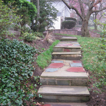 Pennsylvania Landscape & Nursery Association
Terren Landscapes http://www.terrenlandscapes.com
2014 PLNA Awards for Landscape Excellence Winner
Category: Residential $60,000-$120,000
Award Level: Silver
Project Description:
We were contracted by the family to create a master plan for the property. They
were experiencing extreme drainage and erosion problems due to the surrounding properties’
drastic grade changes. Erosion had caused the rear lawn to sink in various areas and the existing
rear patio spaces were failing. The client wanted to rebuild their patios and walkways, repave
their driveway and give their home more visual appeal. Most importantly, they wanted an
environmentally friendly solution.
Our design solution was to create a rain garden that would slow storm water runoff, allow
for percolation, and promote infiltration, while permitting excess clean water to enter the storm
drain at the street with slower velocity. The rain garden acts as a temporary holding space that
allows the earth to slowly absorb water, rather than overwhelm the nearby storm drain. Our first
objective was to conduct a percolation test to determine the amount of clay soil that needed to be
removed before reaching the sandy loam layer. A percolation test and storm water calculations
were generated to accommodate a 1” rain event. Based on our calculations and the small size of
the property, we determined a depth of 18” was necessary for optimal holding capacity. We
removed 18” of clay soil until a layer of sandy loam was encountered. Next, the soil was amended
with compost and sand to create a highly porous planting media for the basin of the garden. We
piped the three existing rear downspouts to the rain garden area to capture for infiltration and
alleviate runoff throughout the rear lawn and patio space. We installed an 18” wide over-flow
standpipe at a 24” depth into the ground that outlets to a stone swale that carries the water to the
property edge. As an added means of holding the maximum amount of water, we designed the
standpipe to sit 14” above grade. The height of this standpipe allows this rain garden to capture
14” of water before reaching the overflow capacity. We placed geotextile fabric to help reduce
migration of the stones into the soil and aid in the prevention of weeds and erosion. We heavily
planted the rain garden to further aid in absorption and to attract local wildlife. A native plant
palette of butterfly weed, Panicum, Joe-Pye weed, and asters form a colorful backdrop while the
basin was filled with obligate wetland plants such as royal ferns, irises and cardinal flowers. The
upper edges in the foreground are planted with Echinacea, Rudbeckia and Monarda, satisfying
the local bird community and adding bright seasonal colors. This garden effectively collects and
cleanses rainwater while creating a habitat for birds, frogs, and butterflies.
Our next challenge was to redesign the existing patios and walkways without increasing
impervious surfaces. According to township regulations this property was currently at its
maximum capacity, therefore we designed the front and rear patios with a slightly smaller
footprint to decrease their existing impervious surfaces.
New planting beds were designed throughout the entire property. Plants were chosen that
were tolerant of specific site conditions. For the rear yard, we choose a backdrop of witch hazel
and hollies to provide an evergreen screen as well as early spring color. We placed hydrangea
throughout to add summer color. We planted ostrich fern under the existing spruce tree to create
a lush floor. This area became an additional backdrop for the rain garden as well as a screen for
the neighboring property. We choose a combination of ‘Blue Star’ juniper and creeping jenny to
soften the existing rear wall with creepers. Around the rear patio areas we choose a combination
of Liatris, Rudbeckia and ‘Lo and Behold’ butterfly bush. This combination of plants works in
harmony with the rain garden and attracts additional butterflies.
For the front of the property we worked with an existing Japanese maple that provided
dense shade. We choose a shade-tolerant combination of Heuchera, Astilbe, ferns and hostas for
this area. We added more hydrangeas to the front foundation of the house to provide lush
layering of plant material and visual interest with additional summer blooms.
Overall, we were able to exceed the client’s needs and expectations in transforming their
property into a colorful paradise that attracts wildlife from season to season. The plant palette
provides seasonal interest and the rain garden has successfully decreased storm water runoff.
The new hardscape surfaces were designed and built with a slightly smaller footprint to decrease
impervious surfaces. This project is a positive example of how all properties, regardless of size,
can make an ecological difference by decreasing impervious surfaces and maintaining proper
storm water management.
Photo Credit:
Terren Landscapes

 Teakwoodcentral
Light fixture with direct emission, with fluorescent sources
• Available with base or fixed support (pivot) made up of mass-coloured concrete
• Diffuser in mass-pigmented polypropylene, screen in light-diffusing silkscreened methacrylate, reflector in painted aluminum
• Mobile-arm structure in extruded EN-AW-6060 aluminum with bright anodizing treat¬ment
• Polished-painted articulations in die-cast EN-AB 46100 aluminum
• Adjustment system in AISI 316 stainless steel
• Silicone seal gaskets
• Suitable for watertight connection
• Electronic ballast
• c.UL.us listed
Lead time: 2 - 4 weeks
Lamping explanation:
INC = incandescent FLU = fluorescent HAL = 120V halogen LV HAL = 12V halogen
MH = metal halide SBF = self-ballasted fluorescent LED = light emitting diode
All lamps are included with the fixtures
Artemide's design and research team focuses on developing quality and long-lasting products.
Utilization of recyclable materials is high priority in our process of conceiving new design.
80% of our lights are energy efficient fluorescent or LED lighting.
But what's more green than having a beautifully crafted light that continues to function well and looks stunning decades from now
The Artemide light has never been solely a function of seeing, or an opportunity for formal experimentation with lamps as objects. For more than forty years, Artemide has aimed to propose light as a companion to people, as a source of physical pleasure and mental comfort. Artemide has done so, with different work groups, searching through the whole design process, starting with a declaration of values - The human light.
Beyond the definition, the human light is intelligent light. A light that knows it has to relate to people, accompanying them in their daily activities. That is why Artemide's attention today is concentrated on the concept of the context of life, understood as a specific microenvironment in which an event occurs where one or more persons are the protagonist, every context of life can be associated with different light contexts, or the different atmospheres of light characterized by the activities that, at various moments of the day, have us as protagonists, starting from these contexts and the lighting conditions that characterize them, Artemide proposes products capable of meeting people's multiple needs and offering the light performance characteristics most suited to each moment of life, it is light that is flexible and adaptable, which produces the optimum visual precision, and consumes the minimum environmental resources, it is Artemide light.
The Artemide group, founded by Ernesto Gismondi in 1959, today operates throughout the world, with 16 subsidiaries and affiliated companies, and 35 exclusive distributors. They have production centers in Italy, France, Germany, the USA, Hungary and the Czech Republic. In a policy aimed at satisfying all lighting needs, the Artemide group has recently acquired companies that reinforce its position as a world leader and further diversifies the offerings. For contexts of life, Artemide offers not only lamps for moments of relaxation at home, but also large sophisticated installations for lighting public and private professional activities.
Technological and productive expertise is achieved through research and development centers, with the product planning and engineering section, laboratories for technical conformity and self-certification tests, and production units equipped with avant-garde processes. A production structure that can offer expertise in the processing of traditional materials such as glass, as well as the capacity for innovation with recently introduced materials such as titanium. Lighting performance characteristics extend from a light with atmosphere, variable, colored, to the most precise of lights for community environments. The vast range of options reflects the commitment of the whole organization to provide a product guaranteed by the Artemide brand, throughout the world, with an image that is strong and consistent - That of a leader in the lighting industry.
Rezek, an Artemide brand, with product development and manufacturing in the United States. Founded by designer Ron Rezek in 1978, the Rezek company has gained strong recognition and appreciation among the architectural and interior design community for the distinctly creative design and quality construction of its American made lighting products for residential and commercial applications.
 InnovationLand
This Houston kitchen remodel and whole-house redesign was nothing less than a time machine – zooming a 40-year-old living space into 2017!
“The kitchen had formica countertops, old wood cabinets, a strange layout and low ceilings,” says Lisha Maxey, lead designer for Outdoor Homescapes of Houston and owner of LGH Design Services. “We basically took it down to the studs to create the new space. It even had original terrazzo tile in the foyer! Almost never see that anymore.”
The new look is all 2017, starting with a pure white maple wood for the new kitchen cabinetry and a 13-foot butcher block island. The china hutch, beam and columns are walnut.
The small kitchen countertop (on fridge side) is Corian. The flooring is solid hickory with a natural stain. The backsplash is Moroccan blue glass.
In the island, Outdoor Homescapes added a small, stainless steel prep sink and a large porcelain sink. All finishes are brushed stainless steel except for the pot filler, which is copper.
“The look is very transitional, with a hearty mix of antiques the client wanted incorporated and the contemporary open concept look of today,” says Lisha. “The bar stools are actually reclaimed science class stools that my client picked up at a local fair. It was an awesome find!”
In addition to the kitchen, the home’s first-floor half bath, living room and den also got an update.
Outdoor Homescapes also built storage into the space under the stairs and warmed up the entry with custom blue and beige wallpaper.
“In the half bath, we used the client’s favorite color, orange,” says Lisha. “We added a vessel bowl that was also found at a fair and an antique chandelier to top it off.”
The paint in that room was textured by running a dry brush vertically while the paint was still wet. “It appears to be wallpaper, but not!” explains Lisha. Outdoor Homescapes also used black/white custom tiles in the bath and laundry room to tie it all in.
Lisha used antique pieces in the laundry room with a custom black/white porcelain floor. To open up the wall between the old kitchen and living room, we had to install a 26’ steel I-beam to support the second floor. It was an engineering feat! Took six men to get it into place!
“The client – an empty nester couple – had already done their upstairs remodel and they knew the first floor would be a gut-out,” continues Lisha. “The home was in very poor condition prior to the remodel, and everything needed to go. Basically, wife told husband, we either do this remodel or we sell the house. And Mr. inherited it from his Mom, so it has sentimental value to him.”
Lisha loves how original it turned out, noting the refreshing department from the usual all-white kitchen with black/white flooring, Carrera marble or granite countertops and subway tile. “The clients were open to mixing up styles and working with me to make it come together,” she says. “I think there’s a new excitement in mixing the decades and finding a way to allow clients to hold on to treasured antiques or special pieces while incorporating them in a more modern space.
Her favorite area is the large island.
“I love that they will spend holidays and regular days around that space,” she says. “It’s just so welcoming!”


 InnovationLand
This Houston kitchen remodel and whole-house redesign was nothing less than a time machine – zooming a 40-year-old living space into 2017!
“The kitchen had formica countertops, old wood cabinets, a strange layout and low ceilings,” says Lisha Maxey, lead designer for Outdoor Homescapes of Houston and owner of LGH Design Services. “We basically took it down to the studs to create the new space. It even had original terrazzo tile in the foyer! Almost never see that anymore.”
The new look is all 2017, starting with a pure white maple wood for the new kitchen cabinetry and a 13-foot butcher block island. The china hutch, beam and columns are walnut.
The small kitchen countertop (on fridge side) is Corian. The flooring is solid hickory with a natural stain. The backsplash is Moroccan blue glass.
In the island, Outdoor Homescapes added a small, stainless steel prep sink and a large porcelain sink. All finishes are brushed stainless steel except for the pot filler, which is copper.
“The look is very transitional, with a hearty mix of antiques the client wanted incorporated and the contemporary open concept look of today,” says Lisha. “The bar stools are actually reclaimed science class stools that my client picked up at a local fair. It was an awesome find!”
In addition to the kitchen, the home’s first-floor half bath, living room and den also got an update.
Outdoor Homescapes also built storage into the space under the stairs and warmed up the entry with custom blue and beige wallpaper.
“In the half bath, we used the client’s favorite color, orange,” says Lisha. “We added a vessel bowl that was also found at a fair and an antique chandelier to top it off.”
The paint in that room was textured by running a dry brush vertically while the paint was still wet. “It appears to be wallpaper, but not!” explains Lisha. Outdoor Homescapes also used black/white custom tiles in the bath and laundry room to tie it all in.
Lisha used antique pieces in the laundry room with a custom black/white porcelain floor. To open up the wall between the old kitchen and living room, we had to install a 26’ steel I-beam to support the second floor. It was an engineering feat! Took six men to get it into place!
“The client – an empty nester couple – had already done their upstairs remodel and they knew the first floor would be a gut-out,” continues Lisha. “The home was in very poor condition prior to the remodel, and everything needed to go. Basically, wife told husband, we either do this remodel or we sell the house. And Mr. inherited it from his Mom, so it has sentimental value to him.”
Lisha loves how original it turned out, noting the refreshing department from the usual all-white kitchen with black/white flooring, Carrera marble or granite countertops and subway tile. “The clients were open to mixing up styles and working with me to make it come together,” she says. “I think there’s a new excitement in mixing the decades and finding a way to allow clients to hold on to treasured antiques or special pieces while incorporating them in a more modern space.
Her favorite area is the large island.
“I love that they will spend holidays and regular days around that space,” she says. “It’s just so welcoming!”
 RAJ Kitchen and Bath, LLC
**Check out the video of this transformation on our website**
This small kitchen was way too small for this 2 bedrooms, 2 bathrooms apartment. Not only was it a very small kitchen, but the physical location of it made it very difficult to make it any bigger. There wasn't much that could have been done without incurring astronomical cost, which would get little or no return on the investment. The client wanted a kitchen that can be optimized in its current location to add a ton of value for resale.
This was difficult to do, because there was no moving of any mechanical around in the kitchen and even if we wanted to, the management of the building would not allow. For those of you who live in condos, co-ops or apartment building, you know how difficult it is to rework these foot prints. When we showed up, we saw the problems, but we also saw a huge opportunity where we can achieve those goals in the small space. This was accomplished by making some key changes and to incorporate some new things that was not possible when this kitchen was built years ago.
The crucial part of the design that would drive the entire new layout, was selecting the only appliance; that was the Refrigerator. Once we nailed down that refrigerator, we then proceeded to design the kitchen around it. We moved it to the other side of the wall where the sink was so that we can tap into the water line from the sink plumbing. It was crucial that it stays exactly 24" deep, not an inch more because we had to keep the entry as open as possible. Also, it was going to be directly in front of another big storage unit - The pantry. It is not ideal in most cases, but we needed the rest of the space to ramp up the design and open feel towards the side where all of the activities would take place, which happend to be the dining room and the view.
Once all that was figured out, we re-positioned the sink, dishwasher and the range and proceeded to wrap the cabinets around the columns to integrate them into the space. Thirty- six inches cabinets height was used so that they can be installed higher towards the ceiling height to give more room rather than the standard 18" required height between the counter tops. This was done to make the room feel a lot bigger than it really was. Not to mention, we also didn't want the faucet to be buried under the cabinets so that was also a necessary design detail for the space.
We then lowered both knee walls so that the counter top can sit on top of them, by removing that stop point that would have otherwise defined the kitchen area. This allowed us to pick up that extra footprint into the room for added prep space and enabled us to create the illusion of a kitchen that is looking longer than it really is. Every inch mattered when designing this kitchen and we made a conscious decision to use every one of that inch.
White cabinets were selected to do just what white cabinets are design to do; make a small or dark room appear bigger, brighter and more open. In this kitchen, this was amplified the more because of the kitchen location. It was perfect! We knew we did justice to the space because while we were there taking some photos, a few potential buyers walked in and went straight for the kitchen! They said its design just to fit the apartment.
Pantry roll out shelving, Double recycle bin, fancy handles, LED lighting, Quartz counter top, beautiful backslash tiles and grey linen floors finished off the kitchen which looked over a beautiful view of the George Washington Bridge from the top of this lovely 4th floor apartment.
Credit to Masterpiece Tile and Marble (Annmarie on the selection of Tiles and countertop and Val on the Construction to complete this project).
Davor Kokic Photography

 Natural Stone Institute
Tucker Design Awards celebrate the innovation and vision that designers bring to their projects through the specification and use of natural stone materials. For members of the Natural Stone Institute, acknowledgement as a contributor to a Tucker Design Awards winning project is a genuine tribute to their traditional values, physicality of work and dedication to precise specifications required in the realization of such accomplished architectural design.
Landscape Architect
Design Workshop, Aspen, CO
Architect
Poss Architecture, Aspen, CO
Landscape Contractor
Landscape Workshop, Carbondale, CO
Stone Supplier/Installer
Gallegos Corporation, Wolcott, CO
Stone Quarry
Arkins Park Stone, Loveland, CO
Within walled boundaries, Woody Creek Garden embraces its high alpine environment through explorations of stone and water that serve as unifying elements of form in the design of the various outdoor spaces. Through striking and distinctively detailed stonework, water is portrayed in its various states and forms – atmospheric mist, single rivulets, cascades, and still pools. Two courtyards interlink the residence allowing each room to enjoy the visual landscape. In the entrance courtyard, the sound from a carved 24”x 24” cut-granite fountain reverberates throughout the walled space. Placed for gathering and quiet contemplation, a pin-wheel arrangement of sculptural, granite slabs provide a honed surface for sitting while providing year-round interest. Each stone was individually specified with intentionally spaced core fractures, utilizing the extraction method to serve as sculpted details. Large sandstone pavers, set in sand and cut in an irregular, but geometric fashion bring a sense of modernity to the space. Throughout the property, stone detailing seek to heighten one’s experience of the landscape and views. Upon the home’s entry, an 18” rectilinear cut in the freestanding stone wall frames a distant peak, creating a singular reference to the outside world in this encased space. Emerging from the center of an organically-shaped carved sandstone slab, water is carried along a narrow 2” runnel sandstone cap, disappearing into the framed horizon. This glimpse to the west is the only opening in the tightly enclosed courtyard. From its opposite aspect, the feature creates a welcoming gesture at the home’s front entrance. The slender rivulet of water trickles from the sandstone slab above onto a honed granite plane, set within a sandstone terrace In contrast, a second promontory courtyard commands a strong presence over its alpine setting, leaving the steeply sloping site undisturbed. A 12’x 40’ reflecting pool – a thin sheet of water over honed black granite – captures the form and silence of the everchanging natural environment on its taut surface. Along its edge, water flows over a ½” radius edge, disappearing into a recirculating slot. Commissioned by Italian artist Bruno Romeda, a bronze sculpture rests upon an elevated granite plinth. Along its western edge, designers crafted a two-tiered, infinity edge detail. In the first vertical drop, water flows between the pool and perimeter stone walls, landing onto an intermediate bench, while the second drop introduces a chamfered edge, allowing water to embrace the vertical relief without splashing. Sandstone terraces provide continuous access to the various landscape features of the garden. At the base of the battered perimeter walls, a sandstone path leads to a fire pit, encircled by lichen-covered boulders. Along the courtyard’s eastern perimeter, water appears to emerge from the hillside, fracturing and falling against the irregular vertical stone wall, melting in a curtain-like formation behind the spa. The colors, distinctive detailing and striking stonework were selected based on their appropriateness to the context. From above, a rectilinear pool lies behind the wall, silently mirroring the sky above and offering no ostensible connection to the structure or to its source.
 RAJ Kitchen and Bath, LLC
**Check out the video of this transformation on our website**
This small kitchen was way too small for this 2 bedrooms, 2 bathrooms apartment. Not only was it a very small kitchen, but the physical location of it made it very difficult to make it any bigger. There wasn't much that could have been done without incurring astronomical cost, which would get little or no return on the investment. The client wanted a kitchen that can be optimized in its current location to add a ton of value for resale.
This was difficult to do, because there was no moving of any mechanical around in the kitchen and even if we wanted to, the management of the building would not allow. For those of you who live in condos, co-ops or apartment building, you know how difficult it is to rework these foot prints. When we showed up, we saw the problems, but we also saw a huge opportunity where we can achieve those goals in the small space. This was accomplished by making some key changes and to incorporate some new things that was not possible when this kitchen was built years ago.
The crucial part of the design that would drive the entire new layout, was selecting the only appliance; that was the Refrigerator. Once we nailed down that refrigerator, we then proceeded to design the kitchen around it. We moved it to the other side of the wall where the sink was so that we can tap into the water line from the sink plumbing. It was crucial that it stays exactly 24" deep, not an inch more because we had to keep the entry as open as possible. Also, it was going to be directly in front of another big storage unit - The pantry. It is not ideal in most cases, but we needed the rest of the space to ramp up the design and open feel towards the side where all of the activities would take place, which happend to be the dining room and the view.
Once all that was figured out, we re-positioned the sink, dishwasher and the range and proceeded to wrap the cabinets around the columns to integrate them into the space. Thirty- six inches cabinets height was used so that they can be installed higher towards the ceiling height to give more room rather than the standard 18" required height between the counter tops. This was done to make the room feel a lot bigger than it really was. Not to mention, we also didn't want the faucet to be buried under the cabinets so that was also a necessary design detail for the space.
We then lowered both knee walls so that the counter top can sit on top of them, by removing that stop point that would have otherwise defined the kitchen area. This allowed us to pick up that extra footprint into the room for added prep space and enabled us to create the illusion of a kitchen that is looking longer than it really is. Every inch mattered when designing this kitchen and we made a conscious decision to use every one of that inch.
White cabinets were selected to do just what white cabinets are design to do; make a small or dark room appear bigger, brighter and more open. In this kitchen, this was amplified the more because of the kitchen location. It was perfect! We knew we did justice to the space because while we were there taking some photos, a few potential buyers walked in and went straight for the kitchen! They said its design just to fit the apartment.
Pantry roll out shelving, Double recycle bin, fancy handles, LED lighting, Quartz counter top, beautiful backslash tiles and grey linen floors finished off the kitchen which looked over a beautiful view of the George Washington Bridge from the top of this lovely 4th floor apartment.
Credit to Masterpiece Tile and Marble (Annmarie on the selection of Tiles and countertop and Val on the Construction to complete this project).
Davor Kokic Photography
 RAJ Kitchen and Bath, LLC
**Check out the video of this transformation on our website**
This small kitchen was way too small for this 2 bedrooms, 2 bathrooms apartment. Not only was it a very small kitchen, but the physical location of it made it very difficult to make it any bigger. There wasn't much that could have been done without incurring astronomical cost, which would get little or no return on the investment. The client wanted a kitchen that can be optimized in its current location to add a ton of value for resale.
This was difficult to do, because there was no moving of any mechanical around in the kitchen and even if we wanted to, the management of the building would not allow. For those of you who live in condos, co-ops or apartment building, you know how difficult it is to rework these foot prints. When we showed up, we saw the problems, but we also saw a huge opportunity where we can achieve those goals in the small space. This was accomplished by making some key changes and to incorporate some new things that was not possible when this kitchen was built years ago.
The crucial part of the design that would drive the entire new layout, was selecting the only appliance; that was the Refrigerator. Once we nailed down that refrigerator, we then proceeded to design the kitchen around it. We moved it to the other side of the wall where the sink was so that we can tap into the water line from the sink plumbing. It was crucial that it stays exactly 24" deep, not an inch more because we had to keep the entry as open as possible. Also, it was going to be directly in front of another big storage unit - The pantry. It is not ideal in most cases, but we needed the rest of the space to ramp up the design and open feel towards the side where all of the activities would take place, which happend to be the dining room and the view.
Once all that was figured out, we re-positioned the sink, dishwasher and the range and proceeded to wrap the cabinets around the columns to integrate them into the space. Thirty- six inches cabinets height was used so that they can be installed higher towards the ceiling height to give more room rather than the standard 18" required height between the counter tops. This was done to make the room feel a lot bigger than it really was. Not to mention, we also didn't want the faucet to be buried under the cabinets so that was also a necessary design detail for the space.
We then lowered both knee walls so that the counter top can sit on top of them, by removing that stop point that would have otherwise defined the kitchen area. This allowed us to pick up that extra footprint into the room for added prep space and enabled us to create the illusion of a kitchen that is looking longer than it really is. Every inch mattered when designing this kitchen and we made a conscious decision to use every one of that inch.
White cabinets were selected to do just what white cabinets are design to do; make a small or dark room appear bigger, brighter and more open. In this kitchen, this was amplified the more because of the kitchen location. It was perfect! We knew we did justice to the space because while we were there taking some photos, a few potential buyers walked in and went straight for the kitchen! They said its design just to fit the apartment.
Pantry roll out shelving, Double recycle bin, fancy handles, LED lighting, Quartz counter top, beautiful backslash tiles and grey linen floors finished off the kitchen which looked over a beautiful view of the George Washington Bridge from the top of this lovely 4th floor apartment.
Credit to Masterpiece Tile and Marble (Annmarie on the selection of Tiles and countertop and Val on the Construction to complete this project).
Davor Kokic Photography

 Abda Custom Window Fashions
We like this room because the use of draperies to frame the window. It adds pattern to the space and contrasts nicely with the mustard colored walls. The picture frame, end table and lamp also are used in this living room to tie the dark colored drapery fabric together. This is important when ever you use a bold wall color.
For clients out of the Indiana area, we now have a professionally trained interior designer! Our "virtual designer" can help you with your project and ship your custom items directly to you at a fraction of the cost without compromising on quality! Let our design specialists help you today!
**UPDATE** We also work with clients all over the country! Our virtual designers have experience as local and long distance design consultants. Our designers offer professional fabric and design recommendations, free estimates and have a great ability to communicate via email or phone to help conceptualize the project and see it through to the final stages. Fabric samples are mailed directly to you and we also provide easy installation guides.
We're very excited to announce that we were featured on HOUZZ! Click the link below to check out the article!
http://www.houzz.com/ideabooks/30722151/list/design-workshop-shutters-all-grown-up
Abda Window fashions of Indianapolis has custom curtains, drapes, valances, cornices, pillows and hardware in a variety of fabrics and finishes. Curtains and drapes are great alone or paired with a hard window treatment for the ultimate fashion statement. All of our curtains, drapes, valances, cornices and pillows are custom-made from our own workroom. We also make custom bedding and upholstery. We have a huge selection of fabrics that will match any style.
Our custom, affordable draperies, curtains and sheers are now available to anyone in the US. We make them in our own workroom and ship them anywhere in the US! Talk with our professional design specialists and let them help you transform your home! It’s simple and easy. This is a great solution for persons who live out of state or are too busy for a traditional home consultation. With our great reviews, solid company and company values- you know that you’re home is in great hands!
We also have ready-made curtains and bedding available too! And don’t forget our custom hardware! You can also check out our houzz.com store for great window fashion products, including our exclusive bendable rods!
To see our new line, contact Talitha at 317-273-8343 or email: talitha@abdawindowfashions.com or check out our houzz.com store!
For our local customers we offer, FREE In-home consultation or showroom appointment to meet your lifestyle and design needs. At Abda, we have the perfect blend of high-end and affordable solutions for every style and budget. Affordable doesn’t mean cheap! We pride ourselves on quality products with excellent service. We’re so confident of our products that we give our customers more than the manufacturers guarantee!
We give our customers an additional 2 year warranty on top of the manufacturers guarantee!
At Abda, you will find knowledgeable staff that will turn your visions into a reality. Stop in our showroom or schedule a Free In-home consultation today! We know you will be happy with the results but don’t take our word for it, check out what some of our customers say about us on Houzz and Angie’s List!
http://www.angieslist.com/companylist/us/in/indianapolis/abda-inc-custom-window-fashions-reviews-60394.htm?cid=ssabadge
Why Choose Us?
We have been in business since November 1998 and started in the window covering business by cleaning & repairing blinds. This gave us a unique perspective from most window covering dealers. We have always considered how well products hold up and which manufacturers stand behind their products the best. We let our clients know the benefits of more expensive products and give honest feedback. We take pride in showing alternative products to fit all budgets.
Our great testamonials on Angie’s List, Houzz.com and referrals have helped our company grow without the need for “conventional” advertising. Abda means ‘servant’. At Abda, we approach every customer with a servant’s attitude. This philosophy has helped our customers feel confident in their purchases and well-taken care of. Our number one focus is customer service and we believe in putting the customer’s needs first. We offer our clients an additional 2 year warranty on top of the manufacturer’s warranty and want each and every client to be completely happy with their purchase. We’ve been awarded the prestigious 2013 Angie’s List Super Service Award, an honor bestowed annually on approximately 5 percent of all the businesses rated on the nation’s leading provider of consumer reviews. We’ve grown over the years and have added more team members to our company and we’re very excited at the direction our company is going.
Check out our website for more information: www.abdawindowfashions.com
Below is a list of styles and types of curtains and draperies that we can help you with. No worries if you do not find what you’re looking for below! Since we have our own workroom, the sky is the limit. There’s no project too small or large! Our design specialists are great at helping you with window treatment ideas. Stop in our showroom or call today for a FREE in-home consultation. If you’re out of state, no problem! We’re now making our custom treatments and shipping them to you!
Call today (317-273-8343) for more information or email:
talitha@abdawindowfashions.com
Some of the styles and types:
Modern curtains & draperies,
Contemporary curtains & draperies,
Traditional curtains & draperies,
Transitional curtains & draperies,
Beach Style curtains & draperies,
Asian Style curtains & draperies,
Eclectic curtains & draperies,
Midcentury curtains & draperies,
Mediterranean curtains & draperies,
Farmhouse Style curtains & draperies
Kitchen curtains,
Living room curtains,
Dining room curtians,
Master Bedroom curtains,
Nursery curtains,
Children’s room curtains,
Guest bedroom curtains,
Areas that we serve for installation for curtains & draperies are listed below. (But we ship to anywhere in the US!) If you don’t see your city on the list, just give us a call and we will see what we can do.
Indianapolis curtains and draperies & surrounding areas,
Carmel curtains and draperies & surrounding areas,
Zionsville curtains and draperies & surrounding areas
Westfield curtains and draperies & surrounding areas,
Avon curtains and draperies & surrounding areas,
Greenwood curtains and draperies & surrounding areas,
 RAJ Kitchen and Bath, LLC
**Check out the video of this transformation on our website**
This small kitchen was way too small for this 2 bedrooms, 2 bathrooms apartment. Not only was it a very small kitchen, but the physical location of it made it very difficult to make it any bigger. There wasn't much that could have been done without incurring astronomical cost, which would get little or no return on the investment. The client wanted a kitchen that can be optimized in its current location to add a ton of value for resale.
This was difficult to do, because there was no moving of any mechanical around in the kitchen and even if we wanted to, the management of the building would not allow. For those of you who live in condos, co-ops or apartment building, you know how difficult it is to rework these foot prints. When we showed up, we saw the problems, but we also saw a huge opportunity where we can achieve those goals in the small space. This was accomplished by making some key changes and to incorporate some new things that was not possible when this kitchen was built years ago.
The crucial part of the design that would drive the entire new layout, was selecting the only appliance; that was the Refrigerator. Once we nailed down that refrigerator, we then proceeded to design the kitchen around it. We moved it to the other side of the wall where the sink was so that we can tap into the water line from the sink plumbing. It was crucial that it stays exactly 24" deep, not an inch more because we had to keep the entry as open as possible. Also, it was going to be directly in front of another big storage unit - The pantry. It is not ideal in most cases, but we needed the rest of the space to ramp up the design and open feel towards the side where all of the activities would take place, which happend to be the dining room and the view.
Once all that was figured out, we re-positioned the sink, dishwasher and the range and proceeded to wrap the cabinets around the columns to integrate them into the space. Thirty- six inches cabinets height was used so that they can be installed higher towards the ceiling height to give more room rather than the standard 18" required height between the counter tops. This was done to make the room feel a lot bigger than it really was. Not to mention, we also didn't want the faucet to be buried under the cabinets so that was also a necessary design detail for the space.
We then lowered both knee walls so that the counter top can sit on top of them, by removing that stop point that would have otherwise defined the kitchen area. This allowed us to pick up that extra footprint into the room for added prep space and enabled us to create the illusion of a kitchen that is looking longer than it really is. Every inch mattered when designing this kitchen and we made a conscious decision to use every one of that inch.
White cabinets were selected to do just what white cabinets are design to do; make a small or dark room appear bigger, brighter and more open. In this kitchen, this was amplified the more because of the kitchen location. It was perfect! We knew we did justice to the space because while we were there taking some photos, a few potential buyers walked in and went straight for the kitchen! They said its design just to fit the apartment.
Pantry roll out shelving, Double recycle bin, fancy handles, LED lighting, Quartz counter top, beautiful backslash tiles and grey linen floors finished off the kitchen which looked over a beautiful view of the George Washington Bridge from the top of this lovely 4th floor apartment.
Credit to Masterpiece Tile and Marble (Annmarie on the selection of Tiles and countertop and Val on the Construction to complete this project).
Davor Kokic Photography
 RAJ Kitchen and Bath, LLC
**Check out the video of this transformation on our website**
This small kitchen was way too small for this 2 bedrooms, 2 bathrooms apartment. Not only was it a very small kitchen, but the physical location of it made it very difficult to make it any bigger. There wasn't much that could have been done without incurring astronomical cost, which would get little or no return on the investment. The client wanted a kitchen that can be optimized in its current location to add a ton of value for resale.
This was difficult to do, because there was no moving of any mechanical around in the kitchen and even if we wanted to, the management of the building would not allow. For those of you who live in condos, co-ops or apartment building, you know how difficult it is to rework these foot prints. When we showed up, we saw the problems, but we also saw a huge opportunity where we can achieve those goals in the small space. This was accomplished by making some key changes and to incorporate some new things that was not possible when this kitchen was built years ago.
The crucial part of the design that would drive the entire new layout, was selecting the only appliance; that was the Refrigerator. Once we nailed down that refrigerator, we then proceeded to design the kitchen around it. We moved it to the other side of the wall where the sink was so that we can tap into the water line from the sink plumbing. It was crucial that it stays exactly 24" deep, not an inch more because we had to keep the entry as open as possible. Also, it was going to be directly in front of another big storage unit - The pantry. It is not ideal in most cases, but we needed the rest of the space to ramp up the design and open feel towards the side where all of the activities would take place, which happend to be the dining room and the view.
Once all that was figured out, we re-positioned the sink, dishwasher and the range and proceeded to wrap the cabinets around the columns to integrate them into the space. Thirty- six inches cabinets height was used so that they can be installed higher towards the ceiling height to give more room rather than the standard 18" required height between the counter tops. This was done to make the room feel a lot bigger than it really was. Not to mention, we also didn't want the faucet to be buried under the cabinets so that was also a necessary design detail for the space.
We then lowered both knee walls so that the counter top can sit on top of them, by removing that stop point that would have otherwise defined the kitchen area. This allowed us to pick up that extra footprint into the room for added prep space and enabled us to create the illusion of a kitchen that is looking longer than it really is. Every inch mattered when designing this kitchen and we made a conscious decision to use every one of that inch.
White cabinets were selected to do just what white cabinets are design to do; make a small or dark room appear bigger, brighter and more open. In this kitchen, this was amplified the more because of the kitchen location. It was perfect! We knew we did justice to the space because while we were there taking some photos, a few potential buyers walked in and went straight for the kitchen! They said its design just to fit the apartment.
Pantry roll out shelving, Double recycle bin, fancy handles, LED lighting, Quartz counter top, beautiful backslash tiles and grey linen floors finished off the kitchen which looked over a beautiful view of the George Washington Bridge from the top of this lovely 4th floor apartment.
Credit to Masterpiece Tile and Marble (Annmarie on the selection of Tiles and countertop and Val on the Construction to complete this project).
Davor Kokic Photography
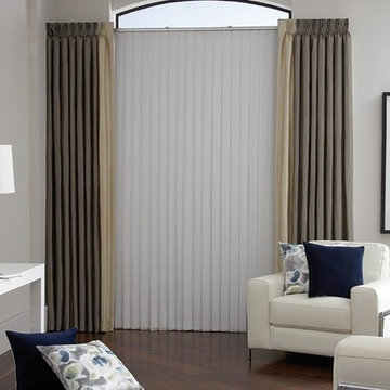 Abda Custom Window Fashions
This is a picture of seamed draperies layered over vertical sheer shades. This is a great option to provide color around your patio door or large windows.
**UPDATE** We also work with clients all over the country! Our virtual designers have experience as local and long distance design consultants. Our designers offer professional fabric and design recommendations, free estimates and have a great ability to communicate via email or phone to help conceptualize the project and see it through to the final stages. Fabric samples are mailed directly to you and we also provide easy installation guides.
For clients out of the Indiana area, we now have a professionally trained interior designer! Our "virtual designer" can help you with your project and ship your custom items directly to you at a fraction of the cost without compromising on quality! Let our design specialists help you today!
We're very excited to announce that we were featured on HOUZZ! Click the link below to check out the article!
http://www.houzz.com/ideabooks/30722151/list/design-workshop-shutters-all-grown-up
Abda Window fashions of Indianapolis has custom curtains, drapes, valances, cornices, pillows and hardware in a variety of fabrics and finishes. Curtains and drapes are great alone or paired with a hard window treatment for the ultimate fashion statement. All of our curtains, drapes, valances, cornices and pillows are custom-made from our own workroom. We also make custom bedding and upholstery. We have a huge selection of fabrics that will match any style.
Our custom, affordable draperies, curtains and sheers are now available to anyone in the US. We make them in our own workroom and ship them anywhere in the US! Talk with our professional design specialists and let them help you transform your home! It’s simple and easy. This is a great solution for persons who live out of state or are too busy for a traditional home consultation. With our great reviews, solid company and company values- you know that you’re home is in great hands!
We also have ready-made curtains and bedding available too! And don’t forget our custom hardware! You can also check out our houzz.com store for great window fashion products, including our exclusive bendable rods!
To see our new line, contact Talitha at 317-273-8343 or email: talitha@abdawindowfashions.com or check out our houzz.com store!
For our local customers we offer, FREE In-home consultation or showroom appointment to meet your lifestyle and design needs. At Abda, we have the perfect blend of high-end and affordable solutions for every style and budget. Affordable doesn’t mean cheap! We pride ourselves on quality products with excellent service. We’re so confident of our products that we give our customers more than the manufacturers guarantee!
We give our customers an additional 2 year warranty on top of the manufacturers guarantee!
At Abda, you will find knowledgeable staff that will turn your visions into a reality. Stop in our showroom or schedule a Free In-home consultation today! We know you will be happy with the results but don’t take our word for it, check out what some of our customers say about us on Houzz and Angie’s List!
http://www.angieslist.com/companylist/us/in/indianapolis/abda-inc-custom-window-fashions-reviews-60394.htm?cid=ssabadge
Why Choose Us?
We have been in business since November 1998 and started in the window covering business by cleaning & repairing blinds. This gave us a unique perspective from most window covering dealers. We have always considered how well products hold up and which manufacturers stand behind their products the best. We let our clients know the benefits of more expensive products and give honest feedback. We take pride in showing alternative products to fit all budgets.
Our great testamonials on Angie’s List, Houzz.com and referrals have helped our company grow without the need for “conventional” advertising. Abda means ‘servant’. At Abda, we approach every customer with a servant’s attitude. This philosophy has helped our customers feel confident in their purchases and well-taken care of. Our number one focus is customer service and we believe in putting the customer’s needs first. We offer our clients an additional 2 year warranty on top of the manufacturer’s warranty and want each and every client to be completely happy with their purchase. We’ve been awarded the prestigious 2013 Angie’s List Super Service Award, an honor bestowed annually on approximately 5 percent of all the businesses rated on the nation’s leading provider of consumer reviews. We’ve grown over the years and have added more team members to our company and we’re very excited at the direction our company is going.
Check out our website for more information: www.abdawindowfashions.com
Below is a list of styles and types of curtains and draperies that we can help you with. No worries if you do not find what you’re looking for below! Since we have our own workroom, the sky is the limit. There’s no project too small or large! Our design specialists are great at helping you with window treatment ideas. Stop in our showroom or call today for a FREE in-home consultation. If you’re out of state, no problem! We’re now making our custom treatments and shipping them to you!
Call today (317-273-8343) for more information or email:
talitha@abdawindowfashions.com
Some of the styles and types:
Modern curtains & draperies,
Contemporary curtains & draperies,
Traditional curtains & draperies,
Transitional curtains & draperies,
Beach Style curtains & draperies,
Asian Style curtains & draperies,
Eclectic curtains & draperies,
Midcentury curtains & draperies,
Mediterranean curtains & draperies,
Farmhouse Style curtains & draperies
Kitchen curtains,
Living room curtains,
Dining room curtians,
Master Bedroom curtains,
Nursery curtains,
Children’s room curtains,
Guest bedroom curtains,
Areas that we serve for installation for curtains & draperies are listed below. (But we ship to anywhere in the US!) If you don’t see your city on the list, just give us a call and we will see what we can do.
Indianapolis curtains and draperies & surrounding areas,
Carmel curtains and draperies & surrounding areas,
Zionsville curtains and draperies & surrounding areas
Westfield curtains and draperies & surrounding areas,
Avon curtains and draperies & surrounding areas,
Greenwood curtains and draperies & surrounding areas,
202