
Search results for "Expanded process" in Home Design Ideas
 Progressive Design Build
Challenge
As part-time residents of this Bonita Springs home, our clients were looking to update their outdoor entertainment area. They also planned to be away for the summer during the remodel and needed their renovation project to be finished prior to their return for the winter.
Their needs included:
Changing the color pallet to a monochromatic scheme, removing the yellow brick pavers, adding an outdoor kitchen area, adding an outdoor fireplace, resurfacing the pool and updating the tile, installing a new screen enclosure, and creating privacy from the neighbors, particularly the main sitting areas, pool and outdoor kitchen.
Although there was already a 1,221 sq. ft. lanai under the roof, it lacked functionality needed by the homeowners. Most of its amenities were located at one end of the lanai, and lacked privacy that the homeowners valued.
Solution
The final project design required two additions to the lanai area adding an accumulative 265 sq. ft. to the existing space expanding their sitting area and accommodating a much-needed outdoor kitchen. The new additions also needed to blend with the home’s existing style.
Addition #1—Sitting Area:
The first addition added approximately 145 sq. ft. to the end of the lanai. This allowed Progressive Design Build to tie into the existing gable room for the new space and create privacy from the neighbors.
Addition #2—Outdoor Kitchen:
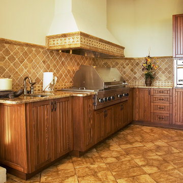
The second addition was a bump out that added approximately 120 sq. ft. to the end of the house close to the interior kitchen. This allowed the client to add an outdoor over and 52” Viking grill (with a side burner) to their outdoor living space. Other amenities included a new sink and under counter fridge, granite countertops, tumbled stone stile and Cypress cabinetry, custom-fabricated with marine grade plywood boxes and marine grade finishes to withstand moisture, common in the Bonita Bay community.
Special attention was given to the preparation area on either side of the stove, the landing area next to the oven and the serving counter behind the bar. Bar seating was added to the outdoor kitchen, allowing guests to visit with the cook comfortably and easily.
Brick Pavers
During the design phase, we discovered that the original brick pavers were set in sand, with no concrete pad below. Consequently, the retaining wall and several pavers were starting to fail, caused by the shifting sands. To remedy the problem, we installed a new concrete deck and laid new nonslip pavers on top of the deck—ideal for wet area applications.
Pool Renovations
To dramatically improve the enjoyment and ambiance of their pool, Progressive Design Build completely re-plumbed it, putting in additional lighting and new water features. New decorative pool tile, coping, and a paver deck were also installed around the pool. The pool finish chosen by our clients was a nice tropical blue color.
Screen Enclosure
A new screen enclosure was installed in compliance with new local building codes, making it more stable and solid than the existing one. The color change from white to bronze coordinated well with the homeowners’ new color scheme; and the location of the service door and stairs provided convenient access to the new pool equipment.
Results
This project was completed on time and within budget before these homeowners returned for their winter holiday. They were thrilled with the weekly communication, which included two-way phone calls and email photo sharing. They always knew where their project was in the construction process and what was happening at all times—providing security and peace of mind.
 CL Design & Landscape LLC
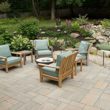
This client wanted to create an outdoor entertainment area. The design included a patio, a boulder retaining wall and a water feature, creating a beautiful outdoor living space. The design process helped the client to expand the initial idea into a larger patio to accommodate a seating area around a portable fire pit and pondless waterfall.
 Barron Home Remodeling
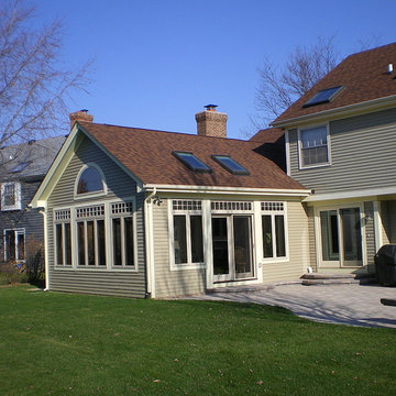
Families grow. Our collection of things grow. And we need more space! That's a normal progression of life and Barron Home Remodeling Corporation are your Woodbridge, NJ experts for home additions. We also happily travel to nearby zip codes to work with clients.
We know that making a house a home takes time and talent. Once you've gotten to the point when your nest is perfect, maybe you're in need of some more living space. Instead of going through the treacherous process of buying and selling homes, why not add to your home and keep things as simple as possible?
We love working with clients to dream up additions to their home that expand their square footage, up their property's value and allow them to keep their roots where they are! At Barron Home Remodeling Corporation, our home addition experts will work with you every step of the way to ensure the finished product is exactly what you want and need.
Our team prides itself on being timely, budget-conscious, respectful and passionate about our work. Discover what we can do for you, call us today at 732-690-7425!
Find the right local pro for your project
 Vermont Plank Flooring
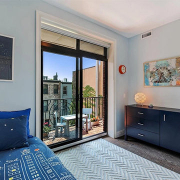
The Park Union Building at 910 Union Street in Park Slope, Brooklyn has Vermont Plank Flooring’s “Roasted” Red Oak wide plank flooring in each of its 15 condominiums. The developer, American Development Group, selected Vermont Plank both for its uniquely beautiful product, and for the sustainable methods used to harvest the local timber.
“I was able to find a local supplier with a local harvest, keeping Americans employed, with a superior product,” said Perry Finkelman, the development group’s CEO.
Vermont Planks “Roasted” Red Oak is thermally treated at 500 degrees Fahrenheit in a special kiln that removes all oxygen to prevent the timber from combusting. The process caramelizes the wood, giving it a dark, almost walnut-like appearance all the way through each plank. It also makes the planks more structurally sound and less likely to expand or contract with moisture.
The floor was finished with a zero VOC finish, Rubio Monocoat, along with a single coat of Rubio 5% White Oil. Click here for the full story on 910 Union Street.
Flooring: Roasted Red Oak in varied widths
Finish: Custom Rubio 5% White Oil Finish
 Wallpaper Artistry
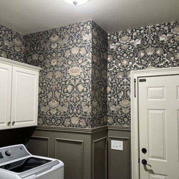
Elevated Laundry Room Wallpaper Installation in Palo Alto, CA
Transform your utilitarian laundry space into a design-forward oasis with our premium wallpaper installation services tailored for Palo Alto homes. We specialize in high-performance wallcoverings that combine Stanford-area sophistication with practical durability for busy households.
Why Palo Alto Homes Choose Our Laundry Wallpaper:
✔ Tech-Forward Materials – Non-toxic, VOC-free European vinyls
✔ Smart Home Ready – Designs that complement appliance panels
✔ Space Optimization – Visual tricks to expand cramped laundry areas
✔ Eco-Conscious Installation – Low-waste process with sustainable adhesives
Signature Palo Alto Styles:
? Mid-Century Modern – Eichler-inspired organic geometries
? Contemporary Luxe – Metallic grasscloths or concrete-look textures
? Stanford Elegance – Subtle university-inspired patterns
? California Wellness – Biophilic designs with natural motifs
White-Glove Service Features:
✅ Precision Appliance Integration – Flawless cuts around LG/Samsung/Miele setups
✅ Humidity-Controlled Adhesives – Silicon Valley climate-tested
✅ Museum-Grade Alignment – Pixel-perfect pattern matching
✅ Invisible Seam Technology – No visible edges in small spaces
The Palo Alto Difference:
• By-Appointment Showroom – View 400+ luxury samples near University Ave
• Silent Installation – Discreet, noise-controlled service
• Smart Home Pairing – Coordinate with your home automation system
Serving: Professorville, Crescent Park, Downtown PA & all 94301/94306 homes
 The Corner Cabinet
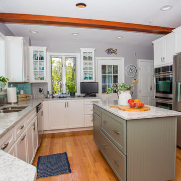
Carolyn & Peter were looking brighten their kitchen space, expand its ocean view, and update their cabinetry. To begin their kitchen renovation, we created a 3D rendering that addressed all their goals. During the design process, Carolyn & Peter selected Decora cabinetry for their kitchen; Prescott Maple Extra White cabinetry with a Prescott Maple Retreat painted island. They were happy with original footprint, so we updated that very little. Instead, we focused on ways to increase their storage and functionality all while, lightening the room to make it appear larger and blending the color palette into their home and their beautiful ocean view. Photo credit: Nicola Richard
 Signature Designs Kitchen | Bath | Interiors
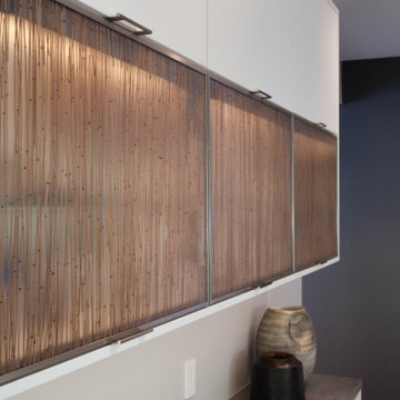
What a fun project to work on with an artist and her husband. We collaborated to create a unique kitchen that expands the clients storage and cooking space. Subtle details that make a bold statement. It was through the clients interviewing process that they choose to go with Signature Designs Kitchen Bath over other large firms because of the personal collaboration connection.
We created a curved island that resembles a piano while it maximized there countertop space it left plenty of room for them to entertain many guest in their nook.
 Sosna Inc
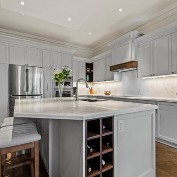
This North York home renovation was designed to perfectly suit a vibrant professional couple, their two active teenagers, and their pets, combining beauty and functionality to match their busy lifestyle. The home needed a functional overhaul, particularly in the kitchen, powder room, master ensuite, and underutilized basement. The clients, eager for an upgrade but short on time, entrusted the project to a team that prioritized communication, thoughtful design, and a seamless process.
The kitchen was completely reimagined with custom cabinetry, maximizing storage and accessibility. A redesigned island now allows access from all sides, improving flow for cooking and family gatherings. New countertops, contemporary flooring, and a balanced mix of crisp tiles and warm wall tones created a cohesive, inviting atmosphere. The master ensuite was transformed into a luxurious retreat with elegant stone-style tiles, an expanded glass-enclosed shower, and a striking tiled feature wall framing the bathtub, delivering both beauty and improved functionality.
To refresh the powder room and entryway on a budget, professional grout cleaning gave existing tiles a new life. Modern lighting and bright wallpaper added charm and energy, welcoming guests into the home. The basement, tailored for the teens and pets, became a cozy entertainment space, separated by subtle partitions for added privacy and comfort.
One notable challenge involved seamlessly transitioning between wood-look porcelain tiles in the kitchen and the existing hardwood floors—a task achieved through careful planning and execution, ensuring a flawless blend. A highlight of the project came when the client saw the near-final result and expressed amazement at the transformation, calling it a “WOW factor.”
The result is a home that perfectly balances style and practicality. The streamlined kitchen, spa-like ensuite, refreshed powder room, and tailored basement now enhance daily life and encourage quality time as a family. This project stands as a testament to thoughtful design and expert craftsmanship, creating a space that reflects the family’s energy and personality while supporting their needs for years to come.
 Zion Home and Building, LLC
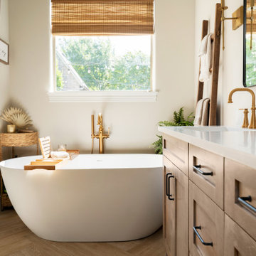
The goal for this master suite was to replace a dated, heavy layout with a sense of "Warm Minimalism." We wanted to trade visual clutter for intentional textures. By pairing the natural grain of White Oak with the crisp, architectural lines of Matte Black fixtures, we created a space that feels grounded, airy, and deeply restorative.
A master bath is a high-stakes environment where every inch counts. We took absolute ownership of the "inch-by-inch" planning required to expand the shower and incorporate a freestanding soaking tub without making the room feel crowded. Our Guided Process ensured the client felt confident in the bold choice of vertical stack tile—a design-forward move that draws the eye upward and adds a custom, boutique-hotel feel to the space.
This is a "Host’s Private Oasis." While the rest of the home is ready for guests, this bathroom is a master-grade sanctuary for the homeowners. The elite craftsmanship is visible in the precision of the tile alignments and the seamless integration of the natural wood elements, providing a feeling of pride and daily joy.
 Signature Designs Kitchen | Bath | Interiors
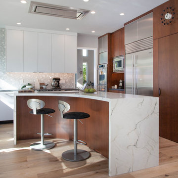
What a fun project to work on with an artist and her husband. We collaborated to create a unique kitchen that expands the clients storage and cooking space. Subtle details that make a bold statement. It was through the clients interviewing process that they choose to go with Signature Designs Kitchen Bath over other large firms because of the personal collaboration connection.
We created a curved island that resembles a piano while it maximized there countertop space it left plenty of room for them to entertain many guest in their nook.
 lolo_3
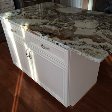
My traditional home's kitchen/family room needed a face lift. The layout works for me so I was able to save money by not having to re-design it. It's currently in the process of being finished and will be updated accordingly.
I wanted to finish out the oak hardwood floors that are in the rest of the first floor, that was my first priority. The second was to change out the lighting from builders grade fluorescent to recessed and a crystal chandelier over an expanded island.
I wasn't in need of a desk area in the kitchen so a drybar was a must. A lady must have a place for her wine!
I decided to use Kitchen Savers for the remodel and they've been amazing. I highly recommend them. I will be finishing out the paint, crown molding and backsplash on my own.
 Klopf Architecture
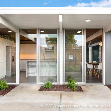
Joseph Eichler developed his moderately priced houses for the mass-market starting in 1949. His homes were designed using affordable materials and simple construction techniques. Nearly 70 years later these homes are in need of updating and remodeling an Eichler home today can become an imposing and costly project if you’re not careful. For this project the clients, who had undergone several previous house renovations, were determined to stick with an established budget from the beginning. Klopf Architecture helped them modernize their Eichler with a premium appearance on a reasonable budget.
The clients challenged the Klopf team to create a design that had a high-end feel and nicely done while adhering to their budget. That meant not all of the initial project scope could be built. Like many other Eichler homes, the original floor plan did not meet the family’s needs leaving them feeling disconnected from one room to another. While an early goal was to expand the house into a carport and create a larger garage, it did not survive the contractor pricing phase of the project.
The goals that did survive through to the end of the project included blurring some of the boundaries and opening up some of the spaces, making them more functional and creating a smoother flow in the house. The Klopf team joined the former separate kitchen and formal living room into one large space and shift the dining room where it is now connected to the kitchen. Klopf swapped the family room to the front alongside the living room, so the spaces feel more cohesive and are now better suited for family activities. The functional layout of the master bathroom was changed to include a large, curbless shower.
Installing a complete IKEA kitchen including cabinets, countertops, appliances, light fixtures, and furnishings was key to staying within budget. Bath fixtures in this house are also exclusively IKEA. Klopf Architecture has designed many homes using IKEA products, which are quite compatible offering an affordable, contemporary take on Eichler homes. The clients saved additional money from the simplicity and availability of IKEA products and by orchestrating the orders and purchases themselves. Following each construction meeting, the clients would make a run to IKEA and purchase items, pick up needed spare parts, and bring them back right away to stay ahead of the contractor’s schedule and minimize the chance of delays and bottlenecks.
Klopf balanced material selections by retaining some of the original woodwork and simply refinishing the mahogany paneling. They were able to retain the original windows and sliding doors which were still in good shape, avoiding some of the most costly replacement expenses. Additionally interior doors were simply refinished and the exterior siding cleaned up and repainted. Formerly dark interiors are now illuminated with new slimmer semi-recessed lighting eliminating the need for costly roof work.
Attention to design details allowed the Klopf team to ensure the house ended up with a high quality feel. Key visual elements were strictly aligned and Klopf worked with the clients to select a unified materials palette throughout the spaces so the house flows seamlessly together. Aligning the tile layout with the trusses and keeping it level with the concrete slab outside allowed them to achieve a level of quality that may otherwise be missed.
The clients were able to keep their budget on track by determining clear goals and making critical decisions upfront, choosing materials and furnishings wisely, working with the right design and construction teams in place and to a large part, their willingness to participate throughout the process. In the end the clients were much happier with their reconfigured Eichler home and Klopf Architecture managed to keep their remodeling costs to about $325/sf – a good amount below the average Bay Area Eichler remodel.
Project Team: John Klopf, Angela Todorova, Sherry Tan
Contractor: Keycon Construction
Structural Engineer: Sezen & Moon
Photography: Sabrina Huang
Year Completed: 2020
 Heidi Reis / Abode Agency LLC
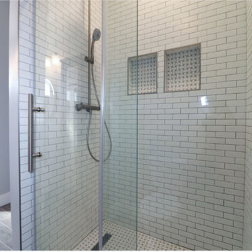
This was a very tight Master Bathroom with a tiled counter that went the length of the wall. A tight space between the vanity and the tub shower insert. The client wanted to have an updated bathroom to include a large tiled shower, a new more modern vanity, and a better use of space. The thought of managing this process was a bit overwhelming for the clients, so they reached out to me to take the reins on the project.
The vision to update the tile with a frameless shower. Expand the opening to extend the width of the shower for ease of use. Upgrade vanity, mirrors, and fixtures. Luckily, one of the owners works with Hansgrohe, and we had the opportunity to use their fixtures in both the shower and vanity, which are stunning! These simple upgrades made a big impact and created a master bathroom space that these clients love.
This renovation was designed by Heidi Reis with Abode Agency LLC, she serves clients in Atlanta including but not limited to Intown neighborhoods such as: Grant Park, Inman Park, Midtown, Kirkwood, Candler Park, Lindberg area, Martin Manor, Brookhaven, Buckhead, Decatur, and Avondale Estates.
For more information on working with Heidi Reis, click here: https://www.AbodeAgency.Net/
 e4 Interior Design, LLC
e4 Interior Design
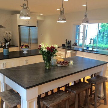
This farmhouse was purchased by the clients in the end of 2015. The timeframe for the renovation was tight, as the home is a hot summer rental in the historic district of Kennebunkport. This antique colonial home had been expanded over the years. The intention behind the renovation was quite simple; to remove wall paper, apply fresh paint, change out some light fixtures and renovate the kitchen. A somewhat small project turned into a massive renovation, with the renovation of 3 bathrooms and a powder room, a kitchen, adding a staircase, plumbing, floors, changing windows, not to mention furnishing the entire house afterwords. The finished product really speaks for itself!
The aesthetic is "coastal farmhouse". We did not want to make it too coastal (as it is not on the water, but rather in a coastal town) or too farmhouse-y (while still trying to maintain some of the character of the house.) Old floors on both the first and second levels were made plumb (reused as vertical supports), and the old wood beams were repurposed as well - both in the floors and in the architectural details. For example - in the fireplace in the kitchen and around the door openings into the dining room you can see the repurposed wood! The newel post and balusters on the mudroom stairs were also from the repurposed lot of wood, but completely refinished for a new use.
The clients were young and savvy, with a very hands on approach to the design and construction process. A very skilled bargain hunter, the client spent much of her free time when she was not working, going to estate sales and outlets to outfit the house. Their builder, as stated earlier, was very savvy in reusing wood where he could as well as salvaging things such as the original doors and door hardware while at the same time bringing the house up to date.
 Progressive Design Build
Challenge
As part-time residents of this Bonita Springs home, our clients were looking to update their outdoor entertainment area. They also planned to be away for the summer during the remodel and needed their renovation project to be finished prior to their return for the winter.
Their needs included:
Changing the color pallet to a monochromatic scheme, removing the yellow brick pavers, adding an outdoor kitchen area, adding an outdoor fireplace, resurfacing the pool and updating the tile, installing a new screen enclosure, and creating privacy from the neighbors, particularly the main sitting areas, pool and outdoor kitchen.
Although there was already a 1,221 sq. ft. lanai under the roof, it lacked functionality needed by the homeowners. Most of its amenities were located at one end of the lanai, and lacked privacy that the homeowners valued.
Solution
The final project design required two additions to the lanai area adding an accumulative 265 sq. ft. to the existing space expanding their sitting area and accommodating a much-needed outdoor kitchen. The new additions also needed to blend with the home’s existing style.
Addition #1—Sitting Area:
The first addition added approximately 145 sq. ft. to the end of the lanai. This allowed Progressive Design Build to tie into the existing gable room for the new space and create privacy from the neighbors.
Addition #2—Outdoor Kitchen:
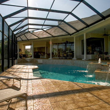
The second addition was a bump out that added approximately 120 sq. ft. to the end of the house close to the interior kitchen. This allowed the client to add an outdoor over and 52” Viking grill (with a side burner) to their outdoor living space. Other amenities included a new sink and under counter fridge, granite countertops, tumbled stone stile and Cypress cabinetry, custom-fabricated with marine grade plywood boxes and marine grade finishes to withstand moisture, common in the Bonita Bay community.
Special attention was given to the preparation area on either side of the stove, the landing area next to the oven and the serving counter behind the bar. Bar seating was added to the outdoor kitchen, allowing guests to visit with the cook comfortably and easily.
Brick Pavers
During the design phase, we discovered that the original brick pavers were set in sand, with no concrete pad below. Consequently, the retaining wall and several pavers were starting to fail, caused by the shifting sands. To remedy the problem, we installed a new concrete deck and laid new nonslip pavers on top of the deck—ideal for wet area applications.
Pool Renovations
To dramatically improve the enjoyment and ambiance of their pool, Progressive Design Build completely re-plumbed it, putting in additional lighting and new water features. New decorative pool tile, coping, and a paver deck were also installed around the pool. The pool finish chosen by our clients was a nice tropical blue color.
Screen Enclosure
A new screen enclosure was installed in compliance with new local building codes, making it more stable and solid than the existing one. The color change from white to bronze coordinated well with the homeowners’ new color scheme; and the location of the service door and stairs provided convenient access to the new pool equipment.
Results
This project was completed on time and within budget before these homeowners returned for their winter holiday. They were thrilled with the weekly communication, which included two-way phone calls and email photo sharing. They always knew where their project was in the construction process and what was happening at all times—providing security and peace of mind.
 Klopf Architecture
Joseph Eichler developed his moderately priced houses for the mass-market starting in 1949. His homes were designed using affordable materials and simple construction techniques. Nearly 70 years later these homes are in need of updating and remodeling an Eichler home today can become an imposing and costly project if you’re not careful. For this project the clients, who had undergone several previous house renovations, were determined to stick with an established budget from the beginning. Klopf Architecture helped them modernize their Eichler with a premium appearance on a reasonable budget.
The clients challenged the Klopf team to create a design that had a high-end feel and nicely done while adhering to their budget. That meant not all of the initial project scope could be built. Like many other Eichler homes, the original floor plan did not meet the family’s needs leaving them feeling disconnected from one room to another. While an early goal was to expand the house into a carport and create a larger garage, it did not survive the contractor pricing phase of the project.
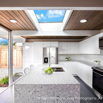
The goals that did survive through to the end of the project included blurring some of the boundaries and opening up some of the spaces, making them more functional and creating a smoother flow in the house. The Klopf team joined the former separate kitchen and formal living room into one large space and shift the dining room where it is now connected to the kitchen. Klopf swapped the family room to the front alongside the living room, so the spaces feel more cohesive and are now better suited for family activities. The functional layout of the master bathroom was changed to include a large, curbless shower.
Installing a complete IKEA kitchen including cabinets, countertops, appliances, light fixtures, and furnishings was key to staying within budget. Bath fixtures in this house are also exclusively IKEA. Klopf Architecture has designed many homes using IKEA products, which are quite compatible offering an affordable, contemporary take on Eichler homes. The clients saved additional money from the simplicity and availability of IKEA products and by orchestrating the orders and purchases themselves. Following each construction meeting, the clients would make a run to IKEA and purchase items, pick up needed spare parts, and bring them back right away to stay ahead of the contractor’s schedule and minimize the chance of delays and bottlenecks.
Klopf balanced material selections by retaining some of the original woodwork and simply refinishing the mahogany paneling. They were able to retain the original windows and sliding doors which were still in good shape, avoiding some of the most costly replacement expenses. Additionally interior doors were simply refinished and the exterior siding cleaned up and repainted. Formerly dark interiors are now illuminated with new slimmer semi-recessed lighting eliminating the need for costly roof work.
Attention to design details allowed the Klopf team to ensure the house ended up with a high quality feel. Key visual elements were strictly aligned and Klopf worked with the clients to select a unified materials palette throughout the spaces so the house flows seamlessly together. Aligning the tile layout with the trusses and keeping it level with the concrete slab outside allowed them to achieve a level of quality that may otherwise be missed.
The clients were able to keep their budget on track by determining clear goals and making critical decisions upfront, choosing materials and furnishings wisely, working with the right design and construction teams in place and to a large part, their willingness to participate throughout the process. In the end the clients were much happier with their reconfigured Eichler home and Klopf Architecture managed to keep their remodeling costs to about $325/sf – a good amount below the average Bay Area Eichler remodel.
Project Team: John Klopf, Angela Todorova, Sherry Tan
Contractor: Keycon Construction
Structural Engineer: Sezen & Moon
Photography: Sabrina Huang
Year Completed: 2020
 Zion Home and Building, LLC
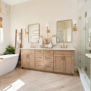
The goal for this master suite was to replace a dated, heavy layout with a sense of "Warm Minimalism." We wanted to trade visual clutter for intentional textures. By pairing the natural grain of White Oak with the crisp, architectural lines of Matte Black fixtures, we created a space that feels grounded, airy, and deeply restorative.
A master bath is a high-stakes environment where every inch counts. We took absolute ownership of the "inch-by-inch" planning required to expand the shower and incorporate a freestanding soaking tub without making the room feel crowded. Our Guided Process ensured the client felt confident in the bold choice of vertical stack tile—a design-forward move that draws the eye upward and adds a custom, boutique-hotel feel to the space.
This is a "Host’s Private Oasis." While the rest of the home is ready for guests, this bathroom is a master-grade sanctuary for the homeowners. The elite craftsmanship is visible in the precision of the tile alignments and the seamless integration of the natural wood elements, providing a feeling of pride and daily joy.
 Signature Designs Kitchen | Bath | Interiors
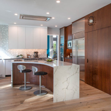
What a fun project to work on with an artist and her husband. We collaborated to create a unique kitchen that expands the clients storage and cooking space. Subtle details that make a bold statement. It was through the clients interviewing process that they choose to go with Signature Designs Kitchen Bath over other large firms because of the personal collaboration connection.
We created a curved island that resembles a piano while it maximized there countertop space it left plenty of room for them to entertain many guest in their nook.
 Azenco Outdoor
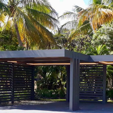
This stunning Puerto Rican beach home was in the process of adding an elegant carport to its grounds, ensuring that this homeowner's expanding collection of cars would have a luxurious space. To guarantee it adequately met both the client and architect's exacting standards for design, installation company SHO-Pros - Azenco Outdoor dealer in Puerto Rico - with their experience crafting luxury carports were brought on board. The result: An exquisitely crafted two-zone solid roofed carport structure providing shade from sun and rain - fit precisely to encase two cars and golf cart accessories needed around resort areas!
This luxury carport was designed to enhance the sophisticated vibe of this Caribbean community. The modern architecture boasted all white exteriors, along with floor-to-ceiling windows that provided breathtaking vistas from every room. To complement its elegance, SHO-Pros opted for an Azenco R-Car fixed roof car port - a sleek structure without any visible assembly hardware whose insulation would protect against sun and rain alike while keeping residents comfortable as they access their vehicles in style!
 lolo_3
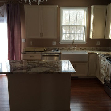
My traditional home's kitchen/family room needed a face lift. The layout works for me so I was able to save money by not having to re-design it. It's currently in the process of being finished and will be updated accordingly.
I wanted to finish out the oak hardwood floors that are in the rest of the first floor, that was my first priority. The second was to change out the lighting from builders grade fluorescent to recessed and a crystal chandelier over an expanded island.
I wasn't in need of a desk area in the kitchen so a drybar was a must. A lady must have a place for her wine!
I decided to use Kitchen Savers for the remodel and they've been amazing. I highly recommend them. I will be finishing out the paint, crown molding and backsplash on my own.
33