
Search results for "Explained" in Home Design Ideas
 Inhabit | Space
Whon Photography
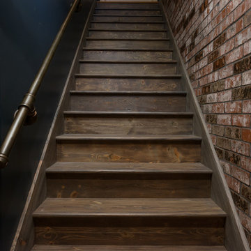
Large urban underground carpeted staircase photo in Indianapolis with gray walls and no fireplace
Large urban underground carpeted staircase photo in Indianapolis with gray walls and no fireplace

 Nautilus Architects
Custom wood bathroom
Cathedral ceilings and seamless cabinetry complement this kitchen’s river view
The low ceilings in this ’70s contemporary were a nagging issue for the 6-foot-8 homeowner. Plus, drab interiors failed to do justice to the home’s Connecticut River view.
By raising ceilings and removing non-load-bearing partitions, architect Christopher Arelt was able to create a cathedral-within-a-cathedral structure in the kitchen, dining and living area. Decorative mahogany rafters open the space’s height, introduce a warmer palette and create a welcoming framework for light.
The homeowner, a Frank Lloyd Wright fan, wanted to emulate the famed architect’s use of reddish-brown concrete floors, and the result further warmed the interior. “Concrete has a connotation of cold and industrial but can be just the opposite,” explains Arelt.
Clunky European hardware was replaced by hidden pivot hinges, and outside cabinet corners were mitered so there is no evidence of a drawer or door from any angle.
 OxanaKovalchukDesign.Inc
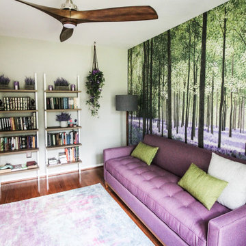
The client asked me to help her with her long time dream to turn one of the guest bedrooms into her own space.
The client explained that her Mom often visit them and they really need a room, which is the cute and cozy office and easily can be transformed into the Guest room for Mama. I asked a few questions to understand the Client's preferable style and favorite colors. She expected fresh colors with some Lilac accents. The room wasn't very big and airy. That is why I suggested to use the the wall murals with the perspective and horizontal line, which will make this room visually deeper and wider. I found this great wallcoverings with the Spring, or summer forest motives. Very important moment is that you can see the forest lit by the bright sun. Very positive mood of this wall mural made this room sunny and airy. I used the colors of Nature: Tree foliage colors in combination with a dark woods. I selected the rug, with repeats blossoming flowers colors. This rug made me feel like the flower's petals scattered to the floor. A biggest color accent of this room is the book folding sofa. The client's Mama now have a very shiny room with a comfortable sofa to sleep on, at the same time my client has a personal space to work, to enjoy while she is reading her favorite books.
.
Find the right local pro for your project
 Murphy Bros. Design | Build | Remodel
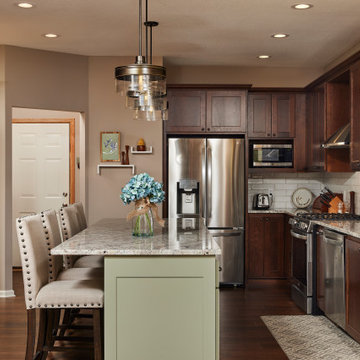
“They had been wanting to change this since they acquired the property in 2008,” recalls Murphy Bros. Senior Design/Build Consultant Jonah Smith, who led the project.
“We did it by converting a wasted desk space area into a deep and expanded pantry and by trading out a choke point peninsula for a high-capacity storage island,” explained Smith, now in his 16th year with Murphy Bros.
KITCHEN APPLIANCES
Refrigerator: Café™ ENERGY STAR® 27.8 Cu. Ft. Smart 4-Door French-Door
Range: 30" Slide-in Gas Range In Stainless Steel L5Gl633Sf
Dishwasher: Top Control Dishwasher is Stainless Steel• LOT567855
Beverage Fridge: 15" Wide under-counter fridge in Stainless Steel• BCA311553
Hood: Zephyr Savona 30" In Stalnless Steel
KITCHEN CABINETS
Doors: Framed, Standard Overlay
UPPERS Finish: English Tea
ISLAND Finish: Benjamin Moore HCl 13 Louisberg Green
KITCHEN COUTERTOPS
Perimeter & Island: I Nevaska Tier 2 Granite
KITCHEN BACKSPLASH
Anne Selke Artisanal White Ceramic wall tile, 3x12 subway - 1/3 Offset installed horizontal
Range Inlay Tile: Splendours Royal Brown Dark OCCor 6x6 #494560
Range around Inlay Tile: Annie Selke Artisanal Cafe au lait Pencil Ceramic Wall Trim Tile #49613560

 Rikki Snyder
James Rixner, Bedroom
Holiday: My First Apartment
Photo: Rikki Snyder © 2013 Houzz
Living room - eclectic living room idea in New York
Living room - eclectic living room idea in New York

 Aeris Home
If I were to explain the atmosphere in this home, I’d say it’s happy. Natural light, unbelievable view of Lake Murray, the mountains, the green hills, the sky – I used those natural colors as inspiration to come up with a palette for this project. As a result, we were brave enough to go with 3 cabinet colors (natural, oyster and olive), a gorgeous blue granite that’s named Azurite (a very powerful crystal), new appliance layout, raised ceiling, and a hole in the wall (butler’s window) … quite a lot, considering that client’s original goal was to just reface the existing cabinets (see before photos).
This remodel turned out to be the most accurate representation of my clients, their way of life and what they wanted to highlight in a space so dear to them. You truly feel like you’re in an English countryside cottage with stellar views, quaint vibe and accessories suitable for any modern family. We love the final result and can’t get enough of that warm abundant light!

 InnovationLand
Houston Interior Designer Lisha Maxey took this Museum District condo from the dated, mirrored walls of the 1980s to Mid Century Modern with a gallery look featuring the client's art collection.
"The place was covered with glued-down, floor-to-ceiling mirrors," says Lisha Maxey, senior designer for Homescapes of Houston and principal at LGH Design Services in Houston. "When we took them off the walls, the walls came apart. We ended up taking them down to the studs."
The makeover took six months to complete, primarily because of strict condo association rules that only gave the Houston interior designers very limited access to the elevator - through which all materials and team members had to go.
"Monday through Friday, we could only be noisy from 10 a.m. to 2 p.m., and if we had to do something extra loud, like sawing or drilling, we had to schedule it with the management and they had to communicate that to the condo owners. So it was just a lot of coordination. But a lot of Inner City Loopers live in these kinds of buildings, so we're used to handling that kind of thing."
The client, a child psychiatrist in her 60s, recently moved to Houston from northeast Texas to be with friends. After being widowed three years ago, she decided it was time to let go of the traditionally styled estate that wasn't really her style anyway. An avid diver who has traveled around the world to pursue her passion, she has amassed a large collection of art from her travels. Downsizing to 1,600 feet and wanting to go more contemporary, she wanted the display - and the look - more streamlined.
"She wanted clean lines and muted colors, with the main focus being her artwork," says Maxey. "So we made the space a palette for that."
Enter the white, gallery-grade paint she chose for the walls: "It's halfway between satin and flat," explains Maxey. "It's not glossy and it's not chalky - just very smooth and clean."
Adding to the gallery theme is the satin nickel track lighting with lamps aimed to highlight pieces of art. "This lighting has no wires," notes Maxey. "It's powered by a positive and negative conduit."
The new flooring throughout is a blended-grey porcelain tile that looks like wood planks. "It's gorgeous, natural-looking and combines all the beauty of wood with the durability of tile," says Maxey. "We used it throughout the condo to unify the space."
After Maxey started looking at the client's bright, vibrant, colorful artwork, she felt the palette couldn't stay as muted anymore. Hence the Mid Century Modern orange leather sofas from West Elm and bright green chairs from Joybird, plus the throw pillows in different textures, patterns and shades of gold, orange and green.
The concave lines of the Danish-inspired chairs, she notes, help them look beautiful from all the way around - a key to designing spaces for loft living.
"The table in the living room is very interesting," notes Maxey. "It was handmade for the client in 1974 and has a signature on it from the artist. She was adamant about including the piece, which has all these hand-painted black-and-white art tiles on the top. I took one look at it and said 'It's not really going to go.'"
However, after cutting 6 inches off the bottom and making it look a little distressed, the table ended up being the perfect complement to the sofas.
The dining room table - from Design Within Reach - is a solid piece of mahogany, the chair upholstery a mix of grey velvet and leather and the legs a shiny brass. "The side chairs are leather and the end ones are velvet," says Maxey. "It's a nice textural mix that lends depth and texture."
The galley kitchen, meanwhile, has been lightened and brightened, with white quartz countertops and backsplashes mimicking the look of Carrara marble, stainless steel appliances and a velvet green bench seat for a punch of color. The cabinets are painted a cool grey color called "Silverplate."
The two bathrooms have been updated with contemporary white vanities and vessel sinks and the master bath now features a walk-in shower tiled in Dolomite white marble (the floor is Bianco Carrara marble mosaic, done in a herringbone pattern.
In the master bedroom, Homescapes of Houston knocked down a wall between two smaller closets with swing doors to make one large walk-in closet with pocket doors. The closet in the guest bedroom also came out 13 more inches.
The client's artwork throughout personalizes the space and tells the story of a life. There's a huge bowl of shells from the client's diving adventures, framed art from her child psychiatry patients and a 16th century wood carving from a monastery that's been in her family forever.
"Her collection is quite impressive," says Maxey. "There's even a framed piece of autographed songs written by John Lennon." (You can see this black-framed piece of art on the wall in the photo above of two green chairs).
"We're extremely happy with how the project turned out, and so is the client," says Maxey. "No expense was spared for her. It was a labor of love and we were excited to do it."
Sponsored
Fredericksburg, OH

High Point Cabinets
Columbus' Experienced Custom Cabinet Builder | 4x Best of Houzz Winner

 JNA Solar
Panel Type: SolarWorld SunModule Plus 275W Mono
“My husband and I would like to share our experience with Zeev Zanzuri from JNA Solar Solutions. Zeev was referred to us by a friend who recommended him highly. At this point, we had already signed a contract with another solar company and were feeling very frustrated and disappointed.
Zeev was very patient and understanding as we had many questions and concerns. We live in the city of San Marino, in the San Gabriel Valley, a city well known for being extremely difficult for contractors to get permits approved. The previous solar company misrepresented their prior experience with the city of San Marino and were unable to get our permits approved. This resulted in unnecessary delays and aggravation.
Whatever Zeev promised, he delivered. He got the approvals from the city, explained our energy savings in detail and provided consistently great customer service. He was always responsive to our calls and followed up with us after the job was done to see if we had any problems.
We are thrilled with our solar system and wouldn’t hesitate to recommend Zeev Zanzuri and JNA Solar Solutions to friends, family, and neighbors.”
San Marino, CA.
 Aeris Home
If I were to explain the atmosphere in this home, I’d say it’s happy. Natural light, unbelievable view of Lake Murray, the mountains, the green hills, the sky – I used those natural colors as inspiration to come up with a palette for this project. As a result, we were brave enough to go with 3 cabinet colors (natural, oyster and olive), a gorgeous blue granite that’s named Azurite (a very powerful crystal), new appliance layout, raised ceiling, and a hole in the wall (butler’s window) … quite a lot, considering that client’s original goal was to just reface the existing cabinets (see before photos).
This remodel turned out to be the most accurate representation of my clients, their way of life and what they wanted to highlight in a space so dear to them. You truly feel like you’re in an English countryside cottage with stellar views, quaint vibe and accessories suitable for any modern family. We love the final result and can’t get enough of that warm abundant light!
 Aeris Home
If I were to explain the atmosphere in this home, I’d say it’s happy. Natural light, unbelievable view of Lake Murray, the mountains, the green hills, the sky – I used those natural colors as inspiration to come up with a palette for this project. As a result, we were brave enough to go with 3 cabinet colors (natural, oyster and olive), a gorgeous blue granite that’s named Azurite (a very powerful crystal), new appliance layout, raised ceiling, and a hole in the wall (butler’s window) … quite a lot, considering that client’s original goal was to just reface the existing cabinets (see before photos).
This remodel turned out to be the most accurate representation of my clients, their way of life and what they wanted to highlight in a space so dear to them. You truly feel like you’re in an English countryside cottage with stellar views, quaint vibe and accessories suitable for any modern family. We love the final result and can’t get enough of that warm abundant light!

 MRF Construction, Inc.
A new bathroom was designed using the same space, and allowing for a larger curbless shower, two generous sink vanities and a linen cabinet.
The new shower is spacious and refreshing, with tall ceilings, frameless glass walls, a curb-less and door-less entry and a barely noticeable infinity drain all adding to the openness. A bench seat was integrated into the quartz countertop wrap of the cabinets, seamlessly integrating the shower and cabinets into one cohesive space, and heat in the tile floor was also run into the bench seat to keep it warm and comfortable
 Aeris Home
If I were to explain the atmosphere in this home, I’d say it’s happy. Natural light, unbelievable view of Lake Murray, the mountains, the green hills, the sky – I used those natural colors as inspiration to come up with a palette for this project. As a result, we were brave enough to go with 3 cabinet colors (natural, oyster and olive), a gorgeous blue granite that’s named Azurite (a very powerful crystal), new appliance layout, raised ceiling, and a hole in the wall (butler’s window) … quite a lot, considering that client’s original goal was to just reface the existing cabinets (see before photos).
This remodel turned out to be the most accurate representation of my clients, their way of life and what they wanted to highlight in a space so dear to them. You truly feel like you’re in an English countryside cottage with stellar views, quaint vibe and accessories suitable for any modern family. We love the final result and can’t get enough of that warm abundant light!


 Emily Griffin Design
This cozy and colourful window seat is the perfect place to curl up on and gaze out the window at the trees for a little daydreaming or to read a book. Designed by: Stephanie Houghton, principal partner at Emily Griffin Design.
 Aeris Home
If I were to explain the atmosphere in this home, I’d say it’s happy. Natural light, unbelievable view of Lake Murray, the mountains, the green hills, the sky – I used those natural colors as inspiration to come up with a palette for this project. As a result, we were brave enough to go with 3 cabinet colors (natural, oyster and olive), a gorgeous blue granite that’s named Azurite (a very powerful crystal), new appliance layout, raised ceiling, and a hole in the wall (butler’s window) … quite a lot, considering that client’s original goal was to just reface the existing cabinets (see before photos).
This remodel turned out to be the most accurate representation of my clients, their way of life and what they wanted to highlight in a space so dear to them. You truly feel like you’re in an English countryside cottage with stellar views, quaint vibe and accessories suitable for any modern family. We love the final result and can’t get enough of that warm abundant light!
 Aeris Home
If I were to explain the atmosphere in this home, I’d say it’s happy. Natural light, unbelievable view of Lake Murray, the mountains, the green hills, the sky – I used those natural colors as inspiration to come up with a palette for this project. As a result, we were brave enough to go with 3 cabinet colors (natural, oyster and olive), a gorgeous blue granite that’s named Azurite (a very powerful crystal), new appliance layout, raised ceiling, and a hole in the wall (butler’s window) … quite a lot, considering that client’s original goal was to just reface the existing cabinets (see before photos).
This remodel turned out to be the most accurate representation of my clients, their way of life and what they wanted to highlight in a space so dear to them. You truly feel like you’re in an English countryside cottage with stellar views, quaint vibe and accessories suitable for any modern family. We love the final result and can’t get enough of that warm abundant light!

 INSPIRED KITCHEN DESIGN
To that end, maximizing storage space was a critical part of her IKEA kitchen.
“Our old cabinets stopped well short of the ceiling, which meant there was a lot of dead space on top that wasn’t being used,” she explains.
As mentioned, she selected Semihandmade’s Super Matte White Slab upper cabinet fronts which run along the upper perimeter of the space, from above the Whirlpool refrigerator, above the open shelving and over the stove and dishwasher, creating a bank of storage along the entire adjacent wall. The white cabinetry is given an understated pop of color with the Natural Brass cabinet pulls and a sense of warmth is created (as are more storage options!) with the Super Matte Clay Slab lower cabinet fronts, drawer fronts and toe kicks from Semihandmade.
“Now that we’ve extended the cabinetry to the ceiling and gotten rid of a wall-mounted microwave we have more storage space than we need – a true luxury in New York!” she says.
 Aeris Home
If I were to explain the atmosphere in this home, I’d say it’s happy. Natural light, unbelievable view of Lake Murray, the mountains, the green hills, the sky – I used those natural colors as inspiration to come up with a palette for this project. As a result, we were brave enough to go with 3 cabinet colors (natural, oyster and olive), a gorgeous blue granite that’s named Azurite (a very powerful crystal), new appliance layout, raised ceiling, and a hole in the wall (butler’s window) … quite a lot, considering that client’s original goal was to just reface the existing cabinets (see before photos).
This remodel turned out to be the most accurate representation of my clients, their way of life and what they wanted to highlight in a space so dear to them. You truly feel like you’re in an English countryside cottage with stellar views, quaint vibe and accessories suitable for any modern family. We love the final result and can’t get enough of that warm abundant light!
 Aeris Home
If I were to explain the atmosphere in this home, I’d say it’s happy. Natural light, unbelievable view of Lake Murray, the mountains, the green hills, the sky – I used those natural colors as inspiration to come up with a palette for this project. As a result, we were brave enough to go with 3 cabinet colors (natural, oyster and olive), a gorgeous blue granite that’s named Azurite (a very powerful crystal), new appliance layout, raised ceiling, and a hole in the wall (butler’s window) … quite a lot, considering that client’s original goal was to just reface the existing cabinets (see before photos).
This remodel turned out to be the most accurate representation of my clients, their way of life and what they wanted to highlight in a space so dear to them. You truly feel like you’re in an English countryside cottage with stellar views, quaint vibe and accessories suitable for any modern family. We love the final result and can’t get enough of that warm abundant light!

 Phantom Screens
The porch area integrates Phantom motorized screens perfectly into its tapered columns, protecting the outdoor seating area from pests. What's best is the screens disappear out of sight into the porch at the touch of a button!
Photo Credit: Ashley Avila Photography
125