
Search results for "Explained" in Home Design Ideas

 Carolyn Reyes
Photo: Carolyn Reyes © 2016 Houzz
Design: Kelly Mack Home
Inspiration for an eclectic deck remodel in Los Angeles
Inspiration for an eclectic deck remodel in Los Angeles

 RHEINZINK
A 100-year-old farmhouse in Central Maryland was totally renovated and now sports a brand new RHEINZINK roof that gives it an authentic old-world look and feel. The property, which was originally a dairy farm, has been in the owner’s family since the 1920’s.
The renovation involved gutting virtually the entire house and keeping only the frame. The asphalt roof, which had started leaking, was replaced with approximately 4,700 sq. ft. RHEINZINK’s PrePATINA graphite-grey Double Lock Standing Seam Panels.
Fabrication and installation of the RHEINZINK panels was done by Hardin Construction, Union Bridge, MD. According to Craig Hardin, president, “The owner contacted me and said he wanted a roof on the house that would last for generations. We considered various metal material options but quickly settled on RHEINZINK because of its low to no maintenance and the color. The graphite-grey develops a nice patina that complements the house and makes the roof look like it’s always been there.”
“Another factor that steered us toward RHEINZINK was their European detailing techniques,” Hardin said. “You don’t see any other metal roofs around here that have the kind of detailing and seaming techniques like this one.”
Prior to doing the job, Hardin attended a how-to workshop at RHEINZINK America headquarters in Woburn, MA. The workshops, led by technical training manager Lou Rondeau, provide practical instruction in the installation of RHEINZINK roofing, façade and gutter systems. “These are hands-on sessions,” Rondeau said, “and they can really contribute to the craftsmanship of installers.”
Hardin explained his approach to the project. “We’re a small company and I’m personally involved in the actual installation. Unlike larger companies with large crews that have to move fast, we really take the time to pay close attention to the detailing and finish work. This project is really distinctive in that regard,” Hardin said.
In addition to the main roof, the RHEINZINK panels were used on the front porch, a screened-in back porch and a small, freestanding outbuilding. The stone outbuilding once enclosed a cold water spring where the dairy farm’s milk was stored. It now welcomes visitors to the property.
The RHEINZINK distributor on the project was Sheet Metal Supply, Mundelein, IL.

 Exodus Construction, LLC
Design by Exodus Group
Installed by Exodus Construction, LLC
Granite from Luxus Marble and Granite
Tile from RI Tile
Bathroom - transitional bathroom idea in Providence
Bathroom - transitional bathroom idea in Providence
Find the right local pro for your project
 Tile Doctor Ltd
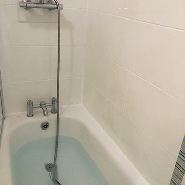
A client with a high-rise apartment in Manchester city centre contacted us in relation to the look of their bathroom tiles. The grout had become grubby and black with mould and it was clear from their message that they were considering have the grout replaced in order to freshen up the bathroom.
We discussed the problem over the telephone, and they emailed a picture of the bathroom across so I could get a better idea of what needed doing. It turns out that the apartment had been rented out previously and they needed the bathroom renovating so they could start letting it again. Clearly, they were keen to have the work completed as soon as possible. Fortunately, we are sometimes able to come out on short notice, especially for small jobs like this and so were able to do the work the following week
Re-grouting is a lot of work and very time consuming so I explained the benefits of Grout Colouring which is much quicker and results in a more practical finish as I will explain. There was a small issue with parking as one would expect from the city centre, but we were able to use one of the parking spaces of a neighbour in the basement of the building.
My first task was to get the grout as clean as possible before applying the colourant and given the amount of mould I decided to apply Tile Doctor Duo-Clean which is a Tile Cleaner/Mould Remover and ideal for use on ceramic tile and grout. The product was sprayed onto the tiles and grout and then scrubbed in by hand to get the grout as clean as possible. I also used a powerful steam cleaner to get the grout as clean as possible before rinsing the soil off with water. This process went well, and the grout looked much cleaner afterwards but was now a little patchy in places due to deep staining.
It’s worth noting that mould thrives in damp warm conditions and can easily be controlled by ensuring the bathroom has adequate ventilation. Some modern showers have a function that cool the bathroom down after use by running the shower on a cold setting. Improving cross-ventilation by leaving the bathroom door and a window open can also improve the situation and of course you can always apply Tile Doctor Duo-Clean on a regular basis.
Once the grout was dry and as clean as it could be, I applied a White Tile Doctor Grout Colourant along the grout lines with a small brush taking care to wipe off any excess from the tiles as I went. Only one bottle of colourant was needed, and I have found baby wipes work well when wiping off the excess.
The last step in the bathroom renovation was to strip out all the old mouldy silicone between the bath and the tiles and replace with new mould resistant silicone.
The cleaning and grout colour completely transformed the look of the bathroom leaving it looking fresh. The grout which was previously dark and patchy was now a consistent white colour giving the impression it had only been recently tiled. The colourant also forms an epoxy barrier over the grout that will prevent dirt from becoming ingrained in the grouts surface going forward, it’s also much easier to clean.
The customer was most impressed with the result and has informed us since that they will back in touch about renovating the grout in their own home! They left the following comment on the Tile Doctor website.
“Kamila made a wonderful job cleaning my grout and silicone. The bathroom looks like new. She was also easy to deal, very friendly and professional. Thank you!”
Alex Logozny
Greater Manchester Tile Doctor

 INSPIRED KITCHEN DESIGN
It was also important for the white IKEA kitchen to have plenty of storage.
“This is a dining room/kitchen combination room, so we wanted to make sure there was ample room for both dining and cooking activities,” he says.
Therefore, featured throughout the kitchen in both the upper and base cabinetry is IKEA VEDDINGE cabinetry in white along with IKEA MAXIMERA drawers and IKEA UTRUSTA door fronts.
Combined with the stainless steel appliances, this creates a light yet warm feel; especially when set against the IKEA KASKER countertops in custom light gray with sleek concrete effect.
From a functional standpoint, there is enormous storage potential throughout.
There is storage above the refrigerator and along the upper perimeter to the electric range and accompanying range hood, and then on the opposite side as well. There is even a small, three-drawer base cabinet on the opposite side of the stainless steel refrigerator.
One standout element of the space is a clever IKEA “hack” using IKEA cabinetry retrofitted to conceal a washer-dryer combo set.
Justin notes this was originally the biggest obstacle of the kitchen design.
He explains: “We thought a washer/dryer was essential to the space, but we were really struggling with where exactly to put it and how to conceal it so that you weren’t staring at your laundry while eating breakfast.”
In addition, the type of cabinet needed was not a cabinet that IKEA standardly offers, so IKD came up with an IKEA hack that was both functional and stylish.
Specifically, the 80”(H) IKEA VEDDINGE cabinetry allows the washer-dryer to seamlessly blend into the layout; which maximizes the kitchen space.
Justin concludes: “We chose IKEA because IKEA’s price point is unbeatable for the quality. We liked that IKEA offered versatility and ease and we really liked that there is a whole industry of professionals that only deal with IKEA products. So they know precisely how to design for IKEA cabinets and build IKEA cabinets, etc.”
Having experienced the IKEA design and installation process, Justin shares some advice with other IKEA customers.
“I would recommend that folks not try to do everything themselves, such as design, demo, shop and build. Designing a kitchen is a lot of work. If you can afford it: seek assistance,” he says.
“We would also recommend using experienced installers who know IKEA cabinets in and out and can help with the details of your kitchen that make it look polished and complete. They also save time.”
To that end, since it was a rental their timeline for the IKEA kitchen to be completed was very tight.
“Our IKEA kitchen wasn’t a project we wanted stretched over six months. We wanted the whole project finished in several weeks [and we accomplished it],” he concludes.

 Westover Landscape Design
Not everyone would see the hidden beauty in the Yonkers property destined for the wrecking ball in 2000. But one family took the serious fixer-upper under their wing. Crumbling walls, overgrown maples (indeed, saplings were busting through the brick walls), and deer living in the basement was the state of affairs when Westover Landscape Design initially arrived on the scene. A year of intensive, meticulous, thoughtful renovation by the homeowner followed while the house was brought up to speed. When the last construction machine finally rumbled out, that’s when Robert Welsch and his crew began their odyssey.
The goal was to honor the newly restored relic and deliver it into the future with fitting surroundings. “We wanted to bring that treasure back to life,” Robert Welsch explains. Working closely with the homeowner as well as the city of Yonkers to guide the restoration, their first feat was to install a proper drainage system with catchments capable of keeping storm water from the massive roof flowing away. Before anything was visible on the surface, extensive work was accomplished underground. Meanwhile, a plan was drafted to honor the era of the house. Westover chose bluestone as the primary path material for its easy maintenance and simplicity when laying the swank configuration of pathways around the house and outward to an entertaining pavilion. By cleverly hemming the bluestone with period brick that echoes the building material for the house for continuity, the result is a smart and sophisticated finish to a promenade that constantly draws the family and their pets outdoors. Brick was also used to rebuild the walled gardens for the much-needed privacy in a close-knit Yonkers community. And a graceful wrought iron gate enhances the arrival experience. But walls and gates were not the only element to screen and reveal views—plant selection was critical.
Few landscapers would go the extra mile to find period perfect plants for a 19th Century restoration, but Robert Welsch saw the importance of authenticity in creating the mood. He repeated large trees—such as an exquisite London plane tree in the front yard—to balance the expression in the back. Recognizing the need for immediate stature, he selected a weeping willow to gain instant volume, giving the landscape a sense of deep roots. A weeping Camperdown elm adds sophisticated drama to the walled stroll gardens. Hydrangeas were incorporated for their billowy stature, easy maintenance, and long blooming season. Similarly, all the plants in residence play their part in the display that goes beyond the usual spring fling to extend throughout the growing season—offering visual interest even when they are not performing. From spring bulbs to autumn perennials, there is never a dull moment. Meanwhile, every step along the way was a collaboration working hand-in-hand with the homeowner and the city to make certain that the historic landmark status of the property was upheld and honored.
The result goes beyond a landscape that is just old faithful. It adds life to the picture, creating a jewel-like setting for the newly proud house. In a word, it is sublime. By planting wisely and using sustainable elements, the restored house and its surroundings are ready for the next generation and beyond. This Yonkers gem remains meticulously groomed under the watchful eye and skill of Westover Landscape Design’s team of gardeners—It’s a keeper.


Sponsored
Fredericksburg, OH

High Point Cabinets
Columbus' Experienced Custom Cabinet Builder | 4x Best of Houzz Winner
 INSPIRED KITCHEN DESIGN
The family that designs together stays together.
This was the approach for IKD customer Alexandra, from Hurley, NY, and her family when they set out to preserve the original galley kitchen footprint for this new IKEA kitchen in their 1950s modern home.
“We liked the existing layout, but we needed more storage and wanted to improve the space’s functionality. We cook every day, but the kitchen is also used as a passage to other parts of the house. It took us some time to think about different design solutions to clarify the space, but it was a process that the whole family enjoyed,” she explains.
Specifically, their main design wish was to incorporate a counter-depth refrigerator, raise the countertops to a more comfortable working height of 38” and to stack the upper cabinets on the stove side.
“We also hoped to find an integrated range hood, which would just blend in with the IKEA cabinetry, so that the horizontal lines in the design could be preserved,” she says.
“Early on in the design process we decided on a white kitchen with sleek, black handles that would create horizontal lines, as well as a concrete-color countertop. We also eliminated the backsplash to keep the kitchen visually simple. Our house is full of art and color, so we didn’t feel the need for patterns and color via the backsplash; plus the stove wall is an actual brick wall which we wanted to expose as a design element.
So Alexandra’s family chose IKEA SEKTION cabinetry framework with IKEA white RINGHULT fronts, IKEA FORBATRA cover panels and IKEA MAXIMERA drawers – all complemented by cabinet handles from Top Knobs.

 InnovationLand
This Houston outdoor kitchen and entertaining area offers a modern take on Mediterranean style.
Designed and built by Outdoor Homescapes of Houston, this fully loaded family and entertaining space echoes the stucco, travertine tile patio and Mediterranean style of the existing home while exuding a more modern, transitional style.
“This was a high-profile client – both VPs of different oil and gas companies who entertain affluent guests on a regular basis – so they wanted to make sure they had high-end appliances and all the latest amenities they could order,” says Lisha Maxey, senior designer for Outdoor Homescapes and owner of LGH Design Services in Houston. “They also have two kids, ages 7 and 10, and wanted a family gathering space that better accompanied their new, luxurious pool.”
What really sets apart this outside kitchen design idea, however, is the way the elements are used throughout the space.
“Usually, outdoor kitchen designs for a backyard are grouped into one island or cabinet,” explains Outdoor Homescapes of Houston owner Wayne Franks. “But here, the patio, roof and fireplace were all in place, separated by stucco columns, and the outdoor kitchen elements had to work around them.”
A 14-foot-long cooking island houses a built-in Fire Magic grill with a Magic View Window (allows the chef to check on food without lifting the lid and losing valuable heat). The island, the countertop of which is "Carnaval" granite from Lackstone, also features a Fire Magic power burner, warming drawer and trash drawer. On one side of the fireplace, forming an “L” with the cooking island, sits a built-in Primo ceramic grill.
On the other side of the fireplace is a 3-foot-long cabinet housing a bar with a wine cooler, ice maker and upper cabinet. And finally, just outside the patio door is a 7-foot-long cabinet with a modern Kohler sink with a high-arc Moen faucet (sink and faucet from Faucets Direct), a trash drawer and another upper cabinet.
Outdoor Homescapes of Houston, by the way, outfitted both cabinets with glass inserts, custom pulls and three-way sensor lighting.
“At the beginning, this was basically a blank space with a fireplace in the middle,” says Maxey. So Outdoor Homescapes upgraded the fireplace with Austin Stack Stone in white (No. 401) from Colorstonescreenshot vickers mosaic tile rectangle. "The stone added that pop,” notes Maxey.
The fireplace’s espresso-colored, distressed wood mantel (from Mantels.com) and upper wood cabinets were both stained with the Minwax color Jacobean. The ceiling fans were also updated with ones featuring similarly espresso-colored, wooden fan blades, to match.
The table in the middle - a cast-iron, Mediterranean style gem with hand-forged scrollwork designs from Patio 1 in Houston – seats 10.
“We wanted this kind of Mediterranean feel,” says Maxey. “We wanted rustic, but the appliance package was so new, with all its stainless steel, so we kept a the cabinets and the columns stucco instead of stone for a more clean, modern look and then did the custom tile backsplash and mosaic in more of a rustic, Mediterranean look."
The backsplash is a 1-inch travertine tile background with 4-inch square metallic insets, both from Floor & Decor. The tile for the 18-by-24-inch rectangle mosaic came from Great Britain Tile Co. and included a Dianno Reale tumbled border and background. The bronze, diamond-shaped insets are tumbled Dark Emperdor tile and the scrolls are tumbled Noce tile.
The client, who admits they have high standards, was more than pleased with the project – especially browsing through Outdoor Homescapes’ vast library of patio kitchen design ideas, the 3D virtual video tour that let them preview the project from every angle before construction. They also liked the personalized design consultation.
"OH provides a very neat service where one of their designers will either shop/buy for you or shop with you for the more detailed pieces that will finish your home," reads the client's review on Houzz. "This was a very positive, personalized feature ... Lisha helped narrow down an enormous marketplace of materials and finishes to a few we could choose from."

 Edgewater Design Group
As written in Northern Home & Cottage by Elizabeth Edwards
Sara and Paul Matthews call their head-turning home, located in a sweet neighborhood just up the hill from downtown Petoskey, “a very human story.” Indeed it is. Sara and her husband, Paul, have a special-needs son as well as an energetic middle-school daughter. This home has an answer for everyone. Located down the street from the school, it is ideally situated for their daughter and a self-contained apartment off the great room accommodates all their son’s needs while giving his caretakers privacy—and the family theirs. The Matthews began the building process by taking their thoughts and
needs to Stephanie Baldwin and her team at Edgewater Design Group. Beyond the above considerations, they wanted their new home to be low maintenance and to stand out architecturally, “But not so much that anyone would complain that it didn’t work in our neighborhood,” says Sara. “We
were thrilled that Edgewater listened to us and were able to give us a unique-looking house that is meeting all our needs.” Lombardy LLC built this handsome home with Paul working alongside the construction crew throughout the project. The low maintenance exterior is a cutting-edge blend of stacked stone, black corrugated steel, black framed windows and Douglas fir soffits—elements that add up to an organic contemporary look. The use of black steel, including interior beams and the staircase system, lend an industrial vibe that is courtesy of the Matthews’ friend Dan Mello of Trimet Industries in Traverse City. The couple first met Dan, a metal fabricator, a number of years ago, right around the time they found out that their then two-year-old son would never be able to walk. After the couple explained to Dan that they couldn’t find a solution for a child who wasn’t big enough for a wheelchair, he designed a comfortable, rolling chair that was just perfect. They still use it. The couple’s gratitude for the chair resulted in a trusting relationship with Dan, so it was natural for them to welcome his talents into their home-building process. A maple floor finished to bring out all of its color-tones envelops the room in warmth. Alder doors and trim and a Doug fir ceiling reflect that warmth. Clearstory windows and floor-to-ceiling window banks fill the space with light—and with views of the spacious grounds that will
become a canvas for Paul, a retired landscaper. The couple’s vibrant art pieces play off against modernist furniture and lighting that is due to an inspired collaboration between Sara and interior designer Kelly Paulsen. “She was absolutely instrumental to the project,” Sara says. “I went through
two designers before I finally found Kelly.” The open clean-lined kitchen, butler’s pantry outfitted with a beverage center and Miele coffee machine (that allows guests to wait on themselves when Sara is cooking), and an outdoor room that centers around a wood-burning fireplace, all make for easy,
fabulous entertaining. A den just off the great room houses the big-screen television and Sara’s loom—
making for relaxing evenings of weaving, game watching and togetherness. Tourgoers will leave understanding that this house is everything great design should be. Form following function—and solving very human issues with soul-soothing style.
 INSPIRED KITCHEN DESIGN
The kitchen has four entrances and a window, which made designing it difficult.
David explains: “It’s a bit of an awkward shape as it’s almost square but not large enough to accommodate an island. We tried to reimagine the layout of the space, but always re-turned to the basic layout that was already there.”
He continues: “We needed to come up with modifications that would make this work. Fitting the dishwasher, large farmhouse sink, under sink garbage and storage all on one side of the kitchen was a challenge.”
So, IKD re-envisioned the laundry room and pantry, which were previously dominated by a floor washer and dryer.
“Now we have a tight combo and space to fold [laundry] on the counter under the window,” Kim says. “We also keep all our cleaning supplies in the cupboard and tons more storage capacity since we have cupboards on both sides of the space.”
To make the space feel less cramped, upper-depth cupboards were added on the side opposite the washing machines.
Similarly, the pantry used to be very cramped and inefficient, featuring laundry machines and an old bookshelf.
“Now we have half of our food, appliances, our microwave and everything else we occasionally use right beside the kitchen. Since we were able to store the microwave in the cabinet, we’re also able to keep the counter in our kitchen clear. Overall, it means less trips to the basement,” Kim concludes.
 RHEINZINK
A 100-year-old farmhouse in Central Maryland was totally renovated and now sports a brand new RHEINZINK roof that gives it an authentic old-world look and feel. The property, which was originally a dairy farm, has been in the owner’s family since the 1920’s.
The renovation involved gutting virtually the entire house and keeping only the frame. The asphalt roof, which had started leaking, was replaced with approximately 4,700 sq. ft. RHEINZINK’s PrePATINA graphite-grey Double Lock Standing Seam Panels.
Fabrication and installation of the RHEINZINK panels was done by Hardin Construction, Union Bridge, MD. According to Craig Hardin, president, “The owner contacted me and said he wanted a roof on the house that would last for generations. We considered various metal material options but quickly settled on RHEINZINK because of its low to no maintenance and the color. The graphite-grey develops a nice patina that complements the house and makes the roof look like it’s always been there.”
“Another factor that steered us toward RHEINZINK was their European detailing techniques,” Hardin said. “You don’t see any other metal roofs around here that have the kind of detailing and seaming techniques like this one.”
Prior to doing the job, Hardin attended a how-to workshop at RHEINZINK America headquarters in Woburn, MA. The workshops, led by technical training manager Lou Rondeau, provide practical instruction in the installation of RHEINZINK roofing, façade and gutter systems. “These are hands-on sessions,” Rondeau said, “and they can really contribute to the craftsmanship of installers.”
Hardin explained his approach to the project. “We’re a small company and I’m personally involved in the actual installation. Unlike larger companies with large crews that have to move fast, we really take the time to pay close attention to the detailing and finish work. This project is really distinctive in that regard,” Hardin said.
In addition to the main roof, the RHEINZINK panels were used on the front porch, a screened-in back porch and a small, freestanding outbuilding. The stone outbuilding once enclosed a cold water spring where the dairy farm’s milk was stored. It now welcomes visitors to the property.
The RHEINZINK distributor on the project was Sheet Metal Supply, Mundelein, IL.

 Housetrends Magazine
Since moving into her Dublin home two and a half years ago, Nancy Sanford has been peeling off the decades—quite literally. Built in the 1980s, the home was “very well-maintained, but very little had been done to it” in terms of updating the finishes or style, Sanford says. Plush white carpet ran from wall-to-wall-to-wall, almond-colored laminate coated the kitchen cabinets and wallpaper ran rampant—even covering some ceilings.
Despite her efforts, Sanford knew it was going to take more than cosmetic editing to shake the ‘80s and make the home her own. Although she lives in the traditional-leaning Muirfield community, Sanford adores a minimalist, contemporary style—and admits to devouring design magazines “ad nauseam.”
To implement her thoroughly modern vision, Sanford turned to Brigid Norton, an interior designer and family friend, and Kristi Youles, a kitchen designer with The JAE Company. Working together, the trio created a carefully considered contemporary design that’s easy on the eyes, and the body.
In addition to improving the flow of the kitchen—by removing a V-shaped peninsula that angled out into the room—and adding appliances like a stainless steel refrigerator, Sanford’s short list of must-haves included clean, uncluttered lines and no wall cabinets over the countertops. “I’ve found as I’ve aged, I’ve gotten shorter and just don’t use the upper cabinets,” Sanford explains.
Easy-access, smooth-slide drawers with clean slab fronts were the answer—resulting in strong visual lines, an open, airy feel and enhanced ergonomics. Starting with a “needs assessment,” Youles and Norton designed the space quite literally around Nancy. By looking at factors such as her height and which items she uses most frequently, they were able to determine the optimum placement for everything from canned goods in the pantry to cutlery, pans and plates in the customized drawers, all of which helped to achieve the ultimate kitchen organization.
But there’s more to the kitchen cabinets smooth façade than clean-lined storage. Walnut drawer fronts—found on the oven and the base of the island—are book-matched, allowing the grain to continue from drawer to drawer. And even in spaces where drawers weren’t feasible, beneath the sink and in a desk area, the designers continued the look with cabinet doors crafted to resemble drawers.
The visual continuity of these lines might not be as impactful if it weren’t for the careful selection of contrasting finishes. The designers filled the space with pure, glossy white—using a specific type of quartz, White Cliff by Cambria, to accent the bold rectangular design of the island. Then, to break up the expanse of accompanying white painted drawers, walnut was selected to bring the contrasting warmth and grain of wood without red undertones. It is commonly found in modern furniture design, as well as current productions of mid-century designs like the iconic Eames Lounge Chair from Herman Miller, Youles says.


 RHEINZINK
A 100-year-old farmhouse in Central Maryland was totally renovated and now sports a brand new RHEINZINK roof that gives it an authentic old-world look and feel. The property, which was originally a dairy farm, has been in the owner’s family since the 1920’s.
The renovation involved gutting virtually the entire house and keeping only the frame. The asphalt roof, which had started leaking, was replaced with approximately 4,700 sq. ft. RHEINZINK’s PrePATINA graphite-grey Double Lock Standing Seam Panels.
Fabrication and installation of the RHEINZINK panels was done by Hardin Construction, Union Bridge, MD. According to Craig Hardin, president, “The owner contacted me and said he wanted a roof on the house that would last for generations. We considered various metal material options but quickly settled on RHEINZINK because of its low to no maintenance and the color. The graphite-grey develops a nice patina that complements the house and makes the roof look like it’s always been there.”
“Another factor that steered us toward RHEINZINK was their European detailing techniques,” Hardin said. “You don’t see any other metal roofs around here that have the kind of detailing and seaming techniques like this one.”
Prior to doing the job, Hardin attended a how-to workshop at RHEINZINK America headquarters in Woburn, MA. The workshops, led by technical training manager Lou Rondeau, provide practical instruction in the installation of RHEINZINK roofing, façade and gutter systems. “These are hands-on sessions,” Rondeau said, “and they can really contribute to the craftsmanship of installers.”
Hardin explained his approach to the project. “We’re a small company and I’m personally involved in the actual installation. Unlike larger companies with large crews that have to move fast, we really take the time to pay close attention to the detailing and finish work. This project is really distinctive in that regard,” Hardin said.
In addition to the main roof, the RHEINZINK panels were used on the front porch, a screened-in back porch and a small, freestanding outbuilding. The stone outbuilding once enclosed a cold water spring where the dairy farm’s milk was stored. It now welcomes visitors to the property.
The RHEINZINK distributor on the project was Sheet Metal Supply, Mundelein, IL.

 Cummings Architecture + Interiors
Situated along Eagle River, looking across to the mouth of the Ipswich Harbor, this was clearly a little cape house that was married to the sea. The owners were inquiring about adding a simple shed dormer to provide additional exposure to the stunning water view, but they were also interested in what Mathew would design if this beach cottage were his.
Inspired by the waves that came ashore mere feet from the little house, Mathew took up a fat marker and sketched a sweeping, S-shape dormer on the waterside of the building. He then described how the dormer would be designed in the shape of an ocean wave. “This way,” he explained, “you will not only be able to see the ocean from your new master bedroom, you’ll also be able to experience that view from a space that actually reflects the spirit of the waves.”
Mathew and his team designed the master suite and study using a subtle combination of contemporary and traditional, beach-house elements. The result was a completely unique and one-of-a-kind space inside and out. Transparencies are built into the design via features like gently curved glass that reflects the water and the arched interior window separating the bedroom and bath. On the exterior, the curved dormer on the street side echoes these rounded shapes and lines to create continuity throughout. The sense of movement is accentuated by the continuous, V-groove boarded ceiling that runs from one ocean-shaped dormer through to the opposite side of the house.
The bedroom features a cozy sitting area with built in storage and a porthole window to look out onto the rowboats in the harbor. A bathroom and closet were combined into a single room in a modern design that doesn't sacrifice any style or space and provides highly efficient functionality. A striking barn door made of glass with industrial hardware divides the two zones of the master suite. The custom, built-in maple cabinetry of the closets provides a textural counterpoint to the unique glass shower that incorporates sea stones and an ocean wave motif accent tile.
With this spectacular design vision, the owners are now able to enjoy their stunning view from a bright and spacious interior that brings the natural elements of the beach into the home.
Photo by Eric Roth


 Rockledge Design + Architecture
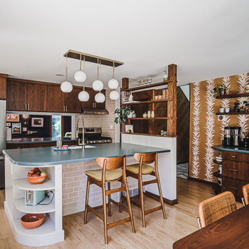
Built in 1979, this home in Pittsburgh’s Bradford Woods borough snuck in at the very tail end of Mid-Century Modern architecture. As lovers of that era, you can imagine our excitement when our clients explained their vision to lean in to that style with their planned kitchen renovation. We collaborated to design a beautiful and functional space that not only better suits this young family’s lifestyle, but truly feels like it has always been a part of the home.
Starting with the layout, we opened the kitchen up to neighboring dining room and eat-in spaces, allowing for a more cohesive main level floorplan. Along with some slight reconfiguring of the refrigerator and pantry locations, a new island created an opportunity for the main kitchen workspace to stay connected for both entertaining and day-to-day activities. Custom open shelving anchors the end of the island without blocking sightlines from the front of the home into the kitchen.
New light oak flooring throughout adds a contemporary nod, integrating two adjoining family rooms. It also creates a nice contrast for the kitchen and dining room’s custom cabinetry in a rich walnut finish. Slab style doors with minimal brass hardware help deliver the streamlined Mid-Century aesthetic. Custom radial edges at the island and coffee bar add a whimsical flair, highlighting the matte green solid surface countertops. To coordinate with the original tile found in the entryway, a neutral choice with rustic handmade detail adds warmth and texture to the backsplash and island base.
Rounding out the rest of this sunny space, Mid-Mod inspired light fixtures, bold patterned wallpaper, a mix of the client’s new and vintage furniture, plus curated textiles and accessories lend the “just right” amount of personality.
 User
Specifications
Plan Styles
Bedroom Features
Upstairs Master Bdrm
Walk In Closet
Garage
Oversized Garage
Side Entry Garage
Lot Characteristics
Suited For Corner Lot
Suited For Sloping Lot
Area
Upper Floor Sq Ft
924 sq ft
Total Sq Ft
2192 sq ft
Main Floor Sq Ft
1268 sq ft
Lower Floor Sq Ft
900 sq ft
Designer Notes
Included
EXTERIOR ELEVATIONS: shows the front, rear and sides of the house, including exterior materials, details and measurements.
FOUNDATION PLAN: includes drawings for a full, daylight or partial basement. Some of our plans are drawn with a crawlspace, but we do not offer plans with pole foundation. All necessary notations and dimensions are included. Foundation options will vary for each plan. If the home you want does not have the type of foundation you desire, one may be developed for you by contacting us.
DETAILED FLOOR PLANS: shows the placement of the interior walls and the dimensions for rooms, doors, windows, stairways, etc., of each level of the house.
CROSS SECTIONS: shows details of the house as though it were cut in slices from the roof to the foundation. The cross sections specify the home's construction, insulation, flooring and roofing details. Most of our Cross Sections are common sections of that particular style of house. If the house is complex a Cross Section or other form of detail will be included to help explain how parts of that house will fit together.
ROOF DETAILS: shows slope, pitch and location of dormers, gables and other roof elements, including skylights. These details may be shown on the elevation sheet or on a separate diagram. Note: If trusses are used, we suggest using a local truss manufacturer to design your trusses to comply with your local codes and regulations. If Rafters are used we suggest using your local lumber company. Most lumber companies employ structural engineers who can figure out the proper spans and loads for this type of roof system.
Additional Rooms
Great Room Living Room
Unfinished Future Space
Outdo
 Rockledge Design + Architecture
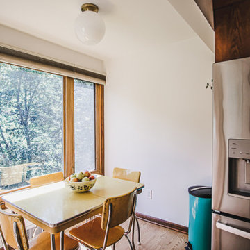
Built in 1979, this home in Pittsburgh’s Bradford Woods borough snuck in at the very tail end of Mid-Century Modern architecture. As lovers of that era, you can imagine our excitement when our clients explained their vision to lean in to that style with their planned kitchen renovation. We collaborated to design a beautiful and functional space that not only better suits this young family’s lifestyle, but truly feels like it has always been a part of the home.
Starting with the layout, we opened the kitchen up to neighboring dining room and eat-in spaces, allowing for a more cohesive main level floorplan. Along with some slight reconfiguring of the refrigerator and pantry locations, a new island created an opportunity for the main kitchen workspace to stay connected for both entertaining and day-to-day activities. Custom open shelving anchors the end of the island without blocking sightlines from the front of the home into the kitchen.
New light oak flooring throughout adds a contemporary nod, integrating two adjoining family rooms. It also creates a nice contrast for the kitchen and dining room’s custom cabinetry in a rich walnut finish. Slab style doors with minimal brass hardware help deliver the streamlined Mid-Century aesthetic. Custom radial edges at the island and coffee bar add a whimsical flair, highlighting the matte green solid surface countertops. To coordinate with the original tile found in the entryway, a neutral choice with rustic handmade detail adds warmth and texture to the backsplash and island base.
Rounding out the rest of this sunny space, Mid-Mod inspired light fixtures, bold patterned wallpaper, a mix of the client’s new and vintage furniture, plus curated textiles and accessories lend the “just right” amount of personality.
128