
Search results for "Explainers" in Home Design Ideas
 Jeanne Schultz Design Studio
Words by Wilson Hack
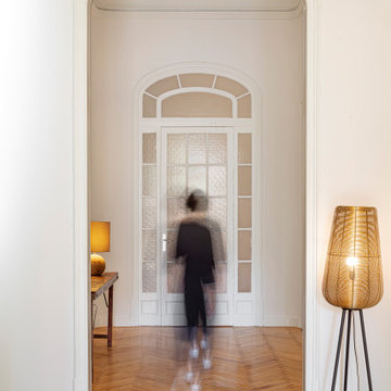
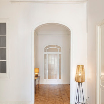
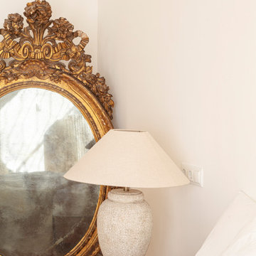
The best architecture allows what has come before it to be seen and cared for while at the same time injecting something new, if not idealistic. Spartan at first glance, the interior of this stately apartment building, located on the iconic Passeig de Gràcia in Barcelona, quickly begins to unfold as a calculated series of textures, visual artifacts and perfected aesthetic continuities.
The client, a globe-trotting entrepreneur, selected Jeanne Schultz Design Studio for the remodel and requested that the space be reconditioned into a purposeful and peaceful landing pad. It was to be furnished simply using natural and sustainable materials. Schultz began by gently peeling back before adding only the essentials, resulting in a harmoniously restorative living space where darkness and light coexist and comfort reigns.
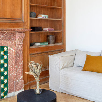
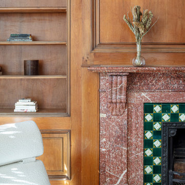
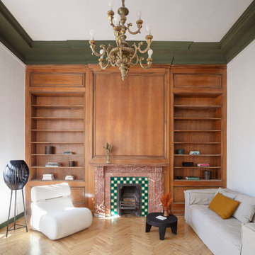
The design was initially guided by the fireplace—from there a subtle injection of matching color extends up into the thick tiered molding and ceiling trim. “The most reckless patterns live here,” remarks Schultz, referring to the checkered green and white tiles, pink-Pollack-y stone and cast iron detailing. The millwork and warm wood wall panels devour the remainder of the living room, eliminating the need for unnecessary artwork.
A curved living room chair by Kave Home punctuates playfully; its shape reveals its pleasant conformity to the human body and sits back, inviting rest and respite. “It’s good for all body types and sizes,” explains Schultz. The single sofa by Dareels is purposefully oversized, casual and inviting. A beige cover was added to soften the otherwise rectilinear edges. Additionally sourced from Dareels, a small yet centrally located side table anchors the space with its dark black wood texture, its visual weight on par with the larger pieces. The black bulbous free standing lamp converses directly with the antique chandelier above. Composed of individual black leather strips, it is seemingly harsh—yet its soft form is reminiscent of a spring tulip.
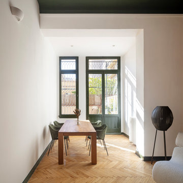
The continuation of the color palette slips softly into the dining room where velvety green chairs sit delicately on a cascade array of pointed legs. The doors that lead out to the patio were sanded down and treated so that the original shape and form could be retained. Although the same green paint was used throughout, this set of doors speaks in darker tones alongside the acute and penetrating daylight. A few different shades of white paint were used throughout the space to add additional depth and embellish this shadowy texture.
Specialty lights were added into the space to complement the existing overhead lighting. A wall sconce was added in the living room and extra lighting was placed in the kitchen. However, because of the existing barrel vaulted tile ceiling, sconces were placed on the walls rather than above to avoid penetrating the existing architecture.

 Cantoni Irvine
When Irvine designer, Richard Bustos’ client decided to remodel his Orange County 4,900 square foot home into a contemporary space, he immediately thought of Cantoni. His main concern though was based on the assumption that our luxurious modern furnishings came with an equally luxurious price tag. It was only after a visit to our Irvine store, where the client and Richard connected that the client realized our extensive collection of furniture and accessories was well within his reach.
“Richard was very thorough and straight forward as far as pricing,” says the client. "I became very intrigued that he was able to offer high quality products that I was looking for within my budget.”
The next phases of the project involved looking over floor plans and discussing the client’s vision as far as design. The goal was to create a comfortable, yet stylish and modern layout for the client, his wife, and their three kids. In addition to creating a cozy and contemporary space, the client wanted his home to exude a tranquil atmosphere. Drawing most of his inspiration from Houzz, (the leading online platform for home remodeling and design) the client incorporated a Zen-like ambiance through the distressed greyish brown flooring, organic bamboo wall art, and with Richard’s help, earthy wall coverings, found in both the master bedroom and bathroom.
Over the span of approximately two years, Richard helped his client accomplish his vision by selecting pieces of modern furniture that possessed the right colors, earthy tones, and textures so as to complement the home’s pre-existing features.
The first room the duo tackled was the great room, and later continued furnishing the kitchen and master bedroom. Living up to its billing, the great room not only opened up to a breathtaking view of the Newport coast, it also was one great space. Richard decided that the best option to maximize the space would be to break the room into two separate yet distinct areas for living and dining.
While exploring our online collections, the client discovered the Jasper Shag rug in a bold and vibrant green. The grassy green rug paired with the sleek Italian made Montecarlo glass dining table added just the right amount of color and texture to compliment the natural beauty of the bamboo sculpture. The client happily adds, “I’m always receiving complements on the green rug!”
Once the duo had completed the dining area, they worked on furnishing the living area, and later added pieces like the classic Renoir bed to the master bedroom and Crescent Console to the kitchen, which adds both balance and sophistication. The living room, also known as the family room was the central area where Richard’s client and his family would spend quality time. As a fellow family man, Richard understood that that meant creating an inviting space with comfortable and durable pieces of furniture that still possessed a modern flare. The client loved the look and design of the Mercer sectional. With Cantoni’s ability to customize furniture, Richard was able to special order the sectional in a fabric that was both durable and aesthetically pleasing.
Selecting the color scheme for the living room was also greatly influenced by the client’s pre-existing artwork as well as unique distressed floors. Richard recommended adding dark pieces of furniture as seen in the Mercer sectional along with the Viera area rug. He explains, “The darker colors and contrast of the rug’s material worked really well with the distressed wood floor.” Furthermore, the comfortable American Leather Recliner, which was customized in red leather not only maximized the space, but also tied in the client’s picturesque artwork beautifully. The client adds gratefully, “Richard was extremely helpful with color; He was great at seeing if I was taking it too far or not enough.”
It is apparent that Richard and his client made a great team. With the client’s passion for great design and Richard’s design expertise, together they transformed the home into a modern sanctuary. Working with this particular client was a very rewarding experience for Richard. He adds, “My client and his family were so easy and fun to work with. Their enthusiasm, focus, and involvement are what helped me bring their ideas to life. I think we created a unique environment that their entire family can enjoy for many years to come.”
https://www.cantoni.com/project/a-contemporary-sanctuary
 Jeanne Schultz Design Studio
Words by Wilson Hack
The best architecture allows what has come before it to be seen and cared for while at the same time injecting something new, if not idealistic. Spartan at first glance, the interior of this stately apartment building, located on the iconic Passeig de Gràcia in Barcelona, quickly begins to unfold as a calculated series of textures, visual artifacts and perfected aesthetic continuities.
The client, a globe-trotting entrepreneur, selected Jeanne Schultz Design Studio for the remodel and requested that the space be reconditioned into a purposeful and peaceful landing pad. It was to be furnished simply using natural and sustainable materials. Schultz began by gently peeling back before adding only the essentials, resulting in a harmoniously restorative living space where darkness and light coexist and comfort reigns.
The design was initially guided by the fireplace—from there a subtle injection of matching color extends up into the thick tiered molding and ceiling trim. “The most reckless patterns live here,” remarks Schultz, referring to the checkered green and white tiles, pink-Pollack-y stone and cast iron detailing. The millwork and warm wood wall panels devour the remainder of the living room, eliminating the need for unnecessary artwork.
A curved living room chair by Kave Home punctuates playfully; its shape reveals its pleasant conformity to the human body and sits back, inviting rest and respite. “It’s good for all body types and sizes,” explains Schultz. The single sofa by Dareels is purposefully oversized, casual and inviting. A beige cover was added to soften the otherwise rectilinear edges. Additionally sourced from Dareels, a small yet centrally located side table anchors the space with its dark black wood texture, its visual weight on par with the larger pieces. The black bulbous free standing lamp converses directly with the antique chandelier above. Composed of individual black leather strips, it is seemingly harsh—yet its soft form is reminiscent of a spring tulip.
The continuation of the color palette slips softly into the dining room where velvety green chairs sit delicately on a cascade array of pointed legs. The doors that lead out to the patio were sanded down and treated so that the original shape and form could be retained. Although the same green paint was used throughout, this set of doors speaks in darker tones alongside the acute and penetrating daylight. A few different shades of white paint were used throughout the space to add additional depth and embellish this shadowy texture.
Specialty lights were added into the space to complement the existing overhead lighting. A wall sconce was added in the living room and extra lighting was placed in the kitchen. However, because of the existing barrel vaulted tile ceiling, sconces were placed on the walls rather than above to avoid penetrating the existing architecture.
Find the right local pro for your project
 DYM Builders Group, Inc.
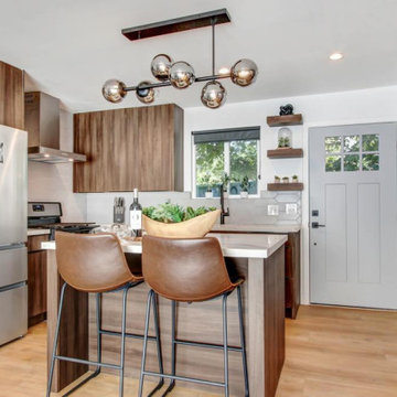
This once unused garage has been transformed into a private suite masterpiece! Featuring a full kitchen, living room, bedroom and 2 bathrooms, who would have thought that this ADU used to be a garage that gathered dust?
 Jeanne Schultz Design Studio
Words by Wilson Hack
The best architecture allows what has come before it to be seen and cared for while at the same time injecting something new, if not idealistic. Spartan at first glance, the interior of this stately apartment building, located on the iconic Passeig de Gràcia in Barcelona, quickly begins to unfold as a calculated series of textures, visual artifacts and perfected aesthetic continuities.
The client, a globe-trotting entrepreneur, selected Jeanne Schultz Design Studio for the remodel and requested that the space be reconditioned into a purposeful and peaceful landing pad. It was to be furnished simply using natural and sustainable materials. Schultz began by gently peeling back before adding only the essentials, resulting in a harmoniously restorative living space where darkness and light coexist and comfort reigns.
The design was initially guided by the fireplace—from there a subtle injection of matching color extends up into the thick tiered molding and ceiling trim. “The most reckless patterns live here,” remarks Schultz, referring to the checkered green and white tiles, pink-Pollack-y stone and cast iron detailing. The millwork and warm wood wall panels devour the remainder of the living room, eliminating the need for unnecessary artwork.
A curved living room chair by Kave Home punctuates playfully; its shape reveals its pleasant conformity to the human body and sits back, inviting rest and respite. “It’s good for all body types and sizes,” explains Schultz. The single sofa by Dareels is purposefully oversized, casual and inviting. A beige cover was added to soften the otherwise rectilinear edges. Additionally sourced from Dareels, a small yet centrally located side table anchors the space with its dark black wood texture, its visual weight on par with the larger pieces. The black bulbous free standing lamp converses directly with the antique chandelier above. Composed of individual black leather strips, it is seemingly harsh—yet its soft form is reminiscent of a spring tulip.
The continuation of the color palette slips softly into the dining room where velvety green chairs sit delicately on a cascade array of pointed legs. The doors that lead out to the patio were sanded down and treated so that the original shape and form could be retained. Although the same green paint was used throughout, this set of doors speaks in darker tones alongside the acute and penetrating daylight. A few different shades of white paint were used throughout the space to add additional depth and embellish this shadowy texture.
Specialty lights were added into the space to complement the existing overhead lighting. A wall sconce was added in the living room and extra lighting was placed in the kitchen. However, because of the existing barrel vaulted tile ceiling, sconces were placed on the walls rather than above to avoid penetrating the existing architecture.
 Jeanne Schultz Design Studio
Words by Wilson Hack
The best architecture allows what has come before it to be seen and cared for while at the same time injecting something new, if not idealistic. Spartan at first glance, the interior of this stately apartment building, located on the iconic Passeig de Gràcia in Barcelona, quickly begins to unfold as a calculated series of textures, visual artifacts and perfected aesthetic continuities.
The client, a globe-trotting entrepreneur, selected Jeanne Schultz Design Studio for the remodel and requested that the space be reconditioned into a purposeful and peaceful landing pad. It was to be furnished simply using natural and sustainable materials. Schultz began by gently peeling back before adding only the essentials, resulting in a harmoniously restorative living space where darkness and light coexist and comfort reigns.
The design was initially guided by the fireplace—from there a subtle injection of matching color extends up into the thick tiered molding and ceiling trim. “The most reckless patterns live here,” remarks Schultz, referring to the checkered green and white tiles, pink-Pollack-y stone and cast iron detailing. The millwork and warm wood wall panels devour the remainder of the living room, eliminating the need for unnecessary artwork.
A curved living room chair by Kave Home punctuates playfully; its shape reveals its pleasant conformity to the human body and sits back, inviting rest and respite. “It’s good for all body types and sizes,” explains Schultz. The single sofa by Dareels is purposefully oversized, casual and inviting. A beige cover was added to soften the otherwise rectilinear edges. Additionally sourced from Dareels, a small yet centrally located side table anchors the space with its dark black wood texture, its visual weight on par with the larger pieces. The black bulbous free standing lamp converses directly with the antique chandelier above. Composed of individual black leather strips, it is seemingly harsh—yet its soft form is reminiscent of a spring tulip.
The continuation of the color palette slips softly into the dining room where velvety green chairs sit delicately on a cascade array of pointed legs. The doors that lead out to the patio were sanded down and treated so that the original shape and form could be retained. Although the same green paint was used throughout, this set of doors speaks in darker tones alongside the acute and penetrating daylight. A few different shades of white paint were used throughout the space to add additional depth and embellish this shadowy texture.
Specialty lights were added into the space to complement the existing overhead lighting. A wall sconce was added in the living room and extra lighting was placed in the kitchen. However, because of the existing barrel vaulted tile ceiling, sconces were placed on the walls rather than above to avoid penetrating the existing architecture.
 Jeanne Schultz Design Studio
Words by Wilson Hack
The best architecture allows what has come before it to be seen and cared for while at the same time injecting something new, if not idealistic. Spartan at first glance, the interior of this stately apartment building, located on the iconic Passeig de Gràcia in Barcelona, quickly begins to unfold as a calculated series of textures, visual artifacts and perfected aesthetic continuities.
The client, a globe-trotting entrepreneur, selected Jeanne Schultz Design Studio for the remodel and requested that the space be reconditioned into a purposeful and peaceful landing pad. It was to be furnished simply using natural and sustainable materials. Schultz began by gently peeling back before adding only the essentials, resulting in a harmoniously restorative living space where darkness and light coexist and comfort reigns.
The design was initially guided by the fireplace—from there a subtle injection of matching color extends up into the thick tiered molding and ceiling trim. “The most reckless patterns live here,” remarks Schultz, referring to the checkered green and white tiles, pink-Pollack-y stone and cast iron detailing. The millwork and warm wood wall panels devour the remainder of the living room, eliminating the need for unnecessary artwork.
A curved living room chair by Kave Home punctuates playfully; its shape reveals its pleasant conformity to the human body and sits back, inviting rest and respite. “It’s good for all body types and sizes,” explains Schultz. The single sofa by Dareels is purposefully oversized, casual and inviting. A beige cover was added to soften the otherwise rectilinear edges. Additionally sourced from Dareels, a small yet centrally located side table anchors the space with its dark black wood texture, its visual weight on par with the larger pieces. The black bulbous free standing lamp converses directly with the antique chandelier above. Composed of individual black leather strips, it is seemingly harsh—yet its soft form is reminiscent of a spring tulip.
The continuation of the color palette slips softly into the dining room where velvety green chairs sit delicately on a cascade array of pointed legs. The doors that lead out to the patio were sanded down and treated so that the original shape and form could be retained. Although the same green paint was used throughout, this set of doors speaks in darker tones alongside the acute and penetrating daylight. A few different shades of white paint were used throughout the space to add additional depth and embellish this shadowy texture.
Specialty lights were added into the space to complement the existing overhead lighting. A wall sconce was added in the living room and extra lighting was placed in the kitchen. However, because of the existing barrel vaulted tile ceiling, sconces were placed on the walls rather than above to avoid penetrating the existing architecture.
Sponsored
Fredericksburg, OH

High Point Cabinets
Columbus' Experienced Custom Cabinet Builder | 4x Best of Houzz Winner
 Jeanne Schultz Design Studio
Written by Wilson Hack
The best architecture allows what has come before it to be seen and cared for while at the same time injecting something new, if not idealistic. Spartan at first glance, the interior of this stately apartment building, located on the iconic Passeig de Gràcia in Barcelona, quickly begins to unfold as a calculated series of textures, visual artifacts and perfected aesthetic continuities.
The client, a globe-trotting entrepreneur, selected Jeanne Schultz Design Studio for the remodel and requested that the space be reconditioned into a purposeful and peaceful landing pad. It was to be furnished simply using natural and sustainable materials. Schultz began by gently peeling back before adding only the essentials, resulting in a harmoniously restorative living space where darkness and light coexist and comfort reigns.
The design was initially guided by the fireplace—from there a subtle injection of matching color extends up into the thick tiered molding and ceiling trim. “The most reckless patterns live here,” remarks Schultz, referring to the checkered green and white tiles, pink-Pollack-y stone and cast iron detailing. The millwork and warm wood wall panels devour the remainder of the living room, eliminating the need for unnecessary artwork.
A curved living room chair by Kave Home punctuates playfully; its shape reveals its pleasant conformity to the human body and sits back, inviting rest and respite. “It’s good for all body types and sizes,” explains Schultz. The single sofa by Dareels is purposefully oversized, casual and inviting. A beige cover was added to soften the otherwise rectilinear edges. Additionally sourced from Dareels, a small yet centrally located side table anchors the space with its dark black wood texture, its visual weight on par with the larger pieces. The black bulbous free standing lamp converses directly with the antique chandelier above. Composed of individual black leather strips, it is seemingly harsh—yet its soft form is reminiscent of a spring tulip.
The continuation of the color palette slips softly into the dining room where velvety green chairs sit delicately on a cascade array of pointed legs. The doors that lead out to the patio were sanded down and treated so that the original shape and form could be retained. Although the same green paint was used throughout, this set of doors speaks in darker tones alongside the acute and penetrating daylight. A few different shades of white paint were used throughout the space to add additional depth and embellish this shadowy texture.
Specialty lights were added into the space to complement the existing overhead lighting. A wall sconce was added in the living room and extra lighting was placed in the kitchen. However, because of the existing barrel vaulted tile ceiling, sconces were placed on the walls rather than above to avoid penetrating the existing architecture.
 Jeanne Schultz Design Studio
Words by Wilson Hack
The best architecture allows what has come before it to be seen and cared for while at the same time injecting something new, if not idealistic. Spartan at first glance, the interior of this stately apartment building, located on the iconic Passeig de Gràcia in Barcelona, quickly begins to unfold as a calculated series of textures, visual artifacts and perfected aesthetic continuities.
The client, a globe-trotting entrepreneur, selected Jeanne Schultz Design Studio for the remodel and requested that the space be reconditioned into a purposeful and peaceful landing pad. It was to be furnished simply using natural and sustainable materials. Schultz began by gently peeling back before adding only the essentials, resulting in a harmoniously restorative living space where darkness and light coexist and comfort reigns.
The design was initially guided by the fireplace—from there a subtle injection of matching color extends up into the thick tiered molding and ceiling trim. “The most reckless patterns live here,” remarks Schultz, referring to the checkered green and white tiles, pink-Pollack-y stone and cast iron detailing. The millwork and warm wood wall panels devour the remainder of the living room, eliminating the need for unnecessary artwork.
A curved living room chair by Kave Home punctuates playfully; its shape reveals its pleasant conformity to the human body and sits back, inviting rest and respite. “It’s good for all body types and sizes,” explains Schultz. The single sofa by Dareels is purposefully oversized, casual and inviting. A beige cover was added to soften the otherwise rectilinear edges. Additionally sourced from Dareels, a small yet centrally located side table anchors the space with its dark black wood texture, its visual weight on par with the larger pieces. The black bulbous free standing lamp converses directly with the antique chandelier above. Composed of individual black leather strips, it is seemingly harsh—yet its soft form is reminiscent of a spring tulip.
The continuation of the color palette slips softly into the dining room where velvety green chairs sit delicately on a cascade array of pointed legs. The doors that lead out to the patio were sanded down and treated so that the original shape and form could be retained. Although the same green paint was used throughout, this set of doors speaks in darker tones alongside the acute and penetrating daylight. A few different shades of white paint were used throughout the space to add additional depth and embellish this shadowy texture.
Specialty lights were added into the space to complement the existing overhead lighting. A wall sconce was added in the living room and extra lighting was placed in the kitchen. However, because of the existing barrel vaulted tile ceiling, sconces were placed on the walls rather than above to avoid penetrating the existing architecture.

 Michelle's Interiors
The beautifully rugged geography of North Central Texas inspired the textures and colors of this luxurious dining room in the Dallas region. But my clients’ relaxed, gracious lifestyle inspired the warm vibe that envelops the space. Among the key features are the oak table with hand-forged, hammered iron bases, which seats 10, the hair-on-hide area rug with Greek key pattern and the carved buffet. The floor is constructed of repurposed French farmhouse wood floor.
Photo by Brian Gassel

 J T Construction & Design LLC
This exterior covered deck with cypress mixed grain tonge and grove soffit material was very specifically designed to seamlessly flow from front to back and integrate with the beam work. The Timber tech decking surface was chosen for durable surface material as we face the ocean and ease of use and cleaning for these clients as they have four children and love to entertain on there deck which is now an extension of there living space. This framless glass rail system also enhances the stunning views from there deck and opens up the space so much with the un obstructed light that flows in from every angle now.

 InnovationLand
Outdoor furniture from Restoration Hardware really made this Houston outdoor living space design project shine.
“It really went well,” says Wayne Franks, owner of Outdoor Homescapes of Houston. “It's not a huge space, but moving the existing two columns about four feet and bringing the roof out only three feet made all the difference in the world.”
“This particular client wanted a larger space to entertain,” says senior designer Lisha Maxey, who served as an outdoor furniture consultant while managing construction for the project.
The original space, Lisha explains, had two oddly placed columns blocking a clear view of the beautiful pool area from inside the home. “We removed those columns and gave her three more feet of roof, which extended her living area while also giving her the view she wanted.”
Since the client - a woman in her mid-50s with grown children who visit frequently - only wanted a small outdoor kitchen island with a 30-inch RCS grill Outdoor Homescapes closed up a French door that led from the master bedroom (which she never used) and created a new stucco wall for the kitchen.
“I would definitely call the style of this space ‘transitional,” says Lisha. The client is a very eclectic world traveler and a collector of art, yet wanted her outdoor living space to feel like a warm, homey living room once we placed the furniture and décor. In the end, her finishes centered around rustic stone, detailed columns and furniture leaning towards the contemporary.”
Much of the warmth in the space, she says, comes from the colors of the dry-stacked Sunset Canyon ledgestone. “It looks just like it sounds – like the sun setting in a deep canyon!”
“The columns are unique – decorative and fluted,” adds Wayne.
The client, who’d received five free hours of outdoor furniture consultation as part of an ongoing promotion, also wanted Lisha to help her select, buy and help place furnishings.
“I believe that now - more than ever - consumers are looking for turn-key operations in any type of service industry - a ‘one-stop-shop,’ so to speak,” says Lisha. “It gives us a more personal touch with the client, as well as an edge in the industry in terms of selling our designs, as the client is reassured that we’ll work with them in every aspect to give them the outdoor living space of their dreams.”
The client ended up choosing the Biscayne collection – including a chair that rocks and swivels - from Restoration Hardware. They also went with a lower, unique teak coffee table from the Belvedere collection.
“We mixed wicker with teak for an equally soft and hard look and added pops of color to bring out the beautiful art collection inside,” says Lisha. “The neutral gray wicker, by the way, was the perfect match for the distressed teak coffee table and credenza. The grays of the Key West granite countertop also echoed this color palette.”
For the fabric, Lisha helped keep it neutral with a Mocha linen and popped the color with royal blue throw pillows matching the area rug: “To make the space truly her own, we added some unique copper pots from her collection and a few items she's collected abroad.”
Ready to let outdoor furniture transform your living space? Contact us, and we'll get your outdoor design project started!
 Cantoni Irvine
When Irvine designer, Richard Bustos’ client decided to remodel his Orange County 4,900 square foot home into a contemporary space, he immediately thought of Cantoni. His main concern though was based on the assumption that our luxurious modern furnishings came with an equally luxurious price tag. It was only after a visit to our Irvine store, where the client and Richard connected that the client realized our extensive collection of furniture and accessories was well within his reach.
“Richard was very thorough and straight forward as far as pricing,” says the client. "I became very intrigued that he was able to offer high quality products that I was looking for within my budget.”
The next phases of the project involved looking over floor plans and discussing the client’s vision as far as design. The goal was to create a comfortable, yet stylish and modern layout for the client, his wife, and their three kids. In addition to creating a cozy and contemporary space, the client wanted his home to exude a tranquil atmosphere. Drawing most of his inspiration from Houzz, (the leading online platform for home remodeling and design) the client incorporated a Zen-like ambiance through the distressed greyish brown flooring, organic bamboo wall art, and with Richard’s help, earthy wall coverings, found in both the master bedroom and bathroom.
Over the span of approximately two years, Richard helped his client accomplish his vision by selecting pieces of modern furniture that possessed the right colors, earthy tones, and textures so as to complement the home’s pre-existing features.
The first room the duo tackled was the great room, and later continued furnishing the kitchen and master bedroom. Living up to its billing, the great room not only opened up to a breathtaking view of the Newport coast, it also was one great space. Richard decided that the best option to maximize the space would be to break the room into two separate yet distinct areas for living and dining.
While exploring our online collections, the client discovered the Jasper Shag rug in a bold and vibrant green. The grassy green rug paired with the sleek Italian made Montecarlo glass dining table added just the right amount of color and texture to compliment the natural beauty of the bamboo sculpture. The client happily adds, “I’m always receiving complements on the green rug!”
Once the duo had completed the dining area, they worked on furnishing the living area, and later added pieces like the classic Renoir bed to the master bedroom and Crescent Console to the kitchen, which adds both balance and sophistication. The living room, also known as the family room was the central area where Richard’s client and his family would spend quality time. As a fellow family man, Richard understood that that meant creating an inviting space with comfortable and durable pieces of furniture that still possessed a modern flare. The client loved the look and design of the Mercer sectional. With Cantoni’s ability to customize furniture, Richard was able to special order the sectional in a fabric that was both durable and aesthetically pleasing.
Selecting the color scheme for the living room was also greatly influenced by the client’s pre-existing artwork as well as unique distressed floors. Richard recommended adding dark pieces of furniture as seen in the Mercer sectional along with the Viera area rug. He explains, “The darker colors and contrast of the rug’s material worked really well with the distressed wood floor.” Furthermore, the comfortable American Leather Recliner, which was customized in red leather not only maximized the space, but also tied in the client’s picturesque artwork beautifully. The client adds gratefully, “Richard was extremely helpful with color; He was great at seeing if I was taking it too far or not enough.”
It is apparent that Richard and his client made a great team. With the client’s passion for great design and Richard’s design expertise, together they transformed the home into a modern sanctuary. Working with this particular client was a very rewarding experience for Richard. He adds, “My client and his family were so easy and fun to work with. Their enthusiasm, focus, and involvement are what helped me bring their ideas to life. I think we created a unique environment that their entire family can enjoy for many years to come.”
https://www.cantoni.com/project/a-contemporary-sanctuary
 Bat City Builders, LLC
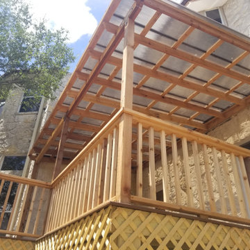
This is a wooden deck with a covered transparent pergola, which provides some shade but still passes some light through. The roof is made from Skypoly, which stops water, and UV rays as well as reduces heat.
 InnovationLand
This Houston kitchen remodel and whole-house redesign was nothing less than a time machine – zooming a 40-year-old living space into 2017!
“The kitchen had formica countertops, old wood cabinets, a strange layout and low ceilings,” says Lisha Maxey, lead designer for Outdoor Homescapes of Houston and owner of LGH Design Services. “We basically took it down to the studs to create the new space. It even had original terrazzo tile in the foyer! Almost never see that anymore.”
The new look is all 2017, starting with a pure white maple wood for the new kitchen cabinetry and a 13-foot butcher block island. The china hutch, beam and columns are walnut.
The small kitchen countertop (on fridge side) is Corian. The flooring is solid hickory with a natural stain. The backsplash is Moroccan blue glass.
In the island, Outdoor Homescapes added a small, stainless steel prep sink and a large porcelain sink. All finishes are brushed stainless steel except for the pot filler, which is copper.
“The look is very transitional, with a hearty mix of antiques the client wanted incorporated and the contemporary open concept look of today,” says Lisha. “The bar stools are actually reclaimed science class stools that my client picked up at a local fair. It was an awesome find!”
In addition to the kitchen, the home’s first-floor half bath, living room and den also got an update.
Outdoor Homescapes also built storage into the space under the stairs and warmed up the entry with custom blue and beige wallpaper.
“In the half bath, we used the client’s favorite color, orange,” says Lisha. “We added a vessel bowl that was also found at a fair and an antique chandelier to top it off.”
The paint in that room was textured by running a dry brush vertically while the paint was still wet. “It appears to be wallpaper, but not!” explains Lisha. Outdoor Homescapes also used black/white custom tiles in the bath and laundry room to tie it all in.
Lisha used antique pieces in the laundry room with a custom black/white porcelain floor. To open up the wall between the old kitchen and living room, we had to install a 26’ steel I-beam to support the second floor. It was an engineering feat! Took six men to get it into place!
“The client – an empty nester couple – had already done their upstairs remodel and they knew the first floor would be a gut-out,” continues Lisha. “The home was in very poor condition prior to the remodel, and everything needed to go. Basically, wife told husband, we either do this remodel or we sell the house. And Mr. inherited it from his Mom, so it has sentimental value to him.”
Lisha loves how original it turned out, noting the refreshing department from the usual all-white kitchen with black/white flooring, Carrera marble or granite countertops and subway tile. “The clients were open to mixing up styles and working with me to make it come together,” she says. “I think there’s a new excitement in mixing the decades and finding a way to allow clients to hold on to treasured antiques or special pieces while incorporating them in a more modern space.
Her favorite area is the large island.
“I love that they will spend holidays and regular days around that space,” she says. “It’s just so welcoming!”
 Tile Doctor Ltd
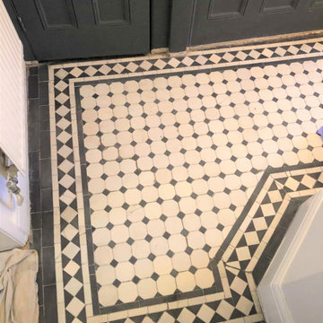
The owners of this Edwardian property in Finchley had purchased it a couple of years prior and since then had slowly been renovating it to restore its original character. The project was almost complete and now attention had turned to the tiled floor. The tiles were in quite a state and I was asked to work our Tile Doctor magic and bring it back to its original condition.
When they moved in the hallway had been covered with carpet which gave the tiles underneath some protection. Unfortunately, however the carpet has been secured with carpet grippers that had been glued to the tiles around the edges. There were also paint splashes on the surface that would need dealing with. On top of that the floor had a few missing tiles that had been back filled by cement to provide a level base for the carpet, the client wanted like them replaced if possible.
After surveying the floor, I explained what could be done and ever completed a small test clean to demonstrate how the tiles would look once deep cleaned. I was confident on being able to source very similar reclaimed tiles so replacing the missing should not be a problem. The client was very happy with the initial test result and my quotation so booked me in to restore the floor.
On my return I started by applying Tile Doctor Remove and Go to soften up the glue which allowed it to be carefully peeled off the tiles with scrappers. Once all the carpet adhesive was gone, I worked a strong dilution of Tile Doctor Remove and Go into the tiles using a black pad to work the cleaning solution deeper into the tiles. A wet vacuum was used to remove the slurry created, and I followed this by giving the tiles an extra clean using a 200-grit diamond burnishing pad lubricated with water.
The last step in the cleaning process was to give the floor an acid rinse using Tile Doctor Grout Clean-up, I did this for several reasons, first it removes old grout smears from the surface of the tile and second it neutralised any efflorescent salts lying dormant in the floor. This can be quite a problem for old floors which don’t have the benefit of a protective damp proof membrane under the floor. The floor was given a final rinse with water which was again extracted with a wet vacuum.
I then set about lifting all the loose tiles (approximately ten) and carefully removing the concrete infills. I had previously managed to source replacements for these holes from original features. Unfortunately, they didn’t sell the correct sized octagon tiles, so I had bought 150mm square tiles and then needed to cut them on site to get the right size.
After cutting and fixing the tiles I fixed them in place and regrouted the rest of the floor.
I then left the floor to dry out overnight and returned in the morning. Before applying a sealer, I took several moisture readings with the damp meter to make sure the tiles were dry enough to take the sealer.
I was able to confirm the floor was dry, so went ahead and applied three coats of Tile Doctor Colour Grow sealant. Colour Grow is an impregnating sealer that is fully breathable sealer which is important when it comes to old floors like these that don’t have a damp proof membrane installed.
My client was very happy with the renovated floor and for aftercare I left them with a bottle of Tile Doctor Neutral Tile Cleaner and gave advice on how best to clean the floor going forward.
Andrew Newstead
North London Tile Doctor
 InnovationLand
This Houston kitchen remodel and whole-house redesign was nothing less than a time machine – zooming a 40-year-old living space into 2017!
“The kitchen had formica countertops, old wood cabinets, a strange layout and low ceilings,” says Lisha Maxey, lead designer for Outdoor Homescapes of Houston and owner of LGH Design Services. “We basically took it down to the studs to create the new space. It even had original terrazzo tile in the foyer! Almost never see that anymore.”
The new look is all 2017, starting with a pure white maple wood for the new kitchen cabinetry and a 13-foot butcher block island. The china hutch, beam and columns are walnut.
The small kitchen countertop (on fridge side) is Corian. The flooring is solid hickory with a natural stain. The backsplash is Moroccan blue glass.
In the island, Outdoor Homescapes added a small, stainless steel prep sink and a large porcelain sink. All finishes are brushed stainless steel except for the pot filler, which is copper.
“The look is very transitional, with a hearty mix of antiques the client wanted incorporated and the contemporary open concept look of today,” says Lisha. “The bar stools are actually reclaimed science class stools that my client picked up at a local fair. It was an awesome find!”
In addition to the kitchen, the home’s first-floor half bath, living room and den also got an update.
Outdoor Homescapes also built storage into the space under the stairs and warmed up the entry with custom blue and beige wallpaper.
“In the half bath, we used the client’s favorite color, orange,” says Lisha. “We added a vessel bowl that was also found at a fair and an antique chandelier to top it off.”
The paint in that room was textured by running a dry brush vertically while the paint was still wet. “It appears to be wallpaper, but not!” explains Lisha. Outdoor Homescapes also used black/white custom tiles in the bath and laundry room to tie it all in.
Lisha used antique pieces in the laundry room with a custom black/white porcelain floor. To open up the wall between the old kitchen and living room, we had to install a 26’ steel I-beam to support the second floor. It was an engineering feat! Took six men to get it into place!
“The client – an empty nester couple – had already done their upstairs remodel and they knew the first floor would be a gut-out,” continues Lisha. “The home was in very poor condition prior to the remodel, and everything needed to go. Basically, wife told husband, we either do this remodel or we sell the house. And Mr. inherited it from his Mom, so it has sentimental value to him.”
Lisha loves how original it turned out, noting the refreshing department from the usual all-white kitchen with black/white flooring, Carrera marble or granite countertops and subway tile. “The clients were open to mixing up styles and working with me to make it come together,” she says. “I think there’s a new excitement in mixing the decades and finding a way to allow clients to hold on to treasured antiques or special pieces while incorporating them in a more modern space.
Her favorite area is the large island.
“I love that they will spend holidays and regular days around that space,” she says. “It’s just so welcoming!”
 Cantoni Irvine
When Irvine designer, Richard Bustos’ client decided to remodel his Orange County 4,900 square foot home into a contemporary space, he immediately thought of Cantoni. His main concern though was based on the assumption that our luxurious modern furnishings came with an equally luxurious price tag. It was only after a visit to our Irvine store, where the client and Richard connected that the client realized our extensive collection of furniture and accessories was well within his reach.
“Richard was very thorough and straight forward as far as pricing,” says the client. "I became very intrigued that he was able to offer high quality products that I was looking for within my budget.”
The next phases of the project involved looking over floor plans and discussing the client’s vision as far as design. The goal was to create a comfortable, yet stylish and modern layout for the client, his wife, and their three kids. In addition to creating a cozy and contemporary space, the client wanted his home to exude a tranquil atmosphere. Drawing most of his inspiration from Houzz, (the leading online platform for home remodeling and design) the client incorporated a Zen-like ambiance through the distressed greyish brown flooring, organic bamboo wall art, and with Richard’s help, earthy wall coverings, found in both the master bedroom and bathroom.
Over the span of approximately two years, Richard helped his client accomplish his vision by selecting pieces of modern furniture that possessed the right colors, earthy tones, and textures so as to complement the home’s pre-existing features.
The first room the duo tackled was the great room, and later continued furnishing the kitchen and master bedroom. Living up to its billing, the great room not only opened up to a breathtaking view of the Newport coast, it also was one great space. Richard decided that the best option to maximize the space would be to break the room into two separate yet distinct areas for living and dining.
While exploring our online collections, the client discovered the Jasper Shag rug in a bold and vibrant green. The grassy green rug paired with the sleek Italian made Montecarlo glass dining table added just the right amount of color and texture to compliment the natural beauty of the bamboo sculpture. The client happily adds, “I’m always receiving complements on the green rug!”
Once the duo had completed the dining area, they worked on furnishing the living area, and later added pieces like the classic Renoir bed to the master bedroom and Crescent Console to the kitchen, which adds both balance and sophistication. The living room, also known as the family room was the central area where Richard’s client and his family would spend quality time. As a fellow family man, Richard understood that that meant creating an inviting space with comfortable and durable pieces of furniture that still possessed a modern flare. The client loved the look and design of the Mercer sectional. With Cantoni’s ability to customize furniture, Richard was able to special order the sectional in a fabric that was both durable and aesthetically pleasing.
Selecting the color scheme for the living room was also greatly influenced by the client’s pre-existing artwork as well as unique distressed floors. Richard recommended adding dark pieces of furniture as seen in the Mercer sectional along with the Viera area rug. He explains, “The darker colors and contrast of the rug’s material worked really well with the distressed wood floor.” Furthermore, the comfortable American Leather Recliner, which was customized in red leather not only maximized the space, but also tied in the client’s picturesque artwork beautifully. The client adds gratefully, “Richard was extremely helpful with color; He was great at seeing if I was taking it too far or not enough.”
It is apparent that Richard and his client made a great team. With the client’s passion for great design and Richard’s design expertise, together they transformed the home into a modern sanctuary. Working with this particular client was a very rewarding experience for Richard. He adds, “My client and his family were so easy and fun to work with. Their enthusiasm, focus, and involvement are what helped me bring their ideas to life. I think we created a unique environment that their entire family can enjoy for many years to come.”
https://www.cantoni.com/project/a-contemporary-sanctuary
 InnovationLand
This Houston kitchen remodel and whole-house redesign was nothing less than a time machine – zooming a 40-year-old living space into 2017!
“The kitchen had formica countertops, old wood cabinets, a strange layout and low ceilings,” says Lisha Maxey, lead designer for Outdoor Homescapes of Houston and owner of LGH Design Services. “We basically took it down to the studs to create the new space. It even had original terrazzo tile in the foyer! Almost never see that anymore.”
The new look is all 2017, starting with a pure white maple wood for the new kitchen cabinetry and a 13-foot butcher block island. The china hutch, beam and columns are walnut.
The small kitchen countertop (on fridge side) is Corian. The flooring is solid hickory with a natural stain. The backsplash is Moroccan blue glass.
In the island, Outdoor Homescapes added a small, stainless steel prep sink and a large porcelain sink. All finishes are brushed stainless steel except for the pot filler, which is copper.
“The look is very transitional, with a hearty mix of antiques the client wanted incorporated and the contemporary open concept look of today,” says Lisha. “The bar stools are actually reclaimed science class stools that my client picked up at a local fair. It was an awesome find!”
In addition to the kitchen, the home’s first-floor half bath, living room and den also got an update.
Outdoor Homescapes also built storage into the space under the stairs and warmed up the entry with custom blue and beige wallpaper.
“In the half bath, we used the client’s favorite color, orange,” says Lisha. “We added a vessel bowl that was also found at a fair and an antique chandelier to top it off.”
The paint in that room was textured by running a dry brush vertically while the paint was still wet. “It appears to be wallpaper, but not!” explains Lisha. Outdoor Homescapes also used black/white custom tiles in the bath and laundry room to tie it all in.
Lisha used antique pieces in the laundry room with a custom black/white porcelain floor. To open up the wall between the old kitchen and living room, we had to install a 26’ steel I-beam to support the second floor. It was an engineering feat! Took six men to get it into place!
“The client – an empty nester couple – had already done their upstairs remodel and they knew the first floor would be a gut-out,” continues Lisha. “The home was in very poor condition prior to the remodel, and everything needed to go. Basically, wife told husband, we either do this remodel or we sell the house. And Mr. inherited it from his Mom, so it has sentimental value to him.”
Lisha loves how original it turned out, noting the refreshing department from the usual all-white kitchen with black/white flooring, Carrera marble or granite countertops and subway tile. “The clients were open to mixing up styles and working with me to make it come together,” she says. “I think there’s a new excitement in mixing the decades and finding a way to allow clients to hold on to treasured antiques or special pieces while incorporating them in a more modern space.
Her favorite area is the large island.
“I love that they will spend holidays and regular days around that space,” she says. “It’s just so welcoming!”

 J Design Group - Interior Designers Miami - Modern
AVENTURA MAGAZINE selected our client’s luxury 5000 Sf ocean front apartment in Miami Beach, to publish it in their issue and they Said:
Story by Linda Marx, Photography by Daniel Newcomb
Light & Bright
New York snowbirds redesigned their Miami Beach apartment to take advantage of the tropical lifestyle.
WHEN INTERIOR DESIGNER JENNIFER CORREDOR was asked to recreate a four-bedroom, six-bath condominium at The Bath Club in Miami Beach, she seized the opportunity to open the rooms and better utilize the vast ocean views.
In five months last year, the designer transformed a dark and closed 5,000-square-foot unit located on a high floor into a series of sweeping waterfront spaces and updated the well located apartment into a light and airy retreat for a sports-loving family of five.
“They come down from New York every other weekend and wanted to make their waterfront home a series of grand open spaces,” says Corrredor, of the J. Design Group in Coral Gables, a firm specializing in modern and contemporary interiors. “Since many of the rooms face the ocean, it made sense to open and lighten up the home, taking advantage of the awesome views of the sea and the bay.”
The designer used 40 x 40 all white tile throughout the apartment as a clean base. This way, her sophisticated use of color would stand out and bring the outdoors in.
The close-knit family members—two parents and three boys in college—like to do things together. But there were situations to overcome in the process of modernizing and opening the space. When Jennifer Corredor was briefed on their desires, nothing seemed too daunting. The confident designer was ready to delve in. For example, she fixed an area at the front door
that was curved. “The wood was concave so I straightened it out,” she explains of a request from the clients. “It was an obstacle that I overcame as part of what I do in a redesign. I don’t consider it a difficult challenge. Improving what I see is part of the process.”
She also tackled the kitchen with gusto by demolishing a wall. The kitchen had formerly been enclosed, which was a waste of space and poor use of available waterfront ambience. To create a grand space linking the kitchen to the living room and dining room area, something had to go. Once the wall was yesterday’s news, she relocated the refrigerator and freezer (two separate appliances) to the other side of the room. This change was a natural functionality in the new open space. “By tearing out the wall, the family has a better view of the kitchen from the living and dining rooms,” says Corredor, who also made it easier to walk in and out of one area and into the other. “The views of the larger public space and the surrounding water are breathtaking.
Opening it up changed everything.”
They clients can now see the kitchen from the living and dining areas, and at the same time, dwell in an airy and open space instead of feeling stuck in a dark enclosed series of rooms. In fact, the high-top bar stools that Corredor selected for the kitchen can be twirled around to use for watching TV in the living room.
In keeping with the theme of moving seamlessly from one room to the other, Corredor designed a subtle wall of glass in the living room along with lots of comfortable seating. This way, all family members feel at ease while relaxing, talking, or watching sporting events on the large flat screen television. “For this room, I wanted more open space, light and a supreme airy feeling,” she says. “With the glass design making a statement, it quickly became the star of the show.”…….
….. To add texture and depth, Corredor custom created wood doors here, and in other areas of the home. They provide a nice contrast to the open Florida tropical feel. “I added character to the openness by using exotic cherry wood,” she says. “I repeated this throughout the home and it works well.”
Known for capturing the client’s vision while adding her own innovative twists, Corredor lightened the family room, giving it a contemporary and modern edge with colorful art and matching throw pillows on the sofas. She added a large beige leather ottoman as the center coffee table in the room. This round piece was punctuated with a bold-toned flowering plant atop. It effortlessly matches the pillows and colors of the contemporary canvas.
Miami,
Miami Interior Designers,
Miami Interior Designer,
Interior Designers Miami,
Interior Designer Miami,
Modern Interior Designers,
Modern Interior Designer,
Modern interior decorators,
Modern interior decorator,
Contemporary Interior Designers,
Contemporary Interior Designer,
Interior design decorators,
Interior design decorator,
Interior Decoration and Design,
Black Interior Designers,
Black Interior Designer,
Interior designer,
Interior designers,
Interior design decorators,
Interior design decorator,
Home interior designers,
Home interior designer,
Interior design companies,
Interior decorators,
Interior decorator,
Decorators,
Decorator,
Miami Decorators,
Miami Decorator,
Decorators Miami,
Decorator Miami,
Interior Design Firm,
Interior Design Firms,
Interior Designer Firm,
Interior Designer Firms,
Interior design,
Interior designs,
Home decorators,
Interior decorating Miami,
Best Interior Designers,
Interior design decorator,
148