
Search results for "Exploit" in Home Design Ideas
 catlin stothers design
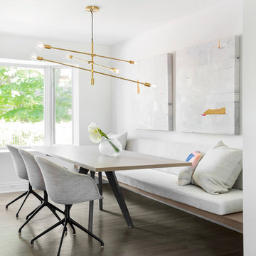
A dysfunctional layout on the main floor included a tiny kitchen and dining room, both of which were disproportionate with other rooms in this sprawling five bedroom home. The spatial constraints didn’t allow for large gatherings nor was the kitchen remotely functional.
The removal of several interior walls, along with opening door entries to their maximum heights and widths provide greater flow and a more inviting atmosphere. Views to the garden were exploited by replacing one small window with a thirteen foot linear window in the kitchen.
Other windows were transformed into exterior doors for easy access to the large terrace leading to a swimming pool during summer months.
The kitchen is a luminous sanctuary, combining a serene palette of muted grey cabinetry and marbled quartz counters. Panels of white oak maintain minimal lines while concealing an abundance of storage. The former dining room gave way to a more casual experience, with a custom built-in banquette spanning the width of the kitchen.
Continuing the oak floors from the living room into the kitchen, creates a visual flow that was integral to the open concept of the main floor.
 Design + Build by Lazar
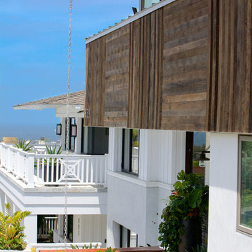
Steve Lazar's newest project, a six-bedroom residence built on a hillside peak of 30th Street in Hermosa Beach for design+build by South Swell, is a study in the functional exploitation of lot size and surrounding beauty. That, and an evolution of the designer’s singular style.
Modernist in its veins, the new home has the earmarks of a Lazar design inside and out. There’s a hint of lifeguard tower in its exterior, though more muted than visible in his past projects, mainly due to a ring of rusticated wood cladding swathed around its mid-section. Other signifiers are there, too, from a row of high-perched observation windows to a slightly raised metal hip roof of soft blue. Jutting out slightly over the home, its underside dressed in tidy shiplap, the roof contrasts smartly against the clean white stucco and earthy wood of the lower levels. In all, it’s still clean-cut Lazar, but more organic than sleek.
“I use a lot of the same ideas,” says Lazar, standing outside the structure while craftsmen and workers buzz around, putting finishing touches on the place. “ “I have a signature vocabulary, but I adapt it with each custom home to meet a client’s needs and maximize the particulars of that space.”
Thoughtfully designed by Steve Lazar design+build by South Swell. designbuildbysouthswell.com Photography by Laura Hull

Find the right local pro for your project
 catlin stothers design
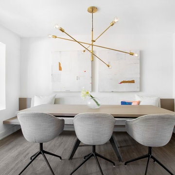
A dysfunctional layout on the main floor included a tiny kitchen and dining room, both of which were disproportionate with other rooms in this sprawling five bedroom home. The spatial constraints didn’t allow for large gatherings nor was the kitchen remotely functional.
The removal of several interior walls, along with opening door entries to their maximum heights and widths provide greater flow and a more inviting atmosphere. Views to the garden were exploited by replacing one small window with a thirteen foot linear window in the kitchen.
Other windows were transformed into exterior doors for easy access to the large terrace leading to a swimming pool during summer months.
The kitchen is a luminous sanctuary, combining a serene palette of muted grey cabinetry and marbled quartz counters. Panels of white oak maintain minimal lines while concealing an abundance of storage. The former dining room gave way to a more casual experience, with a custom built-in banquette spanning the width of the kitchen.
Continuing the oak floors from the living room into the kitchen, creates a visual flow that was integral to the open concept of the main floor.
 Elena Almagro
Elena Almagro
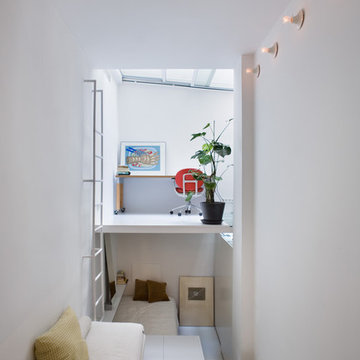
Bedroom - mid-sized contemporary loft-style bedroom idea in Madrid with white walls and no fireplace
Bedroom - mid-sized contemporary loft-style bedroom idea in Madrid with white walls and no fireplace
 catlin stothers design
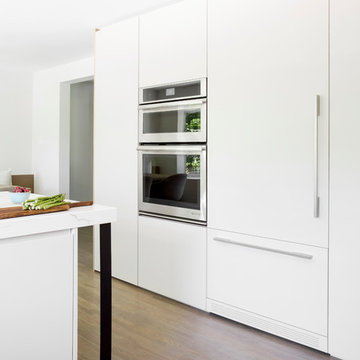
A dysfunctional layout on the main floor included a tiny kitchen and dining room, both of which were disproportionate with other rooms in this sprawling five bedroom home. The spatial constraints didn’t allow for large gatherings nor was the kitchen remotely functional.
The removal of several interior walls, along with opening door entries to their maximum heights and widths provide greater flow and a more inviting atmosphere. Views to the garden were exploited by replacing one small window with a thirteen foot linear window in the kitchen.
Other windows were transformed into exterior doors for easy access to the large terrace leading to a swimming pool during summer months.
The kitchen is a luminous sanctuary, combining a serene palette of muted grey cabinetry and marbled quartz counters. Panels of white oak maintain minimal lines while concealing an abundance of storage. The former dining room gave way to a more casual experience, with a custom built-in banquette spanning the width of the kitchen.
Continuing the oak floors from the living room into the kitchen, creates a visual flow that was integral to the open concept of the main floor.
 catlin stothers design
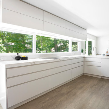
A dysfunctional layout on the main floor included a tiny kitchen and dining room, both of which were disproportionate with other rooms in this sprawling five bedroom home. The spatial constraints didn’t allow for large gatherings nor was the kitchen remotely functional.
The removal of several interior walls, along with opening door entries to their maximum heights and widths provide greater flow and a more inviting atmosphere. Views to the garden were exploited by replacing one small window with a thirteen foot linear window in the kitchen.
Other windows were transformed into exterior doors for easy access to the large terrace leading to a swimming pool during summer months.
The kitchen is a luminous sanctuary, combining a serene palette of muted grey cabinetry and marbled quartz counters. Panels of white oak maintain minimal lines while concealing an abundance of storage. The former dining room gave way to a more casual experience, with a custom built-in banquette spanning the width of the kitchen.
Continuing the oak floors from the living room into the kitchen, creates a visual flow that was integral to the open concept of the main floor.
 Jill Lewis Architecture
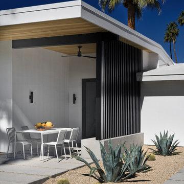
The goal for this mid-century home was to exploit the best features of the property, taking advantage of views, the dramatic light, the potential for an incredible indoor-outdoor experience and the mid-century bones of the house. When we first visited the property, I was struck by the potential for a beautiful mountain view that was currently cut off by a low ceiling height in the main living area. Raising the roof of the main living area became the largest gesture in our scope of work. The former chopped-up side entry and tiny kitchen were combined to make a long, generous kitchen and built-in banquette. The original rhombus-shaped pool was kept, restored and lined with Ann Sacks tiles. In the center of the action, we conceived a large floating desk surface suspended from a black metal screen to define the space and allow filtered light and views to pass between. The clients were drawn to clean lines, pared-down details and highly disciplined palettes of white, grey and matte black. We generally opted for deep, muted colors balanced with crisp white, adding textures to create patterns with the shifting daylight throughout the house. This soothing collection of finishes playing with light and shadow would achieve a peaceful and elegant home that would stand the test of time and honor the landscape of the surrounding area.
Photography: Douglas Friedman
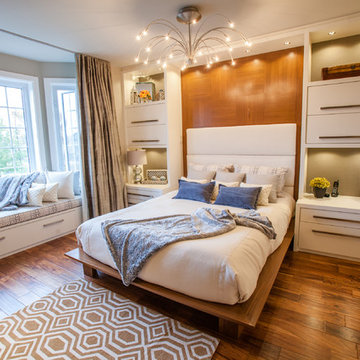
 Carpediem Design
La vie de vacancier
Quand est venu le temps de rénover sa chambre à coucher, les propriétaires souhaitaient se
sentir comme à l’hôtel, avec tout le confort, le calme, la douceur et les commodités qu’on
retrouve lorsqu’on prend des vacances bien méritées.
La pièce n’étant pas très grande, nous avons décidé d’ouvrir la penderie (walk-in) existante afin
d’accroître la superficie visible.
Pour réaliser cet exploit, nous avons misé sur une combinaison de bois laqué de couleur crème
et de noyer naturel pour le mobilier intégré, le tout sur un plancher de noyer africain. L’aire bien
éclairée, en plus du contraste des tons clairs et du bois naturel, contribue à agrandir la pièce.
Même si une esthétique agréable était primordiale, nous n’avons pas négligé le côté pratique
lors de la conception du design. C’est pourquoi nous avons inclus un important espace de
rangement avec de nombreux tiroirs et armoires. Ont également été ajoutées une aire de
maquillage, ainsi qu’une banquette rembourrée douillette au bord des fenêtres en baie, afin de
profiter de bons moments de lecture dans la chaleur du soleil.
Il ne reste que le service aux chambres, la femme de ménage et le chocolat sur l’oreiller pour
que l’illusion soit complète…
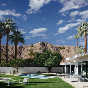 Jill Lewis Architecture
The goal for this mid-century home was to exploit the best features of the property, taking advantage of views, the dramatic light, the potential for an incredible indoor-outdoor experience and the mid-century bones of the house. When we first visited the property, I was struck by the potential for a beautiful mountain view that was currently cut off by a low ceiling height in the main living area. Raising the roof of the main living area became the largest gesture in our scope of work. The former chopped-up side entry and tiny kitchen were combined to make a long, generous kitchen and built-in banquette. The original rhombus-shaped pool was kept, restored and lined with Ann Sacks tiles. In the center of the action, we conceived a large floating desk surface suspended from a black metal screen to define the space and allow filtered light and views to pass between. The clients were drawn to clean lines, pared-down details and highly disciplined palettes of white, grey and matte black. We generally opted for deep, muted colors balanced with crisp white, adding textures to create patterns with the shifting daylight throughout the house. This soothing collection of finishes playing with light and shadow would achieve a peaceful and elegant home that would stand the test of time and honor the landscape of the surrounding area.
Photography: Douglas Friedman
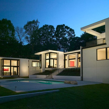
 Choate + Hertlein Architects
Of particular interest are the visual relationships which emerge as it becomes possible to see from the interior spaces of one wing to that of another, or from adjacent exterior areas. As a result, during the day the house is predominantly a setting from which one “looks out”. After dark, it becomes a composition to which one “looks in.”
Rion Rizzo Photographer
 catlin stothers design
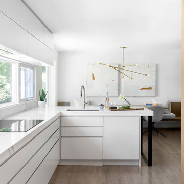
A dysfunctional layout on the main floor included a tiny kitchen and dining room, both of which were disproportionate with other rooms in this sprawling five bedroom home. The spatial constraints didn’t allow for large gatherings nor was the kitchen remotely functional.
The removal of several interior walls, along with opening door entries to their maximum heights and widths provide greater flow and a more inviting atmosphere. Views to the garden were exploited by replacing one small window with a thirteen foot linear window in the kitchen.
Other windows were transformed into exterior doors for easy access to the large terrace leading to a swimming pool during summer months.
The kitchen is a luminous sanctuary, combining a serene palette of muted grey cabinetry and marbled quartz counters. Panels of white oak maintain minimal lines while concealing an abundance of storage. The former dining room gave way to a more casual experience, with a custom built-in banquette spanning the width of the kitchen.
Continuing the oak floors from the living room into the kitchen, creates a visual flow that was integral to the open concept of the main floor.
 catlin stothers design
A dysfunctional layout on the main floor included a tiny kitchen and dining room, both of which were disproportionate with other rooms in this sprawling five bedroom home. The spatial constraints didn’t allow for large gatherings nor was the kitchen remotely functional.
The removal of several interior walls, along with opening door entries to their maximum heights and widths provide greater flow and a more inviting atmosphere. Views to the garden were exploited by replacing one small window with a thirteen foot linear window in the kitchen.
Other windows were transformed into exterior doors for easy access to the large terrace leading to a swimming pool during summer months.
The kitchen is a luminous sanctuary, combining a serene palette of muted grey cabinetry and marbled quartz counters. Panels of white oak maintain minimal lines while concealing an abundance of storage. The former dining room gave way to a more casual experience, with a custom built-in banquette spanning the width of the kitchen.
Continuing the oak floors from the living room into the kitchen, creates a visual flow that was integral to the open concept of the main floor.
 JM Carpets
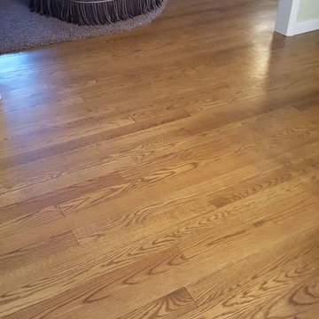
Large country u-shaped medium tone wood floor kitchen photo in Milwaukee with white cabinets and a peninsula
 Carpediem Design
La vie de vacancier
Quand est venu le temps de rénover sa chambre à coucher, les propriétaires souhaitaient se
sentir comme à l’hôtel, avec tout le confort, le calme, la douceur et les commodités qu’on
retrouve lorsqu’on prend des vacances bien méritées.
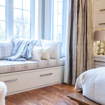
La pièce n’étant pas très grande, nous avons décidé d’ouvrir la penderie (walk-in) existante afin
d’accroître la superficie visible.
Pour réaliser cet exploit, nous avons misé sur une combinaison de bois laqué de couleur crème
et de noyer naturel pour le mobilier intégré, le tout sur un plancher de noyer africain. L’aire bien
éclairée, en plus du contraste des tons clairs et du bois naturel, contribue à agrandir la pièce.
Même si une esthétique agréable était primordiale, nous n’avons pas négligé le côté pratique
lors de la conception du design. C’est pourquoi nous avons inclus un important espace de
rangement avec de nombreux tiroirs et armoires. Ont également été ajoutées une aire de
maquillage, ainsi qu’une banquette rembourrée douillette au bord des fenêtres en baie, afin de
profiter de bons moments de lecture dans la chaleur du soleil.
Il ne reste que le service aux chambres, la femme de ménage et le chocolat sur l’oreiller pour
que l’illusion soit complète…
 Hold It Contemporary Home
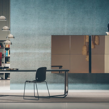
Pianca Furniture draws upon traditional local craft, channelling over 500 years of carpentry along the banks of the Pianca stream. Building on its strong history, Pianca combines experience and innovation to bring the culture of modern design to the world.
The Confluence Table is a modern and bold choice for your dining room. Experimentation on metal, which has always characterized Lust’s work, encounters Pianca’s experience in woodworking, giving life to a fluid and organic structure. The steel structure is sinuous thanks to its curves, and at the same time dynamic, giving the impression of having maintained the malleable consistency of the molding process the material underwent. With a fluid movement, the steel legs converge, supporting the top, which seems to levitate. The myriad of finishings allows the tables – rectangular, round and elliptical – to adapt to different styles.
Spazio Pianca modules offer full creative freedom and spectacular impact. Peerlessly handsome solutions that exploit the interplay of solids and spaces; wall-hanging or free-standing storage elements, creating plucky, modern graphic images. A personal lifestyle that knows how to stay one step ahead of the latest trends.

 Michael Nash Design, Build & Homes
2010 NATIONAL NARI REGIONAL AWARD WINNER
Project Scope
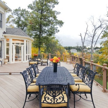
The owners of this 7,000 square foot colonial in Oakton, Virginia, were seeking a multi-level Mediterranean-style indoor/outdoor living space off the back of their home. They turned to Michael Nash Design, Build & Homes for a design solution that would include a stone patio, a second-story deck, a screened-in porch and linking staircases.
While the structure was designed primarily for family dining and entertaining, it also had to accommodate periodic social gatherings of one hundred guests or more. To meet these needs, the project would include a fully-equipped outdoor kitchen, several serving counters with permanent refrigeration, and well-delineated socializing and dining zones.
The existing home’s setting offered several impressive assets the new outdoor living area was designed to exploit. The sprawling acreage features old stand trees, wooded paths and a private lake. Beautifully landscaped, it unfolds as an idyllic panorama that naturally draws people to the outdoors.
Challenges
Since the rear elevation was situated on a slope that drops away from the house, the Michael Nash team had to raise the grade two feet within in a 2,000 square foot area extending out from the back of the house. Infrastructure plans also called for a sophisticated drainage system that had to accommodate a whole series of water “runoff” considerations to be integrated into the decking itself. Excavation included constructing retaining walls to bolster the elevated grade—which also had to support a concrete slab, the primary foundation for the entire complex.
Solutions
The ground level decking consists of a 2,000 square foot flagstone patio level with the home’s lower level doors. There is a decorative water fountain mid-patio—an ornate collectible acquired in Florida. Food preparation is concentrated within a specially designed semi-circular wall that creates an “outdoor kitchen” equipped with a 60” Viking barbecue grill, a prep sink, a warming drawer, refrigerator and appropriate storage. There is a granite surfaced dining counter with seating for eight.
Wrought iron railing and approximately 20 decorative columns (some encasing steel vertical supports) are incorporated into the design scheme. Many of the columns house accent lights.
The top level—supported by horizontal steel beams– is a 2,500 square foot deck constructed entirely of Trex decking. The open air decking is, again, directly accessible from rooms on the second level of the house including the kitchen, sunroom and family room.
The platform’s most prominent feature is a U-shaped “kitchenette” with cedar shake shingle roofing. Like its counterpart one level below, the facility is equipped with grill, refrigerator and stainless steel cabinetry.
One portion of the deck has been allocated for a 16’ x 16’ octagonal screened-in porch crowned by a pair of 2’ x 4’ skylights. The porch can be accessed from the home’s conservatory via a set of French doors. With its mosaic tile flooring, stained cedar panel ceiling and honed granite counters, the interior is elegant and calming. Hand-painted stenciling and a wall-mounted water feature provide distinctive detailing.
Finally, the design introduced elements to highlight and reinforce an awareness of the lovely bucolic setting. Fountains and water features combined with textured surfaces and mosaic tiling and backsplashes to present a villa-like ambiance well-suited to the Virginia countryside.
 Carpediem Design
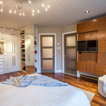
La vie de vacancier
Quand est venu le temps de rénover sa chambre à coucher, les propriétaires souhaitaient se
sentir comme à l’hôtel, avec tout le confort, le calme, la douceur et les commodités qu’on
retrouve lorsqu’on prend des vacances bien méritées.
La pièce n’étant pas très grande, nous avons décidé d’ouvrir la penderie (walk-in) existante afin
d’accroître la superficie visible.
Pour réaliser cet exploit, nous avons misé sur une combinaison de bois laqué de couleur crème
et de noyer naturel pour le mobilier intégré, le tout sur un plancher de noyer africain. L’aire bien
éclairée, en plus du contraste des tons clairs et du bois naturel, contribue à agrandir la pièce.
Même si une esthétique agréable était primordiale, nous n’avons pas négligé le côté pratique
lors de la conception du design. C’est pourquoi nous avons inclus un important espace de
rangement avec de nombreux tiroirs et armoires. Ont également été ajoutées une aire de
maquillage, ainsi qu’une banquette rembourrée douillette au bord des fenêtres en baie, afin de
profiter de bons moments de lecture dans la chaleur du soleil.
Il ne reste que le service aux chambres, la femme de ménage et le chocolat sur l’oreiller pour
que l’illusion soit complète…
 Lodi Tile Works, Inc
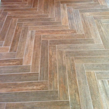
Wood-look tile floor using porcelain plank tiles in a herringbone pattern.
Living room - traditional porcelain tile living room idea in Sacramento
Living room - traditional porcelain tile living room idea in Sacramento
13