
Search results for "External volume" in Home Design Ideas
 STUDIO TASHIMA
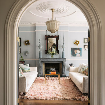
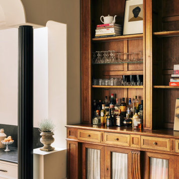
Keyes Road is a two-storey, semi-detached red brick house dating to around 1890-1910. The focus of our work was on the ground floor where we were asked to improve the layout and use of the main living areas of the house, for an active family of four. Important to the design was to maximise the quality and amount of light as well as connection to the garden and flow to the rest of the house.
Our proposal introduces three single storey extensions, comprising a central, large space that extends the main outrigger of the house. To each side are smaller volumes, affording a full width kitchen. While defining a series of discrete volumes, it was important for us to ensure that the kitchen, living, family and dining rooms that are interconnecting and continuous. The result is a big space punctuated by a series of differently sized arches, defining spaces to ensure their intimacy.
It was important for our client to have a sense of warmth and comfort - perhaps not dissimilar to the qualities of a hotel lobby. The colour scheme of the rooms are warm white painted plaster, natural wood flooring with black, bronze and brass accents. Indirect and carefully placed light fittings pulls together the atmosphere of the rooms - particularly in the evenings.
Externally, we felt it important to differentiate the extensions from the main house by using a dark, charcoal grey brick. This sets up a contrasting yet complimentary relationship to the rich red coloured brick house. The facets of the brick play with light and depth as do the graduated brick arches.
During the design process, we grappled with floor levels, the direction of sunlight, and care to not encroach on the neighbouring properties. As the house is in a conservation area, we worked closely with our trusted planning advisor. Throughout, we pursued a sensitive design strategy, using pitched roofs, matching materials and careful detailing. Internally, many of the original details are intact. This has enabled us to create an eclectic ensemble of elements, colours and materials varying in age and period.
 STUDIO TASHIMA
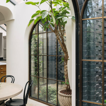
Keyes Road is a two-storey, semi-detached red brick house dating to around 1890-1910. The focus of our work was on the ground floor where we were asked to improve the layout and use of the main living areas of the house, for an active family of four. Important to the design was to maximise the quality and amount of light as well as connection to the garden and flow to the rest of the house.
Our proposal introduces three single storey extensions, comprising a central, large space that extends the main outrigger of the house. To each side are smaller volumes, affording a full width kitchen. While defining a series of discrete volumes, it was important for us to ensure that the kitchen, living, family and dining rooms that are interconnecting and continuous. The result is a big space punctuated by a series of differently sized arches, defining spaces to ensure their intimacy.
It was important for our client to have a sense of warmth and comfort - perhaps not dissimilar to the qualities of a hotel lobby. The colour scheme of the rooms are warm white painted plaster, natural wood flooring with black, bronze and brass accents. Indirect and carefully placed light fittings pulls together the atmosphere of the rooms - particularly in the evenings.
Externally, we felt it important to differentiate the extensions from the main house by using a dark, charcoal grey brick. This sets up a contrasting yet complimentary relationship to the rich red coloured brick house. The facets of the brick play with light and depth as do the graduated brick arches.
During the design process, we grappled with floor levels, the direction of sunlight, and care to not encroach on the neighbouring properties. As the house is in a conservation area, we worked closely with our trusted planning advisor. Throughout, we pursued a sensitive design strategy, using pitched roofs, matching materials and careful detailing. Internally, many of the original details are intact. This has enabled us to create an eclectic ensemble of elements, colours and materials varying in age and period.
 STUDIO TASHIMA
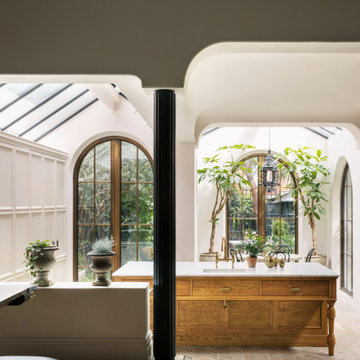
Keyes Road is a two-storey, semi-detached red brick house dating to around 1890-1910. The focus of our work was on the ground floor where we were asked to improve the layout and use of the main living areas of the house, for an active family of four. Important to the design was to maximise the quality and amount of light as well as connection to the garden and flow to the rest of the house.
Our proposal introduces three single storey extensions, comprising a central, large space that extends the main outrigger of the house. To each side are smaller volumes, affording a full width kitchen. While defining a series of discrete volumes, it was important for us to ensure that the kitchen, living, family and dining rooms that are interconnecting and continuous. The result is a big space punctuated by a series of differently sized arches, defining spaces to ensure their intimacy.
It was important for our client to have a sense of warmth and comfort - perhaps not dissimilar to the qualities of a hotel lobby. The colour scheme of the rooms are warm white painted plaster, natural wood flooring with black, bronze and brass accents. Indirect and carefully placed light fittings pulls together the atmosphere of the rooms - particularly in the evenings.
Externally, we felt it important to differentiate the extensions from the main house by using a dark, charcoal grey brick. This sets up a contrasting yet complimentary relationship to the rich red coloured brick house. The facets of the brick play with light and depth as do the graduated brick arches.
During the design process, we grappled with floor levels, the direction of sunlight, and care to not encroach on the neighbouring properties. As the house is in a conservation area, we worked closely with our trusted planning advisor. Throughout, we pursued a sensitive design strategy, using pitched roofs, matching materials and careful detailing. Internally, many of the original details are intact. This has enabled us to create an eclectic ensemble of elements, colours and materials varying in age and period.
Find the right local pro for your project
 Matt Fajkus Architecture
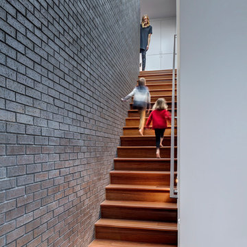
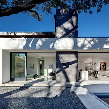
The Main Stay House exists as a straightforward proposal on an urban infill lot, paring down the components of a house to a minimal amount of planes and openings. The scheme is anchored by a modern entry sequence and a staircase volume, both clad in iron spot masonry externally and internally, creating thresholds between the respective realms of public, common and private, by minimal means. The masonry contrasts with an otherwise muted interior atmosphere of smooth, desaturated surfaces.
The entry sequence is a twist upon the conventional domestic front door, front facade, and fence. The front masonry wall replaces the typical residential fence and frames an indirect access to the front door, functioning as a privacy barrier while revealing slices of the interior to the public street.
The staircase bifurcates the layout to provide a clear division between the common and private zones of the house, while clearly reading as a mass from all outside view. Brick and glass become portals between common and private zones.
The design consolidates the service core along the west façade, allowing the structure to fully open the living zone to the pool court and existing trees. This directly connects interior and exterior, as well as human and nature. Freedom to vary the program or functional use of the area is enabled and strongly encouraged.
Photography: Charles Davis Smith
 Matt Fajkus Architecture
The Main Stay House exists as a straightforward proposal on an urban infill lot, paring down the components of a house to a minimal amount of planes and openings. The scheme is anchored by a modern entry sequence and a staircase volume, both clad in iron spot masonry externally and internally, creating thresholds between the respective realms of public, common and private, by minimal means. The masonry contrasts with an otherwise muted interior atmosphere of smooth, desaturated surfaces.
The entry sequence is a twist upon the conventional domestic front door, front facade, and fence. The front masonry wall replaces the typical residential fence and frames an indirect access to the front door, functioning as a privacy barrier while revealing slices of the interior to the public street.
The staircase bifurcates the layout to provide a clear division between the common and private zones of the house, while clearly reading as a mass from all outside view. Brick and glass become portals between common and private zones.
The design consolidates the service core along the west façade, allowing the structure to fully open the living zone to the pool court and existing trees. This directly connects interior and exterior, as well as human and nature. Freedom to vary the program or functional use of the area is enabled and strongly encouraged.
Photography: Matt Fajkus
 STUDIO TASHIMA
Keyes Road is a two-storey, semi-detached red brick house dating to around 1890-1910. The focus of our work was on the ground floor where we were asked to improve the layout and use of the main living areas of the house, for an active family of four. Important to the design was to maximise the quality and amount of light as well as connection to the garden and flow to the rest of the house.
Our proposal introduces three single storey extensions, comprising a central, large space that extends the main outrigger of the house. To each side are smaller volumes, affording a full width kitchen. While defining a series of discrete volumes, it was important for us to ensure that the kitchen, living, family and dining rooms that are interconnecting and continuous. The result is a big space punctuated by a series of differently sized arches, defining spaces to ensure their intimacy.
It was important for our client to have a sense of warmth and comfort - perhaps not dissimilar to the qualities of a hotel lobby. The colour scheme of the rooms are warm white painted plaster, natural wood flooring with black, bronze and brass accents. Indirect and carefully placed light fittings pulls together the atmosphere of the rooms - particularly in the evenings.
Externally, we felt it important to differentiate the extensions from the main house by using a dark, charcoal grey brick. This sets up a contrasting yet complimentary relationship to the rich red coloured brick house. The facets of the brick play with light and depth as do the graduated brick arches.
During the design process, we grappled with floor levels, the direction of sunlight, and care to not encroach on the neighbouring properties. As the house is in a conservation area, we worked closely with our trusted planning advisor. Throughout, we pursued a sensitive design strategy, using pitched roofs, matching materials and careful detailing. Internally, many of the original details are intact. This has enabled us to create an eclectic ensemble of elements, colours and materials varying in age and period.
 Matt Fajkus Architecture
The Main Stay House exists as a straightforward proposal on an urban infill lot, paring down the components of a house to a minimal amount of planes and openings. The scheme is anchored by a modern entry sequence and a staircase volume, both clad in iron spot masonry externally and internally, creating thresholds between the respective realms of public, common and private, by minimal means. The masonry contrasts with an otherwise muted interior atmosphere of smooth, desaturated surfaces.
The entry sequence is a twist upon the conventional domestic front door, front facade, and fence. The front masonry wall replaces the typical residential fence and frames an indirect access to the front door, functioning as a privacy barrier while revealing slices of the interior to the public street.
The staircase bifurcates the layout to provide a clear division between the common and private zones of the house, while clearly reading as a mass from all outside view. Brick and glass become portals between common and private zones.
The design consolidates the service core along the west façade, allowing the structure to fully open the living zone to the pool court and existing trees. This directly connects interior and exterior, as well as human and nature. Freedom to vary the program or functional use of the area is enabled and strongly encouraged.
Photography: Twist Tours
 Matt Fajkus Architecture
The Main Stay House exists as a straightforward proposal on an urban infill lot, paring down the components of a house to a minimal amount of planes and openings. The scheme is anchored by a modern entry sequence and a staircase volume, both clad in iron spot masonry externally and internally, creating thresholds between the respective realms of public, common and private, by minimal means. The masonry contrasts with an otherwise muted interior atmosphere of smooth, desaturated surfaces.
The entry sequence is a twist upon the conventional domestic front door, front facade, and fence. The front masonry wall replaces the typical residential fence and frames an indirect access to the front door, functioning as a privacy barrier while revealing slices of the interior to the public street.
The staircase bifurcates the layout to provide a clear division between the common and private zones of the house, while clearly reading as a mass from all outside view. Brick and glass become portals between common and private zones.
The design consolidates the service core along the west façade, allowing the structure to fully open the living zone to the pool court and existing trees. This directly connects interior and exterior, as well as human and nature. Freedom to vary the program or functional use of the area is enabled and strongly encouraged.
Photography: Charles Davis Smith
 Matt Fajkus Architecture
The Main Stay House exists as a straightforward proposal on an urban infill lot, paring down the components of a house to a minimal amount of planes and openings. The scheme is anchored by a modern entry sequence and a staircase volume, both clad in iron spot masonry externally and internally, creating thresholds between the respective realms of public, common and private, by minimal means. The masonry contrasts with an otherwise muted interior atmosphere of smooth, desaturated surfaces.
The entry sequence is a twist upon the conventional domestic front door, front facade, and fence. The front masonry wall replaces the typical residential fence and frames an indirect access to the front door, functioning as a privacy barrier while revealing slices of the interior to the public street.
The staircase bifurcates the layout to provide a clear division between the common and private zones of the house, while clearly reading as a mass from all outside view. Brick and glass become portals between common and private zones.
The design consolidates the service core along the west façade, allowing the structure to fully open the living zone to the pool court and existing trees. This directly connects interior and exterior, as well as human and nature. Freedom to vary the program or functional use of the area is enabled and strongly encouraged.
Photography: Charles Davis Smith
 Matt Fajkus Architecture
The Main Stay House exists as a straightforward proposal on an urban infill lot, paring down the components of a house to a minimal amount of planes and openings. The scheme is anchored by a modern entry sequence and a staircase volume, both clad in iron spot masonry externally and internally, creating thresholds between the respective realms of public, common and private, by minimal means. The masonry contrasts with an otherwise muted interior atmosphere of smooth, desaturated surfaces.
The entry sequence is a twist upon the conventional domestic front door, front facade, and fence. The front masonry wall replaces the typical residential fence and frames an indirect access to the front door, functioning as a privacy barrier while revealing slices of the interior to the public street.
The staircase bifurcates the layout to provide a clear division between the common and private zones of the house, while clearly reading as a mass from all outside view. Brick and glass become portals between common and private zones.
The design consolidates the service core along the west façade, allowing the structure to fully open the living zone to the pool court and existing trees. This directly connects interior and exterior, as well as human and nature. Freedom to vary the program or functional use of the area is enabled and strongly encouraged.
Photography: Twist Tours

 User
This is an organic Lime Wash done with a true lime wash product as opposed to a brick mortar or concrete that is often seen on new houses. This product can be applied as a solid coating making the surface completely white, or can be applied and "washed off" in many artistic ways, as seen here. If you hate your brick or just want something unique this is a great option!
Photo credit: Jeff Murrey
 Matt Fajkus Architecture
The Main Stay House exists as a straightforward proposal on an urban infill lot, paring down the components of a house to a minimal amount of planes and openings. The scheme is anchored by a modern entry sequence and a staircase volume, both clad in iron spot masonry externally and internally, creating thresholds between the respective realms of public, common and private, by minimal means. The masonry contrasts with an otherwise muted interior atmosphere of smooth, desaturated surfaces.
The entry sequence is a twist upon the conventional domestic front door, front facade, and fence. The front masonry wall replaces the typical residential fence and frames an indirect access to the front door, functioning as a privacy barrier while revealing slices of the interior to the public street.
The staircase bifurcates the layout to provide a clear division between the common and private zones of the house, while clearly reading as a mass from all outside view. Brick and glass become portals between common and private zones.
The design consolidates the service core along the west façade, allowing the structure to fully open the living zone to the pool court and existing trees. This directly connects interior and exterior, as well as human and nature. Freedom to vary the program or functional use of the area is enabled and strongly encouraged.
Photography: Charles Davis Smith
 Matt Fajkus Architecture
The Main Stay House exists as a straightforward proposal on an urban infill lot, paring down the components of a house to a minimal amount of planes and openings. The scheme is anchored by a modern entry sequence and a staircase volume, both clad in iron spot masonry externally and internally, creating thresholds between the respective realms of public, common and private, by minimal means. The masonry contrasts with an otherwise muted interior atmosphere of smooth, desaturated surfaces.
The entry sequence is a twist upon the conventional domestic front door, front facade, and fence. The front masonry wall replaces the typical residential fence and frames an indirect access to the front door, functioning as a privacy barrier while revealing slices of the interior to the public street.
The staircase bifurcates the layout to provide a clear division between the common and private zones of the house, while clearly reading as a mass from all outside view. Brick and glass become portals between common and private zones.
The design consolidates the service core along the west façade, allowing the structure to fully open the living zone to the pool court and existing trees. This directly connects interior and exterior, as well as human and nature. Freedom to vary the program or functional use of the area is enabled and strongly encouraged.
Photography: Charles Davis Smith

 Öney Architecture
Located in Ovacik, an area in Izmir, Turkey, covering 2580 sqm harvested land especially for vineyards, oriented towards North-West, South-East axis, the Ovacik winery is designed as a wine manufacturing - aiming to produce 10.000 wine bottles per year- and accommodation center. The North-East facade is facing the vineyards while the South-West facade is facing the Aegean Sea view.
The wine manufacturing and the accommodation rooms are two programs in the project serving diverse user groups; seasonal employees and leisure visitors. The manufacturing area on the North-West wing designed next to the adjacent farm, blocks the noise acting as a barrier for the rest of the complex.
On the North-West parcel, on one third portion of the lot an ancient village house ruin from the late 19th century is found which is preserved and integrated into the landscape and design.
Due to the manufacturing process, wine making area require 6m of ceiling height. From the terrace level through the openings on the restaurant facing the neighboring manufacturing area, the visitors can observe the process of wine making. Also these openings allow natural ventilation which helps protect the barrel cellar from excessive heat and drought.
For heating and cooling of the facility, ground source system is integrated, allowing minimum external intervention in the future through the stabilization of the heat of ground. In order to maintain the temperature conditions for the wine storage room, the barrel cellar is constructed under the landscape.
Following the natural slope topography existing earth/soil is carried and reused above the accommodation volumes to create a green roof which can also be seen from the restaurant terrace as a part of the natural environment.
 SKfA
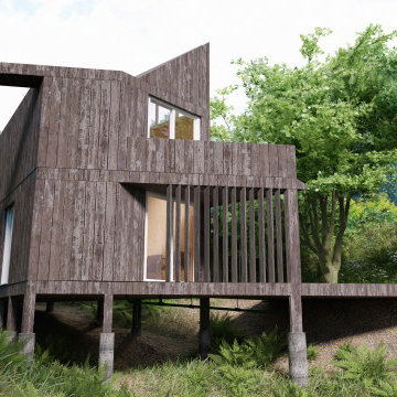
Nestled into a tree-covered hilltop in Fairfax CA this simple timber-framed house exploits what many have considered to be a very restrictive and constrained site too small to develop. The perimeter of the house follows exactly the site and its set back lines thus dictating the overall size and volume. The house was designed for a young couple as a starter home in this desirable area where they would normally be priced out. The strict budget influenced the design of standard off-the-shelf components and an easy and quick construction sequence minimalizing the build time. The house straddle’s a small brook in a ravine at the apex of a hairpin bend on an unincorporated road. Supported on eight concrete peers elevating the house to road level, the layout of the house is based on a simple twelve-foot grid, with an adjoining six-foot tapering sliver along the north-facing long edge, giving the overall footprint the shape of a blunt wedge. Accessed over a triangular bridge dictated by site lines, the entrance is via a covered porte cochere with a balcony above. The entranceway can be closed for security by means of a large sliding door of matching slatted wood. The entrance proper is via a stock sliding glass patio door to the main living space. The choice of sliding window is repeated throughout the building. In its current flexible configuration, the living space is a double-height experience, beyond which on the left centrally located is a spiral staircase leading to the bedroom and bathroom above. Both these rooms have built-in storage. Both bedrooms boast a double-height slopping ceiling; clerestory windows that give the building its distinctive character, and a balcony. On the ground floor beyond the spiral staircase is built-in and concealed fully equipped kitchen and open plan dining area, beyond which, externally and underneath one of the bedroom balconies is an outdoor bbq kitchen.

 J. Brandon Jones
This is an example of a small rustic shade side yard vegetable garden landscape in New York.


 Kestrel Shutters & Doors
These traditional closet doors feature smaller, fixed louvers in the top and colonial raised panels in the bottom and are custom sized to fit your openings.
To receive a quote on our Fixed Louver over Raised Panel doors follow the "Visit Store" link: below.

 Moss Yaw Design studio
Engineered cedar siding creates beautiful gray-blue tones at the exterior of the home, while adding a textural element to activate the simple exterior design.

 RENESA ARCHITECTURE DESIGN INTERIORS
The PentHaus, Gurgaon.
(High-End Luxury Interiors- Residential Category)
2013-14
Built Up Area-
12,000 sq feet approx
Design Team:
RENESA ARCHITECTURE DESIGN INTERIORS,New Delhi
• Sanjay Arora - Founder| Principal Architect
• Sanchit Arora - Studio Head Architect
• Vandana Arora - Interior Designer| Decor Head
• Virender Singh- Studio Technical Head| Architectural Assistant
Photographer-
• Vibhor Yadav - RENESA's Official Photographer.
Social Media Connect:-
RENESA ARCHITECTURE DESIGN INTERIORS STUDIO, New Delhi
www.renesa.in
Contact: +91-9953542461
Tel : 011 455 11 211
Tel : 011 457 00 411
Email: renesa91@gmail.com | sanchit.renesa@gmail.com
Facebook: https://www.facebook.com/renesa.architecture
Instagram: https://www.instagram.com/renesa.architects/
Consultants | Contractors:
• Site Contractor - Mr. Umesh Mehta (Star Construction)
• Mechanical Consultants - TN Engg & Consultants.
• Electrial Consultants - Electro Consultants
"The PentHaus,Gurgaon" - Design Profile.
The Conceptual Design Development-
RENESA ARCHITECTURE DESIGN INTERIORS have recently completed an interiors project for a penthouse(The PentHaus) in Gurgaon.
The basic design requirement as per the client was to divide the floor plates in the penthouse on the basis of public and private relationship.(With the public interaction and services on the lower level with the private interface on the upper level).
The design philosophy as dictated and understood was on the lines of contrast in colors with the play of art and decorative pieces highlighting the depth in the detailing of the accessorization of the whole scale model.
The client's interest in art and design pieces worked in favor for RENESA DESIGN STUDIO as it was a value-addition to the whole interior decor design process.
Credits need to be given to the client for the right selection of art pieces in terms of the color pallet blending into the design philosophy set by RENESA STUDIO.
A mix of contemporary modern with classical essence here and there provides a smooth transition of amalgamation of different design philosophies in a given space model.
The play of solid volumes with double height spaces gives the apartment a very expansive and grand look at the entrance.
Thus a line of communication is created between the public and private zones via the massive chandelier mass structure in the middle of the entrance foyer.
RENESA ARCHITECTURE STUDIO carefully studied and analyzed the given area and the clients requirement for the look and feel for the space (internal decor) and planned the space accordingly. The positioning and placement of art pieces, furniture and furnishings once decided by RENESA was left to the client to decide and they did proper justification to the space with some amazing decor choice to value add to the existing space design by the architects. It is also great to have clients with good design taste as it is always a value addition to the architect's vision.
Each and every space has been demarcated with its own essence of design so that they stand out and give a new experience to the visitor while passing through.
Also, the toilets have been carefully crafted according to the ambience of the space. Different specialized Italian stones for each different toilets gives a new experience for the viewers.
Perhaps the contrasting color pallets of the activity zones change so massively that the eye catching experiential pathway is induced at the lower level of the apartment.
The kitchen area has been expansively designed to give a very airy feeling to the household activities. Huge windows with amazing views provide a perfect setup for a good-to-cook ambiance at any time of the day.
The deck area for the Penthouse has been carefully crafted in terms of keeping the pallet on the green side with a tinge of hardscaping with the lit backdrop of the penthouse adding character to this external space.
Hence, all in all the character of a bling-y yet subtle design space is created at this apartment with more importance given to the transparency of the space transitions with the careful play of the color shade card in the backdrop.
5