
Search results for "Extra basic" in Home Design Ideas
 Wild Child
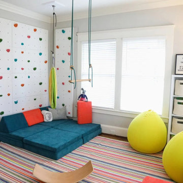
For two active elementary-school-aged kids who love to climb, this playroom has everything they need! In a 14 x 12-foot space, we transformed a cluttered closet into a cozy indoor playhouse, while adding two climbing walls, a climbing rope and a trapeze for extra adventure. The room now offers plenty of space for climbing, swinging, and imaginative play. As the mom put it, “We always talked about creating a playroom but didn’t think we had the room. After our first meeting with Wild Child, I saw that it was possible. They took a weird space, helped organize it, and created a room that our kids basically live in now.” This playroom has quickly become the go-to spot for the kids (as well as all the neighborhood kids!), thanks to a design that blends fun, adventure, and functionality!
 Phoenix Home Remodeling
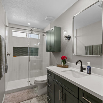
Along with her primary bathroom, Jill decided to give the guest bathroom a complete update. The original space had a dated tub-and-shower combo, basic cabinetry, and flooring that no longer fit the style of the home.
She wanted this room to feel welcoming and fresh for anyone who used it. The tub and shower surround were removed down to the studs to make way for a new custom shower. Large porcelain wall tile, also used in the primary bathroom for a cohesive look, was installed in a stacked layout with clean white trim.
A long recessed niche was added, finished in Bedrosians Makoto Midori Green mosaic. The shower floor was finished with the same white glass mosaic tile used in the primary bathroom, tying the two spaces together.
Stainless fixtures matched those in the primary bathroom, keeping continuity across the home. A frameless barn-style sliding glass door with brushed nickel hardware completed the enclosure.
Cabinetry was updated with sage green for a softer tone than the navy in the primary bath, with a wall cabinet added above the toilet for extra storage.
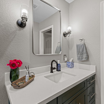
Quartz counters matched the primary bath, paired with an undermount sink and matte black faucet for contrast. A framed mirror with two black-and-nickel sconces finished the vanity wall, tying in with details from the primary bath while giving this space its own style.
 Phoenix Home Remodeling
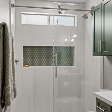
Along with her primary bathroom, Jill decided to give the guest bathroom a complete update. The original space had a dated tub-and-shower combo, basic cabinetry, and flooring that no longer fit the style of the home.
She wanted this room to feel welcoming and fresh for anyone who used it. The tub and shower surround were removed down to the studs to make way for a new custom shower. Large porcelain wall tile, also used in the primary bathroom for a cohesive look, was installed in a stacked layout with clean white trim.
A long recessed niche was added, finished in Bedrosians Makoto Midori Green mosaic. The shower floor was finished with the same white glass mosaic tile used in the primary bathroom, tying the two spaces together.
Stainless fixtures matched those in the primary bathroom, keeping continuity across the home. A frameless barn-style sliding glass door with brushed nickel hardware completed the enclosure.
Cabinetry was updated with sage green for a softer tone than the navy in the primary bath, with a wall cabinet added above the toilet for extra storage.
Quartz counters matched the primary bath, paired with an undermount sink and matte black faucet for contrast. A framed mirror with two black-and-nickel sconces finished the vanity wall, tying in with details from the primary bath while giving this space its own style.
Find the right local pro for your project

 Simply Home Decorating
Before we redesigned the basement of this charming but compact 1950's North Vancouver home, this space was an unfinished utility room that housed nothing more than an outdated furnace and hot water tank. Since space was at a premium we recommended replacing the furnace with a high efficiency model and converting the hot water tank to an on-demand system, both of which could be housed in the adjacent crawl space. That left room for a generous laundry room conveniently located at the back entrance of the house where family members returning from a mountain bike ride can undress, drop muddy clothes into the washing machine and proceed to shower in the bathroom just across the hall. Interior Design by Lori Steeves of Simply Home Decorating. Photos by Tracey Ayton Photography.

 ALL Renovation & Design LLC
Mrs. Deighan loved to cook, but hated her kitchen.
It was nonfunctional, inefficient, and an eyesore.
The sink was in the corner under low cabinets. The awkwardly placed fridge made it impractical for the entire family to be working together.
And that was a big deal.
She wanted a beautiful place to cook and entertain.
Besides the cramped space, the old, brown plywood cabinets were falling apart.
Because the cabinets were low, under-cabinet lighting was useless.
The kitchen was dark.
The previous owners had updated the flooring, but only by putting uglier tiles over the old vinyl.
And the ceiling had a leak stain.
It was time for a big change.
The Deighan's called Amos from ALL Renovation & Design.
Amos’s many successful remodeling projects done for them over the years had forged a friendship that made him the obvious contractor of choice.
Amos sat down with them and asked them to make a dream kitchen list.
If budget were of no concern, what would the space look like?
Once the Deighan's had their list, Amos helped them to evaluate each investment, taking into consideration the age and value of the home.
Then Amos presented a plan that fit perfectly in the Deighan's budget.
The basic U-shaped kitchen layout stayed the same.
Modern, creamy white custom cabinets replaced the dark plywood cabinets.
The fridge moved to make space for more cabinets.
The biggest challenge was moving the laundry room wall a few feet.
Moving it was necessary to add more space, but, since the wall was load-bearing, moving it required extra attention.
It was worth it.
Extra space allowed the counter to extend and the sink to move.
After the hard work ended, the reason for the transformation became reality.
Now “we can have the whole family in there comfortably and working together,” Mrs. Deighan said.
She loves her kitchen.
Especially the windowed cabinets that show off her fiestaware.
And when you see the beautiful St. Cecilia granite countertops, with Milstone Sari porcelain mosaic tile backsplash, maple flat-panel cabinets with under-cabinet lighting, and all new appliances including a double oven, you will see why she does.

 Middlefork Luxury Home Builders
This gracious property in the award-winning Blaine school district - and just off the Southport Corridor - marries an old world European design sensibility with contemporary technologies and unique artisan details. With more than 5,200 square feet, the home has four bedrooms and three bathrooms on the second floor, including a luxurious master suite with a private terrace.
The house also boasts a distinct foyer; formal living and dining rooms designed in an open-plan concept; an expansive, eat-in, gourmet kitchen which is open to the first floor great room; lower-level family room; an attached, heated, 2-½ car garage with roof deck; a penthouse den and roof deck; and two additional rooms on the lower level which could be used as bedrooms, home offices or exercise rooms. The home, designed with an extra-wide floorplan, achieved through side yard relief, also has considerable, professionally-landscaped outdoor living spaces.
This brick and limestone residence has been designed with family-functional experiences and classically proportioned spaces in mind. Highly-efficient environmental technologies have been integrated into the design and construction and the plan also takes into consideration the incorporation of all types of advanced communications systems.
The home went under contract in less than 45 days in 2011.
Jim Yochum

 TKS Design Group
Typical of bungalows and city lots, the footprint of this home was narrow with living spaces in front, bedrooms in back and kitchen centrally located. However, unlike most bungalows, the hall running from front to back have been closed off to, presumably, accommodate a walk-in pantry. Couple that with the fact that this circa 1925 bungalow had seen a lot of living – read boisterous children and remodeling trends like z-brick, soffits, and fluorescent overhead lighting – the kitchen was due for a major overhaul.
Truly the hub of this house, the modest 11’ x 12’ kitchen was most in need of additional countertop space, convenient garbage/recycle bin, counter-depth refrigerator, storage aids, informal dining for two, and sound-proofing to enable this musically adept family to coexist despite varied schedules.
Gone are the wall soffits, boxy overhead lighting, six-foot baseboard heat unit, extra deep refrigerator, refurbished cabinets, laminate countertops, z-brick wall covering, and makeshift door swags. Enter rich mahogany cabinets, roll and pull-out storage units, endcap spice storage, gorgeous granite tops, marble backsplash, LED lighting, acoustic insulation and solid-wood doors.
Under the guise of such a handsome room, provisions such as a period style sink allow for more efficient use of corners with pull-out half-moon trays for storage. Redirecting the baseboard heat to a compact, toekick unit, means more cabinet and counter space – perfect for a baking and/or entertaining area removed from the basic work triangle. The eating area, also, doubles as a work station with drawers for office supplies and dedicated outlet for cable tv. Functional yet beautiful, this kitchen is at the ready as its owners look forward to their golden years.
Designed by: The Kitchen Studio of Glen Ellyn
Photography by: Dawn Jackman
For more information on kitchen and bath design ideas go to: www.kitchenstudio-ge.com
URL http://www.kitchenstudio-ge.com

 Phoenix Home Remodeling
Along with her primary bathroom, Jill decided to give the guest bathroom a complete update. The original space had a dated tub-and-shower combo, basic cabinetry, and flooring that no longer fit the style of the home.
She wanted this room to feel welcoming and fresh for anyone who used it. The tub and shower surround were removed down to the studs to make way for a new custom shower. Large porcelain wall tile, also used in the primary bathroom for a cohesive look, was installed in a stacked layout with clean white trim.
A long recessed niche was added, finished in Bedrosians Makoto Midori Green mosaic. The shower floor was finished with the same white glass mosaic tile used in the primary bathroom, tying the two spaces together.
Stainless fixtures matched those in the primary bathroom, keeping continuity across the home. A frameless barn-style sliding glass door with brushed nickel hardware completed the enclosure.
Cabinetry was updated with sage green for a softer tone than the navy in the primary bath, with a wall cabinet added above the toilet for extra storage.
Quartz counters matched the primary bath, paired with an undermount sink and matte black faucet for contrast. A framed mirror with two black-and-nickel sconces finished the vanity wall, tying in with details from the primary bath while giving this space its own style.

 LiveWell Outdoors
Photo by Matchbook Productions - view of back yard patio and walkways using stamped concrete in a vermont slate pattern in dark charcoal and cool gray color; outdoor kitchen using EP Henry Ledgestone veneer stone; granite counter top; custom presure treated wood pergola; big green egg; built in grill; stainless steel accessories; great entertainment space
 ALL Renovation & Design LLC
Mrs. Deighan loved to cook, but hated her kitchen.
It was nonfunctional, inefficient, and an eyesore.
The sink was in the corner under low cabinets. The awkwardly placed fridge made it impractical for the entire family to be working together.
And that was a big deal.
She wanted a beautiful place to cook and entertain.
Besides the cramped space, the old, brown plywood cabinets were falling apart.
Because the cabinets were low, under-cabinet lighting was useless.
The kitchen was dark.
The previous owners had updated the flooring, but only by putting uglier tiles over the old vinyl.
And the ceiling had a leak stain.
It was time for a big change.
The Deighan's called Amos from ALL Renovation & Design.
Amos’s many successful remodeling projects done for them over the years had forged a friendship that made him the obvious contractor of choice.
Amos sat down with them and asked them to make a dream kitchen list.
If budget were of no concern, what would the space look like?
Once the Deighan's had their list, Amos helped them to evaluate each investment, taking into consideration the age and value of the home.
Then Amos presented a plan that fit perfectly in the Deighan's budget.
The basic U-shaped kitchen layout stayed the same.
Modern, creamy white custom cabinets replaced the dark plywood cabinets.
The fridge moved to make space for more cabinets.
The biggest challenge was moving the laundry room wall a few feet.
Moving it was necessary to add more space, but, since the wall was load-bearing, moving it required extra attention.
It was worth it.
Extra space allowed the counter to extend and the sink to move.
After the hard work ended, the reason for the transformation became reality.
Now “we can have the whole family in there comfortably and working together,” Mrs. Deighan said.
She loves her kitchen.
Especially the windowed cabinets that show off her fiestaware.
And when you see the beautiful St. Cecilia granite countertops, with Milstone Sari porcelain mosaic tile backsplash, maple flat-panel cabinets with under-cabinet lighting, and all new appliances including a double oven, you will see why she does.
 TKS Design Group
Typical of bungalows and city lots, the footprint of this home was narrow with living spaces in front, bedrooms in back and kitchen centrally located. However, unlike most bungalows, the hall running from front to back have been closed off to, presumably, accommodate a walk-in pantry. Couple that with the fact that this circa 1925 bungalow had seen a lot of living – read boisterous children and remodeling trends like z-brick, soffits, and fluorescent overhead lighting – the kitchen was due for a major overhaul.
Truly the hub of this house, the modest 11’ x 12’ kitchen was most in need of additional countertop space, convenient garbage/recycle bin, counter-depth refrigerator, storage aids, informal dining for two, and sound-proofing to enable this musically adept family to coexist despite varied schedules.
Gone are the wall soffits, boxy overhead lighting, six-foot baseboard heat unit, extra deep refrigerator, refurbished cabinets, laminate countertops, z-brick wall covering, and makeshift door swags. Enter rich mahogany cabinets, roll and pull-out storage units, endcap spice storage, gorgeous granite tops, marble backsplash, LED lighting, acoustic insulation and solid-wood doors.
Under the guise of such a handsome room, provisions such as a period style sink allow for more efficient use of corners with pull-out half-moon trays for storage. Redirecting the baseboard heat to a compact, toekick unit, means more cabinet and counter space – perfect for a baking and/or entertaining area removed from the basic work triangle. The eating area, also, doubles as a work station with drawers for office supplies and dedicated outlet for cable tv. Functional yet beautiful, this kitchen is at the ready as its owners look forward to their golden years.
Designed by: The Kitchen Studio of Glen Ellyn
Photography by: Dawn Jackman
For more information on kitchen and bath design ideas go to: www.kitchenstudio-ge.com
URL http://www.kitchenstudio-ge.com
 TKS Design Group
Free ebook, Creating the Ideal Kitchen. DOWNLOAD NOW
Collaborations with builders on new construction is a favorite part of my job. I love seeing a house go up from the blueprints to the end of the build. It is always a journey filled with a thousand decisions, some creative on-the-spot thinking and yes, usually a few stressful moments. This Naperville project was a collaboration with a local builder and architect. The Kitchen Studio collaborated by completing the cabinetry design and final layout for the entire home.
Access to the back of the house is through the mudroom which is outfitted with just about every possible storage feature you can think of for a mudroom. For starters, the basics – a locker for each family member. In addition to that, there is an entire cabinet with roll outs devoted just to shoes, one for cleaning supplies and one for extra coats. The room also features a small clean up sink as well as a set of refrigerator drawers making grabbing a Gatorade on the way to soccer practice a piece of cake.
If you are building a new home, The Kitchen Studio can offer expert help to make the most of your new construction home. We provide the expertise needed to ensure that you are getting the most of your investment when it comes to cabinetry, design and storage solutions. Give us a call if you would like to find out more!
Designed by: Susan Klimala, CKBD
Builder: Hampton Homes
Photography by: Michael Alan Kaskel
For more information on kitchen and bath design ideas go to: www.kitchenstudio-ge.com

 The Cabinet Store + Culina Design
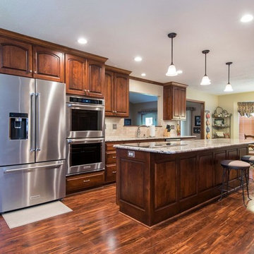
Example of a mid-sized classic u-shaped marble floor eat-in kitchen design in Minneapolis with an undermount sink, raised-panel cabinets, white cabinets, quartz countertops, multicolored backsplash, matchstick tile backsplash, stainless steel appliances, beige walls and an island
 ALL Renovation & Design LLC
Mrs. Deighan loved to cook, but hated her kitchen.
It was nonfunctional, inefficient, and an eyesore.
The sink was in the corner under low cabinets. The awkwardly placed fridge made it impractical for the entire family to be working together.
And that was a big deal.
She wanted a beautiful place to cook and entertain.
Besides the cramped space, the old, brown plywood cabinets were falling apart.
Because the cabinets were low, under-cabinet lighting was useless.
The kitchen was dark.
The previous owners had updated the flooring, but only by putting uglier tiles over the old vinyl.
And the ceiling had a leak stain.
It was time for a big change.
The Deighan's called Amos from ALL Renovation & Design.
Amos’s many successful remodeling projects done for them over the years had forged a friendship that made him the obvious contractor of choice.
Amos sat down with them and asked them to make a dream kitchen list.
If budget were of no concern, what would the space look like?
Once the Deighan's had their list, Amos helped them to evaluate each investment, taking into consideration the age and value of the home.
Then Amos presented a plan that fit perfectly in the Deighan's budget.
The basic U-shaped kitchen layout stayed the same.
Modern, creamy white custom cabinets replaced the dark plywood cabinets.
The fridge moved to make space for more cabinets.
The biggest challenge was moving the laundry room wall a few feet.
Moving it was necessary to add more space, but, since the wall was load-bearing, moving it required extra attention.
It was worth it.
Extra space allowed the counter to extend and the sink to move.
After the hard work ended, the reason for the transformation became reality.
Now “we can have the whole family in there comfortably and working together,” Mrs. Deighan said.
She loves her kitchen.
Especially the windowed cabinets that show off her fiestaware.
And when you see the beautiful St. Cecilia granite countertops, with Milstone Sari porcelain mosaic tile backsplash, maple flat-panel cabinets with under-cabinet lighting, and all new appliances including a double oven, you will see why she does.
 ALL Renovation & Design LLC
Mrs. Deighan loved to cook, but hated her kitchen.
It was nonfunctional, inefficient, and an eyesore.
The sink was in the corner under low cabinets. The awkwardly placed fridge made it impractical for the entire family to be working together.
And that was a big deal.
She wanted a beautiful place to cook and entertain.
Besides the cramped space, the old, brown plywood cabinets were falling apart.
Because the cabinets were low, under-cabinet lighting was useless.
The kitchen was dark.
The previous owners had updated the flooring, but only by putting uglier tiles over the old vinyl.
And the ceiling had a leak stain.
It was time for a big change.
The Deighan's called Amos from ALL Renovation & Design.
Amos’s many successful remodeling projects done for them over the years had forged a friendship that made him the obvious contractor of choice.
Amos sat down with them and asked them to make a dream kitchen list.
If budget were of no concern, what would the space look like?
Once the Deighan's had their list, Amos helped them to evaluate each investment, taking into consideration the age and value of the home.
Then Amos presented a plan that fit perfectly in the Deighan's budget.
The basic U-shaped kitchen layout stayed the same.
Modern, creamy white custom cabinets replaced the dark plywood cabinets.
The fridge moved to make space for more cabinets.
The biggest challenge was moving the laundry room wall a few feet.
Moving it was necessary to add more space, but, since the wall was load-bearing, moving it required extra attention.
It was worth it.
Extra space allowed the counter to extend and the sink to move.
After the hard work ended, the reason for the transformation became reality.
Now “we can have the whole family in there comfortably and working together,” Mrs. Deighan said.
She loves her kitchen.
Especially the windowed cabinets that show off her fiestaware.
And when you see the beautiful St. Cecilia granite countertops, with Milstone Sari porcelain mosaic tile backsplash, maple flat-panel cabinets with under-cabinet lighting, and all new appliances including a double oven, you will see why she does.
 ALL Renovation & Design LLC
Mrs. Deighan loved to cook, but hated her kitchen.
It was nonfunctional, inefficient, and an eyesore.
The sink was in the corner under low cabinets. The awkwardly placed fridge made it impractical for the entire family to be working together.
And that was a big deal.
She wanted a beautiful place to cook and entertain.
Besides the cramped space, the old, brown plywood cabinets were falling apart.
Because the cabinets were low, under-cabinet lighting was useless.
The kitchen was dark.
The previous owners had updated the flooring, but only by putting uglier tiles over the old vinyl.
And the ceiling had a leak stain.
It was time for a big change.
The Deighan's called Amos from ALL Renovation & Design.
Amos’s many successful remodeling projects done for them over the years had forged a friendship that made him the obvious contractor of choice.
Amos sat down with them and asked them to make a dream kitchen list.
If budget were of no concern, what would the space look like?
Once the Deighan's had their list, Amos helped them to evaluate each investment, taking into consideration the age and value of the home.
Then Amos presented a plan that fit perfectly in the Deighan's budget.
The basic U-shaped kitchen layout stayed the same.
Modern, creamy white custom cabinets replaced the dark plywood cabinets.
The fridge moved to make space for more cabinets.
The biggest challenge was moving the laundry room wall a few feet.
Moving it was necessary to add more space, but, since the wall was load-bearing, moving it required extra attention.
It was worth it.
Extra space allowed the counter to extend and the sink to move.
After the hard work ended, the reason for the transformation became reality.
Now “we can have the whole family in there comfortably and working together,” Mrs. Deighan said.
She loves her kitchen.
Especially the windowed cabinets that show off her fiestaware.
And when you see the beautiful St. Cecilia granite countertops, with Milstone Sari porcelain mosaic tile backsplash, maple flat-panel cabinets with under-cabinet lighting, and all new appliances including a double oven, you will see why she does.

 Village Home Stores
A kitchen in Moline, IL remodeled by Village Home Stores using our Full Project Management program. We managed this entire remodel from start to finish.

 Exodus Construction, LLC
Aaron Usher
Eat-in kitchen - small coastal galley porcelain tile and gray floor eat-in kitchen idea in Providence with a farmhouse sink, recessed-panel cabinets, white cabinets, granite countertops, blue backsplash, glass tile backsplash, stainless steel appliances and an island
Eat-in kitchen - small coastal galley porcelain tile and gray floor eat-in kitchen idea in Providence with a farmhouse sink, recessed-panel cabinets, white cabinets, granite countertops, blue backsplash, glass tile backsplash, stainless steel appliances and an island
 ALL Renovation & Design LLC
Mrs. Deighan loved to cook, but hated her kitchen.
It was nonfunctional, inefficient, and an eyesore.
The sink was in the corner under low cabinets. The awkwardly placed fridge made it impractical for the entire family to be working together.
And that was a big deal.
She wanted a beautiful place to cook and entertain.
Besides the cramped space, the old, brown plywood cabinets were falling apart.
Because the cabinets were low, under-cabinet lighting was useless.
The kitchen was dark.
The previous owners had updated the flooring, but only by putting uglier tiles over the old vinyl.
And the ceiling had a leak stain.
It was time for a big change.
The Deighan's called Amos from ALL Renovation & Design.
Amos’s many successful remodeling projects done for them over the years had forged a friendship that made him the obvious contractor of choice.
Amos sat down with them and asked them to make a dream kitchen list.
If budget were of no concern, what would the space look like?
Once the Deighan's had their list, Amos helped them to evaluate each investment, taking into consideration the age and value of the home.
Then Amos presented a plan that fit perfectly in the Deighan's budget.
The basic U-shaped kitchen layout stayed the same.
Modern, creamy white custom cabinets replaced the dark plywood cabinets.
The fridge moved to make space for more cabinets.
The biggest challenge was moving the laundry room wall a few feet.
Moving it was necessary to add more space, but, since the wall was load-bearing, moving it required extra attention.
It was worth it.
Extra space allowed the counter to extend and the sink to move.
After the hard work ended, the reason for the transformation became reality.
Now “we can have the whole family in there comfortably and working together,” Mrs. Deighan said.
She loves her kitchen.
Especially the windowed cabinets that show off her fiestaware.
And when you see the beautiful St. Cecilia granite countertops, with Milstone Sari porcelain mosaic tile backsplash, maple flat-panel cabinets with under-cabinet lighting, and all new appliances including a double oven, you will see why she does.

 JWT Associates
This is the interior/ exterior remodel of a 1930s estate in Encino. We took what was a very narrow and empty backyard and created several spaces for entertaining, including an outdoor pizza oven and bocce court. The stacked stone fireplace is made of Santa Barbara Sandstone. Inside the house, the family room and second story loft were remodeled to include a new guest bathroom. Lee Manning Photography
71