
Search results for "Extra extremely" in Home Design Ideas
 Kitchen Solvers of Fort Lauderdale
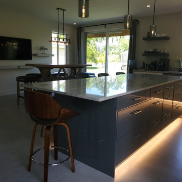
Our client commissioned us to remodel her home. She wanted an open plan concept and for the kitchen to be integrated with the living room and dining room. She also needed a space in which she could work. So we decided to remove the walls that separated the kitchen from the living room and the dining room. We expanded the kitchen space on both sides and made an "L" layout with cabinets on both walls. To complement and establish a virtual limit of space, we placed a large island 10 feet long by 4 feet wide with drawers on the kitchen side and storage cabinets on the sitting side. The cabinets are all prefinished plywood with acrylic doors, white for the cabinets on the walls and gray for the center island. All base cabinets have soft close pullouts. The drawers were complemented with accessories to organize all the kitchen utensils. The corner cabinet was custom made extra long to accommodate a large swing-out and spice rack next to it. At the extreme end of the kitchen cabinets, we placed a "coffee station" with dark gray floating shelves on top, their respective pullouts on the base cabinets. Under the wall and base cabinets we place LED lights that enhance and highlight the kitchen day and night. All ceiling lights were also replaced with recessed LED lights. Over the island and the dining table hanging lights were placed along them. Power strip outlets with USB ports were also placed under the wall cabinets and in the headboards of the island, these are hidden giving a clean aesthetic to the backsplash and very functional on a day-to-day basis. The countertops of the cabinets on the walls were done in gray porcelain as well as the full backsplash that also covers the central area of the hood. The central island countertop was made in Quarzite. The floors were replaced with 48" by 48" rectified porcelain tile. Now this homeowner has the kitchen of their dreams.
 Monarch Sofas
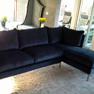
With a slim frame, delicate aluminum legs and an extra-deep seat, the VIOLA STYLE is a sophisticated design that offers extreme comfort. Top stitching on the frame and flange seams on the back cushions add to VIOLA'S personality.
AVAILABLE IN ANY SIZE, CONFIGURATION AND COLOR @ MONARCHSOFAS.COM
 InnovationLand
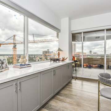
Houston Interior Designer Lisha Maxey took this Museum District condo from the dated, mirrored walls of the 1980s to Mid Century Modern with a gallery look featuring the client’s art collection.
The place was covered with glued-down, floor-to-ceiling mirrors,” says Lisha Maxey, senior designer for Homescapes of Houston and principal at LGH Design Services in Houston. “When we took them off the walls, the walls came apart. We ended up taking them down to the studs."
The makeover took six months to complete, primarily because of strict condo association rules that only gave the Houston interior designers very limited access to the elevator – through which all materials and team members had to go.
“Monday through Friday, we could only be noisy from 10 a.m. to 2 p.m., and if we had to do something extra loud, like sawing or drilling, we had to schedule it with the management and they had to communicate that to the condo owners. So it was just a lot of coordination. But a lot of Inner City Loopers live in these kinds of buildings, so we’re used to handling that kind of thing.”
The client, a child psychiatrist in her 60s, recently moved to Houston from northeast Texas to be with friends. After being widowed three years ago, she decided it was time to let go of the traditionally styled estate that wasn’t really her style anyway. An avid diver who has traveled around the world to pursue her passion, she has amassed a large collection of art from her travels. Downsizing to 1,600 feet and wanting to go more contemporary, she wanted the display – and the look – more streamlined.
“She wanted clean lines and muted colors, with the main focus being her artwork,” says Maxey. “So we made the space a palette for that.”
Enter the white, gallery-grade paint she chose for the walls: “It’s halfway between satin and flat,” explains Maxey. “It’s not glossy and it’s not chalky – just very smooth and clean."
Adding to the gallery theme is the satin nickel track lighting with lamps aimed to highlight pieces of art. “This lighting has no wires,” notes Maxey. “It’s powered by a positive and negative conduit.”
The new flooring throughout is a blended-grey porcelain tile that looks like wood planks. “It’s gorgeous, natural-looking and combines all the beauty of wood with the durability of tile,” says Maxey. “We used it throughout the condo to unify the space.”
After Maxey started looking at the client’s bright, vibrant, colorful artwork, she felt the palette couldn’t stay as muted anymore. Hence the Mid Century Modern orange leather sofas from West Elm and bright green chairs from Joybird, plus the throw pillows in different textures, patterns and shades of gold, orange and green.
The concave lines of the Danish-inspired chairs, she notes, help them look beautiful from all the way around – a key to designing spaces for loft living.
“The table in the living room is very interesting,” notes Maxey. “It was handmade for the client in 1974 and has a signature on it from the artist. She was adamant about including the piece, which has all these hand-painted black-and-white art tiles on the top. I took one look at it and said ‘It’s not really going to go.’”
However, after cutting 6 inches off the bottom and making it look a little distressed, the table ended up being the perfect complement to the sofas.
The dining room table – from Design Within Reach – is a solid piece of mahogany, the chair upholstery a mix of grey velvet and leather and the legs a shiny brass. “The side chairs are leather and the end ones are velvet,” says Maxey. “It’s a nice textural mix that lends depth and texture.”The galley kitchen, meanwhile, has been lightened and brightened, with new, white contemporary cabinetry, quartz countertops mimicking the look of Carrara marble, stainless steel appliances and a velvet green bench seat for a punch of color.The two bathrooms have been updated with contemporary white vanities and vessel sinks and the master bath now features a walk-in shower tiled in Dolomite white marble (the floor is Bianco Carrara marble mosaic, done in a herringbone pattern).In the master bedroom, Homescapes of Houston knocked down a wall between two smaller closets with swing doors to make one large walk-in closet with pocket doors. The closet in the guest bedroom also came out 13 more inches.The client’s artwork throughout personalizes the space and tells the story of a life. There’s a huge bowl of shells from the client’s diving adventures, framed art from her child psychiatry patients and a 16th century wood carving from a monastery that’s been in her family forever.
“Her collection is quite impressive,” says Maxey. “There’s even a framed piece of autographed songs written by John Lennon.” (You can see this black-framed piece of art on the wall in the photo above of two green chairs).
“We’re extremely happy with how the project turned out, and so is the client,” says Maxey. “No expense was spared for her. It was a labor of love and we were excited to do it.”
Find the right local pro for your project
 Cure Design Group
KITCHEN RENOVATION CURRENT CRAFTSMAN
This client started off just being curious about our services - what we could do, and if we could even help her update her kitchen. She and her husband with their two teenage kids have lived in their home for several years without updating anything since the house was originally built. They didn’t quite have a budget in mind yet. They didn’t know their style, or even if they had one. Their timeline was simple, “as fast as you can so we’re not without a kitchen for very long” (usually what we hear for kitchen updates).
After a very productive consultation: determining the scope of work and zeroing in on a budget, I was very excited to update this underwhelming space to something that is modern but timeless, something that is theirs. And, it was easy to see what type of design style they gravitated toward looking at the pieces they already own: Craftsman/Prairie Style. I left the meeting so excited to weave in yet another genre of design to my CDG portfolio! We circled in our contractor to discuss the changes they were looking to make and the scope of work that would be theirs. Then I was off to get designing:
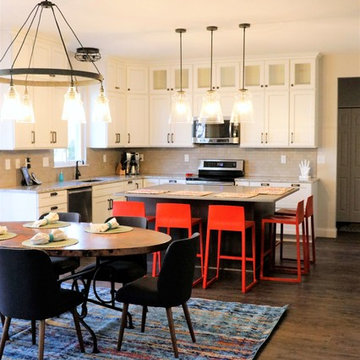
// Because the kitchen’s footprint and the defined breakfast space delineated by the bay, we kept the perimeter cabinetry as it was originally laid out. We updated these cabinets to a beautiful soft Alabaster White with a Barn Wood Glaze to highlight the simplicity of the shaker style doors. We added transom cabinets above the uppers, with only the back wall having seeded glass inserts to highlight some of their collectables.
// The original shaped island was counter-productive (See what I did there?) in functionality and design. We squared this off to reduce some of the angles and gain more storage. We highlighted the new island with a contrasting oak cabinet in a dark finish, to pay our respects to the craftsman style, and topped with a concrete-like countertop as a nod to the Prairie Style, allowing the homeowners to gain two extra seats and a massive -uninterrupted- work surface.
// The small section of cabinetry between the garage entry and fridge now is the perfect dump-station for mail, electronics, whatever is in their hands when they come into the house; and completely hidden by the refrigerator.
// The disconnected cabinetry in the breakfast area makes for a great place to have a working office. Accessible from the kitchen or the adjacent great room, this is the perfect place for the kids to do their homework while mom and dad are putting together dinner. The base cabinets are built out for office-type storage: paper and pencil drawers, filing systems, and cord management. Additionally, the long counter provides a ton of worksurface to spread out.
// The largest transformation was the pantry. We raised the height of the doorway and added huge custom designed bypass sliding barndoors. Finished with a dark stain to compliment the island and cut to inset 4 stained glass windows, typical of this style of design, and driving home the concept for the whole space.
// They were desperate to replace their flooring with something extremely durable to flow throughout the kitchen and the whole main level. This beautiful new flooring is actually a textured LVT(!) Which allowed them to save on overall cost and extend the life of their new flooring purchase.
// They loved their copper table, so we kept it and added new simple, mid-century modern chairs around it and a shiny new craftsman-style chandelier above. We added bright barstools in a burnt orange-red accent, and a bright woven rug to tie it all together.
// Because the kitchen renovation was shaping up to be pretty spectacular, they decided they needed to now replace their ‘now-these-look-a-little-too-old’ upholstered seating in the neighboring great room with 2 new sofas. We found the perfect sage-y-grey fabric which we covered on sofa frames that have and exposed oak-wood base, which we finished in a warm weathered grey.
// As every designer knows, a room isn’t finished until there’s something on the windows. Now that the new flooring was installed and every other room on the main level ‘seemed’ to be updated, we needed to update the window treatments in the dining, and great rooms to reflect their new design concept.
I hope you find the ‘after’ photos refreshing (as refreshing as it was for me to work on something that’s not a “Farm House” style that’s saturating the industry right now!) This was such a fun project and a great collaboration with our contractor.
 Anthology Woods
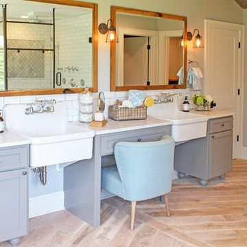
Products making their television debut in this project were Anthology Woods Northwest Blend (a naturally weathered wood installed on a section of the ceiling, unfinished) and the extremely hard & durable Left Coast White Oak, a unique species growing only in a narrow strip of Oregon and bit in California & Washington (installed for the flooring, finished with Rubio Monocoat White natural oil). The homeowners were able to easily apply the finish themselves prior to installing the floor, and the zero VOC nature of the oil insured it was safe to move right in! The White tint to the oil gives a subtle white-washed look to the floors while maintaining a natural look and a supple feel underfoot.
The couple participating in the episode loved their floor so much they decided to add more, installing it in their master bedroom, as well! The rich character of this natural Oak in a flat sawn (the old "European" way to cut Oak) wood product adds a timeless element & warmth to the feel of the space. Looking closely at the grain, you'll see cathedral patterns in many boards, along with a great mix of flat grain with rift areas as well. Finishing out the details of the room, the Bath Crashers team added natural carerra marble in the shower with tones of white & gray, and apron-front vanity sinks for extra charm.
 Kitchen Solvers of Fort Lauderdale
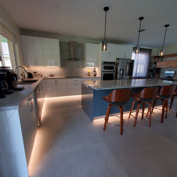
Our client commissioned us to remodel her home. She wanted an open plan concept and for the kitchen to be integrated with the living room and dining room. She also needed a space in which she could work. So we decided to remove the walls that separated the kitchen from the living room and the dining room. We expanded the kitchen space on both sides and made an "L" layout with cabinets on both walls. To complement and establish a virtual limit of space, we placed a large island 10 feet long by 4 feet wide with drawers on the kitchen side and storage cabinets on the sitting side. The cabinets are all prefinished plywood with acrylic doors, white for the cabinets on the walls and gray for the center island. All base cabinets have soft close pullouts. The drawers were complemented with accessories to organize all the kitchen utensils. The corner cabinet was custom made extra long to accommodate a large swing-out and spice rack next to it. At the extreme end of the kitchen cabinets, we placed a "coffee station" with dark gray floating shelves on top, their respective pullouts on the base cabinets. Under the wall and base cabinets we place LED lights that enhance and highlight the kitchen day and night. All ceiling lights were also replaced with recessed LED lights. Over the island and the dining table hanging lights were placed along them. Power strip outlets with USB ports were also placed under the wall cabinets and in the headboards of the island, these are hidden giving a clean aesthetic to the backsplash and very functional on a day-to-day basis. The countertops of the cabinets on the walls were done in gray porcelain as well as the full backsplash that also covers the central area of the hood. The central island countertop was made in Quarzite. The floors were replaced with 48" by 48" rectified porcelain tile. Now this homeowner has the kitchen of their dreams.
 InnovationLand
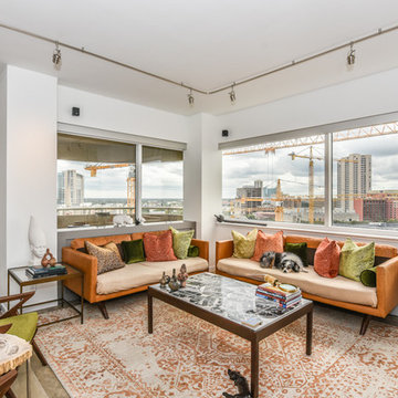
Houston Interior Designer Lisha Maxey took this Museum District condo from the dated, mirrored walls of the 1980s to Mid Century Modern with a gallery look featuring the client’s art collection.
The place was covered with glued-down, floor-to-ceiling mirrors,” says Lisha Maxey, senior designer for Homescapes of Houston and principal at LGH Design Services in Houston. “When we took them off the walls, the walls came apart. We ended up taking them down to the studs."
The makeover took six months to complete, primarily because of strict condo association rules that only gave the Houston interior designers very limited access to the elevator – through which all materials and team members had to go.
“Monday through Friday, we could only be noisy from 10 a.m. to 2 p.m., and if we had to do something extra loud, like sawing or drilling, we had to schedule it with the management and they had to communicate that to the condo owners. So it was just a lot of coordination. But a lot of Inner City Loopers live in these kinds of buildings, so we’re used to handling that kind of thing.”
The client, a child psychiatrist in her 60s, recently moved to Houston from northeast Texas to be with friends. After being widowed three years ago, she decided it was time to let go of the traditionally styled estate that wasn’t really her style anyway. An avid diver who has traveled around the world to pursue her passion, she has amassed a large collection of art from her travels. Downsizing to 1,600 feet and wanting to go more contemporary, she wanted the display – and the look – more streamlined.
“She wanted clean lines and muted colors, with the main focus being her artwork,” says Maxey. “So we made the space a palette for that.”
Enter the white, gallery-grade paint she chose for the walls: “It’s halfway between satin and flat,” explains Maxey. “It’s not glossy and it’s not chalky – just very smooth and clean."
Adding to the gallery theme is the satin nickel track lighting with lamps aimed to highlight pieces of art. “This lighting has no wires,” notes Maxey. “It’s powered by a positive and negative conduit.”
The new flooring throughout is a blended-grey porcelain tile that looks like wood planks. “It’s gorgeous, natural-looking and combines all the beauty of wood with the durability of tile,” says Maxey. “We used it throughout the condo to unify the space.”
After Maxey started looking at the client’s bright, vibrant, colorful artwork, she felt the palette couldn’t stay as muted anymore. Hence the Mid Century Modern orange leather sofas from West Elm and bright green chairs from Joybird, plus the throw pillows in different textures, patterns and shades of gold, orange and green.
The concave lines of the Danish-inspired chairs, she notes, help them look beautiful from all the way around – a key to designing spaces for loft living.
“The table in the living room is very interesting,” notes Maxey. “It was handmade for the client in 1974 and has a signature on it from the artist. She was adamant about including the piece, which has all these hand-painted black-and-white art tiles on the top. I took one look at it and said ‘It’s not really going to go.’”
However, after cutting 6 inches off the bottom and making it look a little distressed, the table ended up being the perfect complement to the sofas.
The dining room table – from Design Within Reach – is a solid piece of mahogany, the chair upholstery a mix of grey velvet and leather and the legs a shiny brass. “The side chairs are leather and the end ones are velvet,” says Maxey. “It’s a nice textural mix that lends depth and texture.”The galley kitchen, meanwhile, has been lightened and brightened, with new, white contemporary cabinetry, quartz countertops mimicking the look of Carrara marble, stainless steel appliances and a velvet green bench seat for a punch of color.The two bathrooms have been updated with contemporary white vanities and vessel sinks and the master bath now features a walk-in shower tiled in Dolomite white marble (the floor is Bianco Carrara marble mosaic, done in a herringbone pattern).In the master bedroom, Homescapes of Houston knocked down a wall between two smaller closets with swing doors to make one large walk-in closet with pocket doors. The closet in the guest bedroom also came out 13 more inches.The client’s artwork throughout personalizes the space and tells the story of a life. There’s a huge bowl of shells from the client’s diving adventures, framed art from her child psychiatry patients and a 16th century wood carving from a monastery that’s been in her family forever.
“Her collection is quite impressive,” says Maxey. “There’s even a framed piece of autographed songs written by John Lennon.” (You can see this black-framed piece of art on the wall in the photo above of two green chairs).
“We’re extremely happy with how the project turned out, and so is the client,” says Maxey. “No expense was spared for her. It was a labor of love and we were excited to do it.”
Sponsored
Columbus, OH

HomeCraft Remodeling
Custom Craftsmanship & Build Solutions in Franklin County, Ohio
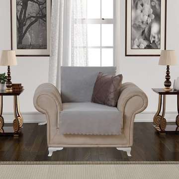
 ESF Home Textile LLC.
Chiara Rose Anti-slip Armless Sofa Cover Furniture Protector Chair Size Diamond
Dimensions: 29 Inch X 70 Inch
BEST SOFA PROTECTOR - This Slipcover is Extremely Sturdy, as well as an Instant, Magical Solution to Renew your Old Furniture with an Elegant Look! Ultrasonically welded seams prevent ripping apart and unraveling. The Edges are Laser-Cut to give a Chenille Trim Effect. Its Velvety Texture is Soft and also functions like a Warm Pet Bed giving a Sense of Security while your Pet is Resting. Our Covers are absolutely Pet-Friendly.
PROTECTIVE! Best Protection for ANIMAL SCRATCHES FUR SHED-HAIR DIRT FOOD SPILLS WEAR TEAR! STAIN PROOF! Perfect Guard against Cats Dogs Kids Children!
DECORATIVE! Great Stylish Coverage and Luxury Decoration in Living, Sitting Room with Full Solid Colors and Beautiful Printed, Patterned Designs, Extra Deluxe Décor, Nice Plush Texture! New Modern Look! CUSTOM-FIT! Relaxed fitted in Wing-back, Club, Rocker, Single Chair and a Half, one two three Pillow Coach, 1 2 Seaters, Box, T cushion, L, U shape Seaters! Big Large Long Wide Couches! Leather Velour Denim Twill Linen Sofas!
NON SLIDE! Slid-Resistant with PLASTIC DROP BACKING! No More Slipping Off / Sliding Over! Plastic Dots firmly Grip Upholstery! Stays in Place! No Zipper, Mat, Elastic Strap! No Pads under!
EASY CARE & WASH, DURABLE, DETERRENT! Machine Washable! Easily Removable Ready Made Furniture Throws! Cheap and Inexpensive! Heavy Duty Fabric! Stretch Enough to Cloth up Perfectly and Look Form Fit! NO ARMS! Slipcovers with Armrests DON’T properly FIT IN the Armrests and always create Fitting Problems. You know, they also have an Ugly Look. But with Chiara Rose no Need to Worry about Armrests anymore!
• PLEASE MAKE SURE TO READ DETAILED PRODUCT INFORMATION BELOW!
________________________________________
Product Description
WHY CHIARA ROSE SOFA COVERS?
Kids and Pets; We love them but we also love our furniture. Cleaning furniture is one of the most difficult chores and that’s why you need to protect it from dirt. The easiest and economical way of preserving your furniture is Chiara Rose Sofa Protector. Just put the sofa protector on your sofas (futon or couch) and stop worrying about stains and spills. It is perfect for homes with kids and pets. Pets love to scratch upholstery of the furniture. The enduring 220 gsm polyester fabric of Chiara Rose Sofa Protectors prevents tears and any kind of debris on your sofas. Its sturdy texture doesn’t let any spill and dirt penetrate the upholstery.
Besides being durable, Chiara Rose Sofa Cover is suitable to all types of decoration. To express your own personal style, you can choose from a variety of color and design options that fit perfectly to your home décor. With brilliant colors and attractive patterns, Chiara Rose Sofa Covers will give your room a completely new outlook. Unlike other covers, you don’t need to remove Chiara Rose Sofa Protector when you have guests. It will both protect your furniture and become a part of your home decoration.
WHY CHIARA ROSE SOFA PROTECTOR IS DURABLE?
The most common problem with traditional sofa covers is that after a short time of use the stitches come apart. The edges of Chiara Rose Sofa Cover are manufactured with ultrasonic laser cut technology. This technology prevents the edges from unraveling. What’s more, the 220 gsm polyester knitted fabric is the most long lasting fabric used in furniture protectors. While being durable, this fabric gives a warm sense
of touch and pleasure to sit upon.
WHY CHIARA ROSE IS THE BEST ANTI-SLIP SOFA PROTECTOR?
We always use the most contemporary technology to develop our products. That’s why we decided to use the patented plastic drop design on the back side of our covers to create the anti slip effect. These plastic drops firmly grip the upholstery of furniture so that the cover doesn’t slip off the seat easily. Even after your kids and pets jump on the sofa, Chiara Rose Sofa Cover holds on to your furniture. A quick adjustment is all it takes to get it back to look smooth. Chiara Rose Sofa Cover is the only sofa protector that uses this new technology.
WHY IT IS EASY TO USE CHIARA ROSE SOFA PROTECTORS?
No zippers, no elastic straps, no metal hooks!!! The anti-slip drops will take care of everything! , As shown on the image, just lay Chiara Rose Sofa Cover on your sofa, and tuck it between the cushion and the arms of the sofa. That’s all you need to do to put it on.
Chiara Rose Sofa Protector doesn’t allow everyday dirt, pet hair and food spills reach your sofa. The pattern of the fabric prevents accumulation of dirt on it. You can easily take off this dirt. In order to get best results, use a vacuum cleaner or shake your cover off before machine wash.
Chiara Rose Sofa Protector is easy care. It can be machine washed on max. 30°C or 85°F water temperature. Don’t use bleacher. Machine dryer can be used on low heat setting. To avoid wrinkles, use gentle cycle on washing machine and hang from a line while drying. If necessary, iron at low temperature.
 InnovationLand
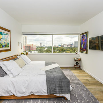
Houston Interior Designer Lisha Maxey took this Museum District condo from the dated, mirrored walls of the 1980s to Mid Century Modern with a gallery look featuring the client's art collection.
"The place was covered with glued-down, floor-to-ceiling mirrors," says Lisha Maxey, senior designer for Homescapes of Houston and principal at LGH Design Services in Houston. "When we took them off the walls, the walls came apart. We ended up taking them down to the studs."
The makeover took six months to complete, primarily because of strict condo association rules that only gave the Houston interior designers very limited access to the elevator - through which all materials and team members had to go.
"Monday through Friday, we could only be noisy from 10 a.m. to 2 p.m., and if we had to do something extra loud, like sawing or drilling, we had to schedule it with the management and they had to communicate that to the condo owners. So it was just a lot of coordination. But a lot of Inner City Loopers live in these kinds of buildings, so we're used to handling that kind of thing."
The client, a child psychiatrist in her 60s, recently moved to Houston from northeast Texas to be with friends. After being widowed three years ago, she decided it was time to let go of the traditionally styled estate that wasn't really her style anyway. An avid diver who has traveled around the world to pursue her passion, she has amassed a large collection of art from her travels. Downsizing to 1,600 feet and wanting to go more contemporary, she wanted the display - and the look - more streamlined.
"She wanted clean lines and muted colors, with the main focus being her artwork," says Maxey. "So we made the space a palette for that."
Enter the white, gallery-grade paint she chose for the walls: "It's halfway between satin and flat," explains Maxey. "It's not glossy and it's not chalky - just very smooth and clean."
Adding to the gallery theme is the satin nickel track lighting with lamps aimed to highlight pieces of art. "This lighting has no wires," notes Maxey. "It's powered by a positive and negative conduit."
The new flooring throughout is a blended-grey porcelain tile that looks like wood planks. "It's gorgeous, natural-looking and combines all the beauty of wood with the durability of tile," says Maxey. "We used it throughout the condo to unify the space."
After Maxey started looking at the client's bright, vibrant, colorful artwork, she felt the palette couldn't stay as muted anymore. Hence the Mid Century Modern orange leather sofas from West Elm and bright green chairs from Joybird, plus the throw pillows in different textures, patterns and shades of gold, orange and green.
The concave lines of the Danish-inspired chairs, she notes, help them look beautiful from all the way around - a key to designing spaces for loft living.
"The table in the living room is very interesting," notes Maxey. "It was handmade for the client in 1974 and has a signature on it from the artist. She was adamant about including the piece, which has all these hand-painted black-and-white art tiles on the top. I took one look at it and said 'It's not really going to go.'"
However, after cutting 6 inches off the bottom and making it look a little distressed, the table ended up being the perfect complement to the sofas.
The dining room table - from Design Within Reach - is a solid piece of mahogany, the chair upholstery a mix of grey velvet and leather and the legs a shiny brass. "The side chairs are leather and the end ones are velvet," says Maxey. "It's a nice textural mix that lends depth and texture."
The galley kitchen, meanwhile, has been lightened and brightened, with white quartz countertops and backsplashes mimicking the look of Carrara marble, stainless steel appliances and a velvet green bench seat for a punch of color. The cabinets are painted a cool grey color called "Silverplate."
The two bathrooms have been updated with contemporary white vanities and vessel sinks and the master bath now features a walk-in shower tiled in Dolomite white marble (the floor is Bianco Carrara marble mosaic, done in a herringbone pattern.
In the master bedroom, Homescapes of Houston knocked down a wall between two smaller closets with swing doors to make one large walk-in closet with pocket doors. The closet in the guest bedroom also came out 13 more inches.
The client's artwork throughout personalizes the space and tells the story of a life. There's a huge bowl of shells from the client's diving adventures, framed art from her child psychiatry patients and a 16th century wood carving from a monastery that's been in her family forever.
"Her collection is quite impressive," says Maxey. "There's even a framed piece of autographed songs written by John Lennon." (You can see this black-framed piece of art on the wall in the photo above of two green chairs).
"We're extremely happy with how the project turned out, and so is the client," says Maxey. "No expense was spared for her. It was a labor of love and we were excited to do it."
 Deck and Patio Company "Outdoor Living Experts"
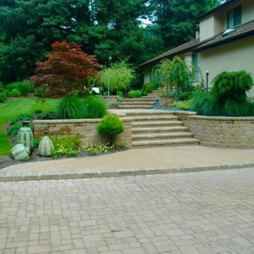
Engineered in Canada where they require extra strength due to the country’s extreme weather changes, Techo-Bloc pavers handle well the freeze/thaw that occurs in our corner of the Northeast.
Like concrete and asphalt pavements, Techo-Bloc pavers can be plowed and shoveled. Actually, the edges and joints around the pavers assist in melting snow and ice, explains their manufacturer. Using de-icing salt (sodium chloride or calcium chloride) to remove snow and ice will not harm these paving stones they say.
We used Techo-Bloc for this project: stairs, walls, driveway, entry, etc.
www.deckandpatio.com
 InnovationLand
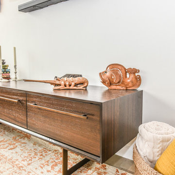
Houston Interior Designer Lisha Maxey took this Museum District condo from the dated, mirrored walls of the 1980s to Mid Century Modern with a gallery look featuring the client's art collection.
"The place was covered with glued-down, floor-to-ceiling mirrors," says Lisha Maxey, senior designer for Homescapes of Houston and principal at LGH Design Services in Houston. "When we took them off the walls, the walls came apart. We ended up taking them down to the studs."
The makeover took six months to complete, primarily because of strict condo association rules that only gave the Houston interior designers very limited access to the elevator - through which all materials and team members had to go.
"Monday through Friday, we could only be noisy from 10 a.m. to 2 p.m., and if we had to do something extra loud, like sawing or drilling, we had to schedule it with the management and they had to communicate that to the condo owners. So it was just a lot of coordination. But a lot of Inner City Loopers live in these kinds of buildings, so we're used to handling that kind of thing."
The client, a child psychiatrist in her 60s, recently moved to Houston from northeast Texas to be with friends. After being widowed three years ago, she decided it was time to let go of the traditionally styled estate that wasn't really her style anyway. An avid diver who has traveled around the world to pursue her passion, she has amassed a large collection of art from her travels. Downsizing to 1,600 feet and wanting to go more contemporary, she wanted the display - and the look - more streamlined.
"She wanted clean lines and muted colors, with the main focus being her artwork," says Maxey. "So we made the space a palette for that."
Enter the white, gallery-grade paint she chose for the walls: "It's halfway between satin and flat," explains Maxey. "It's not glossy and it's not chalky - just very smooth and clean."
Adding to the gallery theme is the satin nickel track lighting with lamps aimed to highlight pieces of art. "This lighting has no wires," notes Maxey. "It's powered by a positive and negative conduit."
The new flooring throughout is a blended-grey porcelain tile that looks like wood planks. "It's gorgeous, natural-looking and combines all the beauty of wood with the durability of tile," says Maxey. "We used it throughout the condo to unify the space."
After Maxey started looking at the client's bright, vibrant, colorful artwork, she felt the palette couldn't stay as muted anymore. Hence the Mid Century Modern orange leather sofas from West Elm and chartruese chairs from Joybird, plus the throw pillows in different textures, patterns and shades of gold, orange and green.
The concave lines of the Danish-inspired chairs, she notes, help them look beautiful from all the way around - a key to designing spaces for loft living.
"The table in the living room is very interesting," notes Maxey. "It was handmade for the client in 1974 and has a signature on it from the artist. She was adamant about including the piece, which has all these hand-painted black-and-white art tiles on the top. I took one look at it and said 'It's not really going to go.'"
However, after cutting 6 inches off the bottom and making it look a little distressed, the table ended up being the perfect complement to the sofas.
The dining room table - from Design Within Reach - is a solid piece of mahogany, the chair upholstery a mix of grey velvet and leather and the legs a shiny brass. "The side chairs are leather and the end ones are velvet," says Maxey. "It's a nice textural mix that lends depth and texture."
The galley kitchen, meanwhile, has been lightened and brightened, with white quartz countertops and backsplashes mimicking the look of Carrara marble, stainless steel appliances and a velvet green bench seat for a punch of color. The cabinets are painted a cool grey color called "Silverplate."
The two bathrooms have been updated with contemporary white vanities and vessel sinks and the master bath now features a walk-in shower tiled in Dolomite white marble (the floor is Bianco Carrara marble mosaic, done in a herringbone pattern.
In the master bedroom, Homescapes of Houston knocked down a wall between two smaller closets with swing doors to make one large walk-in closet with pocket doors. The closet in the guest bedroom also came out 13 more inches.
The client's artwork throughout personalizes the space and tells the story of a life. There's a huge bowl of shells from the client's diving adventures, framed art from her child psychiatry patients and a 16th century wood carving from a monastery that's been in her family forever.
"Her collection is quite impressive," says Maxey. "There's even a framed piece of autographed songs written by John Lennon." (You can see this black-framed piece of art on the wall in the photo above of two green chairs).
"We're extremely happy with how the project turned out, and so is the client," says Maxey. "No expense was spared for her. It was a labor of love and we were excited to do it."
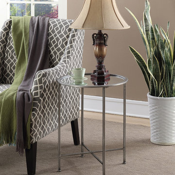
 Convenience Concepts
With its charming and modern design, the Gold Coast Round Mirrored Accent Table is the perfect addition to any décor. Available in multiple finishes, this piece is ready to be used straight out of the box as comes fully assembled. Perfectly welded together, the iron frame is extremely durable while offering incredible style from its sleek lines and bun feet. The X base offers extra support and adds to the simple yet fashionable design. The mirrored round top surface provides the perfect space to place your belongings. This Accent Table is perfectly sized to fit as a side or end table for any room in your home. Look for coordinating items available from the Gold Coast Collection by Convenience Concepts.
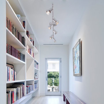
 Globe Electric
Because of innovative designers, track lighting has come so far in the decorating world. Gone are the days where you it to be hidden - let's bring on the light! Versatility is the name of the game and Globe Electric is doing it right. Brighten up your life with Globe Electric's Payton 6-Light Foldable Track Lighting. Made with a lightweight matte silver painted metal, its solid construction ensures sturdiness, functionality and style. A contemporary finish blends with a modern minimalist design to accent all home decor. Extremely versatile, you can place this light in your kitchen, hallway, entranceway or anywhere you require extra light. The foldable aspect means you can direct the light where you need it most. Simply bend the arms at the joints to create a unique look for your home. Includes all mounting hardware for quick and easy installation and requires six GU10/bi-pin 50W reflector bulbs (sold separately).
 InnovationLand
Houston Interior Designer Lisha Maxey took this Museum District condo from the dated, mirrored walls of the 1980s to Mid Century Modern with a gallery look featuring the client's art collection.
"The place was covered with glued-down, floor-to-ceiling mirrors," says Lisha Maxey, senior designer for Homescapes of Houston and principal at LGH Design Services in Houston. "When we took them off the walls, the walls came apart. We ended up taking them down to the studs."
The makeover took six months to complete, primarily because of strict condo association rules that only gave the Houston interior designers very limited access to the elevator - through which all materials and team members had to go.
"Monday through Friday, we could only be noisy from 10 a.m. to 2 p.m., and if we had to do something extra loud, like sawing or drilling, we had to schedule it with the management and they had to communicate that to the condo owners. So it was just a lot of coordination. But a lot of Inner City Loopers live in these kinds of buildings, so we're used to handling that kind of thing."
The client, a child psychiatrist in her 60s, recently moved to Houston from northeast Texas to be with friends. After being widowed three years ago, she decided it was time to let go of the traditionally styled estate that wasn't really her style anyway. An avid diver who has traveled around the world to pursue her passion, she has amassed a large collection of art from her travels. Downsizing to 1,600 feet and wanting to go more contemporary, she wanted the display - and the look - more streamlined.
"She wanted clean lines and muted colors, with the main focus being her artwork," says Maxey. "So we made the space a palette for that."
Enter the white, gallery-grade paint she chose for the walls: "It's halfway between satin and flat," explains Maxey. "It's not glossy and it's not chalky - just very smooth and clean."
Adding to the gallery theme is the satin nickel track lighting with lamps aimed to highlight pieces of art. "This lighting has no wires," notes Maxey. "It's powered by a positive and negative conduit."
The new flooring throughout is a blended-grey porcelain tile that looks like wood planks. "It's gorgeous, natural-looking and combines all the beauty of wood with the durability of tile," says Maxey. "We used it throughout the condo to unify the space."
After Maxey started looking at the client's bright, vibrant, colorful artwork, she felt the palette couldn't stay as muted anymore. Hence the Mid Century Modern orange leather sofas from West Elm and bright green chairs from Joybird, plus the throw pillows in different textures, patterns and shades of gold, orange and green.
The concave lines of the Danish-inspired chairs, she notes, help them look beautiful from all the way around - a key to designing spaces for loft living.
"The table in the living room is very interesting," notes Maxey. "It was handmade for the client in 1974 and has a signature on it from the artist. She was adamant about including the piece, which has all these hand-painted black-and-white art tiles on the top. I took one look at it and said 'It's not really going to go.'"
However, after cutting 6 inches off the bottom and making it look a little distressed, the table ended up being the perfect complement to the sofas.
The dining room table - from Design Within Reach - is a solid piece of mahogany, the chair upholstery a mix of grey velvet and leather and the legs a shiny brass. "The side chairs are leather and the end ones are velvet," says Maxey. "It's a nice textural mix that lends depth and texture."
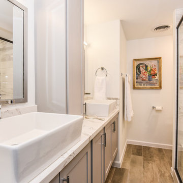
The galley kitchen, meanwhile, has been lightened and brightened, with white quartz countertops and backsplashes mimicking the look of Carrara marble, stainless steel appliances and a velvet green bench seat for a punch of color. The cabinets are painted a cool grey color called "Silverplate."
The two bathrooms have been updated with contemporary white vanities and vessel sinks and the master bath now features a walk-in shower tiled in Dolomite white marble (the floor is Bianco Carrara marble mosaic, done in a herringbone pattern.
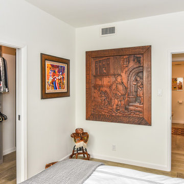
In the master bedroom, Homescapes of Houston knocked down a wall between two smaller closets with swing doors to make one large walk-in closet with pocket doors. The closet in the guest bedroom also came out 13 more inches.
The client's artwork throughout personalizes the space and tells the story of a life. There's a huge bowl of shells from the client's diving adventures, framed art from her child psychiatry patients and a 16th century wood carving from a monastery that's been in her family forever.
"Her collection is quite impressive," says Maxey. "There's even a framed piece of autographed songs written by John Lennon." (You can see this black-framed piece of art on the wall in the photo above of two green chairs).
"We're extremely happy with how the project turned out, and so is the client," says Maxey. "No expense was spared for her. It was a labor of love and we were excited to do it."
 InnovationLand
Houston Interior Designer Lisha Maxey took this Museum District condo from the dated, mirrored walls of the 1980s to Mid Century Modern with a gallery look featuring the client's art collection.
"The place was covered with glued-down, floor-to-ceiling mirrors," says Lisha Maxey, senior designer for Homescapes of Houston and principal at LGH Design Services in Houston. "When we took them off the walls, the walls came apart. We ended up taking them down to the studs."
The makeover took six months to complete, primarily because of strict condo association rules that only gave the Houston interior designers very limited access to the elevator - through which all materials and team members had to go.
"Monday through Friday, we could only be noisy from 10 a.m. to 2 p.m., and if we had to do something extra loud, like sawing or drilling, we had to schedule it with the management and they had to communicate that to the condo owners. So it was just a lot of coordination. But a lot of Inner City Loopers live in these kinds of buildings, so we're used to handling that kind of thing."
The client, a child psychiatrist in her 60s, recently moved to Houston from northeast Texas to be with friends. After being widowed three years ago, she decided it was time to let go of the traditionally styled estate that wasn't really her style anyway. An avid diver who has traveled around the world to pursue her passion, she has amassed a large collection of art from her travels. Downsizing to 1,600 feet and wanting to go more contemporary, she wanted the display - and the look - more streamlined.
"She wanted clean lines and muted colors, with the main focus being her artwork," says Maxey. "So we made the space a palette for that."
Enter the white, gallery-grade paint she chose for the walls: "It's halfway between satin and flat," explains Maxey. "It's not glossy and it's not chalky - just very smooth and clean."
Adding to the gallery theme is the satin nickel track lighting with lamps aimed to highlight pieces of art. "This lighting has no wires," notes Maxey. "It's powered by a positive and negative conduit."
The new flooring throughout is a blended-grey porcelain tile that looks like wood planks. "It's gorgeous, natural-looking and combines all the beauty of wood with the durability of tile," says Maxey. "We used it throughout the condo to unify the space."
After Maxey started looking at the client's bright, vibrant, colorful artwork, she felt the palette couldn't stay as muted anymore. Hence the Mid Century Modern orange leather sofas from West Elm and bright green chairs from Joybird, plus the throw pillows in different textures, patterns and shades of gold, orange and green.
The concave lines of the Danish-inspired chairs, she notes, help them look beautiful from all the way around - a key to designing spaces for loft living.
"The table in the living room is very interesting," notes Maxey. "It was handmade for the client in 1974 and has a signature on it from the artist. She was adamant about including the piece, which has all these hand-painted black-and-white art tiles on the top. I took one look at it and said 'It's not really going to go.'"
However, after cutting 6 inches off the bottom and making it look a little distressed, the table ended up being the perfect complement to the sofas.
The dining room table - from Design Within Reach - is a solid piece of mahogany, the chair upholstery a mix of grey velvet and leather and the legs a shiny brass. "The side chairs are leather and the end ones are velvet," says Maxey. "It's a nice textural mix that lends depth and texture."
The galley kitchen, meanwhile, has been lightened and brightened, with white quartz countertops and backsplashes mimicking the look of Carrara marble, stainless steel appliances and a velvet green bench seat for a punch of color. The cabinets are painted a cool grey color called "Silverplate."
The two bathrooms have been updated with contemporary white vanities and vessel sinks and the master bath now features a walk-in shower tiled in Dolomite white marble (the floor is Bianco Carrara marble mosaic, done in a herringbone pattern.
In the master bedroom, Homescapes of Houston knocked down a wall between two smaller closets with swing doors to make one large walk-in closet with pocket doors. The closet in the guest bedroom also came out 13 more inches.
The client's artwork throughout personalizes the space and tells the story of a life. There's a huge bowl of shells from the client's diving adventures, framed art from her child psychiatry patients and a 16th century wood carving from a monastery that's been in her family forever.
"Her collection is quite impressive," says Maxey. "There's even a framed piece of autographed songs written by John Lennon." (You can see this black-framed piece of art on the wall in the photo above of two green chairs).
"We're extremely happy with how the project turned out, and so is the client," says Maxey. "No expense was spared for her. It was a labor of love and we were excited to do it."
 Kitchen Solvers of Fort Lauderdale
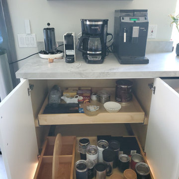
Our client commissioned us to remodel her home. She wanted an open plan concept and for the kitchen to be integrated with the living room and dining room. She also needed a space in which she could work. So we decided to remove the walls that separated the kitchen from the living room and the dining room. We expanded the kitchen space on both sides and made an "L" layout with cabinets on both walls. To complement and establish a virtual limit of space, we placed a large island 10 feet long by 4 feet wide with drawers on the kitchen side and storage cabinets on the sitting side. The cabinets are all prefinished plywood with acrylic doors, white for the cabinets on the walls and gray for the center island. All base cabinets have soft close pullouts. The drawers were complemented with accessories to organize all the kitchen utensils. The corner cabinet was custom made extra long to accommodate a large swing-out and spice rack next to it. At the extreme end of the kitchen cabinets, we placed a "coffee station" with dark gray floating shelves on top, their respective pullouts on the base cabinets. Under the wall and base cabinets we place LED lights that enhance and highlight the kitchen day and night. All ceiling lights were also replaced with recessed LED lights. Over the island and the dining table hanging lights were placed along them. Power strip outlets with USB ports were also placed under the wall cabinets and in the headboards of the island, these are hidden giving a clean aesthetic to the backsplash and very functional on a day-to-day basis. The countertops of the cabinets on the walls were done in gray porcelain as well as the full backsplash that also covers the central area of the hood. The central island countertop was made in Quarzite. The floors were replaced with 48" by 48" rectified porcelain tile. Now this homeowner has the kitchen of their dreams.
 N C R
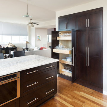
N C RWe gave these clients plenty of storage space in their open kitchen by installing a large linen closet with a built-in pantry as well as extra large cabinets. We also wanted to give their home a modern and trendy look, so for a contrast to the bright and airy design, we installed dark stained cabinets. Our clients were extremely happy with the end result as well as our ability to work around their busy schedules.
Home located in South Loop, Chicago. Designed by Chi Renovation & Design who also serve the Chicagoland area and it's surrounding suburbs, with an emphasis on the North Side and North Shore. You'll find their work from the Loop through Lincoln Park, Evanston, Skokie, Humboldt Park, Wilmette, and all the way up to Lake Forest.
 ESF Home Textile LLC.
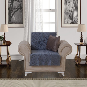
Chiara Rose Anti-slip Armless Sofa Cover Furniture Protector Chair Size Acacia
Dimensions: 29 Inch X 70 Inch
BEST SOFA PROTECTOR - This Slipcover is Extremely Sturdy, as well as an Instant, Magical Solution to Renew your Old Furniture with an Elegant Look! Ultrasonically welded seams prevent ripping apart and unraveling. The Edges are Laser-Cut to give a Chenille Trim Effect. Its Velvety Texture is Soft and also functions like a Warm Pet Bed giving a Sense of Security while your Pet is Resting. Our Covers are absolutely Pet-Friendly.
PROTECTIVE! Best Protection for ANIMAL SCRATCHES FUR SHED-HAIR DIRT FOOD SPILLS WEAR TEAR! STAIN PROOF! Perfect Guard against Cats Dogs Kids Children!
DECORATIVE! Great Stylish Coverage and Luxury Decoration in Living, Sitting Room with Full Solid Colors and Beautiful Printed, Patterned Designs, Extra Deluxe Décor, Nice Plush Texture! New Modern Look! CUSTOM-FIT! Relaxed fitted in Wing-back, Club, Rocker, Single Chair and a Half, one two three Pillow Coach, 1 2 Seaters, Box, T cushion, L, U shape Seaters! Big Large Long Wide Couches! Leather Velour Denim Twill Linen Sofas!
NON SLIDE! Slid-Resistant with PLASTIC DROP BACKING! No More Slipping Off / Sliding Over! Plastic Dots firmly Grip Upholstery! Stays in Place! No Zipper, Mat, Elastic Strap! No Pads under!
EASY CARE & WASH, DURABLE, DETERRENT! Machine Washable! Easily Removable Ready Made Furniture Throws! Cheap and Inexpensive! Heavy Duty Fabric! Stretch Enough to Cloth up Perfectly and Look Form Fit! NO ARMS! Slipcovers with Armrests DON’T properly FIT IN the Armrests and always create Fitting Problems. You know, they also have an Ugly Look. But with Chiara Rose no Need to Worry about Armrests anymore!
• PLEASE MAKE SURE TO READ DETAILED PRODUCT INFORMATION BELOW!
________________________________________
Product Description
WHY CHIARA ROSE SOFA COVERS?
Kids and Pets; We love them but we also love our furniture. Cleaning furniture is one of the most difficult chores and that’s why you need to protect it from dirt. The easiest and economical way of preserving your furniture is Chiara Rose Sofa Protector. Just put the sofa protector on your sofas (futon or couch) and stop worrying about stains and spills. It is perfect for homes with kids and pets. Pets love to scratch upholstery of the furniture. The enduring 220 gsm polyester fabric of Chiara Rose Sofa Protectors prevents tears and any kind of debris on your sofas. Its sturdy texture doesn’t let any spill and dirt penetrate the upholstery.
Besides being durable, Chiara Rose Sofa Cover is suitable to all types of decoration. To express your own personal style, you can choose from a variety of color and design options that fit perfectly to your home décor. With brilliant colors and attractive patterns, Chiara Rose Sofa Covers will give your room a completely new outlook. Unlike other covers, you don’t need to remove Chiara Rose Sofa Protector when you have guests. It will both protect your furniture and become a part of your home decoration.
WHY CHIARA ROSE SOFA PROTECTOR IS DURABLE?
The most common problem with traditional sofa covers is that after a short time of use the stitches come apart. The edges of Chiara Rose Sofa Cover are manufactured with ultrasonic laser cut technology. This technology prevents the edges from unraveling. What’s more, the 220 gsm polyester knitted fabric is the most long lasting fabric used in furniture protectors. While being durable, this fabric gives a warm sense
of touch and pleasure to sit upon.
WHY CHIARA ROSE IS THE BEST ANTI-SLIP SOFA PROTECTOR?
We always use the most contemporary technology to develop our products. That’s why we decided to use the patented plastic drop design on the back side of our covers to create the anti slip effect. These plastic drops firmly grip the upholstery of furniture so that the cover doesn’t slip off the seat easily. Even after your kids and pets jump on the sofa, Chiara Rose Sofa Cover holds on to your furniture. A quick adjustment is all it takes to get it back to look smooth. Chiara Rose Sofa Cover is the only sofa protector that uses this new technology.
WHY IT IS EASY TO USE CHIARA ROSE SOFA PROTECTORS?
No zippers, no elastic straps, no metal hooks!!! The anti-slip drops will take care of everything! , As shown on the image, just lay Chiara Rose Sofa Cover on your sofa, and tuck it between the cushion and the arms of the sofa. That’s all you need to do to put it on.
Chiara Rose Sofa Protector doesn’t allow everyday dirt, pet hair and food spills reach your sofa. The pattern of the fabric prevents accumulation of dirt on it. You can easily take off this dirt. In order to get best results, use a vacuum cleaner or shake your cover off before machine wash.
Chiara Rose Sofa Protector is easy care. It can be machine washed on max. 30°C or 85°F water temperature. Don’t use bleacher. Machine dryer can be used on low heat setting. To avoid wrinkles, use gentle cycle on washing machine and hang from a line while drying. If necessary, iron at low temperature.
 Melanie Rekola Landscape Design
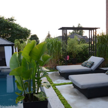
This lovely landscape sports a poured in place concrete slab patio with drought tolerant sedum plants between the slabs. This sedum mix is sold in sheets then cut to fit but it’s actually grown for green-roof application. It works perfectly in this hot environment too as it is extremely drought tolerant and can go a month without water. Because the water runoff is absorbed between the slabs the patio drainage works perfectly and there are no need for drains.The swimming pool is of the fiberglass variety. Though the initial investment is greater than that of vinyl pools the ROI is greater over a 10 year period. Fiberglass pools retains more heat as the pool shell is all one piece and they don’t ever require a new liner.. This fiberglass pool has cool built-in benching and steps. And there is even a swim jet built into one side great for those cardio blasting swims. The pool interior colour is grey though it shows a soft blue/grey when water is added due to the reflection of the sky and other surroundings. The pool coping is natural stone with rock face edge. The steel arbour was custom made. Metal (steel) was chosen for it’s slim strength as wood placed here would have been too chunky. The best rooms (indoors or our) have a subtle layering of textural elements. To me this landscape needed a structure here to define the “rooms” It will look even better in a few years when the vines reach the top and the Miscanthus on either side reaches its 7′ height!The 12′ x 16′ pavilion is also made of steel and houses an alfresco dining table and sofa set. The pavilions built in cupola makes the warm breezes comfortably pass through with no need for a fan. It’s also sunken 2′ from the pool/patio height and nestled nicely in the corner. I must also mention the large slim planters with “Red Shades” Canna lily within. They are the perfect boldness/balance!Step through the arbor and a linear pond with “floating” natural stone step is revealed! Two smooth flow scuppers are responsible for the quiet waterfalls either side. A wood deck overhangs the pond adding softness to the setting. A modern retaining wall with natural stone cap runs the full width of the pond and pool adding interest and dimension. In the covered outdoor living area this wall is the perfect seat wall - adding lots of extra party seating!
The lesson to be learned here is that good design can be applied to any space. This backyard is only 50′ x 45′ and look what can be achieved! Landscape design and photography by Melanie Rekola
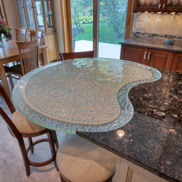
 Lori Jolin Design, LLC.
Sutter Photographers
The Hardware Studio - hardware
Martinwood Cabinetry - millwork
Studio GlassWorks - glass countertop
Window Design Center - awning window
Nonn's Showplace - quartz, granite countertops
• The most difficult part of the project was figuring out all the technical details to install the glass counter-top, which would weigh about 300 pounds!
• One goal was to avoid seeing the cabinet supports through the glass. The glass itself proposed problems because it had a wavy texture and separate confetti glass that could be added to the bottom. Therefore, we needed to add something below it.
• A custom steel base was designed to carry the weight yet float the glass so you are able to see the beauty of the glass itself. A small 1/2 inch trim piece on the steel was added to accomplish this task.
• Once the steel was made, we took it to the glass distributor. We turned the very heavy base upside down, traced the 1/2 inch trim piece on a full size piece of paper, and sent it to the glass manufacturer.
• After this, the base was sent to a powder coater and the raw steel was transformed into a beautiful champagne color.
• In the meantime, the glass manufacturer molded a channel for the glass to rest that would suspend the glass 1/2 inch higher than the powder coated steel base.
• The glass manufacturer was instructed to make the top of the glass smooth so it would hold a plate without rocking; they added an extra layer of 1/4 inch glass after it was fired the first time to accomplish this.
• When the base was brought to the job site, the carpenter installed a thick 6 inch block of wood through the tile and into the floor joists. The hollow 6 inch square base of the steel table was glued and screwed into the wood. The base was leveled and ready for the top to arrive several days later.
• The glass installers put it over the base, and it fit PERFECTLY! (whew)
• The steel base is 3 inches smaller than the glass, creating a see-through effect around the entire perimeter of the kidney bean shape.
• The granite was then templated by using a
specialized camera that measured the curve of the glass. However, upon arrival, the fit was less than perfect. Thanks to a patient and skilled granite installer from Nonn's Showroom who spent several hours hand grinding and polishing the curve on site until it fit perfectly.
• A small bead of silicone between the granite and the glass was all that was needed to complete the perfect installation.
• With a few shims under the end of the granite, the top is perfectly level!
• Our client was extremely excited and very patient with the process because they trusted our abilities so that the end result would be spectacular.
16