
Search results for "Eyeglasses" in Home Design Ideas
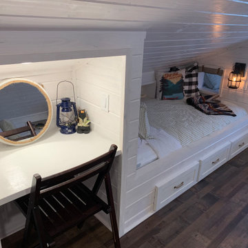
 Happy Space Interiors, LLC
Attic space above lake house garage turned into a fun camping themed bunk room/playroom combo for kids. Four built-in Twin XL beds provide comfortable sleeping arrangements for kids and even adults when extra space is needed at this lake house. Campers can talk between the windows of the beds or lower the canvas shade for privacy. Each bed has it's own dimmable lantern light and built in cubby to keep books, eyeglasses, and electronics nearby. A desk provides space for writing or getting ready for a fun lake day.
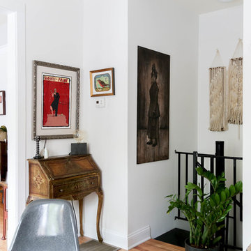
 Rachel Loewen Photography
Photo: Rachel Loewen © 2018 Houzz
Living room - eclectic living room idea in Chicago
Living room - eclectic living room idea in Chicago
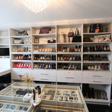
Mid-sized transitional women's dark wood floor and brown floor walk-in closet photo in Detroit with open cabinets and white cabinets
Find the right local pro for your project
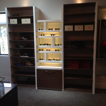
 Inspired Closets Salt Lake City
Inspiration for a huge modern gender-neutral carpeted and brown floor walk-in closet remodel in Salt Lake City with flat-panel cabinets and dark wood cabinets
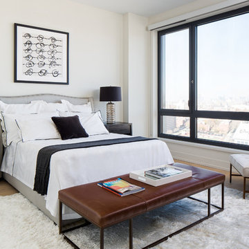
 Décor Aid
Million Dollar Listing’s celebrity broker Ryan Serhant reached out to Decor Aid to stage a luxurious Brooklyn condo development. The only caveat was that our interior designers had 48 hours to come up with the design, concept, and source all the furniture. Always up for a challenge, we partnered with Mitchell Gold & Bob Williams to create this contemporary gem.
Staying true to their contemporary vision, our interior decorators sourced all pieces through MGBW. Starting in the living room, we placed the Gunner Sofa, a piece that offers clean-lined living. The thin arms and slanted profile emphasize the modern elegance of the home. Through the use of various contemporary patterns and textures we were able to avoid the one-dimensional ambiance, and instead, the apartment’s living room feels detailed and thought out, without making anyone who enters overcrowded with home decor.
The Melrose cocktail table was sourced for its sleek, stainless steel and glass design that contrasts with more substantial pieces in the space, while also complementing the contemporary style. The glass design gives the illusion that this table takes up less space, giving the living room design a light and airy feel all around. The living space transformed into something out of a decor catalog with just the right amount of personality, creating a room that follows through with our starting design, yet functional for everyday use.
After the living room area, we set our eyes on designing the master bedroom. Our interior decorators were immediately drawn to the Celina Floating Rail Bed, it’s opulent nailhead trim, and dramatic design brings fresh sophistication to the bedroom design, while also standing out as a timeless piece that can complement various trends or styles that might be added later on to the bedroom decoration. We sourced the Roland Table Lamp to add texture, with its elaborate ribbed design, that compliments the air of masculinity the Carmen Leather Ottoman add while contrasting with the light, sleeker pieces. This difference in weight left us with a bedroom decoration that lives up to the trending modern standards, yet a space that is timeless and stylish no matter the decor trends.
Once we finished and the project was completed, our senior designers took a step back and took in all of their hard labor. Decor Aid was able to make this newly built blank space and design it into a modern wonder small brooklyn apartment. The MGBW furnishings were all hand-picked to keep an even balance of complementing and contrasting contemporary pieces, which was one of our more critical apartment decorating ideas. The apartment home decor brings to life this modern concept in a way that isn’t overbearing and shows off their style making the space in every sense an accurate reflection of a chic contemporary style.
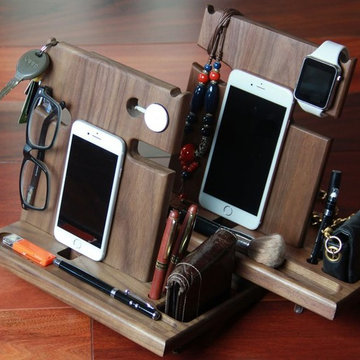
 Tudor Sign Company
Docking Station made out of real 100% SOLID WALNUT hardwood. Also available in Sapele Mahogany PREMIUM Hardwood. Universal design, Qi wireless charger ready, more features, and a smart design that gracefully upgrades as newer smartphones/plug adapters become available. It's based on an age-old valet design with space for your iPhone, Android, iWatch, Fitbit, and tablet. When you get home these stations will keep you neatly organized – they house your electronic devices, wallet, watch, keys, pens, eyeglasses, sunglasses, jewelry, loose change, and an assortment of miscellaneous items living in your pocket - everything is ready for you to pick up when you go out the door.
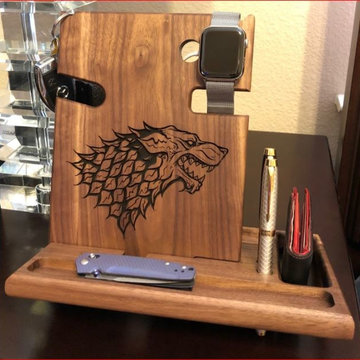 Tudor Sign Company
Docking Station made out of real 100% SOLID WALNUT hardwood. Also available in Sapele Mahogany PREMIUM Hardwood. Universal design, Qi wireless charger ready, more features, and a smart design that gracefully upgrades as newer smartphones/plug adapters become available. It's based on an age-old valet design with space for your iPhone, Android, iWatch, Fitbit, and tablet. When you get home these stations will keep you neatly organized – they house your electronic devices, wallet, watch, keys, pens, eyeglasses, sunglasses, jewelry, loose change, and an assortment of miscellaneous items living in your pocket - everything is ready for you to pick up when you go out the door.
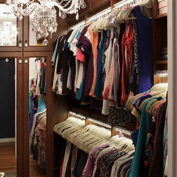
 Rylex Custom Cabinetry and Closets
A light infused closet allows colors and patterns to be seen in all their glory. Lighted garment rods, a chandelier and mirrored doors each play a role in the illumination of this master walk-in closet. Lighted garment rods brighten hanging apparel making colors more vibrant and true while the chandelier beautifully adds sparkle and glamour. The inset mirrored doors create a sense of depth in a narrow closet and they bounce light throughout.
Kara Lashuay
 FMSProjects, Inc.
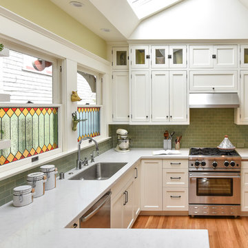
Latch hardware in upper cabinets.
Inspiration for a mid-sized craftsman u-shaped medium tone wood floor eat-in kitchen remodel in San Francisco with a single-bowl sink, shaker cabinets, white cabinets, quartz countertops, green backsplash, ceramic backsplash, stainless steel appliances and a peninsula
Inspiration for a mid-sized craftsman u-shaped medium tone wood floor eat-in kitchen remodel in San Francisco with a single-bowl sink, shaker cabinets, white cabinets, quartz countertops, green backsplash, ceramic backsplash, stainless steel appliances and a peninsula
 Fidelity General Contractors Inc.
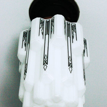
Mid-century modern white tile claw-foot bathtub photo in Los Angeles with a pedestal sink
 Lucia Wilke
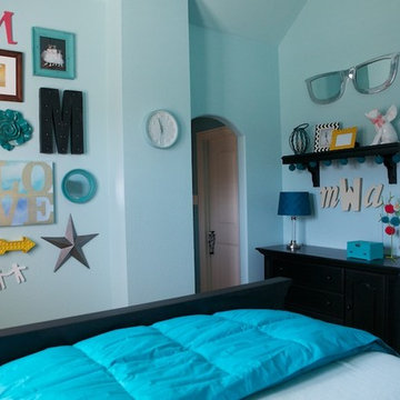
Pre-Tween Girl's Bedroom
Inspiration for a mid-sized eclectic carpeted bedroom remodel in Dallas with blue walls
Inspiration for a mid-sized eclectic carpeted bedroom remodel in Dallas with blue walls
 Pasquale Design Associates, Inc.
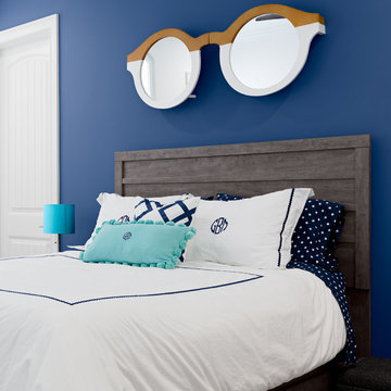
This fun girls bedroom was designed carefully with the clients to showcase the child's personality.
Kids' bedroom - mid-sized and bedroom coastal guest carpeted kids' bedroom idea in Tampa with blue walls
Kids' bedroom - mid-sized and bedroom coastal guest carpeted kids' bedroom idea in Tampa with blue walls
 JUMA architects
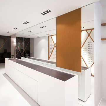
Optiek Herpol wanted to move to a better, more central location with plenty of parking space. A property that complied with these conditions was found on the Market in Deinze, and JUMA architects were subsequently asked to design a new interior for the store.
The property in question is very deep and narrow with little natural light entry. JUMA set to work despite these constraints in an attempt to transform these challenges into qualities.
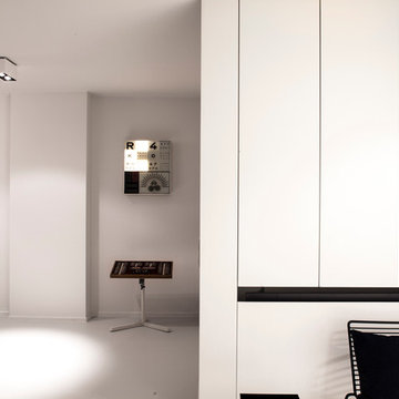
The architects positioned the sales counter right behind the shop window, so as to make optimum use of the available natural light. This also makes store activities visible from the outside, adding an extra element of attraction. At the narrowest section of the store, a large wall mirror was put in to visually double the space. The wall onto which the eyeglasses are displayed is located opposite the mirror and is literally the eye catcher in the store. A wooden lattice makes for an interesting play of diagonal lines behind which the glasses are presented. This unique concept animates the entire store without detracting from the fact that the glasses should remain the main focal point in the store. The workshop is located in the back, separated from the store by a wall in smoked grey glass. In this way, the optician can keep an eye on the store at all times.
The colour palette is predominantly white, to keep the interior as light as possible. As a counterpoint, warm wood accents are added. The chairs at the counter are upholstered in a colour that harmonizes perfectly with the wood.
Pictures © Thomas De Bruyne
 JUMA architects
Optiek Herpol wanted to move to a better, more central location with plenty of parking space. A property that complied with these conditions was found on the Market in Deinze, and JUMA architects were subsequently asked to design a new interior for the store.
The property in question is very deep and narrow with little natural light entry. JUMA set to work despite these constraints in an attempt to transform these challenges into qualities.
The architects positioned the sales counter right behind the shop window, so as to make optimum use of the available natural light. This also makes store activities visible from the outside, adding an extra element of attraction. At the narrowest section of the store, a large wall mirror was put in to visually double the space. The wall onto which the eyeglasses are displayed is located opposite the mirror and is literally the eye catcher in the store. A wooden lattice makes for an interesting play of diagonal lines behind which the glasses are presented. This unique concept animates the entire store without detracting from the fact that the glasses should remain the main focal point in the store. The workshop is located in the back, separated from the store by a wall in smoked grey glass. In this way, the optician can keep an eye on the store at all times.
The colour palette is predominantly white, to keep the interior as light as possible. As a counterpoint, warm wood accents are added. The chairs at the counter are upholstered in a colour that harmonizes perfectly with the wood.
Pictures © Thomas De Bruyne
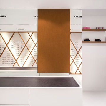 JUMA architects
Optiek Herpol wanted to move to a better, more central location with plenty of parking space. A property that complied with these conditions was found on the Market in Deinze, and JUMA architects were subsequently asked to design a new interior for the store.
The property in question is very deep and narrow with little natural light entry. JUMA set to work despite these constraints in an attempt to transform these challenges into qualities.
The architects positioned the sales counter right behind the shop window, so as to make optimum use of the available natural light. This also makes store activities visible from the outside, adding an extra element of attraction. At the narrowest section of the store, a large wall mirror was put in to visually double the space. The wall onto which the eyeglasses are displayed is located opposite the mirror and is literally the eye catcher in the store. A wooden lattice makes for an interesting play of diagonal lines behind which the glasses are presented. This unique concept animates the entire store without detracting from the fact that the glasses should remain the main focal point in the store. The workshop is located in the back, separated from the store by a wall in smoked grey glass. In this way, the optician can keep an eye on the store at all times.
The colour palette is predominantly white, to keep the interior as light as possible. As a counterpoint, warm wood accents are added. The chairs at the counter are upholstered in a colour that harmonizes perfectly with the wood.
Pictures © Thomas De Bruyne
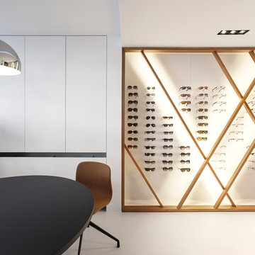 JUMA architects
Optiek Herpol wanted to move to a better, more central location with plenty of parking space. A property that complied with these conditions was found on the Market in Deinze, and JUMA architects were subsequently asked to design a new interior for the store.
The property in question is very deep and narrow with little natural light entry. JUMA set to work despite these constraints in an attempt to transform these challenges into qualities.
The architects positioned the sales counter right behind the shop window, so as to make optimum use of the available natural light. This also makes store activities visible from the outside, adding an extra element of attraction. At the narrowest section of the store, a large wall mirror was put in to visually double the space. The wall onto which the eyeglasses are displayed is located opposite the mirror and is literally the eye catcher in the store. A wooden lattice makes for an interesting play of diagonal lines behind which the glasses are presented. This unique concept animates the entire store without detracting from the fact that the glasses should remain the main focal point in the store. The workshop is located in the back, separated from the store by a wall in smoked grey glass. In this way, the optician can keep an eye on the store at all times.
The colour palette is predominantly white, to keep the interior as light as possible. As a counterpoint, warm wood accents are added. The chairs at the counter are upholstered in a colour that harmonizes perfectly with the wood.
Pictures © Thomas De Bruyne
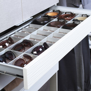
 Closet Factory
Space-saving trays are perfect for hard-to-store sunglasses, jewelry, rolled belts and ties.
Example of a transitional closet design in Los Angeles
Example of a transitional closet design in Los Angeles
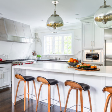
 Alisberg Parker
Eat-in kitchen - transitional l-shaped dark wood floor eat-in kitchen idea in New York with a single-bowl sink, shaker cabinets, white cabinets, granite countertops, white backsplash, marble backsplash, stainless steel appliances, an island and black countertops
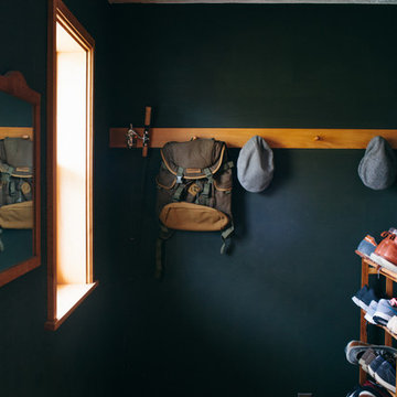
 Ellie Lillstrom Photography
Photo: A Darling Felicity Photography © 2015 Houzz
Example of a mid-sized country porcelain tile mudroom design in Seattle with green walls
Example of a mid-sized country porcelain tile mudroom design in Seattle with green walls

3