
Search results for "Families discover" in Home Design Ideas
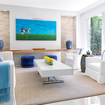
 Interiors by Maite Granda
Project Feature in: Luxe Magazine & Luxury Living Brickell
From skiing in the Swiss Alps to water sports in Key Biscayne, a relocation for a Chilean couple with three small children was a sea change. “They’re probably the most opposite places in the world,” says the husband about moving
from Switzerland to Miami. The couple fell in love with a tropical modern house in Key Biscayne with architecture by Marta Zubillaga and Juan Jose Zubillaga of Zubillaga Design. The white-stucco home with horizontal planks of red cedar had them at hello due to the open interiors kept bright and airy with limestone and marble plus an abundance of windows. “The light,” the husband says, “is something we loved.”
While in Miami on an overseas trip, the wife met with designer Maite Granda, whose style she had seen and liked online. For their interview, the homeowner brought along a photo book she created that essentially offered a roadmap to their family with profiles, likes, sports, and hobbies to navigate through the design. They immediately clicked, and Granda’s passion for designing children’s rooms was a value-added perk that the mother of three appreciated. “She painted a picture for me of each of the kids,” recalls Granda. “She said, ‘My boy is very creative—always building; he loves Legos. My oldest girl is very artistic— always dressing up in costumes, and she likes to sing. And the little one—we’re still discovering her personality.’”
To read more visit:
https://maitegranda.com/wp-content/uploads/2017/01/LX_MIA11_HOM_Maite_12.compressed.pdf
Rolando Diaz

 KitchenLab Interiors
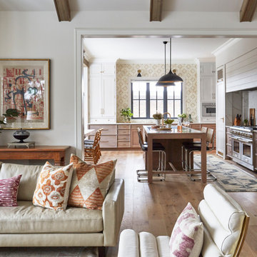
KitchenLab Interiors’ first, entirely new construction project in collaboration with GTH architects who designed the residence. KLI was responsible for all interior finishes, fixtures, furnishings, and design including the stairs, casework, interior doors, moldings and millwork. KLI also worked with the client on selecting the roof, exterior stucco and paint colors, stone, windows, and doors. The homeowners had purchased the existing home on a lakefront lot of the Valley Lo community in Glenview, thinking that it would be a gut renovation, but when they discovered a host of issues including mold, they decided to tear it down and start from scratch. The minute you look out the living room windows, you feel as though you're on a lakeside vacation in Wisconsin or Michigan. We wanted to help the homeowners achieve this feeling throughout the house - merging the causal vibe of a vacation home with the elegance desired for a primary residence. This project is unique and personal in many ways - Rebekah and the homeowner, Lorie, had grown up together in a small suburb of Columbus, Ohio. Lorie had been Rebekah's babysitter and was like an older sister growing up. They were both heavily influenced by the style of the late 70's and early 80's boho/hippy meets disco and 80's glam, and both credit their moms for an early interest in anything related to art, design, and style. One of the biggest challenges of doing a new construction project is that it takes so much longer to plan and execute and by the time tile and lighting is installed, you might be bored by the selections of feel like you've seen them everywhere already. “I really tried to pull myself, our team and the client away from the echo-chamber of Pinterest and Instagram. We fell in love with counter stools 3 years ago that I couldn't bring myself to pull the trigger on, thank god, because then they started showing up literally everywhere", Rebekah recalls. Lots of one of a kind vintage rugs and furnishings make the home feel less brand-spanking new. The best projects come from a team slightly outside their comfort zone. One of the funniest things Lorie says to Rebekah, "I gave you everything you wanted", which is pretty hilarious coming from a client to a designer.
Find the right local pro for your project
 Kraft Custom Construction
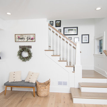
This 1914 family farmhouse was passed down from the original owners to their grandson and his young family. The original goal was to restore the old home to its former glory. However, when we started planning the remodel, we discovered the foundation needed to be replaced, the roof framing didn’t meet code, all the electrical, plumbing and mechanical would have to be removed, siding replaced, and much more. We quickly realized that instead of restoring the home, it would be more cost effective to deconstruct the home, recycle the materials, and build a replica of the old house using as much of the salvaged materials as we could.
The design of the new construction is greatly influenced by the old home with traditional craftsman design interiors. We worked with a deconstruction specialist to salvage the old-growth timber and reused or re-purposed many of the original materials. We moved the house back on the property, connecting it to the existing garage, and lowered the elevation of the home which made it more accessible to the existing grades. The new home includes 5-panel doors, columned archways, tall baseboards, reused wood for architectural highlights in the kitchen, a food-preservation room, exercise room, playful wallpaper in the guest bath and fun era-specific fixtures throughout.
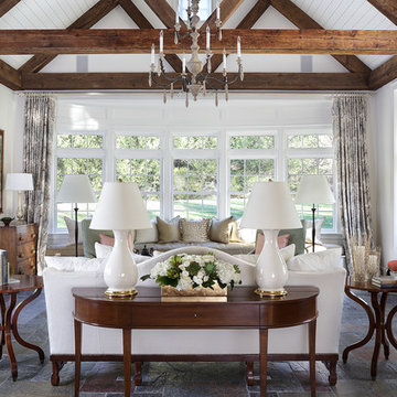
Large elegant enclosed slate floor sunroom photo in New York with white walls, a wall-mounted tv and a standard ceiling
 TOC design & construction inc.
DESIGNED BY TOC design
CONSTRUCTION BY TOC design & Construction inc.
PHOTOS BY : Tania Scardellato
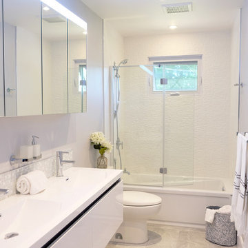
I was fortunate to have a young family approach me in desperate need to renovate there only 3 piece bathroom. This space was In dire need of a remodel, with old brown wall to wall tiles and a dated bulky yellow brown single sink vanity.
Storage was a must, lighting a necessity, and proper accessibility to the shower bath area.
We had a tight budget to respect, but a full gut of this bathroom was required. And a good thing too, once we started doing the demolition we noticed that mildew and rotting floors and walls had accumulated throughout the years. Doing it right the first time is no joke when dealing with water and electrical issues.
We discarded all reminisce of old and built from scratch, new walls, new plumbing, new electrical ,new insulation and a new window, a new fan that actually exhausted outside ( I say this laughing as you would be amazed at how many fans are installed but don’t exhaust outside, and you the client would never know unless you go inside the attic space.
Once all the hard stuff was done, the rest is just a matter of smart design. If you have a small bathroom here are some tips to guide you.
10 tips for making a small bathroom feel larger
Is your tiny bathroom cramping your functionality and style, leaving you longing for the enormous bathrooms gracing the pages of design magazines? Even if your bathroom is a fraction of the size, all it takes is some design savvy to make the most of the space you have. Consider these 10 smart tips that will help your bathroom look, feel and function like those larger contenders.
1-Get creative with corners
Space is at a premium in small bathrooms, so it's important to maximize every inch. Corners, for example, provide extra space for shelving, storage units and even hooks. Get creative and install unique design solutions that are not only functional, but also eye-catching. If you love the airiness of floating cabinets, add baskets or decorative boxes under for extra storage. If you are installing floating cabinets insure that they are installed securely to studs or plywood at wall.
2- Let solid colors shine
Busy patterns have a shrinking effect and make small bathrooms seem even smaller. Conversely, light natural hues make a space feel more open. If you're itching to get creative with design, experiment with textures but keep overpowering patterns to a minimum. Tone on tone is the best to achieve this.
3 - Maximize your bathtub
A bathtub takes up a significant portion of the room, but modern, compact options with curved basins, can make the tub feel larger when in use, all while conserving space.
4 - Select a smaller faucet
A faucet is jewelry for the bathroom. And just as accessories can overpower an outfit, a big bulky faucet isn't flattering in a small bath. Single-handle designs conserve counter space, while a wall-mount installation frees it up all together and can create quite the wow-factor, if the budget can accommodate the required changes to plumbing behind the wall.
5 - Make vanity storage simple
If you're in a storage war with your small bathroom, you're not alone in the battle. Toiletries and personal supplies without a place to call home only add clutter and chaos. Store smart with a space-saving vanity, the dual sink vanity shown here, looks quite simple, but in reality it has 4 sets of full extension drawers, and the vanity tower adds extra storage without overpowering the use of space.
6 - Show off the shower
Shower curtains may be pretty, but they interrupt the visual flow of a bathing space and make it feel significantly smaller. In bathrooms with small footprints, opt for a clear glass sliding shower door that doesn't require the clearance of one with a hinged design. Or as shown in this design and for fraction less expensive a half hinged panel installed on a fixed tempered glass panel. If you're embarking on a big remodel, create the illusion of more space by using same tile in the shower that's used throughout; instead of seeing them as two separate zones, the eye will read them as one.
7 - Discover the treasure of hidden storage
Work with a contractor, and you just might find some serious storage potential hidden behind your walls. Whether it's utilizing space between the studs for shallow shelving or a creating a small linen closet by annexing space from an adjacent room, even small additions can make a big difference.
8 - Focal Point
Tile is a beautiful, durable addition to any bathroom. For dainty spaces, consider installing tile at a diagonal to accentuate the focal point or as in this bathroom I used an oversized textured pattern to bring depth to the space at the window wall.
9 - Choose the right lights
Strategically install light to reflect and brighten a small bathroom to make it appear larger. Recessed lighting is an affordable solution for tiny rooms, offering ample light while taking up little space. Wall sconces alongside a mirror also reflect off the walls and make a room feel bright and airy. I always recommend going with LED lighting at 2800 to 3000K.
10 – Accessorize
This is your time to shine in your decorating skills, have fun with your towels, you can change the color scheme daily just by adding pops of color in your accessories, make sure to get items that serve a dual purpose, like baskets, boxes they can always be used as hampers, storing of towels and even a nice display for your guest.
 Dorian Bolick
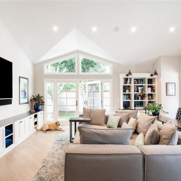
Family room - transitional light wood floor, beige floor and vaulted ceiling family room idea in Los Angeles with gray walls and a wall-mounted tv

Sponsored
Delaware, OH

Buckeye Basements, Inc.
Central Ohio's Basement Finishing ExpertsBest Of Houzz '13-'21
 Klopf Architecture
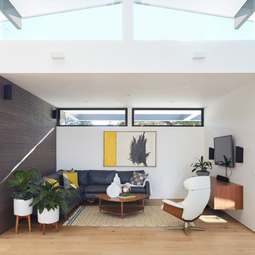
Klopf Architecture and Outer space Landscape Architects designed a new warm, modern, open, indoor-outdoor home in Los Altos, California. Inspired by mid-century modern homes but looking for something completely new and custom, the owners, a couple with two children, bought an older ranch style home with the intention of replacing it.
Created on a grid, the house is designed to be at rest with differentiated spaces for activities; living, playing, cooking, dining and a piano space. The low-sloping gable roof over the great room brings a grand feeling to the space. The clerestory windows at the high sloping roof make the grand space light and airy.
Upon entering the house, an open atrium entry in the middle of the house provides light and nature to the great room. The Heath tile wall at the back of the atrium blocks direct view of the rear yard from the entry door for privacy.
The bedrooms, bathrooms, play room and the sitting room are under flat wing-like roofs that balance on either side of the low sloping gable roof of the main space. Large sliding glass panels and pocketing glass doors foster openness to the front and back yards. In the front there is a fenced-in play space connected to the play room, creating an indoor-outdoor play space that could change in use over the years. The play room can also be closed off from the great room with a large pocketing door. In the rear, everything opens up to a deck overlooking a pool where the family can come together outdoors.
Wood siding travels from exterior to interior, accentuating the indoor-outdoor nature of the house. Where the exterior siding doesn’t come inside, a palette of white oak floors, white walls, walnut cabinetry, and dark window frames ties all the spaces together to create a uniform feeling and flow throughout the house. The custom cabinetry matches the minimal joinery of the rest of the house, a trim-less, minimal appearance. Wood siding was mitered in the corners, including where siding meets the interior drywall. Wall materials were held up off the floor with a minimal reveal. This tight detailing gives a sense of cleanliness to the house.
The garage door of the house is completely flush and of the same material as the garage wall, de-emphasizing the garage door and making the street presentation of the house kinder to the neighborhood.
The house is akin to a custom, modern-day Eichler home in many ways. Inspired by mid-century modern homes with today’s materials, approaches, standards, and technologies. The goals were to create an indoor-outdoor home that was energy-efficient, light and flexible for young children to grow. This 3,000 square foot, 3 bedroom, 2.5 bathroom new house is located in Los Altos in the heart of the Silicon Valley.
Klopf Architecture Project Team: John Klopf, AIA, and Chuang-Ming Liu
Landscape Architect: Outer space Landscape Architects
Structural Engineer: ZFA Structural Engineers
Staging: Da Lusso Design
Photography ©2018 Mariko Reed
Location: Los Altos, CA
Year completed: 2017
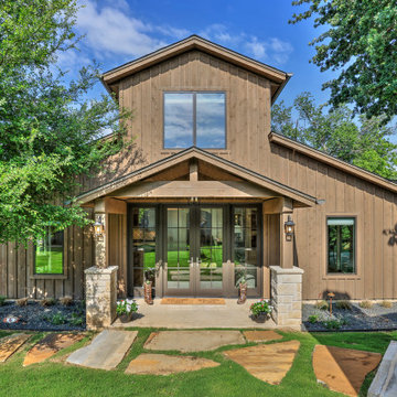
 Fred Parker Company, Inc.
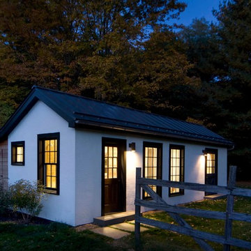
The owners of this beautiful home and property discovered talents of the Fred Parker Company "Design-Build" team on Houzz.com. Their dream was to completely restore and renovate an old barn into a new luxury guest house for parties and to accommodate their out of town family / / This photo features Pella French doors, stone base columns, and large flagstone walk.
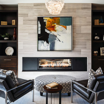
 Falcon Custom Homes
Example of a trendy dark wood floor and brown floor living room design in Grand Rapids with gray walls and a ribbon fireplace
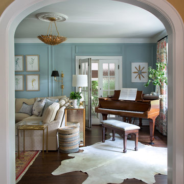
 Laura Lee Home
Emily Minton Redfield
Inspiration for a large timeless enclosed dark wood floor living room remodel in St Louis with blue walls, a standard fireplace, a stone fireplace and a wall-mounted tv
Inspiration for a large timeless enclosed dark wood floor living room remodel in St Louis with blue walls, a standard fireplace, a stone fireplace and a wall-mounted tv
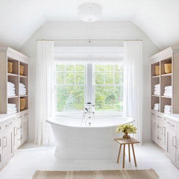
 Chango
Architecture, Interior Design, Custom Furniture Design & Art Curation by Chango & Co.
Example of a huge classic master white tile white floor claw-foot bathtub design in New York with recessed-panel cabinets, light wood cabinets, a one-piece toilet, white walls, an integrated sink, marble countertops, a hinged shower door and white countertops
Example of a huge classic master white tile white floor claw-foot bathtub design in New York with recessed-panel cabinets, light wood cabinets, a one-piece toilet, white walls, an integrated sink, marble countertops, a hinged shower door and white countertops
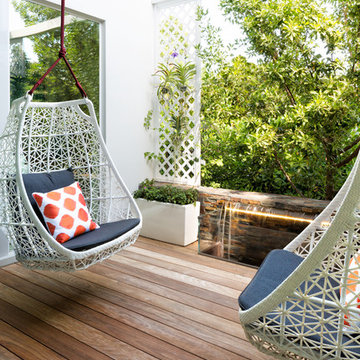 Interiors by Maite Granda
Project Feature in: Luxe Magazine & Luxury Living Brickell
From skiing in the Swiss Alps to water sports in Key Biscayne, a relocation for a Chilean couple with three small children was a sea change. “They’re probably the most opposite places in the world,” says the husband about moving
from Switzerland to Miami. The couple fell in love with a tropical modern house in Key Biscayne with architecture by Marta Zubillaga and Juan Jose Zubillaga of Zubillaga Design. The white-stucco home with horizontal planks of red cedar had them at hello due to the open interiors kept bright and airy with limestone and marble plus an abundance of windows. “The light,” the husband says, “is something we loved.”
While in Miami on an overseas trip, the wife met with designer Maite Granda, whose style she had seen and liked online. For their interview, the homeowner brought along a photo book she created that essentially offered a roadmap to their family with profiles, likes, sports, and hobbies to navigate through the design. They immediately clicked, and Granda’s passion for designing children’s rooms was a value-added perk that the mother of three appreciated. “She painted a picture for me of each of the kids,” recalls Granda. “She said, ‘My boy is very creative—always building; he loves Legos. My oldest girl is very artistic— always dressing up in costumes, and she likes to sing. And the little one—we’re still discovering her personality.’”
To read more visit:
https://maitegranda.com/wp-content/uploads/2017/01/LX_MIA11_HOM_Maite_12.compressed.pdf
Rolando Diaz
Sponsored
Columbus, OH
We Design, Build and Renovate

CHC & Family Developments
Industry Leading General Contractors in Franklin County, Ohio
 Allen Construction
Designer: Allen Construction
General Contractor: Allen Construction
Photographer: Jim Bartsch Photography
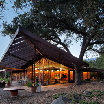
1960s one-story glass exterior home idea in Los Angeles
1960s one-story glass exterior home idea in Los Angeles
 Charmean Neithart Interiors
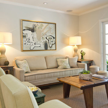
The homeowners of this California Cottage wanted a beach vibe in their 1700 sq. ft. home. They wanted to make the most of their spaces by widening doorways, adding wood floors throughout the house, and adding a skylight. The result is cozy, casual California living at its best with frequent family dinners and celebrations with friends.
Photos by Erika Bierman www.erikabiermanphotography.com
 Advance Design Studio, Ltd.
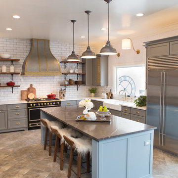
Jennifer and Dan have lived in their Deer Park Illinois home for 15 years, slowly making minor fixes like painting and decorating; but they had a new plan for their kitchen the entire time. An awkwardly placed garage door, and an island cooktop with a terrible downdraft made a full-scale kitchen remodel an absolute must. Jennifer had many ideas in mind and wanted to work with a company that could provide high-end work, while partnering with a designer that would tailor the kitchen to her ideas.
She was intrigued by the phrase “Common Sense Remodeling” in Advance Design’s feature she discovered while perusing an issue of the community’s Quintessential Barrington Magazine. Doing further research on the company’s website, as she looked through project profiles and read about Advance Design’s “Common Sense Remodeling” philosophy, she promptly scheduled an appointment to see if the people and ideas she read about were truly who they said they were. The more she read, the more she knew that the “Common Sense” approach to remodeling they described was exactly the type of company she was looking for.
The partnership was sealed after an initial consultation with Owner Todd Jurs and Project Designer Michelle Lecinski. They displayed a combination of friendliness, professionalism and respect that was unmatched by any of the other companies Jennifer talked to. She knew that with Advance Design, she would be able to retain the vision that she had in mind with high-quality craftsmanship.
“I reached out to Advance Design because of the ‘Common Sense Remodeling’ tagline,” Jennifer said. “That’s what lingered for me”. “Advance Design was the most respectful- of the house and of my design ideas, and the most professional of the handful of companies that looked at my project”.
Soon after the meeting Jennifer began working with Michelle on the project design. They quickly developed chemistry. Jennifer loved how Michelle researched and located every detail that Jennifer wanted for the kitchen. Between the two of them, every concept and idea was worked through and perfected. “Jennifer had definite ideas about what she wanted the new kitchen to look like, she just didn’t know how to bring it all together. We worked together really well to make her ideas into the practical reality necessary for a well-functioning kitchen, with the look and feel that she had envisioned”, says Michelle.
“Michelle was wonderful in using the CAD system she would show me new drawings every time we changed the layout while working through the design,” Jennifer said. “She was a really wonderful partner in execution, she made sure everything happened quickly and easily.”
The finished design drew out elements of Jennifer’s style and personality. The pair call the look “sophisticated farmhouse” to describe the kitchen renovation to family and friends. The result was a beautifully crafted, authentic-feeling space that satisfied Jennifer’s dreams 15 years in the making. The whole project consisted of a kitchen remodel, mudroom upgrade with powder room, and garage entry relocation. “The projects I personally like the best, are the ones that put the client’s dreams on display,” Project Designer Michelle said. “And this is one of those projects.”
The main focal point of the kitchen is custom zinc and brass ventilation hood with a vintage sheen, which was hand made to order by a small company in Indiana named Vogler Metalworking. “It’s like sculpture, a true work of art”, says Jennifer. Your eye is immediately drawn towards this elegant yet practical hood that eliminated the home’s downdraft problem and added a striking conversation piece at the same time. The carpenters had to use special gloves when transporting and installing it, so they didn’t smudge it with fingerprints. The beautiful hood centers proudly over the stunning black enamel and brass LaCornue Range. “I had a friend who had a LaCornue range and after learning how easy it was to cook perfect meals, I was convinced I wanted to have one”, says Jennifer. This unique, breathtaking combination anchors the entire kitchen and is apparent immediately as you walk into the great room the surrounds the space.
DuraSupreme Crestwood cabinets with a Kendall Panel add function and sophistication. A custom gray paint color paired with a storm blue was developed so that the new kitchen looked like it belonged to the existing space. Unlacquered brass faucets and hardware were important to Jennifer because she wanted the living finishes to age over time. Remarkable brass diamond mesh cabinet door inserts imported from the UK continue to add this one-of-a-kind kitchen renovation; giving it a “you won’t see this everywhere” quality. The use of old railcar flooring for the coffee bar countertop and reclaimed oak for the open shelving gives an authenticity to the space uncommon in kitchens today.
Jennifer and Michelle fell in love with the Limestone Grey Stone while they were investigating unique island countertop ideas. They liked the fact that the limestone as a living finish will age and change over time. Calcutta Miel Quartz countertops made for an excellent pairing around the perimeter, as it’s durable and perfect for cooking preparations. A textured white subway tile backsplash that runs to the ceiling keeps your eye moving towards the open shelving, and to the main focal point of the stunning range hood combination.
“The kitchen functions beautifully, and it’s gorgeous,” beams Jennifer as she gestures with both hands while smiling ear to ear. “The most important thing was I wanted a kitchen that had a wonderful flow, cooked beautiful meals and was a great gathering place for family and friends, and this space does that perfectly! Beauty wise, it turned out exactly how I had envisioned. I felt the function part was the hardest part, and that was nailed”!
Relocating the garage entry to the new mudroom was a huge priority and has finally separated the family’s arriving home functions from their kitchen. Now coats and shoes and bags have their own area for dropping once members arrive home. Matching gray DuraSupreme cabinetry helped create gorgeous, purposeful lockers for the family. A reclaimed vintage sink and custom wall paper were added to the tiny powder room to beautify the once previously only functional space. Advance Design was even able to create a custom space for their dog to sleep while the family is away.
“It was unbelievable that a project of this size was completed in such a short time, and I think that’s because of the large amount of planning and preparation that went into it,” Jennifer marveled, “When we started, we were ready, and everything was prepared”.
When it came to execution, Project Manager Justin Davis and his crew were quick, accessible, and organized. Projects like this kitchen are typically completed in as little as 8-10 weeks. Jennifer’s kitchen however despite the relocation of some challenging HVAC in a soffit and moving of an exterior door was completed remarkably fast in part because the team was working with an existing tile floor that ran throughout the first floor that the client really loved.
“You get to know these people really well because they’re living in your house while you’re living in your house. They were so fast and really good, it didn’t take as long as even planned” reported Jennifer. “I would text Justin and he always responded almost immediately. I got to know all the guys who were working in our house and they were all wonderful people”.
Details in a customized kitchen like this one require skill and care from the people who install it. “All the guys on the job were skilled at what the did. I wanted small details like little feet to look like furniture, that is where their carpentry skill came in to make these all perfect”, said Jennifer. “The tile guys were wonderful. They even let me determine how I wanted the texture with the grout to appear for a salt and pepper look; now that is a very skilled trade person making it custom”.
In Jennifer’s interview, she continued to reference Advance Design’s “Common Sense Remodeling”, so I took a minute to ask her exactly what that phrase meant to her and how it played out in her experience with her project and the Advance Design team. Here is what she said: “I was intrigued about Common Sense Remodeling and in my head that there would be clear costs and prices, great communication between the design team, the execution team and me”, said Jennifer. They did deliver on that, it was so clear about the cost breakdown, what I could expect from everyone who came to my house, and everything that we had ordered. That to me is the Common Sense”!
It’s great to see a client take literally our assertion that a well-planned remodeling project is simply “Common Sense”! She anticipated each step of the way would be clear, concise, and predictable, all the while protecting the outcome due to the careful upfront planning. “Advance Design delivered on their ‘Common Sense Remodeling’ promise,” Jennifer said. “From the design team, to the execution team - everything was straight forward like I imagined. The project turned out exactly how I envisioned, I enjoyed this process and absolutely would recommend Advance Design Studio to anyone.”
 Frame My TV
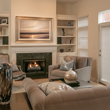
Discover the ultimate solution in television concealment with this TV Art Cover. With the press of a button this 50" TV is revealed as the canvas giclee painting rolls up into the decorative frame. You can choose from over 1,200 pieces of art or send us your own art.
Visit www.FrameMyTV.com to see how easy it is to design a frame for your TV. Every unit is custom made-to-order for your TV by our experienced craftsman here in the USA.
Frame Style: M1017
TV: 50" Panasonic TC-P50ST50
Art: Gloaming by Matthew Hasty
Image Reference: 221669
Sponsored
Columbus, OH

Wannemacher Interiors
Customized Award-Winning Interior Design Solutions in Franklin Cnty OH
 Buffalo Lumber Company Inc.
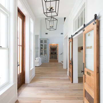
For years people were slapping polyurethane on their floors thinking it doesn’t scratch but that is EXACTLY what scratches. Another little find I have discovered over the years.
*************************************************************************
Buffalo Lumber specializes in Custom Milled, Factory Finished Wood Siding and Paneling. We ONLY do real wood.

 Interiors by Maite Granda
Project Feature in: Luxe Magazine & Luxury Living Brickell
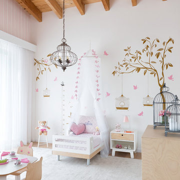
From skiing in the Swiss Alps to water sports in Key Biscayne, a relocation for a Chilean couple with three small children was a sea change. “They’re probably the most opposite places in the world,” says the husband about moving
from Switzerland to Miami. The couple fell in love with a tropical modern house in Key Biscayne with architecture by Marta Zubillaga and Juan Jose Zubillaga of Zubillaga Design. The white-stucco home with horizontal planks of red cedar had them at hello due to the open interiors kept bright and airy with limestone and marble plus an abundance of windows. “The light,” the husband says, “is something we loved.”
While in Miami on an overseas trip, the wife met with designer Maite Granda, whose style she had seen and liked online. For their interview, the homeowner brought along a photo book she created that essentially offered a roadmap to their family with profiles, likes, sports, and hobbies to navigate through the design. They immediately clicked, and Granda’s passion for designing children’s rooms was a value-added perk that the mother of three appreciated. “She painted a picture for me of each of the kids,” recalls Granda. “She said, ‘My boy is very creative—always building; he loves Legos. My oldest girl is very artistic— always dressing up in costumes, and she likes to sing. And the little one—we’re still discovering her personality.’”
To read more visit:
https://maitegranda.com/wp-content/uploads/2017/01/LX_MIA11_HOM_Maite_12.compressed.pdf
Rolando Diaz
4