
Search results for "Favor classic" in Home Design Ideas
 Timber Block Homes
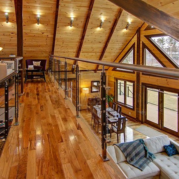
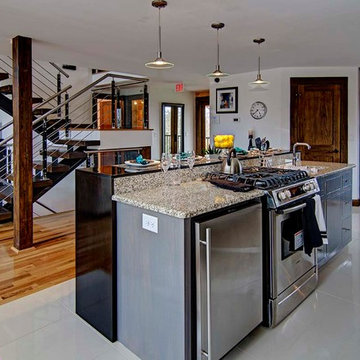
The Denver is very practical, and designed for those who favor the open room concept. At over 2700 square feet, it has substantial living space. The living room and kitchen areas are perfect for gathering, and the generous screened in room completes the picture perfect main floor. The loft is open to below and includes a beautiful large master bedroom. With a cathedral ceiling and abundance of windows, this design lets in tons of light, enhancing the most spectacular views. www.timberblock.com
 Timber Block Homes
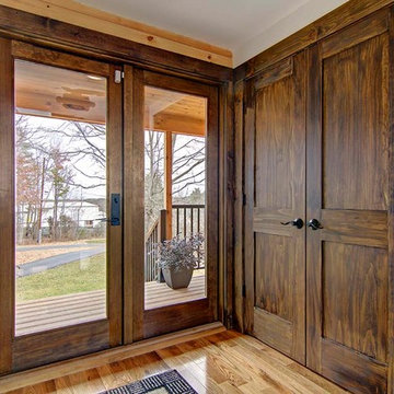
The Denver is very practical, and designed for those who favor the open room concept. At over 2700 square feet, it has substantial living space. The living room and kitchen areas are perfect for gathering, and the generous screened in room completes the picture perfect main floor. The loft is open to below and includes a beautiful large master bedroom. With a cathedral ceiling and abundance of windows, this design lets in tons of light, enhancing the most spectacular views. www.timberblock.com
 DW Ricks Architects + Associates, PC
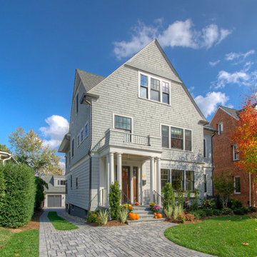
This house is located in Lyon Village just a block from the bustling Wilson Boulevard corridor in downtown Clarendon, VA. The former modest side-hall Colonial was transformed by a whole-house remodel, pop-top and rear addition. In truth, it is a new home. The few existing walls and spaces kept were totally refinished and rebuilt. The original home occupied a very favorable, but, now restricted position on its lot. In zoning parlance, the only option to maintain that preferred "Grandfathered" house placement, was by “remodeling” the existing structure in lieu of a knock-down and new build.
The home owner's preference for shingle siding gave impetus for the exterior design. The remade house is expressed with simple, crisp, gabled forms wrapped in a taught outer shingle skin, all basic precepts of classic turn of the century “Shingle Style” architecture. On the interior, ground floor living spaces are arranged in "open plan" and defined by furniture groupings. In the family/kitchen area, the ceiling is coffered, and room height increased, to maintain appropriate scale and proportion for expansive interior spaces.
As with all remodels, the merit of any design solution is how successfully it transforms new and old together. In this case, both are seamlessly blended as one unified whole.
Find the right local pro for your project
 Timber Block Homes
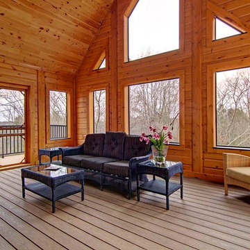
The Denver is very practical, and designed for those who favor the open room concept. At over 2700 square feet, it has substantial living space. The living room and kitchen areas are perfect for gathering, and the generous screened in room completes the picture perfect main floor. The loft is open to below and includes a beautiful large master bedroom. With a cathedral ceiling and abundance of windows, this design lets in tons of light, enhancing the most spectacular views. www.timberblock.com
 Timber Block Homes
The Denver is very practical, and designed for those who favor the open room concept. At over 2700 square feet, it has substantial living space. The living room and kitchen areas are perfect for gathering, and the generous screened in room completes the picture perfect main floor. The loft is open to below and includes a beautiful large master bedroom. With a cathedral ceiling and abundance of windows, this design lets in tons of light, enhancing the most spectacular views. www.timberblock.com
 User
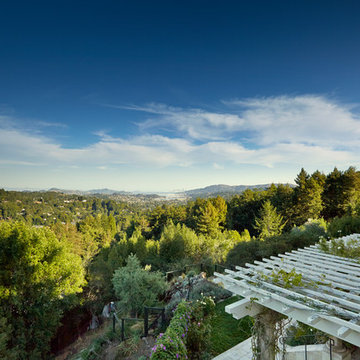
UserSpectacular unobstructed views of the Bay, Bridge, Alcatraz, San Francisco skyline and the rolling hills of Marin greet you from almost every window of this stunning Provençal Villa located in the acclaimed Middle Ridge neighborhood of Mill Valley. Built in 2000, this exclusive 5 bedroom, 5+ bath estate was thoughtfully designed by architect Jorge de Quesada to provide a classically elegant backdrop for today’s active lifestyle. Perfectly positioned on over half an acre with flat lawns and an award winning garden there is unmatched sense of privacy just minutes from the shops and restaurants of downtown Mill Valley.
A curved stone staircase leads from the charming entry gate to the private front lawn and on to the grand hand carved front door. A gracious formal entry and wide hall opens out to the main living spaces of the home and out to the view beyond. The Venetian plaster walls and soaring ceilings provide an open airy feeling to the living room and country chef’s kitchen, while three sets of oversized French doors lead onto the Jerusalem Limestone patios and bring in the panoramic views.
The chef’s kitchen is the focal point of the warm welcoming great room and features a range-top and double wall ovens, two dishwashers, marble counters and sinks with Waterworks fixtures. The tile backsplash behind the range pays homage to Monet’s Giverny kitchen. A fireplace offers up a cozy sitting area to lounge and watch television or curl up with a book. There is ample space for a farm table for casual dining. In addition to a well-appointed formal living room, the main level of this estate includes an office, stunning library/den with faux tortoise detailing, butler’s pantry, powder room, and a wonderful indoor/outdoor flow allowing the spectacular setting to envelop every space.
A wide staircase leads up to the four main bedrooms of home. There is a spacious master suite complete with private balcony and French doors showcasing the views. The suite features his and her baths complete with walk – in closets, and steam showers. In hers there is a sumptuous soaking tub positioned to make the most of the view. Two additional bedrooms share a bath while the third is en-suite. The laundry room features a second set of stairs leading back to the butler’s pantry, garage and outdoor areas.
The lowest level of the home includes a legal second unit complete with kitchen, spacious walk in closet, private entry and patio area. In addition to interior access to the second unit there is a spacious exercise room, the potential for a poolside kitchenette, second laundry room, and secure storage area primed to become a state of the art tasting room/wine cellar.
From the main level the spacious entertaining patio leads you out to the magnificent grounds and pool area. Designed by Steve Stucky, the gardens were featured on the 2007 Mill Valley Outdoor Art Club tour.
A level lawn leads to the focal point of the grounds; the iconic “Crags Head” outcropping favored by hikers as far back as the 19th century. The perfect place to stop for lunch and take in the spectacular view. The Century old Sonoma Olive trees and lavender plantings add a Mediterranean touch to the two lawn areas that also include an antique fountain, and a charming custom Barbara Butler playhouse.
Inspired by Provence and built to exacting standards this charming villa provides an elegant yet welcoming environment designed to meet the needs of today’s active lifestyle while staying true to its Continental roots creating a warm and inviting space ready to call home.
 Amy Pearson Design
As a phase two for this home, APD was brought back to address the bathrooms and bedrooms of our Northwest Hills Mid Century project. While the hall bathroom was simple in scope - pull out what was old and replace with all new - the finished product is anything but simple. A walnut floating vanity takes center stage and grounds the space for all remaining selections. The enlarged penny tile in natural black basalt is a fresh and modern take on a very classic material while providing a functional foundation to the room. Modernity is continued in the updated scale in the herringbone marble shower tile, the warmth of which reflects back to the walnut vanity. With these elements, alongside the rich and warm brass finish on the plumbing, lighting, and cabinet hardware, the hall bathroom now shines as a welcoming room for guests!
The primary bedroom and bathroom are the showstoppers of this phase! Unused and awkwardly located closets in both the bedroom and bathroom were removed to make way for additional square-footage in the bath and replaced with a sizable and functional reach-in closet in the bedroom. A dated and cramped shower stall was removed in favor for an expansive step in shower spanning the width of the bathroom and a new transom window washes the room in natural light. While the previous bathroom was only able to accommodate a single vanity, the new layout allowed us to create double matching vanities mirrored across from each other - a much appreciated addition for a primary bath. Floating walnut vanities boast impressive storage and are capped with tower cabinets with hidden outlets for charging and storing electronic bathroom tools. While the color palette is restrained - black, white, gray, and brown - the result is a timelessly modern and masculine space that is at once striking and warm. Modern geometric patterns play with each other throughout the material selections.
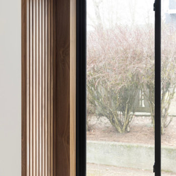
Since we believe firmly in cohesive design, we encourage you to find elements from Phase 1 that are reimagined in Phase 2 (hint, there are a lot!), including the walnut slat detail used to accentuate garden windows in the guest bedrooms!

Sponsored
Columbus, OH

Snider & Metcalf Interior Design, LTD
Leading Interior Designers in Columbus, Ohio & Ponte Vedra, Florida
 Timber Block Homes
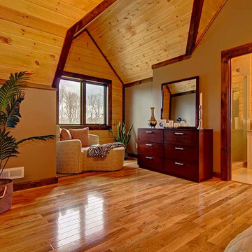
The Denver is very practical, and designed for those who favor the open room concept. At over 2700 square feet, it has substantial living space. The living room and kitchen areas are perfect for gathering, and the generous screened in room completes the picture perfect main floor. The loft is open to below and includes a beautiful large master bedroom. With a cathedral ceiling and abundance of windows, this design lets in tons of light, enhancing the most spectacular views. www.timberblock.com
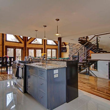 Timber Block Homes
The Denver is very practical, and designed for those who favor the open room concept. At over 2700 square feet, it has substantial living space. The living room and kitchen areas are perfect for gathering, and the generous screened in room completes the picture perfect main floor. The loft is open to below and includes a beautiful large master bedroom. With a cathedral ceiling and abundance of windows, this design lets in tons of light, enhancing the most spectacular views. www.timberblock.com
 Amy Pearson Design
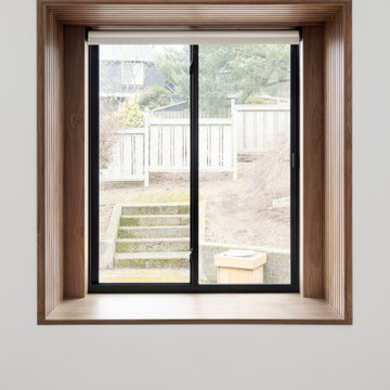
As a phase two for this home, APD was brought back to address the bathrooms and bedrooms of our Northwest Hills Mid Century project. While the hall bathroom was simple in scope - pull out what was old and replace with all new - the finished product is anything but simple. A walnut floating vanity takes center stage and grounds the space for all remaining selections. The enlarged penny tile in natural black basalt is a fresh and modern take on a very classic material while providing a functional foundation to the room. Modernity is continued in the updated scale in the herringbone marble shower tile, the warmth of which reflects back to the walnut vanity. With these elements, alongside the rich and warm brass finish on the plumbing, lighting, and cabinet hardware, the hall bathroom now shines as a welcoming room for guests!
The primary bedroom and bathroom are the showstoppers of this phase! Unused and awkwardly located closets in both the bedroom and bathroom were removed to make way for additional square-footage in the bath and replaced with a sizable and functional reach-in closet in the bedroom. A dated and cramped shower stall was removed in favor for an expansive step in shower spanning the width of the bathroom and a new transom window washes the room in natural light. While the previous bathroom was only able to accommodate a single vanity, the new layout allowed us to create double matching vanities mirrored across from each other - a much appreciated addition for a primary bath. Floating walnut vanities boast impressive storage and are capped with tower cabinets with hidden outlets for charging and storing electronic bathroom tools. While the color palette is restrained - black, white, gray, and brown - the result is a timelessly modern and masculine space that is at once striking and warm. Modern geometric patterns play with each other throughout the material selections.
Since we believe firmly in cohesive design, we encourage you to find elements from Phase 1 that are reimagined in Phase 2 (hint, there are a lot!), including the walnut slat detail used to accentuate garden windows in the guest bedrooms!
 Reico Kitchen & Bath
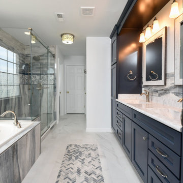
Designed by Cat Neitzey of Reico Kitchen & Bath in Fredericksburg, VA in collaboration with Good Bees Remodeling, this primary bathroom features Merillat Classic cabinets in the Glenrock 5-piece drawer front door style in Maple with a Nightfall finish. The countertop is a 72” Virginia Marble cultured marble double bowl vanity top in Pewter with Wave Bowls and a 1.5" Bullnose Edge.
Additionally, the bathroom also features: Moen Eva fixtures and accessories, including robe hook, towel ring, towel bar, lighting and vanity sink faucets; Moen Flara shower faucet; Moen handheld showering; Sterling Glass Custom Serenity Brushed Stainless Tempered Glass/Flat Polished Shower Surround/Slider; and CDA Elegance Iconic Blue 24” x 48” floor tiles with Roman herringbone pattern inlay.
Said Cat, “It is fun working with clients who favor bold selections. They did a great job making choices to blend this transitional bathroom into their traditional style home. The modern, bold color and variation from the tile juxtapose nicely with the Roman herringbone pattern in the tile to create the spa retreat they were hoping for. In the shower, the tile was hand selected to show the colors ombre from dark to light above the accent lines. I especially love the 24”x 48” tiles used vertically below the accent. It allows you to really see the beauty in the variation of the tile.” Added the client, “I really like how the shower tile extends across the entire wall to include the tub area.”
Photos courtesy of Tim Snyder Photography.
 Neumann & Rudy Architecture
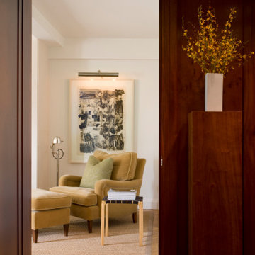
The photograph is constructed as a deliberate act of framing — an enfilade view captured through a threshold, in which the aperture of a doorway becomes both proscenium and compositional device. The image is organized around a strong vertical tripartite division: a dark stile of paneled millwork at the left edge, the luminous rectangle of the adjacent sitting room at center, and a substantial pier of figured hardwood joinery at right, terminating in a plinth-like pedestal. This asymmetrical clamping of the bright volume between two dark masses produces a pronounced sense of compression and release, a Wrightian sequencing in which the constricted, wood-lined passage funnels the eye toward the softer, higher-key room beyond. The architectural vocabulary within that inner volume is restrained and orthogonal: crisp painted plaster planes, a shallow soffit or dropped beam crossing the ceiling to modulate the overhead datum, and a simple flat-stock baseboard that reads as a quiet ground line rather than an ornamental flourish. The sightline is layered and telescopic — foreground jamb, mid-ground seating group, background artwork on the far wall — establishing depth through overlapping planes rather than perspectival theatrics. Underfoot, a herringbone-laid oak parquet in the passage gives way to a large-format sisal rug bound in linen tape, its rectilinear geometry reinforcing the axis while softening the transition between circulation and repose.
The material argument here is one of calibrated opposition: dense, saturated hardwood against pale, absorptive plaster and textile. The framing joinery — most plausibly a rich mahogany or stained cherry, its cathedral grain and ribbon figure fully legible under raking light — carries a deep oxblood-to-umber tonality and a satin, hand-rubbed sheen that lends the passage a library-like gravity. Against this, the interior room is rendered in a warm off-white with distinctly yellow-ochre undertones, avoiding the clinical chill of a true cool white and instead reading as parchment or unbleached linen. The upholstery — a rolled-arm wing chair and matching ottoman in a camel or buff-toned cotton velvet — supplies the tactile fulcrum of the composition: a napped, light-absorbing pile that contrasts against the coarse, tightly woven boucle of the sisal below and the smooth lacquer of the vertical joinery. Accent notes are sparing and precise: a pale celadon embroidered cushion introduces the only cool chromatic interruption; a rectilinear bench in blond ash with a woven black leather strap deck delivers a graphic, near-Nordic counterpoint; and a monolithic white ceramic vessel atop the pedestal provides a hard, matte punctuation. The abstract work on paper — a gestural monochrome in charcoal, ink and Payne's grey, generously matted behind glass — functions as the room's tonal anchor, its cool achromatics preventing the warm palette from tipping into sentimentality. Sprays of yellow oncidium orchid supply the single high-chroma gesture, echoing the ochre undertone of the walls.
The lighting strategy is layered, low-lumen and unapologetically warm, eschewing ambient wash in favor of discrete pools of illumination. A slim linear picture light, bronze-finished and cantilevered from the wall, grazes the artwork with a scalloped throw that reveals the tooth of the paper and establishes the far wall as the room's luminous terminus. A chrome-shaded articulating floor lamp — a modernist task fixture with a distinctly mid-century pedigree — provides a secondary, reflective glint and introduces the only cool metallic in the palette. Daylight enters obliquely and unseen from the left, softly modeling the plaster and the velvet nap without ever flattening the composition; the foreground joinery, meanwhile, sits in deep shadow, its grain caught only in a slow, specular gradient. The cumulative atmosphere is one of hushed, crepuscular intimacy — a room calibrated for reading and retreat rather than reception. Stylistically, the project resolves into a form of Transitional Warm Modernism: the classical proportioning, paneled millwork and rolled-arm seating are drawn from a traditional American vocabulary, yet they are stripped of applied ornament, edited to essentials, and disciplined by the graphic austerity of the abstract art and the blond-and-black bench. It is a sensibility best characterized as quiet luxury — tonal, textural, and materially honest, deriving its authority from the resonance of grain, nap and light rather than from any declarative gesture.
 Ross Howard Designs
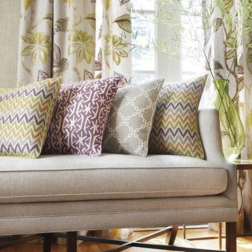
Established in 1886, Thibaut is the nation’s oldest continuously operating wallpaper firm. Over the years our product offering has broadened to include a variety of wallcoverings, coordinating print fabrics, embroideries and woven upholstery fabrics. The recent launch of an upholstered furniture line has established Thibaut as a highly desirable resource of all product categories favored by designers and up-scale consumers alike.
Thibaut has become synonymous with beautiful traditional and transitional designs in signature color palettes. We offer unsurpassed quality and great design in styles ranging from historic reproductions and traditional, classic patterns to tropical and novelty patterns. Our offering is extended by the acquisition of UK based Anna French, a luxury brand of wallcoverings, fabrics, embroideries and Scottish lace. Anna continues as a source of inspiration to the design team at Thibaut, assuring that her energy and style are infused in new collections.

Sponsored
Columbus, OH

Hope Restoration & General Contracting
Columbus Design-Build, Kitchen & Bath Remodeling, Historic Renovations
 Lola Cwikowski Studio
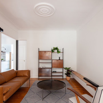
Among the art-deco modernist architecture of the relaxed Penha de França neighborhood, just beyond the tourist path, an actor has acquired a home for peaceful retreat with family and friends. Extensive collaboration with the client rendered a space instilled with wrought-metal accents, vintage woods, and tropical plants, recalling the instruments of cinema’s southern California golden age and the natural landscape of southern Portugal.
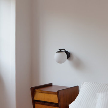
A modest hand-crafted bed is the backdrop of the master bedroom, flanked by modern Portugese wall lamps and nightstands with vintage flair. Generous apertures show changing seasonal foliage, while an adjacent contemporary reading chair relishes rays of afternoon sunlight throughout the year. In the guest room, extant closets were modified into a nook, accommodating a larger bed and slender nightstands.
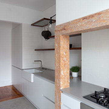
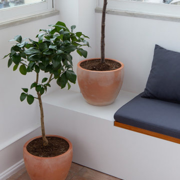
The majority of the wall between the hallway and living room was removed to establish a viewing axis through the apartment, accentuating and linking the cooking and dining spaces. Convivial meals are set on a custom-cut Estremoz marble slab atop a fabricated metal structure, supported by mid-century dining chairs, and illuminated by an enamel factory lamp. The living room doubles as a projection room; a floating bench topped with terracotta tiles conceals home electronics. A raw steel center table is surrounded by an inviting couch, a reupholstered armchair, and a classic Portuguese shelving system.
The pantry was merged into a spacious galley kitchen with integrated appliances, allowing ample space for social cooking. Upper cabinets are eschewed in favor of floating shelves for openness, including dish drying and cookware hanging. Just beyond, a balcony tiled with Algarve terracotta creates a gardenesque hideaway to unwind and enjoy the summer breeze through windows open wide.
PHOTOGRAPHY: © ALEXANDER BOGORODSKIY
 Lola Cwikowski Studio
Among the art-deco modernist architecture of the relaxed Penha de França neighborhood, just beyond the tourist path, an actor has acquired a home for peaceful retreat with family and friends. Extensive collaboration with the client rendered a space instilled with wrought-metal accents, vintage woods, and tropical plants, recalling the instruments of cinema’s southern California golden age and the natural landscape of southern Portugal.
A modest hand-crafted bed is the backdrop of the master bedroom, flanked by modern Portugese wall lamps and nightstands with vintage flair. Generous apertures show changing seasonal foliage, while an adjacent contemporary reading chair relishes rays of afternoon sunlight throughout the year. In the guest room, extant closets were modified into a nook, accommodating a larger bed and slender nightstands.
The majority of the wall between the hallway and living room was removed to establish a viewing axis through the apartment, accentuating and linking the cooking and dining spaces. Convivial meals are set on a custom-cut Estremoz marble slab atop a fabricated metal structure, supported by mid-century dining chairs, and illuminated by an enamel factory lamp. The living room doubles as a projection room; a floating bench topped with terracotta tiles conceals home electronics. A raw steel center table is surrounded by an inviting couch, a reupholstered armchair, and a classic Portuguese shelving system.
The pantry was merged into a spacious galley kitchen with integrated appliances, allowing ample space for social cooking. Upper cabinets are eschewed in favor of floating shelves for openness, including dish drying and cookware hanging. Just beyond, a balcony tiled with Algarve terracotta creates a gardenesque hideaway to unwind and enjoy the summer breeze through windows open wide.
PHOTOGRAPHY: © ALEXANDER BOGORODSKIY
 Zepboo
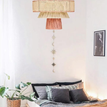
This project is a client case located in France. The client's residence spans 130 square meters. Having grown up in France, the client's aesthetic has been influenced by the country's classical style. Their preferred decor style leans towards French countryside vintage, adorned with vibrant decorative pieces and lush greenery, reflecting a deep appreciation for nature's freshness. For this project, the client aimed to select suitable lighting fixtures for the dining room and bedroom. They favored bamboo and rattan weaving as materials, but wanted to incorporate a range of colors beyond the natural tones of bamboo and rattan. We recommended a three-tiered bamboo and rattan pendant light, accented with black and red tones. Upon receiving the products, the client expressed how perfectly the lighting fixtures aligned with their vision, conveying their satisfaction. We are delighted to share this case study, hoping it inspires and provides ideas for your own home decor endeavors.
 Lola Cwikowski Studio
Among the art-deco modernist architecture of the relaxed Penha de França neighborhood, just beyond the tourist path, an actor has acquired a home for peaceful retreat with family and friends. Extensive collaboration with the client rendered a space instilled with wrought-metal accents, vintage woods, and tropical plants, recalling the instruments of cinema’s southern California golden age and the natural landscape of southern Portugal.
A modest hand-crafted bed is the backdrop of the master bedroom, flanked by modern Portugese wall lamps and nightstands with vintage flair. Generous apertures show changing seasonal foliage, while an adjacent contemporary reading chair relishes rays of afternoon sunlight throughout the year. In the guest room, extant closets were modified into a nook, accommodating a larger bed and slender nightstands.
The majority of the wall between the hallway and living room was removed to establish a viewing axis through the apartment, accentuating and linking the cooking and dining spaces. Convivial meals are set on a custom-cut Estremoz marble slab atop a fabricated metal structure, supported by mid-century dining chairs, and illuminated by an enamel factory lamp. The living room doubles as a projection room; a floating bench topped with terracotta tiles conceals home electronics. A raw steel center table is surrounded by an inviting couch, a reupholstered armchair, and a classic Portuguese shelving system.
The pantry was merged into a spacious galley kitchen with integrated appliances, allowing ample space for social cooking. Upper cabinets are eschewed in favor of floating shelves for openness, including dish drying and cookware hanging. Just beyond, a balcony tiled with Algarve terracotta creates a gardenesque hideaway to unwind and enjoy the summer breeze through windows open wide.
PHOTOGRAPHY: © ALEXANDER BOGORODSKIY


 Lola Cwikowski Studio
Among the art-deco modernist architecture of the relaxed Penha de França neighborhood, just beyond the tourist path, an actor has acquired a home for peaceful retreat with family and friends. Extensive collaboration with the client rendered a space instilled with wrought-metal accents, vintage woods, and tropical plants, recalling the instruments of cinema’s southern California golden age and the natural landscape of southern Portugal.
A modest hand-crafted bed is the backdrop of the master bedroom, flanked by modern Portugese wall lamps and nightstands with vintage flair. Generous apertures show changing seasonal foliage, while an adjacent contemporary reading chair relishes rays of afternoon sunlight throughout the year. In the guest room, extant closets were modified into a nook, accommodating a larger bed and slender nightstands.
The majority of the wall between the hallway and living room was removed to establish a viewing axis through the apartment, accentuating and linking the cooking and dining spaces. Convivial meals are set on a custom-cut Estremoz marble slab atop a fabricated metal structure, supported by mid-century dining chairs, and illuminated by an enamel factory lamp. The living room doubles as a projection room; a floating bench topped with terracotta tiles conceals home electronics. A raw steel center table is surrounded by an inviting couch, a reupholstered armchair, and a classic Portuguese shelving system.
The pantry was merged into a spacious galley kitchen with integrated appliances, allowing ample space for social cooking. Upper cabinets are eschewed in favor of floating shelves for openness, including dish drying and cookware hanging. Just beyond, a balcony tiled with Algarve terracotta creates a gardenesque hideaway to unwind and enjoy the summer breeze through windows open wide.
PHOTOGRAPHY: © ALEXANDER BOGORODSKIY
 M Atelier
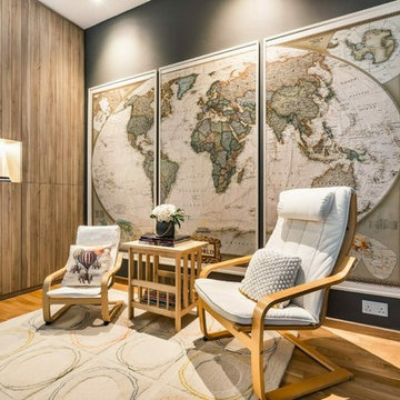
If there is one big mistake that homeowners make when carrying out the decoration tasks of their interior design project, that would be over-accessorising. Indeed, experts in interior design in Singapore agree that there are styles where “more is more,” and there are also those where “less is more.”
While as a homeowner you may choose either of these two style directions, you should first think about the different aspects of interior design and make sure that your style choice fits with these elements. Not doing so may not only result to a poorly executed renovation, but a home that you will find uncomfortable to live in.
So how do you avoid the tendency of over-accessorising? You may want to follow these pieces of advice coming from professionals in interior design in Singapore:
Mistake #1: Using the same fabric on almost all surfaces.
It is common practice among most homeowners to use almost the same fabric on all table surfaces, and sometimes even on sofa covers and drapes. Indeed, this can be cost effective, but it does not contribute to the development of the home’s overall design.
This is because there are fabrics are created to meet specific purposes. For example, lace is often used as table runners, as they give more definition and style to these specific furniture pieces. However, they do not do your windows any favours when used as curtains.
Opaque and heavy fabrics are often intended for curtains and drapes for rooms that require more privacy; in contrast, sheer and fabric materials are more suited for living room windows as they allow natural light and ventilation to move around the house.
Mistake #2: Placing more accents than you actually need.
Another mistake which homeowners are prone to make when decorating their home is placing more accents than needed. There are homes you can see side tables that are overpopulated with picture frames, trinkets, and fancy souvenirs that do not have any connection to each other. Sometimes, you can find numerous throw pillows occupying almost the entire sofa, to the point that all the seats are already occupied.
These are classic examples of “fear of empty spaces,” which is prevalent in most Asian societies, and even in some Western countries. But while it is common practice to occupy empty spaces, you may also want to think about what to do with the space first.
Instead of piling up all your memorabilia in the side tables of your bedroom or living room, why not use a tiered stand so that they can be presented in an organised manner? You may also want to choose a designated area for your trinkets, such as a wall or an unoccupied corner in your room.
Mistake #3: Overdoing the lighting fixtures.
Some homeowners want to imitate the homes of the celebrities they see on TV, and apart from following the same colour schemes and choice of furniture, they also choose to add more lights in their rooms than necessary.
Well, you should understand that the purpose of lighting fixtures is to illuminate the rooms of the house, but this doesn’t mean that you have to brighten up your home all the time. You may want to use lamps that spread the light across the room, rather than several smaller bulbs. The latter only lights up specific parts of the room, and when all these bulbs are lit simultaneously, they only spike up your electric bill.
It would be better to choose lighting fixtures according to your need and the function of the room. Doing so not only illuminates your home properly, but also creates an ambiance that gives you the comfort you are looking for in a dwelling space.
 George Group Cabinetry
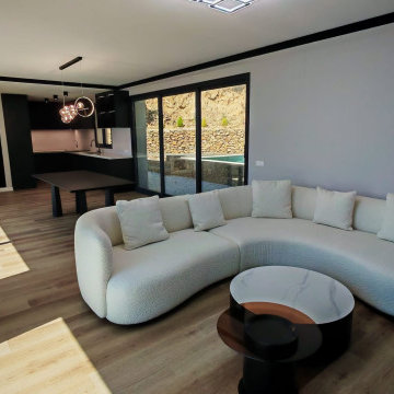
Long perspective shot presenting the whole through-type open layout from kitchen to living room. The kitchen cabinet area is at the foreground, the middle is the independent dining area, and the end is the TV background wall and sofa resting area. The whole space uses unified light wood flooring and consistent dark cabinet color system to ensure visual unity of the public area. Ceiling uses thin black edge line to outline the space hierarchy, matched with modern spherical chandelier above the dining table, creating a sense of advanced hierarchy under the premise of large space openness, which is a classic open layout design favored by Spanish high-end villa owners.
14