
Search results for "Feel lost" in Home Design Ideas
 Revival by Design
We were engaged to give this small lounge a bit of TLC; our clients wanted to make the room feel inviting to sit in. A bit lost, it was acting more like a corridor than a room, as it connects the front door and hallway, to the inner hall and the kitchen.
One of a number of reception rooms, this room in the stunning Georgian property was more of a relaxing space for TV watching and reading for her. It was important that this space had a feminine and homely feel, one that would invite you to sit and relax, whilst being in keeping with the age and location of this country home.
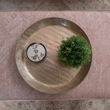
To do this we added warm tones such as muted pinks and warm neutrals with delicate patterns, such as florals and damasks. Keen not to close the room down but have adequate seating, we made the footstool/ottoman the same height as the sofa, so it could be used either as a coffee table, chaise end to the sofa, or as additional seating. We are reliably informed that this is now the go to room in the house for relaxing, which is fantastic.
 Jarrett Design
This bathroom needed help as it was tired, dated and cramped! The vanity area was open to the master bedroom and sandwiched between a closet and existing bathroom wall. Behind the bathroom wall, was a second sink, a small walk-in shower and the commode. A poorly placed linen closet ate into the area and there was a soffit over the shower adding to the cramped feeling. The ceiling was cluttered with old-school heating lamps, flush-mount fixtures and ventilation grills. The “movie star” lighting meant to add some glamour only made the bathroom feel dated and sad. Our clients wanted to bring this bathroom to life.
We built a wall and added a door between the bedroom and bathroom to ensure more privacy and define the space. In addition, we removed the wall separating the actual bathroom and vanity area to make the master bathroom larger. The linen closet was also taken out so the shower could be expanded significantly. Our homeowner had recently suffered a knee injury so they were looking for future solutions that would work for them as they continued to age. We made the shower large enough to include a bench and installed a handheld sprayer located near the seat. Shower walls were reinforced so that when the day came that a grab bar was needed, they would be ready.
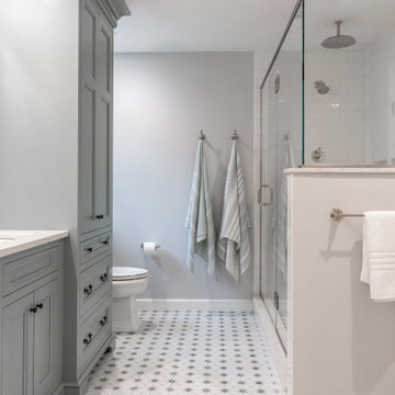
We added a tall cabinet that featured two, deep rollouts and interior shelving to keep linens and bathroom supplies organized. Beneath the sinks, we included rollout drawers so items would not get lost in those dark areas under the plumbing. Everything that had been cluttering the ceiling was removed including the shower soffit and heat lamp. With those gone, we added evenly-spaced, recessed ceiling lights to help brighten the space making it safer and more practical.
We chose a custom blue-green paint for the cabinets which was understated enough to provide a sense of serenity while still offering a splash of color to help liven up the room. Walnut-framed mirrors added a touch of warmth and the patterned floor tile made the whole room fun! An old bathroom came alive!
 User
UserThis Greek Revival row house in Boerum Hill was previously owned by a local architect who renovated it several times, including the addition of a two-story steel and glass extension at the rear. The new owners came to us seeking to restore the house and its original formality, while adapting it to the modern needs of a family of five. The detailing of the 25 x 36 foot structure had been lost and required some sleuthing into the history of Greek Revival style in historic Brooklyn neighborhoods.
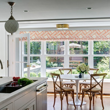
In addition to completely re-framing the interior, the house also required a new south-facing brick façade due to significant deterioration. The modern extension was replaced with a more traditionally detailed wood and copper- clad bay, still open to natural light and the garden view without sacrificing comfort. The kitchen was relocated from the first floor to the garden level with an adjacent formal dining room. Both rooms were enlarged from their previous iterations to accommodate weekly dinners with extended family. The kitchen includes a home office and breakfast nook that doubles as a homework station. The cellar level was further excavated to accommodate finished storage space and a playroom where activity can be monitored from the kitchen workspaces.
The parlor floor is now reserved for entertaining. New pocket doors can be closed to separate the formal front parlor from the more relaxed back portion, where the family plays games or watches TV together. At the end of the hall, a powder room with brass details, and a luxe bar with antique mirrored backsplash and stone tile flooring, leads to the deck and direct garden access. Because of the property width, the house is able to provide ample space for the interior program within a shorter footprint. This allows the garden to remain expansive, with a small lawn for play, an outdoor food preparation area with a cast-in-place concrete bench, and a place for entertaining towards the rear. The newly designed landscaping will continue to develop, further enhancing the yard’s feeling of escape, and filling-in the views from the kitchen and back parlor above. A less visible, but equally as conscious, addition is a rooftop PV solar array that provides nearly 100% of the daily electrical usage, with the exception of the AC system on hot summer days.
The well-appointed interiors connect the traditional backdrop of the home to a youthful take on classic design and functionality. The materials are elegant without being precious, accommodating a young, growing family. Unique colors and patterns provide a feeling of luxury while inviting inhabitants and guests to relax and enjoy this classic Brooklyn brownstone.
This project won runner-up in the architecture category for the 2017 NYC&G Innovation in Design Awards and was featured in The American House: 100 Contemporary Homes.
Photography by Francis Dzikowski / OTTO
Find the right local pro for your project
 Refined & Co
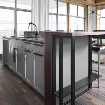
After ten years, the builder grade finishes and design quirks of this downtown condo had long since lost its charm. This homeowner wanted a thoughtful reinterpretation of her kitchen and was ready for a modern space with clean finishes. Handsome lines and striated charcoal tones create depth and an artistic feel in the kitchen. The custom metal work on the island grounds the kitchen and hints at an industrial touch. Custom end-grain walnut countertops balance the strong lines of the sleek brass range hood and sculptural lighting finished in matte black offers a considered feel. The clever design balances sleek finishes and soft lines in a simple statement.
 Phoenix Home Remodeling
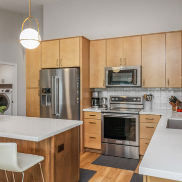
Eric & Jeni wanted to recover the magic their kitchen had lost. They knew something needed to be done but weren't sure how to go about it, so they came to us to finally have their dream kitchen.
The cabinetry was dated and the soffit above the upper cabinets made the space feel dark and confined. The countertops had seen better days, showing signs of wear and tear.
Their renovation began with the removal of the soffit above the upper cabinets to brighten and open up their space. Then, Waypoint Rye cabinetry was meticulously installed and completed with Jeffrey Alexander pulls on both the doors and drawers.
For the countertops, Pro Frost Quartz was selected for the kitchen perimeter, offering a clean and durable surface, which is complimented with the new accent island countertop which features the eye-catching Montreal Quartz countertops.
Eric and Jeni selected Flash Ivory Square to create a stunning backsplash that adds to the clean and bright feel to their space. The Hinkley pendant with etched opal glass adds a modern sophistication to the area.
 Revival by Design
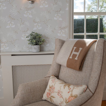
We were engaged to give this small lounge a bit of TLC; our clients wanted to make the room feel inviting to sit in. A bit lost, it was acting more like a corridor than a room, as it connects the front door and hallway, to the inner hall and the kitchen.
One of a number of reception rooms, this room in the stunning Georgian property was more of a relaxing space for TV watching and reading for her. It was important that this space had a feminine and homely feel, one that would invite you to sit and relax, whilst being in keeping with the age and location of this country home.
To do this we added warm tones such as muted pinks and warm neutrals with delicate patterns, such as florals and damasks. Keen not to close the room down but have adequate seating, we made the footstool/ottoman the same height as the sofa, so it could be used either as a coffee table, chaise end to the sofa, or as additional seating. We are reliably informed that this is now the go to room in the house for relaxing, which is fantastic.
 Phoenix Home Remodeling
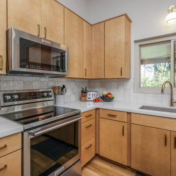
Eric & Jeni wanted to recover the magic their kitchen had lost. They knew something needed to be done but weren't sure how to go about it, so they came to us to finally have their dream kitchen.
The cabinetry was dated and the soffit above the upper cabinets made the space feel dark and confined. The countertops had seen better days, showing signs of wear and tear.
Their renovation began with the removal of the soffit above the upper cabinets to brighten and open up their space. Then, Waypoint Rye cabinetry was meticulously installed and completed with Jeffrey Alexander pulls on both the doors and drawers.
For the countertops, Pro Frost Quartz was selected for the kitchen perimeter, offering a clean and durable surface, which is complimented with the new accent island countertop which features the eye-catching Montreal Quartz countertops.
Eric and Jeni selected Flash Ivory Square to create a stunning backsplash that adds to the clean and bright feel to their space. The Hinkley pendant with etched opal glass adds a modern sophistication to the area.

Sponsored
Delaware, OH

Buckeye Basements, Inc.
Central Ohio's Basement Finishing ExpertsBest Of Houzz '13-'21
 Phoenix Home Remodeling
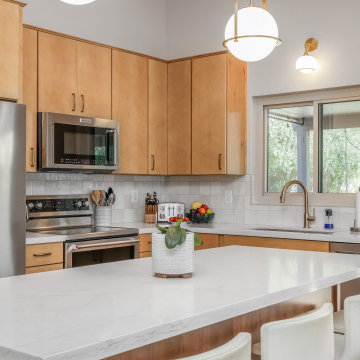
Eric & Jeni wanted to recover the magic their kitchen had lost. They knew something needed to be done but weren't sure how to go about it, so they came to us to finally have their dream kitchen.
The cabinetry was dated and the soffit above the upper cabinets made the space feel dark and confined. The countertops had seen better days, showing signs of wear and tear.
Their renovation began with the removal of the soffit above the upper cabinets to brighten and open up their space. Then, Waypoint Rye cabinetry was meticulously installed and completed with Jeffrey Alexander pulls on both the doors and drawers.
For the countertops, Pro Frost Quartz was selected for the kitchen perimeter, offering a clean and durable surface, which is complimented with the new accent island countertop which features the eye-catching Montreal Quartz countertops.
Eric and Jeni selected Flash Ivory Square to create a stunning backsplash that adds to the clean and bright feel to their space. The Hinkley pendant with etched opal glass adds a modern sophistication to the area.
 Jarrett Design
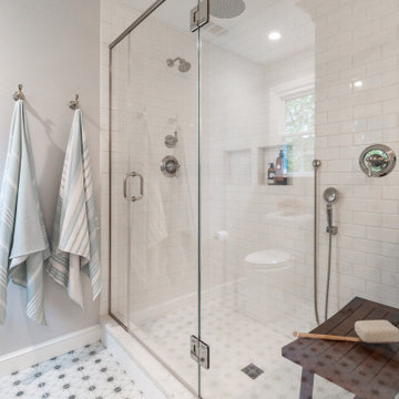
This bathroom needed help as it was tired, dated and cramped! The vanity area was open to the master bedroom and sandwiched between a closet and existing bathroom wall. Behind the bathroom wall, was a second sink, a small walk-in shower and the commode. A poorly placed linen closet ate into the area and there was a soffit over the shower adding to the cramped feeling. The ceiling was cluttered with old-school heating lamps, flush-mount fixtures and ventilation grills. The “movie star” lighting meant to add some glamour only made the bathroom feel dated and sad. Our clients wanted to bring this bathroom to life.
We built a wall and added a door between the bedroom and bathroom to ensure more privacy and define the space. In addition, we removed the wall separating the actual bathroom and vanity area to make the master bathroom larger. The linen closet was also taken out so the shower could be expanded significantly. Our homeowner had recently suffered a knee injury so they were looking for future solutions that would work for them as they continued to age. We made the shower large enough to include a bench and installed a handheld sprayer located near the seat. Shower walls were reinforced so that when the day came that a grab bar was needed, they would be ready.
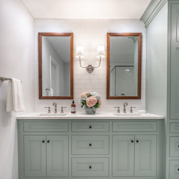
We added a tall cabinet that featured two, deep rollouts and interior shelving to keep linens and bathroom supplies organized. Beneath the sinks, we included rollout drawers so items would not get lost in those dark areas under the plumbing. Everything that had been cluttering the ceiling was removed including the shower soffit and heat lamp. With those gone, we added evenly-spaced, recessed ceiling lights to help brighten the space making it safer and more practical.
We chose a custom blue-green paint for the cabinets which was understated enough to provide a sense of serenity while still offering a splash of color to help liven up the room. Walnut-framed mirrors added a touch of warmth and the patterned floor tile made the whole room fun! An old bathroom came alive!
 Jarrett Design
This bathroom needed help as it was tired, dated and cramped! The vanity area was open to the master bedroom and sandwiched between a closet and existing bathroom wall. Behind the bathroom wall, was a second sink, a small walk-in shower and the commode. A poorly placed linen closet ate into the area and there was a soffit over the shower adding to the cramped feeling. The ceiling was cluttered with old-school heating lamps, flush-mount fixtures and ventilation grills. The “movie star” lighting meant to add some glamour only made the bathroom feel dated and sad. Our clients wanted to bring this bathroom to life.
We built a wall and added a door between the bedroom and bathroom to ensure more privacy and define the space. In addition, we removed the wall separating the actual bathroom and vanity area to make the master bathroom larger. The linen closet was also taken out so the shower could be expanded significantly. Our homeowner had recently suffered a knee injury so they were looking for future solutions that would work for them as they continued to age. We made the shower large enough to include a bench and installed a handheld sprayer located near the seat. Shower walls were reinforced so that when the day came that a grab bar was needed, they would be ready.
We added a tall cabinet that featured two, deep rollouts and interior shelving to keep linens and bathroom supplies organized. Beneath the sinks, we included rollout drawers so items would not get lost in those dark areas under the plumbing. Everything that had been cluttering the ceiling was removed including the shower soffit and heat lamp. With those gone, we added evenly-spaced, recessed ceiling lights to help brighten the space making it safer and more practical.
We chose a custom blue-green paint for the cabinets which was understated enough to provide a sense of serenity while still offering a splash of color to help liven up the room. Walnut-framed mirrors added a touch of warmth and the patterned floor tile made the whole room fun! An old bathroom came alive!
 K T Highland, Inc.
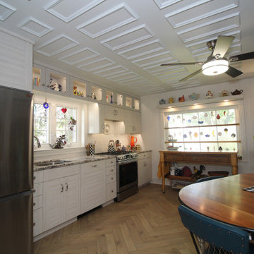
This was a fun project to work on. The homeowner wanted the kitchen to reflect the original feel of this cottage style house. An original plan had the room too filled with cabinets which lost the feel of the house. We decided to stay with one wall of cabinets for everyday cooking and cleanup. The couple was very creative with repurposing some of their existing furniture to make it serve their current needs and provide necessary storage.
 User
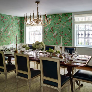
UserThis Greek Revival row house in Boerum Hill was previously owned by a local architect who renovated it several times, including the addition of a two-story steel and glass extension at the rear. The new owners came to us seeking to restore the house and its original formality, while adapting it to the modern needs of a family of five. The detailing of the 25 x 36 foot structure had been lost and required some sleuthing into the history of Greek Revival style in historic Brooklyn neighborhoods.
In addition to completely re-framing the interior, the house also required a new south-facing brick façade due to significant deterioration. The modern extension was replaced with a more traditionally detailed wood and copper- clad bay, still open to natural light and the garden view without sacrificing comfort. The kitchen was relocated from the first floor to the garden level with an adjacent formal dining room. Both rooms were enlarged from their previous iterations to accommodate weekly dinners with extended family. The kitchen includes a home office and breakfast nook that doubles as a homework station. The cellar level was further excavated to accommodate finished storage space and a playroom where activity can be monitored from the kitchen workspaces.
The parlor floor is now reserved for entertaining. New pocket doors can be closed to separate the formal front parlor from the more relaxed back portion, where the family plays games or watches TV together. At the end of the hall, a powder room with brass details, and a luxe bar with antique mirrored backsplash and stone tile flooring, leads to the deck and direct garden access. Because of the property width, the house is able to provide ample space for the interior program within a shorter footprint. This allows the garden to remain expansive, with a small lawn for play, an outdoor food preparation area with a cast-in-place concrete bench, and a place for entertaining towards the rear. The newly designed landscaping will continue to develop, further enhancing the yard’s feeling of escape, and filling-in the views from the kitchen and back parlor above. A less visible, but equally as conscious, addition is a rooftop PV solar array that provides nearly 100% of the daily electrical usage, with the exception of the AC system on hot summer days.
The well-appointed interiors connect the traditional backdrop of the home to a youthful take on classic design and functionality. The materials are elegant without being precious, accommodating a young, growing family. Unique colors and patterns provide a feeling of luxury while inviting inhabitants and guests to relax and enjoy this classic Brooklyn brownstone.
This project won runner-up in the architecture category for the 2017 NYC&G Innovation in Design Awards and was featured in The American House: 100 Contemporary Homes.
Photography by Francis Dzikowski / OTTO
 Powell Construction
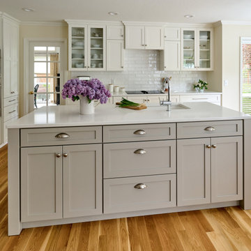
These homeowners came to us seeking a kitchen remodel that would deliver an updated look and increase the kitchen’s overall functionality. They had a clear vision of what they wanted, and we loved working with them to make the transformation a reality.
A change that instantly made the kitchen feel more contemporary was bringing the cabinets up to the ceiling. We chose a tranquil gray for the island cabinetry to add depth to the overall white aesthetic and classic shaker cabinets. A white backsplash tile and some glass front cabinets make the space feel even lighter and brighter. The countertop is a sophisticated white quartz with gray veining.
One complaint the owner had about their original kitchen was the lack of storage space for pots and pans. To address this, we incorporated large, heavy-duty drawers on either side of the cooktop. This is the optimal placement for usage and easily brings all the cookware into view, rather than being lost in a deep cabinet. One handy feature they now enjoy is a custom charging drawer at the end of the island which provides easy access to frequently used electronics without cluttering the countertop. Below the drawer is open shelving that adds charming visual interest and provides the ideal spot to store cookbooks.
Even without drastic layout changes, the transformation is stunning! The contrast between the light cabinets and the hardwood floor is eye-catching without being overly dramatic and the simple hardware and fixtures give it a fresh look. This kitchen is one that is sure to be loved for years to come.

Sponsored
Columbus, OH
Free consultation for landscape design!

Peabody Landscape Group
Franklin County's Reliable Landscape Design & Contracting
 Jarrett Design
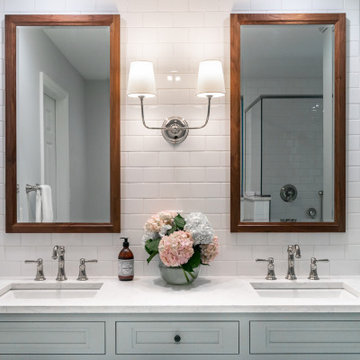
This bathroom needed help as it was tired, dated and cramped! The vanity area was open to the master bedroom and sandwiched between a closet and existing bathroom wall. Behind the bathroom wall, was a second sink, a small walk-in shower and the commode. A poorly placed linen closet ate into the area and there was a soffit over the shower adding to the cramped feeling. The ceiling was cluttered with old-school heating lamps, flush-mount fixtures and ventilation grills. The “movie star” lighting meant to add some glamour only made the bathroom feel dated and sad. Our clients wanted to bring this bathroom to life.
We built a wall and added a door between the bedroom and bathroom to ensure more privacy and define the space. In addition, we removed the wall separating the actual bathroom and vanity area to make the master bathroom larger. The linen closet was also taken out so the shower could be expanded significantly. Our homeowner had recently suffered a knee injury so they were looking for future solutions that would work for them as they continued to age. We made the shower large enough to include a bench and installed a handheld sprayer located near the seat. Shower walls were reinforced so that when the day came that a grab bar was needed, they would be ready.
We added a tall cabinet that featured two, deep rollouts and interior shelving to keep linens and bathroom supplies organized. Beneath the sinks, we included rollout drawers so items would not get lost in those dark areas under the plumbing. Everything that had been cluttering the ceiling was removed including the shower soffit and heat lamp. With those gone, we added evenly-spaced, recessed ceiling lights to help brighten the space making it safer and more practical.
We chose a custom blue-green paint for the cabinets which was understated enough to provide a sense of serenity while still offering a splash of color to help liven up the room. Walnut-framed mirrors added a touch of warmth and the patterned floor tile made the whole room fun! An old bathroom came alive!
 Revival by Design
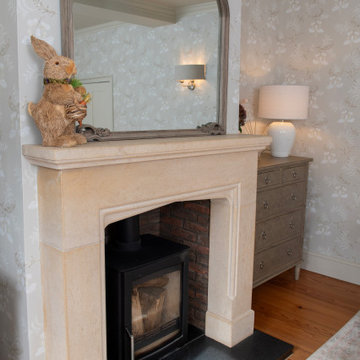
We were engaged to give this small lounge a bit of TLC; our clients wanted to make the room feel inviting to sit in. A bit lost, it was acting more like a corridor than a room, as it connects the front door and hallway, to the inner hall and the kitchen.
One of a number of reception rooms, this room in the stunning Georgian property was more of a relaxing space for TV watching and reading for her. It was important that this space had a feminine and homely feel, one that would invite you to sit and relax, whilst being in keeping with the age and location of this country home.
To do this we added warm tones such as muted pinks and warm neutrals with delicate patterns, such as florals and damasks. Keen not to close the room down but have adequate seating, we made the footstool/ottoman the same height as the sofa, so it could be used either as a coffee table, chaise end to the sofa, or as additional seating. We are reliably informed that this is now the go to room in the house for relaxing, which is fantastic.
 Paul Kelley Architecture
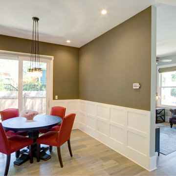
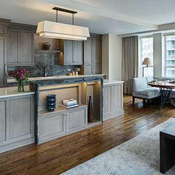
Mid-sized trendy light wood floor and brown floor great room photo in San Francisco with brown walls and no fireplace
 Drury Design
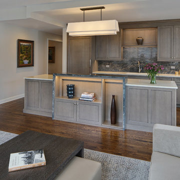
Once cramped and constricted with a wall between the living area and kitchen, this space required some strategic thinking. By removing the wall, the two rooms now had to integrate together seamlessly. This was achieved by using neutral colors to flow with the adjacent areas, integrating all of the appliances with wood panels and, hiding the cooktop and downdraft behind the second level of the island to create a furniture feel. In addition, open display areas at different levels give the kitchen a more furniture-like feel.
The microwave drawer and oven were placed in the island to be hidden from the living area. The Blanco Silgranit sink color was selected to blend in with the countertop and be seamless in that area. Wide wall cabinets, accessories in every cabinet, drawer dividers, a 30” deep 3-drawer cabinet for pots and pans, and additional storage in the Dry Bar make up for the lost storage in the existing kitchen.
Sponsored
Sunbury, OH

J.Holderby - Renovations
Franklin County's Leading General Contractors - 2X Best of Houzz!
 Revival by Design
We were engaged to give this small lounge a bit of TLC; our clients wanted to make the room feel inviting to sit in. A bit lost, it was acting more like a corridor than a room, as it connects the front door and hallway, to the inner hall and the kitchen.
One of a number of reception rooms, this room in the stunning Georgian property was more of a relaxing space for TV watching and reading for her. It was important that this space had a feminine and homely feel, one that would invite you to sit and relax, whilst being in keeping with the age and location of this country home.
To do this we added warm tones such as muted pinks and warm neutrals with delicate patterns, such as florals and damasks. Keen not to close the room down but have adequate seating, we made the footstool/ottoman the same height as the sofa, so it could be used either as a coffee table, chaise end to the sofa, or as additional seating. We are reliably informed that this is now the go to room in the house for relaxing, which is fantastic.
 Drury Design
Once cramped and constricted with a wall between the living area and kitchen, this space required some strategic thinking. By removing the wall, the two rooms now had to integrate together seamlessly. This was achieved by using neutral colors to flow with the adjacent areas, integrating all of the appliances with wood panels and, hiding the cooktop and downdraft behind the second level of the island to create a furniture feel. In addition, open display areas at different levels give the kitchen a more furniture-like feel.
The microwave drawer and oven were placed in the island to be hidden from the living area. The Blanco Silgranit sink color was selected to blend in with the countertop and be seamless in that area. Wide wall cabinets, accessories in every cabinet, drawer dividers, a 30” deep 3-drawer cabinet for pots and pans, and additional storage in the Dry Bar make up for the lost storage in the existing kitchen.
 Revival by Design
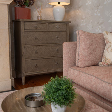
We were engaged to give this small lounge a bit of TLC; our clients wanted to make the room feel inviting to sit in. A bit lost, it was acting more like a corridor than a room, as it connects the front door and hallway, to the inner hall and the kitchen.
One of a number of reception rooms, this room in the stunning Georgian property was more of a relaxing space for TV watching and reading for her. It was important that this space had a feminine and homely feel, one that would invite you to sit and relax, whilst being in keeping with the age and location of this country home.
To do this we added warm tones such as muted pinks and warm neutrals with delicate patterns, such as florals and damasks. Keen not to close the room down but have adequate seating, we made the footstool/ottoman the same height as the sofa, so it could be used either as a coffee table, chaise end to the sofa, or as additional seating. We are reliably informed that this is now the go to room in the house for relaxing, which is fantastic.
18