
Search results for "Feel physically" in Home Design Ideas
 Fiorito Interior Design
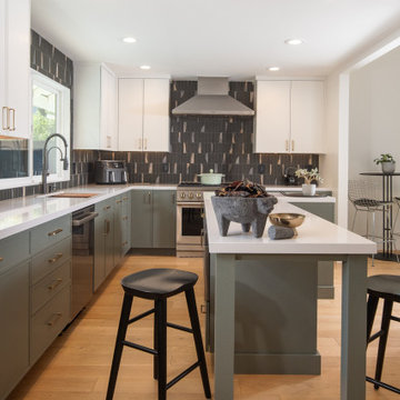
When I began this kitchen project, the space was constrained by an awkward peninsula and a dropped ceiling that compressed the room both physically and visually. Fluorescent fixtures sat behind a plastic diffuser, and the refrigerator was wedged beside the range, leaving the kitchen feeling crowded while also making poor use of the available space. The transformation began by taking things away. The dropped ceiling was removed, the fluorescent tubes went with it, and the room suddenly gained height and light. The peninsula was removed too, opening the floor plan and allowing the cabinetry to continue down an adjacent wall and incorporate a second window. What had been a small, enclosed kitchen became a generous working space with room for a slim, functional L-shaped island, additional cabinetry and, perhaps most importantly, a much more natural relationship between the different parts of the kitchen.
The palette is quiet, but there is a lot happening within it. Soft sage cabinetry grounds the room, while warm white upper cabinets and pantry cabinetry lift the space. A pure white quartz countertop provides a crisp surface against the cabinetry, and soft brass hardware adds just enough warmth. The new Sub Zero refrigerator was given its own wall, beside a full pantry, freeing the range wall to become a strong focal point. A Monogram range now sits centered beneath an angular stainless-steel Zephyr hood, framed by the kitchen's most distinctive element: a graphite backsplash made from WOW Design's Pottery tile. Inspired by Japanese handmade ceramics, the tiles have a wonderfully tactile, imperfect character. Most are deep graphite, but here and there the surface breaks into strokes of camel, dusty peach and deep blue-gunmetal glaze. There is an almost painterly quality to the way those colors move across the wall, giving the kitchen something that is difficult to achieve with a more uniform material—the feeling that someone actually made it.
The rest of the room was designed around that same balance of simplicity and warmth. New pale oak flooring runs throughout the ground floor, bringing a natural material and a soft golden tone beneath the cooler sage and graphite. Floating oak shelves flank the windows and provide a home for plants, ceramics and a few favorite objects, while another pair of shelves beside the refrigerator creates a small landing place for the things that inevitably arrive with you at the end of the day—keys, mail, bags and whatever else happens to be in your hands. The island occupies a surprisingly small footprint, yet its L-shaped form provides both additional work surface and seating without interrupting the flow of the room. A deep sink with an integrated cutting board and roll-up drying rack, a commercial-style faucet and under-cabinet LED lighting bring the practical details up to the same level of thoughtfulness as the larger design decisions. In the end, the renovation did more than just enlarge the kitchen; it created a space that feels calm, contemporary, warm, and a little unexpected … and, most importantly, we created a kitchen that finally makes sense for the way my clients live.
AFTER photos: Bernardo Grijalva
 Fiorito Interior Design
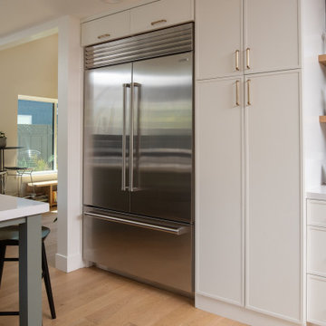
When I began this kitchen project, the space was constrained by an awkward peninsula and a dropped ceiling that compressed the room both physically and visually. Fluorescent fixtures sat behind a plastic diffuser, and the refrigerator was wedged beside the range, leaving the kitchen feeling crowded while also making poor use of the available space. The transformation began by taking things away. The dropped ceiling was removed, the fluorescent tubes went with it, and the room suddenly gained height and light. The peninsula was removed too, opening the floor plan and allowing the cabinetry to continue down an adjacent wall and incorporate a second window. What had been a small, enclosed kitchen became a generous working space with room for a slim, functional L-shaped island, additional cabinetry and, perhaps most importantly, a much more natural relationship between the different parts of the kitchen.
The palette is quiet, but there is a lot happening within it. Soft sage cabinetry grounds the room, while warm white upper cabinets and pantry cabinetry lift the space. A pure white quartz countertop provides a crisp surface against the cabinetry, and soft brass hardware adds just enough warmth. The new Sub Zero refrigerator was given its own wall, beside a full pantry, freeing the range wall to become a strong focal point. A Monogram range now sits centered beneath an angular stainless-steel Zephyr hood, framed by the kitchen's most distinctive element: a graphite backsplash made from WOW Design's Pottery tile. Inspired by Japanese handmade ceramics, the tiles have a wonderfully tactile, imperfect character. Most are deep graphite, but here and there the surface breaks into strokes of camel, dusty peach and deep blue-gunmetal glaze. There is an almost painterly quality to the way those colors move across the wall, giving the kitchen something that is difficult to achieve with a more uniform material—the feeling that someone actually made it.
The rest of the room was designed around that same balance of simplicity and warmth. New pale oak flooring runs throughout the ground floor, bringing a natural material and a soft golden tone beneath the cooler sage and graphite. Floating oak shelves flank the windows and provide a home for plants, ceramics and a few favorite objects, while another pair of shelves beside the refrigerator creates a small landing place for the things that inevitably arrive with you at the end of the day—keys, mail, bags and whatever else happens to be in your hands. The island occupies a surprisingly small footprint, yet its L-shaped form provides both additional work surface and seating without interrupting the flow of the room. A deep sink with an integrated cutting board and roll-up drying rack, a commercial-style faucet and under-cabinet LED lighting bring the practical details up to the same level of thoughtfulness as the larger design decisions. In the end, the renovation did more than just enlarge the kitchen; it created a space that feels calm, contemporary, warm, and a little unexpected … and, most importantly, we created a kitchen that finally makes sense for the way my clients live.
AFTER photos: Bernardo Grijalva
 Fiorito Interior Design
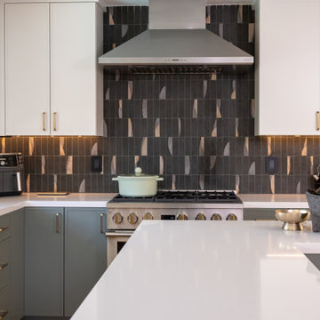
When I began this kitchen project, the space was constrained by an awkward peninsula and a dropped ceiling that compressed the room both physically and visually. Fluorescent fixtures sat behind a plastic diffuser, and the refrigerator was wedged beside the range, leaving the kitchen feeling crowded while also making poor use of the available space. The transformation began by taking things away. The dropped ceiling was removed, the fluorescent tubes went with it, and the room suddenly gained height and light. The peninsula was removed too, opening the floor plan and allowing the cabinetry to continue down an adjacent wall and incorporate a second window. What had been a small, enclosed kitchen became a generous working space with room for a slim, functional L-shaped island, additional cabinetry and, perhaps most importantly, a much more natural relationship between the different parts of the kitchen.
The palette is quiet, but there is a lot happening within it. Soft sage cabinetry grounds the room, while warm white upper cabinets and pantry cabinetry lift the space. A pure white quartz countertop provides a crisp surface against the cabinetry, and soft brass hardware adds just enough warmth. The new Sub Zero refrigerator was given its own wall, beside a full pantry, freeing the range wall to become a strong focal point. A Monogram range now sits centered beneath an angular stainless-steel Zephyr hood, framed by the kitchen's most distinctive element: a graphite backsplash made from WOW Design's Pottery tile. Inspired by Japanese handmade ceramics, the tiles have a wonderfully tactile, imperfect character. Most are deep graphite, but here and there the surface breaks into strokes of camel, dusty peach and deep blue-gunmetal glaze. There is an almost painterly quality to the way those colors move across the wall, giving the kitchen something that is difficult to achieve with a more uniform material—the feeling that someone actually made it.
The rest of the room was designed around that same balance of simplicity and warmth. New pale oak flooring runs throughout the ground floor, bringing a natural material and a soft golden tone beneath the cooler sage and graphite. Floating oak shelves flank the windows and provide a home for plants, ceramics and a few favorite objects, while another pair of shelves beside the refrigerator creates a small landing place for the things that inevitably arrive with you at the end of the day—keys, mail, bags and whatever else happens to be in your hands. The island occupies a surprisingly small footprint, yet its L-shaped form provides both additional work surface and seating without interrupting the flow of the room. A deep sink with an integrated cutting board and roll-up drying rack, a commercial-style faucet and under-cabinet LED lighting bring the practical details up to the same level of thoughtfulness as the larger design decisions. In the end, the renovation did more than just enlarge the kitchen; it created a space that feels calm, contemporary, warm, and a little unexpected … and, most importantly, we created a kitchen that finally makes sense for the way my clients live.
AFTER photos: Bernardo Grijalva
Find the right local pro for your project
 Fiorito Interior Design
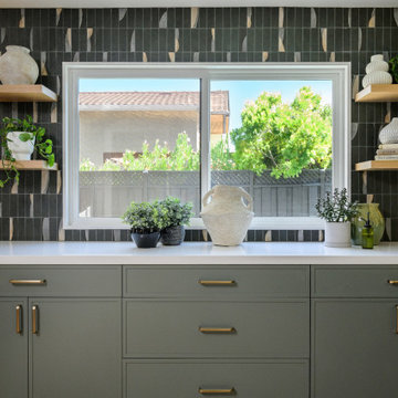
When I began this kitchen project, the space was constrained by an awkward peninsula and a dropped ceiling that compressed the room both physically and visually. Fluorescent fixtures sat behind a plastic diffuser, and the refrigerator was wedged beside the range, leaving the kitchen feeling crowded while also making poor use of the available space. The transformation began by taking things away. The dropped ceiling was removed, the fluorescent tubes went with it, and the room suddenly gained height and light. The peninsula was removed too, opening the floor plan and allowing the cabinetry to continue down an adjacent wall and incorporate a second window. What had been a small, enclosed kitchen became a generous working space with room for a slim, functional L-shaped island, additional cabinetry and, perhaps most importantly, a much more natural relationship between the different parts of the kitchen.
The palette is quiet, but there is a lot happening within it. Soft sage cabinetry grounds the room, while warm white upper cabinets and pantry cabinetry lift the space. A pure white quartz countertop provides a crisp surface against the cabinetry, and soft brass hardware adds just enough warmth. The new Sub Zero refrigerator was given its own wall, beside a full pantry, freeing the range wall to become a strong focal point. A Monogram range now sits centered beneath an angular stainless-steel Zephyr hood, framed by the kitchen's most distinctive element: a graphite backsplash made from WOW Design's Pottery tile. Inspired by Japanese handmade ceramics, the tiles have a wonderfully tactile, imperfect character. Most are deep graphite, but here and there the surface breaks into strokes of camel, dusty peach and deep blue-gunmetal glaze. There is an almost painterly quality to the way those colors move across the wall, giving the kitchen something that is difficult to achieve with a more uniform material—the feeling that someone actually made it.
The rest of the room was designed around that same balance of simplicity and warmth. New pale oak flooring runs throughout the ground floor, bringing a natural material and a soft golden tone beneath the cooler sage and graphite. Floating oak shelves flank the windows and provide a home for plants, ceramics and a few favorite objects, while another pair of shelves beside the refrigerator creates a small landing place for the things that inevitably arrive with you at the end of the day—keys, mail, bags and whatever else happens to be in your hands. The island occupies a surprisingly small footprint, yet its L-shaped form provides both additional work surface and seating without interrupting the flow of the room. A deep sink with an integrated cutting board and roll-up drying rack, a commercial-style faucet and under-cabinet LED lighting bring the practical details up to the same level of thoughtfulness as the larger design decisions. In the end, the renovation did more than just enlarge the kitchen; it created a space that feels calm, contemporary, warm, and a little unexpected … and, most importantly, we created a kitchen that finally makes sense for the way my clients live.
AFTER photos: Bernardo Grijalva
 Fiorito Interior Design
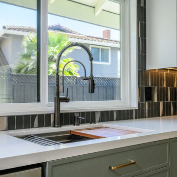
When I began this kitchen project, the space was constrained by an awkward peninsula and a dropped ceiling that compressed the room both physically and visually. Fluorescent fixtures sat behind a plastic diffuser, and the refrigerator was wedged beside the range, leaving the kitchen feeling crowded while also making poor use of the available space. The transformation began by taking things away. The dropped ceiling was removed, the fluorescent tubes went with it, and the room suddenly gained height and light. The peninsula was removed too, opening the floor plan and allowing the cabinetry to continue down an adjacent wall and incorporate a second window. What had been a small, enclosed kitchen became a generous working space with room for a slim, functional L-shaped island, additional cabinetry and, perhaps most importantly, a much more natural relationship between the different parts of the kitchen.
The palette is quiet, but there is a lot happening within it. Soft sage cabinetry grounds the room, while warm white upper cabinets and pantry cabinetry lift the space. A pure white quartz countertop provides a crisp surface against the cabinetry, and soft brass hardware adds just enough warmth. The new Sub Zero refrigerator was given its own wall, beside a full pantry, freeing the range wall to become a strong focal point. A Monogram range now sits centered beneath an angular stainless-steel Zephyr hood, framed by the kitchen's most distinctive element: a graphite backsplash made from WOW Design's Pottery tile. Inspired by Japanese handmade ceramics, the tiles have a wonderfully tactile, imperfect character. Most are deep graphite, but here and there the surface breaks into strokes of camel, dusty peach and deep blue-gunmetal glaze. There is an almost painterly quality to the way those colors move across the wall, giving the kitchen something that is difficult to achieve with a more uniform material—the feeling that someone actually made it.
The rest of the room was designed around that same balance of simplicity and warmth. New pale oak flooring runs throughout the ground floor, bringing a natural material and a soft golden tone beneath the cooler sage and graphite. Floating oak shelves flank the windows and provide a home for plants, ceramics and a few favorite objects, while another pair of shelves beside the refrigerator creates a small landing place for the things that inevitably arrive with you at the end of the day—keys, mail, bags and whatever else happens to be in your hands. The island occupies a surprisingly small footprint, yet its L-shaped form provides both additional work surface and seating without interrupting the flow of the room. A deep sink with an integrated cutting board and roll-up drying rack, a commercial-style faucet and under-cabinet LED lighting bring the practical details up to the same level of thoughtfulness as the larger design decisions. In the end, the renovation did more than just enlarge the kitchen; it created a space that feels calm, contemporary, warm, and a little unexpected … and, most importantly, we created a kitchen that finally makes sense for the way my clients live.
AFTER photos: Bernardo Grijalva
 Fiorito Interior Design
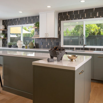
When I began this kitchen project, the space was constrained by an awkward peninsula and a dropped ceiling that compressed the room both physically and visually. Fluorescent fixtures sat behind a plastic diffuser, and the refrigerator was wedged beside the range, leaving the kitchen feeling crowded while also making poor use of the available space. The transformation began by taking things away. The dropped ceiling was removed, the fluorescent tubes went with it, and the room suddenly gained height and light. The peninsula was removed too, opening the floor plan and allowing the cabinetry to continue down an adjacent wall and incorporate a second window. What had been a small, enclosed kitchen became a generous working space with room for a slim, functional L-shaped island, additional cabinetry and, perhaps most importantly, a much more natural relationship between the different parts of the kitchen.
The palette is quiet, but there is a lot happening within it. Soft sage cabinetry grounds the room, while warm white upper cabinets and pantry cabinetry lift the space. A pure white quartz countertop provides a crisp surface against the cabinetry, and soft brass hardware adds just enough warmth. The new Sub Zero refrigerator was given its own wall, beside a full pantry, freeing the range wall to become a strong focal point. A Monogram range now sits centered beneath an angular stainless-steel Zephyr hood, framed by the kitchen's most distinctive element: a graphite backsplash made from WOW Design's Pottery tile. Inspired by Japanese handmade ceramics, the tiles have a wonderfully tactile, imperfect character. Most are deep graphite, but here and there the surface breaks into strokes of camel, dusty peach and deep blue-gunmetal glaze. There is an almost painterly quality to the way those colors move across the wall, giving the kitchen something that is difficult to achieve with a more uniform material—the feeling that someone actually made it.
The rest of the room was designed around that same balance of simplicity and warmth. New pale oak flooring runs throughout the ground floor, bringing a natural material and a soft golden tone beneath the cooler sage and graphite. Floating oak shelves flank the windows and provide a home for plants, ceramics and a few favorite objects, while another pair of shelves beside the refrigerator creates a small landing place for the things that inevitably arrive with you at the end of the day—keys, mail, bags and whatever else happens to be in your hands. The island occupies a surprisingly small footprint, yet its L-shaped form provides both additional work surface and seating without interrupting the flow of the room. A deep sink with an integrated cutting board and roll-up drying rack, a commercial-style faucet and under-cabinet LED lighting bring the practical details up to the same level of thoughtfulness as the larger design decisions. In the end, the renovation did more than just enlarge the kitchen; it created a space that feels calm, contemporary, warm, and a little unexpected … and, most importantly, we created a kitchen that finally makes sense for the way my clients live.
AFTER photos: Bernardo Grijalva
 Fiorito Interior Design
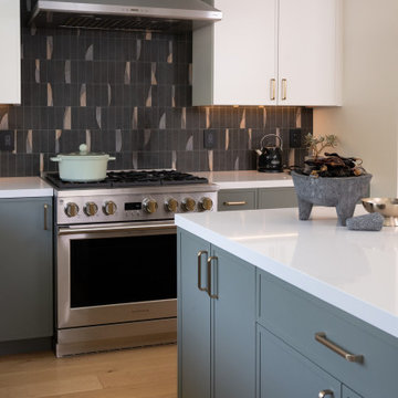
When I began this kitchen project, the space was constrained by an awkward peninsula and a dropped ceiling that compressed the room both physically and visually. Fluorescent fixtures sat behind a plastic diffuser, and the refrigerator was wedged beside the range, leaving the kitchen feeling crowded while also making poor use of the available space. The transformation began by taking things away. The dropped ceiling was removed, the fluorescent tubes went with it, and the room suddenly gained height and light. The peninsula was removed too, opening the floor plan and allowing the cabinetry to continue down an adjacent wall and incorporate a second window. What had been a small, enclosed kitchen became a generous working space with room for a slim, functional L-shaped island, additional cabinetry and, perhaps most importantly, a much more natural relationship between the different parts of the kitchen.
The palette is quiet, but there is a lot happening within it. Soft sage cabinetry grounds the room, while warm white upper cabinets and pantry cabinetry lift the space. A pure white quartz countertop provides a crisp surface against the cabinetry, and soft brass hardware adds just enough warmth. The new Sub Zero refrigerator was given its own wall, beside a full pantry, freeing the range wall to become a strong focal point. A Monogram range now sits centered beneath an angular stainless-steel Zephyr hood, framed by the kitchen's most distinctive element: a graphite backsplash made from WOW Design's Pottery tile. Inspired by Japanese handmade ceramics, the tiles have a wonderfully tactile, imperfect character. Most are deep graphite, but here and there the surface breaks into strokes of camel, dusty peach and deep blue-gunmetal glaze. There is an almost painterly quality to the way those colors move across the wall, giving the kitchen something that is difficult to achieve with a more uniform material—the feeling that someone actually made it.
The rest of the room was designed around that same balance of simplicity and warmth. New pale oak flooring runs throughout the ground floor, bringing a natural material and a soft golden tone beneath the cooler sage and graphite. Floating oak shelves flank the windows and provide a home for plants, ceramics and a few favorite objects, while another pair of shelves beside the refrigerator creates a small landing place for the things that inevitably arrive with you at the end of the day—keys, mail, bags and whatever else happens to be in your hands. The island occupies a surprisingly small footprint, yet its L-shaped form provides both additional work surface and seating without interrupting the flow of the room. A deep sink with an integrated cutting board and roll-up drying rack, a commercial-style faucet and under-cabinet LED lighting bring the practical details up to the same level of thoughtfulness as the larger design decisions. In the end, the renovation did more than just enlarge the kitchen; it created a space that feels calm, contemporary, warm, and a little unexpected … and, most importantly, we created a kitchen that finally makes sense for the way my clients live.
AFTER photos: Bernardo Grijalva

Sponsored
Delaware, OH

Buckeye Basements, Inc.
Central Ohio's Basement Finishing ExpertsBest Of Houzz '13-'21
 Architect
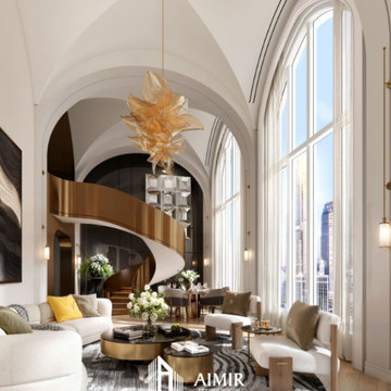
Not all architectural imagery is created equal. Some renderings look obviously computer-generated, with flat lighting and plastic-looking materials that fail to convince viewers. Others are so precise that they are indistinguishable from photographs. That second category, realistic architectural visualization rendering, has become the standard expectation for architects, developers, and marketers who need imagery capable of withstanding close scrutiny from investors, buyers, and planning authorities. As audiences grow more visually literate, the tolerance for obviously artificial, video-game-like imagery in professional presentations continues to shrink.
What Sets Realistic Visualization Apart
Realistic architectural visualization goes beyond simply modeling a building in three dimensions. It requires physically accurate lighting simulation, true-to-life material properties, and careful attention to the small imperfections that make real-world photography convincing, such as subtle reflections, ambient occlusion in corners, and natural depth of field. The goal is an image that a viewer would believe was captured by a camera on-site rather than generated by software. Achieving that level of believability typically means dozens of small adjustments layered on top of one another rather than any single dramatic setting.
Realistic Versus Stylized Rendering Approaches
Stylized or conceptual renderings still have their place, particularly in early design phases when a looser, more artistic representation helps convey mood without locking in every detail. But once a project moves toward marketing, investment, or permitting, stakeholders need to see exactly what they are getting. Realistic visualization removes ambiguity, showing true material colors, accurate proportions, and honest lighting conditions rather than idealized abstractions. Understanding which approach a project actually needs at each stage helps clients avoid paying for a level of polish that a given milestone does not yet require.
Why Realism Builds Client and Buyer Confidence
Buyers and investors are understandably skeptical of overly polished or unrealistic marketing images. When a rendering looks convincingly real, it builds trust rather than raising doubts about what the finished project will actually look like. This is especially important in real estate presales, where buyers are committing significant sums based largely on visual material rather than a finished physical space. A rendering that later turns out to have misrepresented the finished product can also create legal and reputational exposure for developers, making accuracy a genuine business risk rather than just an aesthetic preference.
The Technical Pillars Behind Every Realistic Scene
Achieving true realism depends on several technical disciplines working together: physically based rendering engines that simulate how light actually behaves, high-resolution texture libraries that replicate real materials like stone, wood, and glass, and careful camera work that mimics real photographic lenses and exposure. Post-production adds a final layer of color grading and atmospheric effects that ties everything together into a cohesive, believable image. Each of these pillars depends on the others; even flawless material work can be undermined by lighting that behaves in a physically implausible way.
Applications Across Residential, Commercial, and Institutional Projects
Realistic visualization serves a wide range of building types, from single-family homes and luxury condominiums to office towers, hotels, schools, and healthcare facilities. Each typology has its own material palette and lighting expectations, and an experienced studio adjusts its approach accordingly, whether that means warm, inviting tones for a residential lobby or crisp, professional lighting for a corporate headquarters. Institutional clients such as universities and hospitals often have additional requirements around accessibility signage and wayfinding, which need to be represented accurately alongside the architecture itself.
How AIMIR CG Delivers Photorealistic Accuracy
Our studio specializes in realistic architectural visualization rendering that holds up under close inspection. Every project moves through a disciplined pipeline of modeling, texturing, lighting, and post-production review, with artists cross-checking material references and lighting studies against real-world photography. This attention to detail is why clients consistently describe our end product as impressive and our process as easy to work with. A dedicated quality review stage before delivery catches inconsistencies that might otherwise slip through a faster, less structured pipeline.
Common Challenges in Achieving True Realism
Realistic rendering is technically demanding. Common obstacles include accurately simulating how light bounces between surfaces, matching material reflectivity to real product specifications, and avoiding the uncanny, slightly artificial look that comes from over-processed images. Overcoming these challenges requires experienced artists who understand both the science of light and the craft of photography, not just software proficiency. Rushed production schedules are often the real culprit behind unconvincing renderings, since realism typically requires several iterative passes rather than a single render.
What to Look for in a Realism-Focused Rendering Studio
When evaluating a rendering partner, review their portfolio critically. Do the images include convincing shadow detail and material variation, or do surfaces look uniformly smooth and artificial? Ask about their revision process and how closely they work with architects to source accurate material and lighting references, since realism is ultimately the product of disciplined collaboration, not a single software setting. It also helps to ask for examples of past projects in a similar building type, since a studio's strengths can vary across typologies.
Ready for Renderings That Look Real
If your project deserves imagery that can stand up to the scrutiny of investors, buyers, and planning boards, AIMIR CG is ready to help. Our team combines technical precision with artistic judgment to deliver visualization that looks and feels genuinely real. Contact us to discuss how photorealistic rendering can strengthen your next presentation or marketing campaign, and let us show you examples from projects similar to your own.
 One Eleven Joule
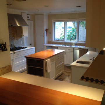
Kitchen remodel includes pushing window wall 4' out, replacing 3' wide window with an 8' wide Pella window and adding a pantry and island with a butcher block top. Relocated ovens and cooktop and added a prep sink. Cabinets are a combination of Ikea and custom built and taken to ceiling to make the 8' ceiling height appear taller. Sink area has two dishwashers with tall dish and glass pantries to either side.
 StudioLAB
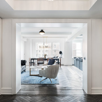
Across from Hudson River Park, the Classic 7 pre-war apartment had not renovated in over 50 years. The new owners, a young family with two kids, desired to open up the existing closed in spaces while keeping some of the original, classic pre-war details. Dark, dimly-lit corridors and clustered rooms that were a detriment to the brilliant natural light and expansive views the existing apartment inherently possessed, were demolished to create a new open plan for a more functional style of living. Custom charcoal stained white oak herringbone floors were laid throughout the space. The dark blue lacquered kitchen cabinets provide a sharp contrast to the otherwise neutral colored space. A wall unit in the same blue lacquer floats on the wall in the Den.
 SM Design
York Mills Residence | Layered Contemporary Elegance
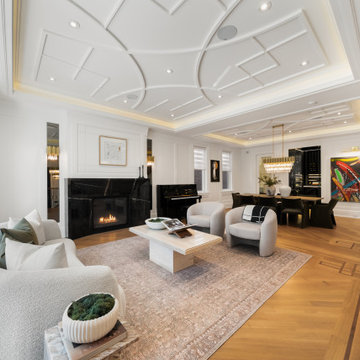
This York Mills residence was designed around the idea of quiet luxury expressed through architectural detail rather than excess. The interior combines classical residential proportions with contemporary forms, creating a sophisticated environment that feels highly curated while remaining comfortable and inviting for everyday living.
A key design strategy was to establish a continuous architectural language across the connected living, dining, and circulation spaces. Rather than designing each zone independently, the spaces are visually tied together through consistent wall paneling, warm oak flooring, carefully controlled neutral tones, and a coordinated lighting strategy. This creates a strong sense of continuity and allows the eye to move naturally through the home.
The ceiling design plays an important role in defining the character of the interior. Elaborate geometric and curved coffering introduces a sculptural element overhead, transforming the ceiling into a fifth architectural surface. The integrated perimeter illumination emphasizes these forms after dark, while recessed lighting provides functional illumination without competing with the decorative architecture.
The black stone fireplace provides a deliberate counterpoint to the predominantly light interior. Its strong visual weight anchors the living area and establishes a dramatic focal point, while the softer curved seating and neutral upholstery balance its intensity. This contrast between monumental architectural elements and tactile, rounded furnishings gives the room a contemporary character without losing its residential warmth.
Furniture planning was approached as an exercise in conversation, proportion, and movement. The seating arrangement creates an intimate conversational zone while maintaining a clear visual and physical connection to the dining area. The curved forms soften the geometry of the architecture and introduce a more relaxed human scale within the larger room.
The dining area extends the social function of the space and is visually framed by the architectural detailing and artwork. A sculptural chandelier establishes a focal point above the dining table, while the large-scale artwork introduces color, energy, and individuality into the otherwise restrained palette. This balance between a controlled architectural background and expressive art allows the homeowner's personality to become part of the design.
The flooring contributes another layer of craftsmanship. The warm wood surface establishes continuity throughout the open interior, while geometric floor detailing and directional patterns subtly define zones without relying on physical partitions. This allows the architecture to remain open while still providing a sense of hierarchy and spatial organization.
Artwork, decorative objects, greenery, and furnishings were intentionally selected to introduce moments of color, texture, softness, and visual contrast. The result is not a purely minimalist interior; instead, it is a layered composition in which restraint provides the foundation for carefully selected moments of expression.
Overall, the project reflects a contemporary approach to traditional luxury, architectural, highly detailed, and timeless, but never overly formal. The design prioritizes proportion, craftsmanship, material relationships, natural light, and the experience of moving through the home, creating an interior that functions as both an elegant entertaining environment and a comfortable everyday living space.
 Cassoni Furniture & Accessories
- RIDDLED TABLE 2.
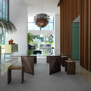
The originality and workmanship of its legs are the outstanding features of the Riddled table, which incorporates the notion of porosity found in multiple architecture works by Steven Holl. The thin sheets of wood, folded through laser engraving, make this project even more spectacular in its apparent defiance of the laws of physics. These four legs, akin to origami sculptures, allow the passage of the internal light to create a myriad of lights and shadows.
98''3/8W x 78''3/4D x 28''3/8H.
http://ow.ly/3yAozT
- RIPPLES STOOL.
The Ripples bench by Toyo Ito, winner of the 2004 Golden Compass, has blossomed into a collection of different furniture complements. Amongst them, we may highlight the Ripples stool, fabricated with a laminated composite of five different solid woods. The seat shape, carved with industrial technology yet entirely hand-finished, feels soft and rich due to both the ductility of wood and Horm's passion for craftsmanship. Slide your hand along the surface to feel the seamless transition between walnut, mahogany, cherry, oak and ash.
16''1/8W x 16''1/8D x 17''3/4H.
16''1/8W x 16''1/8D x 30''3/8H.
http://ow.ly/3yzwu5
- TIDE SIDEBOARD 01.
Tide reflects the style of its designer, Karim Rashid, who worked with various movements and dynamics in this project. The horizontal development of the front, made of evenly-spaced, thin sheets of MDF, confers a gentle and sculptured aspect to the whole. In addition to its remarkable design, Tide appears as a capacious and functional cupboard, with two drawers and a flap front for the living room, or with two drawers and two deep drawers for the bedroom.
75''5/8W x 23''5/8D x 26’’H.
Other height: 31''1/2 - 37’’3/4.
http://ow.ly/3yAoCT
- RIDDLED TOTEM BOOKCASE.
A true work of art, it consists of an aluminium frame and five elements made of origami-folded 2-mm wooden sheets thanks to a complex and patented technological process. Riddled Totem conveys great charm and elegance through its sculptural volumes, already characterized by the typical perforated texture of many famous works by Steven Holl. The result is a faceted container, light and bright as a diamond but made of wood following Horm's unmistakable style.
27''5/8W x 19''5/8D x 80''3/4H.
http://ow.ly/3yAoEx
 Alykhan Velji Design
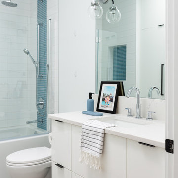
Inspiration for a contemporary gray floor bathroom remodel in Calgary with flat-panel cabinets, white cabinets, white walls, an undermount sink and white countertops
Sponsored
Sunbury, OH

J.Holderby - Renovations
Franklin County's Leading General Contractors - 2X Best of Houzz!

 Coco Atelier
TER won an honorary mention as a part of the YAC’s Calamity Atelier Competition, in addition to the prestigious A' Design Award for Interior Space & Exhibition Design 2019-2020.
The Calamity Atelier competition was based in the art forest of Arte Sella in northern Italy that was in recent years destroyed by a storm. The focus was to bring back life to the forest through the design of a number of spaces.
Design concept description:
Stability is a universal value one seeks to reach in their lifetime.
Given the recent events that shook the core of Art Sella, the basis of its recovery should be in the form of a stable foundation.
The design concept of TER, Malga Costa’s new restaurant expansion, derives from 3 main ideas:
1. What does a “stable” space feel like? Psychologically and physically.
2. The connection between the forest land and the food that is served at the restaurant.
3. How to integrate this space harmoniously into the forest in a way in which it will live cohesively with the neighboring artwork, nature, and people.
The idea of stability is translated through mass, shape, and materials. Different from most of the forest’s artwork, TER looks like a massive boulder rearing in the forest. The stone exterior makes up the majority of the interior as well, acting as its base material.
With the materials, there is a clear balance of old and new. The old acts as the foundation and pays homage to the area’s roots whereas the new alludes to a burgeoning future. Together, they play a game of layering and develop throughout the space.
The connection between the land and the food comes through the method of cooking in the restaurant- which is campfire cooking. In the center of the plan, there is an open outdoor space that is used to cook foods on an open fire. The plan is designed in a circular motion around the open space in order to fully commit to this concept. Everyone in the four areas of the restaurant can view and enjoy the chefs at work, creating a seemingly interactive dining experience.
The restaurant blends into its surroundings by acting as another rock in the landscape. It is differentiated by the smoke arising from its center, which creates a sense of allure and intrigue. It’s a sight that draws people in toward the center – reestablishing the core essence of Art Sella.
 Jack Calderone
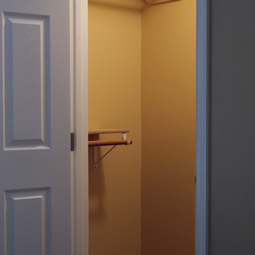
This bedroom and full bathroom are part of an adventuresome project my wife and I embarked upon to create a complete apartment in the basement of our townhouse. We designed a floor plan that creatively and efficiently used all of the 385-square-foot-space, without sacrificing beauty, comfort or function – and all without breaking the bank! To maximize our budget, we did the work ourselves and added everything from thrift store finds to DIY wall art to bring it all together.
A partial double closet bar adds a little extra space while still leaving room for longer hanging clothes.
 contact7524
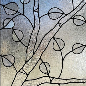
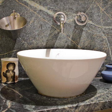
This stained glass window was created as part of our signature Aspen Stained Glass line. These windows look beautiful in cottage style or contemporary homes and are a great way for outdoor enthusiasts to celebrate their love of nature. The textured appearance of the glass provides the homeowners with a high level of privacy and comfort.



 Sabouri Interiors
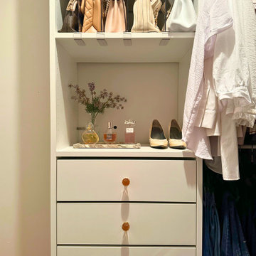
When our client approached us with a budget of $1,000 and a two-month timeline, she was looking to revive her outdated walk-in closet. The old setup was literally falling apart and so cramped that it hardly lived up to the name "walk-in." Our mission was to breathe new life into this space, transforming it into a functional and inviting retreat.
We kicked off the transformation by applying fresh paint and crafting custom storage solutions that precisely matched our client's needs. She had been struggling with locating her shoes, hidden away in old shoe boxes, and her handbags scattered throughout. Our solution was a wallet-friendly, adaptable shoe storage system that keeps everything in sight and easily accessible, evolving right along with her collection.
One of our client's priorities was ensuring comfort for her adorable, cuddly dogs who love spending time in the closet. We chose a washable rug that not only complements the decor but also withstands the occasional mess, maintaining a cozy vibe.
Adding a personal touch, we showcased her cherished wedding shoes and incorporated vintage knobs from her daughter's nursery into the design, making the closet feel uniquely hers.
To streamline her daily routine, we introduced a practical, stylish hamper on wheels, enabling easy transport of laundry from the closet to the laundry room.
The decluttering process was initially overwhelming for our client. With patience and a fresh perspective, we helped her let go of five bags of high-quality clothes and shoes. This not only cleared up physical space but also made room for new beginnings and experiences in her life.
This project was much more than a simple renovation; it was about creating a space that reflects and supports our client's lifestyle, complete with thoughtful touches that make it truly special.
 Sabouri Interiors
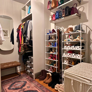
When our client approached us with a budget of $1,000 and a two-month timeline, she was looking to revive her outdated walk-in closet. The old setup was literally falling apart and so cramped that it hardly lived up to the name "walk-in." Our mission was to breathe new life into this space, transforming it into a functional and inviting retreat.
We kicked off the transformation by applying fresh paint and crafting custom storage solutions that precisely matched our client's needs. She had been struggling with locating her shoes, hidden away in old shoe boxes, and her handbags scattered throughout. Our solution was a wallet-friendly, adaptable shoe storage system that keeps everything in sight and easily accessible, evolving right along with her collection.
One of our client's priorities was ensuring comfort for her adorable, cuddly dogs who love spending time in the closet. We chose a washable rug that not only complements the decor but also withstands the occasional mess, maintaining a cozy vibe.
Adding a personal touch, we showcased her cherished wedding shoes and incorporated vintage knobs from her daughter's nursery into the design, making the closet feel uniquely hers.
To streamline her daily routine, we introduced a practical, stylish hamper on wheels, enabling easy transport of laundry from the closet to the laundry room.
The decluttering process was initially overwhelming for our client. With patience and a fresh perspective, we helped her let go of five bags of high-quality clothes and shoes. This not only cleared up physical space but also made room for new beginnings and experiences in her life.
This project was much more than a simple renovation; it was about creating a space that reflects and supports our client's lifestyle, complete with thoughtful touches that make it truly special.
 Sabouri Interiors
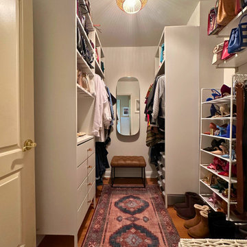
When our client approached us with a budget of $1,000 and a two-month timeline, she was looking to revive her outdated walk-in closet. The old setup was literally falling apart and so cramped that it hardly lived up to the name "walk-in." Our mission was to breathe new life into this space, transforming it into a functional and inviting retreat.
We kicked off the transformation by applying fresh paint and crafting custom storage solutions that precisely matched our client's needs. She had been struggling with locating her shoes, hidden away in old shoe boxes, and her handbags scattered throughout. Our solution was a wallet-friendly, adaptable shoe storage system that keeps everything in sight and easily accessible, evolving right along with her collection.
One of our client's priorities was ensuring comfort for her adorable, cuddly dogs who love spending time in the closet. We chose a washable rug that not only complements the decor but also withstands the occasional mess, maintaining a cozy vibe.
Adding a personal touch, we showcased her cherished wedding shoes and incorporated vintage knobs from her daughter's nursery into the design, making the closet feel uniquely hers.
To streamline her daily routine, we introduced a practical, stylish hamper on wheels, enabling easy transport of laundry from the closet to the laundry room.
The decluttering process was initially overwhelming for our client. With patience and a fresh perspective, we helped her let go of five bags of high-quality clothes and shoes. This not only cleared up physical space but also made room for new beginnings and experiences in her life.
This project was much more than a simple renovation; it was about creating a space that reflects and supports our client's lifestyle, complete with thoughtful touches that make it truly special.
19