
Search results for "Feeling reduce" in Home Design Ideas
 Genesis Window Tinting
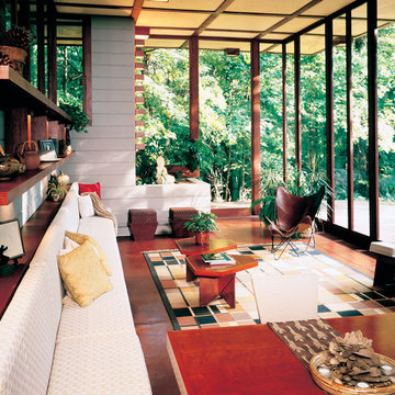
Modern Mid-Century home with floor to ceiling windows Maintains the view with natural light with reduced glare Photo Courtesy of Eastman
Living room - large living room idea in Sacramento
Living room - large living room idea in Sacramento
 Advanced Solar Protection
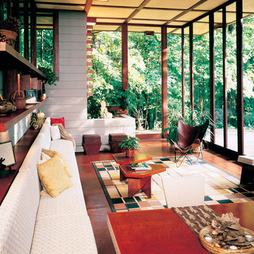
Modern Mid-Century home with floor to ceiling windows Maintains the view with natural light with reduced glare Photo Courtesy of Eastman
Example of a mid-century modern sunroom design in Boston
Example of a mid-century modern sunroom design in Boston
 Susan Friedman Landscape Architecture
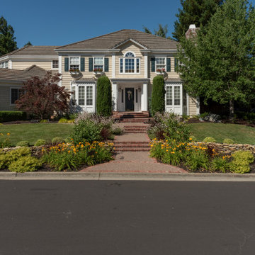
The new grand and welcoming entrance provides a softer, more inviting feel to the home's Colonial Style architecture, while maintaining an old-world charm.
Find the right local pro for your project
 Auger Property Maintenance Services
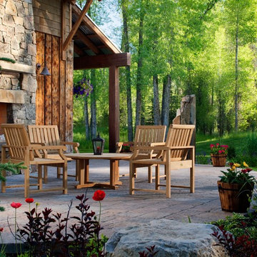
Inspiration for a rustic backyard concrete paver patio remodel in Boston with no cover and a fireplace
 TKS Design Group
Download our free ebook, Creating the Ideal Kitchen. DOWNLOAD NOW
This family from Wheaton was ready to remodel their kitchen, dining room and powder room. The project didn’t call for any structural or space planning changes but the makeover still had a massive impact on their home. The homeowners wanted to change their dated 1990’s brown speckled granite and light maple kitchen. They liked the welcoming feeling they got from the wood and warm tones in their current kitchen, but this style clashed with their vision of a deVOL type kitchen, a London-based furniture company. Their inspiration came from the country homes of the UK that mix the warmth of traditional detail with clean lines and modern updates.
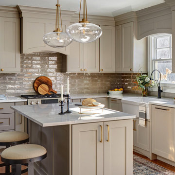
To create their vision, we started with all new framed cabinets with a modified overlay painted in beautiful, understated colors. Our clients were adamant about “no white cabinets.” Instead we used an oyster color for the perimeter and a custom color match to a specific shade of green chosen by the homeowner. The use of a simple color pallet reduces the visual noise and allows the space to feel open and welcoming. We also painted the trim above the cabinets the same color to make the cabinets look taller. The room trim was painted a bright clean white to match the ceiling.
In true English fashion our clients are not coffee drinkers, but they LOVE tea. We created a tea station for them where they can prepare and serve tea. We added plenty of glass to showcase their tea mugs and adapted the cabinetry below to accommodate storage for their tea items. Function is also key for the English kitchen and the homeowners. They requested a deep farmhouse sink and a cabinet devoted to their heavy mixer because they bake a lot. We then got rid of the stovetop on the island and wall oven and replaced both of them with a range located against the far wall. This gives them plenty of space on the island to roll out dough and prepare any number of baked goods. We then removed the bifold pantry doors and created custom built-ins with plenty of usable storage for all their cooking and baking needs.
The client wanted a big change to the dining room but still wanted to use their own furniture and rug. We installed a toile-like wallpaper on the top half of the room and supported it with white wainscot paneling. We also changed out the light fixture, showing us once again that small changes can have a big impact.
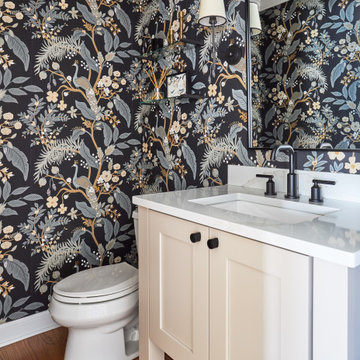
As the final touch, we also re-did the powder room to be in line with the rest of the first floor. We had the new vanity painted in the same oyster color as the kitchen cabinets and then covered the walls in a whimsical patterned wallpaper. Although the homeowners like subtle neutral colors they were willing to go a bit bold in the powder room for something unexpected. For more design inspiration go to: www.kitchenstudio-ge.com
 Carter Decor
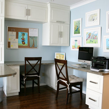
Example of a mid-sized trendy built-in desk medium tone wood floor home office design in Montreal with blue walls
 TKS Design Group
Download our free ebook, Creating the Ideal Kitchen. DOWNLOAD NOW
This family from Wheaton was ready to remodel their kitchen, dining room and powder room. The project didn’t call for any structural or space planning changes but the makeover still had a massive impact on their home. The homeowners wanted to change their dated 1990’s brown speckled granite and light maple kitchen. They liked the welcoming feeling they got from the wood and warm tones in their current kitchen, but this style clashed with their vision of a deVOL type kitchen, a London-based furniture company. Their inspiration came from the country homes of the UK that mix the warmth of traditional detail with clean lines and modern updates.
To create their vision, we started with all new framed cabinets with a modified overlay painted in beautiful, understated colors. Our clients were adamant about “no white cabinets.” Instead we used an oyster color for the perimeter and a custom color match to a specific shade of green chosen by the homeowner. The use of a simple color pallet reduces the visual noise and allows the space to feel open and welcoming. We also painted the trim above the cabinets the same color to make the cabinets look taller. The room trim was painted a bright clean white to match the ceiling.
In true English fashion our clients are not coffee drinkers, but they LOVE tea. We created a tea station for them where they can prepare and serve tea. We added plenty of glass to showcase their tea mugs and adapted the cabinetry below to accommodate storage for their tea items. Function is also key for the English kitchen and the homeowners. They requested a deep farmhouse sink and a cabinet devoted to their heavy mixer because they bake a lot. We then got rid of the stovetop on the island and wall oven and replaced both of them with a range located against the far wall. This gives them plenty of space on the island to roll out dough and prepare any number of baked goods. We then removed the bifold pantry doors and created custom built-ins with plenty of usable storage for all their cooking and baking needs.
The client wanted a big change to the dining room but still wanted to use their own furniture and rug. We installed a toile-like wallpaper on the top half of the room and supported it with white wainscot paneling. We also changed out the light fixture, showing us once again that small changes can have a big impact.
As the final touch, we also re-did the powder room to be in line with the rest of the first floor. We had the new vanity painted in the same oyster color as the kitchen cabinets and then covered the walls in a whimsical patterned wallpaper. Although the homeowners like subtle neutral colors they were willing to go a bit bold in the powder room for something unexpected. For more design inspiration go to: www.kitchenstudio-ge.com

Sponsored
Columbus, OH
Free consultation for landscape design!

Peabody Landscape Group
Franklin County's Reliable Landscape Design & Contracting
 KMG Interiors
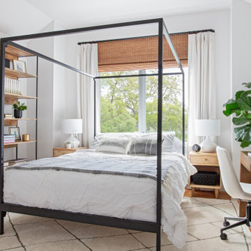
Mid-sized trendy guest light wood floor, brown floor and brick wall bedroom photo in Charleston with white walls
 Nathan Taylor for Obelisk Home
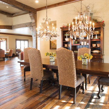
The interior of the home went from Colonial to Classic Lodge without changing the footprint of the home. Columns were removed, fur downs removed that defined space, fireplace relocated, kitchen layout and direction changed, breakfast room and sitting room flip flopped, study reduced in size, entry to master bedroom changed, master suite completely re-arranged and enlarged, custom hand railing designed to open up stairwell, hardwood added to stairs, solid knotty alder 8’ doors added, knotty alder crown moldings added, reclaimed beamed ceiling grid, tongue and groove ceiling in kitchen, knotty alder cabinetry, leather finish to granite, seeded glass insets, custom door to panty to showcase an antique stained glass window from childhood church, custom doors and handles made for study entry, shredded straw added to wall texture, custom glazing done to all walls, wood floor remnants created an antique quilt pattern for the back wall of the powder bath, custom wall treatment created by designer, and a mixture of new and antique furnishing were added, all to create a warm, yet lived in feeling for this special family.
A new central stone wall reversed with an over scaled fireplace and reclaimed flooring from the East became the anchor for this level of the home. Removing all the “divisions” of space and using a unified surface made unused rooms, part of the daily living for this family. The desire to entertain large group in a unified space, yet still feel like you are in a cozy environment was the driving force for removing divisions of space.
Photos by Randy Colwell
 Freeman Design Group
A 1970’s addition on the rear of this house awkwardly consumed the entire backyard and reduced natural light to the interior, creating a dark kitchen and dining room. This project was a unique one in that we actually reduced the square footage. One of the advantages of living in California is that a backyard can easily serve as an extra room - with dining, entertainment, and lounge space usable for most of the year.
In order to maximize natural daylight into the heart of the home, two large bi-folding patio doors were installed in the kitchen and dining room. This creates a strong connection to the backyard entertainment space, complete with an exterior kitchen and fire-pit seating area.
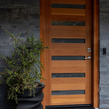
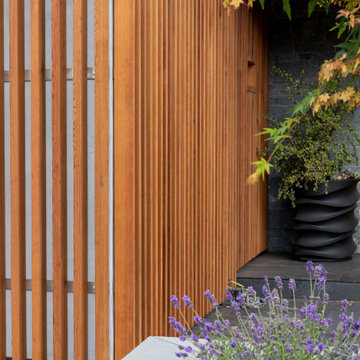
The exterior of the house was redesigned to compliment a modern landscape project. A cedar rain screen leads guests to the front door - shifting the visual emphasis to the front door and reducing the prominence of the garage. The cedar gave the facade a modern, warm feel and differentiated the house from it’s neighbors
 Boyenga Team / Compass
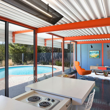
Eichler X-100 Kitchen: A Futuristic Vision of Function and Design
The kitchen of the Eichler X-100 is not just a place to cook—it is a designed system, a forward-thinking experiment in how everyday living could be streamlined, modernized, and elevated through architecture. Envisioned by A. Quincy Jones and Frederick Emmons for Joseph Eichler, the space reflects a bold reimagining of the American kitchen in the mid-20th century.
A Central Hub of the Home
Positioned within the home’s central utility core, the kitchen is strategically located to connect all major living zones. Rather than being tucked away, it becomes a functional anchor, allowing for seamless interaction between cooking, dining, and gathering spaces.
This layout reinforces Eichler’s philosophy:
the kitchen is not separate—it’s part of everyday life.
Innovation Built In
What sets the X-100 kitchen apart is its integration of experimental, built-in features that were far ahead of their time.
Highlights include:
A sliding dining table with integrated electric burners, blending cooking and dining into one continuous experience
Built-in appliances and systems, designed to reduce clutter and maximize efficiency
Thoughtful ergonomic planning that simplifies daily routines
These elements reflect a larger idea:
that the home should work for you—not the other way around.
Material as Modern Expression
The kitchen showcases extensive use of laminate surfaces (Formica)—a material that, in the 1950s, symbolized innovation, durability, and modern living. Clean, smooth, and easy to maintain, these surfaces reinforce the home’s futuristic identity.
Paired with steel structure and clean lines, the material palette creates a space that feels both industrial and approachable.
Open, Light-Filled Design
True to the X-100’s overall concept, the kitchen is fully integrated into the open-plan layout. Sightlines extend outward to living areas, glass walls, and even interior gardens, ensuring the space never feels enclosed.
Natural light filters in from multiple directions, enhanced by skylights and reflective surfaces, giving the kitchen a bright, uplifting atmosphere throughout the day.
A Prototype for Modern Living
In many ways, the X-100 kitchen anticipated how we live today:
Open-concept layouts
Multi-functional islands and dining spaces
Integrated appliances
Clean, minimal design
What feels standard now was radical in 1956.
Where Design Meets Daily Life
The kitchen of the Eichler X-100 is a perfect example of how architecture can elevate the everyday. It transforms routine into experience—where cooking, gathering, and living all happen within a single, beautifully orchestrated space.
It’s not just a kitchen.
It’s a glimpse into the future—designed decades ahead of its time.
 Freeman Design Group
A 1970’s addition on the rear of this house awkwardly consumed the entire backyard and reduced natural light to the interior, creating a dark kitchen and dining room. This project was a unique one in that we actually reduced the square footage. One of the advantages of living in California is that a backyard can easily serve as an extra room - with dining, entertainment, and lounge space usable for most of the year.
In order to maximize natural daylight into the heart of the home, two large bi-folding patio doors were installed in the kitchen and dining room. This creates a strong connection to the backyard entertainment space, complete with an exterior kitchen and fire-pit seating area.
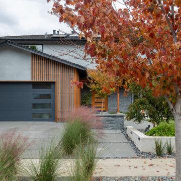
The exterior of the house was redesigned to compliment a modern landscape project. A cedar rain screen leads guests to the front door - shifting the visual emphasis to the front door and reducing the prominence of the garage. The cedar gave the facade a modern, warm feel and differentiated the house from it’s neighbors
 Freeman Design Group
A 1970’s addition on the rear of this house awkwardly consumed the entire backyard and reduced natural light to the interior, creating a dark kitchen and dining room. This project was a unique one in that we actually reduced the square footage. One of the advantages of living in California is that a backyard can easily serve as an extra room - with dining, entertainment, and lounge space usable for most of the year.
In order to maximize natural daylight into the heart of the home, two large bi-folding patio doors were installed in the kitchen and dining room. This creates a strong connection to the backyard entertainment space, complete with an exterior kitchen and fire-pit seating area.
The exterior of the house was redesigned to compliment a modern landscape project. A cedar rain screen leads guests to the front door - shifting the visual emphasis to the front door and reducing the prominence of the garage. The cedar gave the facade a modern, warm feel and differentiated the house from it’s neighbors


 IQnewswire
The End of the Ultra-Slim Wedding Suit
For several years, men’s formalwear was dominated by narrow lapels, short jackets and trousers cut close to the leg. The style created a sharp outline, but it often left little room for sitting, dancing or eating comfortably. Current tailoring is moving towards a more balanced shape, with cleaner shoulders, a defined waist and trousers that follow the leg without gripping it.This change does not mean that wedding suits have become oversized. The newer approach sits between skinny and loose. It keeps the structure expected of formal clothing while allowing the cloth to hang properly. For grooms, that balance is useful during a day that may involve a ceremony, photographs, dinner and several hours on the dance floor.
Look For Shape Rather Than Tightness
A well-fitted suit should create a clear outline without relying on tension. Collections of Marc Darcy suits include tailored three-piece designs, checks and textured fabrics that suit the current preference for visible structure and considered proportions.
The jacket should sit close enough to define the waist, but the front button should fasten without pulling the cloth into an X-shaped crease. At the shoulders, the seam should finish close to the natural shoulder point. Extra width can make the jacket look borrowed, while a shoulder that is too narrow may cause the upper sleeve to collapse.
Fit should be assessed while moving as well as standing. Reach forward, sit down and raise both arms. A tailored jacket will never feel like casual sportswear, but it should allow the groom to carry out ordinary movements without sharp restriction across the back or chest.
Give The Jacket Enough Length
Very short suit jackets became common alongside skinny trousers, but they can disrupt the proportions of a three-piece outfit. If the jacket finishes too high, the waistcoat may appear longer than the outer layer and the trousers may look as though they begin too low.
A more traditional jacket length usually covers most of the seat and divides the body more evenly. This can make the legs appear longer without shortening the jacket excessively. The correct length depends on height and body proportions, so two men wearing the same chest size may still need different jacket lengths.
View the suit from the back and side rather than relying on a front-facing mirror. The vents should lie flat, and the hem should not lift away from the body. A side photograph can reveal an unbalanced jacket more clearly than the changing-room mirror.
Choose Trousers That Fall Cleanly
The move away from very tight tailoring is most noticeable in suit trousers. A modern tailored leg can still be neat at the ankle, but it should provide enough room through the seat and thigh for the fabric to fall without horizontal lines.
Trouser pockets offer a useful fit check. If they pull open while standing, the waist or hips may be too tight. The fly should lie flat, and the waistband should remain in place without depending on an overtightened belt. Higher-rise trousers can work particularly well with a waistcoat because they reduce the chance of shirt fabric appearing between the two pieces.
The hem should make gentle contact with the shoe rather than gathering heavily around it. A short hem can work with narrow trousers but taking it too far may make the suit look dated once the current cropped style moves on. A slight break is easier to wear with different formal shoes and tends to look balanced in full-length wedding photographs.
Let The Waistcoat Support the Silhouette
A waistcoat adds structure through the centre of the outfit, but only when it fits correctly. It should lie flat against the shirt and cover the trouser waistband. Tightening the back strap cannot correct a waistcoat that is the wrong size or too short.
Current three-piece styling often places greater emphasis on the waistcoat. Double-breasted designs, contrasting fabrics and wider openings can distinguish the groom without requiring a brightly coloured jacket. When the groom removes the jacket later, the waistcoat keeps the outfit looking complete.
Allow room for a full meal and several hours of wear. A waistcoat that feels acceptably close during a brief fitting may become uncomfortable at dinner. Sit down with every button fastened and check whether the lower edge presses into the waist or causes the front to bow.
Use Stronger Lapels Carefully
Wider notch and peak lapels are returning after years of extremely narrow designs. A broader lapel can frame the shirt and tie, balance the shoulders and give the jacket a more formal character. Peak lapels create a particularly strong line on double-breasted jackets and evening suits.
The lapel width should still suit the wearer. A very broad lapel can overwhelm a smaller frame, while an extremely narrow one may look out of proportion on a broad chest. The shirt collar, tie width and lapel should relate to one another without matching exactly.
A wider lapel also leaves less need for decorative extras. A simple buttonhole flower or plain pocket square may be enough. Large lapel pins can crowd the upper part of the jacket, especially when the cloth already contains a check.
Avoid Buying According to the Size Label Alone
The same labelled size can fit differently across designs because cut, fabric and construction affect the garment. Begin with accurate chest, waist, inside-leg and approximate jacket-length measurements. Compare those figures with the retailer’s size information rather than ordering the size worn in another brand without checking.
If the jacket fits at the shoulders but needs slight shaping through the waist, a tailor can often make the adjustment. Sleeves and trouser hems are also commonly altered. Major changes to the shoulder line or jacket length are more difficult and may not be economical.
Do not choose the smallest size that can be fastened. A suit that looks tight in the fitting room is unlikely to become more comfortable during a long wedding day. Cloth should skim the body and return to a clean position after movement.
Balance a checked suit with simple styling
Texture and checks remain popular in wedding tailoring, particularly for country houses, converted barns and traditional venues. These fabrics already add depth to the outfit, so the cut should remain controlled and the accessories relatively quiet.
A plain white, pale blue or cream shirt gives a checked suit a clear foundation. Choose a tie from one of the secondary colours in the cloth rather than introducing another strong pattern. A white pocket square works when the suit contains several shades and does not need further decoration.
Shoes should support the proportions of the trousers. A very slim shoe may appear too small beneath a fuller hem, while a heavy casual sole can pull attention away from the tailoring. Oxfords, Derbies and refined brogues usually provide enough visual weight without looking bulky.
Coordinate the wedding party without forcing one fit
Matching groomsmen suits can become difficult when every member of the party has a different build. Insisting on an identical close fit may leave some men comfortable and others visibly restricted. A better approach is to keep the cloth, colour and main design consistent while adjusting jacket and trouser sizes for each person.
The groom can stand apart through a waistcoat, lapel shape or accessory rather than wearing a suit cut much tighter than everyone else. This creates a connection across the group without treating one silhouette as suitable for every body.
Arrange fittings early enough to identify size and alteration issues. Group orders should be checked well before the wedding, particularly when trousers need hemming or jackets require sleeve adjustments. Each person should try the complete outfit with the intended shirt and shoes.
Judge the suit by the whole day
A wedding fitting often lasts less than half an hour, while the suit may be worn for twelve hours or more. Comfort should therefore be tested under realistic conditions. Sit for several minutes, walk upstairs and check the waistband after moving around.
Pay attention to the parts that cannot be seen clearly in a mirror. The collar should remain close to the shirt at the back of the neck. Jacket vents should not pull apart, and the trouser seat should follow the body without sagging or strain.
The current move towards balanced tailoring gives grooms more room to choose clothes that look formal without feeling restrictive. Clean shoulders, a shaped jacket and trousers with a natural fall will outlast extreme proportions. A suit that allows the groom to stand, sit and celebrate comfortably is also more likely to look composed in photographs taken throughout the day.
 Drury Design
The Setup
For this primary bathroom project, the homeowners sought to transform their outdated, beige-toned space into a bright, functional sanctuary. The existing bathroom felt cramped and lifeless, with a small shower and limited storage options. The goal was to create a fresh, updated bathroom that maximizes the existing footprint while addressing specific desires for a more open, organized space with timeless materials.
Design objectives:
Brighten the bathroom and eliminate the dated beige color scheme
Install a freestanding tub in a compact space
Create a larger, more open shower without encroaching on the existing foot print too much
Incorporate hidden storage solutions
Maintain the existing bathroom layout while improving functionality
Update lighting and fixtures to create a contemporary feel
The Remodel
Design challenges to be solved:
- Compact Space Utilization – The small bathroom required careful planning to accommodate a freestanding tub while maintaining functionality and avoiding overcrowding.
- Hidden Storage Integration – The clients wanted a discreet hamper solution that wouldn’t clutter the limited floor space.
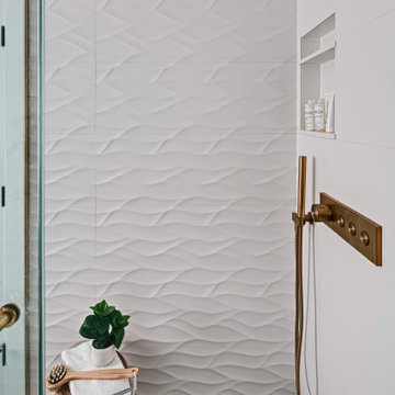
- Shower Niche Placement – With plumbing limitations and the clients’ desire to preserve their wavy accent tile wall, finding the perfect niche spot became a creative puzzle.
- Tile and Finish Coordination – Selecting complementary white tile and floor materials that worked harmoniously together.
- Larger Shower Space – Make the shower feel more open and brighter
The Renewed Space
Design solutions:
- Strategic Tub Placement – The freestanding tub was carefully positioned to maximize space, with its faucet strategically placed to allow easy access while preserving walking room. We reduced the counter depth just a bit by the tub, allowing more room for hamper cabinet and window access.
- Concealed Hamper Storage – A custom pull-out hamper was integrated into the vanity (right side, by tub), providing discreet storage within an 18-inch depth constraint.
- Shower Plumbing Wall Niche – We shifted the niche left, just enough to work around the plumbing infrastructure and still score a roomy storage spot that looks intentional.
- Sophisticated Selections – Porcelanosa curvy white tile, Kohler brushed gold fixtures, and a neutral grey tile floor created a simple, timeless aesthetic that will be loved years to come.
- Open Shower – Replacing the side wall with a clear glass surround, continuing the tile on the ceiling and extending the footprint opened up this area to the room while allowing more natural lighting into the shower space.
This bathroom transformation shows how thoughtful design turns challenges into opportunities. Brushed gold fixtures add warmth to the fresh white palette, while the perfectly balanced floor tile brings just the right depth. A partially glass-fronted vanity introduces subtle charm, giving the space a unique edge. Once cramped and outdated, this bathroom now feels bright, spacious, and serene—a testament to how every design detail makes a difference.
 Skill Construction & Design, LLC
If you are looking for twice your normal bath experience, look no more. This master bath has plenty of room for two with double the storage, double the mirrors, sinks and faucets, and bathing is done two-way. The colors are warm and inviting, but it’s the subtle patterning that caught my eye. The overall effect is of a soft wash, yet on closer examination, the striations travel across the walls and criss-cross on the floor.
This expansive vanity was created with our homeowner’s needs in mind. Each “side” has a bank of drawers and under sink cabinet storage. A large undermount sink dips below the gorgeous stone counter top. Gently arching faucets in brushed nickel adorn each sink with a framed mirror above for reflection. Individual task lighting shine upon each sink and is reflected back into the room. For additional storage and to keep elbows from connecting, a large shared bank of drawers separate the two areas.
The vanities are rich with color and texture, from the swirling grain of the wood, to the raised panels and beading. The subtle beading is repeated on the drawers for a custom look. Our wood color is a deeper, more intense tone of the colors in our tiling.
Whether in a hurry or needing to relax and unwind, this bath can do both. Despite having two substantial pieces in the same area, the open glass panel that separate leaves each feeling open and airy.
This tub was made for soaking. The sides and back gently mold into arm and neck support for a truly relaxing experience. The lineal movement in the tile backsplash lend a long and lean feeling. For easy reach, toiletries are stored in a niche with accent multicolored mosaics.
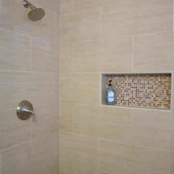
On the other side of the half wall a roomy shower awaits. The long tiles were installed in a brick pattern with striations of color wrapping the walls. The oversized tiles reduce the amount of grout, for a cleaner look. Here too we added a niche for maximum storage and a sprinkle more of the accenting mosaic. We capped the half wall and the generous bench with our vanity’s stone for a rich contrast.
We installed the tile up to the ceiling, which adds to the visual height of the room. We went with clean simple controls and showerhead, enhanced in a brushed nickel finish. So as to not obscure the view, we went frameless on our shower door and panels, using brushed nickel hinges and a simple handle.
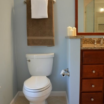
At the end of our vanity, a half wall adds backsplash on the vanity side and a bit of privacy on the other. A simple toilet in crisp white is out of sight but functional in its own “alcove”.
Despite all the patterning, there is nothing busy about the room. For the floor we decided to change things up, using a large square version of the wall tiles. To keep the room from feeling too long, we installed them on the diagonal and then criss-crossed the lines for a dramatic look.
This bath is twice as nice and ready to be shared!
http://www.designsbyskill.com/
http://www.rjkconstructioninc.com/
 CO Interiors
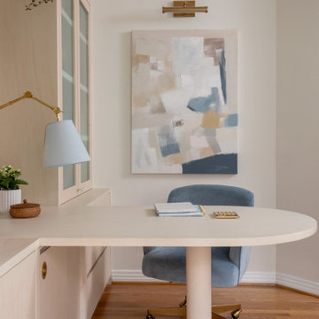
This custom desk area was designed as the creative heart of the room — a sophisticated workspace that supports both everyday function and artistic expression. The softly curved desk extends into the space to create a generous work surface, allowing room for studying, sketching, painting, and collaborative projects with friends.
A calming palette of natural wood tones, warm brass accents, and soft blues creates an atmosphere that feels elegant yet youthful. The sculptural desk design helps soften the room’s clean architectural lines while encouraging flow and interaction within the space.
Integrated cabinetry provides abundant concealed storage for art supplies, books, and creative materials, while frosted glass doors maintain a visually clean and organized feel by subtly concealing contents and reducing visual clutter. Carefully layered lighting, curated artwork, and thoughtful styling add warmth and personality, making this workspace feel inspiring, functional, and deeply personal to its young artist owner.


 Drury Design
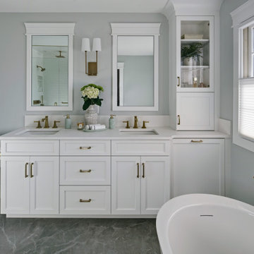
The Setup
For this primary bathroom project, the homeowners sought to transform their outdated, beige-toned space into a bright, functional sanctuary. The existing bathroom felt cramped and lifeless, with a small shower and limited storage options. The goal was to create a fresh, updated bathroom that maximizes the existing footprint while addressing specific desires for a more open, organized space with timeless materials.
Design objectives:
Brighten the bathroom and eliminate the dated beige color scheme
Install a freestanding tub in a compact space
Create a larger, more open shower without encroaching on the existing foot print too much
Incorporate hidden storage solutions
Maintain the existing bathroom layout while improving functionality
Update lighting and fixtures to create a contemporary feel
The Remodel
Design challenges to be solved:
- Compact Space Utilization – The small bathroom required careful planning to accommodate a freestanding tub while maintaining functionality and avoiding overcrowding.
- Hidden Storage Integration – The clients wanted a discreet hamper solution that wouldn’t clutter the limited floor space.
- Shower Niche Placement – With plumbing limitations and the clients’ desire to preserve their wavy accent tile wall, finding the perfect niche spot became a creative puzzle.
- Tile and Finish Coordination – Selecting complementary white tile and floor materials that worked harmoniously together.
- Larger Shower Space – Make the shower feel more open and brighter
The Renewed Space
Design solutions:
- Strategic Tub Placement – The freestanding tub was carefully positioned to maximize space, with its faucet strategically placed to allow easy access while preserving walking room. We reduced the counter depth just a bit by the tub, allowing more room for hamper cabinet and window access.
- Concealed Hamper Storage – A custom pull-out hamper was integrated into the vanity (right side, by tub), providing discreet storage within an 18-inch depth constraint.
- Shower Plumbing Wall Niche – We shifted the niche left, just enough to work around the plumbing infrastructure and still score a roomy storage spot that looks intentional.
- Sophisticated Selections – Porcelanosa curvy white tile, Kohler brushed gold fixtures, and a neutral grey tile floor created a simple, timeless aesthetic that will be loved years to come.
- Open Shower – Replacing the side wall with a clear glass surround, continuing the tile on the ceiling and extending the footprint opened up this area to the room while allowing more natural lighting into the shower space.
This bathroom transformation shows how thoughtful design turns challenges into opportunities. Brushed gold fixtures add warmth to the fresh white palette, while the perfectly balanced floor tile brings just the right depth. A partially glass-fronted vanity introduces subtle charm, giving the space a unique edge. Once cramped and outdated, this bathroom now feels bright, spacious, and serene—a testament to how every design detail makes a difference.
 Skill Construction & Design, LLC
If you are looking for twice your normal bath experience, look no more. This master bath has plenty of room for two with double the storage, double the mirrors, sinks and faucets, and bathing is done two-way. The colors are warm and inviting, but it’s the subtle patterning that caught my eye. The overall effect is of a soft wash, yet on closer examination, the striations travel across the walls and criss-cross on the floor.
This expansive vanity was created with our homeowner’s needs in mind. Each “side” has a bank of drawers and under sink cabinet storage. A large undermount sink dips below the gorgeous stone counter top. Gently arching faucets in brushed nickel adorn each sink with a framed mirror above for reflection. Individual task lighting shine upon each sink and is reflected back into the room. For additional storage and to keep elbows from connecting, a large shared bank of drawers separate the two areas.
The vanities are rich with color and texture, from the swirling grain of the wood, to the raised panels and beading. The subtle beading is repeated on the drawers for a custom look. Our wood color is a deeper, more intense tone of the colors in our tiling.
Whether in a hurry or needing to relax and unwind, this bath can do both. Despite having two substantial pieces in the same area, the open glass panel that separate leaves each feeling open and airy.
This tub was made for soaking. The sides and back gently mold into arm and neck support for a truly relaxing experience. The lineal movement in the tile backsplash lend a long and lean feeling. For easy reach, toiletries are stored in a niche with accent multicolored mosaics.
On the other side of the half wall a roomy shower awaits. The long tiles were installed in a brick pattern with striations of color wrapping the walls. The oversized tiles reduce the amount of grout, for a cleaner look. Here too we added a niche for maximum storage and a sprinkle more of the accenting mosaic. We capped the half wall and the generous bench with our vanity’s stone for a rich contrast.
We installed the tile up to the ceiling, which adds to the visual height of the room. We went with clean simple controls and showerhead, enhanced in a brushed nickel finish. So as to not obscure the view, we went frameless on our shower door and panels, using brushed nickel hinges and a simple handle.
At the end of our vanity, a half wall adds backsplash on the vanity side and a bit of privacy on the other. A simple toilet in crisp white is out of sight but functional in its own “alcove”.
Despite all the patterning, there is nothing busy about the room. For the floor we decided to change things up, using a large square version of the wall tiles. To keep the room from feeling too long, we installed them on the diagonal and then criss-crossed the lines for a dramatic look.
This bath is twice as nice and ready to be shared!
http://www.designsbyskill.com/
http://www.rjkconstructioninc.com/
 Outwater Industries Inc
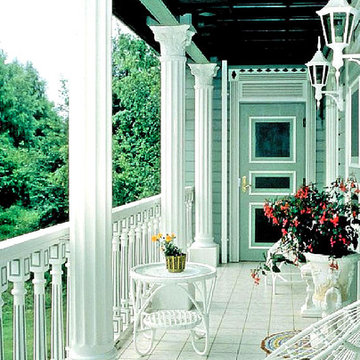
Ideally suited for use on balconies, porches and decking, Outwater has augmented its offering of contractor's grade balusters, baluster rails, newel and porch posts with the introduction of new motifs to accommodate a range of decorative applications.
Comprising lightweight, durable, high-density polyurethane and non-corrosive structural materials, Outwater's Balustrade System is easy to install using traditional woodworking tools and is internally fortified with large diameter, high strength steel or PVC pipes (varies by model) for enhanced structural integrity as well as to meet stringent building codes.
Furthermore, unlike wood balusters, which require fastidious maintenance in order to avoid possible rotting or splitting, consequently diminishing their strength, Outwater's Balustrade System comes factory primed and is impervious to adverse weather conditions, ensuring its uncompromising dimensional stability and steadfast, enduring safety.
Also, in contrast to cement balustrading, which is unwieldy and necessitates laborious installation by masons, not to mention, being highly susceptible to breaking, crumbling and cracking, Outwater's Balustrade System weighs just a portion of cement balustrading, thus significantly reducing its comparative shipping cost.
Offered in approximate heights from 28-in. to 40-in. with 5-in. to 12-in. rail widths, installations can be further customized with the addition of corner and center newel posts, a variety of post tops, accent moldings and ball ornaments.
Product Features:
• Offered with numerous complementary Balusters, Baluster Rails, Newel and Porch Posts from which to choose
• Easy to install without the need of a mason
• Internally fortified with large diameter, high strength steel or PVC pipes for enhanced structural integrity to meet stringent building codes
• Comes factory primed and is impervious to adverse weather conditions
• Weighs just a portion of cement balustrading, thus significantly reducing its comparative shipping cost
• Offered in approximate heights from 28-in. to 40-in. with 5-in. to 12-in. rail widths
• Complementary accessories allow for further customization as desired
Contact:
Architectural Products by Outwater
Sales & Product Information (USA & Canada):
1-800-631-8375 / 1-201-498-8750
Fax (USA & Canada): 1-800-888-3315 / 1-201-498-8751
Sales & Product Information (Outside of the USA & Canada):
1-201-498-8750
Fax (Outside of the USA & Canada): 1-201-498-8751
Email: info@outwaterplastics.com
Web: www.outwater.com
Visit us!
East Coast:
24 River Road
Bogota, NJ 07603
1-201-498-8750
West Coast:
4720 West Van Buren
Phoenix, AZ 85043
1-602-447-0936
About Architectural Products by Outwater:
It really is easy to shop with us!
Relied upon by more than 1,000,000 builders, renovators, architects designers, woodworkers, cabinet and furniture manufacturers, OEM's and retail consumers since 1972, Architectural Products by Outwater is an international manufacturer and distributor of more than 65,000 innovative and traditional Decorative Building Products that you possibly never knew existed or for which you simply could not find a reliable source. This is where Outwater truly shines!
“Now you can design, buy, build and dream like the Pros…”
Outwater’s products are, to say the least, very competitively priced and include interior and exterior architectural mouldings and millwork; columns and capitals; LED lighting and lighting accessories; balustrading; faux stone panels; faux wood beams; genuine stone tiles; decorative wood carvings; wrought iron components; stamped steel and polymer ceiling panels and backsplashes; wainscoting; wall coverings; fireplace surrounds and mantels; plastic "glass" block; period and contemporary hardware; home organization systems; kitchen and bath accessories; kitchen and bath cabinetry; bath vanities; furniture & cabinet components; knobs & pulls; casters; laminates; brass tubing & fittings; surfacing materials… and so much more!
In addition, with warehouse and distribution facilities in New Jersey and Arizona totaling over 300,000 square feet, Outwater facilitates purchases with reduced lead times and shipping costs, enabling us to fulfill and ship over 98% of our orders from stock within one to two business days!
At a time when many companies appear to have rapidly transitioned away from personalized customer service, having replaced their knowledgeable and immensely valuable human sales representatives with inanimate online marketing channels, which can be helpful to you if you were to know exactly what you might need and were not to encounter difficulties in placing your order, here at Outwater, we still believe that human interaction with a live, well versed, non-commissioned sales representative will undoubtedly better serve your needs in the long run. Even though you can always shop with us at www.outwater.com, you can also always deal directly with our extremely well versed and friendly sales and customer service representatives for their unparalleled support and assistance, most of whom have worked at Outwater for more than 15 years.
Whether you have been one of our loyal customers over the years or this is your first time in doing business with us, we would like to thank you for your expressed interest in our company and the products that we carry.
Please feel free to contact us with any questions at 1-800-631-8375 or visit us online at www.outwater.com
We look forward to serving you in the near future.
19