
Search results for "Feeling tired" in Home Design Ideas
 Renovisions
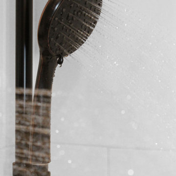
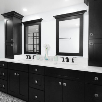
Perectly balanced, this dramatic black and white bathroom is a stunner. Thoughtful design was top of mind for these clients as they approached the Renovisions team to help narrow down their choices and bring it to life. Finding balance while mixing darker, heavier black finishes and lighter, white finishes was the task at hand and the goal was to create a modern look with an industrial/rustic feel.
The challenge on this project was incorporating all the desired elements and products in a tight spatial constraint of 9’ x 7.5’. The clients biggest concern in the old bathroom was inadequate storage, tired and under-utilized bathtub and they also needed an additional sink for their two daughters who often share this space. Renovisions recommended removing the wall between the shower and closet to gain additional floor space as you enter the bath, while providing wall space for the three towel bars.
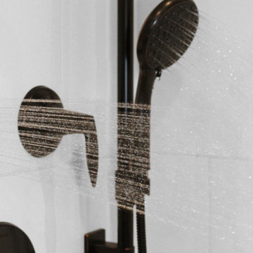
Collaborating with the clients and searching to find the right fixtures paid off nicely. This newly remodeled Renovision accommodated two rectangular sinks, a walk-in shower with hand-held shower, wall-mounted shower head and two soft spray body jets. The oil-rubbed bronze fixtures not only provided a luxurious spa experience, but also added warmth and softness to the vintage feel. The glass shower enclosure is trimmed in a matte black grid that boasts an industrial aesthetic with retro feel while delivering modernistic function. It’s unique in appearance while allowing the chic white subway and black and white diamond tile to peek through.
The beautifully designed cabinetry in a matte black painted finish provides plenty of storage. This smart configuration included two banks of three drawers for toiletries and accessories, two towers with adjustable shelves for towels and two ‘garage’ doors for hair dryers.
Another unique design detail to capture attention was the black and white curvy geometric floor tile which plays off the straight lines of the cabinets and square grids of the shower enclosure.
The clients are thrilled with the results and their modern, high-contrast styled digs – a true customized relaxation sanctuary for the entire family.
 TELFORD+BROWN STUDIO ARCHITECTURE
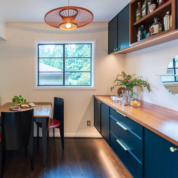
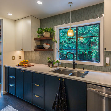
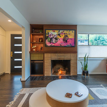
Tired of working from their tiny apartment during the beginning of the pandemic, we helped these clients bring new life to this adorable split-level home, by focusing on efficiency with a touch of glamour. The existing house from 1952 had great bones, and some fun features, such as a nice layout and corner windows, but was feeling worn and dated, and needed some attention. We were tasked with a quick-turnaround project, celebrating the home’s midcentury past, while making the spaces feel cohesive and fun. We were also asked to create more visual connections between spaces.
We designed new walnut cabinetry to surround the existing fireplace, re-worked the home’s entry, replaced the cabinetry in the kitchen, added a bar in the dining room, and enhanced the storage opportunities in the upstairs bedrooms and throughout the house. We continued a clean and modern materials palette throughout. These include warm white walls, refinished dark wood floors, walnut and painted cabinets, and luxe brass fixtures; all the finishes tie together and made the spaces feel more connected and full of whimsy.
Photographer: Matt Swain Photography
 TELFORD+BROWN STUDIO ARCHITECTURE
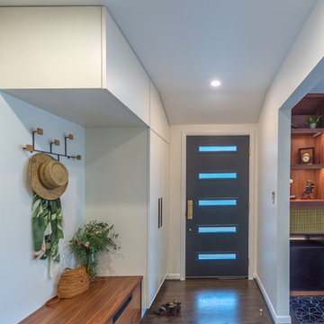
Tired of working from their tiny apartment during the beginning of the pandemic, we helped these clients bring new life to this adorable split-level home, by focusing on efficiency with a touch of glamour. The existing house from 1952 had great bones, and some fun features, such as a nice layout and corner windows, but was feeling worn and dated, and needed some attention. We were tasked with a quick-turnaround project, celebrating the home’s midcentury past, while making the spaces feel cohesive and fun. We were also asked to create more visual connections between spaces.
We designed new walnut cabinetry to surround the existing fireplace, re-worked the home’s entry, replaced the cabinetry in the kitchen, added a bar in the dining room, and enhanced the storage opportunities in the upstairs bedrooms and throughout the house. We continued a clean and modern materials palette throughout. These include warm white walls, refinished dark wood floors, walnut and painted cabinets, and luxe brass fixtures; all the finishes tie together and made the spaces feel more connected and full of whimsy.
Photographer: Matt Swain Photography
Find the right local pro for your project
 Renovisions
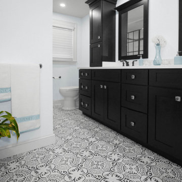
Perectly balanced, this dramatic black and white bathroom is a stunner. Thoughtful design was top of mind for these clients as they approached the Renovisions team to help narrow down their choices and bring it to life. Finding balance while mixing darker, heavier black finishes and lighter, white finishes was the task at hand and the goal was to create a modern look with an industrial/rustic feel.
The challenge on this project was incorporating all the desired elements and products in a tight spatial constraint of 9’ x 7.5’. The clients biggest concern in the old bathroom was inadequate storage, tired and under-utilized bathtub and they also needed an additional sink for their two daughters who often share this space. Renovisions recommended removing the wall between the shower and closet to gain additional floor space as you enter the bath, while providing wall space for the three towel bars.
Collaborating with the clients and searching to find the right fixtures paid off nicely. This newly remodeled Renovision accommodated two rectangular sinks, a walk-in shower with hand-held shower, wall-mounted shower head and two soft spray body jets. The oil-rubbed bronze fixtures not only provided a luxurious spa experience, but also added warmth and softness to the vintage feel. The glass shower enclosure is trimmed in a matte black grid that boasts an industrial aesthetic with retro feel while delivering modernistic function. It’s unique in appearance while allowing the chic white subway and black and white diamond tile to peek through.
The beautifully designed cabinetry in a matte black painted finish provides plenty of storage. This smart configuration included two banks of three drawers for toiletries and accessories, two towers with adjustable shelves for towels and two ‘garage’ doors for hair dryers.
Another unique design detail to capture attention was the black and white curvy geometric floor tile which plays off the straight lines of the cabinets and square grids of the shower enclosure.
The clients are thrilled with the results and their modern, high-contrast styled digs – a true customized relaxation sanctuary for the entire family.
 Renovisions
Perectly balanced, this dramatic black and white bathroom is a stunner. Thoughtful design was top of mind for these clients as they approached the Renovisions team to help narrow down their choices and bring it to life. Finding balance while mixing darker, heavier black finishes and lighter, white finishes was the task at hand and the goal was to create a modern look with an industrial/rustic feel.
The challenge on this project was incorporating all the desired elements and products in a tight spatial constraint of 9’ x 7.5’. The clients biggest concern in the old bathroom was inadequate storage, tired and under-utilized bathtub and they also needed an additional sink for their two daughters who often share this space. Renovisions recommended removing the wall between the shower and closet to gain additional floor space as you enter the bath, while providing wall space for the three towel bars.
Collaborating with the clients and searching to find the right fixtures paid off nicely. This newly remodeled Renovision accommodated two rectangular sinks, a walk-in shower with hand-held shower, wall-mounted shower head and two soft spray body jets. The oil-rubbed bronze fixtures not only provided a luxurious spa experience, but also added warmth and softness to the vintage feel. The glass shower enclosure is trimmed in a matte black grid that boasts an industrial aesthetic with retro feel while delivering modernistic function. It’s unique in appearance while allowing the chic white subway and black and white diamond tile to peek through.
The beautifully designed cabinetry in a matte black painted finish provides plenty of storage. This smart configuration included two banks of three drawers for toiletries and accessories, two towers with adjustable shelves for towels and two ‘garage’ doors for hair dryers.
Another unique design detail to capture attention was the black and white curvy geometric floor tile which plays off the straight lines of the cabinets and square grids of the shower enclosure.
The clients are thrilled with the results and their modern, high-contrast styled digs – a true customized relaxation sanctuary for the entire family.
 TELFORD+BROWN STUDIO ARCHITECTURE
Tired of working from their tiny apartment during the beginning of the pandemic, we helped these clients bring new life to this adorable split-level home, by focusing on efficiency with a touch of glamour. The existing house from 1952 had great bones, and some fun features, such as a nice layout and corner windows, but was feeling worn and dated, and needed some attention. We were tasked with a quick-turnaround project, celebrating the home’s midcentury past, while making the spaces feel cohesive and fun. We were also asked to create more visual connections between spaces.
We designed new walnut cabinetry to surround the existing fireplace, re-worked the home’s entry, replaced the cabinetry in the kitchen, added a bar in the dining room, and enhanced the storage opportunities in the upstairs bedrooms and throughout the house. We continued a clean and modern materials palette throughout. These include warm white walls, refinished dark wood floors, walnut and painted cabinets, and luxe brass fixtures; all the finishes tie together and made the spaces feel more connected and full of whimsy.
Photographer: Matt Swain Photography
 Renovisions
Perectly balanced, this dramatic black and white bathroom is a stunner. Thoughtful design was top of mind for these clients as they approached the Renovisions team to help narrow down their choices and bring it to life. Finding balance while mixing darker, heavier black finishes and lighter, white finishes was the task at hand and the goal was to create a modern look with an industrial/rustic feel.
The challenge on this project was incorporating all the desired elements and products in a tight spatial constraint of 9’ x 7.5’. The clients biggest concern in the old bathroom was inadequate storage, tired and under-utilized bathtub and they also needed an additional sink for their two daughters who often share this space. Renovisions recommended removing the wall between the shower and closet to gain additional floor space as you enter the bath, while providing wall space for the three towel bars.
Collaborating with the clients and searching to find the right fixtures paid off nicely. This newly remodeled Renovision accommodated two rectangular sinks, a walk-in shower with hand-held shower, wall-mounted shower head and two soft spray body jets. The oil-rubbed bronze fixtures not only provided a luxurious spa experience, but also added warmth and softness to the vintage feel. The glass shower enclosure is trimmed in a matte black grid that boasts an industrial aesthetic with retro feel while delivering modernistic function. It’s unique in appearance while allowing the chic white subway and black and white diamond tile to peek through.
The beautifully designed cabinetry in a matte black painted finish provides plenty of storage. This smart configuration included two banks of three drawers for toiletries and accessories, two towers with adjustable shelves for towels and two ‘garage’ doors for hair dryers.
Another unique design detail to capture attention was the black and white curvy geometric floor tile which plays off the straight lines of the cabinets and square grids of the shower enclosure.
The clients are thrilled with the results and their modern, high-contrast styled digs – a true customized relaxation sanctuary for the entire family.

Sponsored
Delaware, OH

Buckeye Basements, Inc.
Central Ohio's Basement Finishing ExpertsBest Of Houzz '13-'21
 TELFORD+BROWN STUDIO ARCHITECTURE
Tired of working from their tiny apartment during the beginning of the pandemic, we helped these clients bring new life to this adorable split-level home, by focusing on efficiency with a touch of glamour. The existing house from 1952 had great bones, and some fun features, such as a nice layout and corner windows, but was feeling worn and dated, and needed some attention. We were tasked with a quick-turnaround project, celebrating the home’s midcentury past, while making the spaces feel cohesive and fun. We were also asked to create more visual connections between spaces.
We designed new walnut cabinetry to surround the existing fireplace, re-worked the home’s entry, replaced the cabinetry in the kitchen, added a bar in the dining room, and enhanced the storage opportunities in the upstairs bedrooms and throughout the house. We continued a clean and modern materials palette throughout. These include warm white walls, refinished dark wood floors, walnut and painted cabinets, and luxe brass fixtures; all the finishes tie together and made the spaces feel more connected and full of whimsy.
Photographer: Matt Swain Photography
 Renovisions
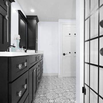
Perectly balanced, this dramatic black and white bathroom is a stunner. Thoughtful design was top of mind for these clients as they approached the Renovisions team to help narrow down their choices and bring it to life. Finding balance while mixing darker, heavier black finishes and lighter, white finishes was the task at hand and the goal was to create a modern look with an industrial/rustic feel.
The challenge on this project was incorporating all the desired elements and products in a tight spatial constraint of 9’ x 7.5’. The clients biggest concern in the old bathroom was inadequate storage, tired and under-utilized bathtub and they also needed an additional sink for their two daughters who often share this space. Renovisions recommended removing the wall between the shower and closet to gain additional floor space as you enter the bath, while providing wall space for the three towel bars.
Collaborating with the clients and searching to find the right fixtures paid off nicely. This newly remodeled Renovision accommodated two rectangular sinks, a walk-in shower with hand-held shower, wall-mounted shower head and two soft spray body jets. The oil-rubbed bronze fixtures not only provided a luxurious spa experience, but also added warmth and softness to the vintage feel. The glass shower enclosure is trimmed in a matte black grid that boasts an industrial aesthetic with retro feel while delivering modernistic function. It’s unique in appearance while allowing the chic white subway and black and white diamond tile to peek through.
The beautifully designed cabinetry in a matte black painted finish provides plenty of storage. This smart configuration included two banks of three drawers for toiletries and accessories, two towers with adjustable shelves for towels and two ‘garage’ doors for hair dryers.
Another unique design detail to capture attention was the black and white curvy geometric floor tile which plays off the straight lines of the cabinets and square grids of the shower enclosure.
The clients are thrilled with the results and their modern, high-contrast styled digs – a true customized relaxation sanctuary for the entire family.
 In Detail Interiors
Small coastal condo gets a new life!
This project started as a consultation that really focused on whether or not it was feasible to maximize functionality out of a tight kitchen area in a condo on the beach. The cabinetry was sort of dated but not terrible terrible.
Refresh or total gut of this small kitchen
The client wanted to give it a refresh worked but we had worked with her before…so she could not quite decide how far to go. Maybe just repaint the existing cabinets? She needed some furniture. She wanted a little more ambiance and pizazz. And she wanted the Cheryl magic.
Ok finally, decision made. Kitchen had to go@!
Decision made- a new kitchen to go with the new living!
After further review on site with her during the consult meeting, and pitching a few inquiries around for bids on cabinetry and countertops – she ultimately decided to gut and re-do the whole layout. And man-oh-man what a difference some well executed design makes!!
This layout was unique and truly optimized every inch we could muster from the kitchen. (Working around that spiral staircase and navigating the soffit that wrapped the entire kitchen and adjacent living room!!) Colors needed to be bold while still feeling fresh so we paired a deep aubergine and a sort of “matte” Caribbean blue which laid the groundwork for a stunning living area palette.
Tough layout to enlarge much
There were a lot of other “givens” in this space that made the execution of the design a highly strategized process. We knew we had to work around the large wall space that starts the kitchen because it had the laundry room hiding on the other side… the awkward nook with windows on all sides that was a small breakfast area before the remodel… oh, and did we mention that dang spiral staircase?! Multiple site visits to plot the cabinetry and countertop curve paid off all said and done, though!
Living space that work with the open floor plan kitchen
Designing the furnishings then became the fun part! With a smaller living space flanked by windows and sliders – but one that needed to balance the kitchen in substance – we had to break a few preferred design rules to make up the amount of seating desired.
The deep grape-y purple barrel swivels were the perfect “transition” piece by the slider offering access to the views while being versatile enough to still afford safe use of the slider and passage outside. Adding some graphic punch with the droplet shaped, stone and brass cocktail table and bold multicolored rug we love the balance of these weightier aesthetic choices with the adjacent kitchen.
Signature pieces make all the difference
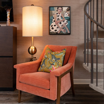
Carrying through little pops of that blue green between the counter stools (I die! Seriously! SO GORGEOUS) and the sofa (with those brass nails!) — these colors really created a sturdy but eclectic tonal feel that the client was just over the moon for. The art and grasscloth on the walls throughout developed the architecture of the space in an overall structure that was really lacking – it feels warm, inviting, comfortable – BEAUTIFUL – but not too priss and pomp.
Now if we could just keep the pup off the sofa!
 Skill Construction & Design, LLC
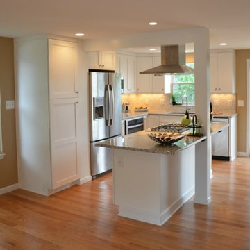
There are so many design elements to this kitchen, I almost don’t know where to start. Bright and airy with crisp clean white cabinets, the kitchen is open and welcoming. Still crisp but gently contrasting, the stainless steel appliance add depth amid the white. To keep this kitchen warm, natural oak covers the floors and a toasted wheat color washes the walls. And then there is the architectural elements. You know. That post and beam in the middle of the room. It’s the center of attention.
When you walk into a room your eyes roam around, establishing the size and shape of the room as your feet take you forward. From the front door of this home straight ahead you encountered this wall. The dining area to the right gives you a glimpse of things to come. Where there is a dining room you will usually find a kitchen.
The architecture of years gone by consistently hides the kitchen, the heart of the home, behind walls. I sympathize with my Mom, and all the other Moms, who have had to spend so much time tucked into a tight kitchen, away from the family. This wall had to go, but it was structural. We needed its support but not its bulk.
So we got rid of the bulk and only the bulk. Instead of a wall we have a post and beam, offering all of the structure we need. We could have installed a huge steel beam and reconfigure the joists to upset the beam, but why? The small beam and post add an incredible architectural element. It’s turning lemons into lemon, we simply made the most of what we had. It may be functional but it’s so fantastic. It looks like we created the effect just for the drama.
The original kitchen may have had a working triangle and some counter space, but it was fairly small, with each area only a step or two away. The dark cabinets made the space feel even smaller and the butcher block patterned laminate counter tops were very dated. The appliances were feeling their age as well, from a coil burner electric stove to a top freezer refrigerator. To keep this kitchen within its space, a half wall separated it from the dining area.
With the wall gone we borrowed some space from the living room and extended what was a U shaped kitchen into an L. At the living room window we start our new kitchen. We kept a small part of the wall to support the other end of our decorative beam. Sandwiched between a large pantry and our new French door refrigerator, the wall disappears. With our new open floor plan a sizable island was in order.
We split our cooking areas and installed a continuous grill gas cooktop into the island. A sleek island hood takes care of exhaust and adds an extra element to our architectural feature. Under the cooktop we added over-sized drawers for pots and pan storage. The frameless cabinets from New River Cabinetry are maple, painted white, with the Herndon door style. With the cooktop safely nestled into our island, we still had to add an oven.
We used the space where the old range sat for a large single oven of stainless steel and glass. If it worked for one, why not two? We created a home for a microwave in the wall cabinets. It’s perfect for heating leftovers so close to the refrigerator.
An important consideration for hot spots in your kitchen is landing zones. Each of our cooking areas have generous landing zones, one on each side of the cooktop and an entire counter area above or below the ovens, depending on which one you’re using.
We wanted to give the sink area more room so the half wall had to come out. We moved the trash and recycle cans into a cabinet, removed the heavy soffits and kept the sink under the window.
With that little bit of extra space we were able to add a larger cabinet above the dishwasher and slide it all down. This used to be where the carpeting met the vinyl floor, but all of it is gone. Long oak planks eliminate that final divide between the kitchen and the dining area, while adding visual length to the area. White wall cabinets on each side of the window reflect the sunlight for a brighter view.
With all of the darker cabinetry the backsplash walls had been painted white. Even still, there was a darkness in the corners and it wasn’t very exciting. We wanted to add visual interest and reflect the new under-cabinet lighting, eliminating the shadows in this corner.
With 1″x 2″ Arabescato Honed marble mosaics and those under-cabinet lights, we achieved the perfect balance. The marble has subtle swirls in gray and beige on a clean white background, but with the honed finish the light is softly reflected instead of glaring. For granite, we chose the soft gray tones of Luna Pearl. The speckles of gray and beige are a gentle contrast to the white cabinets and emulate the color of the stainless steel.
Between the carpet, red half wall, dark railing and dated light fixture, the dining area felt tired. Since the kitchen lacked sufficient storage, a large utility cabinet crowded the table space without adding any decorate elements.
Although it didn’t get any bigger, our dining area feels fresher and more open too. With the oak flooring joining the area to the rest of our space and the toasted wheat on the walls, the white table and chairs compliment the cabinetry while contrasting the warmer colors. We replaced the chandelier with recessed lighting and changed that railing too.
With our new open floor plan, we ended up with a fairly open area in between our foyer closet and the living room window. Not one to miss an opportunity, we filled the space with a multi-functional work space.
With the sunlight streaming in this bright corner works for anything this family needs.
There’s plenty of space for a chair under this large desk drawer. A closed cabinet below, glass doors above and lots of open shelving let you store and or showcase your belongings. We added a lite area at the top to keep away the darker corners.
The transformation is complete. This kitchen and all of its features are truly the center of attention in this home.
http://www.designsbyskill.com/
http://www.rjkconstructioninc.com/
 Skill Construction & Design, LLC
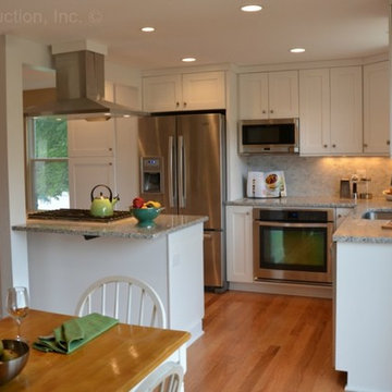
There are so many design elements to this kitchen, I almost don’t know where to start. Bright and airy with crisp clean white cabinets, the kitchen is open and welcoming. Still crisp but gently contrasting, the stainless steel appliance add depth amid the white. To keep this kitchen warm, natural oak covers the floors and a toasted wheat color washes the walls. And then there is the architectural elements. You know. That post and beam in the middle of the room. It’s the center of attention.
When you walk into a room your eyes roam around, establishing the size and shape of the room as your feet take you forward. From the front door of this home straight ahead you encountered this wall. The dining area to the right gives you a glimpse of things to come. Where there is a dining room you will usually find a kitchen.
The architecture of years gone by consistently hides the kitchen, the heart of the home, behind walls. I sympathize with my Mom, and all the other Moms, who have had to spend so much time tucked into a tight kitchen, away from the family. This wall had to go, but it was structural. We needed its support but not its bulk.
So we got rid of the bulk and only the bulk. Instead of a wall we have a post and beam, offering all of the structure we need. We could have installed a huge steel beam and reconfigure the joists to upset the beam, but why? The small beam and post add an incredible architectural element. It’s turning lemons into lemon, we simply made the most of what we had. It may be functional but it’s so fantastic. It looks like we created the effect just for the drama.
The original kitchen may have had a working triangle and some counter space, but it was fairly small, with each area only a step or two away. The dark cabinets made the space feel even smaller and the butcher block patterned laminate counter tops were very dated. The appliances were feeling their age as well, from a coil burner electric stove to a top freezer refrigerator. To keep this kitchen within its space, a half wall separated it from the dining area.
With the wall gone we borrowed some space from the living room and extended what was a U shaped kitchen into an L. At the living room window we start our new kitchen. We kept a small part of the wall to support the other end of our decorative beam. Sandwiched between a large pantry and our new French door refrigerator, the wall disappears. With our new open floor plan a sizable island was in order.
We split our cooking areas and installed a continuous grill gas cooktop into the island. A sleek island hood takes care of exhaust and adds an extra element to our architectural feature. Under the cooktop we added over-sized drawers for pots and pan storage. The frameless cabinets from New River Cabinetry are maple, painted white, with the Herndon door style. With the cooktop safely nestled into our island, we still had to add an oven.
We used the space where the old range sat for a large single oven of stainless steel and glass. If it worked for one, why not two? We created a home for a microwave in the wall cabinets. It’s perfect for heating leftovers so close to the refrigerator.
An important consideration for hot spots in your kitchen is landing zones. Each of our cooking areas have generous landing zones, one on each side of the cooktop and an entire counter area above or below the ovens, depending on which one you’re using.
We wanted to give the sink area more room so the half wall had to come out. We moved the trash and recycle cans into a cabinet, removed the heavy soffits and kept the sink under the window.
With that little bit of extra space we were able to add a larger cabinet above the dishwasher and slide it all down. This used to be where the carpeting met the vinyl floor, but all of it is gone. Long oak planks eliminate that final divide between the kitchen and the dining area, while adding visual length to the area. White wall cabinets on each side of the window reflect the sunlight for a brighter view.
With all of the darker cabinetry the backsplash walls had been painted white. Even still, there was a darkness in the corners and it wasn’t very exciting. We wanted to add visual interest and reflect the new under-cabinet lighting, eliminating the shadows in this corner.
With 1″x 2″ Arabescato Honed marble mosaics and those under-cabinet lights, we achieved the perfect balance. The marble has subtle swirls in gray and beige on a clean white background, but with the honed finish the light is softly reflected instead of glaring. For granite, we chose the soft gray tones of Luna Pearl. The speckles of gray and beige are a gentle contrast to the white cabinets and emulate the color of the stainless steel.
Between the carpet, red half wall, dark railing and dated light fixture, the dining area felt tired. Since the kitchen lacked sufficient storage, a large utility cabinet crowded the table space without adding any decorate elements.
Although it didn’t get any bigger, our dining area feels fresher and more open too. With the oak flooring joining the area to the rest of our space and the toasted wheat on the walls, the white table and chairs compliment the cabinetry while contrasting the warmer colors. We replaced the chandelier with recessed lighting and changed that railing too.
With our new open floor plan, we ended up with a fairly open area in between our foyer closet and the living room window. Not one to miss an opportunity, we filled the space with a multi-functional work space.
With the sunlight streaming in this bright corner works for anything this family needs.
There’s plenty of space for a chair under this large desk drawer. A closed cabinet below, glass doors above and lots of open shelving let you store and or showcase your belongings. We added a lite area at the top to keep away the darker corners.
The transformation is complete. This kitchen and all of its features are truly the center of attention in this home.
http://www.designsbyskill.com/
http://www.rjkconstructioninc.com/
 Renovisions
Perectly balanced, this dramatic black and white bathroom is a stunner. Thoughtful design was top of mind for these clients as they approached the Renovisions team to help narrow down their choices and bring it to life. Finding balance while mixing darker, heavier black finishes and lighter, white finishes was the task at hand and the goal was to create a modern look with an industrial/rustic feel.
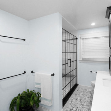
The challenge on this project was incorporating all the desired elements and products in a tight spatial constraint of 9’ x 7.5’. The clients biggest concern in the old bathroom was inadequate storage, tired and under-utilized bathtub and they also needed an additional sink for their two daughters who often share this space. Renovisions recommended removing the wall between the shower and closet to gain additional floor space as you enter the bath, while providing wall space for the three towel bars.
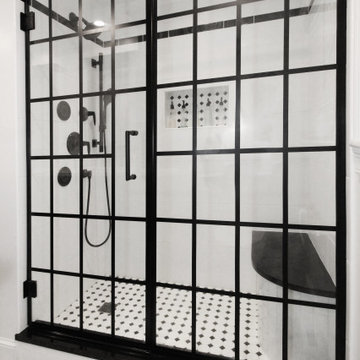
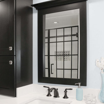
Collaborating with the clients and searching to find the right fixtures paid off nicely. This newly remodeled Renovision accommodated two rectangular sinks, a walk-in shower with hand-held shower, wall-mounted shower head and two soft spray body jets. The oil-rubbed bronze fixtures not only provided a luxurious spa experience, but also added warmth and softness to the vintage feel. The glass shower enclosure is trimmed in a matte black grid that boasts an industrial aesthetic with retro feel while delivering modernistic function. It’s unique in appearance while allowing the chic white subway and black and white diamond tile to peek through.
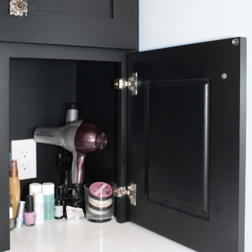
The beautifully designed cabinetry in a matte black painted finish provides plenty of storage. This smart configuration included two banks of three drawers for toiletries and accessories, two towers with adjustable shelves for towels and two ‘garage’ doors for hair dryers.
Another unique design detail to capture attention was the black and white curvy geometric floor tile which plays off the straight lines of the cabinets and square grids of the shower enclosure.
The clients are thrilled with the results and their modern, high-contrast styled digs – a true customized relaxation sanctuary for the entire family.


 Renovisions
Perectly balanced, this dramatic black and white bathroom is a stunner. Thoughtful design was top of mind for these clients as they approached the Renovisions team to help narrow down their choices and bring it to life. Finding balance while mixing darker, heavier black finishes and lighter, white finishes was the task at hand and the goal was to create a modern look with an industrial/rustic feel.
The challenge on this project was incorporating all the desired elements and products in a tight spatial constraint of 9’ x 7.5’. The clients biggest concern in the old bathroom was inadequate storage, tired and under-utilized bathtub and they also needed an additional sink for their two daughters who often share this space. Renovisions recommended removing the wall between the shower and closet to gain additional floor space as you enter the bath, while providing wall space for the three towel bars.
Collaborating with the clients and searching to find the right fixtures paid off nicely. This newly remodeled Renovision accommodated two rectangular sinks, a walk-in shower with hand-held shower, wall-mounted shower head and two soft spray body jets. The oil-rubbed bronze fixtures not only provided a luxurious spa experience, but also added warmth and softness to the vintage feel. The glass shower enclosure is trimmed in a matte black grid that boasts an industrial aesthetic with retro feel while delivering modernistic function. It’s unique in appearance while allowing the chic white subway and black and white diamond tile to peek through.
The beautifully designed cabinetry in a matte black painted finish provides plenty of storage. This smart configuration included two banks of three drawers for toiletries and accessories, two towers with adjustable shelves for towels and two ‘garage’ doors for hair dryers.
Another unique design detail to capture attention was the black and white curvy geometric floor tile which plays off the straight lines of the cabinets and square grids of the shower enclosure.
The clients are thrilled with the results and their modern, high-contrast styled digs – a true customized relaxation sanctuary for the entire family.
 Renovisions
Perectly balanced, this dramatic black and white bathroom is a stunner. Thoughtful design was top of mind for these clients as they approached the Renovisions team to help narrow down their choices and bring it to life. Finding balance while mixing darker, heavier black finishes and lighter, white finishes was the task at hand and the goal was to create a modern look with an industrial/rustic feel.
The challenge on this project was incorporating all the desired elements and products in a tight spatial constraint of 9’ x 7.5’. The clients biggest concern in the old bathroom was inadequate storage, tired and under-utilized bathtub and they also needed an additional sink for their two daughters who often share this space. Renovisions recommended removing the wall between the shower and closet to gain additional floor space as you enter the bath, while providing wall space for the three towel bars.
Collaborating with the clients and searching to find the right fixtures paid off nicely. This newly remodeled Renovision accommodated two rectangular sinks, a walk-in shower with hand-held shower, wall-mounted shower head and two soft spray body jets. The oil-rubbed bronze fixtures not only provided a luxurious spa experience, but also added warmth and softness to the vintage feel. The glass shower enclosure is trimmed in a matte black grid that boasts an industrial aesthetic with retro feel while delivering modernistic function. It’s unique in appearance while allowing the chic white subway and black and white diamond tile to peek through.
The beautifully designed cabinetry in a matte black painted finish provides plenty of storage. This smart configuration included two banks of three drawers for toiletries and accessories, two towers with adjustable shelves for towels and two ‘garage’ doors for hair dryers.
Another unique design detail to capture attention was the black and white curvy geometric floor tile which plays off the straight lines of the cabinets and square grids of the shower enclosure.
The clients are thrilled with the results and their modern, high-contrast styled digs – a true customized relaxation sanctuary for the entire family.
 Renovisions
Perectly balanced, this dramatic black and white bathroom is a stunner. Thoughtful design was top of mind for these clients as they approached the Renovisions team to help narrow down their choices and bring it to life. Finding balance while mixing darker, heavier black finishes and lighter, white finishes was the task at hand and the goal was to create a modern look with an industrial/rustic feel.
The challenge on this project was incorporating all the desired elements and products in a tight spatial constraint of 9’ x 7.5’. The clients biggest concern in the old bathroom was inadequate storage, tired and under-utilized bathtub and they also needed an additional sink for their two daughters who often share this space. Renovisions recommended removing the wall between the shower and closet to gain additional floor space as you enter the bath, while providing wall space for the three towel bars.
Collaborating with the clients and searching to find the right fixtures paid off nicely. This newly remodeled Renovision accommodated two rectangular sinks, a walk-in shower with hand-held shower, wall-mounted shower head and two soft spray body jets. The oil-rubbed bronze fixtures not only provided a luxurious spa experience, but also added warmth and softness to the vintage feel. The glass shower enclosure is trimmed in a matte black grid that boasts an industrial aesthetic with retro feel while delivering modernistic function. It’s unique in appearance while allowing the chic white subway and black and white diamond tile to peek through.
The beautifully designed cabinetry in a matte black painted finish provides plenty of storage. This smart configuration included two banks of three drawers for toiletries and accessories, two towers with adjustable shelves for towels and two ‘garage’ doors for hair dryers.
Another unique design detail to capture attention was the black and white curvy geometric floor tile which plays off the straight lines of the cabinets and square grids of the shower enclosure.
The clients are thrilled with the results and their modern, high-contrast styled digs – a true customized relaxation sanctuary for the entire family.
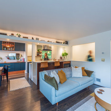 TELFORD+BROWN STUDIO ARCHITECTURE
Tired of working from their tiny apartment during the beginning of the pandemic, we helped these clients bring new life to this adorable split-level home, by focusing on efficiency with a touch of glamour. The existing house from 1952 had great bones, and some fun features, such as a nice layout and corner windows, but was feeling worn and dated, and needed some attention. We were tasked with a quick-turnaround project, celebrating the home’s midcentury past, while making the spaces feel cohesive and fun. We were also asked to create more visual connections between spaces.
We designed new walnut cabinetry to surround the existing fireplace, re-worked the home’s entry, replaced the cabinetry in the kitchen, added a bar in the dining room, and enhanced the storage opportunities in the upstairs bedrooms and throughout the house. We continued a clean and modern materials palette throughout. These include warm white walls, refinished dark wood floors, walnut and painted cabinets, and luxe brass fixtures; all the finishes tie together and made the spaces feel more connected and full of whimsy.
Photographer: Matt Swain Photography
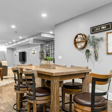
Sponsored
Sunbury, OH

J.Holderby - Renovations
Franklin County's Leading General Contractors - 2X Best of Houzz!
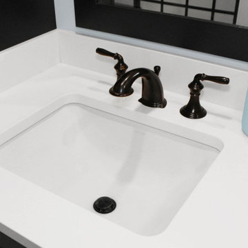 Renovisions
Perectly balanced, this dramatic black and white bathroom is a stunner. Thoughtful design was top of mind for these clients as they approached the Renovisions team to help narrow down their choices and bring it to life. Finding balance while mixing darker, heavier black finishes and lighter, white finishes was the task at hand and the goal was to create a modern look with an industrial/rustic feel.
The challenge on this project was incorporating all the desired elements and products in a tight spatial constraint of 9’ x 7.5’. The clients biggest concern in the old bathroom was inadequate storage, tired and under-utilized bathtub and they also needed an additional sink for their two daughters who often share this space. Renovisions recommended removing the wall between the shower and closet to gain additional floor space as you enter the bath, while providing wall space for the three towel bars.
Collaborating with the clients and searching to find the right fixtures paid off nicely. This newly remodeled Renovision accommodated two rectangular sinks, a walk-in shower with hand-held shower, wall-mounted shower head and two soft spray body jets. The oil-rubbed bronze fixtures not only provided a luxurious spa experience, but also added warmth and softness to the vintage feel. The glass shower enclosure is trimmed in a matte black grid that boasts an industrial aesthetic with retro feel while delivering modernistic function. It’s unique in appearance while allowing the chic white subway and black and white diamond tile to peek through.
The beautifully designed cabinetry in a matte black painted finish provides plenty of storage. This smart configuration included two banks of three drawers for toiletries and accessories, two towers with adjustable shelves for towels and two ‘garage’ doors for hair dryers.
Another unique design detail to capture attention was the black and white curvy geometric floor tile which plays off the straight lines of the cabinets and square grids of the shower enclosure.
The clients are thrilled with the results and their modern, high-contrast styled digs – a true customized relaxation sanctuary for the entire family.
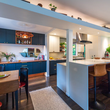 TELFORD+BROWN STUDIO ARCHITECTURE
Tired of working from their tiny apartment during the beginning of the pandemic, we helped these clients bring new life to this adorable split-level home, by focusing on efficiency with a touch of glamour. The existing house from 1952 had great bones, and some fun features, such as a nice layout and corner windows, but was feeling worn and dated, and needed some attention. We were tasked with a quick-turnaround project, celebrating the home’s midcentury past, while making the spaces feel cohesive and fun. We were also asked to create more visual connections between spaces.
We designed new walnut cabinetry to surround the existing fireplace, re-worked the home’s entry, replaced the cabinetry in the kitchen, added a bar in the dining room, and enhanced the storage opportunities in the upstairs bedrooms and throughout the house. We continued a clean and modern materials palette throughout. These include warm white walls, refinished dark wood floors, walnut and painted cabinets, and luxe brass fixtures; all the finishes tie together and made the spaces feel more connected and full of whimsy.
Photographer: Matt Swain Photography
 Green Acres Landscaping & Aquascapes
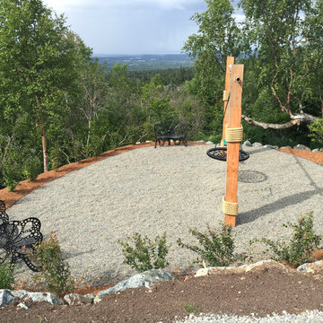
Design ideas for a large contemporary full sun backyard gravel landscaping in Other for summer.
13