
Search results for "Fluid space" in Home Design Ideas
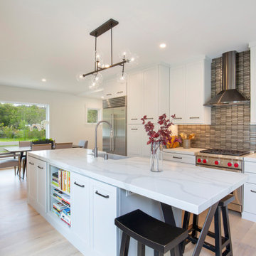
 Character Builders Inc. General Contractors
SubZeroRefrigerator
Wolf Gas Range
Cove Dishwasher
Waterstone/Pentair Filtration for Kitchen Faucet
Painted Wood Cabinetry
OneQuartz Solid Counters with Waterfall Edge
Stacked Glass Tile Backsplash
 StudioLAB
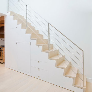
A young couple with three small children purchased this full floor loft in Tribeca in need of a gut renovation. The existing apartment was plagued with awkward spaces, limited natural light and an outdated décor. It was also lacking the required third child’s bedroom desperately needed for their newly expanded family. StudioLAB aimed for a fluid open-plan layout in the larger public spaces while creating smaller, tighter quarters in the rear private spaces to satisfy the family’s programmatic wishes. 3 small children’s bedrooms were carved out of the rear lower level connected by a communal playroom and a shared kid’s bathroom. Upstairs, the master bedroom and master bathroom float above the kid’s rooms on a mezzanine accessed by a newly built staircase. Ample new storage was built underneath the staircase as an extension of the open kitchen and dining areas. A custom pull out drawer containing the food and water bowls was installed for the family’s two dogs to be hidden away out of site when not in use. All wall surfaces, existing and new, were limited to a bright but warm white finish to create a seamless integration in the ceiling and wall structures allowing the spatial progression of the space and sculptural quality of the midcentury modern furniture pieces and colorful original artwork, painted by the wife’s brother, to enhance the space. The existing tin ceiling was left in the living room to maximize ceiling heights and remain a reminder of the historical details of the original construction. A new central AC system was added with an exposed cylindrical duct running along the long living room wall. A small office nook was built next to the elevator tucked away to be out of site.
 de-spec
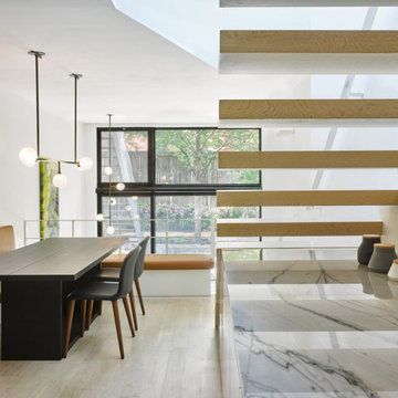
In this picture, the cut back of entry level allows a vertical connection to the lower level and a feeling of space beyond.
In this project, we identified the challenge of renovating a triplex as finding a way to integrate the stairs, so as to not take up the entire width of a narrow house, as well as to minimize the feeling of constantly having to run up and down to connect floors. This twelve-foot-wide townhouse consists of a cellar living room, a master bedroom suite on the upper floor, and a kitchen and dining area on the entry level. In trying to weave together these different floors, the aim of the project was to transform the stairs and steps into a fluid space that combines transition and rest.
The steps were designed to be integrated with the architecture, cantilevering from the wall and almost disappearing. The living room on the ground plane folds into the garden through steps and a full-window wall, effectively extending the garden into the living room. From the garden to the entry level, the stairs were transformed into a platform and space for meditation within the open-space living room, dining room and kitchen.
The introduction of a skylight midway through the length of the triplex permits natural light to flow to the back of the home, blending into the natural light coming in through the window facing the garden. The skylight also revealed a view of the trees hanging over the townhouse, framing the master bedroom suite from above and extending down with a view towards the garden.
In this project, we identified the challenge of renovating a triplex as finding a way to integrate the stairs, so as to not take up the entire width of a narrow house, as well as to minimize the feeling of constantly having to run up and down to connect floors. This twelve-foot-wide townhouse consists of a cellar living room, a master bedroom suite on the upper floor, and a kitchen and dining area on the entry level. In trying to weave together these different floors, the aim of the project was to transform the stairs and steps into a fluid space that combines transition and rest.
The steps were designed to be integrated with the architecture, cantilevering from the wall and almost disappearing. The living room on the ground plane folds into the garden through steps and a full-window wall, effectively extending the garden into the living room. From the garden to the entry level, the stairs were transformed into a platform and space for meditation within the open-space living room, dining room and kitchen.
The introduction of a skylight midway through the length of the triplex permits natural light to flow to the back of the home, blending into the natural light coming in through the window facing the garden. The skylight also revealed a view of the trees hanging over the townhouse, framing the master bedroom suite from above and extending down with a view towards the garden.
In this project, we identified the challenge of renovating a triplex as finding a way to integrate the stairs, so as to not take up the entire width of a narrow house, as well as to minimize the feeling of constantly having to run up and down to connect floors. This twelve-foot-wide townhouse consists of a cellar living room, a master bedroom suite on the upper floor, and a kitchen and dining area on the entry level. In trying to weave together these different floors, the aim of the project was to transform the stairs and steps into a fluid space that combines transition and rest.
The steps were designed to be integrated with the architecture, cantilevering from the wall and almost disappearing. The living room on the ground plane folds into the garden through steps and a full-window wall, effectively extending the garden into the living room. From the garden to the entry level, the stairs were transformed into a platform and space for meditation within the open-space living room, dining room and kitchen.
The introduction of a skylight midway through the length of the triplex permits natural light to flow to the back of the home, blending into the natural light coming in through the window facing the garden. The skylight also revealed a view of the trees hanging over the townhouse, framing the master bedroom suite from above and extending down with a view towards the garden
Find the right local pro for your project

 Custom Design & Construction
The homeowners had just purchased this home in El Segundo and they had remodeled the kitchen and one of the bathrooms on their own. However, they had more work to do. They felt that the rest of the project was too big and complex to tackle on their own and so they retained us to take over where they left off. The main focus of the project was to create a master suite and take advantage of the rather large backyard as an extension of their home. They were looking to create a more fluid indoor outdoor space.
When adding the new master suite leaving the ceilings vaulted along with French doors give the space a feeling of openness. The window seat was originally designed as an architectural feature for the exterior but turned out to be a benefit to the interior! They wanted a spa feel for their master bathroom utilizing organic finishes. Since the plan is that this will be their forever home a curbless shower was an important feature to them. The glass barn door on the shower makes the space feel larger and allows for the travertine shower tile to show through. Floating shelves and vanity allow the space to feel larger while the natural tones of the porcelain tile floor are calming. The his and hers vessel sinks make the space functional for two people to use it at once. The walk-in closet is open while the master bathroom has a white pocket door for privacy.
Since a new master suite was added to the home we converted the existing master bedroom into a family room. Adding French Doors to the family room opened up the floorplan to the outdoors while increasing the amount of natural light in this room. The closet that was previously in the bedroom was converted to built in cabinetry and floating shelves in the family room. The French doors in the master suite and family room now both open to the same deck space.
The homes new open floor plan called for a kitchen island to bring the kitchen and dining / great room together. The island is a 3” countertop vs the standard inch and a half. This design feature gives the island a chunky look. It was important that the island look like it was always a part of the kitchen. Lastly, we added a skylight in the corner of the kitchen as it felt dark once we closed off the side door that was there previously.
Repurposing rooms and opening the floor plan led to creating a laundry closet out of an old coat closet (and borrowing a small space from the new family room).
The floors become an integral part of tying together an open floor plan like this. The home still had original oak floors and the homeowners wanted to maintain that character. We laced in new planks and refinished it all to bring the project together.
To add curb appeal we removed the carport which was blocking a lot of natural light from the outside of the house. We also re-stuccoed the home and added exterior trim.
 StudioLAB
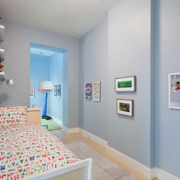
A young couple with three small children purchased this full floor loft in Tribeca in need of a gut renovation. The existing apartment was plagued with awkward spaces, limited natural light and an outdated décor. It was also lacking the required third child’s bedroom desperately needed for their newly expanded family. StudioLAB aimed for a fluid open-plan layout in the larger public spaces while creating smaller, tighter quarters in the rear private spaces to satisfy the family’s programmatic wishes. 3 small children’s bedrooms were carved out of the rear lower level connected by a communal playroom and a shared kid’s bathroom. Upstairs, the master bedroom and master bathroom float above the kid’s rooms on a mezzanine accessed by a newly built staircase. Ample new storage was built underneath the staircase as an extension of the open kitchen and dining areas. A custom pull out drawer containing the food and water bowls was installed for the family’s two dogs to be hidden away out of site when not in use. All wall surfaces, existing and new, were limited to a bright but warm white finish to create a seamless integration in the ceiling and wall structures allowing the spatial progression of the space and sculptural quality of the midcentury modern furniture pieces and colorful original artwork, painted by the wife’s brother, to enhance the space. The existing tin ceiling was left in the living room to maximize ceiling heights and remain a reminder of the historical details of the original construction. A new central AC system was added with an exposed cylindrical duct running along the long living room wall. A small office nook was built next to the elevator tucked away to be out of site.
 Trio Surfaces
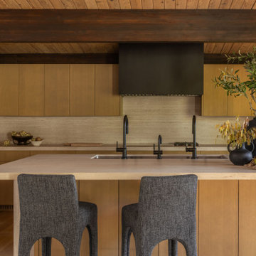
Island Crest is a story of transformation—a quiet reinvention of a 1958 mid-century modern home on Mercer Island that honors its rich past while embracing fresh, expansive possibilities. At Onoma Architecture, we approached this project as an opportunity to reveal the home's latent potential, reconfiguring a 4,000-square-foot post and beam structure into an open, inviting dialogue between interior and exterior spaces.
The vision was clear from the outset: enhance the living area without sacrificing the home's original character. Through creative structural reinforcement techniques, we meticulously eliminated unnecessary columns and walls, forging a continuous, unencumbered space that seamlessly connects the main living areas. This open plan accentuates the relationship between spaces—a fluid exchange where natural light and effortless flow become the orchestrated elements of daily life.
 Drewett Works
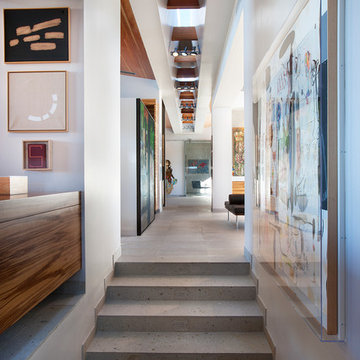
Believe it or not, this award-winning home began as a speculative project. Typically speculative projects involve a rather generic design that would appeal to many in a style that might be loved by the masses. But the project’s developer loved modern architecture and his personal residence was the first project designed by architect C.P. Drewett when Drewett Works launched in 2001. Together, the architect and developer envisioned a fictitious art collector who would one day purchase this stunning piece of desert modern architecture to showcase their magnificent collection.
The primary views from the site were southwest. Therefore, protecting the interior spaces from the southwest sun while making the primary views available was the greatest challenge. The views were very calculated and carefully managed. Every room needed to not only capture the vistas of the surrounding desert, but also provide viewing spaces for the potential collection to be housed within its walls.
The core of the material palette is utilitarian including exposed masonry and locally quarried cantera stone. An organic nature was added to the project through millwork selections including walnut and red gum veneers.
The eventual owners saw immediately that this could indeed become a home for them as well as their magnificent collection, of which pieces are loaned out to museums around the world. Their decision to purchase the home was based on the dimensions of one particular wall in the dining room which was EXACTLY large enough for one particular painting not yet displayed due to its size. The owners and this home were, as the saying goes, a perfect match!
Project Details | Desert Modern for the Magnificent Collection, Estancia, Scottsdale, AZ
Architecture: C.P. Drewett, Jr., AIA, NCARB | Drewett Works, Scottsdale, AZ
Builder: Shannon Construction | Phoenix, AZ
Interior Selections: Janet Bilotti, NCIDQ, ASID | Naples, FL
Custom Millwork: Linear Fine Woodworking | Scottsdale, AZ
Photography: Dino Tonn | Scottsdale, AZ
Awards: 2014 Gold Nugget Award of Merit
Feature Article: Luxe. Interiors and Design. Winter 2015, “Lofty Exposure”

 Crystal Kitchen + Bath
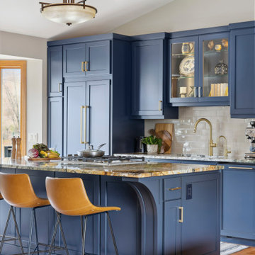
At the core of this transformation was the client’s aspiration for an open, interconnected space.
The removal of barriers between the kitchen, dining, and living areas created an expansive, fluid layout, elevating the home’s ambiance and facilitating seamless interaction among spaces.
The new open layout is the perfect space to cook and entertain merging sophistication with functionality.
The journey began with the client’s exploration of colors, eventually embracing Benjamin Moore’s Hale Navy blue as the cornerstone for the cabinetry. This choice set the stage for a harmonious palette that tied in with the living and dining room furniture and rugs.
Integrating a natural stone countertop became a focal point, incorporating these varied hues while gold fixtures added a touch of luxury and sophistication.
Throughout the design process, challenges were met with innovative solutions. Space optimization was key, requiring strategic placement of appliances like a smaller-width refrigerator alongside a pull-out pantry cabinet. The island, a central feature, not only provided additional seating but replaced the need for a separate table and chairs, optimizing the space for gatherings and enhancing the flow between the kitchen and the adjoining areas.
The revitalized kitchen now stands as a vibrant hub for social interaction. The homeowner seamlessly integrates into gatherings, no longer confined by kitchen walls, while guests engage effortlessly in the cooking process at the island. This transformation embodies the convergence of beauty and functionality, where every design element tells a story of thoughtful innovation and meticulous attention to detail.
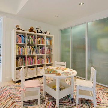 StudioLAB
A young couple with three small children purchased this full floor loft in Tribeca in need of a gut renovation. The existing apartment was plagued with awkward spaces, limited natural light and an outdated décor. It was also lacking the required third child’s bedroom desperately needed for their newly expanded family. StudioLAB aimed for a fluid open-plan layout in the larger public spaces while creating smaller, tighter quarters in the rear private spaces to satisfy the family’s programmatic wishes. 3 small children’s bedrooms were carved out of the rear lower level connected by a communal playroom and a shared kid’s bathroom. Upstairs, the master bedroom and master bathroom float above the kid’s rooms on a mezzanine accessed by a newly built staircase. Ample new storage was built underneath the staircase as an extension of the open kitchen and dining areas. A custom pull out drawer containing the food and water bowls was installed for the family’s two dogs to be hidden away out of site when not in use. All wall surfaces, existing and new, were limited to a bright but warm white finish to create a seamless integration in the ceiling and wall structures allowing the spatial progression of the space and sculptural quality of the midcentury modern furniture pieces and colorful original artwork, painted by the wife’s brother, to enhance the space. The existing tin ceiling was left in the living room to maximize ceiling heights and remain a reminder of the historical details of the original construction. A new central AC system was added with an exposed cylindrical duct running along the long living room wall. A small office nook was built next to the elevator tucked away to be out of site.
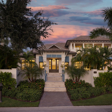
 Nautilus Homes
Framed by mature trees and nestled within Sarasota’s historic McClellan Park, Sunset Place is a home shaped by a deep understanding of, and sensibility for, its setting—reflecting the charm of the neighborhood, the rhythm of downtown living, and the client’s vision of entertaining, connection, and family life. Every decision—from site strategy to spatial flow—was made with intention: to support a lifestyle centered on warmth, community, and a strong sense of place.
At its core, the project is a masterclass in leveraging zoning and code to unlock the full potential of a complex site. Though landlocked, the home lives like waterfront—offering openness, privacy, and expansive sunset views. Placing the pool in the front yard, within the 25-foot setback, redefines the entry experience. It captures the western light and sets a relaxed, resort-like tone from the very first step inside the gate. Paired with a rear-loaded garage, accessed discreetly via the side setback, the layout transforms the site’s limitations into its greatest assets. Architecture and landscape take center stage, while the full buildable envelope is maximized without compromise.
A natural rise of eight feet from front to back—rare in Sarasota—was embraced as an opportunity. Site walls function as both retaining structures and architectural elements, elevating the pool terrace and entry by over four feet to align with the main interior floor level. The result is a fluid connection between indoors and out: kitchen, dining, and living spaces unfold onto the terrace, blurring boundaries and enhancing everyday rituals as well as social gatherings.
Architecturally, the home is coastal contemporary: open yet composed, airy yet grounded. Clarity in the massing tells a story of the inhabitants from the first glance, while the interior planning offers spatial generosity and ease. The interiors echo this sensibility with a palette that is soft, natural, and tactile—serene without being neutral. The landscape design provides a lush tropical frame, softening edges and reinforcing privacy through layered plantings rather than enclosure.
Ultimately, Sunset Place is not defined by any single gesture, but by the way the home reflects its owners. Their gracious, family-centered nature informed every layer of design—resulting in a space that feels deeply personal, tailored for connection and ease, and perfectly suited for gathering, unwinding, and watching the sun slip behind the trees from the comfort of home.
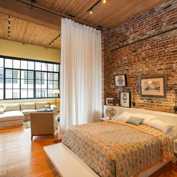
 Crescent Builds
Photo by Ross Anania
Example of a large urban medium tone wood floor bedroom design in Seattle with no fireplace
Example of a large urban medium tone wood floor bedroom design in Seattle with no fireplace
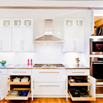
 CR Cabinetry Kitchen & Bath Design Studio
Featuring R.D. Henry & Company
Mid-sized transitional single-wall medium tone wood floor kitchen photo in Chicago with shaker cabinets, white cabinets, white backsplash, subway tile backsplash, stainless steel appliances and stainless steel countertops
Mid-sized transitional single-wall medium tone wood floor kitchen photo in Chicago with shaker cabinets, white cabinets, white backsplash, subway tile backsplash, stainless steel appliances and stainless steel countertops
 Zogheib, Necessary Luxury
Michael Hunter
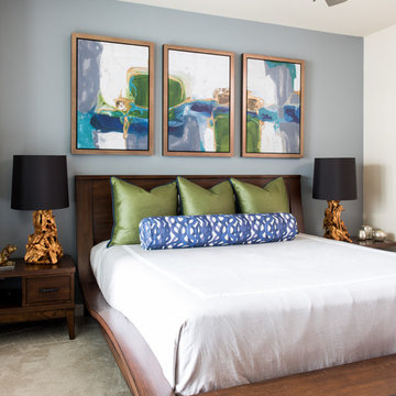
Mid-sized trendy master carpeted bedroom photo in Other with blue walls and no fireplace
Mid-sized trendy master carpeted bedroom photo in Other with blue walls and no fireplace

 House of L
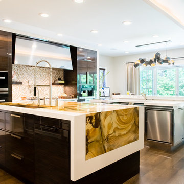
A traditional Georgian home receives an incredible transformation with an addition to expand the originally compact kitchen and create a pathway into the family room and dining area, opening the flow of the spaces that allow for fluid movement from each living space for the young family of four. Taking the lead from the client's desire to have a contemporary and edgier feel to their home's very classic facade, House of L worked with the architect's addition to the existing kitchen to design a kitchen that was incredibly functional and gorgeously dramatic, beckoning people to grab a barstool and hang out. Glossy macassar ebony wood is complimented with lacquered white cabinets for an amazing study in contrast. An oversized brushed nickel hood with polished nickel banding makes a presence on the feature wall of the kitchen. Brushed and polished nickel details are peppered in the landscape of this room, including the cabinets in the second island, a storage cabinet and automated hopper doors by Hafele on the refrigeration wall and all of the cabinet hardware, supplied and custom sized by Rajack. White quartz countertops by Hanstone in the Bianco Canvas colorway float on all the perimeter cabinets and the secondary island and creates a floating frame for the Palomino Quartzite that is a highlight in the kitchen and lends an organic feel to the clean lines of the millwork. The backsplash area behind the rangetop is a brick patterned mosaic blend of stone and glass, while surrounding walls have a layered sandstone tile that lend an incredible texture to the room. The light fixture hanging above the second island is by Wells Long and features faceted metal polygons with an amber gold interior. Woven linen drapes at window winks at the warmer tones in the room with a lustrous sheen that catches the natural light filtering in. The rift and sawn cut white oak floors are 8" planks that were fitted and finished on site to match the existing floor in the family and dining rooms. The clients were very clear on the appliances they needed the kitchen to accommodate. In addition to the vast expanses of wall space that were gained with the kitchen addition the larger footprint allowed for two sizeable islands and a host of cooking amenities, including a 48" rangetop, two double ovens, a warming drawer, and a built-in coffee maker by Miele and a 36" Refrigerator and Freezer and a beverage drawer by Subzero. A fabulous stainless steel Kallista sink by Mick De Giulio's series for the company is fitted in the first island which serves as a prep area, flanked by an Asko dishwasher to the right. A Dorenbracht faucet is a strong compliment to the scale of the sink. A smaller Kallista stainless sink is centered in the second island which has a secondary burner by Miele for overflow cooking.
Jason Miller, Pixelate
 Terry and Terry Architecture
Bruce Damonte
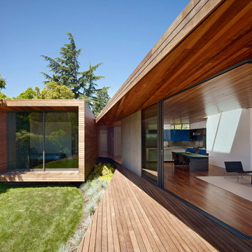
Mid-sized trendy backyard deck photo in San Francisco with a roof extension
Mid-sized trendy backyard deck photo in San Francisco with a roof extension
 MainStreet Design Build
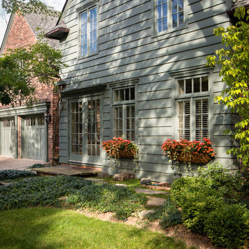
This early 20th century Poppleton Park home was originally 2548 sq ft. with a small kitchen, nook, powder room and dining room on the first floor. The second floor included a single full bath and 3 bedrooms. The client expressed a need for about 1500 additional square feet added to the basement, first floor and second floor. In order to create a fluid addition that seamlessly attached to this home, we tore down the original one car garage, nook and powder room. The addition was added off the northern portion of the home, which allowed for a side entry garage. Plus, a small addition on the Eastern portion of the home enlarged the kitchen, nook and added an exterior covered porch.
Special features of the interior first floor include a beautiful new custom kitchen with island seating, stone countertops, commercial appliances, large nook/gathering with French doors to the covered porch, mud and powder room off of the new four car garage. Most of the 2nd floor was allocated to the master suite. This beautiful new area has views of the park and includes a luxurious master bath with free standing tub and walk-in shower, along with a 2nd floor custom laundry room!
Attention to detail on the exterior was essential to keeping the charm and character of the home. The brick façade from the front view was mimicked along the garage elevation. A small copper cap above the garage doors and 6” half-round copper gutters finish the look.
KateBenjamin Photography
 Barley|Pfeiffer Architecture
Our inspiration for this home was an updated and refined approach to Frank Lloyd Wright’s “Prairie-style”; one that responds well to the harsh Central Texas heat. By DESIGN we achieved soft balanced and glare-free daylighting, comfortable temperatures via passive solar control measures, energy efficiency without reliance on maintenance-intensive Green “gizmos” and lower exterior maintenance.
The client’s desire for a healthy, comfortable and fun home to raise a young family and to accommodate extended visitor stays, while being environmentally responsible through “high performance” building attributes, was met. Harmonious response to the site’s micro-climate, excellent Indoor Air Quality, enhanced natural ventilation strategies, and an elegant bug-free semi-outdoor “living room” that connects one to the outdoors are a few examples of the architect’s approach to Green by Design that results in a home that exceeds the expectations of its owners.
Photo by Mark Adams Media

Sponsored
Columbus, OH

Wannemacher Interiors
Customized Award-Winning Interior Design Solutions in Franklin Cnty OH
 Andrew Franz Architect PLLC
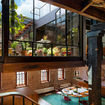
In Manhattan’s landmarked Tribeca North, the top floor and roof of an 1884 warehouse are reconceived as a warm and welcoming residence with a fluid connection to the outdoor environment. A relocated mezzanine features a sunken court yard with a retractable glass roof and connects to the new green roof garden above. Embracing the building’s industrial past, a visual discourse between new and old is devised through insertions of modern materials along with restored or reclaimed materials.
Photography: Albert Vecerka-Esto
 Riverside Construction, LLC
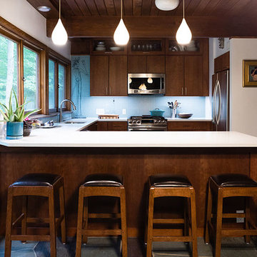
When our clients approached us with this kitchen renovation project, their wishes were to have an open, fluid space with more room for storage, upgraded appliances and modern amenities. It was also important to make sure the renovation matched the style and character of the home. Before the kitchen remodel, the kitchen was walled off from the rest of the living area. Riverside Construction knocked down a wall and opened up the space so that the homeowners could enjoy abundant natural light and the beautiful view outside their windows. Ensuring the home’s architectural integrity, we used Mid Century inspired materials that complimented the original wood color and style of the home, taking full advantage of the high ceilings to add more storage. Damaged wood in the kitchen was replaced with new unfinished hardwood that was expertly stained to match the existing hardwood in the nearby hallway. Other key features in this gorgeous kitchen remodel include a porcelain mosaic tile backsplash, Wellborn Milan cabinets in Cherry with light stain and new task and ambient lighting.
 The Cultural Landscape Foundation
Saturday June 27, 4:00 to 5:30pm | Manhattan
Pool Farm by David Seiter of Future Green Studio
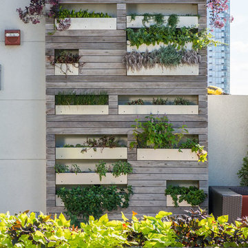
High above Midtown Manhattan, this transformed rooftop pool is now a farm-to-table restaurant, the Press Lounge, offering guests a dazzling view of the New York City skyline. From the 19th floor of Ink Hotel, a beautifully designed edible garden is meticulously cared for to create seasonal food and drink options from ingredients grown onsite. Utilizing themes of material reuse and urban infill, this custom design and fabricated system of wood terraced planters transforms an underutilized rooftop pool into a dynamic private dining experience. The project is inspired by the structure of a sushi mat- with flexibility in one direction and rigidity in the other, the mat rolls fluidly from deck to bench to planter to wall. In an effort to make the project sustainable and cost effective, ipe wood decking was salvaged from a recent renovation and repurposed. The planting palette was selected in consultation with the restaurant’s chef, professional forager and a rooftop farmer in order to orchestrate the edible garden with unique seasonal food and drink menus. A small slice of paradise has been found in Hell’s Kitchen. Photo by K•Taro Hashimura
3