
Search results for "Fraction" in Home Design Ideas


Find the right local pro for your project

 TKS Design Group
Download our free ebook, Creating the Ideal Kitchen. DOWNLOAD NOW
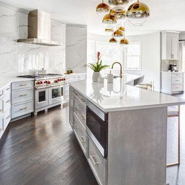
This client was referred to us from a past client. They are a busy 2-career household with young children and enjoy entertaining friends and family in their home. They have a beautiful open concept home but unfortunately the kitchen was not fitting for the rest of the home. They were not quite sure what to do with the space. We talked about trying to refresh it or do more of a minor remodel, but in the end they decided a full gut would get them to where they wanted to be.
One problem was there was no place for guests to hang out other than the large and awkward banquette area. The brick wall and tiled hood area were feeling a bit dated and tired. The space was just not functional for their lifestyle. There was no prep space near the cooktop and no landing area for items coming out of the ovens or refrigerator, plus a big dead zone in the center of the room.
Banquettes, like the one they previously had in the space, are great for small spaces, but when they get really large like this one, it makes getting in and out of the seating area awkward and uncomfortable. Plus, there was room for a large table, so we eliminated the awkward built in.
We started by removing the faux brick wall between the kitchen and back entry. We relocated the entry to the garage over a couple feet in order to get every last inch out of the new kitchen. We also made the decision to close up the primary window that faced the pretty ho hum brick wall of the neighbor’s house. There was plenty of light coming in from the seating area, so we just didn’t feel the window was adding much to the room.
Construction went smoothy. There was a bit of rework with electrical, flooring and HVAC, but in the end, we think it was well worth it.
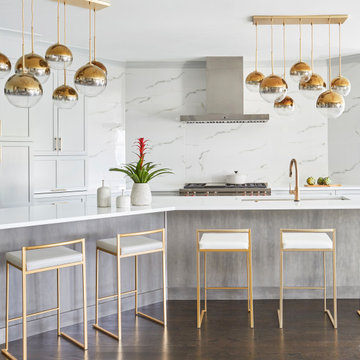
The clients really wanted a sleek contemporary look, and we originally had planned for a full height slab backsplash, but due to it’s size, it was a budget buster. Instead, we got creative and settled on large format porcelain tiles that have a similar feel but were a fraction of the cost. We made sure the wall was plumb and level so that the fit and finish would mimic that of slab material.
The final space was quite a change. A large prep sink sits directly across from the new pro-style range with plenty additional prep space on the large island. The refrigerator and ovens now have miles of landing space, and a nice tight work triangle makes cooking a breeze.
Since we wanted a more contemporary feel, not many wall cabinets were included. Instead, we outfitted some of the drawers for dish storage with a peg system. Two large pantries flanking the refrigerator hold baking supplies and small appliances. Large drawers by the cooktop hold pots and pans, and an appliance garage tucked away to the left of the range hides away miscellaneous items. The large island also houses a microwave drawer and tons of storage, most of which is drawers offering maximum convenience.
The island now seats 5-6 people comfortably along with the new table in the seating area which can seat up to 8. Entertaining will be a breeze in this space. With such a clean backdrop, we knew we would need some drama with the lighting, so we chose two sets of staggered pendants, which we adjusted for the right visual balance above the island.
We also included a small coffee station to the right of the main kitchen, which helps keep the coffee clutter out of the kitchen proper. Two tones of complimentary gray are featured in this kitchen. The perimeter is a light gray that reads almost white. The island is a gray stain that adds some depth and interest with the visible wood texture. The countertops are clean white quartz, and the hardware, barstools and light fixtures add warm brass tones. I see lots of cooking and entertaining with family and friends in the near future in this bright and airy new space.
Designed by: Susan Klimala, CKD, CBD
Photography by: Michael Kaskel
For more information on kitchen and bath design ideas go to: www.kitchenstudio-ge.com
 Andersen Windows + Doors
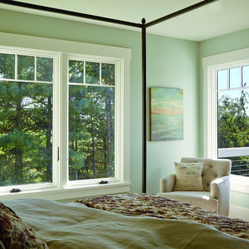
Andersen A-Series Casement Windows with Short Fractional Grille Pattern and Dark Bronze Exteriors. A-Series Frenchwood Gliding Patio Door with Short Fractional Grille Pattern and Dark Bronze Exterior.

 Greg Steffensen Architect
Joshua Caldwell
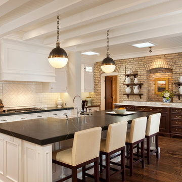
Example of a mid-sized transitional l-shaped dark wood floor and brown floor eat-in kitchen design in Salt Lake City with a farmhouse sink, white cabinets, white backsplash, subway tile backsplash, an island, shaker cabinets, stainless steel appliances, marble countertops and black countertops
Example of a mid-sized transitional l-shaped dark wood floor and brown floor eat-in kitchen design in Salt Lake City with a farmhouse sink, white cabinets, white backsplash, subway tile backsplash, an island, shaker cabinets, stainless steel appliances, marble countertops and black countertops
 Rustic Chic Interiors
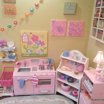
Kids' room - mid-sized traditional girl medium tone wood floor kids' room idea in Chicago with yellow walls
 Ben Herzog
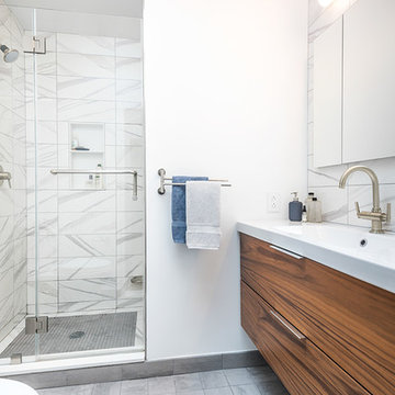
The marble of the master shower is actually an easy-care porcelain look-alike, at a fraction of the cost.
Floor: Terra Maestricht in Smoke Gray by Mosa.
Walls: Porcelain Calacatta-look, Decor Planet.
Plumbing: Grohe Atrio in brushed nickel.
Light: Kovacs, Y Lighting.
Vanity: IKEA base, walnut front by Semi-handmade.
 Alpine Lumber
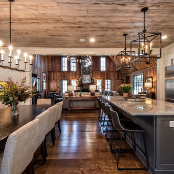
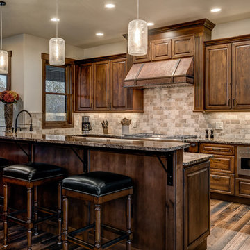
Located in Steamboat Springs, Colorado is Ideal Mountain Property’s newest fractionally owned property offering. This brand new, custom built lodge is located at the base of Steamboat Ski Mountain, in one of Steamboat Springs newest resort communities, Wildhorse Meadows. Center stage is the Wildhorse gondola providing incredible access to the ski mountain and village while offering owners and guests a spacious single family residence right in the heart of the mountain area.
Builder | Greg Fortune & Rory Witzel
Designer | Tara Bender
Starmark Cabinetry
 User
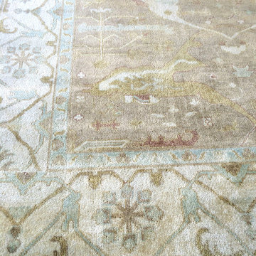
UserLight chocolate and robin's egg blue Oushak Persian rug.
Laurl Self
Mid-sized trendy home design photo in Birmingham
Mid-sized trendy home design photo in Birmingham
 McKinney Homes LLC
David White Photography
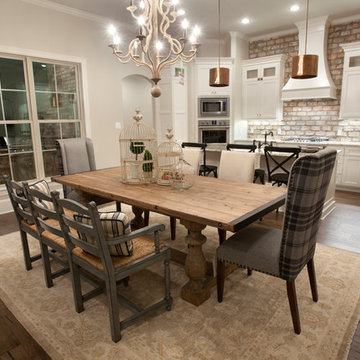
Example of a large farmhouse light wood floor and brown floor kitchen/dining room combo design in Dallas with gray walls and no fireplace
Example of a large farmhouse light wood floor and brown floor kitchen/dining room combo design in Dallas with gray walls and no fireplace

 TKS Design Group
Download our free ebook, Creating the Ideal Kitchen. DOWNLOAD NOW
This client was referred to us from a past client. They are a busy 2-career household with young children and enjoy entertaining friends and family in their home. They have a beautiful open concept home but unfortunately the kitchen was not fitting for the rest of the home. They were not quite sure what to do with the space. We talked about trying to refresh it or do more of a minor remodel, but in the end they decided a full gut would get them to where they wanted to be.
One problem was there was no place for guests to hang out other than the large and awkward banquette area. The brick wall and tiled hood area were feeling a bit dated and tired. The space was just not functional for their lifestyle. There was no prep space near the cooktop and no landing area for items coming out of the ovens or refrigerator, plus a big dead zone in the center of the room.
Banquettes, like the one they previously had in the space, are great for small spaces, but when they get really large like this one, it makes getting in and out of the seating area awkward and uncomfortable. Plus, there was room for a large table, so we eliminated the awkward built in.
We started by removing the faux brick wall between the kitchen and back entry. We relocated the entry to the garage over a couple feet in order to get every last inch out of the new kitchen. We also made the decision to close up the primary window that faced the pretty ho hum brick wall of the neighbor’s house. There was plenty of light coming in from the seating area, so we just didn’t feel the window was adding much to the room.
Construction went smoothy. There was a bit of rework with electrical, flooring and HVAC, but in the end, we think it was well worth it.
The clients really wanted a sleek contemporary look, and we originally had planned for a full height slab backsplash, but due to it’s size, it was a budget buster. Instead, we got creative and settled on large format porcelain tiles that have a similar feel but were a fraction of the cost. We made sure the wall was plumb and level so that the fit and finish would mimic that of slab material.
The final space was quite a change. A large prep sink sits directly across from the new pro-style range with plenty additional prep space on the large island. The refrigerator and ovens now have miles of landing space, and a nice tight work triangle makes cooking a breeze.
Since we wanted a more contemporary feel, not many wall cabinets were included. Instead, we outfitted some of the drawers for dish storage with a peg system. Two large pantries flanking the refrigerator hold baking supplies and small appliances. Large drawers by the cooktop hold pots and pans, and an appliance garage tucked away to the left of the range hides away miscellaneous items. The large island also houses a microwave drawer and tons of storage, most of which is drawers offering maximum convenience.
The island now seats 5-6 people comfortably along with the new table in the seating area which can seat up to 8. Entertaining will be a breeze in this space. With such a clean backdrop, we knew we would need some drama with the lighting, so we chose two sets of staggered pendants, which we adjusted for the right visual balance above the island.
We also included a small coffee station to the right of the main kitchen, which helps keep the coffee clutter out of the kitchen proper. Two tones of complimentary gray are featured in this kitchen. The perimeter is a light gray that reads almost white. The island is a gray stain that adds some depth and interest with the visible wood texture. The countertops are clean white quartz, and the hardware, barstools and light fixtures add warm brass tones. I see lots of cooking and entertaining with family and friends in the near future in this bright and airy new space.
Designed by: Susan Klimala, CKD, CBD
Photography by: Michael Kaskel
For more information on kitchen and bath design ideas go to: www.kitchenstudio-ge.com
 Interiors by Popov
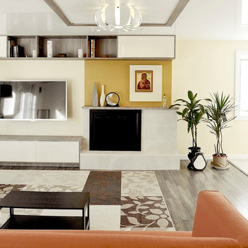
This is another favorite home redesign project.
Throughout my career, I've worked with some hefty budgets on a number of high-end projects. You can visit Paris Kitchens and Somerset Kitchens, companies that I have worked for previously, to get an idea of what I mean. I could start name dropping here, but I won’t, because that's not what this project is about. This project is about a small budget and a happy homeowner.
This was one of the first projects with a custom interior design at a fraction of a regular budget. I could use the term “value engineering” to describe it, because this particular interior was heavily value engineered.
The result: a sophisticated interior that looks so much more expensive than it is. And one ecstatic homeowner. Mission impossible accomplished.
P.S. Don’t ask me how much it cost, I promised the homeowner that their impressive budget will remain confidential.
In any case, no one would believe me even if I spilled the beans.
 Artistic Kitchens - Kristi Hodson
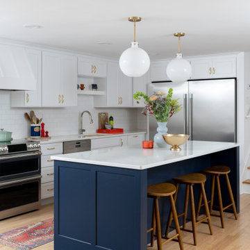
The original kitchen in this midcentury Ann Arbor home was only a fraction of the size it is today. We removed walls to open up the main floor and create a brighter, more connected space that fits the way this family lives. The existing hardwood floors were blended and refinished for a seamless transition between old and new, tying the whole space together. Storage and function were at the top of the list. We added dedicated spaces for spices, a mixer, corner pullouts, and small appliances to keep the counters clear and organized. Full-size column refrigerator and freezer units now provide plenty of food storage without sacrificing style. We also improved the light and flow of the space. A small window that faced a brick wall and a non-functioning door were both removed, replaced by a new sliding door that brings in natural light and connects the kitchen to the backyard. The new design combines navy and white cabinetry with brass and orange accents for a look that feels modern but still connected to the home’s midcentury roots. The result is a kitchen that works as beautifully as it looks, filled with smart storage and thoughtful details. Contractor: MAV Design + Build Stylist: Jill Fagan Interiors Photographer: Jacob Hawkins Photography
 Shirl Ames
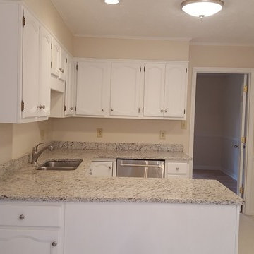
If your family is like most American families, the kitchen is the heart of your home. It is where you gather for meals, to do homework, meet with friends, and, of course, sneak a midnight snack! Knowing that the kitchen is the center of your home, is the overall style what you want when entertaining? If the answer is no, but you don’t have the funds to do a complete renovation, you may be considering painting the kitchen cabinets. Here are three of the top benefits of making this choice.
A Face-Lift – Kitchen cabinets are most likely one of the first things people notice when they enter a kitchen, as they take up a majority of the wall space. So if they are drab, dated, worn, or darker than you prefer, you may want to consider brightening up your kitchen with a professional painting of not only the wall surfaces but also the kitchen cabinets. If your cabinets are in fairly good condition, there really is no need to replace, but rather have the experts bring back the shine and new look to your kitchen through paint.
Economical – Having a team of professionals remove, clean, sand, and paint your cabinet doors and the surrounding woodwork can be much more cost effective than a complete replacement of the cabinets. The average cost of revitalizing cabinets by painting is a fraction of the cost of both the labor and materials needed to replace the existing cabinets.
Time and Convenience – Not only is the cost a factor when deciding whether to replace or rejuvenate your cabinets, but time and convenience should be considered as well. For most contractors, gutting and replacing cabinets will take approximately 3-6 weeks and will mean losing your kitchen during that time. In a fraction of the time, usually less than a week, your kitchen can look like new with a paint color that you have chosen.
 Interiors by Popov
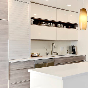
This is another favorite home redesign project.
Throughout my career, I've worked with some hefty budgets on a number of high-end projects. You can visit Paris Kitchens and Somerset Kitchens, companies that I have worked for previously, to get an idea of what I mean. I could start name dropping here, but I won’t, because that's not what this project is about. This project is about a small budget and a happy homeowner.
This was one of the first projects with a custom interior design at a fraction of a regular budget. I could use the term “value engineering” to describe it, because this particular interior was heavily value engineered.
The result: a sophisticated interior that looks so much more expensive than it is. And one ecstatic homeowner. Mission impossible accomplished.
P.S. Don’t ask me how much it cost, I promised the homeowner that their impressive budget will remain confidential.
In any case, no one would believe me even if I spilled the beans.
6