
Search results for "Framework" in Home Design Ideas

 Amanda Martocchio Architecture
Time had stood still at this 1970s ranch in Armonk when the owners invited us to collaborate with them to transform it into a modern, light-filled home for their young family. The budget was lean, so economy was a primary consideration for every design decision. The challenge was to identify the modest home’s virtues – vaulted ceilings and a lovely backyard – and accentuate them by strategically optimizing available funds.
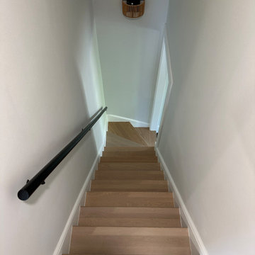
We were tasked with rectifying a dysfunctional interior stair, connecting to the outdoors with new large windows, and updating the exterior. We focused our attention on a finite set of architectural moves which would have the biggest impact and improve our clients’ daily experience of the home. Detailing was kept simple, using common grade materials and standard components. All exterior walls were revamped with new windows and siding. Although these materials were not particularly costly, thoughtful layout of boards, battens, and openings produced a cohesive, rigorous composition at each facade.
Since the budget would not cover the homeowners’ complete wish list, some items were bracketed for subsequent phases. The challenge was to establish a framework that would allow future work – including a new roof and kitchen renovation – to proceed smoothly.
The homeowners, both scientists, were enthusiastic collaborators, contributing their outstanding design sensibilities to selection of fixtures and finishes. Construction ended just in time for the arrival of their baby – and with that, the transformation of their family home was complete.
 H2D Architecture + Design
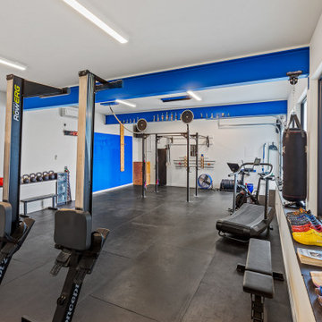
The fully outfitted home gym was designed as a high-performance fitness space that reflects the industrial-modern character of the home. Exposed steel beams painted in a bold blue tone bring energy and personality to the space while expressing the structural framework overhead. Tall ceilings accommodate a full range of exercise equipment and create an open, motivating environment for workouts of all types. Durable rubber flooring provides comfort, resilience, and functionality for strength training and fitness activities. A garage-style door opens directly to the yard, allowing fresh air and natural light to flow into the space while creating a strong indoor-outdoor connection for workouts. The combination of exposed structure, bold material choices, and functional planning creates a dynamic and purposeful wellness space.
Architecture and Design by: H2D Architecture + Design
www.h2darchitects.com
Built by: Carlisle Classic Homes
Interior Design by: Karlee Coble Interiors
Photos by: Christopher Nelson Photography
 Birch+Oak Construction
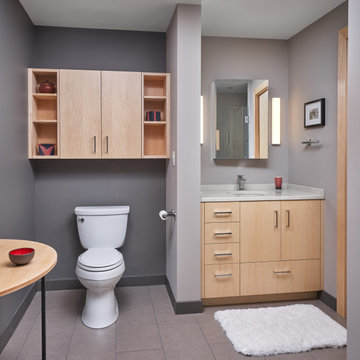
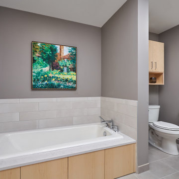
Reprioritizing & reconfiguring spaces to update master bath and create guest accommodations.
Project Details:
These homeowners loved the light, the views, and the compactness of their condo unit. The dining space could accommodate the whole family, they had private areas for quiet reading time, and they loved the location, the building and the community. They definitely did not want to leave.
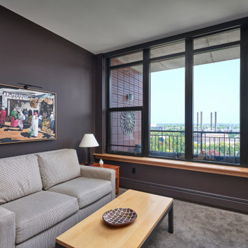
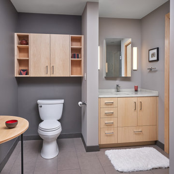
However, the wasted space in the guest bath, the dark, depressing, heavy-feeling in the master bath and the lack of closet space for guests were all problems for them. They wanted a brighter, more inviting bathroom with more functionality and storage, better accommodations for guests, and the tv room to become a comfortable place to relax and actually enjoy the incredible view they had. The unit was designed specifically for the needs of the previous owner, but they needed their home to fit their own needs and lifestyle.
Our team helped this couple create the bright master bath they wanted, complete with additional functionality and storage options. The guest bath and sitting room were also both reconfigured. The guest bath was reworked to become smaller - but more functional, and the sitting room was expanded to become a fully-functioning guest room.
The reprioritization and reworking of spaces in this unit is a great example of working within an existing framework to create rooms that better fit the needs and wants of a homeowner. The new spaces are a much better fit for the lifestyle and aesthetic of this couple, while mimicking the warmth and welcoming feel of the existing spaces they already enjoyed. They are now able to fully take advantage of the views in all living areas of the unit and can easily accommodate guests in comfort whenever they desire.
Find the right local pro for your project
 Birch+Oak Construction
Reprioritizing & reconfiguring spaces to update master bath and create guest accommodations.
Project Details:
These homeowners loved the light, the views, and the compactness of their condo unit. The dining space could accommodate the whole family, they had private areas for quiet reading time, and they loved the location, the building and the community. They definitely did not want to leave.
However, the wasted space in the guest bath, the dark, depressing, heavy-feeling in the master bath and the lack of closet space for guests were all problems for them. They wanted a brighter, more inviting bathroom with more functionality and storage, better accommodations for guests, and the tv room to become a comfortable place to relax and actually enjoy the incredible view they had. The unit was designed specifically for the needs of the previous owner, but they needed their home to fit their own needs and lifestyle.
Our team helped this couple create the bright master bath they wanted, complete with additional functionality and storage options. The guest bath and sitting room were also both reconfigured. The guest bath was reworked to become smaller - but more functional, and the sitting room was expanded to become a fully-functioning guest room.
The reprioritization and reworking of spaces in this unit is a great example of working within an existing framework to create rooms that better fit the needs and wants of a homeowner. The new spaces are a much better fit for the lifestyle and aesthetic of this couple, while mimicking the warmth and welcoming feel of the existing spaces they already enjoyed. They are now able to fully take advantage of the views in all living areas of the unit and can easily accommodate guests in comfort whenever they desire.
 Levite Construction Co
? **Exciting Update from Levite Construction!** ?
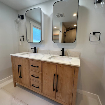
We're thrilled to share the successful completion of the second phase of our remodeling project in Green Lake, Seattle. This extensive renovation stripped the property down to its studs, transforming it from the inside out.
✨ **What We Did:**
- Removed all old plaster walls
- Exposed and restructured the second floor framework
- Installed state-of-the-art insulation
- Rewired the entire house, replacing outdated knob and tube wiring
- Remodeled the bathroom with modern fixtures and finishes
- Laid down stunning hardwood floors
- Added fresh drywall and paint for a brand-new look
This project was a symphony of efficiency, involving multiple skilled professionals who excelled in time management and budget control. The result? A home that not only looks new but feels tailor-made for modern living.
Swipe to see the transformation ➡️
? Before/After photos
? Behind-the-scenes
? Time-lapse of our progress
We're proud to say that this home is now ready for many more years of memories. Thank you to everyone involved for their hard work and dedication. Enjoy the new space! ?
GET IN TOUCH WITH US TODAY TO GET YOUR FREE ESTIMATE.
? (425) 998-8958 ? info@leviteconstruction.com
#LeviteConstruction #HomeRemodeling #SeattleHomes #GreenLakeSeattle #ModernLiving #RenovationMagic #seattlehomedesign #homeconstructionproject #remodelingbathroom #homerenovationspecialist #remodelingproject #seattlehome #bathroomdesigner #houseexterior #buildyourdreamhome #bathroomrenovations #bathroomremodeling #bathroomdesigns #homebuild #bathroominterior #bathroomreno #homedesigner #homeremodeling #customhomebuilder #homemakeover #homeimprovements #homeremodel #bathroomremodel #homerenovation
 Levite Construction Co
? **Exciting Update from Levite Construction!** ?
We're thrilled to share the successful completion of the second phase of our remodeling project in Green Lake, Seattle. This extensive renovation stripped the property down to its studs, transforming it from the inside out.
✨ **What We Did:**
- Removed all old plaster walls
- Exposed and restructured the second floor framework
- Installed state-of-the-art insulation
- Rewired the entire house, replacing outdated knob and tube wiring
- Remodeled the bathroom with modern fixtures and finishes
- Laid down stunning hardwood floors
- Added fresh drywall and paint for a brand-new look
This project was a symphony of efficiency, involving multiple skilled professionals who excelled in time management and budget control. The result? A home that not only looks new but feels tailor-made for modern living.
Swipe to see the transformation ➡️
? Before/After photos
? Behind-the-scenes
? Time-lapse of our progress
We're proud to say that this home is now ready for many more years of memories. Thank you to everyone involved for their hard work and dedication. Enjoy the new space! ?
GET IN TOUCH WITH US TODAY TO GET YOUR FREE ESTIMATE.
? (425) 998-8958 ? info@leviteconstruction.com
#LeviteConstruction #HomeRemodeling #SeattleHomes #GreenLakeSeattle #ModernLiving #RenovationMagic #seattlehomedesign #homeconstructionproject #remodelingbathroom #homerenovationspecialist #remodelingproject #seattlehome #bathroomdesigner #houseexterior #buildyourdreamhome #bathroomrenovations #bathroomremodeling #bathroomdesigns #homebuild #bathroominterior #bathroomreno #homedesigner #homeremodeling #customhomebuilder #homemakeover #homeimprovements #homeremodel #bathroomremodel #homerenovation
 Birch+Oak Construction
Reprioritizing & reconfiguring spaces to update master bath and create guest accommodations.
Project Details:
These homeowners loved the light, the views, and the compactness of their condo unit. The dining space could accommodate the whole family, they had private areas for quiet reading time, and they loved the location, the building and the community. They definitely did not want to leave.
However, the wasted space in the guest bath, the dark, depressing, heavy-feeling in the master bath and the lack of closet space for guests were all problems for them. They wanted a brighter, more inviting bathroom with more functionality and storage, better accommodations for guests, and the tv room to become a comfortable place to relax and actually enjoy the incredible view they had. The unit was designed specifically for the needs of the previous owner, but they needed their home to fit their own needs and lifestyle.
Our team helped this couple create the bright master bath they wanted, complete with additional functionality and storage options. The guest bath and sitting room were also both reconfigured. The guest bath was reworked to become smaller - but more functional, and the sitting room was expanded to become a fully-functioning guest room.
The reprioritization and reworking of spaces in this unit is a great example of working within an existing framework to create rooms that better fit the needs and wants of a homeowner. The new spaces are a much better fit for the lifestyle and aesthetic of this couple, while mimicking the warmth and welcoming feel of the existing spaces they already enjoyed. They are now able to fully take advantage of the views in all living areas of the unit and can easily accommodate guests in comfort whenever they desire.
 Birch+Oak Construction
Reprioritizing & reconfiguring spaces to update master bath and create guest accommodations.
Project Details:
These homeowners loved the light, the views, and the compactness of their condo unit. The dining space could accommodate the whole family, they had private areas for quiet reading time, and they loved the location, the building and the community. They definitely did not want to leave.
However, the wasted space in the guest bath, the dark, depressing, heavy-feeling in the master bath and the lack of closet space for guests were all problems for them. They wanted a brighter, more inviting bathroom with more functionality and storage, better accommodations for guests, and the tv room to become a comfortable place to relax and actually enjoy the incredible view they had. The unit was designed specifically for the needs of the previous owner, but they needed their home to fit their own needs and lifestyle.
Our team helped this couple create the bright master bath they wanted, complete with additional functionality and storage options. The guest bath and sitting room were also both reconfigured. The guest bath was reworked to become smaller - but more functional, and the sitting room was expanded to become a fully-functioning guest room.
The reprioritization and reworking of spaces in this unit is a great example of working within an existing framework to create rooms that better fit the needs and wants of a homeowner. The new spaces are a much better fit for the lifestyle and aesthetic of this couple, while mimicking the warmth and welcoming feel of the existing spaces they already enjoyed. They are now able to fully take advantage of the views in all living areas of the unit and can easily accommodate guests in comfort whenever they desire.

 Ackley Cabinet, LLC
Example of a large classic l-shaped limestone floor eat-in kitchen design in New York with an undermount sink, raised-panel cabinets, white cabinets, granite countertops, brown backsplash, matchstick tile backsplash, stainless steel appliances and an island
 Cabinets 4U, Inc.
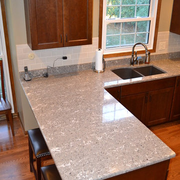
This Naperville kitchen had some BIG changes. From the ceiling to the floor, everything was transformed. Soffits were removed, and also a small closet, which opened up the kitchen space. New lighting, moldings and interior doors elevated the look. And finally, new hardwood floors installed throughout complete the updated framework.
For this new space we chose lovely Cherry cabinets from Kemper. The transitional Wolcott door style bridges the more modern family area with the formal living spaces. The classic chestnut tones blend perfectly with the existing furniture. Finishing the look is a traditional tall crown, adding detail at the ceiling. Though the room is not huge, thoughtful storage options make the most of the space. On the wall that previously held the small closet, a buffet piece was designed. This carries our wood tones through the space, provides more storage, and offers the perfect opportunity for a display piece. The antique glass doors are a subtle touch of texture.
The next layer is the beautiful Cambria countertops. The soft, neutral tones allow the cabinetry to be the star, while the random variations in pattern add interest, and pull together our color palette. In keeping with the brown tones, an Espresso quartz sink was used, as well as Vintage Bronze hardware, and classic brown leather stools. The slightly irregular handmade tiles used for the backsplash add texture without being distracting. Overall, the blending of rich wood tones and neutral surfaces creates a warm yet light and open space – a perfect place for the family to gather!

 Studio21 Architects
 designed this 5,000 square foot ranch home in the western suburbs of Chicago. It is the Dream Home for our clients who purchased an expansive lot on which to locate their home. The owners loved the idea of using heavy timber framing to accent the house. The design includes a series of timber framed trusses and columns extend from the front porch through the foyer, great room and rear sitting room.
A large two-sided stone fireplace was used to separate the great room from the sitting room. All of the common areas as well as the master suite are oriented around the blue stone patio. Two additional bedroom suites, a formal dining room, and the home office were placed to view the large front yard.
 Amanda Martocchio Architecture
Time had stood still at this 1970s ranch in Armonk when the owners invited us to collaborate with them to transform it into a modern, light-filled home for their young family. The budget was lean, so economy was a primary consideration for every design decision. The challenge was to identify the modest home’s virtues – vaulted ceilings and a lovely backyard – and accentuate them by strategically optimizing available funds.
We were tasked with rectifying a dysfunctional interior stair, connecting to the outdoors with new large windows, and updating the exterior. We focused our attention on a finite set of architectural moves which would have the biggest impact and improve our clients’ daily experience of the home. Detailing was kept simple, using common grade materials and standard components. All exterior walls were revamped with new windows and siding. Although these materials were not particularly costly, thoughtful layout of boards, battens, and openings produced a cohesive, rigorous composition at each facade.
Since the budget would not cover the homeowners’ complete wish list, some items were bracketed for subsequent phases. The challenge was to establish a framework that would allow future work – including a new roof and kitchen renovation – to proceed smoothly.
The homeowners, both scientists, were enthusiastic collaborators, contributing their outstanding design sensibilities to selection of fixtures and finishes. Construction ended just in time for the arrival of their baby – and with that, the transformation of their family home was complete.

 Hive Modular, LLC
Example of a trendy backyard outdoor kitchen deck design in Minneapolis with decking and a pergola
 Klopf Architecture
Nestled in the hills of Orinda, California, this 1951 residence is one of only seven extant homes, now known as “The Magnificent Seven”, designed by architect Olof Dahlstrand, a protégé of Frank Lloyd Wright. With its low-slung rooflines, natural materials, and deep integration with the sloping landscape, the home is a pristine example of mid-century modern design inspired by Wright’s organic principles. Over the years, prior homeowners have emphasized preservation, ensuring that the house remained relatively untouched. Each owner has respected the original architecture and stayed true to Dahlstrand’s intent. When a family of five—two college-aged sons and a middle school-aged daughter—acquired the property, they were captivated by its history, legacy of care, and architectural significance. While they appreciated Dahlstrand’s original vision, they also recognized the need to adapt the home for contemporary living while preserving its design integrity.
The remodel was conceived as a thoughtful response to the past—an effort to bring the house into the 21st century without compromising its soul. The primary mandate was to maintain architectural continuity while improving the functionality, comfort, and livability for a modern family. The design team—architects and contractor alike—worked with a shared reverence for the original architecture, allowing that mindset to guide even the most technical or pragmatic decisions.
A key objective was to increase natural light in the kitchen—a departure from Wrightian principles of enclosed, intimate cooking spaces—while maintaining the home’s architectural language. The kitchen was reconfigured to foster a stronger connection to adjacent living spaces while retaining the underlying concept of spatial separation. One of the most transformative architectural changes was the removal of a ridge beam that was originally planned to remain visible through the kitchen. During construction, the team collaborated on a better solution: a wide-flanged steel beam concealed within the roof envelope. This subtle move preserved the clean lines and ceiling continuity, a modern update carried out with utmost respect for the existing framework.
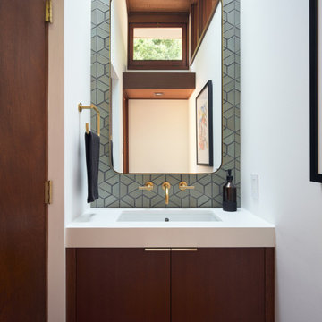
The home’s original powder room, previously accessible only through the kitchen, was relocated for better flow and privacy. A new powder room was carved out of former kitchen cabinetry—a narrow, interior space that could have felt dark and enclosed. To avoid this, the design extended the line of original transom windows into the new powder room and added a skylight above the vanity. The result is a bright and airy space that feels consistent with the rest of the home. Other updates included the installation of new solid-core interior doors with veneers carefully matched to the original mahogany, enhancing the continuity of the interiors. Even smaller decisions, such as placing the door knobs at 42 inches high, mirrored the original proportions. Every choice reflected a shared belief between the architect, contractor, and client: that new work should serve the integrity of the old.
The home’s extensive interior redwood millwork and paneling was meticulously restored. Where new materials were introduced—such as the replacement redwood soffit paneling—the contractor took pains to find finish nails that matched the original, rather than using modern equivalents. This level of craftsmanship and collaboration defined the project. It extended even to the detailing of a blind door to the new powder room, which had to disappear into the existing redwood board-and-batten wall. It was a team effort: the owner found a suitable handle, the architects devised the custom in-swing mechanism, and the contractor executed it so the door aligned precisely with the battens. Throughout, the homeowners were deeply engaged in the design process. One, a meticulous design enthusiast, focused on aesthetic integrity and historic detail. The other brought a practical and function-driven perspective, ensuring that new fixtures and materials would be durable and require minimal maintenance.
While the home’s location posed no major site challenges, sustainability was a key concern. The team upgraded the roof insulation, installed solar panels with battery storage, and added ductless mini-split cooling systems. Lighting was another area where modern technology was woven into a historic framework: new square LED fixtures echo the original custom perimeter soffit lights, maintaining the design language while offering advanced performance.
A planned expansion of a bedroom into suite with a bathroom had to be shelved due to budget constraints and the high cost of below-grade foundation work. Still, the team focused their efforts on making the most of the existing footprint, resolving constraints through design ingenuity rather than adding square footage. This renovation represents a collaborative achievement in preserving and evolving a historically significant home. Every decision was shaped by a shared ethos among clients, architects, and contractor: to maintain the home’s architectural soul while updating it for contemporary life. The result is a timeless modernist residence that continues Olof Dahlstrand’s legacy, remaining grounded in nature, craftsmanship, and human-scale design.
Klopf Architecture Team: John Klopf, AIA, Klara Kevane, Fernanda Bernardes
Interior Architectural Design: Klopf Architecture
Structural Engineer: Daniel Bastiao
Contractor: Don Larwood, Larwood Construction
Photography: Mariko Reed
Year Completed: 2022

 User
The 5,000 square foot private residence is located in the community of Horseshoe Bay, above the shores of Lake LBJ, and responds to the Texas Hill Country vernacular prescribed by the community: shallow metal roofs, regional materials, sensitive scale massing and water-wise landscaping. The house opens to the scenic north and north-west views and fractures and shifts in order to keep significant oak, mesquite, elm, cedar and persimmon trees, in the process creating lush private patios and limestone terraces.
The Owners desired an accessible residence built for flexibility as they age. This led to a single level home, and the challenge to nestle the step-less house into the sloping landscape.
Full height glazing opens the house to the very beautiful arid landscape, while porches and overhangs protect interior spaces from the harsh Texas sun. Expansive walls of industrial insulated glazing panels allow soft modulated light to penetrate the interior while providing visual privacy. An integral lap pool with adjacent low fenestration reflects dappled light deep into the house.
Chaste stained concrete floors and blackened steel focal elements contrast with islands of mesquite flooring, cherry casework and fir ceilings. Selective areas of exposed limestone walls, some incorporating salvaged timber lintels, and cor-ten steel components further the contrast within the uncomplicated framework.
The Owner’s object and art collection is incorporated into the residence’s sequence of connecting galleries creating a choreography of passage that alternates between the lucid expression of simple ranch house architecture and the rich accumulation of their heritage.
The general contractor for the project is local custom homebuilder Dauphine Homes. Structural Engineering is provided by Structures Inc. of Austin, Texas, and Landscape Architecture is provided by Prado Design LLC in conjunction with Jill Nokes, also of Austin.
Cecil Baker + Partners Photography
 Amanda Martocchio Architecture
Time had stood still at this 1970s ranch in Armonk when the owners invited us to collaborate with them to transform it into a modern, light-filled home for their young family. The budget was lean, so economy was a primary consideration for every design decision. The challenge was to identify the modest home’s virtues – vaulted ceilings and a lovely backyard – and accentuate them by strategically optimizing available funds.
We were tasked with rectifying a dysfunctional interior stair, connecting to the outdoors with new large windows, and updating the exterior. We focused our attention on a finite set of architectural moves which would have the biggest impact and improve our clients’ daily experience of the home. Detailing was kept simple, using common grade materials and standard components. All exterior walls were revamped with new windows and siding. Although these materials were not particularly costly, thoughtful layout of boards, battens, and openings produced a cohesive, rigorous composition at each facade.
Since the budget would not cover the homeowners’ complete wish list, some items were bracketed for subsequent phases. The challenge was to establish a framework that would allow future work – including a new roof and kitchen renovation – to proceed smoothly.
The homeowners, both scientists, were enthusiastic collaborators, contributing their outstanding design sensibilities to selection of fixtures and finishes. Construction ended just in time for the arrival of their baby – and with that, the transformation of their family home was complete.

 Studio KZ- Architecture
This modern wood fence was constructed to provide curb appeal to a traditional block wall in front of an ranch style home in the Arcadia neighborhood of Phoenix, Arizona. Anchored directly onto the cement block this fence was the perfect simple facelift for this home.
 H2D Architecture + Design
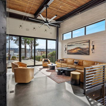
The living room was designed as an open, light-filled space with a strong connection to the outdoors. Expansive lift-and-slide doors span the full width of the wall, opening directly to the patio and allowing the interior living space to flow seamlessly outside. Exposed steel posts and beams express the structural framework of the home, adding rhythm and industrial character throughout the space. Above, a dramatic vaulted ceiling highlights the structural roof system constructed with SIPs panels, creating both visual warmth and high-performance energy efficiency. A custom floor-to-ceiling steel-clad fireplace serves as a sculptural focal point within the room, contrasting against the smooth polished concrete floors and clean modern detailing. The layered combination of steel, concrete, wood, and glass creates a refined yet comfortable living environment, thoughtfully designed by H2D Architecture + Design.
+ Architecture: H2D Architecture + Design
www.h2darchitects.com
+ Interior Design: Karlee Coble Interiors
+ Built by: Carlisle Classic Homes
+ Photography: Christopher Nelson Photography
 Cabinets 4U, Inc.
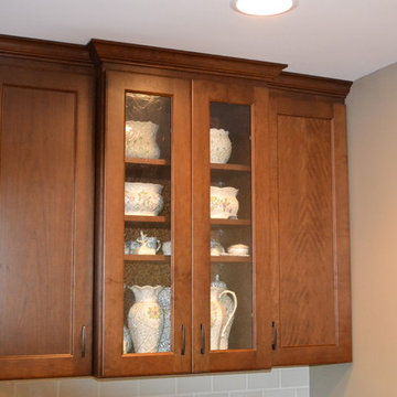
This Naperville kitchen had some BIG changes. From the ceiling to the floor, everything was transformed. Soffits were removed, and also a small closet, which opened up the kitchen space. New lighting, moldings and interior doors elevated the look. And finally, new hardwood floors installed throughout complete the updated framework.
For this new space we chose lovely Cherry cabinets from Kemper. The transitional Wolcott door style bridges the more modern family area with the formal living spaces. The classic chestnut tones blend perfectly with the existing furniture. Finishing the look is a traditional tall crown, adding detail at the ceiling. Though the room is not huge, thoughtful storage options make the most of the space. On the wall that previously held the small closet, a buffet piece was designed. This carries our wood tones through the space, provides more storage, and offers the perfect opportunity for a display piece. The antique glass doors are a subtle touch of texture.
The next layer is the beautiful Cambria countertops. The soft, neutral tones allow the cabinetry to be the star, while the random variations in pattern add interest, and pull together our color palette. In keeping with the brown tones, an Espresso quartz sink was used, as well as Vintage Bronze hardware, and classic brown leather stools. The slightly irregular handmade tiles used for the backsplash add texture without being distracting. Overall, the blending of rich wood tones and neutral surfaces creates a warm yet light and open space – a perfect place for the family to gather!

 A. Perry Homes
Traditional kitchen with antique mirror cabinets, farmhouse sink, and prep sink in island. Also has built-in benches and a metal breakfast table
Example of a large classic u-shaped medium tone wood floor open concept kitchen design in Chicago with an undermount sink, recessed-panel cabinets, white cabinets, wood countertops, gray backsplash, stone slab backsplash, stainless steel appliances and an island
Example of a large classic u-shaped medium tone wood floor open concept kitchen design in Chicago with an undermount sink, recessed-panel cabinets, white cabinets, wood countertops, gray backsplash, stone slab backsplash, stainless steel appliances and an island
138