
Search results for "Functional" in Home Design Ideas
 CairnsCraft Design & Remodel
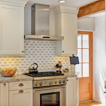
This adorable kitchen in Point Loma, CA is now open to the family room, small in spaces but united with a nature-inspired color palette. The kitchen went through an extensive remodel removing walls, raised ceiling, exposing the beam and a new glass door for the back entry and now this small kitchen feel open and spacious. The cabinetry features shaker elements―clean lines, plain trim, and little ornamentation― great for transitional decor.
Functional fixtures and modern appliances peacefully coexist with the mosaic marble backsplash. Hidden behind the door panels is a 30” Subzero refrigerator/freezer integrated nicely to keep the kitchen plan, clean and understated. The corner sink is recessed back adding a nice detail but even more importantly a more accessible corner access to the kitchen windows.
Accessories and details added to the kitchen cabinets give this chef everything she was looking for with a spice pullout, knife block pullout and rollouts to top off the new cabinets.
When space is tight it is a great option for a small family to open up the walls and add a counter where the family can dine. On the walls, neutral gray painted create a soothing atmosphere.
Adjacent to the kitchen was a cramped room that functioned as a workout room and laundry room. By changing some wall space, closing in a door and removing a closet the new space has great storage and is more open and functional for a quick workout.
In the family room the fireplace was re-tiled with a concrete looking porcelain tile topped off with a rustic beam mantle. Combined with new home furnishings to make the most of a small space this new family room is both functional and a great place for the couple to spend time with each other on a daily basis and to entertain guest and a new space has been created with the feel of a comfortable cozy space for all to enjoy.
General Contractor: CairnsCraft Design & Remodel
Designer: Bonnie Bagley Catlin
Photogtapher: Jon Upson
 Couture Window Fashions
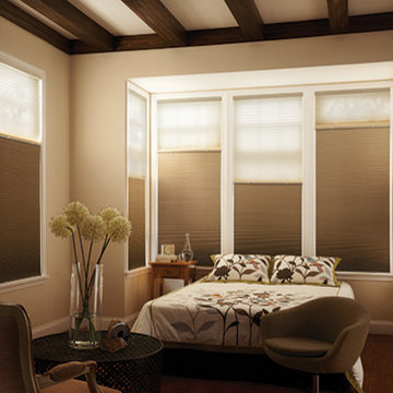
The different styles of modern taste Couture has designed various styles that meet today’s tastes, which are all capable of effectively satisfying the different needs for performing, functioning and appealing qualities.
Couture Sheer Horizontal Shades offers an innovative decorative design and functionality through a unique three-dimension structure. An acoustic absorption effect is formed by the internal spacing of three-dimensional structure.
Couture Sheer Shades is energy efficient and offers UV protection superior functionality by adjusting and angle other vane to limit the amount light transmitted.
Components are available in 15 color and variety of option for both components and fabrics allow you the best possible color and functionality match.
 2MO
2MOLoft 25 is a converted pre-war condominium located in Chelsea. With its pre-war charm and refined, state-of-the-art aesthetic, Loft 25 offers a unique living experience for its residents. The combination of high ceilings, expansive interior space, and well-maintained outdoor gardens adds to the appeal of this property.
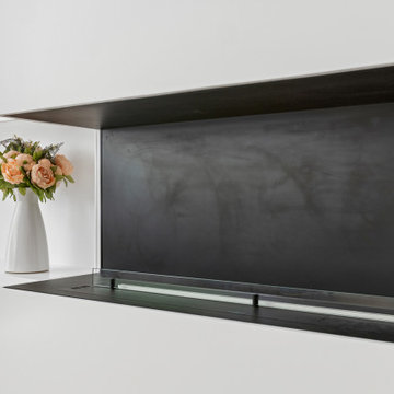
On the ground floor, where the atmosphere is warm, relaxing, and personal, 2MO's design contributions have certainly enhanced the living space. The focal point of the living room is a gorgeous and functional fireplace, which not only adds warmth but also serves as a visually striking element. The inclusion of display shelves and customized cabinets around the fireplace adds both functionality and an opportunity to showcase decorative items or personal belongings.
In the bathroom, upgrades were made to enhance its modernity and functionality. The use of subway tiles provides a classic and timeless look, while the modern folding-glass doors for storage space offer a sleek and space-saving solution. This upgrade not only improves the aesthetics of the bathroom but also provides practicality by maximizing storage options.
Overall, the design choices made by 2MO in Loft 25 contribute to creating an inviting and stylish living environment. The attention to detail, functionality, and the combination of classic and modern elements help elevate the overall appeal of the condominium.
Find the right local pro for your project
 Drury Design
THE SETUP
Sam’s clients wanted to update their hall bathroom used by their three children. The goal was to create a space that is both kid-friendly and elegant, ensuring it remains functional and stylish as the children grow. The original bathroom felt confined due to dark materials and a single-sink vanity. The challenge was to find a design that looks great now and in the future.
Design objectives:
Create a sense of spaciousness
Increase storage for bathroom necessities and daily routines
Enhance lighting
THE REMODEL
Design challenges to be solved:
No structural changes – must keep the tub and wall structure
Transforming a small, dark space into a bright, open one without adding a new window
Multi-user-minded – Improving functionality for multiple users simultaneously
Timeless & kid-friendly – create a comfy kid-friendly look that won’t appear dated as the kids grow older
THE RENEWED SPACE
Design solutions:
Slimmer Tub and Sliding Shower Door installed to free up functional space, making the bathroom feel larger.
Lighter Materials used to reflect more light and add a vibrant feel. Open shelves above the toilet provide storage without making the space feel cramped, while allowing light from the existing window to permeate.
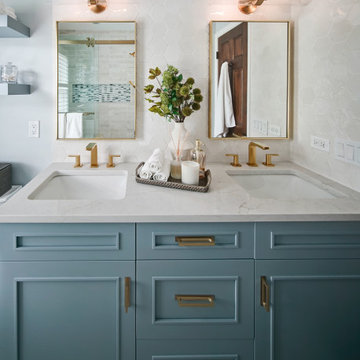
Dual Sink Vanity added, and split the mirror into two, creating individual stations for the kids and enhancing usability during busy routines.
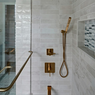
Kid-Friendly Features – Incorporated toe-kick lighting that works as a nightlight, a lower-mounted shower handheld, and a large, accessible shower niche. The geometric shapes and blue color palette contribute to a fun yet sophisticated look.
The clients are thrilled with the transformation. The bathroom is now fun and elegant, providing a timeless look that will grow with the kids. They appreciate the increased functionality and the bright, open feel of the space.
This remodel successfully blends practical solutions with stylish design, ensuring the hall bathroom meets the needs of a busy family while maintaining a sophisticated look.
 Drury Design
THE SETUP
Sam’s clients wanted to update their hall bathroom used by their three children. The goal was to create a space that is both kid-friendly and elegant, ensuring it remains functional and stylish as the children grow. The original bathroom felt confined due to dark materials and a single-sink vanity. The challenge was to find a design that looks great now and in the future.
Design objectives:
Create a sense of spaciousness
Increase storage for bathroom necessities and daily routines
Enhance lighting
THE REMODEL
Design challenges to be solved:
No structural changes – must keep the tub and wall structure
Transforming a small, dark space into a bright, open one without adding a new window
Multi-user-minded – Improving functionality for multiple users simultaneously
Timeless & kid-friendly – create a comfy kid-friendly look that won’t appear dated as the kids grow older
THE RENEWED SPACE
Design solutions:
Slimmer Tub and Sliding Shower Door installed to free up functional space, making the bathroom feel larger.
Lighter Materials used to reflect more light and add a vibrant feel. Open shelves above the toilet provide storage without making the space feel cramped, while allowing light from the existing window to permeate.
Dual Sink Vanity added, and split the mirror into two, creating individual stations for the kids and enhancing usability during busy routines.
Kid-Friendly Features – Incorporated toe-kick lighting that works as a nightlight, a lower-mounted shower handheld, and a large, accessible shower niche. The geometric shapes and blue color palette contribute to a fun yet sophisticated look.
The clients are thrilled with the transformation. The bathroom is now fun and elegant, providing a timeless look that will grow with the kids. They appreciate the increased functionality and the bright, open feel of the space.
This remodel successfully blends practical solutions with stylish design, ensuring the hall bathroom meets the needs of a busy family while maintaining a sophisticated look.
 ONE Design
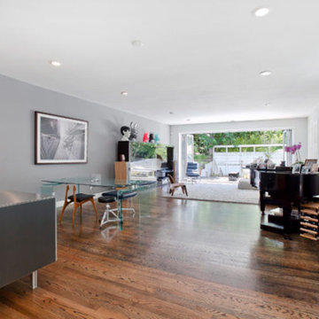
This project was an exercise in minimalism — how it can be embraced and incorporated at multiple levels. Typical of San Franciscan Victorians, the dark interior of this home was segregated and circulation spaces were narrow and dark. The stairs to the upper level was an afterthought and tucked away.
By removing the walls and rebuilding the stairs, we shifted the focus of this home’s interior and made the stairs the focal point. This project pays homage to the stairs, a critical element in the function and tone the home sets. As a transitional element, it carries the user from level to level, function to function, and mindset to mindset. The goal of this remodel was to invite the user upstairs and offer a more integrated transition to the upper level while at the same time using it to create a shaft of light into the inner recesses of the living space below.
As one ascends the stairs, the floor gradually disappears revealing a naked structural spine as the stairs reaches the upper level. The dormer addition offered ample headspace and invites columns of light to penetrate below. The cantilevered floor and shadow play this offers, dynamically marks its imprint on both levels.
Ancillary and storage spaces tucked away neatly and delicately – reminding us that expression should not be at the expense of function. Delicate and clean food preparation areas — now integrated with the rest of the home — invite us to celebrate this expression of unity.
 Modern Citi Group: Renovations & Remodeling
Modern Citi Group recently collaborated with Amelia and Jeremy to reimagine their newly purchased Junior-4 apartment with a complete remodel. This exciting renovation transformed the layout to add a second bedroom, a full second bathroom, and an updated kitchen layout. The goal was to create a functional, family-friendly floor plan and a modern, visually appealing space tailored to their lifestyle.
Our design team faced the challenge of balancing modern aesthetics with a strict budget. After exploring multiple layout options and visualizations, Amelia and Jeremy chose a design they felt best suited their vision.
The construction team brought the design to life, converting the dining room into a second bedroom with a large closet. The kitchen layout was reconfigured to feature an island, additional storage, and ergonomic functionality. We transformed a powder room into a full second bathroom with a walk-in shower and re-purposed the walk-in closet off the primary bedroom into a home office with a built-in desk.
Our professionals refinished floors, walls, and ceilings, upgraded plumbing and electrical systems, and installed additional lighting throughout to optimize flow and functionality.
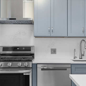
The kitchen featured solid wood cabinetry, quartz countertops, and a porcelain tile floor. Neutral gray-blue cabinets complement the Empira White stone and matte black hardware, creating a sleek, fashion-forward space.
Both bathrooms were reimagined with luxurious new tiling, stylish fixtures, and upgraded plumbing and lighting. The powder room was converted into a full bathroom with a walk-in shower, featuring Arabescato Marble porcelain tiles and Benjamin Moore Palladian Blue walls to unify the kitchen and bath designs. High-quality fixtures from Delta and Kohler added a refined touch.
In just a few short months, Modern Citi Group transformed an outdated apartment into a sleek, modern home. The remodel beautifully combines style, comfort, and functionality, creating a space that's both elevated and efficient.

Sponsored
Columbus, OH

Structural Remodeling
Franklin County's Heavy Timber Specialists | Best of Houzz 2020!
 Drury Design
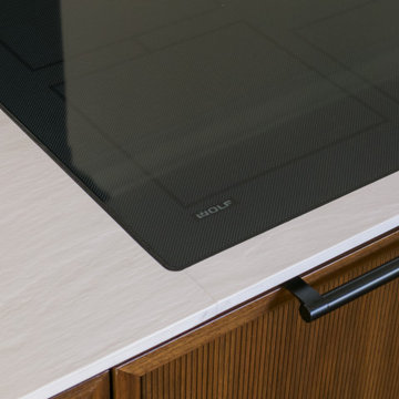
The island cabinets were a complementing walnut to the perimeters soft creamy white color.. The tight reeded door style is custom by our Drury Select Custom Cabinetry.
THE SETUP
Our journey began with a familiar face — Alicia had previously transformed the client’s mother’s home, establishing a trusted relationship that naturally led to this personal project. The client desired a kitchen that truly reflected her own style while facilitating seamless entertaining.
Design Vision:
The original kitchen, segregated from the dining area by a wall, hindered the flow of interaction and space. Our client envisioned a unified area where she could engage with guests in both the kitchen and dining room simultaneously. Moreover, the space lacked a central island, relying instead on a floorplan anchored by cabinetry in a u-shaped layout.
Design Objectives:
Open up the space for an airy design conducive to entertaining large gatherings
Modernize the kitchen to be both stylish and functional
Integrate the design with the home’s new black-framed windows and doors
Relocate the cooktop to a central position to enhance usability and interaction
Design Challenges:
Removing the wall between the kitchen and dining room would necessitate the rerouting of existing HVAC ductwork that services the upper floor
Limited pantry space in the existing kitchen
The existing u-shaped layout of the kitchen restricted functionality and storage options
Insufficient space for wine storage
The client desired a raised-furniture look for the island, but without showing a new downdraft vent
THE RENEWED SPACE
Design Solutions:
We added a second HVAC unit to the upper floor and rerouted the existing ductwork in that wall
Created tall pantry pullouts on either side of the fridge to maximize dry goods storage
Designed a long island to facilitate cooking stations and dining moments
Created a stylish open display cabinet for wine
Engineered a dual-design island with a footed floating aesthetic on one side, and a full floor reach on the other to conceal the new downdraft ventilation.
Paired with the newly opened adjacent dining room featuring a wet bar, the kitchen has become a stylish and highly functional space for cooking and entertaining. Following a large baby shower hosted by the client (which seamlessly accommodated an 80-person gathering!), it is clear that the new design not only meets but exceeds the needs for hosting and everyday living. This project was a harmonious blend of the client’s vision and Alicia’s innovative design solutions, resulting in a kitchen that truly embodies personalized elegance and functionality.
 dRemodeling Design-Build
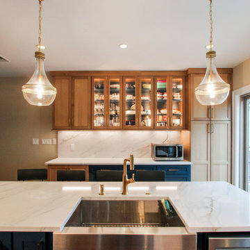
• Design Elements: To achieve a transitional look, the client selected two-toned shaker-style cabinetry that blends timeless charm with contemporary appeal. Navy blue base cabinets anchor the design with rich contrast, while light wood wall cabinets and a coordinating range hood add warmth and balance. Modern elements were introduced through sleek quartz countertops, which extend seamlessly up the wall as a full-height backsplash and waterfall gracefully down the side of the peninsula. This peninsula also provides integrated seating, creating a functional and stylish space for dining and entertaining.
• Functional Improvements: On the wall opposite of the kitchen, additional cabinetry was incorporated to maximize storage and create a dedicated coffee bar. Tall pantry cabinets were installed to provide more storage, while upper cabinets with glass doors introduced both function and style. The glass-front cabinetry features a matching wood interior and integrated lighting, offering a warm glow that highlights the displayed glassware and adds a touch of elegance to the overall design.
 D&G Construction
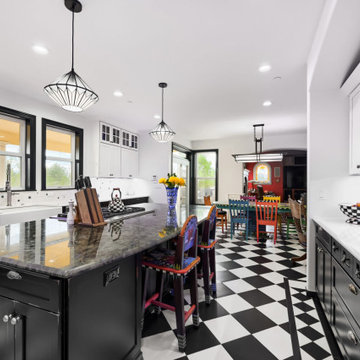
This kitchen remodel was designed to make a statement—balancing bold character with refined craftsmanship to create a space that’s both highly functional and visually unforgettable.
At the heart of the design is a striking contrast palette. Crisp white perimeter cabinetry keeps the space bright and open, while rich black lower cabinets and a substantial island ground the room with depth and sophistication. The oversized island serves as both a functional workspace and a central gathering point, topped with a dramatic stone surface that adds movement and texture.
The flooring plays a defining role in the overall aesthetic. A custom black-and-white patterned tile layout introduces energy and personality, transforming the kitchen into a true design centerpiece while maintaining a timeless appeal. This bold foundation is thoughtfully balanced by clean lines, classic shaker cabinetry, and elegant hardware selections.
Functionality was a key driver throughout the project. The layout maximizes workflow efficiency with dedicated zones for cooking, prep, and cleanup. A professional-grade range anchors the island, while the farmhouse sink positioned beneath large windows brings in natural light and enhances the everyday experience. Custom storage solutions—including extended cabinetry, integrated dish storage, and built-in appliance areas—ensure everything has its place without compromising the clean aesthetic.
Lighting was carefully layered to elevate both form and function. Statement pendant fixtures above the island add architectural interest, while recessed lighting provides consistent illumination throughout the space.
The result is a kitchen that feels both elevated and livable—where bold design choices meet practical everyday use. It’s a space designed not just to cook in, but to gather, entertain, and truly enjoy.
 Talon Construction Inc.
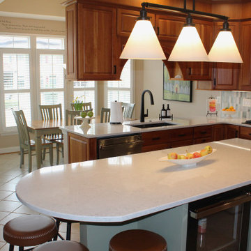
In Frederick, Maryland, a design-build kitchen remodel incorporates local charm with modern touches, creating a functional and inviting space. This kitchen remodel blends traditional elements with contemporary design, making the space ideal for both daily use and entertaining. Here's a breakdown of the remodel, featuring a large island, a beverage station, and an Icelandic Picket ceramic tile backsplash above the gas range.
1. Large Island:
The focal point of the kitchen is a spacious island, perfect for meal preparation, casual dining, and socializing. At about 8 to 10 feet long, the island features a high-end engineered quartz countertop, with subtle veining in shades of gray and white. This island is designed for both functionality and beauty, with ample storage beneath in custom cabinetry, including pull-out drawers, open shelves and deep cabinets. The island is finished with painted cabinetry in soft olive-green color, balancing the space with a touch of elegance.
2. Beverage Station:
Adjacent to the island is a dedicated beverage station, positioned for convenience and style. This cozy nook includes a built-in coffee bar, and a sleek under-counter wine cooler, and drawers to store glassware and coffee mugs. The beverage station provides plenty of counter space for drink preparation and is thoughtfully integrated into the kitchen layout, so it’s easily accessible from both the dining area and living spaces.
3. Icelandic Picket Ceramic Tile Backsplash Above the Gas Range:
Above the gas range, the Icelandic Picket ceramic tile backsplash makes a bold statement, drawing attention with its unique design and color palette. These elongated, picket-shaped tiles come in a range of soft, natural tones – think cool whites, subtle greens, and light grays – that evoke the serene beauty of Iceland’s landscapes. The tiles are installed in a chic, geometric pattern, creating a contemporary feel that contrasts beautifully with the traditional elements of the kitchen. Their glossy finish adds a sense of brightness, reflecting natural light from the large windows. The backsplash not only serves as a practical, easy-to-clean surface but also acts as a visually dynamic feature that ties the entire kitchen design together.
4. Overall Aesthetic and Materials:
The kitchen remodel brings a blend of modern sophistication and rustic charm, perfectly suited to Frederick’s historic character. Light-colored cherry cabinetry provides warmth and a timeless feel, while stainless steel appliances contribute a sleek, polished contrast. The flooring consists of large ceramic tiles in a soft, natural finish, tying the kitchen's elements together and ensuring a cohesive, inviting atmosphere. Large windows bring in plenty of natural light, enhancing the airy, open feel of the space. The addition of subtle, muted lighting throughout creates a soft, welcoming glow for evening meals and gatherings.
5. Local Touches and Context:
Incorporating elements of the local Frederick style, the remodel emphasizes craftsmanship and functional beauty. The kitchen’s open-plan layout flows seamlessly into the dining and living areas, creating an inviting space for both intimate family dinners and larger gatherings..
This remodel captures the essence of Frederick, combining contemporary style with local tradition, all while making a bold statement with design choices that are both elegant and functional.
 Liberty Windoors Corp.
Tilt Turn windows and doors can be combined in numerous configurations with casement, awning, and fixed windows as they utilize the same profile system. The seamless integration of windows provides a uniform appearance and customization beyond compare.
Tilt turn windows are a very unique and functional European window, applicable in endless applications. These windows are quickly gaining popularity in the United States. These windows have been manufactured for almost a hundred years, starting out in Europe in the early 1900′s. The beauty of a tilt turn window is its dual action. The window will open like a casement window and will tilt in at the top. Each window is customized to your exact specifications. Tilt turn doors are also available; the window is capable of being manufactured to fit large openings.
Glancing at the window, one cannot tell that the window has two functions. The window will swing inward when opened like a casement, with a screen on the window’s exterior. The window can then be hinged at the bottom and open inward at the top. Both actions are activated by the turn of a lever, which controls all the mechanics within the frame.
There are great benefits to these operations. Ample fresh air can pass into the room when opened like a casement. When the window is open at the top, it functions as a safety precaution. Small children cannot climb up the window and fall through it as in a traditional double hung window. The same function prevents intruders from entering a room. There is simply no way to climb up the window and fit through the small opening; but ventilation is still possible.
A tilt and turn window can be used in both residential and commercial applications. The window can be utilized in almost any room within a residential home. A home’s exterior is a great place for the windows as are sunrooms and pool enclosures. Commercial applications include restaurants, office buildings, and high rise apartments. A condominium on the thirtieth floor cannot typically be cleaned, except by a professional cleaning service; tilt turn windows open inward and allow for complete cleaning of the window units with out calling costly professionals.
Modern PVC windows are suitable for many types of buildings. Weather it's a historic building, detached private residence, office building or a multi-family house, stylish window profiles can achieve consistency of design between the building's exterior and interior walls.
PVC profile is made from UV stabilized materials protecting windows from solar expositon and discoloration. This problem is often observed with standard vinyl windows. In addition, our profiles are reinforced with galvanized steel, which makes them exceptionally durable. This feature is important for large windows, which require greater strength and stability.
High thermal insulation of PVC material combined with multi chamber profile structure ensures the highest comfort of living. In fact uPVC windows have the highest energy rating in the US outperforming all brands of wooden windows. Double or triple pane glass have the added benefit of being extremely effective in deadening sound. It makes PVC windows the best choice for buildings or homes located close to railroads or noisy roads
Browse and Shop Our Online Site : www.shop.libertywindoors.com
For More Infomation About Tilt Turn Windows and Doors and Custom Order Options Visit : www.libertywindoors.com
Warehouse Location :
127 Squankum Yellowbrook Road
Farmingdale , NJ , 07727
TEL: (973) 773-2188
EMAIL: infonj@libertywindoors.com
Hours Of Operation :
Monday - Friday : 10:00am-5:00pm
Saturday : Closed
Sunday : Closed
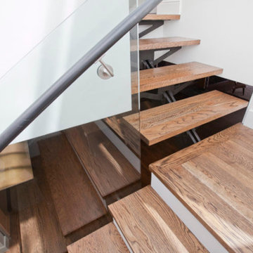 ONE Design
This project was an exercise in minimalism — how it can be embraced and incorporated at multiple levels. Typical of San Franciscan Victorians, the dark interior of this home was segregated and circulation spaces were narrow and dark. The stairs to the upper level was an afterthought and tucked away.
By removing the walls and rebuilding the stairs, we shifted the focus of this home’s interior and made the stairs the focal point. This project pays homage to the stairs, a critical element in the function and tone the home sets. As a transitional element, it carries the user from level to level, function to function, and mindset to mindset. The goal of this remodel was to invite the user upstairs and offer a more integrated transition to the upper level while at the same time using it to create a shaft of light into the inner recesses of the living space below.
As one ascends the stairs, the floor gradually disappears revealing a naked structural spine as the stairs reaches the upper level. The dormer addition offered ample headspace and invites columns of light to penetrate below. The cantilevered floor and shadow play this offers, dynamically marks its imprint on both levels.
Ancillary and storage spaces tucked away neatly and delicately – reminding us that expression should not be at the expense of function. Delicate and clean food preparation areas — now integrated with the rest of the home — invite us to celebrate this expression of unity.


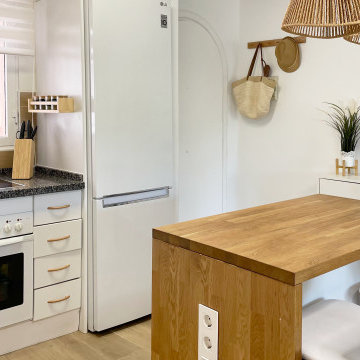
 Costa del Sol Interiors | Interior Designer
This interior design project involved a comprehensive renovation that completely transformed the appearance and features of an apartment located on the Costa del Sol, Spain. The goal was to modernize the space, enhance functionality, and create a more sophisticated and welcoming atmosphere, aligned with a Nordic style that emphasizes warmth and natural elements.
### Space Redistribution:
Originally, the apartment had only one bedroom and one bathroom. The first phase of the renovation involved redistributing the space to add a second bathroom, with one of them becoming an en-suite connected directly to the master bedroom. This addition significantly improved comfort and privacy, allowing each bedroom to have its own bathroom. Additionally, a new laundry area was created, providing a dedicated space for the washing machine, water heater, and cleaning supplies, optimizing the home's functionality without compromising aesthetics.
### Flooring and Visual Continuity:
The old dark, square-patterned flooring was replaced with porcelain tiles that mimic the texture and tone of wood. This new material was extended from the interior to the terrace, creating a sense of continuity and spaciousness. This change not only modernized the apartment's appearance but also reinforced the visual harmony between indoor and outdoor spaces, inviting residents to enjoy the natural light and views offered by the coastal location.
### Bathroom Renovation:
With the addition of a second bathroom, both spaces were completely renovated. The old tiles and bathtub were removed in favor of a more modern and functional design. Light-colored ceramics reflecting the Nordic style were installed, along with contemporary fixtures and clean lines. The en-suite bathroom was designed to offer an intimate and luxurious space, while the second bathroom, though equally modern, provides comfort and accessibility for the rest of the home.
### Style and Décor:
The predominant Nordic style was reflected in the choice of materials and colors. The walls were adorned with wooden slats, a detail that adds texture and warmth to the space, while the décor focused on natural elements like wood, linen, and plant fibers, creating a serene and relaxing atmosphere. Neutral tones and simple lines prevail, achieving a perfect balance between sophistication and comfort.
### Final Result:
The result is an apartment that not only looks more spacious and modern but also exudes a sense of tranquility and comfort. The renovation has transformed the space into a home that invites you to enjoy sunny days on the Costa del Sol, with a terrace seamlessly integrated with the interior and living spaces that reflect a sophisticated, functional, and inviting lifestyle.
Este proyecto de interiorismo consistió en una reforma integral que transformó por completo el aspecto y las características de un apartamento ubicado en la Costa del Sol, España. El objetivo era modernizar el espacio, mejorar la funcionalidad y crear un ambiente más sofisticado y acogedor, alineado con un estilo nórdico que resalta la calidez y la naturalidad.
### Redistribución del Espacio:
Inicialmente, el apartamento contaba con una sola habitación y un solo baño. La primera fase de la reforma implicó una redistribución del espacio, añadiendo un segundo baño, de los cuales uno se convirtió en suite, conectado directamente con la habitación principal. Esta ampliación mejoró significativamente la comodidad y privacidad, permitiendo que cada habitación tuviera su propio baño. Además, se creó una nueva zona de lavadero, un espacio dedicado para la lavadora, el termotanque y los elementos de limpieza, optimizando la funcionalidad del hogar sin sacrificar la estética.
### Suelos y Continuidad Visual:
Se reemplazaron los antiguos suelos de color oscuro, de apariencia cuadrada, por un porcelánico que imita la textura y el tono de la madera. Este nuevo material se extendió desde el interior hasta la terraza, creando una sensación de continuidad y amplitud. Este cambio no solo modernizó el aspecto del apartamento, sino que también reforzó la armonía visual entre los espacios interiores y exteriores, invitando a disfrutar de la luz natural y las vistas que ofrece la ubicación costera.
### Renovación de Baños:
Con la adición de un segundo baño, ambos espacios fueron completamente renovados. Se eliminaron los viejos azulejos y la bañera en favor de un diseño más moderno y funcional. Se instalaron cerámicas de tonos claros que reflejan el estilo nórdico, junto con elementos contemporáneos y líneas limpias. El baño en suite, en particular, fue diseñado para ofrecer un espacio íntimo y lujoso, mientras que el segundo baño, aunque igualmente moderno, ofrece comodidad y accesibilidad para el resto de la casa.
### Estilo y Decoración:
El estilo nórdico predominante se reflejó en la elección de materiales y colores. Las paredes fueron adornadas con palillería, un detalle que aporta textura y calidez al espacio, mientras que la decoración se basó en elementos naturales como madera, lino y fibras vegetales, creando una atmósfera serena y relajante. Los tonos neutros y las líneas simples predominan, logrando un equilibrio perfecto entre sofisticación y comodidad.
### Resultado Final:
El resultado es un apartamento que no solo se ve más amplio y moderno, sino que también transmite una sensación de tranquilidad y confort. La reforma ha transformado el espacio en un hogar que invita a disfrutar de los días soleados en la Costa del Sol, con una terraza que se integra perfectamente con el interior, y unos ambientes interiores que reflejan un estilo de vida sofisticado, funcional y acogedor.
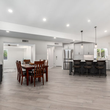
 Kitchens by Good Guys
Our second Tonto Trail project in Rio Verde was quite the transformation for Phase 1. The existing flooring throughout was a stamped concrete, the kitchen was outdated and the pantry was a bizarre shape that made it almost unusable. It was time for some changes!
We removed soffits and re-arranged the kitchen a little to make it feel more open and functional. Selecting Repose Grey painted cabinetry for the perimeter, a warm grey wood stained island and bar to coordinate, marble quartz, Cloe white subway tile laid in herringbone pattern for the backsplash and a wood tile plank flooring that tied all the tones together, really brightened up the home. Lighting was extremely important to our client, so we added can lighting throughout and LED lighting under all the uppers.
For the pantry, it was also important to our client for it to be functional. We reconfigured the surrounding walls to make the pantry more square and bigger on the inside, allowing space for cabinetry, countertops and floating shelves to keep it visually open. By their slider and dining area, we created a bar area to have a beverage fridge and more storage. With changes to openings and existing closets, we were able to gain additional functional storage for our client as well.
This remodel has made our clients home more functional, lighter and brighter with updated finishes throughout!
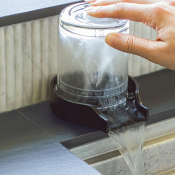 Drury Design
Along with the primary Galley workstation in the kitchen, the homeowner requested a glass rinser for ease when she has company!
THE SETUP
Our journey began with a familiar face — Alicia had previously transformed the client’s mother’s home, establishing a trusted relationship that naturally led to this personal project. The client desired a kitchen that truly reflected her own style while facilitating seamless entertaining.
Design Vision:
The original kitchen, segregated from the dining area by a wall, hindered the flow of interaction and space. Our client envisioned a unified area where she could engage with guests in both the kitchen and dining room simultaneously. Moreover, the space lacked a central island, relying instead on a floorplan anchored by cabinetry in a u-shaped layout.
Design Objectives:
Open up the space for an airy design conducive to entertaining large gatherings
Modernize the kitchen to be both stylish and functional
Integrate the design with the home’s new black-framed windows and doors
Relocate the cooktop to a central position to enhance usability and interaction
Design Challenges:
Removing the wall between the kitchen and dining room would necessitate the rerouting of existing HVAC ductwork that services the upper floor
Limited pantry space in the existing kitchen
The existing u-shaped layout of the kitchen restricted functionality and storage options
Insufficient space for wine storage
The client desired a raised-furniture look for the island, but without showing a new downdraft vent
THE RENEWED SPACE
Design Solutions:
We added a second HVAC unit to the upper floor and rerouted the existing ductwork in that wall
Created tall pantry pullouts on either side of the fridge to maximize dry goods storage
Designed a long island to facilitate cooking stations and dining moments
Created a stylish open display cabinet for wine
Engineered a dual-design island with a footed floating aesthetic on one side, and a full floor reach on the other to conceal the new downdraft ventilation.
Paired with the newly opened adjacent dining room featuring a wet bar, the kitchen has become a stylish and highly functional space for cooking and entertaining. Following a large baby shower hosted by the client (which seamlessly accommodated an 80-person gathering!), it is clear that the new design not only meets but exceeds the needs for hosting and everyday living. This project was a harmonious blend of the client’s vision and Alicia’s innovative design solutions, resulting in a kitchen that truly embodies personalized elegance and functionality.
 Drury Design
The Setup
The homeowners of this Barrington Hills residence approached Drury Design with a clear vision: transform their existing kitchen into a space that would better serve their active family of four. With two young children who are homeschooled and love to bake with their mom, plus two dogs, this kitchen needed to function as the true heart of the home.
The existing kitchen was functional but didn’t maximize the potential of the beautiful natural light and scenic views available through the floor-to-ceiling windows. The space was locked between the dining room and family room, which limited structural modifications, but the homeowners wanted to create a more family-friendly environment that would complement the warm walnut built-ins and furnishings in the adjacent dining room while staying true to the home’s overall aesthetic.
Design Objectives:
Create a highly functional workspace that accommodates multiple family members cooking and gathering simultaneously
Maximize the connection to the beautiful outdoor scenery and natural light through thoughtful design choices
Establish a cohesive color palette that complements the existing walnut elements in the adjacent dining room without becoming too tone-on-tone (aka “matchy matchy”)
Improve the seating arrangement to take advantage of the stunning views (rather than facing away from the windows)
Work within the existing architectural constraints, including a curved soffit that could not be removed
Increase storage capacity while maintaining clean, uncluttered sightlines throughout the space
Design Challenges:
The curved soffit presented a design dilemma of whether to echo the curve throughout the kitchen or work with it in a more subtle way
The relatively low ceiling height required careful consideration to avoid making the space feel cramped or cave-like
The existing hardwood floor could not be refinished, which meant the new kitchen footprint had to match or exceed the original layout exactly
Finding the right balance of warm and neutral tones to complement both the existing walnut elements nearby and the natural outdoor views proved challenging
The refrigerator placement was constrained by door swing requirements, which affected the entire layout and prevented centering the sink on the back wall
Rethinking the original seating, which faced inward toward the kitchen (turning backs to the beautiful windows and outdoor views)
Pendant lighting from the previous kitchen obstructed views to the outdoors despite the abundant natural light available
The Renewed Space
Design Solutions:
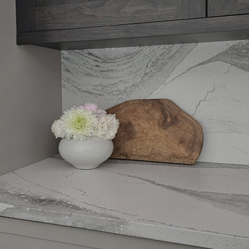
The curved soffit was embraced subtly through the full slab backsplash, which echoes the curve without requiring curved cabinetry or architectural elements that might feel forced
Low ceiling challenges were addressed by using lighter painted cabinets for some tall elements, including the double oven, pantries, and refrigerator area, creating an airy feel while reserving the darker stained walnut for the center section and island
The floor constraint was managed by designing the new layout to cover all previously unfinished areas while maintaining the exact footprint, with only minor touch-ups needed in a few areas
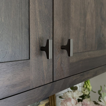
The color palette balances warm walnut stain (harmonizing with the dining room built-ins) with soft, neutral painted cabinets – avoiding stark white that wouldn’t complement the home’s warm aesthetic
Refrigerator placement was optimized with a slim pullout pantry to the left, allowing proper door clearance while maintaining the desired layout flow and enabling the main pantry to be positioned adjacently
The seating was completely reimagined with a built-in banquette facing the windows, allowing diners to enjoy the outdoor views while providing flexible seating for two to four people
Decorative pendant lighting was eliminated in favor of recessed can lights, preserving the unobstructed views to the beautiful outdoor scenery
This kitchen transformation demonstrates how thoughtful design can dramatically improve functionality for a busy family while honoring existing architectural elements. The children immediately began cooking and baking with their mother in the new space, and the window-facing banquette has become a favorite gathering spot where the family can enjoy both meals and the beautiful outdoor views.
 Drury Design
The Setup
The homeowners of this Barrington Hills residence approached Drury Design with a clear vision: transform their existing kitchen into a space that would better serve their active family of four. With two young children who are homeschooled and love to bake with their mom, plus two dogs, this kitchen needed to function as the true heart of the home.
The existing kitchen was functional but didn’t maximize the potential of the beautiful natural light and scenic views available through the floor-to-ceiling windows. The space was locked between the dining room and family room, which limited structural modifications, but the homeowners wanted to create a more family-friendly environment that would complement the warm walnut built-ins and furnishings in the adjacent dining room while staying true to the home’s overall aesthetic.
Design Objectives:
Create a highly functional workspace that accommodates multiple family members cooking and gathering simultaneously
Maximize the connection to the beautiful outdoor scenery and natural light through thoughtful design choices
Establish a cohesive color palette that complements the existing walnut elements in the adjacent dining room without becoming too tone-on-tone (aka “matchy matchy”)
Improve the seating arrangement to take advantage of the stunning views (rather than facing away from the windows)
Work within the existing architectural constraints, including a curved soffit that could not be removed
Increase storage capacity while maintaining clean, uncluttered sightlines throughout the space
Design Challenges:
The curved soffit presented a design dilemma of whether to echo the curve throughout the kitchen or work with it in a more subtle way
The relatively low ceiling height required careful consideration to avoid making the space feel cramped or cave-like
The existing hardwood floor could not be refinished, which meant the new kitchen footprint had to match or exceed the original layout exactly
Finding the right balance of warm and neutral tones to complement both the existing walnut elements nearby and the natural outdoor views proved challenging
The refrigerator placement was constrained by door swing requirements, which affected the entire layout and prevented centering the sink on the back wall
Rethinking the original seating, which faced inward toward the kitchen (turning backs to the beautiful windows and outdoor views)
Pendant lighting from the previous kitchen obstructed views to the outdoors despite the abundant natural light available
The Renewed Space
Design Solutions:
The curved soffit was embraced subtly through the full slab backsplash, which echoes the curve without requiring curved cabinetry or architectural elements that might feel forced
Low ceiling challenges were addressed by using lighter painted cabinets for some tall elements, including the double oven, pantries, and refrigerator area, creating an airy feel while reserving the darker stained walnut for the center section and island
The floor constraint was managed by designing the new layout to cover all previously unfinished areas while maintaining the exact footprint, with only minor touch-ups needed in a few areas
The color palette balances warm walnut stain (harmonizing with the dining room built-ins) with soft, neutral painted cabinets – avoiding stark white that wouldn’t complement the home’s warm aesthetic
Refrigerator placement was optimized with a slim pullout pantry to the left, allowing proper door clearance while maintaining the desired layout flow and enabling the main pantry to be positioned adjacently
The seating was completely reimagined with a built-in banquette facing the windows, allowing diners to enjoy the outdoor views while providing flexible seating for two to four people
Decorative pendant lighting was eliminated in favor of recessed can lights, preserving the unobstructed views to the beautiful outdoor scenery
This kitchen transformation demonstrates how thoughtful design can dramatically improve functionality for a busy family while honoring existing architectural elements. The children immediately began cooking and baking with their mother in the new space, and the window-facing banquette has become a favorite gathering spot where the family can enjoy both meals and the beautiful outdoor views.
 Drury Design
The Setup
The homeowners of this Barrington Hills residence approached Drury Design with a clear vision: transform their existing kitchen into a space that would better serve their active family of four. With two young children who are homeschooled and love to bake with their mom, plus two dogs, this kitchen needed to function as the true heart of the home.
The existing kitchen was functional but didn’t maximize the potential of the beautiful natural light and scenic views available through the floor-to-ceiling windows. The space was locked between the dining room and family room, which limited structural modifications, but the homeowners wanted to create a more family-friendly environment that would complement the warm walnut built-ins and furnishings in the adjacent dining room while staying true to the home’s overall aesthetic.
Design Objectives:
Create a highly functional workspace that accommodates multiple family members cooking and gathering simultaneously
Maximize the connection to the beautiful outdoor scenery and natural light through thoughtful design choices
Establish a cohesive color palette that complements the existing walnut elements in the adjacent dining room without becoming too tone-on-tone (aka “matchy matchy”)
Improve the seating arrangement to take advantage of the stunning views (rather than facing away from the windows)
Work within the existing architectural constraints, including a curved soffit that could not be removed
Increase storage capacity while maintaining clean, uncluttered sightlines throughout the space
Design Challenges:
The curved soffit presented a design dilemma of whether to echo the curve throughout the kitchen or work with it in a more subtle way
The relatively low ceiling height required careful consideration to avoid making the space feel cramped or cave-like
The existing hardwood floor could not be refinished, which meant the new kitchen footprint had to match or exceed the original layout exactly
Finding the right balance of warm and neutral tones to complement both the existing walnut elements nearby and the natural outdoor views proved challenging
The refrigerator placement was constrained by door swing requirements, which affected the entire layout and prevented centering the sink on the back wall
Rethinking the original seating, which faced inward toward the kitchen (turning backs to the beautiful windows and outdoor views)
Pendant lighting from the previous kitchen obstructed views to the outdoors despite the abundant natural light available
The Renewed Space
Design Solutions:
The curved soffit was embraced subtly through the full slab backsplash, which echoes the curve without requiring curved cabinetry or architectural elements that might feel forced
Low ceiling challenges were addressed by using lighter painted cabinets for some tall elements, including the double oven, pantries, and refrigerator area, creating an airy feel while reserving the darker stained walnut for the center section and island
The floor constraint was managed by designing the new layout to cover all previously unfinished areas while maintaining the exact footprint, with only minor touch-ups needed in a few areas
The color palette balances warm walnut stain (harmonizing with the dining room built-ins) with soft, neutral painted cabinets – avoiding stark white that wouldn’t complement the home’s warm aesthetic
Refrigerator placement was optimized with a slim pullout pantry to the left, allowing proper door clearance while maintaining the desired layout flow and enabling the main pantry to be positioned adjacently
The seating was completely reimagined with a built-in banquette facing the windows, allowing diners to enjoy the outdoor views while providing flexible seating for two to four people
Decorative pendant lighting was eliminated in favor of recessed can lights, preserving the unobstructed views to the beautiful outdoor scenery
This kitchen transformation demonstrates how thoughtful design can dramatically improve functionality for a busy family while honoring existing architectural elements. The children immediately began cooking and baking with their mother in the new space, and the window-facing banquette has become a favorite gathering spot where the family can enjoy both meals and the beautiful outdoor views.
 EA Home Design
We are thrilled to unveil our latest bathroom remodeling project, a seamless blend of modern design and functional elegance. Here's a glimpse into the transformation:
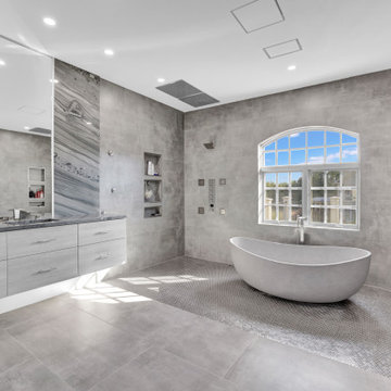
1. Contemporary Palette: The choice of a grey color tile sets a sophisticated and neutral backdrop, allowing the features of the bathroom to shine. This hue not only exudes a sense of calm but also complements the contemporary design elements we've incorporated.
2. Warmth Underfoot: One of the standout features of this remodel is the heated flooring that runs under all the tiled areas. This luxurious addition ensures that even on the coldest mornings, your feet are greeted with a warm embrace, elevating the comfort level of the bathroom.
3. Enhanced Layout: Recognizing the need for more convenience, we repositioned the shower and introduced a second toilet room. This not only maximizes the use of space but also ensures that the bathroom can cater to multiple users without any hassle.
4. Dual Shower Spaces: By eliminating two angles in the bathroom's corner, we've carved out space for two distinct shower areas. This design choice not only adds a touch of luxury but also offers a versatile bathing experience tailored to individual preferences.
5. Wet Room Wonder: The shower and tub area now reside within a waterproof wet room. This innovative design ensures that water stays where it's supposed to, eliminating the need for a curb and offering a sleek, uninterrupted flow to the space.
6. Floating Vanities: Our floating vanities are more than just a design statement. They create an illusion of space, making the bathroom appear larger and more open. Paired with a stunning stone backsplash, they offer a perfect blend of style and functionality.
7. Illuminated Elegance: The mirrors, with their integrated lights, are the pièce de résistance. They not only enhance the aesthetic appeal of the bathroom but also ensure optimal lighting, making daily grooming tasks a breeze.
This bathroom remodel is a testament to our commitment to marrying design with functionality. Every element, from the choice of tiles to the heated floors, has been thoughtfully chosen to create a space that is not just visually appealing but also supremely functional and comfortable. We invite you to step in and experience this modern oasis for yourself.
168