
Search results for "Gained roughly" in Home Design Ideas
 Thompson Remodeling
When dreaming about the perfect master suite remodel, there are two important ingredients that are always in the mix– the closet space and the master bath. Too often, existing homes will have small closets and baths in the master suite leaving homeowners frustrated and ultimately unsatisfied. At Thompson Remodeling, we have seen our share of strange configurations, but that’s part of the fun. We enjoy the challenge of reconfiguring space to make it work better for our clients.
In this recent master suite remodel, the existing floor plan had a small bath with vanities located in the bedroom not the bath, two reach-in closets, and a massive closet with a vaulted ceiling and skylight. Now, who doesn’t love a great big closet? But this one was roughly 11’x 14’ – big enough to be a bedroom!
To start, we decided to get rid of the two reach-in closets to make the main section of the bedroom larger, a gain of 66 square feet. In the massive closet space we designed a spacious bathroom and dressing area. With a window and skylight already in place, there is a ton of natural light. Next, we swapped the original bath space out for a closet.
The flow of this master bedroom is so much better now! Before, you would walk in to the room and be facing a double vanity sink. Now, there’s a small entryway that leads to a much more open and inviting space. The homeowners wanted an organic feel to the space and we used an existing corner fireplace to set the tone. Cream, muted grays and taupes are mixed with natural and weathered woods throughout.
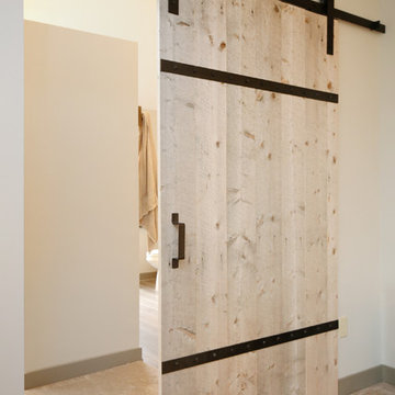
We replaced glass block with a barn door made of reclaimed wood. This creates a beautiful focal point in the room.
In the bathroom, quartz countertops are accented with a stone mosaic backsplash. Maple cabinets with a java finish are a rich offset to the lighter wood vanity mirror and heated ceramic floor.
We think this new master suite remodel is stunning! What a major improvement in the functionality of the entire space.
 Tracy Berman Interiors
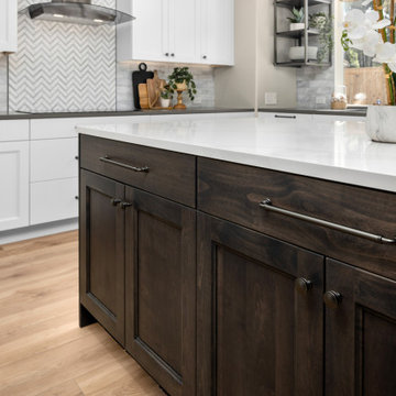
The layout in this kitchen wasn't bad. It had a corner pantry that took up a lot of space for minimal storage. We took that out and gained the corner for a lazy susan and upper corner cabinets. We added a large roll-out shelf pantry for food storage. We also added a full transom row of upper cabinets for additional seasonal storage. The existing cabinets were in rough shape and the design was very dated. The client's style is contemporary with a bit of a coastal nod. The kitchen is mostly white with shades of grey and some added woven texture. We created a focal point at the hood by using glass tile in a chevron pattern and a black stainless hood.
We carried the textured feel to the kitchen table and into the family room. The family room adds more coastal blue to the design. The dated built in under the tv and staircase wall were removed and updated. A fresh coat of paint for the whole house completed the look. The adjacent laundry room got a refresh as well with a new patterned floor that uses the same blue from the family room walls. A new cabinet, sink, faucet and fun penny round tiles complete the look.
 Tracy Berman Interiors
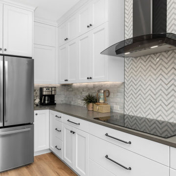
The layout in this kitchen wasn't bad. It had a corner pantry that took up a lot of space for minimal storage. We took that out and gained the corner for a lazy susan and upper corner cabinets. We added a large roll-out shelf pantry for food storage. We also added a full transom row of upper cabinets for additional seasonal storage. The existing cabinets were in rough shape and the design was very dated. The client's style is contemporary with a bit of a coastal nod. The kitchen is mostly white with shades of grey and some added woven texture. We created a focal point at the hood by using glass tile in a chevron pattern and a black stainless hood.
We carried the textured feel to the kitchen table and into the family room. The family room adds more coastal blue to the design. The dated built in under the tv and staircase wall were removed and updated. A fresh coat of paint for the whole house completed the look. The adjacent laundry room got a refresh as well with a new patterned floor that uses the same blue from the family room walls. A new cabinet, sink, faucet and fun penny round tiles complete the look.
Find the right local pro for your project
 Tracy Berman Interiors
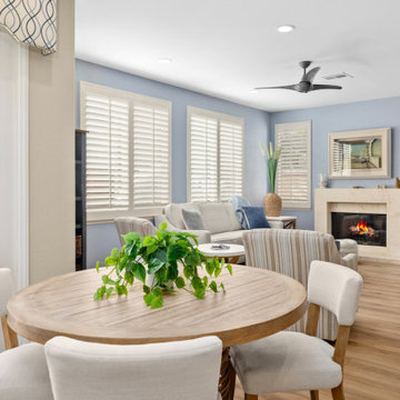
The layout in this kitchen wasn't bad. It had a corner pantry that took up a lot of space for minimal storage. We took that out and gained the corner for a lazy susan and upper corner cabinets. We added a large roll-out shelf pantry for food storage. We also added a full transom row of upper cabinets for additional seasonal storage. The existing cabinets were in rough shape and the design was very dated. The client's style is contemporary with a bit of a coastal nod. The kitchen is mostly white with shades of grey and some added woven texture. We created a focal point at the hood by using glass tile in a chevron pattern and a black stainless hood.
We carried the textured feel to the kitchen table and into the family room. The family room adds more coastal blue to the design. The dated built in under the tv and staircase wall were removed and updated. A fresh coat of paint for the whole house completed the look. The adjacent laundry room got a refresh as well with a new patterned floor that uses the same blue from the family room walls. A new cabinet, sink, faucet and fun penny round tiles complete the look.
 Tracy Berman Interiors
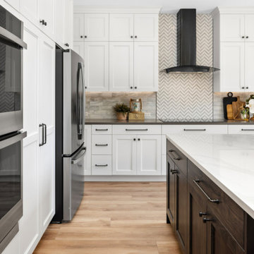
The layout in this kitchen wasn't bad. It had a corner pantry that took up a lot of space for minimal storage. We took that out and gained the corner for a lazy susan and upper corner cabinets. We added a large roll-out shelf pantry for food storage. We also added a full transom row of upper cabinets for additional seasonal storage. The existing cabinets were in rough shape and the design was very dated. The client's style is contemporary with a bit of a coastal nod. The kitchen is mostly white with shades of grey and some added woven texture. We created a focal point at the hood by using glass tile in a chevron pattern and a black stainless hood.
We carried the textured feel to the kitchen table and into the family room. The family room adds more coastal blue to the design. The dated built in under the tv and staircase wall were removed and updated. A fresh coat of paint for the whole house completed the look. The adjacent laundry room got a refresh as well with a new patterned floor that uses the same blue from the family room walls. A new cabinet, sink, faucet and fun penny round tiles complete the look.
 Tracy Berman Interiors
The layout in this kitchen wasn't bad. It had a corner pantry that took up a lot of space for minimal storage. We took that out and gained the corner for a lazy susan and upper corner cabinets. We added a large roll-out shelf pantry for food storage. We also added a full transom row of upper cabinets for additional seasonal storage. The existing cabinets were in rough shape and the design was very dated. The client's style is contemporary with a bit of a coastal nod. The kitchen is mostly white with shades of grey and some added woven texture. We created a focal point at the hood by using glass tile in a chevron pattern and a black stainless hood.
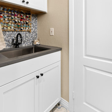
We carried the textured feel to the kitchen table and into the family room. The family room adds more coastal blue to the design. The dated built in under the tv and staircase wall were removed and updated. A fresh coat of paint for the whole house completed the look. The adjacent laundry room got a refresh as well with a new patterned floor that uses the same blue from the family room walls. A new cabinet, sink, faucet and fun penny round tiles complete the look.
 Tracy Berman Interiors
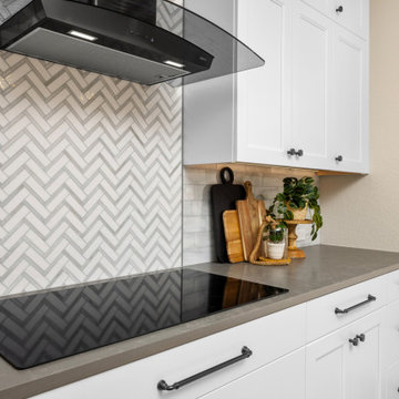
The layout in this kitchen wasn't bad. It had a corner pantry that took up a lot of space for minimal storage. We took that out and gained the corner for a lazy susan and upper corner cabinets. We added a large roll-out shelf pantry for food storage. We also added a full transom row of upper cabinets for additional seasonal storage. The existing cabinets were in rough shape and the design was very dated. The client's style is contemporary with a bit of a coastal nod. The kitchen is mostly white with shades of grey and some added woven texture. We created a focal point at the hood by using glass tile in a chevron pattern and a black stainless hood.
We carried the textured feel to the kitchen table and into the family room. The family room adds more coastal blue to the design. The dated built in under the tv and staircase wall were removed and updated. A fresh coat of paint for the whole house completed the look. The adjacent laundry room got a refresh as well with a new patterned floor that uses the same blue from the family room walls. A new cabinet, sink, faucet and fun penny round tiles complete the look.


 Tracy Berman Interiors
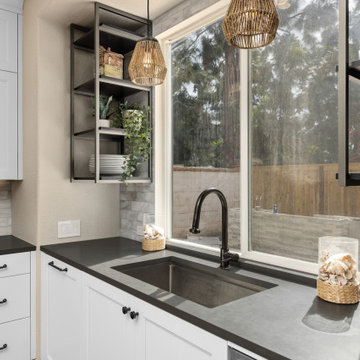
The layout in this kitchen wasn't bad. It had a corner pantry that took up a lot of space for minimal storage. We took that out and gained the corner for a lazy susan and upper corner cabinets. We added a large roll-out shelf pantry for food storage. We also added a full transom row of upper cabinets for additional seasonal storage. The existing cabinets were in rough shape and the design was very dated. The client's style is contemporary with a bit of a coastal nod. The kitchen is mostly white with shades of grey and some added woven texture. We created a focal point at the hood by using glass tile in a chevron pattern and a black stainless hood.
We carried the textured feel to the kitchen table and into the family room. The family room adds more coastal blue to the design. The dated built in under the tv and staircase wall were removed and updated. A fresh coat of paint for the whole house completed the look. The adjacent laundry room got a refresh as well with a new patterned floor that uses the same blue from the family room walls. A new cabinet, sink, faucet and fun penny round tiles complete the look.
 Tracy Berman Interiors
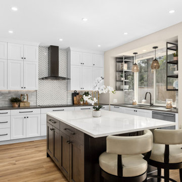
The layout in this kitchen wasn't bad. It had a corner pantry that took up a lot of space for minimal storage. We took that out and gained the corner for a lazy susan and upper corner cabinets. We added a large roll-out shelf pantry for food storage. We also added a full transom row of upper cabinets for additional seasonal storage. The existing cabinets were in rough shape and the design was very dated. The client's style is contemporary with a bit of a coastal nod. The kitchen is mostly white with shades of grey and some added woven texture. We created a focal point at the hood by using glass tile in a chevron pattern and a black stainless hood.
We carried the textured feel to the kitchen table and into the family room. The family room adds more coastal blue to the design. The dated built in under the tv and staircase wall were removed and updated. A fresh coat of paint for the whole house completed the look. The adjacent laundry room got a refresh as well with a new patterned floor that uses the same blue from the family room walls. A new cabinet, sink, faucet and fun penny round tiles complete the look.
 Tracy Berman Interiors
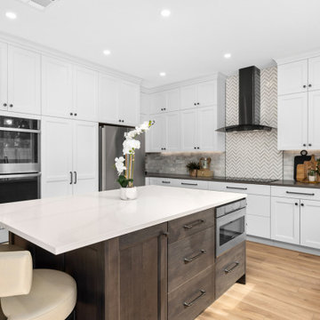
The layout in this kitchen wasn't bad. It had a corner pantry that took up a lot of space for minimal storage. We took that out and gained the corner for a lazy susan and upper corner cabinets. We added a large roll-out shelf pantry for food storage. We also added a full transom row of upper cabinets for additional seasonal storage. The existing cabinets were in rough shape and the design was very dated. The client's style is contemporary with a bit of a coastal nod. The kitchen is mostly white with shades of grey and some added woven texture. We created a focal point at the hood by using glass tile in a chevron pattern and a black stainless hood.
We carried the textured feel to the kitchen table and into the family room. The family room adds more coastal blue to the design. The dated built in under the tv and staircase wall were removed and updated. A fresh coat of paint for the whole house completed the look. The adjacent laundry room got a refresh as well with a new patterned floor that uses the same blue from the family room walls. A new cabinet, sink, faucet and fun penny round tiles complete the look.
 Tracy Berman Interiors
The layout in this kitchen wasn't bad. It had a corner pantry that took up a lot of space for minimal storage. We took that out and gained the corner for a lazy susan and upper corner cabinets. We added a large roll-out shelf pantry for food storage. We also added a full transom row of upper cabinets for additional seasonal storage. The existing cabinets were in rough shape and the design was very dated. The client's style is contemporary with a bit of a coastal nod. The kitchen is mostly white with shades of grey and some added woven texture. We created a focal point at the hood by using glass tile in a chevron pattern and a black stainless hood.
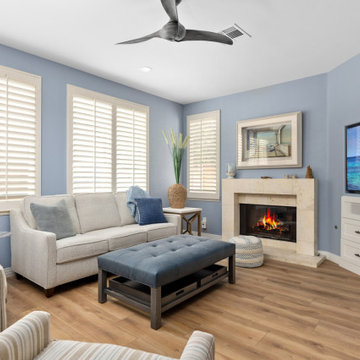
We carried the textured feel to the kitchen table and into the family room. The family room adds more coastal blue to the design. The dated built in under the tv and staircase wall were removed and updated. A fresh coat of paint for the whole house completed the look. The adjacent laundry room got a refresh as well with a new patterned floor that uses the same blue from the family room walls. A new cabinet, sink, faucet and fun penny round tiles complete the look.
 Tracy Berman Interiors
The layout in this kitchen wasn't bad. It had a corner pantry that took up a lot of space for minimal storage. We took that out and gained the corner for a lazy susan and upper corner cabinets. We added a large roll-out shelf pantry for food storage. We also added a full transom row of upper cabinets for additional seasonal storage. The existing cabinets were in rough shape and the design was very dated. The client's style is contemporary with a bit of a coastal nod. The kitchen is mostly white with shades of grey and some added woven texture. We created a focal point at the hood by using glass tile in a chevron pattern and a black stainless hood.
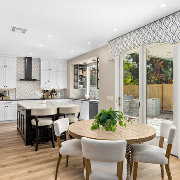
We carried the textured feel to the kitchen table and into the family room. The family room adds more coastal blue to the design. The dated built in under the tv and staircase wall were removed and updated. A fresh coat of paint for the whole house completed the look. The adjacent laundry room got a refresh as well with a new patterned floor that uses the same blue from the family room walls. A new cabinet, sink, faucet and fun penny round tiles complete the look.
 Thompson Remodeling
When dreaming about the perfect master suite remodel, there are two important ingredients that are always in the mix– the closet space and the master bath. Too often, existing homes will have small closets and baths in the master suite leaving homeowners frustrated and ultimately unsatisfied. At Thompson Remodeling, we have seen our share of strange configurations, but that’s part of the fun. We enjoy the challenge of reconfiguring space to make it work better for our clients.
In this recent master suite remodel, the existing floor plan had a small bath with vanities located in the bedroom not the bath, two reach-in closets, and a massive closet with a vaulted ceiling and skylight. Now, who doesn’t love a great big closet? But this one was roughly 11’x 14’ – big enough to be a bedroom!
To start, we decided to get rid of the two reach-in closets to make the main section of the bedroom larger, a gain of 66 square feet. In the massive closet space we designed a spacious bathroom and dressing area. With a window and skylight already in place, there is a ton of natural light. Next, we swapped the original bath space out for a closet.
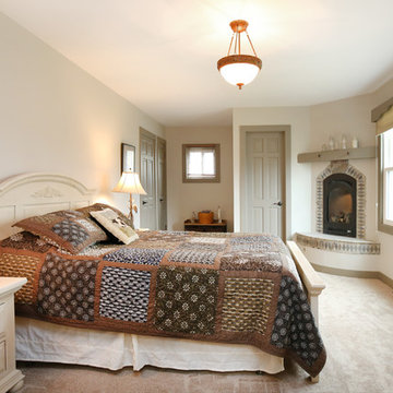
The flow of this master bedroom is so much better now! Before, you would walk in to the room and be facing a double vanity sink. Now, there’s a small entryway that leads to a much more open and inviting space. The homeowners wanted an organic feel to the space and we used an existing corner fireplace to set the tone. Cream, muted grays and taupes are mixed with natural and weathered woods throughout.
We replaced glass block with a barn door made of reclaimed wood. This creates a beautiful focal point in the room.
In the bathroom, quartz countertops are accented with a stone mosaic backsplash. Maple cabinets with a java finish are a rich offset to the lighter wood vanity mirror and heated ceramic floor.
We think this new master suite remodel is stunning! What a major improvement in the functionality of the entire space.

Sponsored
Columbus, OH

Structural Remodeling
Franklin County's Heavy Timber Specialists | Best of Houzz 2020!

 Thompson Remodeling
When dreaming about the perfect master suite remodel, there are two important ingredients that are always in the mix– the closet space and the master bath. Too often, existing homes will have small closets and baths in the master suite leaving homeowners frustrated and ultimately unsatisfied. At Thompson Remodeling, we have seen our share of strange configurations, but that’s part of the fun. We enjoy the challenge of reconfiguring space to make it work better for our clients.
In this recent master suite remodel, the existing floor plan had a small bath with vanities located in the bedroom not the bath, two reach-in closets, and a massive closet with a vaulted ceiling and skylight. Now, who doesn’t love a great big closet? But this one was roughly 11’x 14’ – big enough to be a bedroom!
To start, we decided to get rid of the two reach-in closets to make the main section of the bedroom larger, a gain of 66 square feet. In the massive closet space we designed a spacious bathroom and dressing area. With a window and skylight already in place, there is a ton of natural light. Next, we swapped the original bath space out for a closet.
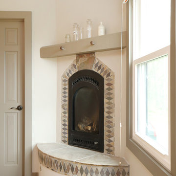
The flow of this master bedroom is so much better now! Before, you would walk in to the room and be facing a double vanity sink. Now, there’s a small entryway that leads to a much more open and inviting space. The homeowners wanted an organic feel to the space and we used an existing corner fireplace to set the tone. Cream, muted grays and taupes are mixed with natural and weathered woods throughout.
We replaced glass block with a barn door made of reclaimed wood. This creates a beautiful focal point in the room.
In the bathroom, quartz countertops are accented with a stone mosaic backsplash. Maple cabinets with a java finish are a rich offset to the lighter wood vanity mirror and heated ceramic floor.
We think this new master suite remodel is stunning! What a major improvement in the functionality of the entire space.
 Thompson Remodeling
When dreaming about the perfect master suite remodel, there are two important ingredients that are always in the mix– the closet space and the master bath. Too often, existing homes will have small closets and baths in the master suite leaving homeowners frustrated and ultimately unsatisfied. At Thompson Remodeling, we have seen our share of strange configurations, but that’s part of the fun. We enjoy the challenge of reconfiguring space to make it work better for our clients.
In this recent master suite remodel, the existing floor plan had a small bath with vanities located in the bedroom not the bath, two reach-in closets, and a massive closet with a vaulted ceiling and skylight. Now, who doesn’t love a great big closet? But this one was roughly 11’x 14’ – big enough to be a bedroom!
To start, we decided to get rid of the two reach-in closets to make the main section of the bedroom larger, a gain of 66 square feet. In the massive closet space we designed a spacious bathroom and dressing area. With a window and skylight already in place, there is a ton of natural light. Next, we swapped the original bath space out for a closet.
The flow of this master bedroom is so much better now! Before, you would walk in to the room and be facing a double vanity sink. Now, there’s a small entryway that leads to a much more open and inviting space. The homeowners wanted an organic feel to the space and we used an existing corner fireplace to set the tone. Cream, muted grays and taupes are mixed with natural and weathered woods throughout.
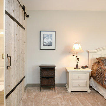
We replaced glass block with a barn door made of reclaimed wood. This creates a beautiful focal point in the room.
In the bathroom, quartz countertops are accented with a stone mosaic backsplash. Maple cabinets with a java finish are a rich offset to the lighter wood vanity mirror and heated ceramic floor.
We think this new master suite remodel is stunning! What a major improvement in the functionality of the entire space.
 Thompson Remodeling
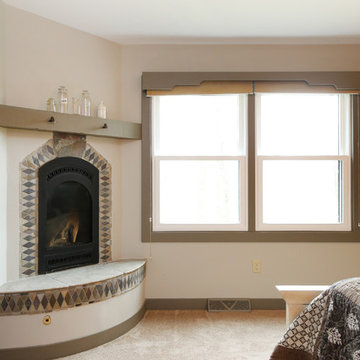
When dreaming about the perfect master suite remodel, there are two important ingredients that are always in the mix– the closet space and the master bath. Too often, existing homes will have small closets and baths in the master suite leaving homeowners frustrated and ultimately unsatisfied. At Thompson Remodeling, we have seen our share of strange configurations, but that’s part of the fun. We enjoy the challenge of reconfiguring space to make it work better for our clients.
In this recent master suite remodel, the existing floor plan had a small bath with vanities located in the bedroom not the bath, two reach-in closets, and a massive closet with a vaulted ceiling and skylight. Now, who doesn’t love a great big closet? But this one was roughly 11’x 14’ – big enough to be a bedroom!
To start, we decided to get rid of the two reach-in closets to make the main section of the bedroom larger, a gain of 66 square feet. In the massive closet space we designed a spacious bathroom and dressing area. With a window and skylight already in place, there is a ton of natural light. Next, we swapped the original bath space out for a closet.
The flow of this master bedroom is so much better now! Before, you would walk in to the room and be facing a double vanity sink. Now, there’s a small entryway that leads to a much more open and inviting space. The homeowners wanted an organic feel to the space and we used an existing corner fireplace to set the tone. Cream, muted grays and taupes are mixed with natural and weathered woods throughout.
We replaced glass block with a barn door made of reclaimed wood. This creates a beautiful focal point in the room.
In the bathroom, quartz countertops are accented with a stone mosaic backsplash. Maple cabinets with a java finish are a rich offset to the lighter wood vanity mirror and heated ceramic floor.
We think this new master suite remodel is stunning! What a major improvement in the functionality of the entire space.
 Thompson Remodeling
When dreaming about the perfect master suite remodel, there are two important ingredients that are always in the mix– the closet space and the master bath. Too often, existing homes will have small closets and baths in the master suite leaving homeowners frustrated and ultimately unsatisfied. At Thompson Remodeling, we have seen our share of strange configurations, but that’s part of the fun. We enjoy the challenge of reconfiguring space to make it work better for our clients.
In this recent master suite remodel, the existing floor plan had a small bath with vanities located in the bedroom not the bath, two reach-in closets, and a massive closet with a vaulted ceiling and skylight. Now, who doesn’t love a great big closet? But this one was roughly 11’x 14’ – big enough to be a bedroom!
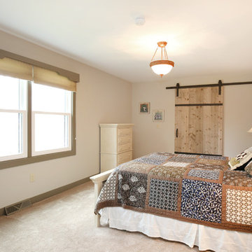
To start, we decided to get rid of the two reach-in closets to make the main section of the bedroom larger, a gain of 66 square feet. In the massive closet space we designed a spacious bathroom and dressing area. With a window and skylight already in place, there is a ton of natural light. Next, we swapped the original bath space out for a closet.
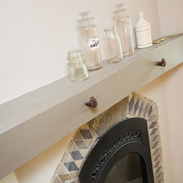
The flow of this master bedroom is so much better now! Before, you would walk in to the room and be facing a double vanity sink. Now, there’s a small entryway that leads to a much more open and inviting space. The homeowners wanted an organic feel to the space and we used an existing corner fireplace to set the tone. Cream, muted grays and taupes are mixed with natural and weathered woods throughout.
We replaced glass block with a barn door made of reclaimed wood. This creates a beautiful focal point in the room.
In the bathroom, quartz countertops are accented with a stone mosaic backsplash. Maple cabinets with a java finish are a rich offset to the lighter wood vanity mirror and heated ceramic floor.
We think this new master suite remodel is stunning! What a major improvement in the functionality of the entire space.
 Thompson Remodeling
When dreaming about the perfect master suite remodel, there are two important ingredients that are always in the mix– the closet space and the master bath. Too often, existing homes will have small closets and baths in the master suite leaving homeowners frustrated and ultimately unsatisfied. At Thompson Remodeling, we have seen our share of strange configurations, but that’s part of the fun. We enjoy the challenge of reconfiguring space to make it work better for our clients.
In this recent master suite remodel, the existing floor plan had a small bath with vanities located in the bedroom not the bath, two reach-in closets, and a massive closet with a vaulted ceiling and skylight. Now, who doesn’t love a great big closet? But this one was roughly 11’x 14’ – big enough to be a bedroom!
To start, we decided to get rid of the two reach-in closets to make the main section of the bedroom larger, a gain of 66 square feet. In the massive closet space we designed a spacious bathroom and dressing area. With a window and skylight already in place, there is a ton of natural light. Next, we swapped the original bath space out for a closet.
The flow of this master bedroom is so much better now! Before, you would walk in to the room and be facing a double vanity sink. Now, there’s a small entryway that leads to a much more open and inviting space. The homeowners wanted an organic feel to the space and we used an existing corner fireplace to set the tone. Cream, muted grays and taupes are mixed with natural and weathered woods throughout.
We replaced glass block with a barn door made of reclaimed wood. This creates a beautiful focal point in the room.
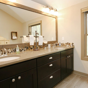
In the bathroom, quartz countertops are accented with a stone mosaic backsplash. Maple cabinets with a java finish are a rich offset to the lighter wood vanity mirror and heated ceramic floor.
We think this new master suite remodel is stunning! What a major improvement in the functionality of the entire space.
 Thompson Remodeling
When dreaming about the perfect master suite remodel, there are two important ingredients that are always in the mix– the closet space and the master bath. Too often, existing homes will have small closets and baths in the master suite leaving homeowners frustrated and ultimately unsatisfied. At Thompson Remodeling, we have seen our share of strange configurations, but that’s part of the fun. We enjoy the challenge of reconfiguring space to make it work better for our clients.
In this recent master suite remodel, the existing floor plan had a small bath with vanities located in the bedroom not the bath, two reach-in closets, and a massive closet with a vaulted ceiling and skylight. Now, who doesn’t love a great big closet? But this one was roughly 11’x 14’ – big enough to be a bedroom!
To start, we decided to get rid of the two reach-in closets to make the main section of the bedroom larger, a gain of 66 square feet. In the massive closet space we designed a spacious bathroom and dressing area. With a window and skylight already in place, there is a ton of natural light. Next, we swapped the original bath space out for a closet.
The flow of this master bedroom is so much better now! Before, you would walk in to the room and be facing a double vanity sink. Now, there’s a small entryway that leads to a much more open and inviting space. The homeowners wanted an organic feel to the space and we used an existing corner fireplace to set the tone. Cream, muted grays and taupes are mixed with natural and weathered woods throughout.
We replaced glass block with a barn door made of reclaimed wood. This creates a beautiful focal point in the room.
In the bathroom, quartz countertops are accented with a stone mosaic backsplash. Maple cabinets with a java finish are a rich offset to the lighter wood vanity mirror and heated ceramic floor.
We think this new master suite remodel is stunning! What a major improvement in the functionality of the entire space.
3